Choosing the right Tooltip Library for your Project
xxxxxxxxxxxxxxxxxxxxxxxxxxxxx xx ABSTRACT TEXT GOES HERE xx xxxxxxxxxxxxxxxxxxxxxxxxxxxxx

Discover how at OpenReplay.com.
Comparing Popper.js and Tippy.js: Choosing the Right Tooltip Library for Your Project
Tooltips are subtle yet indispensable elements, offering users informative snippets that enhance their interactions. As web developers strive for seamless and user-friendly interfaces, choosing a tooltip library plays a pivotal role in achieving this goal. Among the myriad options available, two prominent contenders, Popper.js and Tippy.js, have earned recognition for their prowess in this regard.
This article explores and compares both libraries, shedding light on their significance, features, and applications in web development. As tooltips continue to play a vital role in guiding users through digital landscapes, the decision between these two libraries becomes crucial. Join us as we delve into the nuanced world of tooltip libraries, dissecting the strengths and considerations that accompany their use.
Significance of Popper.js and Tippy.js
Tooltips are pivotal in web design by providing users with additional context and aiding navigation. They serve as informative companions, offering concise explanations, guidance, or supplementary details when interacting with specific web elements. Popper.js and Tippy.js are standout libraries that elevate tooltip implementation, offering enhanced features, customization options, and responsive behavior. Incorporating them enhances the overall user experience, making interactions more intuitive and enjoyable.
In the upcoming sections, we’ll delve into the intricacies of these libraries, understanding what sets them apart and how they contribute to the broader landscape of web development.
Popper.js
Popper.js is a versatile positioning engine designed for creating tooltips and popovers effortlessly. It is widely recognized for addressing major challenges in using pure CSS for tooltips, resolving these issues and ensuring optimal application performance. Its prevalence is notable in popular libraries like Bootstrap, Foundation, and Material UI, underscoring its widespread adoption and reliability in the development community.
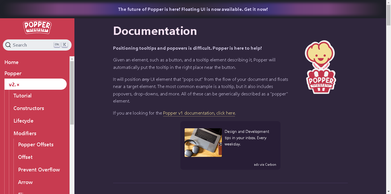 Source: Popper.js
The image above showcases the interface of the official Popper.js website, highlighting sections such as navigation menus, informational content, and interactive elements like documentation and tutorials.
Key Features of Popper.js
- Enables versatile positioning around the reference element.
- Optimized for swift position updates, ensuring real-time adjustments without delays.
- Offers a range of modifiers for customizing tooltip behavior and appearance based on specific needs.
- Prevents popovers from being clipped or sliced when screen size changes.
Pros and Cons of Using Popper.js
It excels in precision for tooltip and popover placement, ensuring accuracy in various scenarios. It intelligently handles overflow situations by adjusting tooltip positions for visibility. It seamlessly integrates with popular frontend frameworks like Bootstrap, providing a robust foundation for web development.
However, due to its extensive features, it may have a steep learning curve for developers new to tooltip implementation. Additionally, it might be considered heavier compared to lightweight solutions, potentially impacting performance in specific scenarios.
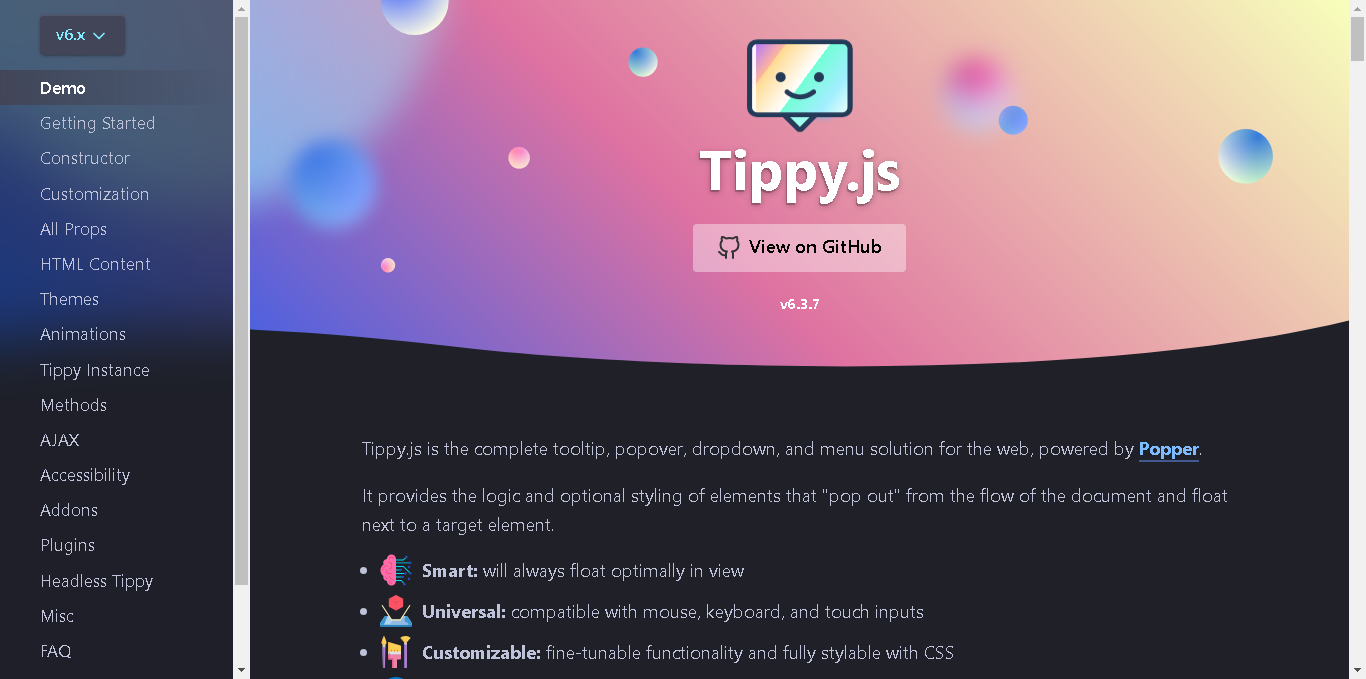
Tippy.js
Tippy.js simplifies tooltip implementation, offering versatile functionality for HTML elements. Its lightweight design and emphasis on customization balance simplicity and powerful features. Developers benefit from easy-to-use solutions, making them suitable for various projects.
 Source: Tippy.js
The image above displays the interface of the official Tippy.js website, showcasing various sections such as navigation menus, descriptive content, and potentially interactive elements like demo and getting started.
Key Features of Tippy.js
- It is known for its lightweight nature and user-friendly approach.
- It allows using any HTML markup, enabling developers to create rich and dynamic content for enhanced user experiences.
- It allows for nested tooltips, making it simple for developers to build complex structures that enhance user interactions.
- It allows developers to run custom actions based on various tooltip events through callback methods.
Pros and Cons of Tippy.js
Tippy.js offers a lightweight and highly customizable solution for creating tooltips, empowering developers to tailor tooltips to their specific design needs. Its straightforward and easy-to-use interface makes Tippy accessible to developers of all skill levels. However, while Tippy excels in simplicity, it may lack some advanced features found in other tooltip libraries, potentially limiting its suitability for projects with advanced requirements.
In the next section, we’ll guide you through both libraries’ installation and setup process, laying the foundation for their practical implementation.
Basic Tooltip Usage
This section covers the essential aspects of using both libraries, focusing on installation and initialization. We’ll provide clear instructions and code examples to assist developers in getting started with these libraries.
Both Popper and Tippy can be installed via npm or included directly from a CDN. We’ll guide you through the installation process and demonstrate how to initialize these libraries in your project.
Installation of Popper.js
In this article, we will install Popper.js via CDN. You can include it directly from a CDN by adding the following script tag to your HTML file:
<script src="https://unpkg.com/@popperjs/core@2"></script>This allows you to reference it directly from an external source without installing it locally.
Initializing Popper.js
After installing it via the CDN, proceed with initialization. Start by identifying the reference element and the tooltip element. Then, call the createPopper function with these elements and any additional configuration options.
const referenceElement = document.querySelector(".reference-element");
const tooltipElement = document.querySelector(".tooltip-element");

const popperInstance = createPopper(referenceElement, tooltipElement, {
  placement: "top",
  modifiers: [
    {
      name: "offset",
      options: {
        offset: [0, 10],
      },
    },
  ],
});
We use document.querySelector() in this code to identify the reference and tooltip elements. Then, we call createPopper with these elements and specify the tooltip placement and any modifiers for customization.
Installation of Tippy.js
Similarly, you can include Tippy.js directly from a CDN by adding these script tags to your HTML file:
<script src="https://unpkg.com/@popperjs/core@2"></script>
<script src="https://unpkg.com/tippy.js@6"></script>
This allows you to reference it from an external source without installing it locally.
Initializing Tippy.js
After installing Tippy.js via CDN, proceed to initialize it:
tippy("#tooltipButton", {
  content: "Tooltip content",
  placement: "top",
  // Additional configuration options can be specified here
});
In this code snippet, we initialize Tippy.js and attach a tooltip to the HTML element with the id 'tooltipButton'. Specify the content and placement, and add more configuration options as needed.
By following these steps and understanding the provided code snippets, you can easily install and initialize both libraries in your web projects. This will empower you to create dynamic and interactive tooltips to enhance user experience.
Implementing Practical Tooltip Usage
This section delves into practical tooltip usage with both libraries, highlighting their unique features and ease of implementation. Through hands-on examples, we showcase how these libraries enhance user interactions and provide concise information. Join us as we explore the versatility and effectiveness of tooltips in web design, comparing the strengths of both libraries in facilitating seamless user experiences.
Implementing Tooltip Usage with Popper.js
First, we start by creating a button element and a content element in your HTML with a unique identifier. This identifier will be used to target the button element in JavaScript.
<!-- Tooltip Button -->
<button
  id="tooltipButton"
  class="relative px-4 py-2 bg-blue-500 text-white rounded-lg shadow-md hover:bg-blue-600"
>
  Hover Me
</button>
<!-- Tooltip Content -->
<div
  id="tooltipContent"
  class="hidden bg-yellow-200 p-2 mt-2 rounded-lg shadow-md"
>
  This is a tooltip example using Popper
</div>
The button with the id tooltipButton and the <div> with the id tooltipContent serve as unique identifiers for JavaScript targeting. The button utilizes Tailwind CSS for styling, setting its background color to blue, and text color to white, and applying padding, rounded corners, and shadow. Additionally, it changes its background color to a darker shade of blue on hover. The text 'hover me' represents the button’s content. The content <div> is also styled utilizing Tailwind CSS with a yellow background, padding, margin, rounded corners, and shadow.
In your JavaScript file or within a <script> tag in your HTML, initialize it to create the tooltip. Use the unique identifier of the button element and the content you want to display.
// Initialize Popper for tooltip
const button = document.getElementById("tooltipButton");
const tooltip = document.getElementById("tooltipContent");
const popperInstance = Popper.createPopper(button, tooltip, {
  placement: "bottom",
  modifiers: [
    {
      name: "offset",
      options: {
        offset: [0, 10],
      },
    },
  ],
});
// Show tooltip on button hover
button.addEventListener("mouseenter", function () {
  tooltip.classList.remove("hidden");
  popperInstance.update();
});

// Hide tooltip on button mouseleave
button.addEventListener("mouseleave", function () {
  tooltip.classList.add("hidden");
});
The JavaScript code initializes Popper to create an effect. It targets the button with the id tooltipButton and the content with the id tooltipContent.
Using Popper’s createPopper function, it establishes a connection between the button and the content, defining the position as 'bottom'. Additionally, it includes a modifier to adjust the offset for proper alignment.
Event listeners are then set up to show the content when the button is hovered over and hide it when the cursor leaves. These listeners toggle the visibility of the content by adding or removing the 'hidden' class, ensuring smooth display and disappearance as per user interaction.
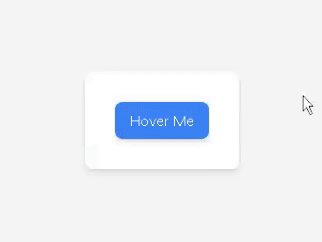
The GIF showcases Popper’s functionality, demonstrating how content is dynamically positioned and displayed relative to a trigger element, such as a button. It allows for precise control over the placement and appearance, ensuring they remain visible and aligned correctly. You can try it out firsthand here.
Implementing Tooltip Usage with Tippy.js
Let’s create an HTML button element with a distinct identity. In JavaScript, this identifier will be used to target the button element.
<button
  id="tooltipButton"
  class="px-4 py-2 bg-blue-500 text-white rounded-lg shadow-md hover:bg-blue-600"
>
  Hover Me</button
>;
This HTML snippet defines a button element with the id tooltipButton and specific styling classes from Tailwind CSS. The button features a blue background, white text, rounded corners, and a shadow effect. On hover, the background color changes to a darker shade of blue. The button’s purpose is indicated by the text 'hover me,' inviting user interaction.
Initialize Tippy to create the tooltip. In the JavaScript code block, specify the target element with the unique id tooltipButton and provide the desired content.
// Initialize Tippy for tooltip
tippy("#tooltipButton", {
  content: "This is a tooltip example using Tippy",
  placement: "bottom", // Set tooltip placement
  animation: "scale", // Add animation effect
  theme: "light", // Use light theme
  arrow: false, // Disable the arrow
  offset: [0, 10], // Adjust tooltip position
  minWidth: 200, // Set minimum width for tooltip
});
The JavaScript code initializes Tippy to create tooltips on the button element with the id tooltipButton. It specifies the content as 'this is a Tippy example' and sets the placement to 'bottom' to position the tooltip below the button. Additionally, it configures the animation to 'scale' for a visual effect, uses a light theme, disables the arrow, adjusts the position offset, and sets a minimum width for the tooltip.
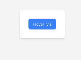
The GIF illustrates Tippy’s functionality, showcasing the seamless creation and display of tooltips in response to user interaction with a trigger element, such as a button. It offers simplicity and ease of use, allowing developers to quickly implement it with minimal configuration. You can try it out here.
Comparison of Popper vs Tippy.js
Popper and Tippy are two widely-used JavaScript libraries for creating tooltips, essential UI components that provide contextual information and enhance user experience on websites and web applications. While both libraries serve the common purpose of tooltip creation, they differ significantly in their approach, features, and capabilities.
In this comparison, we’ll delve into the key aspects of these JavaScript libraries, including ease of implementation, customization options, performance metrics, community support, and unique features. By evaluating these factors, developers can make informed decisions when choosing the most suitable one for their projects.
Ease of Implementation
Popper and Tippy offer solutions for implementing tooltips with varying levels of complexity. While Popper provides precise control over positioning and advanced customization options, Tippy excels in simplicity and ease of use.
The choice between the two libraries depends on the project requirements, developer preferences, and the desired balance between functionality and ease of implementation.
Customization and Flexibility
When it comes to customization and flexibility, Popper provides extensive options for fine-tuning the appearance, behavior, and interaction. This allows developers to achieve precise control over the positioning, styling, and animations through a comprehensive range of configuration options and modifiers.
On the other hand, while Tippy offers some customization capabilities, its focus on simplicity may limit the level of control, particularly for developers seeking highly tailored experiences.
Performance Metrics
Popper and Tippy are lightweight libraries with minimal impact on page load times and rendering efficiency. Popper tends to be slightly more efficient in rendering performance due to its optimized positioning algorithms and minimal overhead.
Additionally, Popper provides better responsiveness when dealing with complex tooltip scenarios or high-frequency updates, making it a preferred choice for projects where performance is critical. Nonetheless, the difference in performance between the two libraries is often negligible for most use cases, and developers should prioritize other factors, such as ease of implementation and customization when choosing between them.
Community Support and Documentation
Popper and Tippy benefit from active community support and comprehensive documentation, which are crucial for developers when choosing a tooltip library. Popper, a widely used library, has a larger community base and extensive online documentation resources. It has been around longer and garnered a strong following, resulting in many tutorials, guides, and community forums where developers can seek assistance and share knowledge.
On the other hand, while Tippy may have a smaller community than Popper, it still offers robust documentation and responsive community support. Its documentation provides clear and concise explanations, examples, and demos to help developers get started quickly and troubleshoot any issues they encounter. Both libraries offer reliable community support and documentation, ensuring developers have the resources to effectively implement them in their projects.
Unique Features and Differences
Popper excels in flexibility and customization, making it suitable for projects with complex requirements that demand precise positioning and advanced customization. On the other hand, Tippy prioritizes simplicity and ease of implementation, making it ideal for projects requiring rapid development and user-friendly tooltips with basic customization needs.
In summary, the choice between Popper and Tippy depends on the specific project requirements, developer expertise, and the desired balance between customization and ease of implementation. Both libraries offer valuable features and can enhance user interactions through well-designed tooltips.
Conclusion
In this comparison, we explored two powerful tooltip libraries: Popper and Tippy. Popper excels at precise placement and handling complex scenarios accurately. On the other hand, Tippy prioritizes simplicity and aesthetics, offering a lightweight and customizable solution. Developers should choose based on project needs, prioritizing precision or modern design. Both libraries empower developers to create engaging tooltips that enhance user interactions.
Truly understand users experience
See every user interaction, feel every frustration and track all hesitations with OpenReplay — the open-source digital experience platform. It can be self-hosted in minutes, giving you complete control over your customer data. . Check our GitHub repo and join the thousands of developers in our community..