Harmony in Hues: Crafting a Consistent Color Palette for Best User Experience

Colors are storytellers, creating captivating and engaging user experiences. Used strategically, they can evoke emotions, convey messages, and shape our perception of a brand or product. This article delves into crafting a consistent color palette, exploring how harmonious hues can create a seamless user experience that captivates and guides users.

Discover how at OpenReplay.com.
Designers must create a consistent color palette to create an identity or help users quickly recognize a brand. Humans readily associate different brands with their distinctive colors.
For instance, we can quickly tell a skincare brand with Soft, pastel colors like blush pink, lavender, or baby blue. This is due to a consistency in colors that have been ingrained in users’ memory for skincare products.
When it comes to design, Consistency is critical, and a well-crafted color palette can make all the difference in creating a seamless user experience.
What is a color palette?
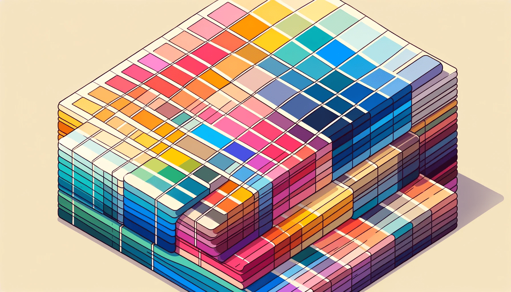
A color palette, or a color scheme, is a carefully selected range of colors used consistently throughout a design project. It serves as a visual foundation, providing a cohesive and harmonious visual language for a brand or product. A thoughtful and well-executed color palette can enhance users’ usability, aesthetics, and overall experience. A typical example of a consistent color palette used in digital products is Apple’s devices, ranging from phones to wristwatches.
With its minimalist design approach, the iterating system allows to experience a seamless transition across different devices, icons, buttons, and other UI elements maintained in a coherent color scheme to create a unified and intuitive interface.
Apple’s marketing materials and product packaging adhere to the established color palette. All these contribute to the brand’s identity and recognizability with users.
 Apple’s color palette
 Application of Apple’s colour palette in designing their various products
Balancing Aesthetics and Functionality
One of the primary goals of a color palette is to create a seamless user experience. When colors are used consistently, users can easily navigate and interact with a digital interface without distractions or confusion.
Consistency in color helps users understand how different elements relate. This allows for a smoother and more efficient user experience, as users can quickly identify essential elements, navigate through the interface, and complete tasks.
To achieve this, designers can create color style guides with complementary colors throughout the design for cohesion and aesthetics. To enhance readability for accessibility, especially for users with visual impairments, picking colors with high contrast is essential, making sure that the colors used in texts and other elements are different from those of the background.
In the study of color psychology, it is well-known that colors evoke emotions. In the digital space, designers can use colors to create a form of familiarization for users when interacting with interfaces, either a website or an app. Not only should colors in an interface look nice, but they also need to help the user understand how to use the application easily. For example, the red and green buttons during an incoming call mean the user can decide to end or receive the call, creating a clear understanding of what each icon does, thus eliminating confusion.
The aesthetics-usability effects: This is the phenomenon where people perceive more aesthetic designs as much more intuitive (usable and effective).
Tips for Crafting a Unified Color Palette
To create a consistent color palette, it is essential first to understand the psychology of colors. Different colors have different associations and can evoke distinct emotions.
For example, red can signify excitement or danger; blue conveys a sense of trust and calmness. By understanding these associations, designers can strategically choose colors that align with the intended message or brand personality. This not only enhances the user experience but also helps in building a solid and memorable brand identity.
First, Identify the type of brand you want to create, its target audience, and the specific goals you are trying to reach with the project. For instance, a healthcare app’s color palette may differ from a gaming app’s; tailoring your color choices would create a better user experience.
The next important thing to look out for when crafting a color palette is accessibility. Users, irrespective of their disabilities, should be able to use your product. A typical example would be color contrast, which affects the readability and overall use of the digital application. There should be high contrast between background colors and texts used when designing to ensure a seamless user experience. This is important for those with visual impairments. Below is a typical example of a good and bad contrast.

In addition to accessibility, designers must also consider the scalability and adaptability of the color palette. Digital interfaces often need to be displayed across various devices and screen sizes. A well-designed color palette should be able to adapt and maintain its visual integrity across different platforms. This ensures that the user experience remains consistent, regardless of the device or platform used.
Practical Way of Creating a Harmonious Colour Scheme
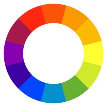
Using the color wheel is a practical way of choosing colors that tell your brand story and generally lead to a great user experience.
First is to select a base color that speaks to your brand’s identity. Think about the emotions such color can evoke in the users you’re designing for. When selecting a base color, looking at color trends within your industry is essential.
Next, you can create a color scheme by selecting colors close to each other. These colors are known as analogous colors. For example, a designer can combine yellow, yellow-orange, and orange to create a palette.
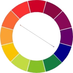
Another way to create a color scheme using the color wheel is to develop complementary colors. This type of color is obtained by picking colors opposite each other on the color wheel, as they can create a subtle look.
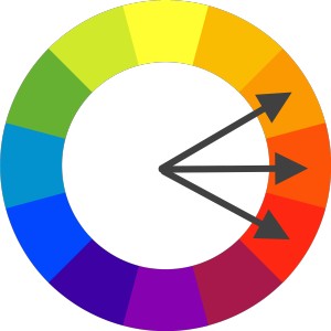
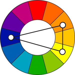
Selecting three colors evenly spaced out by drawing a triangle would create what is known as a triad color scheme. Though only some colors are used in this color scheme, understanding their relationship can help you know what works when designing for users.
Consistency in color is not limited to the digital realm alone. A consistent color palette should extend to all brand or product touchpoints in print, packaging, or physical spaces. This helps in reinforcing brand recognition and creating a cohesive brand experience. Users should be able to easily recognize and associate the colors with the brand, regardless of where they encounter it.
Emerging Trends in Color Design
As design trends evolve, designers must stay updated with the latest color design trends to remain relevant.
In 2024, one of the most prominent trends in color design is using vibrant and bold colors. This is due to these hues’ ability to grab users’ attention and create a memorable visual impact. A typical example is the current use of pink, blues, and reds in designing logos, packaging, and website backgrounds.
To adapt to this trend, designers can experiment with their color palettes by using bold shades in smaller accents or incorporating them as gradients. As such, a consistent overall look is maintained without overwhelming the design.
While exploring new trends, retaining core brand colors to foster brand recognition and seamless user experience is essential.
Conclusion
A well-crafted color palette is essential for creating a seamless user experience. When we, as designers, strategically select colors, we can enhance usability, create an engaging and visually appealing interface, and establish a strong brand identity.
Using consistent colors improves navigation, readability, and overall user satisfaction. By considering factors such as psychology, context, accessibility, scalability, and adaptability, designers can create a color palette that looks aesthetically pleasing and delivers a seamless and memorable user experience.
Designing with harmony in hues sets the stage for success in the digital landscape.
Truly understand users experience
See every user interaction, feel every frustration and track all hesitations with OpenReplay — the open-source digital experience platform. It can be self-hosted in minutes, giving you complete control over your customer data. . Check our GitHub repo and join the thousands of developers in our community..