Build Responsive Web Pages With React-responsive and TypeScript

There’s a recent need to quickly build and ship responsive web applications that are displayed properly on devices with different screen resolutions. This need requires that developers find ways to quickly incorporate styles into the logic (functionalities) of the application giving them the flexibility to easily build web application that are responsive without writing media query CSS. In this tutorial, we’ll learn about react-responsive library, and how to use it with TypeScript in our projects. We will also apply our knowledge from this tutorial to build a simple responsive portfolio application.
Let quickly establish some knowledge on the actual meaning of implementing responsive web applications;
What is Responsive Web Design?
According to MDN, Responsive web design (RWD) is an approach to web design that makes web pages render well on a variety of devices and window or screen sizes from minimum to maximum display size. Recent work also considers the viewer proximity as part of the viewing context as an extension for RWD. Content, design and performance are necessary across all devices to ensure usability and satisfaction.
Implementing RWD in web applications provides these applications with the capacity to easily readjust and adapt to the constant changing of screen sizes in devices. To build applications that are RWD adhesive means these web application have fluid and proportion-based grids, flexible images, and CSS3 media queries, an extension of the @media rule. For this tutorial, we’ll focus on the Media query part of implementing RWD in web application.
What is React-responsive?
React-responsive is a media query module that provides CSS media queries in react as a component or hook for responsive web design. This is super useful for rendering or removing specific styled elements in the DOM — restructure your DOM in terms of CSS/Sass Styling, depending on the screen resolution/size.
Using react-responsive in our projects mean we can easily separate the content we want to display without writing any additional styles for it. These styles are handled by react-responsive under-the-hood by providing us with a component or hook interface that we can use to set the max-width or min-width values. These values determine on what screen sizes the content within them would be displayed or hidden.
React-responsive vs Styled components
Before we make this comparison between these tools, it’s worthwhile to note that while react-responsive was made for breakpoints through custom components, styled-components focused on creating components with customizable CSS styles. This means that these two tools can be combined together to add more CSS capability to our webpage. While react-responsive focus more on giving us encapsulation as breakpoints, styled-components focus on adding more CSS styles through custom components.
Improving your styled-components capacity would involve handling your media queries through react-responsive as demonstrate below:
...
const SampleComponent = (props) => {
  ...
  return(
    <div>
      <ReactResponsive breakpoint={1040}>
        <StyledComponents {...props}>
      </ReactResponsive>

      <ReactResponsive breakpoint={786}>
        <StyledComponents {...props}>
      </ReactResponsive>
    </div>
  )
}
...
The above represents the possible code of combining the two libraries together to build a more responsive web applications. On screen sizes within the min-width of 1040px, the children components, which is <StyledComponents {...props}> would be render onto the screen. The same concept applies to the second <ReactResponsive breakpoint={786}> component.
Implementing React-responsive In React
In the following parts of this tutorial, we’ll discuss and explore implementing React-responsive both as a hook, and also as a component. We’ll also combine the two approaches together, this way we’re covering any possible implementation of react-responsive you would need to know before building a well responsive application.
Let’s started with setting up react-responsive as a hook within a react project:
import { useMediaQuery } from "react-responsive";

const App = () => {
  const isDesktop = useMediaQuery({
    query: "(min-width: 1224px)"
  });

  const isTablet = useMediaQuery({
    query: "(max-width: 1224px)"
  });

  const isMobile = useMediaQuery({
    query: "(max-width: 786px)"
  });

  const isPortrait = useMediaQuery({
    query: "(orientation: portrait)"
  });

  const isRetina = useMediaQuery({
    query: "(max-resolution: 300dpi)"
  });

  return (
    <Wrapper>
      {
        isDesktop ? <DesktopView /> : <MobileView />
      }
      {isTablet && <Tablet />}
      <p>This is {isPortrait ? 'portrait' : 'landscape'} orientation</p>
      {isRetina && <p>You are testig retina</p>}
  </div>
    </Wrapper>
  )
}
Using the useMediaQuery hook provided by react-responsive, we were able to created breakpoint logic within our code. Components validated by isDesktop will display only on screens above the viewport of 1224px. While isTablet and isMobile will display components within the viewport of 1224px and 786px respectively.
Next, we’ll set up react-responsive as a component interface within a react project:
import MediaQuery from "react-responsive";

const App = () => (
  <Wrapper>
    <MediaQuery minWidth={1224}>
      <DeskTopView>This will display in desktop screen</DeskTopView>
      <MediaQuery minWidth={1824}>
        <Banner text="this will dsiplay on larger screen size" />
      </MediaQuery>
    </MediaQuery>
    <MediaQuery minResolution="2dppx">
      {(matches) =>
        matches
          ? <Retina>This is a retina view</Retina>
          : <div>This isn't a retina</div>
      }
    </MediaQuery>
  </Wrapper>
)
The above code snippet gives us an idea of how we can use the MediaQuery component, and then pass in the breakpoint as a prop into the component. Also within the <MediaQuery minResolution="2dppx">, we used a function (render prop) as a child to programmatically choose the children props of the component.
The last concept before we implement React-responsive within our portfolio project is on how to trigger an event using the onChange prop in the MediaQuery component or as a callback in our useMediaQuery hook.
import MediaQuery, { useMediaQuery } from "react-responsive";

const App = () => {
  const handleMediaQueryChange = (matches) => {
    if(matches) {
      // do something if true
    } else {
      // do something if false
    }
  };
  const isDesktop = useMediaQuery(
    { minWidth: 1224 }, undefined,  handleMediaQueryChange
  );

  return (
    <Wrapper>
      <MediaQuery minWidth={1224} onChange={handleMediaQueryChange}>
      ...
      </MediaQuery>
      {"or"}
      {isDesktop && <div>Welcome to desktop view...</div>}
    </Wrapper>
  )
}
In the above code, we’re attaching a callback function, handleMediaQueryChange , to the useMediaQuery hook to handle onChange event that occurs when the browser’s viewport changes to 1224px in width. This also applies to the MediaQuery component, where the handleMediaQueryChange function is executed by the onChange prop on the component.
Open Source Session Replay
OpenReplay is an open-source, session replay suite that lets you see what users do on your web app, helping you troubleshoot issues faster. OpenReplay is self-hosted for full control over your data.

Start enjoying your debugging experience - start using OpenReplay for free.
Implement React-responsive with TypeScript
Within this project, we’ll use Styled-components library to apply basic styles to custom components. Then we’ll use the React-responsive library to add media queries for breakpoints in screens.
Let’s clone our project from GitHub into a portfolio folder using the following command, then change directory into this folder and install all the dependencies and the devDependencies needed.
git clone https://github.com/IkehAkinyemi/react-responsive-portfolio portfolio
cd portfolio
yarn install
Let’s start the project by running the yarn start command in the terminal, and on the browser we navigate to the route, localhost:3000/experience to view the current UI before implementing our media query.
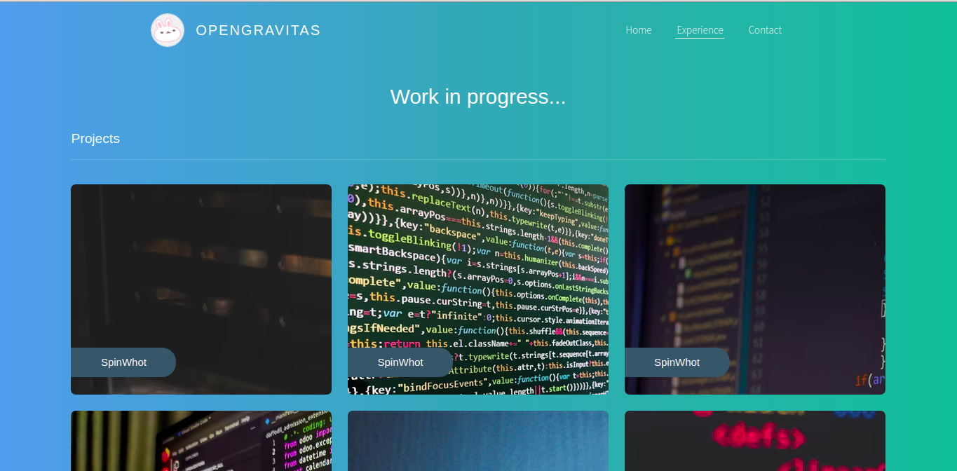
Now let’s start with the simplest implementation of react-responsive by separating what content display on desktop and mobile viewports.
import Projects from "./Projects";
import MediaQuery from "react-responsive";
...
const Experience = () => {
  ...
  return (
    <div className="container max-w-screen-lg mx-auto">
      <div className="mt-8">
        <MediaQuery maxWidth={786}>
          <h1 className="text-3xl text-center mb-6 z-50">
            For desktop view only
          </h1>
        </MediaQuery>

        <MediaQuery minWidth={1224}>
          <Projects />
        </MediaQuery>
      </div>
    </div>
  );
};
export default Experience;
We’ve updated our application to only display the h1 element in mobile view, while the list of cards for the projects, i.e the <Project /> component, displays only on viewport above 1224px.
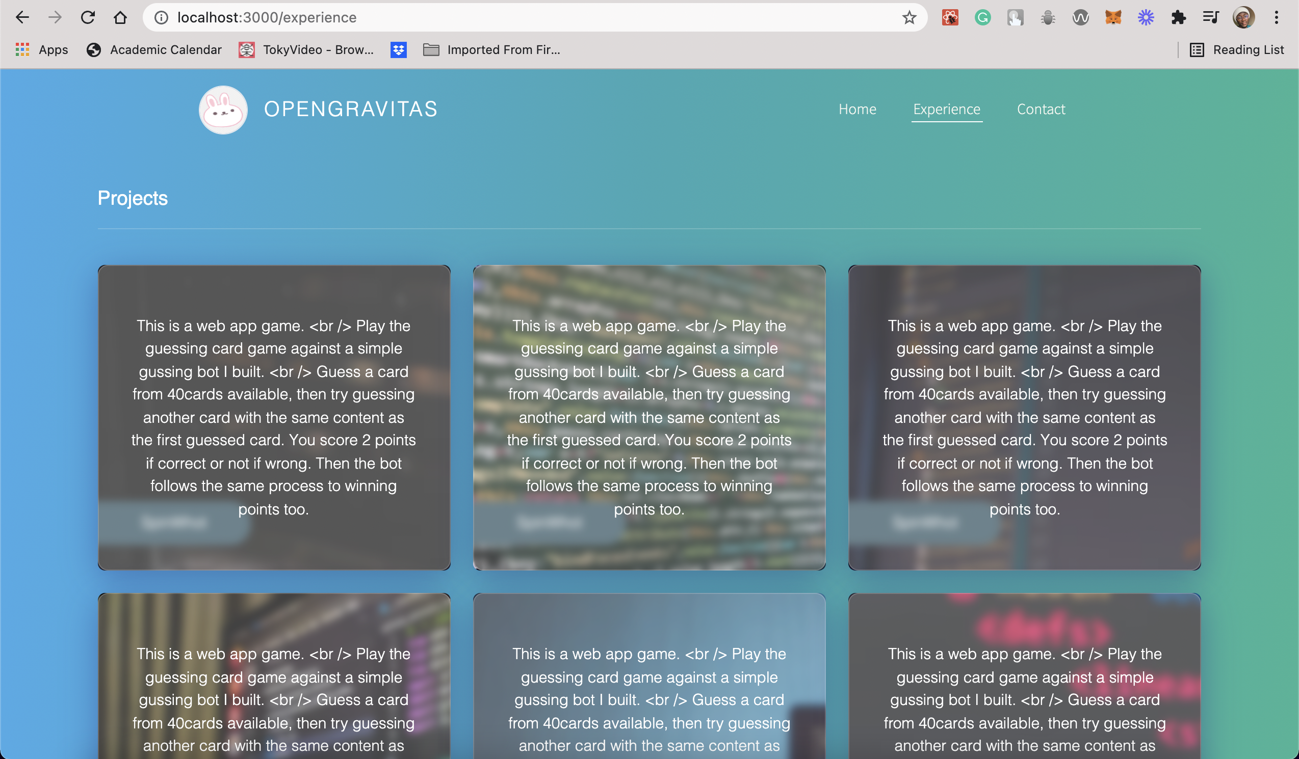
Next, let’s update the Card component in the src/experience/Project.tsx file. Here we’ll make the content of the custom component, Glass, only visible within desktop viewport.
import { useMediaQuery } from "react-responsive";
...
const Card = ({ img, name, description }: CProps) => {
  const isDesktop = useMediaQuery({
    query: "(min-width: 1224px)"
  });

  return (
    <Wrapper bg={img} className="SpinWhot project">
      <div className="project-name-holder">
        <p className="project-name-holder-SpinWhot project-title">{name}</p>
      </div>
      <Glass className="">{isDesktop && description}</Glass>
    </Wrapper>
  );
};
...
Our updated UI will look like the below UI when viewed on a desktop screen:
Now lets implement an onChange event within our application to always trigger when we enter a particular viewport.
import { useMediaQuery } from "react-responsive";
...
const Card = ({ img, name, description }: CProps) => {
  const handleMediaQueryChange = (matches: boolean) => {
    if(matches) {
    window.alert("Trigger a window's alert at viewport of 1244px")
    }
  };

  const isDesktop = useMediaQuery(
    { minWidth: 1224 }, undefined,  handleMediaQueryChange
  );

  return (
    <Wrapper bg={img} className="SpinWhot project">
      <div className="project-name-holder">
        <p className="project-name-holder-SpinWhot project-title">{name}</p>
      </div>

      <Glass className="">{isDesktop && description}</Glass>
    </Wrapper>
  );
};
...
The above snippet would trigger a window.alert function to display an alert on the browser whenever we resizes the width of our browser to 1224px in value.
Conclusion
Building with react-responsive offers the ability to use it together with other CSS focused libraries to build responsive webpages. We can extend the knowledge from this tutorial to quickly build grid system for different screen sizes. Also we can modularize our application’s components to display depending on the viewport we set it to display on. Also, the different prop interfaces provided by react-responsive ranges from ultra large screens to smart watch screens, making it a good library to build UI design for smaller screens from start to finish without writing any CSS media query . Here’s the GitHub link to download the code used for our project.