
如何使用 ShadCN UI 创建无障碍表单

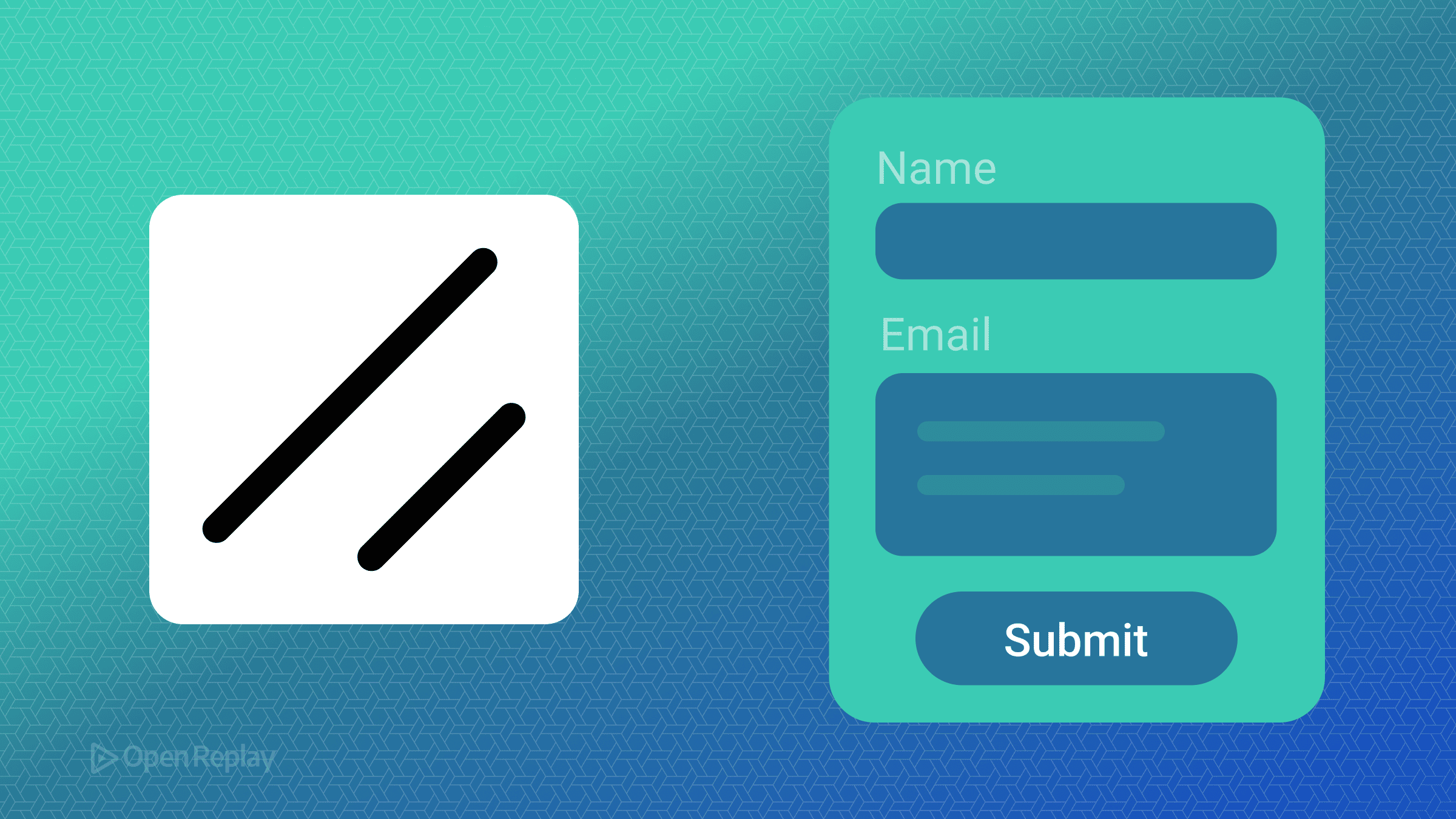
构建既实用又无障碍的表单可能是一项挑战。在管理状态、处理验证和确保正确的 ARIA 属性之间,开发者往往需要在本应简单的任务上花费大量时间。ShadCN UI 结合 React Hook Form 和 Zod,提供了一个强大的解决方案,既简化了表单创建,又保持了无障碍标准。
本文演示了如何使用 ShadCN UI 构建无障碍表单,集成 ShadCN UI React Hook Form 进行状态管理,并实现在未来几年内都将保持相关性的 ShadCN UI Zod 验证模式。
核心要点
- ShadCN UI 通过其可组合的表单系统自动处理 ARIA 属性和无障碍模式
- React Hook Form 集成提供高效的状态管理,最小化重新渲染
- Zod 模式验证确保类型安全的表单验证和清晰的错误消息
- 内置组件处理标签关联、错误公告和键盘导航
理解 ShadCN UI 的表单架构
ShadCN UI 提供了一个基于 React Hook Form 和 Radix UI 原语构建的可组合表单系统。该架构遵循一致的模式:
<Form>
  <FormField
    control={form.control}
    name="fieldName"
    render={({ field }) => (
      <FormItem>
        <FormLabel>Field Label</FormLabel>
        <FormControl>
          <Input {...field} />
        </FormControl>
        <FormDescription>Helper text</FormDescription>
        <FormMessage />
      </FormItem>
    )}
  />
</Form>
这个结构自动处理:
- 使用
React.useId()生成唯一 ID - 正确的
aria-describedby和aria-invalid属性 - 错误消息关联
- 标签-输入关系
使用 ShadCN UI 设置无障碍表单
首先,安装必要的组件:
npx shadcn@latest add form input textarea checkbox label此命令安装 ShadCN UI 组件以及 React Hook Form 和 Zod 依赖项。
创建基本表单模式
使用 Zod 定义表单结构以实现类型安全验证:
import { z } from "zod"

const formSchema = z.object({
  name: z.string().min(2, "Name must be at least 2 characters"),
  email: z.string().email("Invalid email address"),
  message: z.string().min(10, "Message must be at least 10 characters"),
  terms: z.boolean().refine((val) => val === true, {
    message: "You must accept the terms"
  })
})

type FormData = z.infer<typeof formSchema>
实现表单组件
以下是如何使用 ShadCN UI React Hook Form 集成构建无障碍联系表单:
import { useForm } from "react-hook-form"
import { zodResolver } from "@hookform/resolvers/zod"
import { Form, FormControl, FormField, FormItem, FormLabel, FormMessage, FormDescription } from "@/components/ui/form"
import { Input } from "@/components/ui/input"
import { Textarea } from "@/components/ui/textarea"
import { Checkbox } from "@/components/ui/checkbox"
import { Button } from "@/components/ui/button"

export function ContactForm() {
  const form = useForm<FormData>({
    resolver: zodResolver(formSchema),
    defaultValues: {
      name: "",
      email: "",
      message: "",
      terms: false
    }
  })

  function onSubmit(data: FormData) {
    console.log(data)
  }

  return (
    <Form {...form}>
      <form onSubmit={form.handleSubmit(onSubmit)} className="space-y-6">
        <FormField
          control={form.control}
          name="name"
          render={({ field }) => (
            <FormItem>
              <FormLabel>Name</FormLabel>
              <FormControl>
                <Input placeholder="John Doe" {...field} />
              </FormControl>
              <FormMessage />
            </FormItem>
          )}
        />

        <FormField
          control={form.control}
          name="email"
          render={({ field }) => (
            <FormItem>
              <FormLabel>Email</FormLabel>
              <FormControl>
                <Input type="email" placeholder="john@example.com" {...field} />
              </FormControl>
              <FormMessage />
            </FormItem>
          )}
        />

        <FormField
          control={form.control}
          name="message"
          render={({ field }) => (
            <FormItem>
              <FormLabel>Message</FormLabel>
              <FormControl>
                <Textarea
                  placeholder="Your message here..."
                  className="resize-none"
                  {...field}
                />
              </FormControl>
              <FormMessage />
            </FormItem>
          )}
        />

        <FormField
          control={form.control}
          name="terms"
          render={({ field }) => (
            <FormItem className="flex flex-row items-start space-x-3 space-y-0">
              <FormControl>
                <Checkbox
                  checked={field.value}
                  onCheckedChange={field.onChange}
                />
              </FormControl>
              <div className="space-y-1 leading-none">
                <FormLabel>
                  Accept terms and conditions
                </FormLabel>
              </div>
              <FormMessage />
            </FormItem>
          )}
        />

        <Button type="submit">Submit</Button>
      </form>
    </Form>
  )
}
Discover how at OpenReplay.com.
内置的无障碍功能
ShadCN UI 的表单组件自动实现关键的无障碍模式:
- 正确的标签:
FormLabel组件使用htmlFor属性与表单控件关联 - 错误公告:
FormMessage组件通过aria-describedby链接 - 无效状态: 当验证失败时,字段自动接收
aria-invalid="true" - 键盘导航: 所有组件都支持标准键盘交互
高级验证模式
实现复杂的 ShadCN UI Zod 验证场景:
const advancedSchema = z.object({
  password: z.string()
    .min(8, "Password must be at least 8 characters")
    .regex(/[A-Z]/, "Password must contain at least one uppercase letter")
    .regex(/[a-z]/, "Password must contain at least one lowercase letter")
    .regex(/[0-9]/, "Password must contain at least one number"),
  confirmPassword: z.string()
}).refine((data) => data.password === data.confirmPassword, {
  message: "Passwords don't match",
  path: ["confirmPassword"]
})
无障碍表单的最佳实践
- 始终使用标签: 每个输入都需要一个可见的标签供屏幕阅读器用户使用
- 提供清晰的错误消息: 具体说明出了什么问题以及如何修复
- 分组相关字段: 为逻辑分组使用
fieldset和legend - 使用键盘测试: 确保所有交互都能在没有鼠标的情况下工作
- 在提交时验证: 避免干扰用户的激进内联验证
结论
ShadCN UI 通过将 React Hook Form 的状态管理能力与 Zod 的类型安全验证相结合,同时将无障碍作为核心原则,改变了表单开发。组件架构确保您构建的每个表单都符合 WCAG 标准,而无需手动管理 ARIA 属性。
通过遵循这些模式,您可以创建适用于每个人的表单——无论他们的能力或辅助技术如何。这种方法的美妙之处在于其简单性:无障碍表单成为默认选择,而不是事后的考虑。
常见问题
虽然技术上可行,但 ShadCN UI 的表单组件是为与 React Hook Form 配合使用而设计的。不使用它意味着失去自动验证、状态管理和使库有价值的无障碍功能。
ShadCN UI 自动生成唯一 ID,通过 htmlFor 属性将标签与输入关联,通过 aria-describedby 链接错误消息,并在验证错误时设置 aria-invalid。所有组件默认支持键盘导航。
Zod 验证仅在需要时运行,通常在失焦或提交事件时。性能影响很小,因为 React Hook Form 防止不必要的重新渲染。对于有数百个字段的表单,考虑使用字段级验证而不是模式级验证。
Gain Debugging Superpowers
Unleash the power of session replay to reproduce bugs, track slowdowns and uncover frustrations in your app. Get complete visibility into your frontend with OpenReplay — the most advanced open-source session replay tool for developers. Check our GitHub repo and join the thousands of developers in our community.
