5 Accessibility Checks to Run Before Shipping
Five quick accessibility checks before shipping: keyboard tab order, automated scans, semantic HTML, color contrast, and 200% zoom.

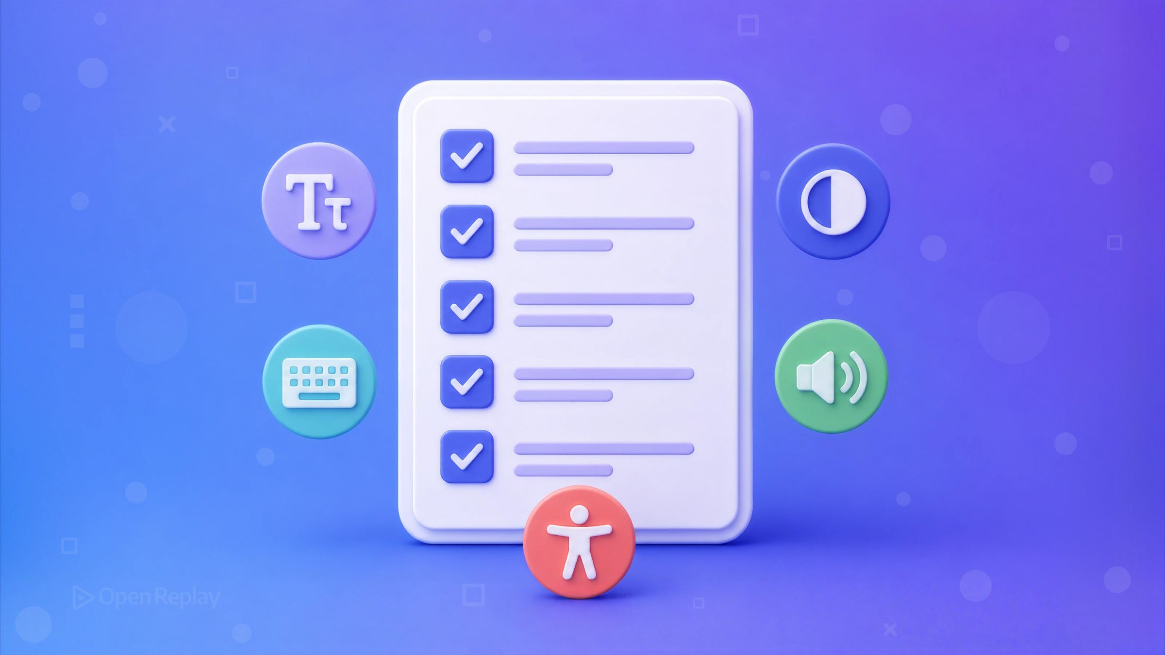
Before you ship, run five checks in this order: tab through the whole UI with your keyboard, run an automated scan, verify semantic HTML and labels, check color contrast, and test at 200% zoom.
Anyone who has shipped a modal that quietly trapped keyboard users, then found out weeks later from a bug report, knows why a list like this exists. It’s the kind of thing nobody catches with a mouse in their hand.
Together they take a few minutes and catch the most common accessibility failures. No expertise, no expensive tooling, no weeks of study required. This is a pre-ship accessibility checklist you can run on every pull request, built to be fast and honest about its own limits. It won’t make your app fully conformant to WCAG 2.2 (the current standard, published as a W3C Recommendation in October 2023 and adopted as ISO/IEC 40500:2025), but it clears the failures that hurt real users most. Doing a little is meaningfully better than doing none.
Key Takeaways
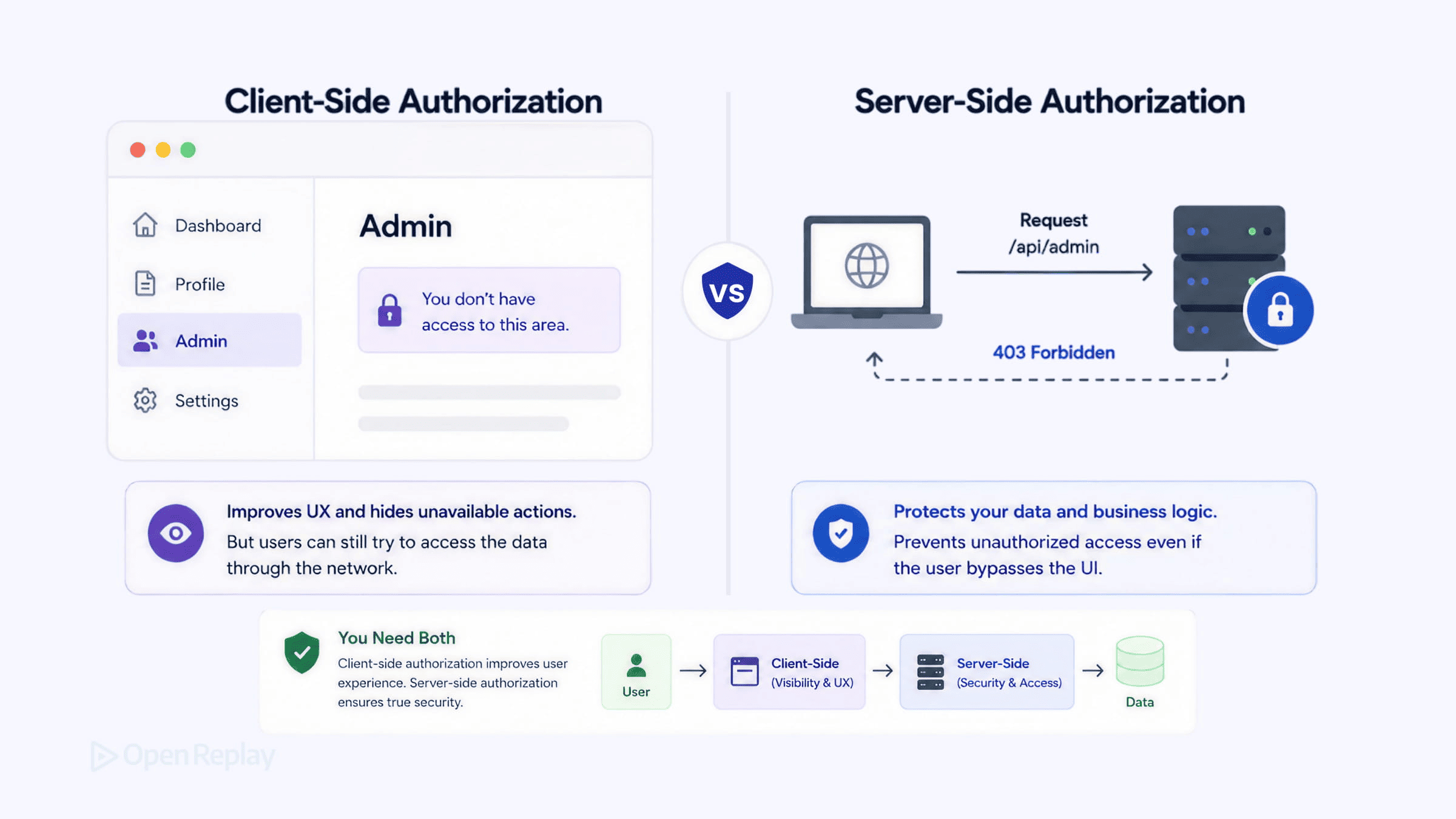
- The fastest real accessibility test is free and takes under a minute: put the mouse away, press Tab through the page, and confirm you can see focus, reach everything interactive, and escape every modal.
- For Level AA, text needs a contrast ratio of at least 4.5:1 for normal text and 3:1 for large text (18pt/24px, or 14pt/18.66px bold), per WCAG Success Criterion 1.4.3.
- A scan will surface somewhere between a third and 40% of accessibility issues, so a green Lighthouse score means you’ve cleared the easy wins and nothing more.
- Never signal an error with color alone; pair a red border with an icon and text so the meaning survives for colorblind users.
- Respect
prefers-reduced-motionso users who asked their OS to reduce motion aren’t triggered by animation.
1. Tab through the whole UI with your keyboard
The fastest real test is free and takes under a minute: put the mouse away, press Tab through the page, and confirm you can see focus, reach everything interactive, and escape every modal without getting trapped. Watch for four things: a visible focus indicator on each element, a logical tab order, every button/link/input reachable, and no focus trap in dropdowns or dialogs.
Two bugs cause most keyboard failures. First, custom controls that hid the native outline to restyle it. If you did that, add a visible :focus (or :focus-visible) style back:
.custom-checkbox input:focus-visible + .box {
  outline: 2px solid #2563eb;
  outline-offset: 2px;
}
Second, a clickable <div>. Swap it for a <button>, which takes focus by default and comes with Enter/Space activation and a button role at no cost. A <div> has none of that:
// Not reachable by keyboard
<div onClick={handleClick}>Save</div>
// Focusable and operable by default
<button onClick={handleClick}>Save</button>
Your manual tab-through tests the happy path you designed. Session replay of real sessions surfaces the keyboard and focus failures that only appear in the wild: a user who tabs into a modal and can’t tab back out, or focus that vanishes to the top of the document after a dialog closes, leaving a keyboard user lost. Replay shows you where real focus behavior diverges from what your scan approved.
2. Run an automated scan (Lighthouse + axe DevTools)
Discover how at OpenReplay.com.
A scanner will find somewhere between a third and 40% of the accessibility problems on a page, so a green score means you’ve cleared the easy wins (missing alt text, unlabeled inputs, low contrast, a missing lang attribute) and nothing more. That range is what testing vendors generally report, and it’s a floor rather than a ceiling: Deque’s 2021 study argues that counting the volume of issues found, instead of the share of success criteria covered, puts automated coverage nearer 57%. Either way, the caught issues are the cheapest to fix.
Run the scan from the Lighthouse panel in Chrome DevTools: open DevTools, select the Lighthouse panel, check Accessibility, and generate the report. An accessibility-only run finishes quickly. Lighthouse’s accessibility audit is built on Deque’s open-source axe-core rule set, but it runs only part of that set, so add the axe DevTools extension, which runs the complete rules and looks at nothing but accessibility. Fix Critical and Serious issues first.
| Automated scans catch | Automated scans miss |
|---|---|
Missing alt, unlabeled inputs | Whether alt text is actually good |
| Low text contrast | Logical tab order and keyboard traps |
Missing lang, page title | Meaningful reading order |
| Missing form labels | Whether focus is managed after interaction |
3. Verify semantic HTML and labels
Screen readers convey structure through semantics, so use the element that matches the job: <button> for actions, <a href> for navigation, <ul>/<li> for lists, <nav> and <main> for landmarks, and headings in order (h1 → h2 → h3, never skipping levels). When everything is a <div>, a screen reader announces “group, group, group” and the page loses its shape.
Every input needs an associated <label>; icon-only buttons need an aria-label so they aren’t announced as just “button”:
<label htmlFor="email">Email</label>
<input id="email" type="email" />

<button aria-label="Copy to clipboard" onClick={copy}>
  <ClipboardIcon />
</button>
A common production failure mode: a polished third-party component library ships inaccessible markup, such as an accordion or combobox whose <input> has no <label>, so a screen reader announces nothing. A pretty component is not a guarantee. Inspect the DOM the library renders and verify the labels are really there.
4. Check color contrast and don’t rely on color alone
For Level AA, text needs a contrast ratio of at least 4.5:1 for normal text and 3:1 for large text (18pt/24px, or 14pt/18.66px bold), per WCAG Success Criterion 1.4.3. Treat both numbers as hard floors. Nothing gets rounded up to them, so a measured 4.499:1 fails. Interface components and meaningful icons sit under a separate, lower bar of 3:1 against adjacent colors (SC 1.4.11 Non-Text Contrast), which means a passing text color is no guarantee that your buttons and form borders pass.
Lighthouse flags many text-contrast failures; the WebAIM Contrast Checker confirms exact ratios. Concretely: #999999 on white is 2.85:1 and fails; #595959 on white is 7:1 and passes.
Contrast isn’t the whole story. Never signal an error with color alone. A red border is invisible to many colorblind users, so pair it with an icon and text so the meaning survives without color. Add a ”⚠ Email is required” message next to the field, not just a red outline.
5. Zoom to 200% and respect reduced motion
At 200% browser zoom, nothing should overlap, clip, or force horizontal scrolling. Hold Ctrl/Cmd and press + until zoom hits 200%, then click around: fixed-width containers and pixel-based sizing are the usual culprits. Sizing in rem and adding overflow-wrap keeps layouts fluid:
.container { max-width: 60rem; padding: 1rem; }
p { overflow-wrap: break-word; }
Then respect prefers-reduced-motion: wrap non-essential animation in a media query so users who’ve asked their OS to reduce motion don’t get triggered by it. The setting asks you to cut motion that exists for decoration, not to strip every animation, so leave anything that carries meaning (a loading spinner, a progress indicator) running.
@media (prefers-reduced-motion: reduce) {
  /* Target the decorative motion, not every animation on the page.
     Loading spinners and other essential feedback should keep moving. */
  .parallax,
  .carousel-autoplay,
  .hero-animation {
    animation: none;
    transition: none;
  }
}
Bonus, 60 seconds: turn on a screen reader and listen. On macOS, press Cmd + F5 for VoiceOver; on Windows, install the free NVDA. Tab through and confirm headings, labels, and inputs are announced with real meaning.
Ship it, then go deeper
These five checks are a floor, not a ceiling. They skip complex ARIA patterns, focus management in single-page apps, and accessible data tables, all real work for another day. Pick your next feature, run the five before you open the PR, and fix the Critical issues you find. When you’re ready to go further, WCAG 2.2, WebAIM, and MDN’s accessibility docs are the primary sources worth your time. Accessibility is a direction you move in, and shipping these five checks moves you there today.
FAQs
What contrast ratio do I need for accessibility?
For WCAG 2.2 Level AA, normal text needs a contrast ratio of at least 4.5:1 against its background, and large text (18pt/24px, or 14pt/18.66px bold) needs at least 3:1, per Success Criterion 1.4.3. Interface components and meaningful icons fall under a separate criterion, 1.4.11, requiring 3:1 against adjacent colors. Neither number can be rounded up to, so a measured 4.499:1 fails.
Do automated accessibility tools catch everything?
No. Lighthouse and axe surface somewhere between a third and 40 percent of accessibility issues, mostly the easy wins such as missing alt text, unlabeled inputs, low contrast, and a missing lang attribute. They cannot judge whether alt text is meaningful, whether tab order is logical, or whether focus is managed after interaction. A green Lighthouse score clears the cheap fixes, not the whole page, so pair every scan with keyboard and screen reader testing.
What is the difference between Lighthouse and axe DevTools?
Lighthouse's accessibility audit is built on Deque's axe-core rule set, though it runs only part of it, alongside performance, SEO, and best-practices audits, all from the Lighthouse panel in Chrome DevTools. The axe DevTools browser extension runs the full axe-core rule set and focuses exclusively on accessibility. Run Lighthouse for a quick pass, then use axe DevTools for deeper, accessibility-only coverage.
Which WCAG version should I follow in 2026?
Follow WCAG 2.2, the current standard. It became a W3C Recommendation in October 2023, was updated in December 2024, and is now also ISO/IEC 40500:2025, which is identical to the October 2023 version. WCAG 3.0 exists only as a Working Draft that the W3C revises periodically, with a Candidate Recommendation projected for late 2027 and a final Recommendation not expected before 2028. WCAG 3.0 does not govern anything today.
Truly understand users experience
See every user interaction, feel every frustration and track all hesitations with OpenReplay — the open-source digital experience platform. It can be self-hosted in minutes, giving you complete control over your customer data.
Star on GitHub12k