5 Mobile Web Papercuts (and How to Fix Them)

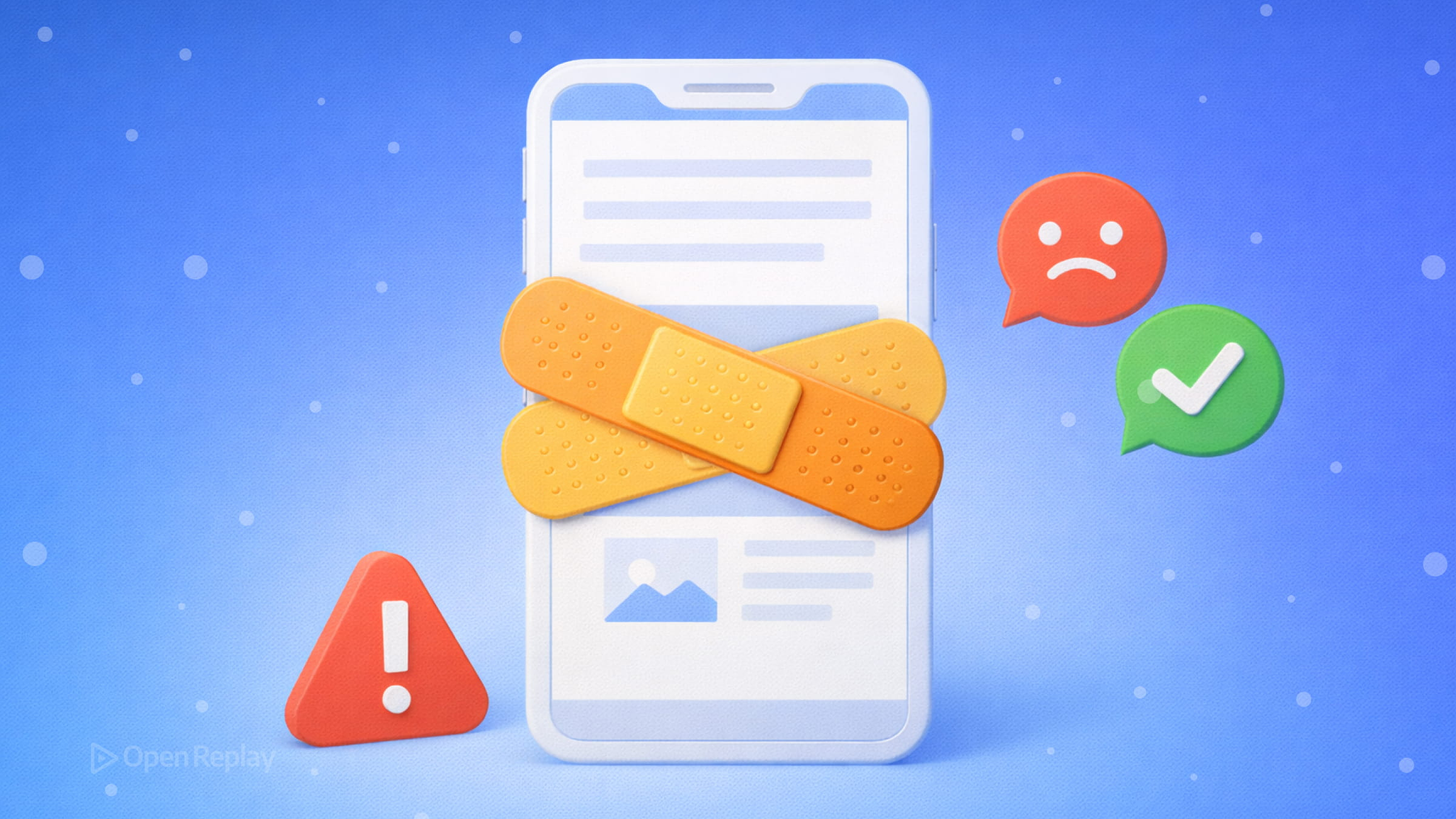
You’ve tested your layout at every breakpoint, your responsive grid looks clean, and everything works fine in Chrome DevTools. Then you open the site on an actual phone and something is slightly, stubbornly wrong. These are mobile web papercuts — small bugs that don’t break the page but quietly degrade the experience.
Here are five that show up repeatedly in real projects, and the modern fixes for each.
Key Takeaways
100vhoverflows on mobile browsers with dynamic UI chrome. Use100svhas a stable default, or100dvhfor layouts that should resize as the browser chrome hides and shows.- Bottom-fixed elements can get obscured by device safe areas. Add
viewport-fit=coverand useenv(safe-area-inset-bottom)to keep them visible. - iOS Safari auto-zooms on inputs with a font size below 16px. Set
font-size: 16pxor larger on all form fields instead of disabling user zoom. - Scroll chaining leaks scroll events out of modals. Apply
overscroll-behavior: containto the scrollable container — no JavaScript required. - Undersized tap targets cause missed or misrouted taps. Aim for touch targets around 44×44px using padding to expand the hit area.
1. Full-Height Layouts Break Because of 100vh
Symptom: A full-screen hero or modal is slightly too tall on iOS Safari, causing content to be clipped or a scrollbar to appear.
Why it happens: 100vh is calculated against the full viewport height, ignoring the browser’s dynamic UI chrome (address bar and navigation controls). When those elements are visible, 100vh overflows.
The fix: Use the newer CSS viewport units. For most full-height layouts, 100svh (small viewport height) is a stable choice because it represents the visible area with browser UI present. Use 100dvh when you want the layout to resize dynamically as the browser chrome hides and shows. Modern browser support for these units is widely available, as shown on https://webstatus.dev/features/viewport-unit-variants.
.hero {
  height: 100svh; /* stable default */
}
2. Bottom-Fixed UI Gets Hidden Behind Device Safe Areas
Symptom: A sticky footer, bottom nav bar, or action button is partially obscured by the home indicator on iPhone or by other device safe areas.
Why it happens: Fixed elements positioned at bottom: 0 sit flush with the edge of the viewport, not the device’s safe area. On devices with home indicators or rounded corners, system UI can overlap the element.
The fix: Add viewport-fit=cover to your meta viewport tag, then use CSS safe area environment variables such as env(safe-area-inset-bottom) to push the element up.
<meta name="viewport" content="width=device-width, initial-scale=1, viewport-fit=cover">.bottom-nav {
padding-bottom: env(safe-area-inset-bottom);
}3. iOS Zooms In on Form Inputs
Symptom: Tapping an <input> on iOS Safari causes the page to zoom in unexpectedly, disrupting the layout.
Why it happens: iOS Safari automatically zooms when an input’s font size is smaller than 16px, treating it as a readability assist.
The fix: Set font-size: 16px (or larger) on all inputs. Don’t disable zoom via user-scalable=no — that harms accessibility. While you’re at it, use inputmode to request the right keyboard, autocomplete to reduce friction, and enterkeyhint to label the return key.
<input
  type="email"
  inputmode="email"
  autocomplete="email"
  enterkeyhint="done"
  style="font-size: 16px;"
/>
Discover how at OpenReplay.com.
4. Scroll Leaks Out of Modals and Drawers
Symptom: When a user scrolls inside a modal or bottom sheet and reaches the end, the page behind it starts scrolling too.
Why it happens: This is scroll chaining — the browser propagates scroll events to the parent when the child scroll container hits its boundary.
The fix: Apply overscroll-behavior: contain to the scrollable container. Modern browser support is broad, including Safari 16 and later, as shown on https://webstatus.dev/features/overscroll-behavior.
.modal-body {
  overflow-y: auto;
  overscroll-behavior: contain;
}
5. Tap Targets Feel Unresponsive or Trigger the Wrong Element
Symptom: Buttons feel sluggish, or taps register on the wrong element — especially in dense UI like nav menus or lists.
Why it happens: Touch targets that are too small create hit-testing ambiguity. Modern browsers handle tap events without the historic 300ms delay (as long as your viewport meta tag is correct), but undersized targets still cause missed or misrouted taps.
The fix: Aim for touch targets around the WCAG target size recommendation of roughly 44×44 CSS pixels. Use padding rather than margin to expand the hit area without affecting layout.
.nav-link {
  min-height: 44px;
  min-width: 44px;
  display: flex;
  align-items: center;
  padding: 0 12px;
}
Conclusion
These mobile web papercuts rarely appear in isolation — a layout that clips, a button that hides, a form that zooms. Each one is minor on its own, but together they signal a site that wasn’t really tested on a device. Modern CSS gives you clean, standards-based tools to address all of them. Apply these fixes once and they’ll hold up as browsers evolve.
FAQs
Yes. The small, large, and dynamic viewport units (svh, lvh, dvh) are supported in all modern browsers, including Safari on iOS 15.4 and later, Chrome, Edge, and Firefox. For older browsers you can provide a fallback by declaring height: 100vh before the svh or dvh rule. The browser will ignore the unit it does not recognize and use the fallback.
Yes, starting with Safari 16. On older versions of iOS Safari, overscroll-behavior has no effect and scroll chaining will still occur. If you need to support those older versions, a JavaScript-based approach that prevents touchmove on the body while the modal is open is the most reliable fallback.
Disabling user scaling removes the ability to pinch-to-zoom, which is an important accessibility feature for users with low vision. It also violates WCAG Success Criterion 1.4.4. The correct fix is to set the font size on inputs to 16px or larger, which prevents the auto-zoom without restricting zoom for users who need it.
Only elements that sit near the edges of the screen need safe-area insets. A bottom-fixed nav bar or a floating action button near the bottom edge will benefit from env(safe-area-inset-bottom). Elements positioned away from the screen edges or centered in the viewport generally do not need it. Always test on a device with a home indicator or notch to confirm.
Truly understand users experience
See every user interaction, feel every frustration and track all hesitations with OpenReplay — the open-source digital experience platform. It can be self-hosted in minutes, giving you complete control over your customer data. . Check our GitHub repo and join the thousands of developers in our community..