
A Dive into React Storybook


When it comes to development testing and documenting components, Storybook is the best tool, in my opinion. Storybook is an awesome tool to help you build, demo, and document component libraries.
Components are files that make up the application. Though they make up the main application(App.js), they need to be in the application for it to be rendered in the browser because they don’t have Index.js files attached to them. Unlike the main application, this would be a problem if the project is massively built with numerous functionalities.
This is where Storybook comes in handy. It helps highlight components with various tools available for your use and makes our life much easier. Storybook provides you with the runtime environment to bring components to life with change detection, providing a nice-looking user interface for your components.
In this article, I will elaborate on how we can use Storybook with React and how to best integrate Storybook into any React project. For this tutorial to make sense, you need to understand that Storybook can be used with many frameworks like Vue, Angular, and even plain vanilla Javascript. However, within the scope of this tutorial, we will be using React only. You need prior knowledge of React and how to use prop types. These are the tools to be installed ;
- Node.js and npm
Node ≥v14.0.0 and npm ≥v5.6 - React version 18.0
- StoryBook
- Proptype
Setting up the Development Environment
Open up your command line, and create a folder with a name of your choice; we’ll use stories-article. Then, move into the folder and follow these steps to start up your project quickly:
npx create-react-app stories-articleWe do not need all the dependencies that come with React application, but we need the components. After the React application is installed, we have to remove some scripts. To take off the nugatory scripts, do this in the folder:
npm uninstall - -save react-scriptsClear up the App.js file and return anything. Yes, this must have left you thinking because there is no place to render our code in the browser. This is because we do not have a main application but a component, and we haven’t installed Storybook yet.
The next thing to install is Proptype.
npm install - -save prop-types Then, install Storybook.
npx sb initIf you run into warning errors, please install these plugins.
npm install --save-dev webpack webpack-cli html-webpack-plugin webpack-dev-server webpack-dev-middleware Inside package.json, replace the script we deleted with Storybook just like this;
    "scripts": {
      "start": "start-storybook -p 6006",
      "build": "build-storybook"
To start up Storybook, run:
npm startNow Storybook is up and running.
You can always refer here for more instructions.
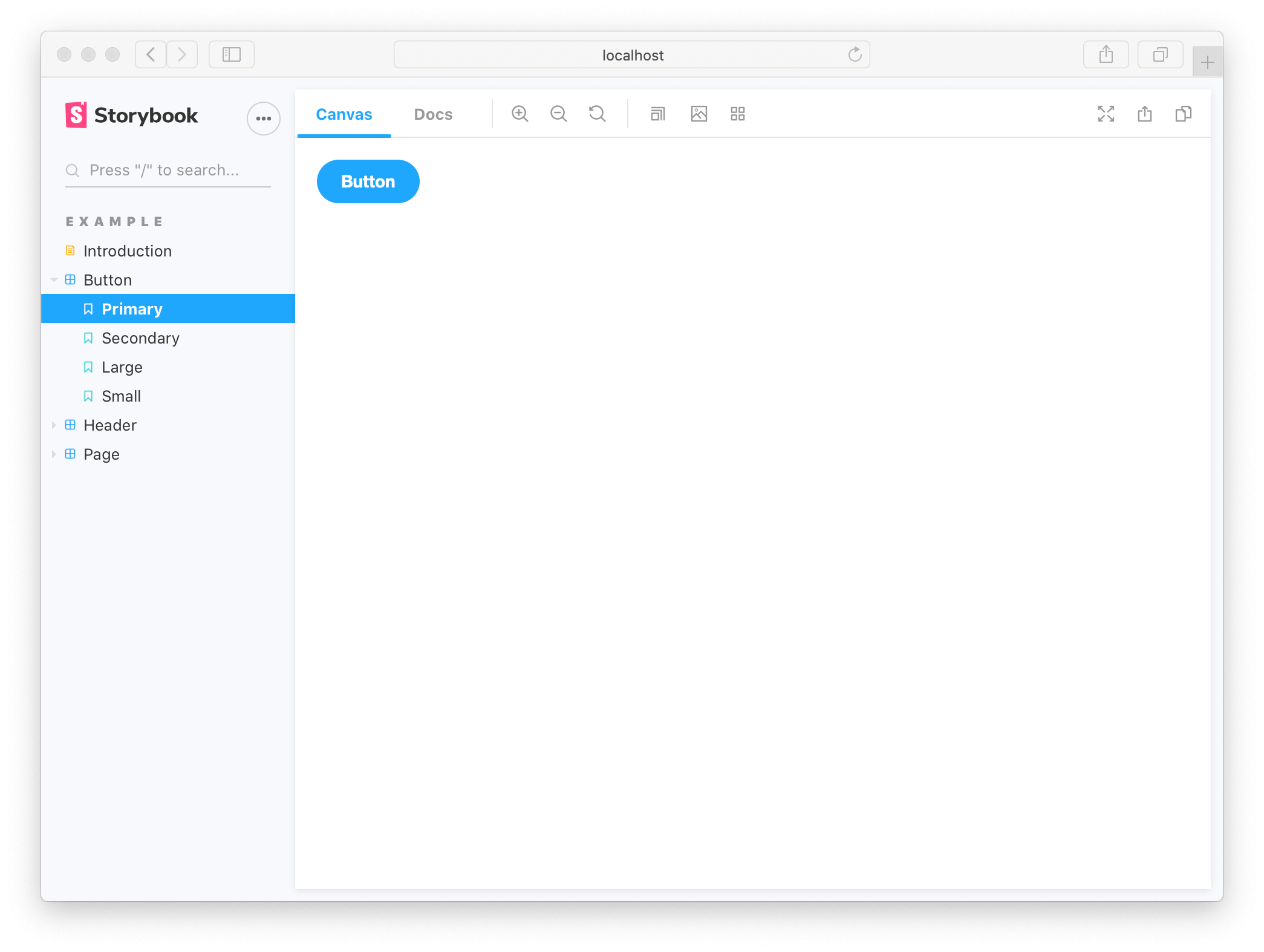
Button Component
Let’s create a basic Story. For instance, we have a full-stack application, and one of the activities of the components is to call a function that increments whenever it is clicked. We want to see this working before importing the function to our main App.js file. Let’s create the button and add functionalities on React. First, create a component, and name it Button.js.
import React, { useState } from "react";

function Button() {
  const [count, setCount] = useState(0);

  const increment = () => {
    setCount((prev) => prev + 1);
  };

  return (
    <div>
      <h2>counter:{count}</h2>
      <input
        type="button"
        value="increment"
        onClick={increment}
      />
    </div>
  );
}

export default Button;
We could picture this component as an actor performing on a stage without a spotlight. You would think variably if the performer is backstage or on stage, but you are sure he is performing.
Just like the components, the increment function could be working fine if you console.log it. Still, there is no place to see it as a user to help the user-interface experience unless we do something: either we import it in our App.js file, or we deploy the use of Storybook. The latter is why this article was written. We may create a basic Story right now.
First, we need to create our own story, and we will do that by going to the Stories folder and creating one. I will name mine Button.stories.js. Adding stories" before the .js` tells Storybook what this file is.
Secondly, we need to import the Button component and export our stories. We will also need to export a default object that carries the actual Story, and carries a title, and the component to be rendered.
import Button from "../component/Button";

export default {
  title: "Button",
  component: Button,
};
Finally, we need to tell Storybook what our stories are, as we had primary and secondary stories in our button category. To implement a clear-cut named story, we have to export a function that will return our component, and whatever name we give this function, that’s the name of our story in our button component.
export const increment = () => <Button/>;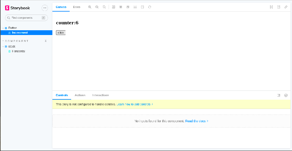
As we can see, this works just fine. That’s how you can create a basic story.
Stack component
For the advanced story, we will create a brand new folder named Stack.js. Our Stack.js component takes in children, direction, and a wrap variable with a bit of CSS styling.
function Stack({
  children,
  spacing = 2,
  direction = "row",
  wrap = false,
}) {
  const style = {
    display: "flex",
    gap: `${spacing * 0.3}px`,
    flexWrap: wrap ? "wrap" : "nowrap",
    flexDirection: direction,
  };
  return <div style={style}>{children}</div>;
}

export default Stack;
We also need a stack.stories.js folder, which we should create right away. In the stack Story, we need to add children to it. We should be able to change the number of children being passed into our stack by adding an argument that we could pass into the Storybook to control how many children elements we see in a storybook. This is where argTypes comes into place. First, we need to export the default title and components we will see.
import Stack from "../component/Stack";
export default {
title: "Component/stack",
component: Stack,
argTypes: {
childrenNumber: { type: "number", defaultValue: 5 },
},
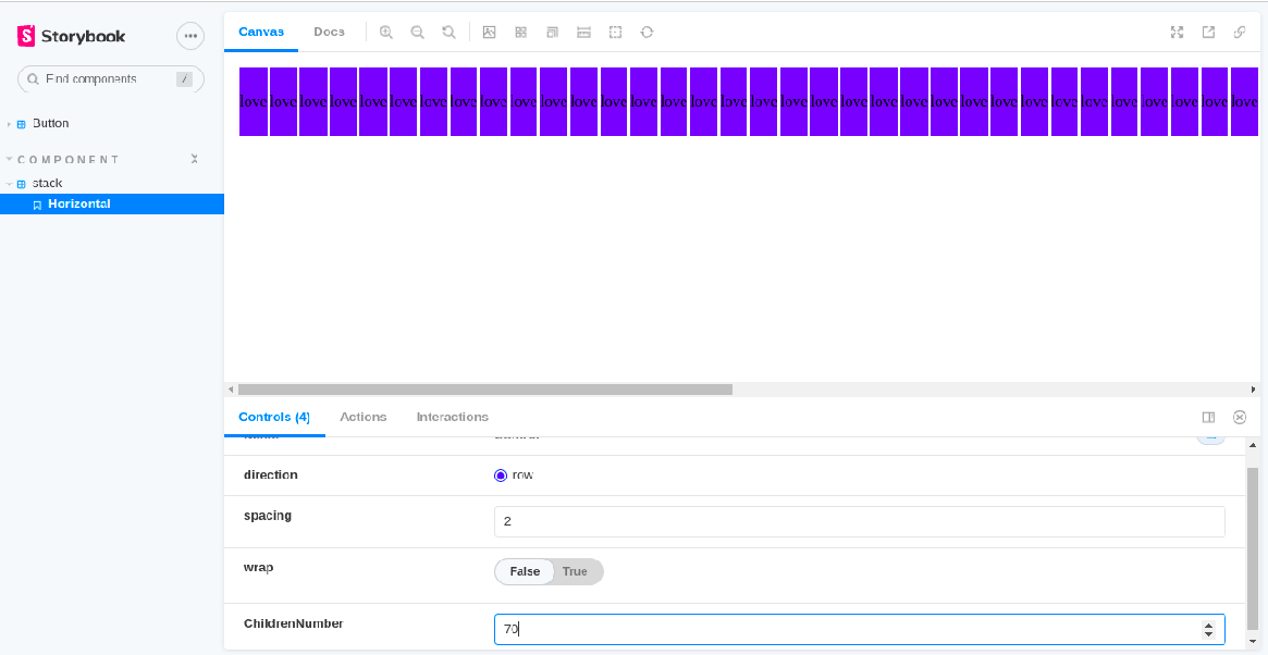
};Component/stack makes Stack a child that pops up when clicking the component. We can name our argument whatever we want. In my case, I called it childrenNumber, and I gave it a type of number, so we can choose and control how many children we desire. I gave it a default value of 5.
Open Source Session Replay
OpenReplay is an open-source, session replay suite that lets you see what users do on your web app, helping you troubleshoot issues faster. OpenReplay is self-hosted for full control over your data.

Start enjoying your debugging experience - start using OpenReplay for free.
Interactivity
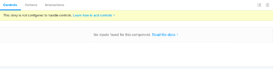
We need to configure our story so that controls quit displaying “this story is not configured to handle controls”. To fix this, we need to add some code. This may not be very clear, but hang on.
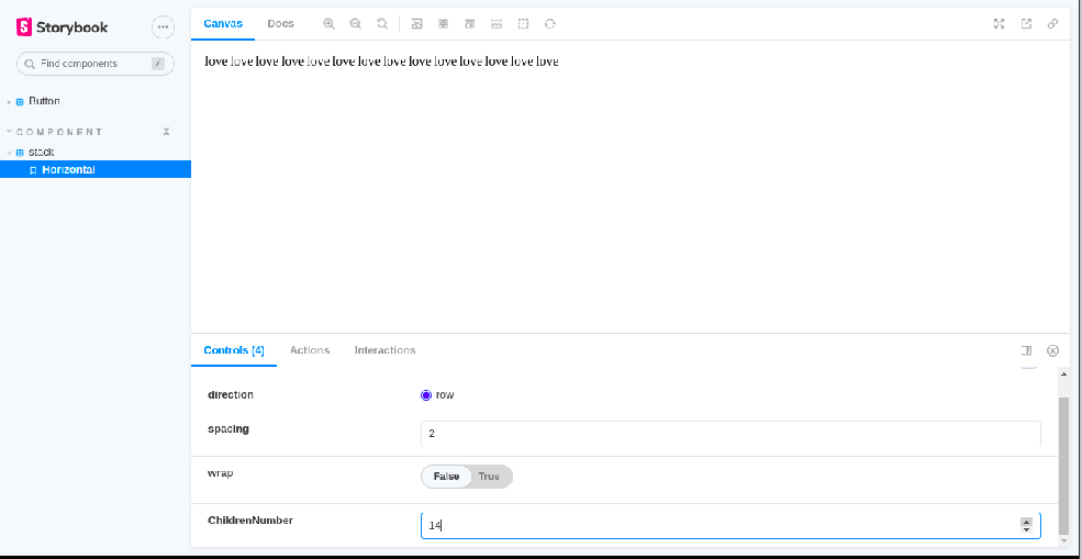
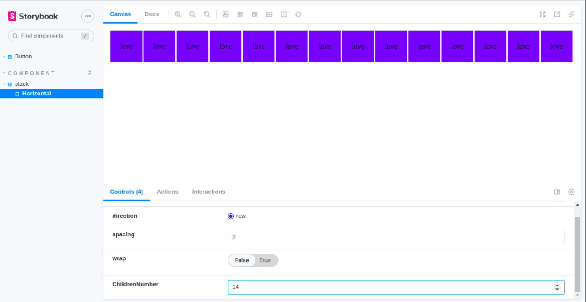
We need to set up a plinth function which we will call a paradigm (because it serves as a model for what our various stories shall follow). The paradigm function will return our Stack and pass our argument childrenNumber into it. Here we need an array with the value of childrenNumber. We need to map it, so we get a number(any number), and inside the number, we want to return a string with the value love in a div.
const paradigm = ({ ChildrenNumber, ...args }) => (
  <Stack {...args}>
    {[...Array(ChildrenNumber).keys()].map((n) => (
      <div>{"love"}</div>
    ))}
  </Stack>
);
Now we can export our Story as a horizontal component baring our control arguments.
export const Horizontal = paradigm.bind({});

Horizontal.args = {
  direction: "",
  spacing: 2,
  wrap: false,
};
We get this displayed on our screen.
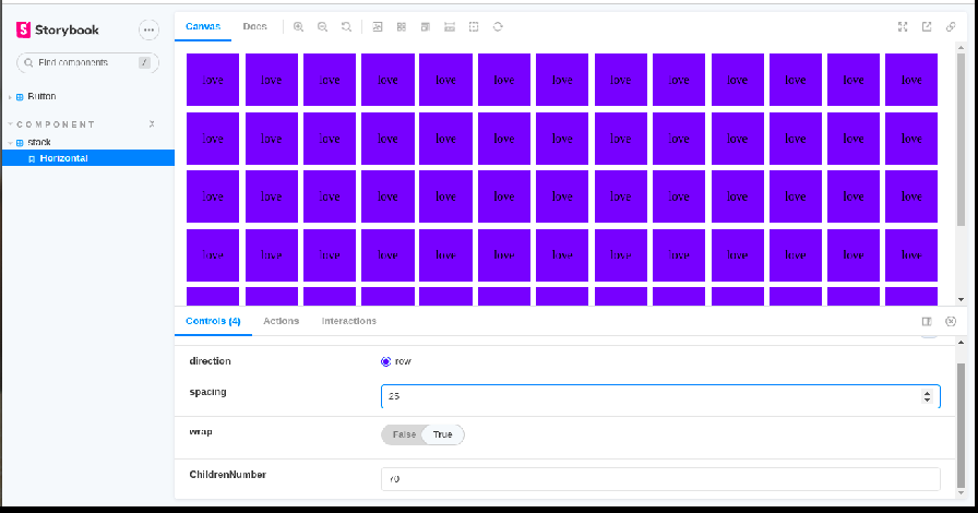
Let’s style the div.
style = {{
  width: "70px",
  height: "70px",
  backgroundColor: "blue",
  display: "flex",
  justifyContent: "center",
  alignItems: "center",
}}
The important thing to note about all of this, as you could see here,
export default {
  title: "Component/stack",
  component: Stack,
  argTypes: {
    childrenNumber: { type: "number", defaultValue: 5 },
  },
};
We needed to pass an additional argument that is not needed anywhere in our component, but only needed for Storybook. We defined that inside our argtypes and then applied it in our paradigm, using that argument to pass all the additional arguments that the Stack needs.
proptypes
Proptypes help ensure the passed value is of a correct data type. Proptypes used to be included in React, but now it is separate. That’s why it was individually installed. What’s the benefit of Proptype in Storybook? Proptypes inform Storybook on descriptions and tell Storybook what values are being passed. Automatically, Storybook is built to integrate and display these functionalities.
This is a little outside the scope of our tutorial, but it’s needed, and here is why. Even after configuring our controls, we got a few errors (our controls are not all functional). That’s probably because our values passed in the stack.js component have not been described to Storybook, and Storybook doesn’t know what they are. That’s why using Proptypes is essential. If this is confusing to you, you could read this article on Proptype.
To describe our values, so we can manipulate our controls and Storybook knows what is renderable, we need to add this in our stack.Js component right above the export default.
Stack.propTypes = {
  spacing: PropTypes.number,
  wrap: PropTypes.bool,
  direction: PropTypes.oneOf(["row"]),
};
Now we can return to Storybook and see that everything is interactive. We can wrap our div and increase or decrease spacing.
Conclusion
One of the peculiarities of being a developer is keeping up to date on new technologies in the development space because they help immensely, just like Storybook. Knowing how to use them could ease stress, and one of the keys to being at the pick of your development career is finding tools for fast and efficient delivery.
Further Reading
-
Ateev Duggal. How to use proptypes in React, 2022.
-
Storybook docs. How to write stories.