The Top CSS Focus Pseudo-classes Explained: :focus, :focus-within, and :focus-visible
How to use the most important focus pseudoclasses


The user’s focus state is entirely overlooked among web developers. Imagine navigating a website without clearly indicating where you are or what you’re interacting with; it’s a confusing experience. This is where CSS pseudo-classes such as
:focus,:focus-within, and:focus-visiblecome into play. This tutorial aims to shed light on the importance of the focus state in web development.

Discover how at OpenReplay.com.
The three focus pseudo-classes we’ll consider give straightforward solutions, from overcoming keyboard navigation issues to fine-tuning interactions within nested items. We’ll review practical examples, discuss browser supports, and discuss best practices.
Remember that this is about making your websites more user-friendly, not merely code. This tutorial is for you if you’re new to web development, specifically front-end development.
Let’s get started.
Prerequisites
To follow along with this tutorial, you need:
- A good knowledge of HTML
- A basic understanding of CSS
- A knowledge of how to navigate web browsers.
Understanding Focus States in CSS
The concept of focus states weaves an important thread, significantly contributing to the user experience. Understanding and effectively using focus states in CSS is important for creating accessible, user-friendly interfaces.
In CSS and web development, focus states generally refer to the styling applied to an element when it receives focus. This interaction is especially important for users who use keyboards or other assistive technologies to navigate a website. Focus states improve accessibility and usability by visually indicating the currently selected element.
:focus - Solving Keyboard Navigation Problem
The :focus pseudo-class is a fundamental method in web development that addresses a critical challenge: providing clarity in keyboard navigation. When users interact with a webpage with their keyboard, such as tabbing through links, forms, and interactive elements, the :focus pseudo-class becomes the beacon, highlighting the selected element.
Consider a situation in which keyboard navigation lacks the benefit of visual feedback. Users tab through elements, but the user experience becomes disorienting without a clear indication of which button, link, or input field is active. This problem is addressed by the :focus pseudo-class, which allows developers to define distinct styles for focused elements.
Developers can use :focus to make the element under keyboard focus stand out, providing a visual guide to users exploring the interface without a mouse. This straightforward but powerful pseudo-class makes web applications more inclusive and navigable for all users.
Let’s look at some real-world examples.
HTML:
<!DOCTYPE html>
<html lang="en">
  <head>
    <meta charset="UTF-8">
    <meta name="viewport" content="width=device-width, initial-scale=1.0">
    <title>Focus Pseudo-Class Example</title>
  </head>

  <body>
    <nav>
      <li><a href="#">Home</a></li>
      <li><a href="#">About</a></li>
      <li><a href="#">Services</a></li>
      <li><a href="#">Contact</a></li>
    </nav>
  </body>
</html>
The navigation menu is a straightforward unordered list (<ul>) with list items (<li>) that contain anchor links (<a>). We’ll add some basic styling to make the links stand out, as well as a focus state.
CSS:
/* Basic styling for navigation items */
nav {
  display: flex;
  list-style: none;
  padding: 0;
}

li {
  margin: 0 10px;
}

a {
  text-decoration: none;
  padding: 8px 12px;
  border-radius: 5px;
  color: #333;
  background-color: #eee;
}

/* Apply styles when the link is focused */
a:focus {
  outline: none;
  box-shadow: 0 0 5px red;
}
The :focus pseudo-class is used to improve the appearance of the focused link. When a link receives focus (for example, by tabbing through elements), the default focus outline is removed, and a subtle box shadow is added to make it visually clear which link is active.
Output:
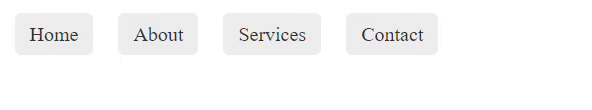
When we talk about the :focus pseudo-class and its importance for keyboard navigation, we’re referring to its role in providing a visual cue for users who only use the keyboard to navigate through a webpage. It ensures that the focused element stands out when they tab through elements, indicating their current point of interaction.
For example, some people, particularly those with certain disabilities, may rely on keyboard navigation. They use the Tab key to move between interactive elements on a webpage, such as links and form fields, and activate them with the Enter or Space key.
Beginners may be confused by the :focus and :active pseudo-classes, but here is the difference:
When an element is currently selected or has focus, the :focus property is used. It’s frequently used to style elements accessed via keyboard navigation. In contrast, :active is used when an element is actively clicked or pressed. It represents the moment when the mouse button (for mouse users) or a key (for keyboard users) is clicked while over the element.
Browser Compatibility
The :focus pseudo-class has good support across modern browsers. Here are some supported browsers and their versions:
| Browsers | Version Range | Support Level |
|---|---|---|
| Chrome | 3.0+ | Full support |
| Firefox | 3.0+ | Full support |
| Safari | 5.1+ | Full support |
| Edge | 12.0+ | Full support |
| Opera | 7.0+ | Partial support |
For more information on :focus, visit caniuse.com
:focus-within - Solving Nested Element Focus Problem
The :focus-within pseudo-class is activated when any child element within a parent comes into focus. While it may appear to be a minor addition to CSS, it is a game changer, particularly in resolving a critical issue: ensuring that nested elements receive clear visual feedback when they are in focus.
Consider a form with multiple nested components. Without :focus-within, users may be left wondering where their keyboard interactions are concentrated if they only style the individual focused input or button. This is where the :focus-within pseudo-class comes in to help.
It ensures a cohesive and clear visual representation of the user’s current interaction within nested structures by applying styles to the parent when any of its children receive focus. This is particularly useful in complex layouts where understanding the hierarchy of focused elements is essential.
Let’s look at an example to see how :focus-within improves the user experience in nested component scenarios.
HTML
<!DOCTYPE html>
<html lang="en">
<head>
  <meta charset="UTF-8">
  <meta name="viewport" content="width=device-width, initial-scale=1.0">
  <title>Focus-Within Example</title>
</head>
<body>
  <form>
    <label for="username">Username:</label>
    <input type="text" id="username" name="username" placeholder="Enter your username">

    <label for="password">Password:</label>
    <input type="password" id="password" name="password" placeholder="Enter your password">
  </form>
</body>
</html>
For clarity, we labeled each input field separately.
CSS
/* Basic styling for form and nested components */
form {
  padding: 20px;
  border: 1px solid #ddd;
  border-radius: 8px;
}

label {
  display: block;
  margin-bottom: 10px;
}

input {
  padding: 8px;
  width: 100%;
  box-sizing: border-box;
}

/* Apply styles to the form when any child has focus */
form:focus-within {
  border-color: red;
  box-shadow: 0 0 10px red;
}
Output:
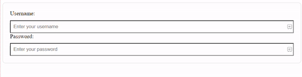
When a form’s child element (such as the input fields) gains focus, the entire form is given a distinct border color and a subtle box shadow. This gives the user a clear visual indication that they are interacting with form elements.
Browser Compatibility
The :focus-within pseudo-class is supported across modern browsers. Here are some supported browsers and their versions:
| Browsers | Version Range | Support Level |
|---|---|---|
| Chrome | 4.0+ | Full Support |
| Firefox | 52.0+ | Full Support |
| Safari | 10.1+ | Full Support |
| Edge | 79.0+ | Full Support |
| Opera | 48.0+ | full Support |
You can visit caniuse for more information about browser versions and compatibility with :focus-within.
:focus-visible - Solving Unwanted Focus Indicators
The :focus-visible pseudo-class also emerges as a thoughtful solution in web development. When an element receives keyboard focus, it applies styles, but not when mouse clicks or taps trigger the focus. This refined pseudo-class provides a smooth and subtle user experience for that.
Consider a scenario in which focus styles are essential for keyboard navigation but may be distracting when using a mouse or touchscreen. Without :focus-visible, focus styles would be applied universally, resulting in unwanted and potentially jarring visual cues for mouse users.
:focus-visible addresses this by allowing developers to tailor focus styles specifically for keyboard users, resulting in a polished and device-appropriate experience for all.
Let’s look at some examples to get a better understanding.
HTML:
<!DOCTYPE html>
<html lang="en">
<head>
<meta charset="UTF-8">
<meta name="viewport" content="width=device-width, initial-scale=1.0">
<title>Focus-Visible Example</title>
</head>
<body>
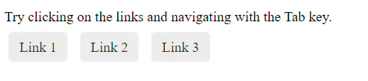
<p>Try clicking the links and navigating with the Tab key.</p>
<a href="#">Link 1</a>
<a href="#">Link 2</a>
<a href="#">Link 3</a>
</body>
</html>CSS:
/* Basic styling for links */
a {
  text-decoration: none;
  padding: 8px 12px;
  border-radius: 5px;
  color: #333;
  background-color: #eee;
  margin: 5px;
}

/* Apply styles only when the link is focused via keyboard */
a:focus {
  outline: none;
  box-shadow: 0 0 5px red;
}

/* Apply styles only when the link is focused, but not when clicked with a mouse */
a:focus:not(:focus-visible) {
  box-shadow: none;
}
When a link receives focus (via keyboard navigation), it gets a box shadow to indicate focus.
:focus:not(:focus-visible) applies styles when the link is focused but not when it’s focused by a mouse click or tap. This prevents unwanted focus styles for mouse users.
Output:
Browser Compatibility
The :focus-visible pseudo-class is also supported across modern browsers. Here are some supported browsers and their versions:
| Browsers | Version Range | Support Level |
|---|---|---|
| Chrome | 76.0+ | Full Support |
| Firefox | 65.0+ | Full Support |
| Safari | 13.1+ | Full Support |
| Edge | 81.0+ | Full Support |
| Opera | 64.0+ | full Support |
For more information on browser compatibility with :focus-visible, visit caniuse
Best Practices
These are some of the best practices for designing a focus state:
- Subtle Visual Cues: To avoid overwhelming users, keep focus styles subtle. A subtle color, border, or shadow change can be effective without distraction.
- Clear Contrast: Make sure the focused element stands out against its background with enough contrast. This is important for accessibility because it helps users identify where they are on the page.
- Avoid Removing Outlines Entirely: While customizing focus styles is common, avoid completely removing outlines. Outlines include a focus indicator by default that is easily accessible. Instead, think about styling outlines to fit your design.
- Test Across Devices: Try different focus styles on different devices, such as desktops, laptops, tablets, and smartphones. Maintain a consistent and pleasant user experience regardless of input method.
- Consider Touchscreen Users: When using
:focus-visible, remember that touchscreen users may also benefit from customized focus styles. Try different styles and see how they work with keyboard and touchscreen interactions. - Consider Animation: When using animations for focus states, keep them subtle and quick to avoid user discomfort or distraction.
- Accessibility First: When designing focus states, prioritize accessibility. Aim for a unified experience for disabled users who rely on keyboard navigation or assistive technologies.
- Pseudo-classes should be combined for complex interactions: For more complex UI interactions, combine
:focus,:focus-within, and:focus-visibleas needed. These fictitious classes can collaborate to create nuanced and inclusive designs.
Conclusion
In conclusion, the :focus, :focus-within, and :focus-visible pseudo-classes are essential for creating accessible and user-friendly interfaces. These enable developers to create designs that prioritize clarity and inclusivity, from refining keyboard navigation with :focus to handling nested components with :focus-within and ensuring unobtrusive focus states with :focus-visible. You can elevate your interfaces and provide a seamless user experience by following best practices, testing across devices, and embracing subtle visual cues. Happy coding!
Gain control over your UX
See how users are using your site as if you were sitting next to them, learn and iterate faster with OpenReplay — the open-source session replay tool for developers. Self-host it in minutes, and have complete control over your customer data.
Star on GitHub12k