
A set of CSS Snippets and Tricks for Common Design Problems
CSS snippets and tricks are ready-made solutions to several common web design issues, and this article will show you an interesting set that you can apply to your coding tasks.

Discover how at OpenReplay.com.
CSS snippets and tricks are small pieces of code. They can be used in web development to solve specific design problems or optimize a website’s performance. They are reusable and easily implemented in CSS stylesheets or embedded directly into HTML documents.
For example:
.button { background-color: #f1f1f1; }This CSS snippet targets elements with the class .button and sets the background color to #f1f1f1.
Snippets can be simple one-liners or more complex combinations of selectors, properties, and values. They provide ready-made solutions to common design patterns or functionalities, saving developers time and effort in writing code from scratch.
CSS tricks, on the other hand, are creative and not normal uses of CSS. They use properties, selectors, or animations in unusual ways. This is done to achieve specific design goals.
For example:
html, body {
  height: 100%;
  margin: 0;
}
body {
  display: flex;
  flex-direction: column;
}
.content {
  flex: 1;
}
.footer {
  flex-shrink: 0;
}
These CSS tricks use flexbox properties to create a sticky footer layout. By setting the html and body elements to 100% height and removing margins, the body becomes a flex container with a column layout. The .content class expands to fill available space using flex: 1, while the .footer class remains fixed at the bottom with flex-shrink: 0.
These tricks use CSS’s flexibility and power to create appealing effects, improve user experience, solve design challenges, and more.
This article will show you how to solve some common web design problems with CSS snippets and tricks. We will cover four sections. Each focuses on a different part of web design: layout, animation, typography, and responsiveness.
Let’s get started.
Layout problems
Layout is vital in web design. It determines how your web elements are arranged and aligned on the page. Fixing layout problems is important as they can impact a website’s structure and user experience.
This section will explore three common layout problems and their CSS solutions.
Overlapping elements
One of the common layout problems web designers face is overlapping elements. This happens when two or more web elements overlap, creating confusion and hiding the content. To solve this problem, we can use the CSS property z-index to control the stacking order of elements.
z-index is a CSS property that controls the stacking order of positioned elements on a web page. It determines how elements are layered and displayed along the z-axis, which represents depth on the page.
Here’s an example.
HTML code:
<!DOCTYPE html>
<html>
<head>
  <title>Z-Index Example</title>
  <link rel="stylesheet" href="style.css">
</head>
<body>
  <div class="box box1">Box 1</div>
  <div class="box box2">Box 2</div>
</body>
</html>
CSS code:
.box {
  position: absolute;
  width: 200px;
  height: 200px;
  padding: 20px;
  color: #fff;
  font-size: 20px;
  text-align: center;
}

.box1 {
  background-color: #ff6347;
  top: 50px;
  left: 50px;
  z-index: 1;
}

.box2 {
  background-color: #4169e1;
  top: 100px;
  left: 100px;
  z-index: 2;
}
In this example, we have two <div> elements with the classes box1 and box2. Each box is absolutely positioned and has a fixed width, height, padding, and text styling.
The CSS code specifies that box1 should have a background color of #ff6347 and a z-index of 1. It is positioned 50px from the top and 50px from the left. box2 has a background color of #4169e1 and a higher z-index of 2. It is positioned 100px from the top and 100px from the left.
The z-index values determine the stacking order of the boxes. Since box2 has a higher z-index value than box1, it will appear in front of box1. As a result, box2 will overlap box1 on the web page.
Output:
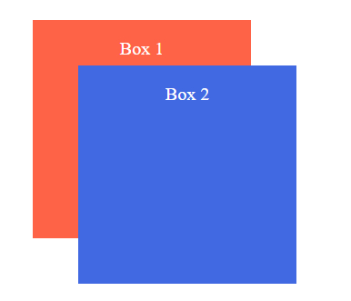
We can control their stacking order by assigning different z-index values to the overlapping elements. Higher values bring elements to the front, while lower values push them back.
Uneven spacing
Another common layout problem that web designers face is uneven spacing. This happens when the web elements have inconsistent or excessive spacing between them, creating gaps and misalignment.
Uneven spacing can lead to a cluttered and unbalanced layout. CSS provides many techniques to achieve consistent, pleasing spacing. These include flexbox and grid layouts.
Here’s an example using Flexbox.
HTML code:
<!DOCTYPE html>
<html>
<head>
  <title>Flexbox Example</title>
  <link rel="stylesheet" href="style.css">
</head>
<body>
  <div class="container">
    <div class="box">Box 1</div>
    <div class="box">Box 2</div>
    <div class="box">Box 3</div>
  </div>
</body>
</html>
CSS code:
.container {
  display: flex;
  justify-content: space-between;
}

.box {
  width: 100px;
  height: 100px;
  background-color: #ff6347;
  color: #fff;
  font-size: 20px;
  text-align: center;
  display: flex;
  align-items: center;
  justify-content: center;
}
In this example, a container <div> wraps three child <div> elements with the class box. The container has the CSS property display: flex;, which enables Flexbox layout.
The justify-content property is set to space-between on the container. This evenly spaces the child elements along the main axis, pushing the first and last child elements to the edges.
The child elements box have fixed dimensions, background color, and text styling. They also have display: flex;, align-items: center;, and justify-content: center; properties, which center the content vertically and horizontally within each box.
Output:
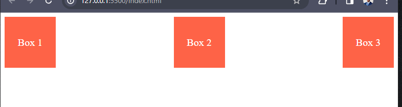
As you can see, applying the justify-content: space-between; property to a flex container can evenly distribute the child elements, creating consistent spacing between them.
Sticky footer
A sticky footer is a web design technique. It sticks the footer of a webpage to the bottom of the viewport or content area. It does this regardless of the content’s height. It remains visible even when the content does not fill the entire height of the page.
Creating a sticky footer that remains at the bottom of the page, regardless of the content’s height, is a common challenge. CSS can help achieve this using a combination of positioning and margin properties.
Here’s an example.
HTML code:
<!DOCTYPE html>
<html>
<head>
  <title>Sticky Footer Example</title>
  <link rel="stylesheet" href="style.css">
</head>
<body>
  <div class="wrapper">
    <header>
      <h1>Website Header</h1>
    </header>
    <main>
      <h2>Main Content</h2>
      <p>Lorem ipsum dolor sit amet, consectetur adipiscing elit. Donec vitae vestibulum massa. Aenean at ante tristique, fringilla risus eget, tempus quam. Proin sed justo nec urna pretium tristique. Vestibulum ante ipsum primis in faucibus orci luctus et ultrices posuere cubilia curae; Ut sit amet metus ac purus venenatis ullamcorper et at nunc.</p>
    </main>
  </div>
  <footer>
    <p>Footer 2024</p>
  </footer>
</body>
</html>
CSS code:
html, body {
  height: 100%;
  margin: 0;
}

.wrapper {
  display: flex;
  flex-direction: column;
  min-height: 100vh;
}

main {
  padding: 1rem;
  flex-grow: 1;
}

header, footer {
  background-color: #f2f2f2;
  padding: 20px;
}

footer {
  background-color: #f2f2f2;
  padding: 20px;
  position: sticky;
  bottom: 0;
  text-align: center;
}
In the above code, we use Flexbox to achieve the sticky footer effect. The .wrapper class is set to display as a flex container with a column direction. This allows the main content area to expand and occupy the available space while keeping the footer at the bottom.
The main element uses flex-grow: 1 to occupy the remaining vertical space. The footer element has a background color, and padding is positioned as sticky with bottom: 0. This ensures that the footer sticks to the bottom of the viewport or content area, regardless of the content height.
Output:
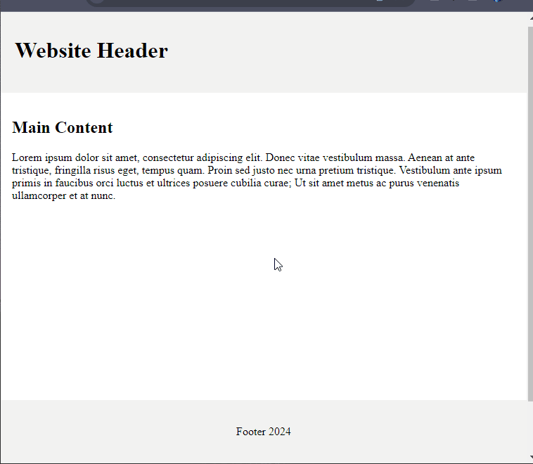
By setting the container’s min-height to 100% and using flexbox properties, we can ensure that the container expands to the full height of the viewport. The flex-grow: 1 property on the content element pushes it to occupy the remaining space, causing the footer to stick to the bottom.
Animation problems
Animation is another important aspect of web design, as it can add motion, interactivity, visual appeal, etc., to your website. Animations greatly improve user experience. But, they can also be a challenge if not implemented correctly.
Let’s explore three common animation problems and their CSS solutions.
Slow loading
Slow-loading refers to the delay in loading and displaying the content of a web page. Slow-loading animations can frustrate users and negatively impact the overall experience. To address this, we can use CSS animation properties to optimize performance.
Here’s an example of animating an element’s opacity.
HTML code:
<!DOCTYPE html>
<html>
<head>
  <title>Optimized Loading Animation</title>
  <link rel="stylesheet" href="style.css">
</head>
<body>
  <div class="loading-animation"></div>

  <div class="content">
    <h1>Slow-loading refers to the delay in loading and displaying the content of a web page. Slow-loading animations can frustrate users and negatively impact the overall experience.</h1>
    <p>To address this, we can use CSS animation properties to optimize performance.</p>
  </div>
</body>
</html>
CSS code:
.loading-animation {
  position: fixed;
  top: 0;
  left: 0;
  width: 100%;
  height: 100vh;
  background-color: #fff;
  z-index: 9999;
  animation: fadeOut 1s forwards;
}

@keyframes fadeOut {
  0% {
    opacity: 1;
  }
  100% {
    opacity: 0;
    display: none;
  }
}

.content {
  opacity: 0;
  animation: fadeIn 1s forwards 1s;
}

@keyframes fadeIn {
  0% {
    opacity: 0;
    transform: translateY(10px);
  }
  100% {
    opacity: 1;
    transform: translateY(0);
  }
}
In this example, the loading animation is displayed initially and gradually fades out using the fadeOut keyframe animation. The loading animation is represented by an empty <div> element with the class .loading-animation.
The content within the <div class="content"> element is initially hidden (opacity: 0) and then gradually fades in and moves up using the fadeIn keyframe animation. This animation starts 1 second after the page loads to allow the loading animation to fade out.
Output:
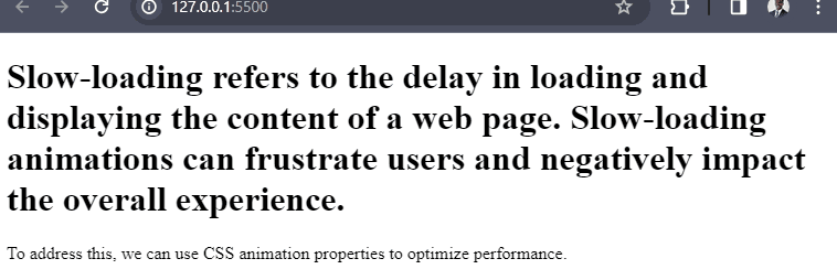
We can create a smooth fade-in effect by defining a keyframe animation that gradually changes the element’s opacity from 0 to 1. The animation property is applied to the element, specifying the animation name, duration, and easing.
Janky movement
Janky movement refers to a jerky or stuttering motion in animations or transitions on a website or application. It can occur when the animation or transition is not smooth and appears to move non-fluidly. To achieve smooth animations, we can utilize CSS transforms and transitions.
Here’s an example of a smooth-scaling animation.
HTML code:
<!DOCTYPE html>
<html>
<head>
  <title>Smooth Animation with Transforms and Transitions</title>
  <link rel="stylesheet" href="style.css">
</head>
<body>
  <div class="box"></div>

  <button class="animate-button">Animate</button>

  <script src="index.js"></script>
</body>
</html>
CSS code:
.box {
  width: 100px;
  height: 100px;
  background-color: red;
  position: relative;
  left: 0;
  transition: transform 0.3s ease-in-out;
}

.box.animate {
  transform: translateX(200px);
}

.animate-button {
  margin-top: 5px;
  padding: 10px 20px;
  background-color: #337ab7;
  color: white;
  border: none;
  border-radius: 4px;
  font-size: 16px;
  cursor: pointer;
}

.animate-button:hover {
  background-color: #135589;
}
JavaScript code:
const box = document.querySelector('.box');
const animateButton = document.querySelector('.animate-button');

animateButton.addEventListener('click', () => {
  box.classList.toggle('animate');
});
In the above snippet, the transition property is set to transform 0.3s ease-in-out, indicating that any changes to the transform property will be smoothly transitioned over 0.3 seconds. When the .animate class is added to the box element, the transform: translateX(200px) style is applied, causing the box to smoothly move 200px to the right.
The JavaScript code listens for a click event on the animate button and toggles the .animate class on the box element when clicked, triggering the animation.
Output:
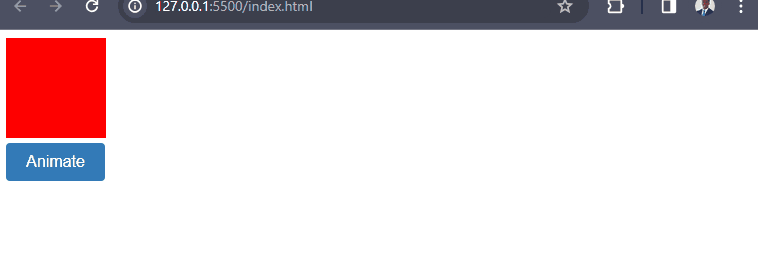
Applying a transition to the transform property allows for smooth animation of changes. When the element is hovered over, it gradually scales up with a duration of 0.3 seconds and an ease-in-out timing function.
Lack of interactivity
Lack of interactivity refers to websites or web applications that have limited or no dynamic features, user engagement, or responsiveness. It means that the website or web application lacks elements that allow users to interact with the content, provide input, or receive feedback.
Animations that lack interactivity can feel static and unengaging. CSS provides pseudo-classes and animations triggered by user interactions to add interactive elements.
Here’s an example of a box with a hover effect.
HTML code:
<!DOCTYPE html>
<html lang="en">
<head>
  <meta charset="UTF-8">
  <title>Interactive Animations Example</title>
  <link rel="stylesheet" href="style.css">
</head>
<body>
  <div class="box">
    <h1>Animate Me!</h1>
  </div>
</body>
</html>
CSS code:
.box {
  width: 200px;
  height: 200px;
  background-color: #337ab7;
  display: flex;
  justify-content: center;
  align-items: center;
  cursor: pointer;
  transition: background-color 0.3s ease-in-out;
}

.box:hover {
  background-color: #135589;
}

.box h1 {
  color: white;
  font-size: 24px;
  text-align: center;
  opacity: 0;
  transition: opacity 0.3s ease-in-out;
}

.box:hover h1 {
  opacity: 1;
}
In the above code, the CSS file contains styles that address the lack of interactivity. The .box class is applied to a <div> element, representing an interactive container. It has a transition property that animates the background color change when hovered over using the :hover pseudo-class.
The .box h1 selector targets the heading element <h1> inside the .box container. It starts with an initial opacity of 0 and gradually transitions to an opacity of 1 when the container is hovered over.
Here’s the output:
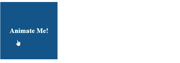
By applying these CSS styles and utilizing the :hover pseudo-class, the animations’ interactivity is improved, making the content feel more dynamic and engaging.
Typography problems
Typography is another important aspect of web design, as it can affect the readability, style, and contrast of your website.
Let’s explore three common typography problems and their CSS solutions.
Poor readability
Poor readability refers to issues that make it difficult for users to read and understand the text displayed on a website. Poor readability can hinder users from consuming content effectively.
CSS offers various properties to improve readability, such as adjusting font size, line height, and letter spacing.
Here’s an example.
HTML code:
<!DOCTYPE html>
<html lang="en">
<head>
<meta charset="UTF-8">
<title>Poor Readability Example</title>
<link rel="stylesheet" href="style.css">
</head>
<body>
<div class="content">
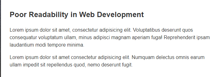
<h1>Poor Readability in Web Development</h1>
<p>
Lorem ipsum dolor sit amet, consectetur adipisicing elit. Voluptatibus deserunt quos consequatur voluptatum ullam, minus adipisci magnam aperiam fuga! Reprehenderit ipsam laudantium modi tempore minima.
</p>
<p>
Lorem ipsum dolor sit amet consectetur adipisicing elit. Numquam delectus omnis earum ullam impedit sit repellendus quod, nemo deserunt fugit.
</p>
</div>
</body>
</html>CSS code:
body {
  font-family: Arial, sans-serif;
  font-size: 16px;
  line-height: 1.5;
  color: #333;
}

.content {
  max-width: 800px;
  margin: 0 auto;
  padding: 20px;
}

h1 {
  font-size: 24px;
  font-weight: bold;
  margin-bottom: 20px;
}

p {
  margin-bottom: 10px;
}
In the above code, the CSS file contains styles that address the poor readability issues. The styles focus on improving readability by using appropriate font sizes, line spacing, and font families.
The body text is set to use the Arial font with a font size of 16px and a line height of 1.5 to enhance legibility. The content is centered using margin: 0 auto and has a maximum width of 800px to improve readability by preventing long lines of text.
Headings <h1> have a larger font size and a bold font weight to show a clear hierarchy, while paragraphs <p> have a smaller margin to provide proper spacing between paragraphs and improve readability.
Output:
By adjusting the font size, line height, and letter spacing properties, we can enhance the readability of paragraphs.
Note: These values can be adjusted according to the specific requirements of the website.
Inconsistent style
Inconsistent style refers to the lack of uniformity or coherence in the visual presentation of text across a website or web application. It means that different typography elements, such as font choices, font sizes, font weights, line heights, or text alignments, vary inconsistently throughout the design.
Inconsistencies in typography style can make a website appear unprofessional. CSS provides the font-weight, font-style, and text-transform properties to ensure consistent typography.
Here’s an example.
HTML code:
<!DOCTYPE html>
<html lang="en">
<head>
<meta charset="UTF-8">
<title>Inconsistent Styles Example</title>
<link rel="stylesheet" href="style.css">
</head>
<body>
<div class="content">
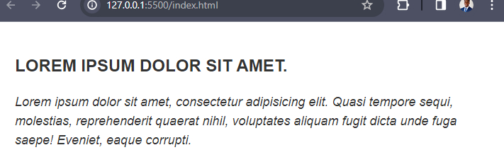
<h1>Lorem ipsum dolor sit amet.</h1>
<p>Lorem ipsum dolor sit amet, consectetur adipisicing elit. Quasi tempore sequi, molestias, reprehenderit quaerat nihil, voluptates aliquam fugit dicta unde fuga saepe! Eveniet, eaque corrupti.</p>
</div>
</body>
</html>CSS code:
body {
  font-family: Arial, sans-serif;
  font-size: 16px;
  line-height: 1.5;
  color: #333;
}

.content {
  max-width: 800px;
  margin: 0 auto;
  padding: 20px;
}

h1 {
  font-size: 24px;
  font-weight: bold;
  text-transform: uppercase;
  margin-bottom: 20px;
}

p {
  font-size: 18px;
  font-weight: normal;
  font-style: italic;
  text-transform: none;
  margin-bottom: 10px;
}
In the above code, the body text is set to use the Arial font with a font size of 16px and a line height of 1.5 to enhance legibility, ensuring a consistent base typography style.
The <h1> heading element has a larger font size of 24px and a bold font weight to establish a clear hierarchy. Additionally, the text-transform: uppercase; property is used to ensure consistent capitalization for all heading elements.
The <p> paragraph element has a font size of 18px, a normal font weight, and an italic font style to differentiate it from the headings. The text-transform: none; property ensures that the text appears in its original capitalization.
Output:
By applying these CSS styles, including the use of font-weight, font-style, and text-transform properties, the typography styles are made consistent throughout the website, resulting in a more professional and cohesive visual appearance.
Lack of contrast
Lack of contrast is when there is insufficient difference. It’s between the text color and the background color. This lack of contrast makes it difficult for users to read and understand the text content on a website.
Insufficient contrast between text and background can make it challenging to read the content. CSS provides properties such as color and background-color to ensure appropriate contrast.
Here’s an example.
HTML code:
<!DOCTYPE html>
<html lang="en">
<head>
<meta charset="UTF-8">
<title>Lack of Contrast Example</title>
<link rel="stylesheet" href="style.css">
</head>
<body>
<div class="content">
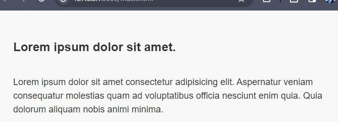
<h1>Lorem ipsum dolor sit amet.</h1>
<p>Lorem ipsum dolor sit amet.</h1>
<p>Lorem ipsum dolor sit amet consectetur adipisicing elit. Aspernatur veniam consequatur molestias quam ad voluptatibus officia nesciunt enim quia. Quia dolorum aliquam nobis animi minima.</p>
</div>
</body>
</html>CSS code:
body {
  font-family: Arial, sans-serif;
  font-size: 16px;
  line-height: 1.5;
  color: #333;
  background-color: #F8F8F8;
}

.content {
  max-width: 800px;
  margin: 0 auto;
  padding: 20px;
}

h1 {
  font-size: 24px;
  font-weight: bold;
  color: #333;
  background-color: #F8F8F8;
  padding: 10px;
}

p {
  font-size: 18px;
  color: #333;
  background-color: #F8F8F8;
  padding: 10px;
}
In the above code, the body of the page has a light gray background color #F8F8F8 and dark gray text color #333 to provide a noticeable contrast.
The <h1> heading and <p> paragraph elements have the same background and text color as the body to maintain consistency. They also have additional padding to create separation between the text and the background, improving readability.
Output:
By setting the color property to a dark color and the background-color property to a light color, we can achieve a sufficient contrast that enhances the legibility of the text.
Responsiveness problems
Responsiveness is a very important aspect of web design, as it can affect how your website looks and works on different devices, browsers, and screen sizes. With the increasing variety of devices and screen sizes, responsiveness is vital for optimal user experience.
Let’s explore three common responsiveness problems and their CSS solutions.
Fixed width
Fixed width refers to a design approach where elements on a webpage have a specified width that remains constant regardless of the screen size or device used to view the website. Elements with fixed widths can cause layout issues on different screen sizes.
CSS offers flexible units and media queries to create responsive designs.
Here’s an example.
HTML code:
<!DOCTYPE html>
<html lang="en">
<head>
<meta charset="UTF-8">
<title>Responsive Design Example</title>
<link rel="stylesheet" href="style.css">
</head>
<body>
<div class="container">
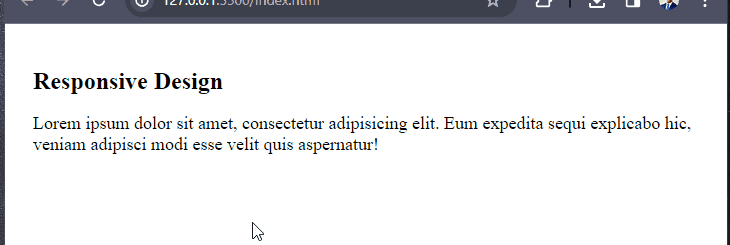
<h1>Responsive Design</h1>
<p>Lorem ipsum dolor sit amet, consectetur adipisicing elit. Eum expedita sequi explicabo hic, veniam adipisci modi esse velit quis aspernatur!</p>
</div>
</body>
</html>CSS code:
.container {
  max-width: 800px;
  margin: 0 auto;
  padding: 20px;
}

h1 {
  font-size: 24px;
}

p {
  font-size: 18px;
}

@media (max-width: 600px) {
  .container {
    padding: 10px;
  }

  h1 {
    font-size: 20px;
  }

  p {
    font-size: 16px;
  }
}
In the above code, the .container class wraps the content and sets a maximum width of 800px, with 20px of padding to create spacing around the content. The h1 and p elements have their default font sizes set to 24px and 18px, respectively.
The @media rule is used to apply specific styles when the maximum width of the viewport is 600px or less. Inside the media query, the .container class has its padding reduced to 10px, and the font sizes of h1 and p are adjusted to 20px and 16px, respectively. These changes ensure the content stays readable. The layout adjusts on smaller screens.
Output:
By using flexible units like percentages and applying media queries, the design becomes responsive and adapts to different screen sizes.
Broken layout
Broken layout is when a webpage’s design becomes distorted or unusable. This happens on certain screen sizes or devices. Elements that break or overlap on smaller screens can lead to a poor user experience.
CSS provides techniques like media queries and flex-wrap to handle responsive layouts.
Here’s an example.
HTML code:
<!DOCTYPE html>
<html lang="en">
<head>
  <meta charset="UTF-8">
  <title>Responsive Design Example</title>
  <link rel="stylesheet" href="style.css">
</head>
<body>
  <div class="container">
    <h1>Responsive Design</h1>
    <p>Lorem ipsum dolor, sit amet consectetur adipisicing elit. Velit magni assumenda dolore, vitae error ratione eum blanditiis nam vel voluptatum libero, dolorem culpa quis id! Modi porro delectus necessitatibus explicabo.</p>
  </div>
</body>
</html>
CSS code:
.container {
  max-width: 800px;
  margin: 0 auto;
  padding: 20px;
}

h1 {
  font-size: 24px;
  margin-bottom: 10px;
}

p {
  font-size: 18px;
  line-height: 1.5;
}

@media (max-width: 600px) {
  .container {
    padding: 10px;
    text-align: center;
  }

  h1 {
    font-size: 20px;
  }

  p {
    font-size: 16px;
  }
}
In this example, the @media rule has a maximum width of 600px. It applies specific styles when the viewport width is smaller. Inside this media query, the padding for the .container class is reduced to 10px, and the font sizes for <h1> and <p> are adjusted to 20px and 16px, respectively. Additionally, the text-align property is set to center to center-align the content within the container on smaller screens.
Output:
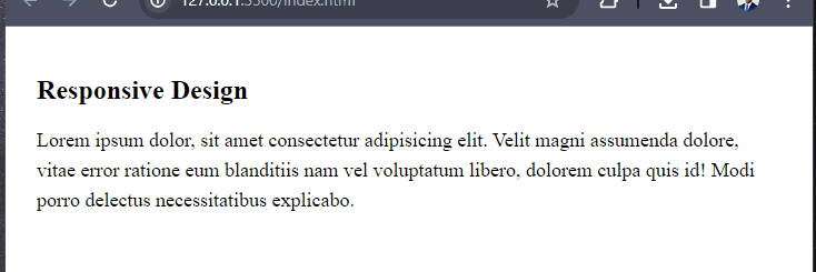
These CSS techniques improve the layout’s responsiveness. They do this by adjusting the padding, font sizes, and content alignment. They adjust them based on the screen size.
But this is a simplified example. The fixes for the broken layout would depend on your web page’s issues and requirements.
Hidden content
Hidden content refers to content that is intentionally hidden or removed from view on certain screen sizes or devices to improve the user experience and ensure that the layout remains intact. When content becomes hidden on smaller screens, it can frustrate users trying to access information.
CSS offers methods to control visibility and create responsive designs.
Here’s an example.
HTML code:
<!DOCTYPE html>
<html lang="en">
<head>
  <meta charset="UTF-8">
  <title>Responsive Design Example</title>
  <link rel="stylesheet" href="style.css">
</head>
<body>
  <div class="container">
    <h1>Responsive Design</h1>
    <p>Lorem ipsum dolor sit amet consectetur adipisicing elit. Ea, quibusdam! Error voluptatibus, soluta veritatis cumque adipisci porro sunt reprehenderit deserunt praesentium sit. Ratione, aliquam earum?</p>
    <p class="hidden-content">Lorem ipsum dolor, sit amet consectetur adipisicing elit. Eaque, minus.</p>
  </div>
</body>
</html>
CSS code:
.container {
  max-width: 800px;
  margin: 0 auto;
  padding: 20px;
}

h1 {
  font-size: 24px;
  margin-bottom: 10px;
}

p {
  font-size: 18px;
  line-height: 1.5;
}

.hidden-content {
  display: none;
}

@media (max-width: 600px) {
  .container {
    padding: 10px;
    text-align: center;
  }

  h1 {
    font-size: 20px;
  }

  p {
    font-size: 16px;
  }

  .hidden-content {
    display: block;
    font-size: 14px;
    margin-top: 20px;
    color: red;
  }
}
In the above code, the .container class is used to wrap the content. It sets a max width of 800px and adds 20px of padding for spacing. The h1 heading element has a font size of 24px and a bottom margin of 10px, while the <p> paragraph elements have a font size of 18px and a line height of 1.5.
The .hidden-content class is initially set to display: none, effectively hiding the content. This class is applied to the second paragraph element.
Inside the @media rule with a maximum width of 600px, the .container class has less padding (10px). The font sizes for h1 and p change to 20px and 16px. The .hidden-content class is given a display: block property, making it visible on smaller screens. Additionally, the font size is set to 14px, a margin is added to separate it from the previous paragraph, and the color is changed to red to make it stand out.
Output:
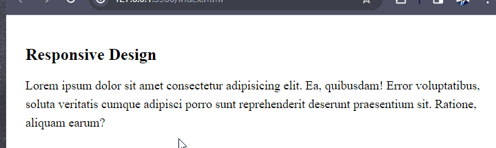
By initially setting the display property of the element to none, we can hide it on smaller screens. Then, we use a media query with a minimum width of 600px. We set the display property to block to make the element visible on larger screens.
Conclusion
This article showed you how to solve some common web design problems with CSS snippets and tricks. We have covered four sections, each focusing on a different aspect of web design: layout, animation, typography, and responsiveness.
Truly understand users experience
See every user interaction, feel every frustration and track all hesitations with OpenReplay — the open-source digital experience platform. It can be self-hosted in minutes, giving you complete control over your customer data. . Check our GitHub repo and join the thousands of developers in our community..
