Accessibility, design, and the CSS visually-hidden class
Learn how to use visually-hidden to make pages more accessible

Good communication can frequently lead to a compromise or resolution that meets aesthetic and usability requirements. However, there are situations when workarounds are required to produce a solution that fits both requirements. This article will show how to use the visually-hidden class to keep the same visual look but work efficiently with assistive technology.

Discover how at OpenReplay.com.
Accessibility has become important while planning and creating websites and applications in today’s digital age. Ensuring that digital content is useable and accessible to individuals with disabilities, allowing them to perceive, navigate, and engage with information efficiently, is referred to as accessibility. On the other hand, the design includes a website or application’s visual and interactive features, aiming to create an aesthetically pleasant and engaging user experience. However, accessibility and design occasionally collide, and it is critical to balance the two to build inclusive and user-friendly digital experiences.
In this article, we’ll look at a useful workaround: using the CSS visually-hidden utility class to make some elements available to assistive technology users while maintaining the visual appearance of the website or app. We’ll go through the utility class, how it works, and how to use it. We’ll also consider potential solutions to issues arising using this utility class.
Understanding the visually-hidden utility class
The visually-hidden utility class is a popular CSS class that allows you to visually hide components on a web page while keeping them accessible to assistive devices such as screen readers. It allows you to incorporate hidden content that is only visible to people using assistive technology, guaranteeing they can access the information.
Also, it provides a means of delivering alternative text or additional descriptive material for items that are not visibly apparent but are nonetheless necessary for web accessibility purposes. For example, you can use it to hide ornamental graphics or icons that do not transmit significant information to sighted people but must be defined for a screen reader user.
Here are several methods for visually hiding content, the most frequent of which is to use the visually-hidden class:
<p>This is a visible text on the page.</p>
<span class="visually-hidden">This text is hidden visually but accessible to screen readers.</span>
The css code
.visually-hidden:not(:focus):not(:active) {
 position: absolute;
 left: -9999px;
 width: 1px;
 height: 1px;
 overflow: hidden;
}
Let’s break down what the visually-hidden class in the above code does:
The visually-hidden class is given to a <span> element, rendering it visually hidden by putting it far off-screen (left: -9999px) and giving it a modest width and height. The overflow: hidden rule ensures that any content within the element that exceeds its dimensions remains hidden.
Applying the visually-hidden class to an element ensures that screen readers can still access and interpret the material within it, delivering crucial information to users with disabilities without cluttering the visual interface.
N.B, Adding the not(:focus):not(:active) exception to this selector makes the element visible while it is focused, allowing us to construct visually hidden skip links.
Use cases
The Visually-hidden utility class can improve accessibility while keeping a visually appealing design. Here are some examples of how the visually-hidden class is used:
Live regions
Dynamic content which updates without a page reload is generally either a region or a widget. Simple content changes which are not interactive should be marked as live regions. A live region is explicitly denoted using the aria-live attribute.
You can successfully deliver critical information to people with impairments while producing visual distractions or disruptions for seeing users by combining the visually-hidden class with the live region technique. This method ensures that screen reader users are instantly aware of any page updates or alerts, improving the overall accessibility of your application or website.
Here’s an example of how you can use JavaScript to dynamically change the content of a live region:
<button onclick="updateLiveRegion()">Update Live Region</button>
<div id="live-region" aria-live="polite"></div>

<script>
 function updateLiveRegion() {
   var liveRegion = document.getElementById('live-region');
   var message = 'New notification: You have a new message.';
   liveRegion.textContent = message;
 }
</script>
In the above code, when the button is clicked, it calls the updateLiveRegion() JavaScript method. The function uses getElementById(‘live-region’) to fetch the live region element and change its text content with the appropriate message.
The attribute aria-live=“polite” is applied to the live region element. This attribute instructs assistive technology that the material within the live region should be announced to the user, giving precedence to any continuing screen reader output without interfering with the user’s current activity.
The updateLiveRegion() function runs when the button is clicked, and the textContent property of the live region element is set to the new message. The change in content causes screen readers to proclaim the live region, informing users of the new notification.
Skip links
Skip links are hidden navigation links at the top of a web page that allow users to jump directly to certain content areas, skipping through repetitive or navigational aspects. Like the image below
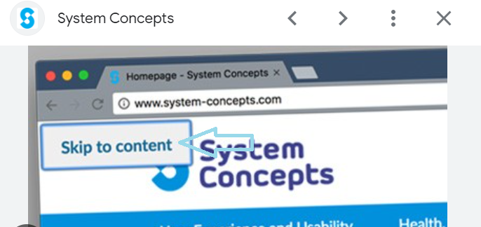
The visually-hidden utility class can be combined with skip links to improve a website’s accessibility and user experience. Here is an example:
<a href="#main-content" class="skip-link visually-hidden">Skip to main content</a>

<header>
 <!-- Header content here -->
</header>

<main id="main-content">
 <!-- Main content here -->
</main>

<footer>
 <!-- Footer content here -->
</footer>
From the code above, the skip link gives the visually-hidden class, ensuring that it is hidden visually but still accessible to assistive devices. This is especially important because sighted users rarely need to see the skip links, although screen readers can use them to browse the website more effectively.
The skip link is at the top of the page and contains an anchor (href=“#main-content”) that leads to the page’s main content section. When the skip link is engaged or focused, users can go straight to the main content section, bypassing the header and other repeated elements.
Heading structure
A good heading structure is beneficial to assistive technology users because it creates a document outline. This outline can assist visitors in navigating the text and quickly locating information. However, the heading required to construct this structure is hidden visually to avoid detracting from the app’s visual appeal.
The visually-hidden utility class is used in conjunction with a web page’s heading structure to increase accessibility and ensure that assistive technology users understand the content’s hierarchy and structure. Let’s look at a heading from this website:
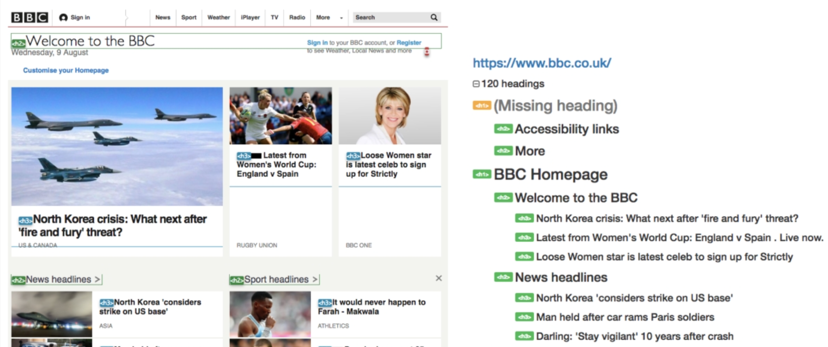
A single Heading 1 has been utilized on the page, wrapped around the logo (which is only appropriate for the homepage). The ‘homepage’ feature is buried visually but is present for assistive technology to announce.
The various portions of the page are defined as Heading 2s (including some of the items above heading 1), allowing readers to easily scan the page for the correct section to read. Heading 3s are the headlines under each topic.
The heading level and visual appearance (e.g., size, boldness) should be consistent, but a page must have a strong structure regardless of its appearance. This has two major implications:
- Do not style text to look like a heading unless you utilize heading markup.
- The level of the header is not the same as the text size.
From an accessibility standpoint, skipping heading levels (e.g., H1 directly to H3) should be avoided. People who use screen readers frequently navigate by heading; thus, if the structure is not hierarchical, they may not understand the relationship.
Icon button
Screen reader users can use icon buttons to get alternative text or more information. Icon buttons communicate their functionality through visual signals such as icons or glyphs. It is, nevertheless, critical that users with disabilities comprehend the purpose and action connected with these buttons.
This utility class is commonly used to add an accessible name to an icon button. This button lacks a visible name and is represented by an icon. A common example of an icon button is a social “like” or a download icon. Although the purpose of various sorts of buttons may be evident to sighted users, the button will be unrecognizable to assistive technology users unless it has an accessible name.
Here’s an example of how a visually-hidden class can be used with an icon button:
<button class="icon-button" aria-label="Favorite">
 <span class="visually-hidden">Favorite</span>
 <i class="fa fa-heart"></i>
</button>
The above code applies the visually-hidden class to a <span> element within the button. It visually hides the text content from sighted users, but it is still accessible to assistive tools such as screen readers.
The aria-label attribute is added to the button, which provides a brief and descriptive title for the button’s operation. Screen readers read this label aloud to users to educate them on the button’s meaning.
The accessible alternative text for the icon button is contained in the <span> element with the visually-hidden class. In this case, it includes the text “Favorite,” which specifies the action linked with the button. As a result, screen reader users will understand the meaning and purpose of the icon button.
Alternative methods of visually hiding elements
There are alternative methods to visually hide elements on a web page. These methods focus on hiding elements from sighted users while keeping them accessible to assistive technologies. There are a couple of other options for hiding elements.
Css opacity and filter properties
Opacity or filter: opacity allows you to change the transparency of an element. Setting opacity: 0; makes the element transparent, effectively hiding it from sighted users. However, the context or material within the element may not be entirely accessible or intelligible. The Filter property enables many visual effects, including visually hiding items. You can, for example, use the filters brightness(0), blur(0), or grayscale(1) to visually hide an element.
Moving off the canvas
Moving an element off-canvas means moving it outside the viewable region of the screen while keeping it accessible and usable. This technique is commonly used to create off-canvas menus or hidden panels that can be revealed as needed. Here’s an example of how to use CSS to relocate an element off-canvas:
.off-canvas {
 position: absolute;
 left: -200vw;
 top: -200vh;
}
Looking at the code above, the position: absolute moves the object away. When relocating it off-canvas, it is critical to guarantee that an element stays available to all users. Test the implementation with assistive technologies to check that the content is perceivable and useable, and that keyboard navigation and screen readers can interact effectively with the off-canvas element.
Potential issues with the visually-hidden class
Using the visibly hidden utility class is a hack. Therefore, there may be some concerns to be aware of. Recognizing these constraints and utilizing the visually hidden class is critical.
The issues are listed below in order of least to most problematic. We’ll also give alternatives or workarounds where possible. The easiest strategy to avoid potential conflict between development and design is to communicate openly between both roles and consider alternate options early in the design phase.
Creating an additional stop for screen readers
Creating an additional stop for screen readers is a way to provide more context or instructions to screen reader users. It enables you to insert hidden content that screen readers will encounter while navigating, offering essential information that may not be seen visually.
To create an additional stop for screen readers, you can use the <span> element with the visually-hidden class and specific ARIA attributes. Here’s an example:
<span class="visually-hidden" tabindex="0" role="region" aria-label="Additional Information">
 <!-- Hidden content for screen readers -->
</span>
Let’s go through the above code. The visually-hidden class is applied to the <span> element to ensure it is visually hidden but accessible to screen readers.
The tabindex=“0” feature focuses on the hidden span, allowing screen reader users to navigate it with the keyboard.
The role=“region” attribute gives the hidden content semantic significance by stating that it represents a distinct area or region of the page.
The aria-label=“Additional Information” feature offers a descriptive title for the hidden information, informing screen reader users of its function.
Now, let’s take a look at the Chrome accessibility tree:
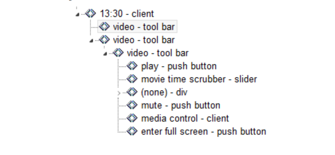
When the virtual cursor is over the group element, the element is read aloud by a screen reader as “client.” When the user pushes the down arrow key, the screen reader reads the span as “client” again, resulting in an unnecessary pause. We could tag this group with an aria-label, but it might not translate properly, and visually hiding the element presents a tiny usability issue.
There are two possible solutions to this problem. First, we may convert the span to a heading; this method can potentially strengthen the heading structure for screen reader users. As an alternative to utilizing the visually-hidden utility class, we might conceal the span with the HTML property hidden:
<div role="group" aria-labelledby="accordion-group">
 <span id="accordion-group" hidden>Frequently Asked Questions</span>
</div>
The group element will still be recognized as having an accessible name with this technique, but the span itself will not be identified by screen readers, removing the extra stop. Except in cases when we need the semantic value of the element, this may be a better technique for adding the utility class to label an element.
Elements detectable by the browser’s search function
The visually-hidden class intends to hide features from sighted users while keeping them accessible to assistive technology like screen readers. It may, however, have implications for the browser’s search feature, which is used to locate specific content on a web page.
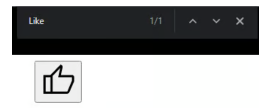
Although this situation is extreme, the browser’s search function will still detect an element when using the visually-hidden utility class. Consider the following markup for building a Like icon button:
<button>
 <span class="visually-hidden">Like</span>
 <svg aria-hidden="true">
   <!-- SVG content -->
 </svg>
</button>
So, if we search the word “Like” on the website, it will display as a result, but the element will not be highlighted because it is visually hidden:
To avoid a potential usability issue, we can label the button using aria-labeled and hide the span, so if we search the word “Like” on the website, it will appear as a result. However, because the element is hidden, it will not be visually emphasized:
<button aria-labelledby="like-btn">
 <span id="like-btn" hidden>Like</span>
 <svg aria-hidden="true">
   <!-- SVG content -->
 </svg>
</button>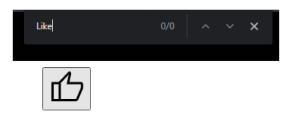
N.B, We use aria-labeled when using generic elements to label an element; using the visually-hidden utility class is the best way to hide elements with semantic values.
Interactive elements undetectable by touch-based screen readers
Undetectable interactive elements by touch-based screen readers can create significant barriers for persons with disabilities. It is critical to ensure that all interactive features are accessible and functional for users who rely on touch-based screen readers or other assistive technologies while building web experiences.
Some of the most prevalent difficulties that can render interactive elements undetectable or difficult to use with touch-based screen readers and how to improve their accessibility are as follows:
- Using non-semantic elements for interactive content:
<!-- Undetectable by screen readers -->
<div onclick="doSomething()">Click me</div>

<!-- Accessible - Use semantic element -->
<button onclick="doSomething()">Click me</button>
In the first example, a <div> element is used for an interactive action, such as a click event. Screen readers do not identify this element as interactive. The accessible version employs a <button> element, which communicates the interactive aspect of the page to both sighted and screen reader users.
- Incorrect or missing ARIA attributes:
<!-- Undetectable by screen readers -->
<div role="button" onclick="doSomething()">Click me</div>

<!-- Accessible - Correct ARIA attributes -->
<button type="button" onclick="doSomething()">Click me</button>
Using the role=“button” property, a <div> element is given the role of a button in the code above. However, this is not enough to make it fully accessible. The accessible version employs a <button> element with the type=“button” property, indicating that it is a button control.
- Insufficient touch target size:
<!-- Undetectable by screen readers and challenging for touch users -->
<a href="link.html" style="font-size: 12px;">Small link</a>

<!-- Accessible - Sufficient touch target size -->
<a href="link.html" style="font-size: 16px;">Accessible link</a>
Looking at the code above, from the first example, we can see that the link has a small text size, making it difficult for touch users and screen readers to engage. The accessible version boosts the font size to make the touch target more comfortable.
- Relying solely on hover-based interactions:
<!-- Undetectable by touch-based screen readers -->
<div onmouseover="showTooltip()">Hover me</div>

<!-- Accessible - Alternative interaction method -->
<div onclick="showTooltip()" onkeypress="showTooltip()" role="button" tabindex="0">Click or press Enter to show tooltip</div>
In the first example of the code above, a tooltip shows on hover, inaccessible to touch-based screen readers. The accessible version includes an element that displays the tooltip when the user clicks or pushes the Enter key, making it available to all users.
Follow these best practices to improve the detectability and accessibility of interactive features, which can create a more inclusive and accessible user experience for all users, especially those who rely on touch-based screen readers:
- Use semantic HTML elements for interactive content.
- Include proper ARIA attributes for custom interactive elements to convey roles and behavior.
- Manage focus properly to enable easy navigation to focusable elements.
- Provide sufficient touch target size for easy activation.
- Offer alternative methods for interactions that rely on hover or complex gestures.
visually-hidden elements undetectable by voice control users
Users who interact with webpages using voice control or other speech recognition technology may be unable to discover visually hidden elements. Voice control users navigate and interact with web content using spoken commands.
When CSS techniques are used to visually hide content, it is removed from the visual layout but remains in the DOM. However, because voice control systems can not understand the visual representation of the page, they may not recognize or interact with visually hidden features.
This can be a substantial barrier for voice control users, who may miss out on essential information or interactive features if they are visually obscured. To remedy this issue, voice control users must have access to visibly hidden features. For example, voice control users may find it difficult to click links or buttons with partially or completely hidden names since they must utter the entire name of the link or button to click them. Below is an example of a list of articles with visually hidden “Click me” links and how to make them accessible for voice control users:
<!DOCTYPE html>
<html>
<head>
 <title>List of Articles</title>
 <style>
   /* CSS for visually-hidden class */
   .visually-hidden {
     position: absolute;
     top: -9999px;
     left: -9999px;
     width: 1px;
     height: 1px;
     overflow: hidden;
   }
 </style>
</head>
<body>
 <h1>List of Articles</h1>
 <ul>
   <li>
     <h2>Article 1</h2>
     <p>Summary of Article 1...</p>
     <div class="visually-hidden">
       <a href="#article1">Click me to read more about Article 1</a>
     </div>
   </li>
   <li>
     <h2>Article 2</h2>
     <p>Summary of Article 2...</p>
     <div class="visually-hidden">
       <a href="#article2">Click me to read more about Article 2</a>
     </div>
   </li>
   <li>
     <h2>Article 3</h2>
     <p>Summary of Article 3...</p>
     <div class="visually-hidden">
       <a href="#article3">Click me to read more about Article 3</a>
     </div>
   </li>
 </ul>
</body>
</html>
In this example, we have a list of articles with visually hidden “Click me” links that link to the respective article sections. The .visually-hidden class is used to hide the links from the visual layout.
To make the links accessible to voice control users, we must ensure that they are accessible without relying on the visually hidden container:
<!DOCTYPE html>
<html>
<head>
 <title>List of Articles</title>
</head>
<body>
 <h1>List of Articles</h1>
 <ul>
   <li>
     <h2>Article 1</h2>
     <p>Summary of Article 1...</p>
     <a href="#article1" aria-label="Read more about Article 1">Click me to read more about Article 1</a>
   </li>
   <li>
     <h2>Article 2</h2>
     <p>Summary of Article 2...</p>
     <a href="#article2" aria-label="Read more about Article 2">Click me to read more about Article 2</a>
   </li>
   <li>
     <h2>Article 3</h2>
     <p>Summary of Article 3...</p>
     <a href="#article3" aria-label="Read more about Article 3">Click me to read more about Article 3</a>
   </li>
 </ul>
</body>
</html>
We make the “Click me” links visible to voice control users without hiding them visually by deleting the visually hidden container and directly employing the <a> elements with the aria-label property. The aria-label gives a descriptive label for each link, which will be announced by voice control systems, allowing users to understand the purpose of the links.
Wrapping Up
To create a truly inclusive and user-friendly digital experience, accessibility, and design must work together. Accessibility ensures that websites and applications are usable and accessible to all individuals, regardless of their abilities or disabilities. On the other hand, design seeks to create visually appealing and engaging interfaces that enhance user satisfaction. Accessibility and design should be integrated into the development process rather than being viewed as competing goals. Designers may overcome potential barriers and create interfaces that work well for everyone by considering accessibility principles during the design phase. An accessible design benefits all users by frequently enhancing usability and overall user experience.
Truly understand users experience
See every user interaction, feel every frustration and track all hesitations with OpenReplay — the open-source digital experience platform. It can be self-hosted in minutes, giving you complete control over your customer data.
Star on GitHub12k