Building Accessible Modals: Native `<dialog>` or a Library?
Native <dialog> vs library for accessible modals: focus, inert background, ESC, scroll lock, and when custom focus traps still matter.

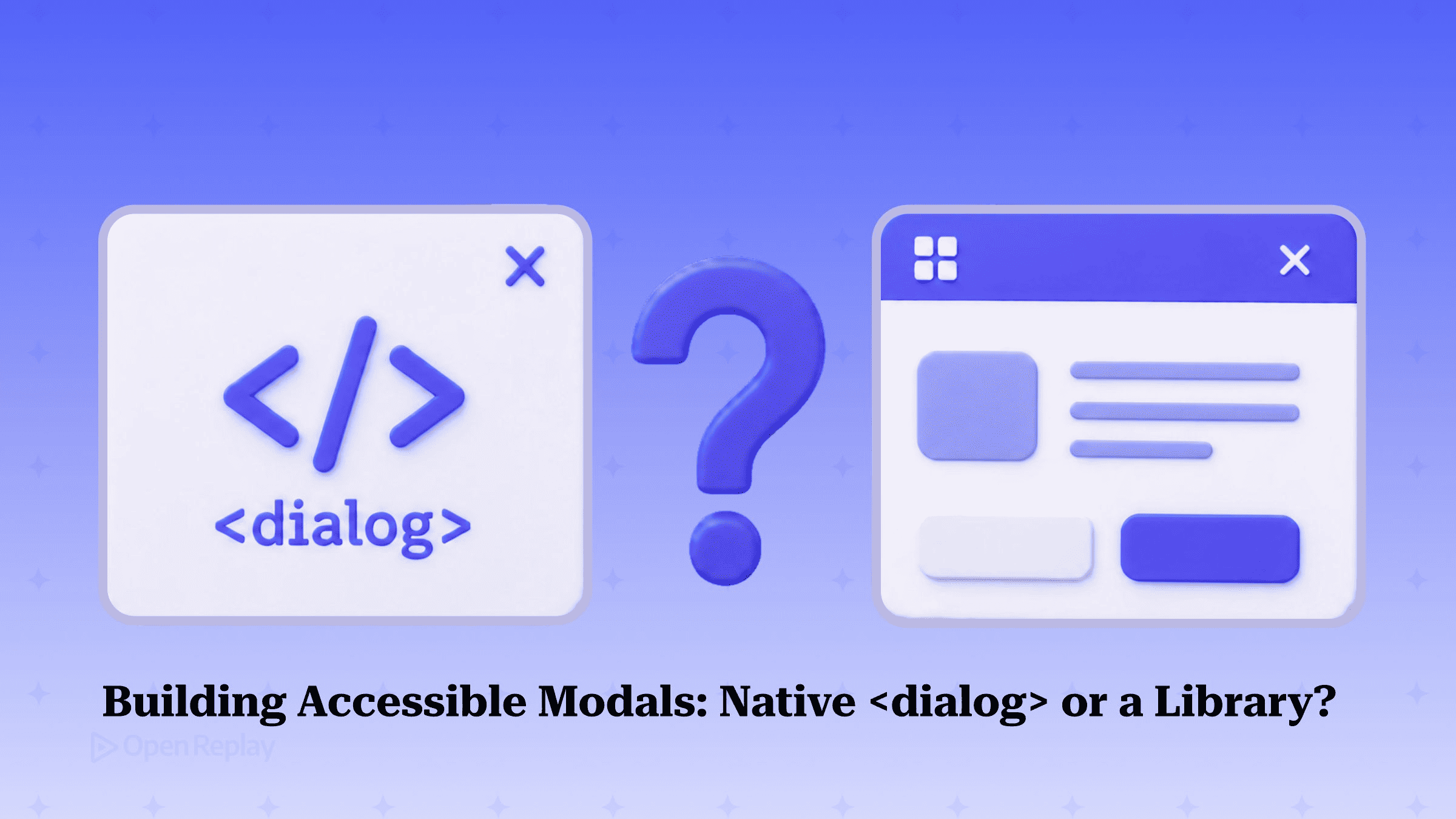
In 2026, default to the native <dialog> element with showModal(): it gives you focus containment, ESC-to-close, top-layer rendering, background scroll prevention, and an implicit aria-modal with zero JavaScript — reach for a library like Radix, React Aria, Headless UI, or a11y-dialog only when you hit complex stacking, rich animation requirements, design-system composability, or a specific native gap you’ve actually measured.
That verdict reverses years of received wisdom. The standard advice — portal the modal, manually trap focus, hide the background with aria-hidden, wire up ESC by hand — described what you had to do before <dialog> and inert shipped. The <dialog> element has been Baseline across all major browsers since March 2022, so most of that scaffolding is now browser default. This article resolves the native-vs-library choice with concrete criteria, gets the focus-trap nuance right where most guides repeat stale advice, gives you a verified minimal implementation in vanilla JS and React, and ends with the screen-reader reality that correct ARIA alone doesn’t fix.
Key Takeaways
- Native
<dialog>opened withshowModal()places the dialog in the browser’s top layer and makes the rest of the pageinert, so focus is contained to the page-level modal without any JavaScript focus trap. - Do not add a JavaScript focus trap to a native
<dialog>: the only thing Tab can still reach is the browser’s own chrome, which keyboard users should be allowed to reach exactly as mouse users can. - Manual focus traps belong to custom, non-
<dialog>modals — and if you build one, you own theinertattribute on the background too, because nothing manages it for you. - The most common native gotcha is silent: if the first focusable control sits at the bottom of the dialog’s DOM,
showModal()focuses it and the modal opens scrolled to the bottom — fix it by ordering the close button after the heading in source. - Correct ARIA is necessary but not sufficient: as of 2026, Safari plus VoiceOver can still leave static content inside an
aria-modaldialog unreachable, so test on real screen readers.
What an accessible modal must actually do
An accessible modal has five non-negotiable behaviors: it moves focus into itself on open, it makes the background unreachable and non-interactive, it can be dismissed by keyboard (ESC) and a visible control, it restores focus to the triggering element on close, and it exposes a dialog role with an accessible name so screen readers announce it. These map directly to WCAG success criteria — focus order (2.4.3), keyboard operability (2.1.1, 2.1.2), and name/role/value (4.1.2). The full WCAG 2.2 quick reference lists the rest; this short set is what a modal lives or dies by.
The reason these get botched is that each one is a separate piece of machinery in a hand-rolled position: fixed modal. You script the focus move, the focus restore, the ESC listener, the background-hiding, and the role wiring independently — and any one of them silently regressing produces a modal that looks fine to a mouse user and is broken for everyone else. The argument for the native element is that it collapses most of that machinery into one DOM call.
What <dialog> and showModal() give you for free — and what they don’t
Discover how at OpenReplay.com.
Calling showModal() on a <dialog> gives you, with no JavaScript beyond the call itself: initial focus moved into the dialog, dismissal via the Esc key handled by the browser, top-layer rendering that sidesteps z-index and portal gymnastics, a backdrop you can style with ::backdrop, an implicit role="dialog" with aria-modal="true", and an inert background so Tab can’t reach page content behind it. close() then restores focus to the element that opened the dialog. Jared Cunha, who rebuilt the U.S. Web Design System modal on top of <dialog>, reports the rewrite went from roughly 400 lines of JavaScript plus four utilities to about 38 lines — the accessibility behaviors you used to script are now browser defaults.
What it does not give you, and the fixes:
| Gotcha | What happens | Fix |
|---|---|---|
| First focusable at bottom of DOM | showModal() focuses it, and the dialog opens scrolled to the bottom | Put the close button after the heading in source order; or set initial focus deliberately |
autofocus attribute | Unreliable for moving initial focus in some desktop browsers | Set focus in JS after showModal(), targeting the right element |
| Backdrop click | Native dialog does not close on outside click by default | Listen for clicks where event.target === dialogEl |
| Background scroll | Page behind the dialog can still scroll | Lock scroll explicitly (see below) |
The scroll-to-bottom behavior is not a quirk of one library — the W3C ARIA APG modal dialog example documents that placing initial focus on an element near the end of dialog content can cause the dialog to open scrolled out of view. The cleanest fix is source order: heading first, close button after it, so the screen reader announces the title before the control and the dialog opens at the top.
For scroll locking, capture the scroll position, lock the body, and restore on close:
:root:has(dialog[open]) {
  overflow: hidden;
  scrollbar-gutter: stable; /* prevents the layout jump when the scrollbar disappears */
}
scrollbar-gutter: stable reserves the scrollbar’s width so the page doesn’t shift sideways when scrolling locks. On iOS Safari, overflow: hidden on the body is famously leaky; capturing window.scrollY and applying position: fixed with a negative top is the more reliable cross-platform approach when you need it.
The focus-trap question, settled: don’t trap a native dialog
Do not add a JavaScript focus trap to a native <dialog> opened with showModal(). The browser already places it in the top layer and makes the rest of the page inert, so focus is contained — the only thing Tab can still reach is the browser’s own chrome (address bar, tabs, extensions), which keyboard users should be allowed to reach, exactly as mouse users can. This is the single most-repeated piece of outdated advice in modal tutorials, and it’s wrong for the native element.
The reasoning comes from named accessibility authorities, synthesized by Zell Liew in CSS-Tricks’ “There is No Need to Trap Focus on a Dialog Element”. Scott O’Hara’s position is that WCAG does not normatively require focus trapping; the trap recommendation came from informative guidance written before inert and <dialog> were widely supported, when scripted dialogs made trapping easier than making external elements untabbable. Léonie Watson’s framing is that users should keep the same control options inside a dialog as on a normal page — they should still be able to reach browser controls. The W3C APA Working Group’s view is that native dialog behavior should remain as-is, partly because tabbing to browser chrome is an escape mechanism in kiosk and locked-down contexts.
This is a genuine, current debate, not settled law. Jared Cunha, in the USWDS work cited above, still adds a focus-trap function on the native element. His reasoning is practitioner caution. But the weight of normative interpretation sits with the no-trap position for the native element, and adding a trap actively removes a capability keyboard users have by default.
The caveat that completes the rule: manual focus traps belong to custom, non-<dialog> modals — and if you build one, you own inert on the background too, because nothing manages it for you. The “always trap focus” advice isn’t wrong in general; it’s wrong when applied to the element that already handles containment.
A minimal, correct native <dialog> implementation
Here is the vanilla version with the three enhancements worth adding: backdrop-click close, reduced-motion-aware animation, and nothing else. Focus restoration is already handled by close().
<button id="open">Open dialog</button>

<dialog id="dlg" aria-labelledby="dlg-title">
  <h2 id="dlg-title">Confirm changes</h2>
  <p>Your edits will be applied immediately.</p>
  <form method="dialog">
    <button value="cancel">Cancel</button>
    <button value="confirm">Confirm</button>
  </form>
</dialog>
const dlg = document.getElementById('dlg');
document.getElementById('open').addEventListener('click', () => dlg.showModal());
// Backdrop click closes (native does NOT do this).
dlg.addEventListener('click', (e) => {
if (e.target === dlg) dlg.close();
});aria-labelledby points at the visible heading, giving the dialog its accessible name. <form method="dialog"> closes the dialog on submit and records which button was pressed in dlg.returnValue — no extra JS. The backdrop check works because clicking the ::backdrop registers as a click on the <dialog> element itself, while clicking the content registers on a child.
Animate it without fighting the top layer, and respect motion preferences:
dialog {
  opacity: 0;
  transition: opacity 0.2s, overlay 0.2s allow-discrete, display 0.2s allow-discrete;
}
dialog[open] { opacity: 1; }
@starting-style {
  dialog[open] { opacity: 0; }
}
@media (prefers-reduced-motion: reduce) {
  dialog { transition: none; }
}
@starting-style and transition-behavior: allow-discrete are what make entry transitions work for an element moving in and out of the top layer. The prefers-reduced-motion block satisfies WCAG 2.3.3.
The React version uses useRef to call the imperative methods and useId for an SSR-safe label association:
import { useRef, useEffect, useId } from 'react';

function Dialog({ open, onClose, title, children }) {
  const ref = useRef(null);
  const titleId = useId();

  useEffect(() => {
    const el = ref.current;
    if (open) el.showModal();
    else el.close();
  }, [open]);

  return (
    <dialog
      ref={ref}
      aria-labelledby={titleId}
      onClose={onClose}
      onClick={(e) => { if (e.target === ref.current) ref.current.close(); }}
    >
      <h2 id={titleId}>{title}</h2>
      {children}
    </dialog>
  );
}
The native close event (fired by ESC, the backdrop handler, or form submit) drives your onClose, keeping React state in sync with the element. Use role="alertdialog" instead of the default for destructive confirmations, and do not close those on backdrop click.
Native <dialog> vs a library: the 2026 decision matrix
Use this to decide. Re-verify on npm at integration time, since patch levels drift.
| Option | When it wins | Trade-off | Current version |
|---|---|---|---|
Native <dialog> | Most modals; you want zero JS deps and built-in a11y | Less animation/stacking control; you wire backdrop-close yourself | Baseline since March 2022 |
| a11y-dialog (vanilla) | Vanilla/non-React projects needing a tested wrapper and events | Relies on aria-modal; known mobile-AT limits | 8.1.5 |
| Radix / shadcn (React) | Design-system teams; composable primitives; shadcn workflow | Adds a primitive layer and bundle | unified radix-ui 1.6.0 |
| React Aria (React) | A11y-critical apps wanting Adobe’s behavior guarantees | Steeper API; opinionated | @react-aria/dialog 3.5.34 |
| Headless UI (React) | Tailwind projects wanting matched unstyled primitives | React-only; custom (non-<dialog>) impl | 2.2.10 |
| Base UI (React) | New projects wanting modern primitives from the MUI team | Younger ecosystem | stable v1.0 (Dec 2025) |
a11y-dialog’s latest version is 8.1.5, and per its own known-issues documentation it relies on aria-modal (WAI-ARIA 1.1), with support that isn’t great across certain mobile assistive technologies — pairing it with the aria-hidden helper is the documented mitigation.
Headless UI for React is at version 2.2.10, published April 7, 2026. Per the Headless UI docs, its Dialog is a custom div-based component that moves focus inside and traps it — which is correct, because it’s not a native <dialog>, so it must trap. Per the React Aria docs, focus moves into the dialog on mount and is restored to the trigger on unmount, and is contained while open. One caution: React Aria’s docs still describe the HTML <dialog> element as not yet widely supported — that line is out of date given Baseline status since 2022, so don’t inherit it.
The headless landscape genuinely shifted in late 2025 and early 2026. Base UI, maintained by the MUI team and built by alumni of Radix, Floating UI, and Material UI, reached a stable v1.0 in December 2025, and shadcn/ui consolidated its Radix usage onto the unified radix-ui package in February 2026. One frequently muddled fact: Radix’s parent Modulz was acquired by WorkOS back in 2022 — that’s four years old, not recent news. The real recent change is the rise of Base UI as an alternative primitive layer. Most teams still consume Radix through shadcn/ui.
When you can’t use <dialog>: the custom-modal checklist
If you must build a custom modal — non-modal coexisting dialogs, exotic stacking, or a legacy constraint — you take back ownership of everything the native element handled. At minimum:
- move focus in on open and restore it on close;
- apply the
inertattribute to the rest of the app (more robust thanaria-hidden, sinceinertalso removes elements from the tab order); - implement a real focus trap cycling Tab and Shift+Tab over focusable children;
- add an ESC keydown handler;
- lock background scroll; and
- set
role="dialog"/alertdialogwitharia-modal="true"and an accessible name.
This is the case — and the only case — where “always trap focus” is correct advice.
Custom-modal accessibility bugs like these are exactly what production session replay surfaces, because it reconstructs the actual focus and keyboard trail a user experienced. You can watch a keyboard user Tab straight out of a custom modal into background content — the unmistakable signature of a missing inert or a broken trap. You see focus land nowhere after a modal closes, the tell that the opener reference was never stored. You see a modal that can’t be dismissed by keyboard at all, because a custom build shipped without an ESC handler. These are the failure modes that audits pass and replays catch.
Screen-reader reality: correct ARIA isn’t enough
Correct ARIA is necessary but not sufficient. As of 2026, Safari plus VoiceOver can still leave static, non-focusable content inside an aria-modal dialog unreachable to the virtual cursor — a known WebKit issue corroborated by Deque’s December 2025 write-up on ARIA modal dialogs. The practical implication: a perfectly marked-up dialog can still hide its body text from a VoiceOver user. Test it; don’t assume.
Beyond that, NVDA may not announce the dialog role in every configuration, and TalkBack can miss absolutely-positioned content. The takeaway is process, not markup: test on at least two screen-reader/browser combinations — VoiceOver/Safari and NVDA/Firefox or Chrome at minimum — because an automated audit confirms the attributes are present, not that a real assistive technology reaches the content.
Conclusion
Reach for the native <dialog> first, write the four small enhancements (backdrop-close, deliberate initial focus, scroll lock, reduced-motion animation), and resist the urge to bolt on a focus trap it doesn’t need. Pull in Radix, React Aria, Headless UI, a11y-dialog, or Base UI only when a concrete requirement — composability, animation, stacking — outweighs a zero-dependency element that ships the accessibility for you. Then open a screen reader and confirm what the audit can’t: that a real user can actually reach every word.
FAQs
Does a native dialog element work without JavaScript using the form method dialog attribute?
A dialog can open without JavaScript only if you use the open attribute, but that renders it as a non-modal dialog with no top layer, no inert background, and no focus containment. The modal behaviors require calling showModal() in JavaScript, which cannot be triggered declaratively. You can, however, close a dialog without extra JavaScript by placing a form with method='dialog' inside it; submitting that form closes the dialog and records the pressed button in the returnValue property.
What is the difference between role dialog and role alertdialog on a modal?
The default role='dialog' from a native dialog element is for general modals where users browse or enter content, while role='alertdialog' signals an urgent, interruptive message that needs a response, such as a destructive-action confirmation. Screen readers announce alertdialog content more assertively. For alertdialog modals, do not allow backdrop-click or casual dismissal, because the pattern assumes the user must make a deliberate choice rather than dismiss the dialog accidentally.
Why does my dialog open scrolled to the bottom instead of the top?
This happens when the first focusable element in the dialog's DOM sits near the end of the content. When showModal() runs, the browser moves focus to that first focusable control, and if it is at the bottom, the dialog opens scrolled to it. The W3C ARIA Authoring Practices Guide documents this same behavior. Fix it by ordering source so the heading comes before the first interactive control, for example placing the close button after the title rather than before it.
Can I style an open dialog with the open pseudo-class instead of the open attribute selector?
The :open pseudo-class can style an open dialog, but it became Baseline newly available only as of May 2026, when Safari 26.5 shipped it. Because it is newly available rather than widely supported across older browser versions, the safer cross-browser selector remains the attribute selector dialog[open], which has worked since the element reached Baseline in March 2022. Use the attribute selector as your primary approach and treat :open as progressive enhancement until support is broad.
Does Headless UI use the native dialog element, and should I still trap focus with it?
Headless UI's Dialog component is a custom div-based implementation, not the native HTML dialog element, so it correctly moves focus inside and traps it as the user cycles through focusable elements. This is consistent with the rule that custom, non-dialog modals must trap focus and manage background inertness themselves. You should not strip out its focus trap. The no-focus-trap guidance applies only to the native dialog element opened with showModal(), where the browser already contains focus to the page.
Truly understand users experience
See every user interaction, feel every frustration and track all hesitations with OpenReplay — the open-source digital experience platform. It can be self-hosted in minutes, giving you complete control over your customer data.
Star on GitHub12k