
Allow PayStack Payments in your React App


PayStack payments are an easy way to allow online payments to users. This article will teach users how to integrate Paystack in a React-Typescript app by building a simple shopping app with a shopping cart and a checkout button that will enable users to make payments for items in their shopping cart via PayStack.

Discover how at OpenReplay.com.
To start building this app, I listed out every package and dependency that we’ll be using and the commands to install them into the project.
- To install React-Typescript into the project, use this command on your prompt
npx create-react-app react-paystack --template typescriptoryarn create react-app react-paystack --template typescript. “react-paystack” being the app name. - We’ll be using Tailwindcss to style the app. So to install tailwind into your project, use this command:
npm install -D tailwindcssandnpx tailwindcss init. - We’ll add some icons from the react icons library. To install the react icon library, do this:
npm install react-icons save - Also install the React-Toastify library used to create beautiful notifications and alerts:
npm i react-toastify - Lastly, we’ll need to install the Paystack library:
npm install react-paystack --save.
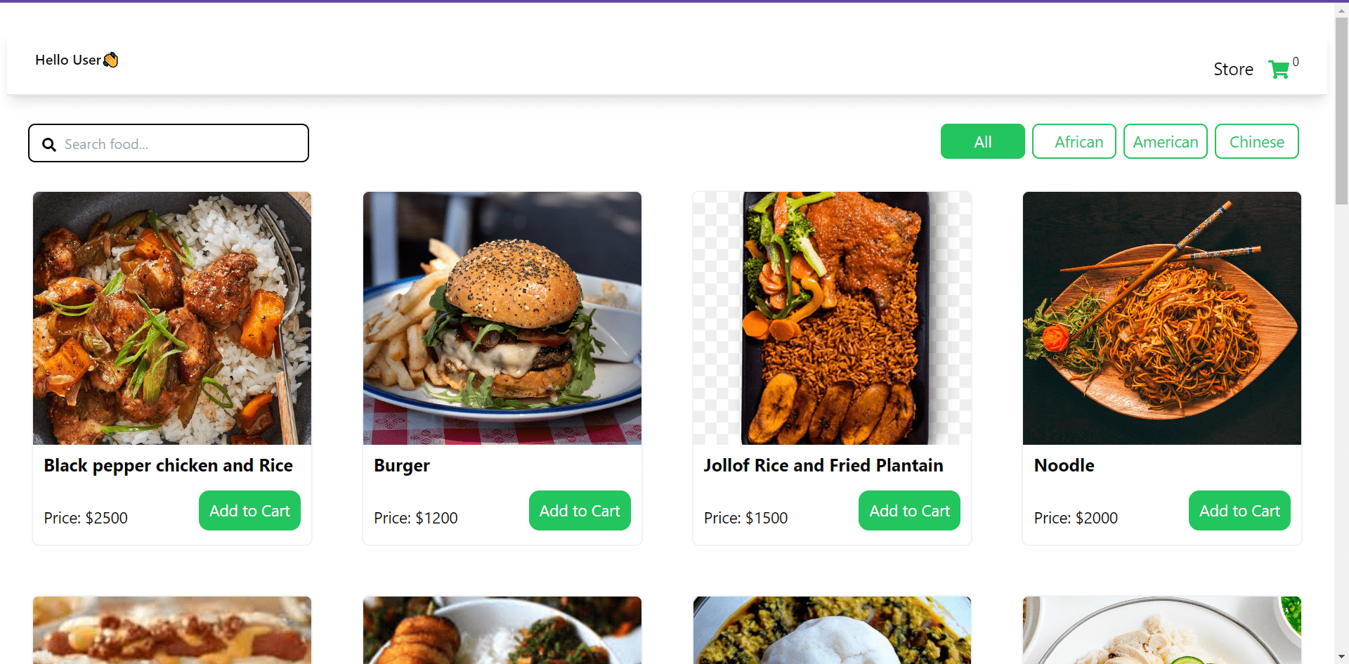
Here’s a quick look at what we’ll be building.
Looks good, right? Well, let’s get started.
Folder structure
In your src folder, create a directory named “Components”. In this components folder, create four files, namely: Cards.tsx, Cart.tsx, TopSect.tsx, and Details.tsx.
Create a file named “data.tsx” in your src directory. This is where the items’ data will be fetched from the app. The main page will be the App.tsx file.
Let’s now dive into the main work of building the application.
The data.tsx file
This file will be located outside the components directory but inside the src folder. It is where the contents of the shopping cards will be contained.
export const list = [
 {
   id: 1,
   name: "Black pepper chicken and Rice",
   price: 2500,
   img: "img/chinese 1.jpeg",
   amount: 1,
   kind: "Chinese",
 },
 {
   id: 2,
   name: "Burger",
   price: 1200,
   img: "img/american 1.jpeg",
   amount: 1,
   kind: "American",
 },
 {
   id: 3,
   name: "Jollof Rice and Fried Plantain",
   price: 1500,
   img: "img/african 1.png",
   amount: 1,
   kind: "African",
 },
 {
   id: 4,
   name: "Noodle",
   price: 2000,
   img: "img/chinese 2.jpeg",
   amount: 1,
   kind: "Chinese",
 },
 {
   id: 5,
   name: "Hot dog",
   price: 1000,
   img: "img/american 2.jpeg",
   amount: 1,
   kind: "American",
 },
 {
   id: 6,
   name: "White Rice and Vegetable Sauce with Plantain",
   price: 1700,
   img: "img/african 2.jpeg",
   amount: 1,
   kind: "African",
 },
 {
   id: 7,
   name: "Fufu and Egusi Soup",
   price: 2000,
   img: "img/african 3.jpg",
   amount: 1,
   kind: "African",
 },
 {
   id: 8,
   name: "Hainanese chicken rice",
   price: 1800,
   img: "img/chinese 3.jpg",
   amount: 1,
   kind: "Chinese",
 },
 {
   id: 9,
   name: "Cobb salad",
   price: 1200,
   img: "img/american 3.jpeg",
   amount: 1,
   kind: "American",
 },
 {
   id: 10,
   name: "Baked Apple Pie",
   price: 1500,
   img: "img/american 4.jpg",
   amount: 1,
   kind: "American",
 },
];
Code explanation of the data component The code snippet above is an array of food items with details, such as food name, price, image, quantity, and category, which will be used to display the food items in our app.
The Details.tsx
This component renders a section with search functionality and buttons for filtering food items by category.
import React, { useState, useEffect } from "react";
import Cards from "./Cards";
import { list } from "../data";
import { FaSearch } from "react-icons/fa";

interface CartItem {
 id: string;
 img: string;
 name: string;
 amount: number;
 price: number;
}

interface DetailsProps {
 handleClick: (item: any) => void;
}

function Details({ handleClick }: DetailsProps) {
 const [category, setCategory] = useState(list);
 const [activeTab, setActiveTab] = useState("All");

 //search functionality
 const [query, setQuery] = useState("");

 //filtering functionality
 const handleBtns = (word: string) => {
   if (word === "All") {
     setCategory(list);
   } else {
     const filtered = list.filter((item) => item.kind === word);
     setCategory(filtered);
   }

   setActiveTab(word);
 };

 return (
   <>
     <section className="container pt-4 mx-auto w-full bg-bgColor">
       <section className="px-6 flex flex-row justify-between">
         <div className="relative w-80 h-11 mt-4">
           <input
             type="text"
             onChange={(event) => setQuery(event.target.value)}
             className="w-full h-full py-4 px-10 text-base text-black rounded-lg border-2 border-black"
             placeholder="Search food..."
           />
           <i>
             <FaSearch className="absolute left-4 top-4 text-lg w-4 h-4 text-center text-black focus:outline-none" />
           </i>
         </div>

         <div className="flex flex-wrap mt-4 lg:mb-4 mb-8">
           <button
             value="All"
             onClick={() => handleBtns("All")}
             className={`mr-2 text-brandColor border-brandColor border-2 py-1 px-6 md:w-24 h-10 rounded-lg text-lg ${
               activeTab === "All"
                 ? "bg-brandColor outline-none text-white"
                 : ""
             }`}
           >
             All
           </button>
           <button
             value="African"
             onClick={() => handleBtns("African")}
             className={`mr-2 text-brandColor border-brandColor border-2 py-1 px-6 md:w-24 h-10 rounded-lg text-lg ${
               activeTab === "African"
                 ? "bg-brandColor outline-none text-white"
                 : ""
             }`}
           >
             African
           </button>
           <button
             value="American"
             onClick={() => handleBtns("American")}
             className={`mr-2 text-brandColor border-brandColor border-2 py-1 md:w-24 h-10 rounded-lg text-lg ${
               activeTab === "American"
                 ? "bg-brandColor outline-none text-white"
                 : ""
             }`}
           >
             American
           </button>
           <button
             value="Chinese"
             onClick={() => handleBtns("Chinese")}
             className={`mr-2 text-brandColor border-brandColor border-2 py-1 md:w-24 h-10 rounded-lg text-lg ${
               activeTab === "Chinese"
                 ? "bg-brandColor outline-none text-white"
                 : ""
             }`}
           >
             Chinese
           </button>
         </div>
       </section>

       <section className="flex flex-row flex-wrap">
         {category
           .filter((name) => {
             if (query === "") {
               return name;
             } else if (
               name.name.toLowerCase().includes(query.toLowerCase())
             ) {
               return name;
             }
           })
           .map((item) => (
             <Cards key={item.id} item={item} handleClick={handleClick} />
           ))}
       </section>
     </section>
   </>
 );
}

export default Details;
Code explanation of the Details component
- Since we’re working with Typescript, all data types must be declared. Hence the interfaces
CartItemandDetailsProps. TheCartItemrepresents the type definition for an item in the cart with properties such as img, id, name, and so on. These properties have already been assigned values in the “data.tsx” file above. TheDetailsPropsinterface represents the type definition for a prop passed to the Details component - a handleClick function. - Next, we set up state variables using the useState hook. It initializes the category with the list array imported from ’../data’ and activeTab with the initial value of ‘All’. The activeTab is for filtering items based on certain criteria - categories.
- For the search functionality, we’ll set a state variable called
queryand a functionsetQueryto manage the state. - The
handleBtnsfunction is defined to handle the button clicks for filtering food items based on their categories. It updates the category state based on the selected category and sets the active tab usingsetActiveTabstate. - Return some lines of JSX code to display the component’s UI. The UI has an input field that implements the search functionality. The search value users input is being managed by the
querystate defined previously. - The
handleBtnsfunction in each button is used to handle the click events of the buttons based on their category, and they are dynamically rendered based on values from the ‘list’ array in the data file. - The
categorystate set above is then filtered based on the search query and mapped to render the “Cards” components for each filtered item. - The
itemandhandleClickprop is passed into the Cards component.
The Cards.tsx component
The Cards component is a reusable card that displays individual food items’ details, including the name, price, and image. It also includes an Add to Cart button that triggers the handleClick function with the corresponding item object when clicked.
interface Item {
 name: string;
 price: number;
 img: string;
}

const Cards = ({
 item,
 handleClick,
}: {
 item: Item,
 handleClick: (item: Item) => void,
}) => {
 const { name, price, img } = item;

 return (
   <>
     <section className="flex flex-row px-6 py-4 lg:w-1/4 w-full">
       <div className="p-1 md:w-1/3 w-1/2 lg:w-full mb-4">
         <div className="h-full border-2 border-gray-200 border-opacity-60 rounded-lg overflow-auto">
           <img
             className="lg:h-72 md:h-36 h-48 w-full object-cover object-center"
             src={img}
             alt="item"
           />
           <div className="px-3 py-2">
             <h1 className="text-xl font-bold mb-3">{name}</h1>
             <div className="flex flex-wrap justify-between mb-2 mt-4">
               <p className="leading-relaxed mt-4 text-lg">Price: ${price}</p>
               <button
                 onClick={() => handleClick(item)}
                 className="bg-brandColor text-white py-2 px-3 text-lg rounded-xl hover:border-2 hover:bg-white hover:text-brandColor hover:border-brandColor"
               >
                 Add to Cart
               </button>
             </div>
           </div>
         </div>
       </div>
     </section>
   </>
 );
};

export default Cards;
Code explanation of the Cards component
- The
Interfaceis used in Typesrcipt to represent the type definition for the individual food items with properties such as “name”, “price,” and “img”. - The component receives two props,
itemandhandleClick, and returns the JSX code to render the component. - The
itemprop is destructured to extract the “name”, “price,” and “img” values. - Next is the JSX code to render the UI of the cards component. This card will contain the food name, the image, and the price of the food defined in the data file. Populate the elements in the card with their corresponding values.
- Next is the Add-to-cart button containing the
handleClickfunction, which when clicked, passes the “item” object as an argument.
The TopSect.tsx file
The TopSect component represents the top section of a UI that displays a greeting message to users, a link that takes users back to the menu page when they are in the cart page, a shopping cart icon that takes users to their cart/shopping list, a number beside the icon to keep count of the items purchased.
import { FaShoppingCart } from "react-icons/fa";

function TopSect({
 setShow,
 size,
}: {
 setShow: (value: boolean) => void,
 size: number,
}) {
 return (
   <>
     <div className="flex justify-between items-center px-8 pt-2 pb-4 sticky w-full top-0 z-50 bg-white shadow-lg border-b-[2px]">
       <div className="flex justify-center items-center relative">
         <p className="font-semibold text-base text-black">Hello User👋</p>
       </div>

       <div className="flex flex-row flex-wrap text-black">
         <p
           onClick={() => setShow(true)}
           className="text-xl mt-5 mr-4 hover:text-brandColor hover:underline cursor-pointer"
         >
           Store
         </p>
         <span
           className="text-brandColor text-xl cursor-pointer"
           onClick={() => setShow(false)}
         >
           <FaShoppingCart className="text-2xl mt-6" />
         </span>
         <p className="mt-4 ml-1 text-sm">{size}</p>
       </div>
     </div>
   </>
 );
}

export default TopSect;
Code explanation of the TopSect component
- This component receives props
setShowandsizeand returns the JSX code for rendering the component. - Next is the JSX code that displays the UI of this top section.
- A div element that contains the store link and an icon to display the cart page. The
onClickevent handlers are attached to the store link and shopping cart icon to trigger the correspondingsetShowfunction when clicked. That is, when users click the icon, it takes them to their cart. When on their cart page and they click the store link, it takes them back to the menu page/store where they can add more items to their cart. - There is also a count
sizefunction beside the cart icon that displays how many items users have added to their cart.
Cart.tsx component
The Cart component represents the shopping cart feature that allows users to add, remove, and update items in the cart. It also provides a checkout option using the react-paystack library.
Here, you’ll need a Paystack API key to implement the Paystack integration. Head over to the Paystck website, sign up, or log in if you already have an account on Paystack.
To get your own API key, go to your dashboard. Click the “Settings” option on the left-hand panel, select the “Api Keys and webhooks” tab, and you’ll see API configuration information for live mode(top section) and test mode(section below). Since we’re testing the app, copy out the “Test Public Key” and keep it safe.
Now head over to your component and paste these lines of code below into the component.
import React, { useState, useEffect } from "react";
import { FaTrash } from "react-icons/fa";
import { ToastContainer, toast } from 'react-toastify';
import 'react-toastify/dist/ReactToastify.css';
import { usePaystackPayment } from 'react-paystack';

interface CartItem {
 id: string;
 img: string;
 name: string;
 amount: number;
 price: number;
}

interface CartProps {
 cart: CartItem[];
 setCart: React.Dispatch<React.SetStateAction<CartItem[]>>;
 handleChange: (item: CartItem, value: number) => void;
}

const Cart = ({ cart, setCart, handleChange }: CartProps) => {
 const [price, setPrice] = useState(0);

 const handleRemove = (id: string) => {
   const arr = cart.filter((item) => item.id !== id);
   setCart(arr);
   handlePrice();
   toast.error("Item removed from cart", {
     position: "top-center",
     autoClose: 1000,
     hideProgressBar: false,
     closeOnClick: true,
     pauseOnHover: true,
     draggable: true,
     progress: undefined,
     theme: "light",
   });
 };

 const handlePrice = () => {
   let ans = 0;
   cart.forEach((item) => (ans += item.amount * item.price));
   setPrice(ans);
 };

 useEffect(() => {
   handlePrice();
 }, [cart]);


 const config = {
   reference: (new Date()).getTime().toString(),
   email: "email-linked-to-your-paystack-account",
   publicKey: 'your-public-key',
 };

 const onSuccess = (reference: any) => {
   toast.success("Payment successfully completed");
 };

 const onClose = () => {
   toast.error("Your payment was unsuccessful, try again later!");
 }

 const initializePayment = usePaystackPayment({
   ...config,
   amount: price * 100,
 });

 return (
   <>
     <section className="w-full align-center text-black items-center mx-auto container flex justify-center">
       <section className="mt-8 px-2">
         {cart.length === 0 ? (
           <div className="container mx-auto justify-center">
             <p className="text-center font-semibold text-xl">Nothing in cart yet</p>
           </div>

         ) : (
           cart.map((item) => (
             <div className="flex items-center justify-between mt-10 pb-2 border-b-2" key={item.id}>
               <div className="flex w-80">
                 <img src={item.img} alt="" className="w-20 h-16" />
                 <p className="font-bold ml-5 mt-4">{item.name}</p>
               </div>
               <div className="flex items-center justify-between pb-2 mt-2">
                 <button className="px-2.5 py-1.5 text-lg font-bold mr-1.5" onClick={() => handleChange(item, -1)}>
                   -
                 </button>
                 <button>{item.amount}</button>
                 <button className="px-2.5 py-1.5 text-lg font-bold mr-1.5" onClick={() => handleChange(item, 1)}>
                   +
                 </button>
               </div>
               <div>
                 <span className="text-brandColor py-1.5 px-2.5 rounded-lg mr-2.5"> $ {item.price}</span>
                 <button
                   className="py-2 px-2.5 font-semibold bg-red-100 rounded-lg cursor-pointer text-red-500 hover:text-red-600"
                   onClick={() => handleRemove(item.id)}
                 >
                   <FaTrash title="Remove from cart" />
                 </button>
               </div>
             </div>
           ))
         )}
         {cart.length > 0 && (
           <>
             <div className="flex justify-between mt-8">
               <span className="text-lg font-semibold">Total price :</span>
               <span className="text-lg font-semibold text-brandColor">  ${price}</span>
             </div>
             <section className="flex justify-between mt-12">
               <button onClick={() => initializePayment(onSuccess as any, onClose)} className="bg-brandColor text-white py-2 px-4 text-lg w-full rounded-xl hover:border-2 hover:bg-white hover:text-brandColor hover:border-brandColor">Checkout</button>
             </section>
           </>
         )}
       </section>
     </section>
     <ToastContainer />
   </>
 );
};

export default Cart;
Code explanation
- The
CartIteminterface represents the type definition for the item in the cart that has the properties; id, img, name, amount, and price. - The 2nd interface,
CartPropsrepresents the type definition for the props passed to the Cart component, which includescart,setCart, andhandleChangefunctions. - This component receives the
cart,setCart, andhandleChangeprops and returns the JSX code for rendering the component. - Define a state variable -
priceand set the value to zero. - The
handleRemovefunction is defined to remove an item from the cart. It filters the cart array based on the provided id, updates the cart state, and triggers a toast notification to indicate that an item has been removed from the cart. - The
handlePricefunction calculates the total price of the items in the cart by iterating through the cart array and updating the price state variable. - The useEffect hook is used to call the
handlePricefunction whenever the cart state changes. - Next step is to integrate the Paystack API into the app when users want to check out items in their cart.
- The config object contains the configuration options required for the PayStack payment functionality. The options include the email address associated with your Paystack account and the text public key you previously copied out.
- The
onSuccessandonClosefunctions are defined to handle the payment success and closure events. These functions come in-built with Paystack. A toast notification message is displayed based on the success or failure, or closure of the payment. - Define the
initializePaymentfunction using the usePaystackPayment hook, pass the config object, and the calculated total price (price * 100). The amount will be in the lowest currency unit. - Next is to write the JSX code that will render the cart UI.
- We then set a conditional statement that renders a simple text “Nothing in cart yet” when users haven’t added anything to their cart. This component, on the other hand, renders the cart content when an item is added to the cart displaying the item image, title, quantity, price, and a delete button.
- The
handleChangefunction is called when the ”+” or ”-” buttons are clicked to increase or decrease the item quantity in the cart. - The total price of items in the cart is then displayed below the cart items.
- Call the
initializePaymentfunction when the Checkout button is clicked to initiate the payment process with Paystack.
App.tsx component
This is the main function component that represents the entire application. It is the main page where all the components will be displayed. The TopSect UI is displayed here, and it also manages the visibility of the Details and Cart sections based on the show state. You need to import the three components at the top.
import React, { useState } from "react";
import { ToastContainer, toast } from 'react-toastify';
import 'react-toastify/dist/ReactToastify.css';
import Details from "./Components/Details";
import TopSect from "./Components/TopSect";
import Cart from "./Components/Cart";

const App = () => {
 const [show, setShow] = useState(true);
 const [cart, setCart] = useState<any[]>([]);

 const handleClick = (item: any) => {
   if (cart.some((cartItem) => cartItem.id === item.id)) return;
   setCart([...cart, item]);
   toast.success('Item has been added to cart', {
     position: "top-center",
     autoClose: 2000,
     hideProgressBar: false,
     closeOnClick: true,
     pauseOnHover: true,
     draggable: true,
     progress: undefined,
     theme: "light",
   });
 };

 const handleChange = (item: any, d: number) => {
   setCart((prevCart) =>
     prevCart.map((cartItem) => {
       if (cartItem.id === item.id) {
         const updatedAmount = cartItem.amount + d;
         return { ...cartItem, amount: updatedAmount > 0 ? updatedAmount : 1 };
       }
       return cartItem;
     })
   );
 };

 return (
   <>
     <section className="flex flex-col px-2 pt-8 w-full bg-bgColor">
       <React.Fragment>
         <TopSect setShow={setShow} size={cart.length} />
         {show ? (
           <Details handleClick={handleClick} />
         ) : (
           <Cart cart={cart} setCart={setCart} handleChange={handleChange} />
         )}
       </React.Fragment>
     </section>
     <ToastContainer />
   </>
 );
};

export default App;- Contained in this component is the
showstate variable that is set up to manage the visibility of the Cart and Details section. - The
cartstate variable is also set up to manage the items in the shopping cart. - The
handleClickfunction is defined to handle the addition of items to the cart. It checks to see if the item already exists in the cart and returns if it does. If it does not exist in the cart, it adds the item to the cart using the spread operator and triggers a toast notification to indicate the successful addition. - The
handleChangefunction is defined to handle the quantity changes of items in the cart. It updates the cart state based on the changes(increase or decrease) in the item’s quantity. - Then comes the JSX code to render the App component UI. The UI consists of the TopSect component, which is rendered with the
setShowandsizeprops. - The
sizeprop represents the number of items in the cart. While thesetShowprop is used to toggle between the Details and Cart sections. This means that depending on theshowstate, either the Details or Cart component is rendered.
Notice how I took the liberty of inserting Tailwind CSS styles in each of these code components to keep the app from looking boring.
After you’ve written all of these lines of code, your app should begin to function normally. The App component is rendered when you start your development server with the npm start command. Users will see a list of food items together with the food name, an image of the food to enhance visuals, the price of the food, and an Add-to-cart button.
Users can use the search input form to look for a meal of their choice. There are additional tools to filter food alternatives by American, African, and Chinese cuisines.
Here’s a little demonstration.
When a customer clicks the Add-to-Cart button on each food item card, the count status beside the cart icon increases. When users click the cart icon to view their cart, the cart page opens, allowing them to increase or reduce the amount of food being purchased. They can remove a specific food item from their cart and go to the payment screen. When customers click the Checkout button, the Paystack option appears, allowing them to choose a payment method that will charge them the fee, which will then be credited to your Paystack account. The transaction details will also be emailed to the email connected to your Paystack account.
NB: In this particular demo, no real money was sent because the Paystack API key being used is the public key for test mode. You have to switch the API key to production or live mode when you’re ready to deploy. Don’t forget to hide your API key before pushing it to GitHub. The price in this example is in my local currency. That’s all there is to it. You can add more food items to your data or fetch food items from a third-party API without having to create your own mock API like I did.
Happy Coding!
Understand every bug
Uncover frustrations, understand bugs and fix slowdowns like never before with OpenReplay — the open-source session replay tool for developers. Self-host it in minutes, and have complete control over your customer data. Check our GitHub repo and join the thousands of developers in our community.
