An Introduction to Native Web Components
Implement components using standard HTML, without the need for a framework

Popular JavaScript frameworks released in the past decade often use the concept of “components”. These are simple, encapsulated modules with a single responsibility that you can combine to create complex web applications. A framework component may wrap HTML, CSS, and JavaScript in a single file isolated from other components, so styles and functionality should not clash on a single page.
Framework-based components have some downsides:
-
You must learn that framework and update your code as it evolves. This is not always easy: ask anyone upgrading from Angular 1.
-
Frameworks rise and fall. Will the choice you make today still be viable next year? Perhaps next month, given the rapid evolution of JavaScript projects and techniques?
-
Components developed for one framework are not compatible with others. Even if they don’t conflict, loading both frameworks affects page performance.
-
A framework can only implement what’s possible in JavaScript today. Features such as a truly isolated (shadow) DOM are impossible.
What Are Native Web Components?
Native browser web components provide a way to create encapsulated, single-responsibility, custom functionality that can be used with or without a framework. In other words, you can create your own HTML tags, such as <hello-world>.
It’s best explained by considering an existing HTML element such as <video>. This plays a media file and provides user controls to play, pause, rewind, fast forward, adjust volume, etc. Internally, these controls are child HTML elements such as <button> and <div> with styling and event handlers applied.
You can control a <video> by setting attributes in HTML or DOM properties in JavaScript, such as autoplay to start playing automatically, poster to define a thumbnail image, or width and height to set dimensions. The inner HTML of the element cannot be directly inspected or changed: it’s contained in a Shadow DOM and isolated from the rest of the page. You can place any number of <video> elements on a page: each is configurable, but one video will not conflict with the operation of another.
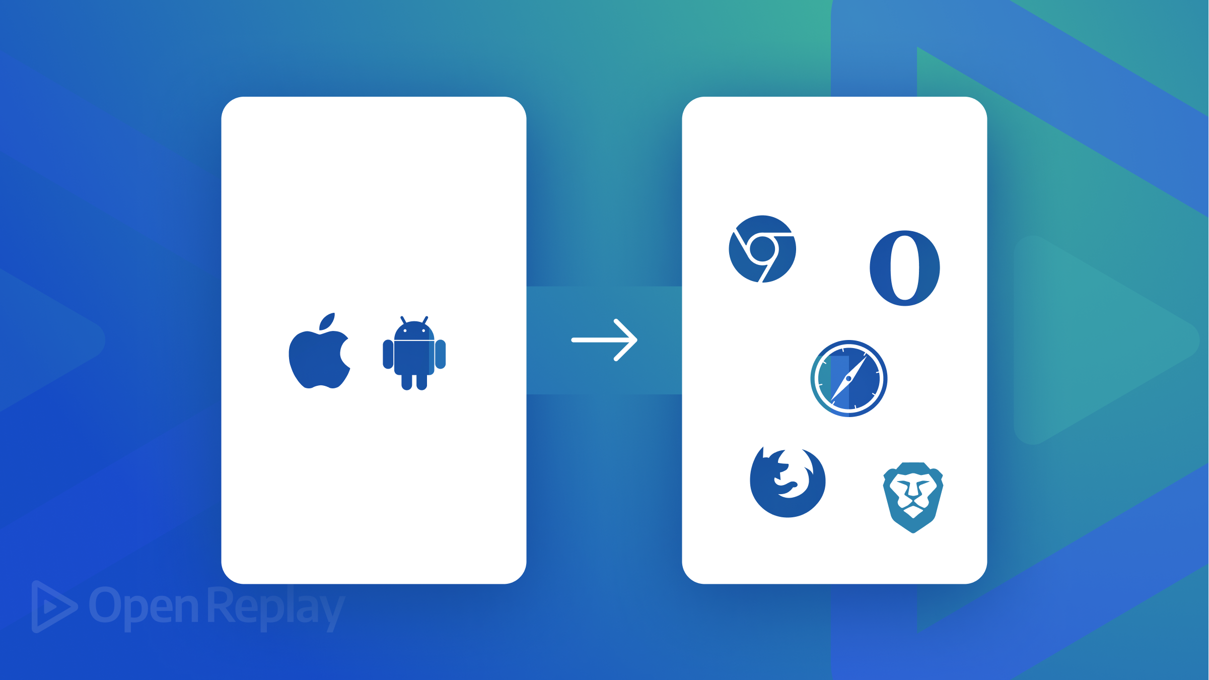
This behavior is available to your own controls in native web components. The concepts were first introduced by Alex Russell at the Fronteers Conference in 2011. Google’s Polymer library polyfill appeared in 2013, and initial implementations arrived in Chrome and Safari in 2016. More time elapsed while details were negotiated, but web components finally appeared in Firefox in 2018 and Edge in 2020 when Microsoft switched to the Chromium engine. They’re now a web standard.
Browser support for web components is excellent, but, understandably, few developers have been willing or able to adopt them, given the time it’s taken and the ubiquity of frameworks like React. You may be unwilling to dump your favorite framework, but web components are viable and compatible with them all.
The following repositories provide a range of pre-built web components:
- WebComponents.org
- The Component Gallery
- generic-components
- web-components-examples
- awesome-standalones
- accessible components
- Kickstand UI
This tutorial introduces web components you can write without a JavaScript framework. Reasonable knowledge of HTML5, CSS, and JavaScript is essential.
Your First Web Component
Web components are custom HTML elements such as <hello-world></hello-world>. The name must contain a dash to ensure it will never clash with built-in future HTML elements. The closing element is also required even when is no inner content.
You must define an ES2015 class to control the element. Use any name you like, but a camel-case version of the element name is common practice, e.g., HelloWorld. It must extend the HTMLElement interface, representing all HTML elements’ default properties and methods.
(Note that Firefox permits extending specific HTML elements such as HTMLParagraphElement, HTMLImageElement, and HTMLButtonElement but this is not supported in other browsers.)
The class requires a method named connectedCallback(), which executes when the element is added to the HTML document. Assuming you’re using ES modules, that occurs when the DOM content is ready:
class HelloWorld extends HTMLElement {

  // connect component
  connectedCallback() {
    this.textContent = 'Hello World!';
  }

}
The code above sets the element’s text to “Hello World”.
You must register a web component class in the CustomElementRegistry as the handler an HTML element:
// use HelloWorld class for <hello-world> component
customElements.define( 'hello-world', HelloWorld );
If your JavaScript code is contained in hello-world.js, the new component can be added to any HTML page:
<!-- load web component code -->
<script type="module" src="./hello-world.js"></script>

<!-- use web component -->
<hello-world></hello-world>
View the <hello-world> demonstration…
Like any other element, you can style a web component with CSS:
hello-world {
  font-weight: bold;
  color: red;
}
Attribute Handling
The <hello-world> component outputs the same content every time. You can add HTML attributes to make it more useful. This example outputs “Hello Craig!”:
<hello-world name="Craig"></hello-world>The HelloWorld class can use a constructor() function, which executes when creating an object of that type. It must:
- call the
super()method to execute the parent HTMLElement constructor, and - run other initialization code. In this case, set a
nameproperty to “World” by default.
class HelloWorld extends HTMLElement {

  constructor() {
    super();
    this.name = 'World';
  }

  // more code...
Now add a static observedAttributes() property which returns an array of attributes to observe:
// component attributes
static get observedAttributes() {
  return ['name'];
}
The browser calls an attributeChangedCallback() handler when setting the name attribute in HTML or using the JavaScript setAttribute() function. The function receives the property name, old value, and new value — the code below sets it as an object .name property for easier use:
// attribute change
attributeChangedCallback(property, oldValue, newValue) {

  if (oldValue === newValue) return;
  this[ property ] = newValue;

}
You now need to edit the connectedCallback() method to use the name in the output message:
// connect component
connectedCallback() {

  this.textContent = `Hello ${ this.name }!`;

}
View the <hello-world name="Craig"> demonstration…
Other Lifecycle Methods
The browser can call one of six handler methods depending on the current state of the web component:
constructor()- Called when creating the component object. It must callsuper()and typically sets defaults or executes other pre-rendering processes.static observedAttributes()- Sets an array of attribute names that triggerattributeChangedCallback()when changed.attributeChangedCallback(propertyName, oldValue, newValue)- The handler called when changing an observed attribute. The function may need to trigger a re-render when this occurs.connectedCallback()- The handler called when adding the web component to the document. It typically renders the output.disconnectedCallback()- The handler called when removing the web component from the document. It typically runs clean-up operations such as aborting in-flightFetch()requests.adoptedCallback()- The handler called when moving a web component from one document to another.
Using the Shadow DOM
Any CSS or JavaScript outside our class could change the output rendered by the <hello-world> components. Styles defined inside the component could also leak into other HTML elements.
To solve this problem, a Shadow DOM can isolate the inner web component elements from the page’s Document Object Model (DOM). You can use it within the connectedCallback() function:
connectedCallback() {

  // create a Shadow DOM
  const shadow = this.attachShadow({ mode: 'closed' });

  // add elements to the Shadow DOM
  shadow.innerHTML = `
    <style>
      p {
        text-align: center;
        font-weight: normal;
        padding: 1em;
        margin: 0 0 2em 0;
        background-color: #eee;
        border: 1px solid #666;
      }
    </style>

    <p>Hello ${ this.name }!</p>`;

}
The mode can be either:
-
'open': code outside the class can access the component’s Shadow DOM usingElement.shadowRoot, or -
'closed': you can only manipulate the Shadow DOM within the web component class. Note that some CSS styles such asfont-family,background-color, andcolorwill cascade into the component like any other HTML element.
View the <hello-world> Shadow DOM demonstration…
In this example, styles and functionality explicitly scoped within the web component cannot be overridden. The web component’s styles will not affect other components.
Note that the CSS :host selector can style the outer <hello-world> element within the component:
:host {
  transform: rotate(180deg);
}
You can also set styles when the element uses a specific attribute or class, e.g. <hello-world class="rotate90">:
:host(.rotate90) {
  transform: rotate(90deg);
}
Using HTML Templates
Building complex HTML structures with strings or DOM manipulation can become impractical. You can define HTML within <template> elements to use in a web component. This allows you to:
- change HTML without having to rewrite JavaScript classes.
- create variations of the same web component without requiring new JavaScript classes, and
- edit HTML within HTML returned by the client or server.
The following <template> example sets styles and paragraphs to use inside the web component. It’s given an ID so you can reference it when rendering:
<template id="hello-world">

  <style>
    p {
      text-align: center;
      font-weight: normal;
      padding: 0.5em;
      margin: 1px 0;
      background-color: #eee;
      border: 1px solid #666;
    }
  </style>

  <p class="hw-text"></p>
  <p class="hw-text"></p>
  <p class="hw-text"></p>

</template>
The connectedCallback() function can access this template, get its contents, clone the child elements, and add a unique DOM fragment to the Shadow DOM:
connectedCallback() {

  const
    shadow = this.attachShadow({ mode: 'closed' }),

    // clone template into DOM fragment
    template = document.getElementById('hello-world').content.cloneNode(true),
    hwMsg = `Hello ${ this.name }`;

  // change message on all paragraphs
  Array.from( template.querySelectorAll('.hw-text') )
    .forEach( n => n.textContent = hwMsg );

  // append fragment to Shadow DOM
  shadow.append( template );

}
View the <hello-world> template demonstration…
Using Template Slots
You can customize templates using slots defined in the web component HTML. For example, you could define a <hello-world> element with an <h1> heading that sets a slot attribute:
<hello-world name="Craig">

  <h1 slot="msgtext">Hello Default!</h1>

</hello-world>
You could optionally add additional elements such as paragraphs:
<hello-world name="Craig">

  <h1 slot="msgtext">Hello Default!</h1>
  <p>This text will become part of the component.</p>

</hello-world>
You can reference these slots in an HTML <template>:
<template id="hello-world">

  <slot name="msgtext" class="hw-text"></slot>

  <slot></slot>

</template>
The following occurs:
-
The
<slot name="msgtext">placeholder inserts any element with aslotattribute set to"msgtext"(the<h1>). -
The
<slot>placeholder inserts the next unnamed element (the<p>).
The template therefore becomes:
<template id="hello-world">

  <slot name="msgtext" class="hw-text">
    <h1 slot="msgtext">Hello Default!</h1>
  </slot>

  <slot>
    <p>This text will become part of the component.</p>
  </slot>

</template>
Note that each <slot> element inside the component’s Shadow DOM does not contain child nodes. You can access them by locating the <slot> node and using its .assignedNodes() method to return an array of child elements:
connectedCallback() {

  const
    shadow = this.attachShadow({ mode: 'closed' }),
    hwMsg = `Hello ${ this.name }`;

  // append template to shadow DOM
  shadow.append(
    document.getElementById('hello-world').content.cloneNode(true)
  );

  // find all slots with a hw-text class
  Array.from( shadow.querySelectorAll('slot.hw-text') )

    // update first assignedNode in slot
    .forEach( n => n.assignedNodes()[0].textContent = hwMsg );

}
View the <hello-world> template slot demonstration…
Note you cannot directly style slotted child elements. You must target specific slots and set styles to cascade through, e.g.
<template id="hello-world">

  <style>
    slot { color: red; }
    slot[name="msgtext"] { color: green; }
  </style>

  <slot name="msgtext" class="hw-text"></slot>
  <slot></slot>

</template>
One benefit of slots is that content renders before JavaScript runs (or if it fails to download and execute). The example above shows a default heading and paragraph, and, assuming nothing goes wrong, your JavaScript can progressively enhance the output.
Using the Declarative Shadow DOM
The experimental declarative Shadow DOM in Chrome-based browsers allows server-side rendering before JavaScript rendering occurs. This can improve perceived performance, permit hydration-like techniques, and prevent layout shifts or flashes of unstyled content.
The browser creates an identical Shadow DOM to that shown above when it supports the declarative Shadow DOM:
<hello-world name="Craig">

  <template shadowroot="closed">
    <slot name="msgtext" class="hw-text"></slot>
    <slot></slot>
  </template>

  <h1 slot="msgtext">Hello Default!</h1>
  <p>This text will become part of the component.</p>

</hello-world>
The feature is not available in Firefox or Safari yet, although they will still render using JavaScript. See Declarative Shadow DOM for more information.
Handling Shadow DOM Events
Your web component can attach event handlers to any element in the Shadow DOM in the same way you would in a page, e.g.
const shadow = this.attachShadow({ mode: 'closed' });

shadow.addEventListener('click', e => {

  // user clicked web component

});
Unless you run the stopPropagation() method, the event will bubble up to the page DOM. However, the event object is retargeted, so it appears to emit from your custom element rather than a child Shadow DOM element.
Open Source Session Replay
OpenReplay is an open-source, session replay suite that lets you see what users do on your web app, helping you troubleshoot issues faster. OpenReplay is self-hosted for full control over your data. Start enjoying your debugging experience - start using OpenReplay for free.
Using Web Components in Other Frameworks
All JavaScript frameworks support native web components. Frameworks do not know or care about HTML elements, so <hello-world> activates as soon you place it into the page DOM. You could render it from JSX returned from a React component:
// React libraries
import { StrictMode } from 'react';
import { createRoot } from 'react-dom/client';

// web component class
import from './hello-world.js';

const
  rootElement = document.getElementById('root'),
  root = createRoot(rootElement);

root.render(
  <StrictMode>
    <hello-world name="Craig"></hello-world>
  </StrictMode>
);
Most frameworks have full support for web components. React has some limitations:
- You can only pass primitive data types to HTML attributes — not arrays and objects.
- You cannot listen for web component events and must attach your own handlers.
Web Component Gotchas
Native web components incur development challenges you may not have encountered with frameworks. For example:
- poor support for server-side and declarative Shadow DOM rendering
- no framework-like magic such as data binding, and
- few development tools. You’re on your own with vanilla JavaScript.
The following sections highlight some difficulties with potential solutions.
Configurable Styles
You often want to override scoped web component styles. You could accept this restriction, although there are workarounds such as:
- Do not use the Shadow DOM - This would permit inner element modification and styling but removes the safeguards. Other JavaScript or CSS code could accidentally or intentionally modify your component.
- Use
:hostclasses - Your scoped CSS can apply styles according toclassattribute options (as described above). - Use CSS custom properties - Custom properties (CSS variables) cascade into web components. Your scoped CSS can reference a variable such as
--my-color: #f00;set in an outer container up to the:root. - Use shadow parts - Web components can expose specific elements with a
partattribute, e.g.<h1 part="heading">. You can target this element in page CSShello-world::part(heading)and style it accordingly. - Pass styles to component attributes - You could permit one or more web component attributes that apply content directly (and somewhat dangerously) into an inner
<style>.
No solution is perfect, but consider how other users may want to customize your component.
Handling Form Inputs
Shadow DOM <input>, <textarea>, and <select> fields are not associated with an outer form containing your web component. You can either:
- Add hidden fields to the page DOM, which update when fields change. This may be difficult when using more than one web component of the same type.
- Intercept the form submit event and use the FormData interface to add, remove, or modify values. This is only possible if form submission occurs.
- Use the ElementInternals interface to add custom values and validity checks to a form. This has good support in all browsers except Safari, although a polyfill is available.
Consider an <input-age> web component with an inner <input type="number"> in its shadow DOM. The class must set a static formAssociated property to true and provide an optional formAssociatedCallback() method which executes when an outer form registers:
class InputAge extends HTMLElement {

  static formAssociated = true;

  formAssociatedCallback(form) {
    console.log('form associated:', form.id);
  }
The constructor must run an attachInternals() method to allow the component to communicate with the form and let other JavaScript code inspect values or validation criteria:
  constructor() {
    super();
    this.internals = this.attachInternals();
    this.setValue('');
  }

  // set form value
  setValue(v) {
    this.value = v;
    this.internals.setFormValue(v);
  }
The ElementInternal setFormValue() method sets the element’s value for the parent form. The code above defines a single empty string but you can also pass a FormData object with multiple name/value pairs. Other ElementInternal properties and methods include:
form: the parent form nodelabels: an array of elements that label the component- Constraint Validation API options such as
willValidate,checkValidity, andvalidationMessage.
The connectedCallback() method creates a Shadow DOM as before, but it must also monitor internal form fields and call setValue() when changes occur:
  connectedCallback() {

    const shadow = this.attachShadow({ mode: 'closed' });

    shadow.innerHTML = `
      <style>input { width: 4em; }</style>
      <input type="number" placeholder="age" min="18" max="120" />`;

    // input value change
    shadow.querySelector('input').addEventListener('input', e => {
      this.setValue(e.target.value);
    });

  }
You can use the web component in any form where it acts much like a native field:
<form id="myform">

  <input type="text" name="your-name" placeholder="name" />
  <input-age></input-age>

  <button>submit</button>

</form>
View the ElementInternals form demonstration…
For more information, refer to More capable form controls.
Binding Attributes and Properties
Web component HTML attributes and JavaScript class properties are separate entities. Consider this component:
<my-component id="myc" name="Craig" job-title="developer"></my-component>You can inspect or change an attribute:
const myc = document.getElementById('myc');

myc.getAttribute('name'); // Craig
myc.setAttribute('job-title', 'author');
But it’s not possible to reference equivalent object properties:
const myc = document.getElementById('myc');

myc.name; // undefined
myc.jobTitle = 'author'; // does nothing
This can make rendering more complex. You must use:
connectedCallback() {
  const
    name = this.getAttribute('name'),
    jobTitle = this.getAttribute('job-title');

  this.textContent = `${ name } is a ${ jobTitle }.`;
}
rather than the simpler:
connectedCallback() {
  this.textContent = `${ this.name } is a ${ this.jobTitle }.`;
}
Fortunately, we can bind attributes and properties together, so it’s possible to use either interchangeably. The class requires a private #camelCase() method to convert kebab case attributes (lowercase with or without hyphens) to camel case properties (mixed case without hyphens):
// component class
class MyComponent extends HTMLElement {

  static get observedAttributes() {
    return ['name', 'job-title'];
  }

  // convert camel-case attribute to camelCase property
  #attrToProp = {}; // camelCase cache
  #camelCase(attr) {

    let prop = this.#attrToProp[attr];

    if (!prop) {
      let np = attr.split('-');
      prop = [ np.shift(), ...np.map(n => n[0].toUpperCase() + n.slice(1)) ].join('');
      this.#attrToProp[attr] = prop;
    }

    return prop;

  }

}
The private #attrToProp object stores previous conversions, so it’s only necessary to calculate them once.
A private #defineProperties() method defines property setters and getters for the observedAttributes, which fetch and update attributes:
  // set/get attribute when property is used
  #defineProperties() {

    const attributes = new Set([...this.constructor.observedAttributes]);
    attributes.forEach(attr => {

      Object.defineProperty(this, this.#camelCase(attr), {
        set: value => { this.setAttribute( attr, value ); },
        get: () => this.getAttribute( attr )
      });

    });

  }
Call this method in the constructor:
  constructor() {
    super();
    this.#defineProperties();
  }
Create a private #render() method to update the output using the more convenient property names:
  #render() {
    this.textContent = `${ this.name } is a ${ this.jobTitle }.`;
  }
Then call it within the attributeChangedCallback() and connectedCallback() methods:
  attributeChangedCallback(property, valueOld, value) {
    if (value == valueOld) return;
    this.#render();
  }

  connectedCallback() {
    this.#render();
  }
View the web component data binding demonstration…
Experiment by opening the Codepen console and getting a reference to the component at the > prompt:
const myc = document.getElementById('myc');You can examine values using properties or attributes:
myc.name; // Craig
myc.getAttribute('name'); // Craig

myc.jobTitle; // developer
myc.getAttribute('job-title'); // developer
Similarly, you can update values using properties or attributes:
myc.name = 'Alice';
myc.setAttribute('name', 'Bob');

myc.jobTitle = 'author';
myc.setAttribute('job-title', 'book keeper');
Either option re-renders the output because the attributeChangedCallback() method executes. You have implemented one-way data binding in an identical manner to popular JavaScript frameworks!
Conclusion
Native web components took some time to arrive and may seem clunky compared to JavaScript frameworks that provide tools and built-in functionality. You may not want to drop React, Vue, or Svelte yet, but native components offer some compelling advantages:
-
They’re framework-agnostic. You can adopt web components today and use them within frameworks or vanilla JavaScript projects.
-
Web components are lightweight, fast, and genuinely isolated from the page via the Shadow DOM (frameworks take avoiding action against conflicts and may not always be successful).
-
Web component support should continue for decades because browser vendors avoid breaking the web. Can the same be said for any framework?
There are issues to iron out, but web components are the future. The next generation of tools and frameworks will exploit and enhance web component functionality, so I recommend you try them now.
A TIP FROM THE EDITOR: For more on templates, do not miss our Understanding The Template Element In HTML article.