An Introduction to React Portals
Use this new React feature for greater flexibility placing components


According to Merriam-Webster’s dictionary, a portal is a door or a gateway to let something or someone inside. In layman’s terms, you can refer to React Portals as a door or a gateway that paves the way for some sort of component to pass through safely without bothering other components. This article will explain everything about the
<Portal>component and how to use it in your code.
To illustrate portals, I’d like to use an analogy. Consider a large container named “KITCHEN TOOLS” containing various kitchen utensils such as knives, plates, spoons, and frying pans. Among all the utensils in the box, you have a special one - a blender. Let’s say you saved up some money to purchase this blender because of how powerful and helpful it is while preparing different dishes. This blender is precious to you, and you want to ensure it stays safe and doesn’t get damaged at any cost. You realize that leaving your special blender inside the same box with all the other kitchen utensils and using them together might cause damage while trying to cook. You want to ensure that your blender remains safe whenever you need it. You create a special section inside your Kitchen Tools box and carefully place the blender in it. Now, you have separated the blender from the rest of the kitchen utensils. Now, when you’re cooking with the other utensils and want to use the blender, you don’t have to worry about it getting damaged or not functioning correctly. The blender exists in its separate section and can be used independently of other kitchen utensils.
Let’s now consider this scenario in the context of web development using React as a JavaScript framework. The big Kitchen Tools box represents the DOM (Document Object Model) in this analogy. The DOM includes all the elements that make up a particular web page. Inside the DOM, we have the root element.
<div id="root"></div>;When working with React, there is a global parent component represented by the “App Component”, and it serves as the global parent component for all other components in the application. The root element contains all the code written in our App component, and every other component created in our React application falls under the App component. You can think of the root div as “DOM tree 1” .It is considered a tree, as it will have other branches under it, just like a family tree.
This article aims to teach you how to break out of the “DOM Tree 1” and create another DOM node, which you can call “DOM Tree 2”. In the same way that we have the App component and its children under “DOM node 1”, forming the DOM Tree 1, we can create another component and place it under “DOM node 2” to form the DOM Tree 2.
Importance of Understanding the React Portal
The main purpose of using React Portals is to render components onto the webpage that may be in the form of an overlay, like in the case of creating modals.
Modals are usually displayed on top of other contents of the application. If not implemented properly, the developer may face accessibility issues with people using screen readers or other assistive technologies. For example, it might be difficult for them to navigate the modal using keyboard-only commands.
The styles from the other components on the webpage may affect the styles of the modal or vice versa, which will cause layout and appearance issues, eventually leading to a poor user experience and poor user interface.
Modals created without portals could often lead to slow performance of the application. This is because the modal is rendered as a child component without a portal. Whenever the parent component is being updated, the modal component and its child elements must also be re-rendered, regardless of whether the modal will be used at that time or not.
Using React Portals ensures that the modal is only rendered when needed, leading to better application performance.
- At initial render, when the modal is first mounted in the DOM
- When the modal is opened.
- When the modal is closed.
- If the state of the modal changes.
- If props are passed to the modal changes.
Without React Portals, unnecessary re-renders would occur, leading to slow performance in our application.
Components that may likely act as an overlay on the main content of the page at specific points in time in our application must be created outside of the “DOM node 1” to avoid running into bugs and unwarranted issues.
Components that may require the use of Portals include:
- Modals
- Tooltips
- Dropdown menus
- Drag and drop interfaces
- Video and audio players
It is our job as developers to make sure that the following components above are very accessible at any point and do not conflict with the content of the application, hence the use of React Portals.
As stated earlier in the article, think of React Portals as a gateway that opens up and lets you take a child component from its “DOMNode 1” to “DOMNode 2”, so that it can be independent and not be affected by the rest of the components. The same way we wanted our favorite kitchen utensils,“The Blender”, to stay independent of the other kitchen utensils.
Set up the Development Environment
- You need to already have node.js installed on your local computer.
- Create a react application using a tool such as create-react- app or Vite.
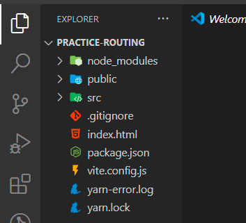
- After successfully creating the React application, you should get a default file like this. Now you are ready to create your component.
Creating a Modal without React Portal
Step 1:
Create a Modal Component
With the React application already created. The next step is to create a modal component which will include all the content you would want inside your modal and the styles to go along with it using CSS.
function Modal() {
  return (
    <div className="modalContainer">
      <div className="modal">
        <p>Hello this is my Modal</p>
        <button>Close Modal</button>
      </div>
    </div>
  );
}
export default Modal;
Step 2:
Export Modal Component
Above, a modal component has been created with a simple message that reads “Hello, this is my modal”. It also contains a button element that will be clicked to stop displaying the modal. Now that the modal component has been successfully created and exported using JavaScript modules, it can be imported into our App.js component, which is the parent component of our application.
Step 3:
Import Modal Component into Parent Component
import Modal from "./Modal";
function App() {
return (
<div className="container">
<button className="openModal">Open Modal</button>
<Modal />
</div>
);
}
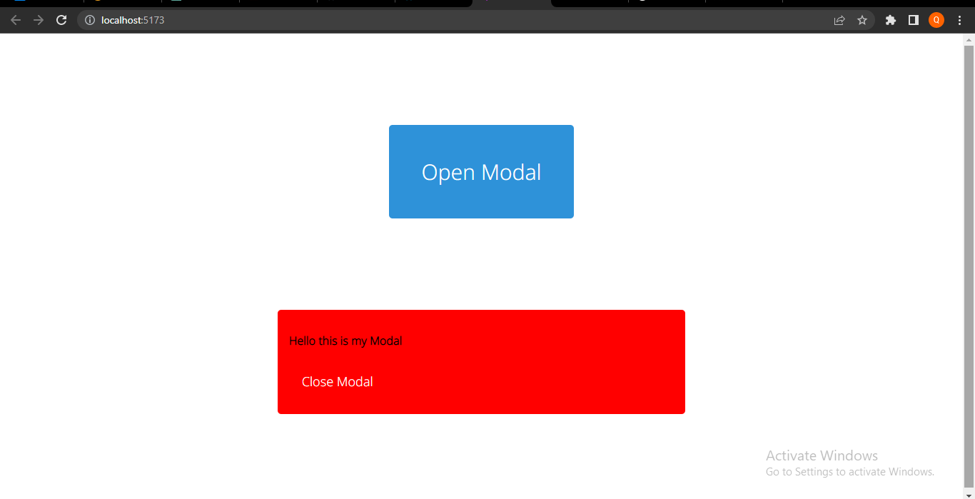
export default App;From the code above, we have successfully imported the Modal component into the Parent Component “App.js”.
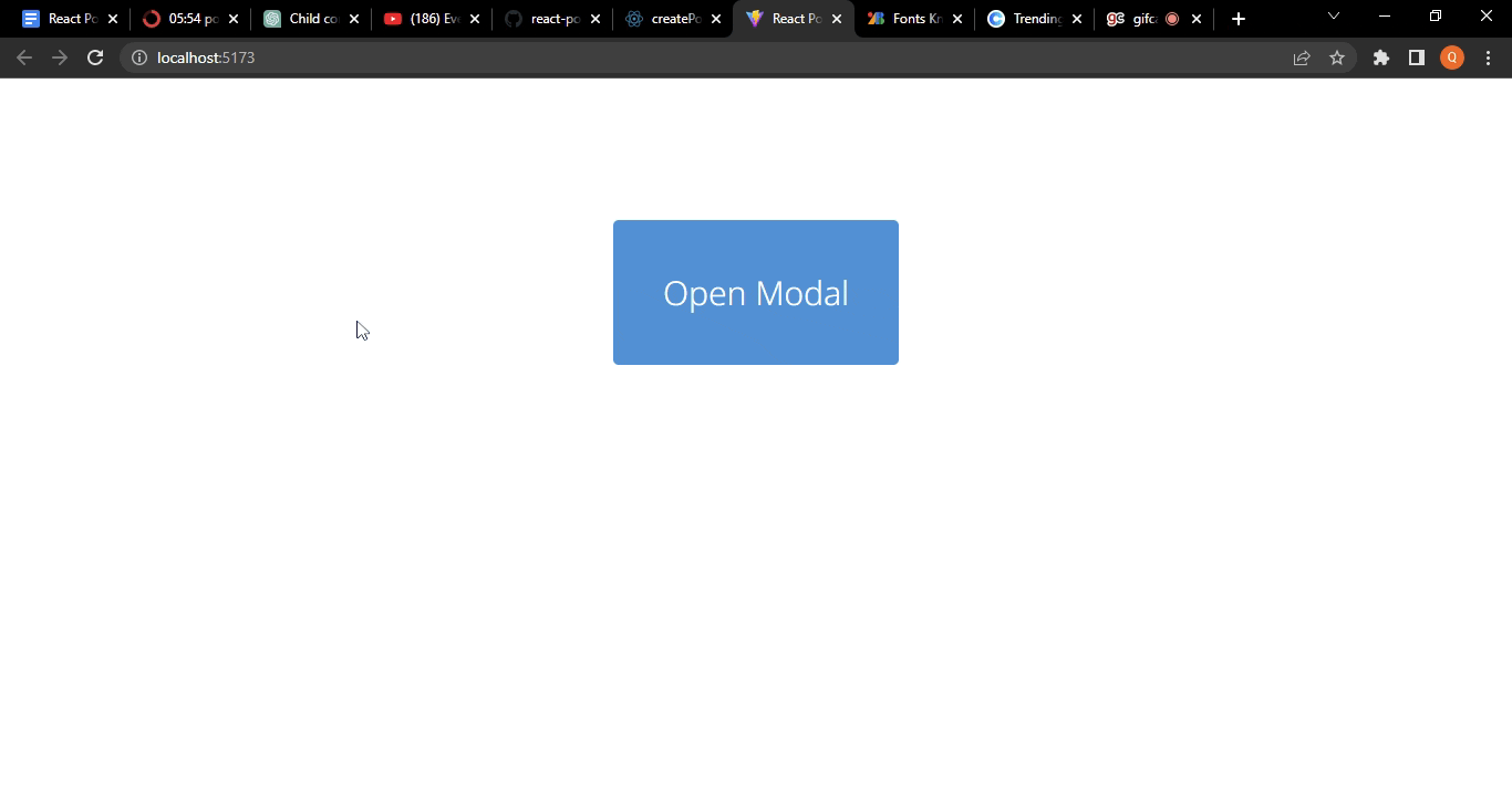
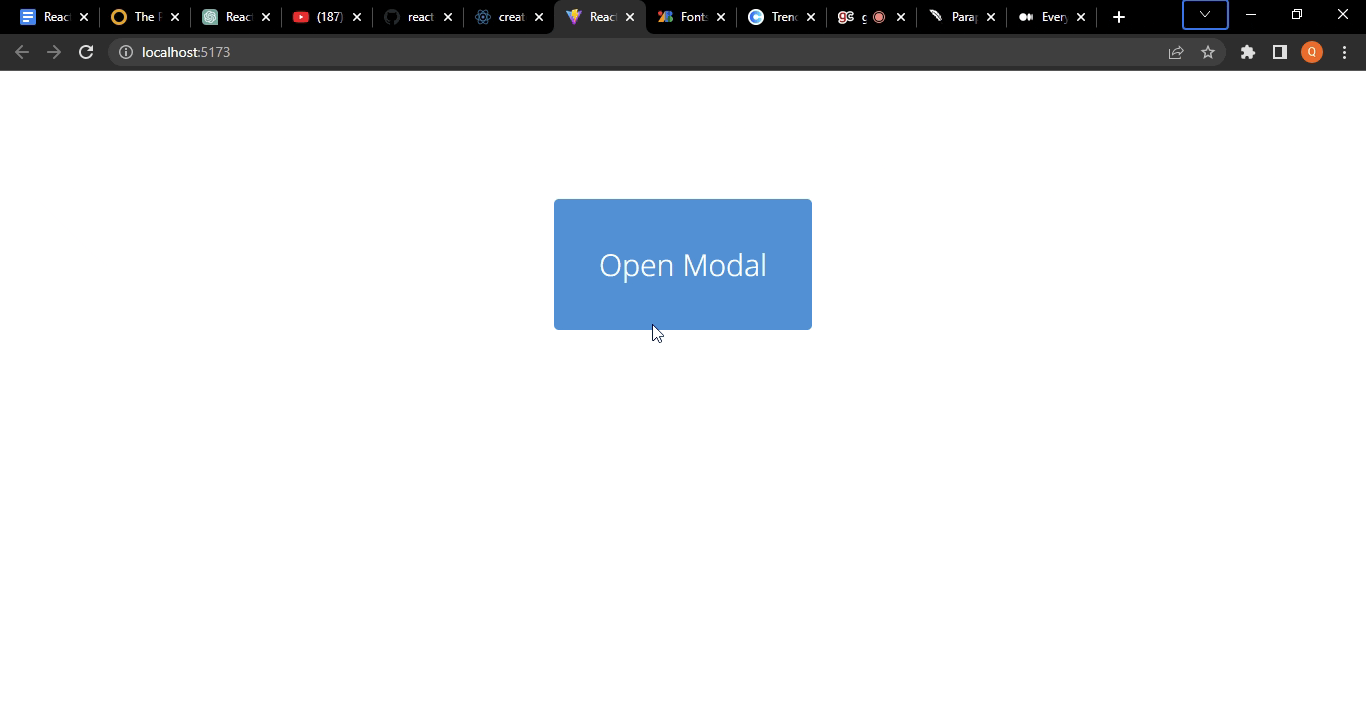
Right now, we just have the App Component and Modal content visible to the user, and the overlay effect has not been implemented yet as in the image below.
Step 4:
Implement Overlay Effect
To showcase the power of portals in this article, we will see the behavior of this modal and how it works with predefined CSS styles on the parent component.
The Parent Component has the following predefined styles:
.container {
  width: 500px;
  display: flex;
  justify-content: center;
  align-items: center;
  position: relative;
}
The modal needs to have these styles below to give that overlay effect :
modal-container {
  top: 0;
  position: absolute;
  width: 100%;
  height: 100%;
  z-index: 1;
  background-color: rgba(0, 0, 0, 0.7);
}
On the browser, this is how our Modal currently looks without the use of Portals:
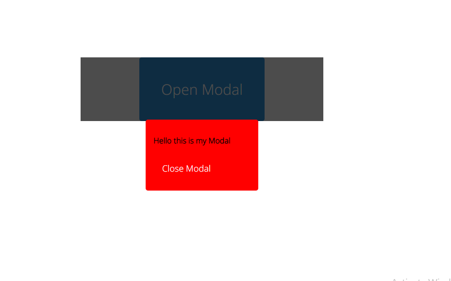
Judging from the Image above, I am sure this looks nothing like how a Modal should look like. This is because even though the styles we set In our modal container are correct and should work by taking up the full width and height of the webpage, we have run into issues. After all, the styles in the Parent, most specifically the width of our Parent component, is affecting the Modal; therefore, the modal cannot take the full width and height of the Page.
This is just an example of an issue you could run into when creating overlays like a modal because this is a simple application, but with more complex applications, the bugs could be very hard to figure out.
Now let us see how we can fix this issue, using the same CSS Styles, but this time creating our Modal using Portals.
Session Replay for Developers
Uncover frustrations, understand bugs and fix slowdowns like never before with OpenReplay — an open-source session replay tool for developers. Self-host it in minutes, and have complete control over your customer data. Check our GitHub repo and join the thousands of developers in our community.
Creating a Modal with React Portal
Step 1:
Create a second DOMNode in the index.html file
Recall that at the beginning of this article, we concluded that when working with portals, you need to create a second DOM node to render just the Modal Component alone to make it independent of every other component in the react application.
Navigate to your index.html file and create another div next to the original “root div” already placed by default when you created your React application.
<body>
  <div id="root"></div>
  <div id="modal"></div>
  <script type="module" src="/src/main.jsx"></script>
</body>;
The id name given to the second “div” is totally up to you, but for the sake of this article, I used the id name “modal”, so it can be easily understood.
You can confirm the presence of this second DOM NODE if you head to your browser’s developer tools and click on the Elements tab.
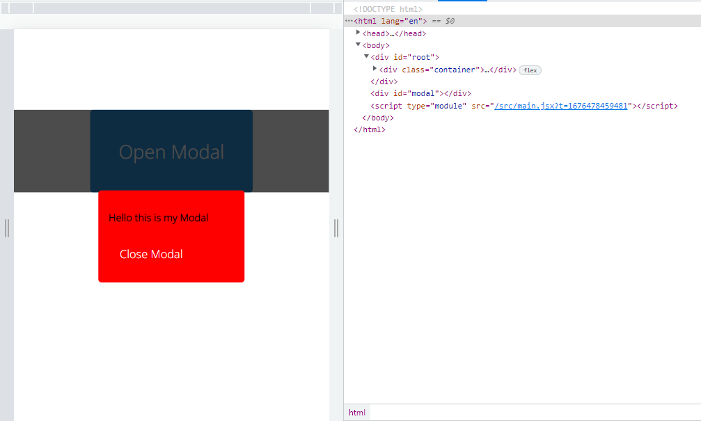
You can see from the console the two divs. The initial root div contains all the components we would create in our React application, and the second div, which has the id of “modal”, is where the modal we created will be ported to make our modal work properly and not run into unexpected problems, just like we did earlier on.
Step 2:
Import createPortal( ) from ‘react-dom’.
React-dom is a JavaScript package responsible for creating an interface for the developer to work with the Document Object Model.
Therefore createPortal( ) is a method obtained from react-dom that allows you to render a particular component in another DOM node other than the position where it is.
This means that since we want to render the Modal component in an entirely different DOM node,createPortal is going to help us create that gateway without affecting where the Modal was created.
Let us understand this better;
You are a child born to your Parents, your parents are your home, and you can never be someone else’s child, no matter what.
But then you decide to live with an uncle somewhere else in another State or country probably somewhere in China, while your parents live in India.
Therefore you’re always seen in China with another family, but this does not change the fact that you are the child of your parents; you are still a part of them no matter what.
The fact that you left for another country and you’re seen in that country, and not India does not change your origin and Home with your parents.
This is the same thing that happens with creating components and then transporting them to another DOM node different from that of the parent Element.
The fact that the modal is displayed in another DOM node, does not mean it is no longer a Child Component; the Parent-Child Component relationship still exists. What changes is that the modal is rendered independently from the rest of the component through another DOM node.
The createPortal( ) function takes two arguments:
- The first argument is the Component you want to port out from the Original DOMNode 1.
- The second argument is the new DOMNode you created, where you want to render the content of your Component.
import { createPortal } from 'react-dom'Step 3:
Inject the two arguments into the createPortal Function.
import { createPortal } from "react-dom";
function Modal({ closeModal }) {
  return createPortal(
    <div className="modalContainer">
      <div className="modal">
        <p>Hello this is my Modal</p>
        <button className="closeModal">Close Modal</button>
      </div>
    </div>,
    document.getElementById("modal")
  );
}
export default Modal;
This code does not just return the Content of the modal component, but it is also returning the createPortal function with the two arguments.
The first argument is the modal-container div we want to render on the webpage, then notice after the comma is the second argument which uses the JavaScript element retrieval method “getElementById” to point to the new DOM node 2 we created. This is to confirm that it is where the modal will be ported to.
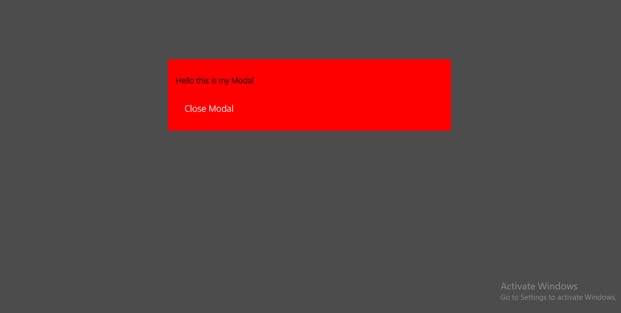
Bear in mind that we still have our initial modal Styles and styles on the Parent component, but the webpage does not look the same; it looks so much better, just like a modal should.
Because we used a portal to create this Modal, it is not affected by styles from other components or causes some unnecessary bugs in the process of development.
Step 4
Proceed to Add your onClick event listeners, which will trigger the modal to open and close with the click of a button.
Modal created without Portals

Modal created using a Portal
Improved Accessibility by managing keyboard Focus
A screen reader might not be able to tell a modal from the rest of the content on the page when a portal is used to render one.
Keyboard focus needs to be managed carefully to improve portal accessibility. The element on a web page that is currently selected for keyboard input is referred to as having keyboard focus.
The element with keyboard focus should be visibly highlighted when a user tabs using the “tab” key on the keyboard through a web page so they can see where they are in the document.
This can be achieved by using the tab index attribute to the specific element we want to make more accessible. Read more about tab index https://developer.mozilla.org/en-US/docs/Web/HTML/Global_attributes/tabindex
Therefore the tab index represents the order in which elements in HTML are being highlighted when you press the tab key. By default, most elements have a tab index of 0, so they get highlighted when someone presses the tab key.
Elements with higher tab indexes get highlighted before elements with lower tab indexes. Elements with a negative tab index like -1 mean that they will not be highlighted when you press the “tab” key.
function Modal({ closeModal }) {
  return createPortal(
    <div className="modal-container" tabIndex="-1" onClick={closeModal}>
      <div className="modal" tabIndex="0">
        <p>Hello this is my Modal</p>
        <button className="closeModal" onClick={closeModal}>
          Close Modal
        </button>
      </div>
    </div>,
    document.getElementById("modal")
  );
}
Notice that the main content of the modal has a tab index of 0 and the overlay background container has a tab index of -1. This is because you do not want the user to be confused between the main content and the background.
The content is more important; therefore it should be highlighted and not the background.
Notice the borders formed around the different icons, including the modal content, as the tab key is being pressed. This is exactly how it works, making the modal more accessible to the users. Read more about ARIA best practices for modals
Tips and Tricks for working with Modals
-
Portals are a strong tool, but using them excessively might make your codebase more complicated to understand. Make sure portals benefit your application by only using them when necessary.
-
Verify the target element is present: This refers to the second div to be added in your HTML file. Before using a portal, you must confirm that the target element is present in the DOM. Your application will throw an error otherwise.
-
As with Modals, it’s crucial to add keyboard functionality so that users may interact with the portal using the keyboard. To avoid having the target element become the keyboard’s focus, be sure to set its tab index to -1.
-
Test your portals for accessibility to ensure that everyone can use them and that they are simple to understand. Similar to modals, certain users may find it challenging to use portals, especially those who use screen readers or other assistive devices.
-
Maintain the focus of the material: Portals are excellent for showcasing the concentrated content, so be sure to maintain the clarity and conciseness of the content. A portal should not be overloaded with features or content because this can make it difficult for users to explore.
-
Use portals to conditionally render content: Depending on user activity, portals can be a great tool for conditionally rendering material. When a user clicks a button, for instance, you can use a portal to display a dropdown menu without having to worry about the menu’s position in relation to the button or other elements.
Conclusion
In general, portals are a strong tool that may assist you in building stronger and more adaptable UI components for your React application. These pointers and techniques can help you build portals that are simple to use, accessible, and improve user experience.
This is a link to the github repository for this project
Gain Debugging Superpowers
Unleash the power of session replay to reproduce bugs and track user frustrations. Get complete visibility into your frontend with OpenReplay, the most advanced open-source session replay tool for developers.