Spectre.css is a modern, responsive, lightweight CSS framework enabling more rapid and flexible development. It is a straightforward and adaptable CSS framework that offers basic styles for navigation, buttons, tables, grids, and typography. It is made to be flexible and compatible with current web development tools like task runners, package managers, and preprocessors. Spectre.css is built with a mobile-first approach and uses a flexbox-based grid system to create responsive layouts. It also includes a number of utility classes for common styles, such as text alignment, margin, padding, and visibility.
Its features include:
- Lightweight: With a small footprint and quick performance, Spectre.css is made as light as possible. It’s a wonderful option for projects that need to load swiftly and effectively because of this.
- Responsive design: The framework uses a flexible grid structure and responsive design principles to create layouts that look excellent on all devices. This is crucial in the modern world when people use a range of devices with various screen sizes and resolutions to access the internet.
- Extensible: Spectre.css is made to be readily adaptable and extensible, enabling you to build your styles and components based on the framework. This is helpful if you want to give your project a special look and feel or if you need to add new functionality that the framework doesn’t offer.
- Modern: By utilizing current CSS best practices and approaches, Spectre.css is simple to use and maintain. It is, therefore, current with the most recent advancements in web design and development and is probably compatible with newer web browsers and technologies.
However, as with any tool, there are some potential drawbacks to using Spectre.css. Here are a few things to consider when deciding whether or not to use this framework:
- Limited customization: While Spectre.css is designed to be extensible, it may not offer as much customization as other CSS frameworks. If you need to create a highly customized look and feel for your project, you may need to use a more feature-rich framework or build your own styles from scratch.
- Limited features: While Spectre.css includes a wide range of basic styles and components, it may not offer all the features and functionality you need for your project. If you require more advanced features, such as advanced grid systems, animations, or pre-built UI components, you may need to use a different framework or add additional libraries to your project.
- Limited browser support: Spectre.css aims to support the latest versions of modern web browsers, but it may not work with older or less commonly used browsers. If you need to support a wide range of browsers or legacy versions, you may need to use a framework that provides more comprehensive cross-browser compatibility.
Finally, Spectre.css aims to support the latest versions of modern web browsers, including:
- Google Chrome
- Mozilla Firefox
- Apple Safari
- Microsoft Edge
Getting started
There are several ways to install Spectre.css in your project:
- Download the CSS file: You can download the Spectre.css CSS file from the official website and include it in your project manually. To do this, simply download the file, place it in your project folder, and then add a link to it in the head of your HTML file:
<link rel="stylesheet" href="/path/to/spectre.css" />- Use a CDN: You can also use a CDN (Content Delivery Network) to include Spectre.css in your project. To do this, add a link to the CDN in the head of your HTML file:
<link
  rel="stylesheet"
  href="https://unpkg.com/spectre.css/dist/spectre.min.css"
/>
<link
  rel="stylesheet"
  href="https://unpkg.com/spectre.css/dist/spectre-exp.min.css"
/>
<link
  rel="stylesheet"
  href="https://unpkg.com/spectre.css/dist/spectre-icons.min.css"
/>- Install with a package manager: If you are using a package manager such as npm or Yarn, you can install Spectre.css as a dependency in your project. To do this, run the following command:
## With npm
npm install spectre.css

## With Yarn
yarn add spectre.css
Once the package is installed, you can include it in your project by linking to the CSS file in the head of your HTML file:
<link rel="stylesheet" href="/node_modules/spectre.css/dist/spectre.min.css" />Several options exist for installing Spectre.css in your project, depending on your needs and preferences. Choose the method that is most convenient and works best for your project.
UI components
We’ll discuss UI components in this area of the article because they are made up of the fundamentally helpful elements used on websites.
Typography
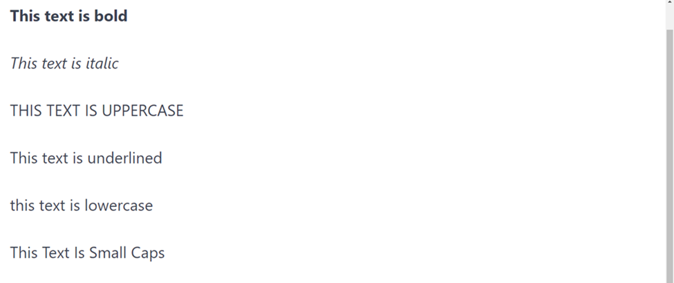
Spectre.css is a lightweight, responsive and modern CSS framework that provides a number of styles and layout tools for typography. To use typography styles in Spectre.css, you can apply the appropriate class to your HTML element. Here are some examples:
- To make text bold, you can use the
.text-boldclass: - To make text italic, you can use the
.text-italicclass: - To underline text, you can use the
.text-underlineclass: - To make text uppercase, you can use the
.text-uppercaseclass: - To make text lowercase, you can use the
.text-lowercaseclass: - To make text small caps, you can use the
.text-smallcapsclass:
Code:
<p class="text-bold">This text is bold</p>
<p class="text-italic">This text is italic</p>
<p class="text-uppercase">This text is uppercase</p>
<p class="text-underline">This text is underlined</p>
<p class="text-lowercase">this text is lowercase</p>
<p class="text-smallcaps">This Text Is Small Caps</p>
Output:
You can also use the .text-left, .text-center, and .text-right classes to align text to its container’s left, center, or right.
<div class="text-center">
  <p>This text is centered</p>
</div>
Output:

For more information on the typography styles available in Spectre.css, you can refer to the documentation by clicking here.
Form elements
Spectre.css provides a number of styles and layout tools for creating and styling form elements such as text inputs, radio buttons, checkboxes, and select menus.
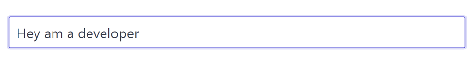
To create a basic text input field using Spectre.css, you can use the input element with the .form-input class.
Code:
<input type="text" class="form-input" placeholder="Enter your name" />Output:
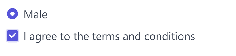
To create a radio button or checkbox, you can use the input element with the type attribute set to "radio" or "checkbox", respectively, and the .form-checkbox or .form-radio class:
<label class="form-radio">
  <input type="radio" name="gender" value="male" />
  <i class="form-icon"></i> Male
</label>

<label class="form-checkbox">
  <input type="checkbox" name="agreement" />
  <i class="form-icon"></i> I agree to the terms and conditions
</label>
Output:
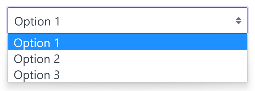
To create a select menu, you can use the select element with the .form-select class:
<select class="form-select">
  <option>Option 1</option>
  <option>Option 2</option>
  <option>Option 3</option>
</select>
Output:
Spectre.css also provides a number of classes for styling and layout, such as .form-group for grouping form elements, .form-inline for displaying form elements inline, and .form-horizontal for creating a horizontal form layout.
For more information on the form elements and styles available in Spectre.css, you can refer to the documentation by clicking here.
Buttons and button groups
To create a button using Spectre.css, you can use the button element with the .btn class:
<button class="btn">Click me</button>Output:

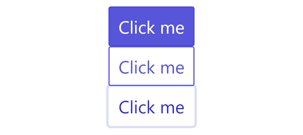
Spectre.css provides a number of classes for styling buttons, such as .btn-primary for a primary button, .btn-secondary for a secondary button, and .btn-link for a link-style button.
<!-- Primary button -->
<button class="btn btn-primary">Click me</button>

<!-- Secondary button -->
<button class="btn btn-secondary">Click me</button>

<!-- Link-style button -->
<button class="btn btn-link">Click me</button>
Output:
You can also use the .btn-outline class to create an outline style button and the .btn-clear class to create a clear style button.
Code:
<!-- Outline button -->
<button class="btn btn-outline">Click me</button>

<!-- Clear button -->
<button class="btn btn-clear">Click me</button>
Output:

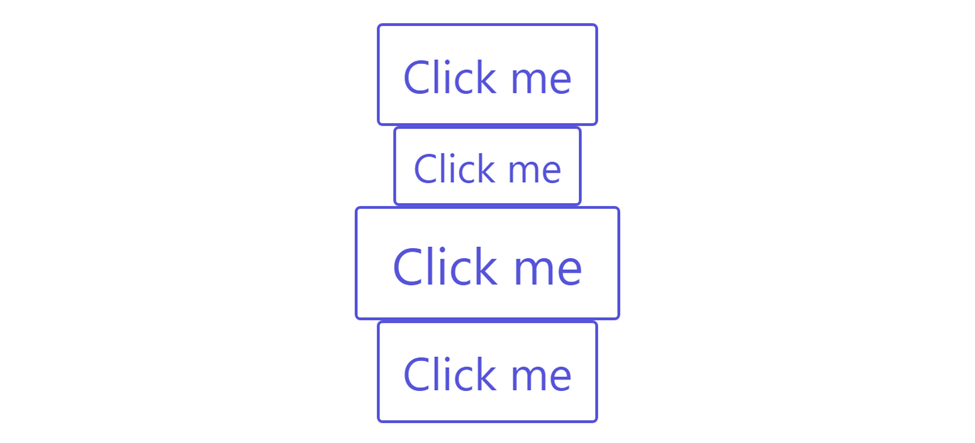
Spectre.css also provides a number of classes for controlling the size of buttons, such as .btn-xs, .btn-sm, .btn-lg, and .btn-xl.
Code:
<!-- Extra small button -->
<button class="btn btn-xs">Click me</button>

<!-- Small button -->
<button class="btn btn-sm">Click me</button>

<!-- Large button -->
<button class="btn btn-lg">Click me</button>

<!-- Extra large button -->
<button class="btn btn-xl">Click me</button>
Output:
For more information on the button styles available in Spectre.css, you can refer to the documentation.
Tables
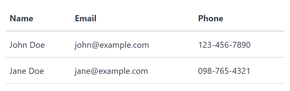
Spectre.css provides a number of styles and layout tools for creating and styling tables.
To create a basic table using Spectre.css, you can use the table element with the .table class:
<table class="table">
  <thead>
    <tr>
      <th>Name</th>
      <th>Email</th>
      <th>Phone</th>
    </tr>
  </thead>
  <tbody>
    <tr>
      <td>John Doe</td>
      <td>john@example.com</td>
      <td>123-456-7890</td>
    </tr>
    <tr>
      <td>Jane Doe</td>
      <td>jane@example.com</td>
      <td>098-765-4321</td>
    </tr>
  </tbody>
</table>
Code:
Spectre.css also provides a number of classes for styling tables, such as .table-striped for creating a striped table, .table-hover for highlighting rows on hover, and .table-border for adding borders to the table.
<table class="table table-striped table-hover table-border">
  <!-- Table content -->
</table>
You can also use the .table-scroll class to create a table with a fixed header and scrollable body:
<div class="table-scroll">
  <table class="table">
    <!-- Table content -->
  </table>
</div>
Please click here to learn more about from the official website.
Navbar
To create a navbar using Spectre.css, you can use the nav element with the .navbar class:
<nav class="navbar">
  <a class="navbar-brand" href="#">My Site</a>
  <ul class="navbar-nav">
    <li class="nav-item">
      <a class="nav-link" href="#">Home</a>
    </li>
    <li class="nav-item">
      <a class="nav-link" href="#">About</a>
    </li>
    <li class="nav-item">
      <a class="nav-link" href="#">Contact</a>
    </li>
  </ul>
</nav>
Output:
Spectre.css provides a number of classes for styling and layout, such as .navbar-fixed for creating a fixed navbar, .navbar-center for aligning the navbar items to the center, and .navbar-right for aligning the navbar items to the right.
<!-- Fixed navbar -->
<nav class="navbar navbar-fixed">
  <!-- Navbar content -->
</nav>

<!-- Centered navbar -->
<nav class="navbar navbar-center">
  <!-- Navbar content -->
</nav>

<!-- Right-aligned navbar -->
<nav class="navbar navbar-right">
  <!-- Navbar content -->
</nav>
You can also use the .navbar-menu class to create a navbar with a toggleable menu:
<nav class="navbar navbar-menu">
  <a class="navbar-brand" href="#">My Site</a>
  <a class="navbar-toggle" href="#" id="navbar-toggle">
    <i class="menu-icon"></i>
  </a>
  <ul class="navbar-nav" id="navbar-nav">
    <!-- Navbar items -->
  </ul>
</nav>
For more information on the navbar styles and layouts available in Spectre.css, you can refer to the documentation.
Avatar
An avatar is a customized graphic representation of a computer user, or a persona or alter ego the user chooses to portray themselves as.
You can customize the sizes of images by applying the class names such as avatar-xl (64px), avatar-lg (48px), avatar-sm (24px),
Below is a sample of a responsive avatar from Spectre.css:
<figure class="avatar avatar-xl" style="margin-right: 20px">
  <img
    src="https://images.unsplash.com/photo-1661956601349-f61c959a8fd4?ixlib=rb-4.0.3&ixid=MnwxMjA3fDF8MHxlZGl0b3JpYWwtZmVlZHwxfHx8ZW58MHx8fHw%3D&auto=format&fit=crop&w=500&q=60"
    alt="..."
  />
  <i class="avatar-presence online"></i>
</figure>
<figure class="avatar avatar-xl">
  <img
    src="https://images.unsplash.com/photo-1671394033488-a3ce85f1076a?ixlib=rb-4.0.3&ixid=MnwxMjA3fDB8MHxlZGl0b3JpYWwtZmVlZHwyM3x8fGVufDB8fHx8&auto=format&fit=crop&w=500&q=60"
    alt="..."
  />
  <img
    src="https://images.unsplash.com/photo-1671398098105-5a49b16bfaab?ixlib=rb-4.0.3&ixid=MnwxMjA3fDB8MHxlZGl0b3JpYWwtZmVlZHwyMnx8fGVufDB8fHx8&auto=format&fit=crop&w=500&q=60"
    class="avatar-icon"
    alt="..."
  />
</figure>
Output:
You can learn more about avatars by clicking on this link.
Advanced components
We’ll talk about more Advance components in this section as we work with Spectre. These advanced elements are significant since they represent the advanced website section or design.
Pagination
To create pagination in Spectre.css, you can use the pagination class along with the nav element or the ul element. Here’s an example of how you can do this:
<ul class="pagination">
  <li class="page-item disabled">
    <a href="#" tabindex="-1">Previous</a>
  </li>
  <li class="page-item active">
    <a href="#">1</a>
  </li>
  <li class="page-item">
    <a href="#">2</a>
  </li>
  <li class="page-item">
    <a href="#">3</a>
  </li>
  <li class="page-item">
    <span>...</span>
  </li>
  <li class="page-item">
    <a href="#">12</a>
  </li>
  <li class="page-item">
    <a href="#">Next</a>
  </li>
</ul>
Output:

This will create a pagination element with the pagination class applied to it. The pagination class in Spectre.css applies a default style to the pagination.
Here’s another example of how to use pagination in Spectre:
<ul class="pagination">
  <li class="page-item page-prev">
    <a href="#">
      <div class="page-item-subtitle">Previous</div>
      <div class="page-item-title h5">Getting started</div>
    </a>
  </li>
  <li class="page-item page-next">
    <a href="#">
      <div class="page-item-subtitle">Next</div>
      <div class="page-item-title h5">Layout</div>
    </a>
  </li>
</ul>
Output:

This will create a larger, rounded pagination element with the page items and links styled accordingly.
Responsive navbar
To create a navbar using Spectre.css, you can use the ul element with the .nav class:
<ul class="nav">
  <li class="nav-item">
    <a href="#">Elements</a>
  </li>
  <li class="nav-item active">
    <a href="#">Layout</a>
    <ul class="nav">
      <li class="nav-item">
        <a href="#">Flexbox grid</a>
      </li>
      <li class="nav-item">
        <a href="#">Responsive</a>
      </li>
      <li class="nav-item">
        <a href="#">Navbar</a>
      </li>
      <li class="nav-item">
        <a href="#">Empty states</a>
      </li>
    </ul>
  </li>
  <li class="nav-item">
    <a href="#">Components</a>
  </li>
  <li class="nav-item">
    <a href="#">Utilities</a>
  </li>
</ul>
Output:

Spectre.css provides a number of classes for styling and layout, such as .navbar-fixed for creating a fixed navbar, .navbar-center for aligning the navbar items to the center, and .navbar-right for aligning the navbar items to the right.
Sticky elements
To create a sticky element using Spectre.css, you can use the div element with the .sticky class:
<div class="sticky">
  <!-- Sticky content goes here -->
</div>
Spectre.css will apply a position: sticky style to the element, which will cause it to stick to the top of the viewport as the user scrolls down the page.
You can also use the .sticky-bottom class to cause the element to stick to the bottom of the viewport, and the .sticky-top class to cause the element to stick to the top of the viewport.
<!-- Sticky element at the bottom of the viewport -->
<div class="sticky sticky-bottom">
  <!-- Sticky content goes here -->
</div>

<!-- Sticky element at the top of the viewport -->
<div class="sticky sticky-top">
  <!-- Sticky content goes here -->
</div>
Session Replay for Developers
Uncover frustrations, understand bugs and fix slowdowns like never before with OpenReplay — an open-source session replay tool for developers. Self-host it in minutes, and have complete control over your customer data. Check our GitHub repo and join the thousands of developers in our community.
Experimentals
We’ll be dealing with the advanced styling and class names in this section because the experimental area contains items we have covered in UI components. Experimental components merely include archiving a design using various class names in various styles.
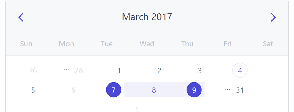
Calendars
To utilize a Calendar in Spectre.css, you do not need to add extra styles unless you want to customize the Calendar you want to utilize. Below is a sample of the calendar in Spectree.css:
<div class="calendar">
  <!-- calendar navbar -->
  <div class="calendar-nav navbar">
    <button class="btn btn-action btn-link btn-lg">
      <i class="icon icon-arrow-left"></i>
    </button>
    <div class="navbar-primary">March 2017</div>
    <button class="btn btn-action btn-link btn-lg">
      <i class="icon icon-arrow-right"></i>
    </button>
  </div>

  <div class="calendar-container">
    <div class="calendar-header">
      <div class="calendar-date">Sun</div>
      <div class="calendar-date">Mon</div>
      <div class="calendar-date">Tue</div>
      <div class="calendar-date">Wed</div>
      <div class="calendar-date">Thu</div>
      <div class="calendar-date">Fri</div>
      <div class="calendar-date">Sat</div>
    </div>

    <div class="calendar-body">
      <!-- calendar previous month -->
      <div class="calendar-date prev-month">
        <button class="date-item">26</button>
      </div>
      ...
      <div class="calendar-date prev-month">
        <button class="date-item">28</button>
      </div>

      <!-- calendar current month -->
      <div class="calendar-date">
        <button class="date-item">1</button>
      </div>
      <div class="calendar-date">
        <button class="date-item">2</button>
      </div>
      <div class="calendar-date">
        <button class="date-item">3</button>
      </div>
      <!-- calendar date: today -->
      <div class="calendar-date">
        <button class="date-item date-today">4</button>
      </div>
      <!-- calendar date: tooltip -->
      <div class="calendar-date tooltip" data-tooltip="You have appointments">
        <button class="date-item">5</button>
      </div>
      <!-- calendar date: not available -->
      <div class="calendar-date tooltip" data-tooltip="Not available">
        <button class="date-item" disabled="">6</button>
      </div>

      <!-- calendar range -->
      <div class="calendar-date calendar-range range-start">
        <button class="date-item">7</button>
      </div>
      <div class="calendar-date calendar-range">
        <button class="date-item">8</button>
      </div>
      <div class="calendar-date calendar-range range-end">
        <button class="date-item">9</button>
      </div>
      ...
      <div class="calendar-date">
        <button class="date-item">31</button>
      </div>

      <!-- calendar next month -->
      <div class="calendar-date next-month">
        <button class="date-item">1</button>
      </div>
    </div>
  </div>
</div>
Output:
Carousels
Carousels are nothing more than a slider used to present items repeatedly, and there are two possible manual or automatic sliding effects. You can use a cool slider created by Spectre in Spectre with ease; it’s cool to use and maintain.
Here is a fantastic slider that the Spectre developers put in place for us; you don’t need to create any additional JavaScript code to use this slider in your project because everything is already there.
Example:
<!DOCTYPE html>
<html lang="en">
  <head>
    <meta charset="UTF-8" />
    <meta http-equiv="X-UA-Compatible" content="IE=edge" />
    <meta name="viewport" content="width=device-width, initial-scale=1.0" />
    <title>Document</title>
    <link
      rel="stylesheet"
      href="https://unpkg.com/spectre.css/dist/spectre.min.css"
    />
    <link
      rel="stylesheet"
      href="https://unpkg.com/spectre.css/dist/spectre-exp.min.css"
    />
    <link
      rel="stylesheet"
      href="https://unpkg.com/spectre.css/dist/spectre-icons.min.css"
    />
  </head>
  <body
    style="
      display: flex;
      align-items: center;
      justify-content: center;
      min-height: 100vh;
    "
  >
    <br />
    <div class="carousel" style="width: 700px">
      <!-- carousel locator -->
      <input
        class="carousel-locator"
        id="slide-1"
        type="radio"
        name="carousel-radio"
        hidden=""
        checked=""
      />
      <input
        class="carousel-locator"
        id="slide-2"
        type="radio"
        name="carousel-radio"
        hidden=""
      />
      <input
        class="carousel-locator"
        id="slide-3"
        type="radio"
        name="carousel-radio"
        hidden=""
      />
      <input
        class="carousel-locator"
        id="slide-4"
        type="radio"
        name="carousel-radio"
        hidden=""
      />
      <!-- carousel container -->
      <div class="carousel-container">
        <!-- carousel item -->
        <figure class="carousel-item">
          <label class="item-prev btn btn-action btn-lg" for="slide-4"
            ><i class="icon icon-arrow-left"></i
          ></label>
          <label class="item-next btn btn-action btn-lg" for="slide-2"
            ><i class="icon icon-arrow-right"></i
          ></label>
          <img
            class="img-responsive rounded"
            style="width: 100%"
            src="https://images.unsplash.com/photo-1671394507023-76c50b824053?ixlib=rb-4.0.3&ixid=MnwxMjA3fDB8MHxlZGl0b3JpYWwtZmVlZHw1fHx8ZW58MHx8fHw%3D&auto=format&fit=crop&w=500&q=60"
            alt="macOS Yosemite Wallpaper"
          />
        </figure>
        <figure class="carousel-item">
          <label class="item-prev btn btn-action btn-lg" for="slide-1"
            ><i class="icon icon-arrow-left"></i
          ></label>
          <label class="item-next btn btn-action btn-lg" for="slide-3"
            ><i class="icon icon-arrow-right"></i
          ></label>
          <img
            class="img-responsive rounded"
            style="width: 100%"
            src="avatar"
            alt="macOS Yosemite Wallpaper"
          />
        </figure>
        <figure class="carousel-item">
          <label class="item-prev btn btn-action btn-lg" for="slide-2"
            ><i class="icon icon-arrow-left"></i
          ></label>
          <label class="item-next btn btn-action btn-lg" for="slide-4"
            ><i class="icon icon-arrow-right"></i
          ></label>
          <img
            class="img-responsive rounded"
            style="width: 100%"
            src="https://images.unsplash.com/photo-1671398098105-5a49b16bfaab?ixlib=rb-4.0.3&ixid=MnwxMjA3fDB8MHxlZGl0b3JpYWwtZmVlZHwyMnx8fGVufDB8fHx8&auto=format&fit=crop&w=500&q=60"
            alt="macOS El Capitan Wallpaper"
          />
        </figure>
        <figure class="carousel-item">
          <label class="item-prev btn btn-action btn-lg" for="slide-3"
            ><i class="icon icon-arrow-left"></i
          ></label>
          <label class="item-next btn btn-action btn-lg" for="slide-1"
            ><i class="icon icon-arrow-right"></i
          ></label>
          <img
            class="img-responsive rounded"
            style="width: 100%"
            src="https://images.unsplash.com/photo-1671394033488-a3ce85f1076a?ixlib=rb-4.0.3&ixid=MnwxMjA3fDB8MHxlZGl0b3JpYWwtZmVlZHwyM3x8fGVufDB8fHx8&auto=format&fit=crop&w=500&q=60"
            alt="macOS El Capitan Wallpaper"
          />
        </figure>
      </div>
      <!-- carousel navigation -->
      <div class="carousel-nav">
        <label class="nav-item text-hide c-hand" for="slide-1">1</label>
        <label class="nav-item text-hide c-hand" for="slide-2">2</label>
        <label class="nav-item text-hide c-hand" for="slide-3">3</label>
        <label class="nav-item text-hide c-hand" for="slide-4">4</label>
      </div>
    </div>
  </body>
  <script></script>
</html>
Output:
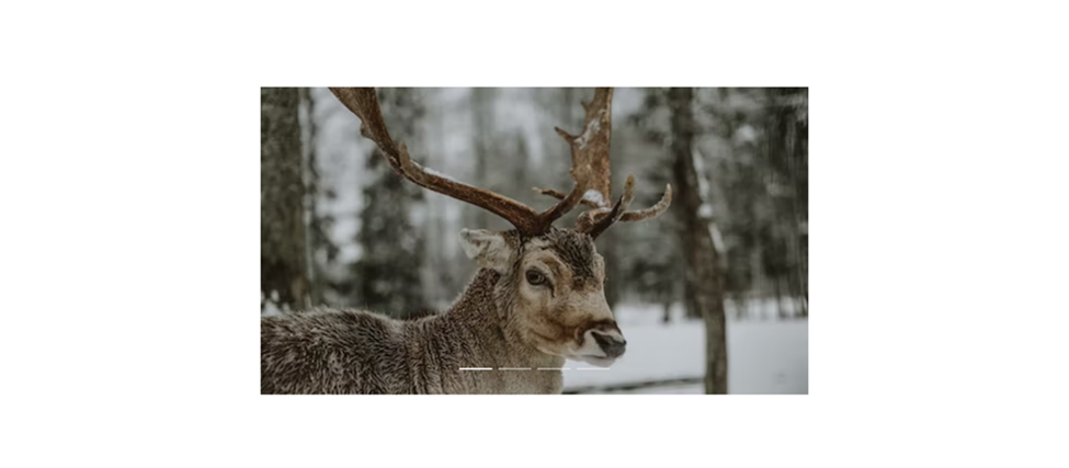
From the output, you will notice that the Slider above is very responsive, and if you need awesome pictures like the one you see above, kindly visit www.unsplash.com to learn more about sliders/carousels, please refer to the official documentation.
Progress
The progression of a lengthy computer process, such as a download, file transfer, or installation, is visualized using a progress bar, a graphical control element. To use progress bars in Spectre.css, follow these steps:
- Import the Spectre.css stylesheet into your HTML file.
- Add a progress bar element to your HTML file. This element should have the class “progress” and should contain a “progress-bar” element.
- Set the value of the progress bar by adding a “value” attribute to the “progress” element. This attribute should be a number between 0 and 100, representing the completion percentage.
- Optionally, you can add a “max” attribute to the “progress-bar” element to set the maximum value of the progress bar.
- Style the progress bar and its elements as needed using the provided Spectre.css classes.
Example HTML:
<progress class="progress" value="75" max="100"></progress>
<br />
<progress class="progress" max="100"></progress>
Output:
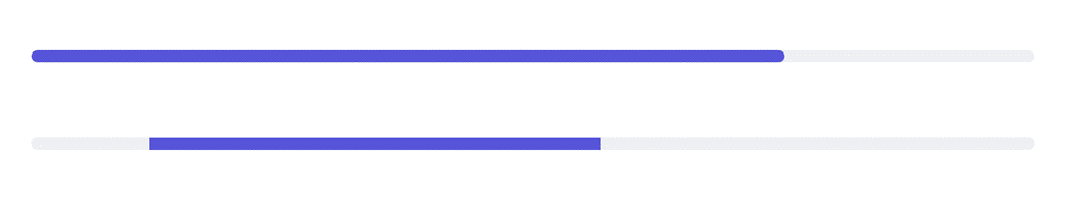
Here are two examples of progress bars. We just set the value property in our code to 75, which causes the first progress bar to display at 75%. The second progress just moves from the left to the right side of the screen; it has no counter to show and is merely an infinite progress bar. Instead of worrying about writing difficult code to add a progress indication, using the progress bar from Spectre is fantastic.
Conclusion
Hopefully, we now understand the Spectre CSS. Sincerely, I do hope you have enjoyed reading this. Spectre.css installation instructions were covered in this article, and we also created a few Spectre.css examples to further comprehend the syntax’s essential ideas. You can modify this example to suit your requirements if you want to quickly and beautifully develop a website for yourself or a customer. Alternatively, you may use what you’ve learned to make even more beautiful websites.
Gain Debugging Superpowers
Unleash the power of session replay to reproduce bugs and track user frustrations. Get complete visibility into your frontend with OpenReplay, the most advanced open-source session replay tool for developers.