An Introduction to the Fomantic UI Framework
A new HTML/CSS framework with stunning results


INTRODUCTION TO FOMANTIC-UI
An HTML development framework called Fomantic-UI makes it easier to produce stunning, responsive layouts. Fomantic UI sees words and classes as interchangeable ideas. Fomantic-UI creates amazing and gorgeous layouts and designs for web pages, including sliders, cards, custom buttons, calendars, dropdown menus, etc., in contrast to existing CSS front-end frameworks. The majority of the topics we specified will be covered by the tutorial’s conclusion. The Fomantic-UI is simple to use and learn. Fomantic-UI has consistently been a preferred choice for developers worldwide since it allows faster and more responsive delivery of websites.
If you are familiar with CSS Frameworks from a different perspective, you will notice that CSS Frameworks are not tough to use because all of the layouts and designs are already available for you to use. It is always a good idea to work with anything that is not difficult. A front-end framework called Fomantic-UI improves the design of online interfaces. It is lightweight and flexible. It is a framework for developing websites that makes it easier to create stunning responsive layouts with user-friendly HTML. I’ll show you how to get started with Fomantic-UI in this tutorial. And by the time the article is over, you will be among the top developers working with Fomantic-UI. However, let’s first examine the benefits and drawbacks of the Fomantic-UI before we begin developing Fomantic Codes.
Benefits of Fomantic-UI
-
Fomantic-UI creates quick and adaptable user interfaces.
-
Controls how your app communicates with the system and provides classes that allow you to manage the resources and data.
-
Improves follow-up and accelerates learning via documentation and content accessibility
-
Produced by Fomantic-UI are Mobile Friendly Views.
-
The load time is fast
-
Code maintenance is always simple and easy.
Drawbacks of Fomantic-UI
- Utilizing Fomantic-UI could result in styling conflicts.
Recent developer reviews of Fomantic-UI have not received many unfavorable comments. However, stylistic conflicts are common among developers. In this article, we’ll discuss how to handle stylistic conflicts while using the Fomantic-UI application.
All modern web browsers support Fomantic-UI:
- Internet Explorer by Microsoft (beginning with version 3.0)
- Firefox
- Safari
- Opera
- Chrome
Fomantic-UI Extensions for Auto Complete
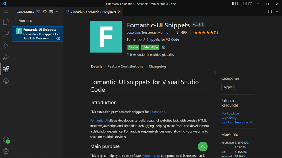
VS-Code now supports the most used Fomantic-UI plugin. And the Auto-Complete, which accelerates development, makes it a top choice. The VS-Code addon is available on GitHub and is listed below.
The simplest method to obtain this extension is to use VS-Code to perform a search for Fomantic-UI Extension. From there, you can locate and download the extension by installing it.
A screenshot of the auto-complete VS-Code extensions may be found below.
Installation
Let’s begin the installation now that we are familiar with the fundamentals of Fomantic-UI. It’s way too simple to install Fomantic-UI; in this section, we’ll cover how to do it utilizing CDN setup and node.js setup. It’s simple to complete all this installation and setup, so we’ll also go over how to distribute LESS & SASS in Fomantic-UI. Please read on to get the installation instructions.
Method 1: Installation via npm
You must have node.js installed and running to install Fomantic-UI using npm or yarn. If you don’t already have node.js installed, please click here to get the most recent version. You don’t have to click the link to install node.js on your computer if you are already using or running it. Run the code below in a terminal window (CMD) to see if node.js is already installed and running on your computer:
node -v
// Output: 18.12.1
Let’s use npm to install Fomantic-UI now that node.js is operational. Please run “npm init” in your project folder and respond to the prompted questions. To disable the prompting questions, please run “npm init -y”; this bypasses the questions and produces the lovely package.json file. Run the code listed below to install Fomantic-UI next in your terminal.
npm i fomantic-uiYou will find a node modules folder containing all the downloaded files after installing Fomantic-UI. Open it, navigate to a folder named “Fomantic UI,” and click on it. Inside, you will find a folder called “dist.” copy the “dist” folder from the node module folder, then paste it outside the node module folder where your files are.
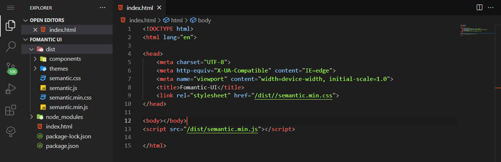
As you can see from the example above, we are only linking the files in the dist folder to our HTML file. If you have reached this stage, I will encourage you to take your time and carefully study the instructions for setting this up again if you are having trouble. Although I am certain you will figure this out correctly, if you find this step more challenging, you shouldn’t have any problems because we’ll be configuring Fomantic UI utilizing a CDN below.
Method 2: Using a CDN provider
There are versions of Fomantic-UI for cdnjs, jsDelivr, and unpkg. However, we’ll be using the CNDJS-based Fomantic-UI CDN. To find Fomantic-UI, we shouldn’t use cdnjs.com as a search engine. Please use the code below as a starting point.
<!DOCTYPE html>
<html lang="en">
<head>
    <meta charset="UTF-8">
    <meta http-equiv="X-UA-Compatible" content="IE=edge">
    <meta name="viewport" content="width=device-width, initial-scale=1.0">
    <title>Fomantic-UI</title>
</head>
<body>
</body>
<!-- You MUST include jQuery before Fomantic -->
<script src="https://cdnjs.cloudflare.com/ajax/libs/jquery/3.6.1/jquery.min.js"></script>
<link rel="stylesheet" type="text/css" href="https://cdnjs.cloudflare.com/ajax/libs/fomantic-ui/2.9.0/semantic.min.css">
<script src="https://cdnjs.cloudflare.com/ajax/libs/fomantic-ui/2.9.0/semantic.min.js"></script>
</html>
The javascript and css from Fomantic-UI are included in the code above, which will help us get started using Fomantic UI.
Adding LESS or SASS
Run the following command if you’re using the SASS or LESS packages through NPM.
CSS
$ npm update fomantic-ui-css

LESS
$ npm update fomantic-ui-less
If the files are already downloaded locally, you must download the most recent version and replace your local files. For this article, the coding will be done utilizing CDN. You’re now prepared to go on to the coding portion, where we’ll be utilizing visual components and modules from Fomantic-UI.
Session Replay for Developers
Uncover frustrations, understand bugs and fix slowdowns like never before with OpenReplay — an open-source session replay tool for developers. Self-host it in minutes, and have complete control over your customer data. Check our GitHub repo and join the thousands of developers in our community.
Getting Started
Our emphasis here will be on code because we discussed the concept of Fomantic-UI at the beginning of this article. We’ll work with HTML properties like classes and ids during the coding portion. The custom style of an element from Fomantic-UI will be applied using the class name in CSS. We’ll use any Fomantic-UI component’s Id attributes for the JavaScript implementation. However, there isn’t just one complexity. Since everything you need to know is available to you, you must pick the code that best fits your needs. The class names are self-explanatory, and we’ll discuss this as we work through the code. We’ll be looking at some stunning patterns and layouts because we’ll deal with code in this segment, so I would like you to have your hands ready.
In this section, we will study and discuss the customizable elements that Fomantic-UI offers us to use on our web pages. Let’s examine the key fundamental elements of Fomantic-UI by focusing on just six of them.
Buttons
We’ll use some cool, readymade buttons; some even describe what they do, so let’s take a closer look.
Code:
<button class= "ui button">
    Follow
</button>
Output:

You can see that the class attribute for a basic button has the class name “ui button” if you closely examine the code. As I explained to you earlier in the getting started section, class names are used for styling purposes, while id attributes integrate any element containing JavaScript.
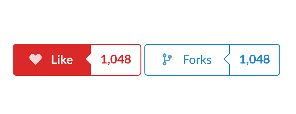
The following are some stunning buttons from the Fomantic-UI buttons collection, along with their source code:
Code:
<div class="ui labeled button" tabindex="0">
    <div class=" ui red button">
        <i class="heart icon"></i> Like
    </div>
    <a class= "ui basic red left pointing label">
        1,048
    </a>
</div>
<div class="ui labeled button" tabindex="0">
    <div class=" ui basic blue button">
        <i class="fork icon"></i> Forks
    </div>
    <a class= "ui basic left pointing blue label">
        1,048
    </a>
</div>
Output:
Inverted buttons
Code:
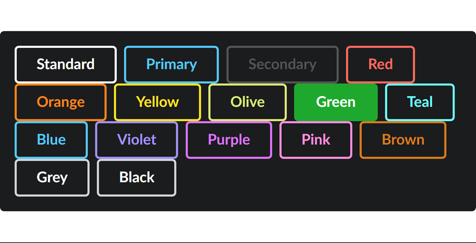
<div class= "ui inverted segment">
    <button class="ui inverted button">Standard</button>
    <button class="ui inverted primary button">Primary</button>
    <button class="ui inverted secondary button">Secondary</button>
    <button class="ui inverted red button">Red</button>
    <button class="ui inverted orange button">Orange</button>
    <button class="ui inverted yellow button">Yellow</button>
    <button class="ui inverted olive button">Olive</button>
    <button class="ui inverted green button">Green</button>
    <button class="ui inverted teal button">Teal</button>
    <button class="ui inverted blue button">Blue</button>
    <button class="ui inverted violet button">Violet</button>
    <button class="ui inverted purple button">Purple</button>
    <button class="ui inverted pink button">Pink</button>
    <button class="ui inverted brown button">Brown</button>
    <button class="ui inverted grey button">Grey</button>
    <button class="ui inverted black button">Black</button>
</div>
According to the code above, the buttons have the class names inverted, color, and button. This is from the Fomantic semantic.min.css file in the dist folder, and you can also find it in the CDN we put into our HTML. Click here to view some of the buttons in the Fomantic-UI.
Images
A quick way to improve user experience on your website is to include photos. 90% of the information ingested and transmitted to our brains is visual. Images can help direct users’ eyes and draw attention to your website. Before discussing Fomantic-image Ui’s layouts, let’s look at the table below.
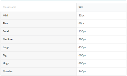
There are certain class names in the table you can see above that are used in Fomantic, and you can also see their sizes. Before we move on to the real image-related scripts we will create later in this tutorial, I’d like to demonstrate this to you. You may locate most of the class names from the previous list in some programs.
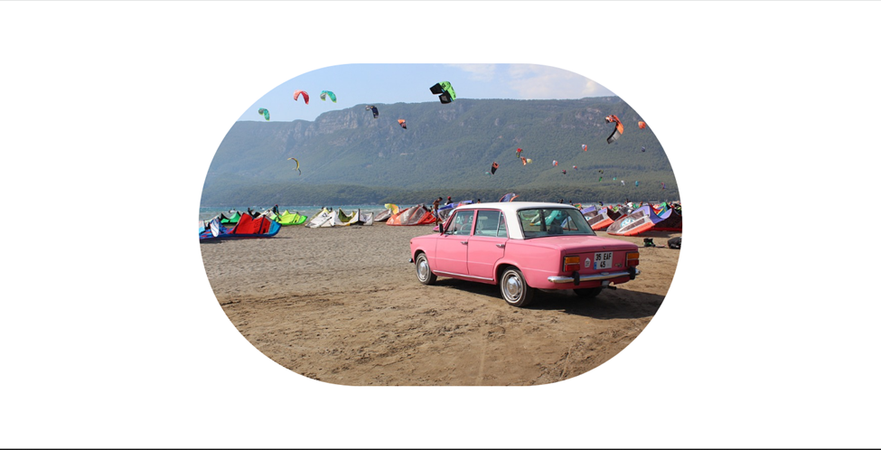
Rounded images: Without writing any CSS code, like the border-radius property we do in conventional CSS, we can easily create a rounded picture in Fomantic-UI.
Code:
<img class= "ui medium circular image"
    src="https://cdn.pixabay.com/photo/2018/04/26/12/14/travel-3351825_960_720.jpg">
You can see how simple and cool this is by looking at the image class name, which has the phrase “ui medium circle picture.” The circular shape has a rounded radius added to it. It’s really simple to use. Simply click here to discover more about Fomantic-UI pictures.
Icons
Awesome icons from the Fomantic-UI library are available for use. Please remember that you use the <i> tag, which is also prevalent in ordinary HTML when using these icons.
We’ll use a selection of animal icons from Fomantic-UI in the section below.
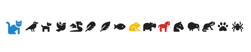
Code:
<i class="cat large blue icon" style="visibility: visible;"></i>
<i class="crow icon" style="visibility: visible;"></i>
<i class="dog icon" style="visibility: visible;"></i>
<i class="dove icon" style="visibility: visible;"></i>
<i class="dragon gold icon" style="visibility: visible;"></i>
<i class="feather icon" style="visibility: visible;"></i>
<i class="feather alternate icon" style="visibility: visible;"></i>
<i class="fish icon" style="visibility: visible;"></i>
<i class="frog yellow icon" style="visibility: visible;"></i>
<i class="hippo icon" style="visibility: visible;"></i>
<i class="horse red icon" style="visibility: visible;"></i>
<i class="horse head icon" style="visibility: visible;"></i>
<i class="kiwi bird icon" style="visibility: visible;"></i>
<i class="otter icon" style="visibility: visible;"></i>
<i class="paw icon" style="visibility: visible;"></i>
<i class="spider icon" style="visibility: visible;"></i>
You may have noticed that we added a color name, and it reflected to give some of the icons new colors. To find out how to use more of these cool icons from Fomangtic-UI, just click this link.
Inputs
Inputs are utilized to obtain user information or details, so Fomantic-UI offers fantastic designs and a quick and simple method of employing inputs. The Fomantic-UI file upload input is shown below.
<div class=" ui file input">
    <input type="file">
</div>

<hr>
<input type="file" id="invisibleupload1" class="ui invisible file input">
<label for="invisibleupload1" class="ui red icon button">
    <i class="file icon"></i>
    Open any file
</label>
<input type="file" id="invisibleupload2" class="ui invisible file input">
<label for="invisibleupload2" class="ui placeholder segment">
    <div class="ui icon header" style="width: 500px">
        <i class="upload icon"></i>
        Click here to upload
    </div>
</label>
Output:
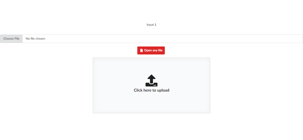
Please be aware that you can also customize the designs by adding your own class name, but you have to be aware of styling conflicts. Styling conflicts come when your own added class name has the same class name as a CSS library or framework., but we’ll talk more about resolving styling conflicts in this article. To learn more about input, click here.
Dividers
A divider is a tool used in web development to visually separate content into categories. Text is frequently used in situations like this. Let’s use Fomantic-UI to create a divider so you can understand how it functions. I’m not entirely sure what they used for theirs, but I can confidently say that it has to do with CSS flex-direction. Please inspect the output preview and the code below.
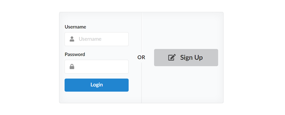
Code:
<div class= "ui placeholder segment">
    <div class= "ui two column very relaxed stackable grid">
    <div class="column">
        <div class= "ui form">
        <div class="field">
            <label>Username</label>
            <div class=" ui left icon input">
            <input type="text" placeholder="Username">
            <i class="user icon"></i>
            </div>
        </div>
        <div class="field">
            <label>Password</label>
            <div class=" ui left icon input">
            <input type="password">
            <i class="lock icon"></i>
            </div>
        </div>
        <div class="ui blue submit button">Login</div>
        </div>
    </div>
    <div class= "middle aligned column">
        <div class=" ui big button">
        <i class="signup icon"></i>
        Sign Up
        </div>
    </div>
    </div>
    <div class= "ui vertical divider">
    Or
    </div>
</div>
I hope you now have a better understanding of how Dividers work in Fomantic-IU. You can view further Driver’s samples by clicking here.
Loaders
We’ll be utilizing Loaders in Fomantic-UI element collections in this part. Spinners warn a user to hold off until an activity is finished.

Code:
<div class="ui segment "  style="padding: 20px">
        <div class= "ui active dimmer">
        <div class="ui loader "></div>
    </div>
</div>
This one should be your first choice when using loaders because it won’t require writing a lot of CSS code. Everything is ready for you to use on your website, thanks to Fomantic-UI. Click here for additional information on loaders.
Breadcrumbs
A website’s breadcrumb navigation system gives links to each previous page the user has visited while also displaying the user’s current location within the website. It is simple for users to understand how their position on a page (such as a product page) relates to higher-level pages thanks to breadcrumbs, a secondary navigation tool (a category page, for instance)
A standard breadcrumb:

Code:
<div class= "ui breadcrumb">
    <a class="section">Home</a>
    <div class="divider"> / </div>
    <a class="section">Store</a>
    <div class="divider"> / </div>
    <div class="active section">T-Shirt</div>
</div>
Tables
Table layouts will automatically stack for mobile devices. Use the tablet stackable variant to enable responsive modifications or the unsackable variant to stop this behavior.
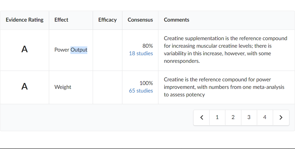
Code:
<table class=" ui celled padded table">
    <thead>
        <tr>
            <th class="single line">Evidence Rating</th>
            <th>Effect</th>
            <th>Efficacy</th>
            <th>Consensus</th>
            <th>Comments</th>
        </tr>
    </thead>
    <tbody>
        <tr>
            <td>
                <h2 class="ui center aligned header">A</h2>
            </td>
            <td class=" single line">
                Power Output
            </td>
            <td>
                <div class="ui yellow rating" data-rating="3" data-max-rating="3"></div>
            </td>
            <td class=" right aligned">
                80% <br>
                <a href="#">18 studies</a>
            </td>
            <td>Creatine supplementation is the reference compound for increasing muscular creatine levels; there is
                variability in this increase, however, with some nonresponders.</td>
        </tr>
        <tr>
            <td>
                <h2 class="ui center aligned header">A</h2>
            </td>
            <td class=" single line">
                Weight
            </td>
            <td>
                <div class="ui yellow rating" data-rating="3" data-max-rating="3"></div>
            </td>
            <td class=" right aligned">
                100% <br>
                <a href="#">65 studies</a>
            </td>
            <td>Creatine is the reference compound for power improvement, with numbers from one meta-analysis to
                assess potency</td>
        </tr>
    </tbody>
    <tfoot>
        <tr>
            <th colspan="5">
                <div class=" ui right floated pagination menu">
                    <a class=" icon item">
                        <i class="left chevron icon"></i>
                    </a>
                    <a class="item">1</a>
                    <a class="item">2</a>
                    <a class="item">3</a>
                    <a class="item">4</a>
                    <a class=" icon item">
                        <i class="right chevron icon"></i>
                    </a>
                </div>
            </th>
        </tr>
    </tfoot>
</table>
Statistics
Web statistics are log files that keep track of specifics about your website and track visitor behavior. This tool is useful for businesses as it evaluates and rates website elements contributing to organizational goals.
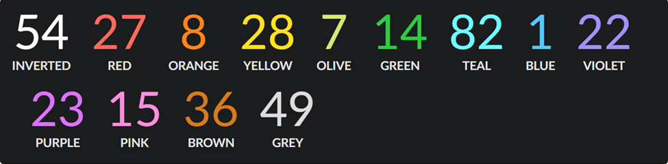
CodeL
<div class= "ui inverted segment">
    <div class=" ui inverted statistic">
        <div class="value">
            54
        </div>
        <div class="label">
            Inverted
        </div>
    </div>
    <div class= "ui red inverted statistic">
        <div class="value">
            27
        </div>
        <div class="label">
            Red
        </div>
    </div>
    <div class= "ui orange inverted statistic">
        <div class="value">
            8
        </div>
        <div class="label">
            Orange
        </div>
    </div>
    <div class= "ui yellow inverted statistic">
        <div class="value">
            28
        </div>
        <div class="label">
            Yellow
        </div>
    </div>
    <div class=" ui olive inverted statistic">
        <div class="value">
            7
        </div>
        <div class="label">
            Olive
        </div>
    </div>
    <div class=" ui green inverted statistic">
        <div class="value">
            14
        </div>
        <div class="label">
            Green
        </div>
    </div>
    <div class= "ui teal inverted statistic">
        <div class="value">
            82
        </div>
        <div class="label">
            Teal
        </div>
    </div>
    <div class= "ui blue inverted statistic">
        <div class="value">
            1
        </div>
        <div class="label">
            Blue
        </div>
    </div>
    <div class= "ui violet inverted statistic">
        <div class="value">
            22
        </div>
        <div class="label">
            Violet
        </div>
    </div>
    <div class= "ui purple inverted statistic">
        <div class="value">
            23
        </div>
        <div class="label">
            Purple
        </div>
    </div>
    <div class= "ui pink inverted statistic">
        <div class="value">
            15
        </div>
        <div class="label">
            Pink
        </div>
    </div>
    <div class= "ui brown inverted statistic">
        <div class="value">
            36
        </div>
        <div class="label">
            Brown
        </div>
    </div>
    <div class= "ui grey inverted statistic">
        <div class="value">
            49
        </div>
        <div class="label">
            Grey
        </div>
    </div>
</div>
Cards
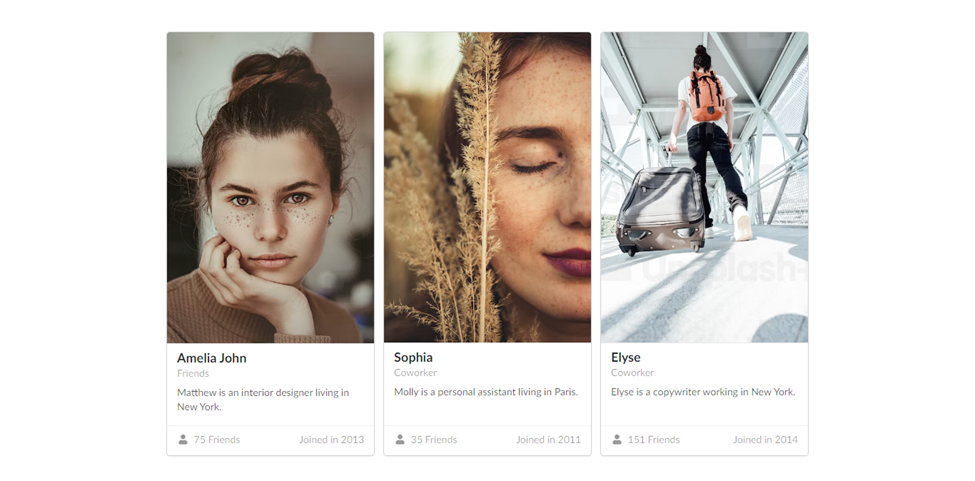
Website content is shown on a playing card-like card. A card is a container for a handful of relevant, brief facts. Its size and shape are similar to playing cards, and its function is to represent a mental unit in a linked, condensed manner. Click here to learn more about cards and how to use more card examples.
Code:
<div class= "ui link cards">
    <div class="card">
        <div class="image">
            <img
                src="https://images.unsplash.com/photo-1554151228-14d9def656e4?ixlib=rb-4.0.3&ixid=MnwxMjA3fDB8MHxzZWFyY2h8OXx8aHVtYW58ZW58MHx8MHx8&auto=format&fit=crop&w=500&q=60">
        </div>
        <div class="content">
            <div class="header">Amelia John</div>
            <div class="meta">
                <a>Friends</a>
            </div>
            <div class="description">
                Matthew is an interior designer living in New York.
            </div>
        </div>
        <div class=" extra content">
            <span class=" right floated">
                Joined in 2013
            </span>
            <span>
                <i class="user icon"></i>
                75 Friends
            </span>
        </div>
    </div>
    <div class="card">
        <div class="image">
            <img
                src="https://images.unsplash.com/photo-1571816119607-57e48af1caa9?ixlib=rb-4.0.3&ixid=MnwxMjA3fDB8MHxzZWFyY2h8MjB8fGh1bWFufGVufDB8fDB8fA%3D%3D&auto=format&fit=crop&w=500&q=60">
        </div>
        <div class="content">
            <div class="header">Sophia</div>
            <div class="meta">
                <span class="date">Coworker</span>
            </div>
            <div class="description">
                Molly is a personal assistant living in Paris.
            </div>
        </div>
        <div class=" extra content">
            <span class=" right floated">
                Joined in 2011
            </span>
            <span>
                <i class="user icon"></i>
                35 Friends
            </span>
        </div>
    </div>
    <div class="card">
        <div class="image">
            <img
                src="https://plus.unsplash.com/premium_photo-1664368832363-9f9c97e40aed?ixlib=rb-4.0.3&ixid=MnwxMjA3fDB8MHxzZWFyY2h8MTl8fGh1bWFufGVufDB8fDB8fA%3D%3D&auto=format&fit=crop&w=500&q=60">
        </div>
        <div class="content">
            <div class="header">Elyse</div>
            <div class="meta">
                <a>Coworker</a>
            </div>
            <div class="description">
                Elyse is a copywriter working in New York.
            </div>
        </div>
        <div class=" extra content">
            <span class=" right floated">
                Joined in 2014
            </span>
            <span>
                <i class="user icon"></i>
                151 Friends
            </span>
        </div>
    </div>
</div>
Accordions
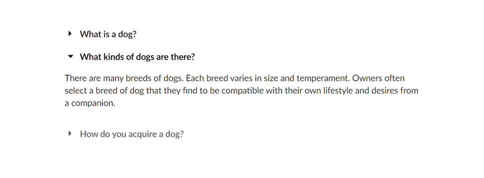
A web design technique for a menu called an accordion displays a group of headers stacked on top of one another. If you click on these headers, associated content will either appear or disappear (or when a keyboard click or screen reader click is made). For your use, Fomantic-UI offers a ton of awesome accordions; click here to see more accordions.
HTML Code:
<div class= "ui basic styled accordion">
    <div class="title">
        <i class="dropdown icon"></i>
        What is a dog?
    </div>
    <div class="content">
        <p class=" transition hidden">A dog is a type of domesticated animal. Known for its loyalty and faithfulness, it can be found as a welcome guest in many households across the world.</p>
    </div>
    <div class=" title active">
        <i class="dropdown icon"></i>
        What kinds of dogs are there?
    </div>
    <div class=" content active">
        <p style="display: block !important;" class="visible">There are many breeds of dogs. Each breed varies in size and temperament. Owners often select a breed of dog that they find to be compatible with their own lifestyle and desires from a companion.</p>
    </div>
    <div class="title">
        <i class="dropdown icon"></i>
        How do you acquire a dog?
    </div>
    <div class="content">
        <p>Three common ways for a prospective owner to acquire a dog is from pet shops, private owners, or shelters.</p>
        <p>A pet shop may be the most convenient way to buy a dog. Buying a dog from a private owner allows you to assess the pedigree and upbringing of your dog before choosing to take it home. Lastly, finding your dog from a shelter, helps give a good home to a dog who may not find one so readily.</p>
    </div>
</div>
JavaScript:
$('.ui.accordion')
    .accordion()
;
Dropdowns
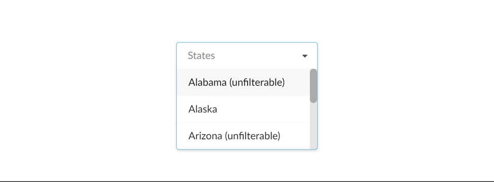
The purpose of a dropdown menu, sometimes called a pull-down menu or list, is to make it simpler for website visitors to find specific pages or features. The input pick type currently uses a dropdown. However, we’ll be making a prettier dropdown for Fomantic-UI. To view more dropdowns, click on this link.
We must understand how to use a dropdown before we leap to initializing one. For Fomantic-U Dropdowns to function, the dropdown must be initialized with JavaScript; otherwise, it will simply be displayed on the browser without any functionality. The Jquery code for initializing the javaScript is located underneath the HTML code. But to save time for this article, I ask that you click on this link to take advantage of the dropdown’s full functionality. The official page covers everything you need to know to get started using the dropdown. HTML:
<div class= "ui search selection dropdown">
    <input name="states" type="hidden">
    <i class="dropdown icon"></i>
    <div class="default text">States</div>
    <div class="menu">
        <div class="unfilterable item" data-value="AL">Alabama (unfilterable)</div>
        <div class="item" data-value="AK">Alaska</div>
        <div class="unfilterable item" data-value="AZ">Arizona (unfilterable)</div>
        <div class="unfilterable item" data-value="AR">Arkansas (unfilterable)</div>
        <div class="item" data-value="CA">California</div>
        <div class="item" data-value="OH">Ohio</div>
        <div class="item" data-value="OK">Oklahoma</div>
    </div>
</div>
JavaScript:
<script>
    $('.ui.dropdown')
        .dropdown()
        ;
</script>
Output:
Progress Bars
Using a progress bar, a graphical control element, one can see an extended computer process, such as a download, file transfer, or installation. There are several reasons why a webpage might employ progress indicators, such as The user can get a general sense of how long it takes to complete the task. By showing the level of completion, progress indicators can estimate the performance rate of a certain activity, such as upload speed.
We’ll be using some Progress Bar from the official Fomantic-UI websites in this progress bar area. There are several lovely progress bars, and most of these will be put to the test, but first, let’s look at how the Progress Bar is used and protected in the Fomantic-Ui. You must execute a javascript code before using the Progress Bar in Fomantic-UI, but the javascript code you are about to do will match with the precise Progress Bar HTML code you are collecting from the Fomantic-UI Progress Bar page. Click here to read more about the Progress Bar.
Sample Progress Bar:
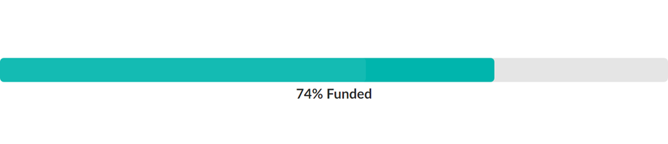
HTML code:
<div class="ui teal progress" data-percent="74" id="example1">
    <div class="bar"></div>
    <div class="label">74% Funded</div>
</div>
JavaScript:
$('#example1').progress();Calendars
A web calendar is a tool to keep track of upcoming events, dates, appointments, deadlines or special occasions for you or other people.
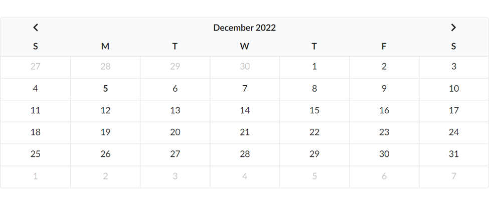
HTML code:
<div class="ui calendar" id="inline_calendar">
</div>
JavaScript:
$('#inline_calendar')
    .calendar();
You can see from the code that everything appears to be quite simple. Fomantic-UI is a preferred choice for developers because of this. Read more here about Calendar.
Checkboxes
A user can select a value from a handful of binary alternatives that are used frequently by checking a box.
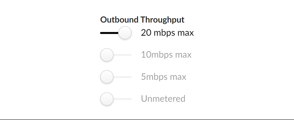
HTML:
<div class= "ui form">
    <div class=" grouped fields">
        <label>Outbound Throughput</label>
        <div class="field">
            <div class= "ui slider checkbox">
                <input type="radio" name="throughput" checked="checked">
                <label>20 mbps max</label>
            </div>
        </div>
        <div class="field">
            <div class= "ui slider checkbox">
                <input type="radio" name="throughput">
                <label>10mbps max</label>
            </div>
        </div>
        <div class="field">
            <div class= "ui slider checkbox">
                <input type="radio" name="throughput">
                <label>5mbps max</label>
            </div>
        </div>
        <div class="field">
            <div class= "ui slider checkbox checked">
                <input type="radio" name="throughput">
                <label>Unmetered</label>
            </div>
        </div>
    </div>
</div>
How to prevent styling conflicts in Fomantic-UI
You must be very careful when adding any extra class names to your elements when using Fomantic-UI; this caution helps you avoid stylistic conflicts. CSS doesn’t generally have conflicts, but developers are to blame for those that do. The notion is that you can specify several rules that apply to the same elements, and the order in which you list the styles indicates importance; for example, if a style is listed last, it will take precedence over earlier rules in situations where you’ve identified a conflict. Giving a unique class name that does not correspond to any other general class names while using Fomantic-UI is the best solution to avoid this general styling conflict.
Conclusion
I hope it was enjoyable for you to finish this tutorial. In this article, we learned how to set up Fomantic-UI and developed a few sample projects to understand the fundamental concepts of the tool. To create a portfolio website, you can customize this example to your preferences or put what you’ve learned into action by creating more stunning websites.
Gain Debugging Superpowers
Unleash the power of session replay to reproduce bugs and track user frustrations. Get complete visibility into your frontend with OpenReplay, the most advanced open-source session replay tool for developers.