

Animated elements on a webpage play a critical role in creating an amazing user experience. Creating custom animations, particularly for Javascript frameworks, has long been engaging. As a result, it has provided room for animation libraries such as react-spring, Animie.js, and AnimXYZ, to mention a few.
AnimXYZ differs from the rest by being lightweight and extremely easy to use. With AnimXYZ, you only provide a few CSS variables to elements, and you will achieve a wide range of complex and unique animations. Additionally, it gives you control over the animation, as you can customize it to your needs. If this seems too good to be true, hold on; we are getting there.
This article will give you a comprehensive look at AnimXYZ and conclude by creating this React landing page.

What is AnimXYZ?
AnimXYZ is an open-source animation library that makes it easy to animate components on your page with a few lines of code. It supports basic HTML and CSS, ReactJs, VueJs, and SCSS. AnimXYX utilizes utility classes and CSS variables to achieve many animations without writing keyframes. Once the animation runs, it’s compiled down to native CSS keyframes, giving you smooth transitions between elements.
How does AnimXYZ work?
Instead of creating keyframes for every animation on your page, AnimXYZ creates keyframes to perform a specific animation, leaving you to provide the parameter through the xyz utilities.
Under the hood, we have lots of keyframes like the one below:
@keyframes xyz-keyframes {
  from {
    opacity: var(--xyz-opacity);
    transform: translate3d(
      var(--xyz-translate-x),
      var(--xyz-translate-y),
      var(--xyz-translate-z)
    );
  }
}
Setup and installation
To get started, we’ll create our React project using Vite. Vite is a build tool that helps you set up your app in seconds, but you are also free to use create-react-app. Then we will install AnimXYZ as a dependency.
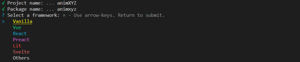
First, create an empty folder that will host all our project files. Next, start up VS Code and open the created folder in it. Next, open the VS Code integrated terminal via the Ctrl+Shift+` shortcut or by clicking the Terminal UI menu at the top of the VS Code navbar. Then, to initialize Vite, run the following command:
npm create vite@latestThe Vite’s installation wizard will ask you for the name of your project and package name and then ask you to choose your preferred framework, as shown below.
Navigate to the React option through your keyboard’s up and down arrow keys, then press enter. It will prompt you to choose the variant you’d like your React app to come with, as shown below.
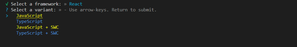
For our case, we will go with Javascript, the first option, but you are also free to use Typescript. Press enter for the first option, and Vite shall be ready to install. You will receive the below prompt for your project setup.
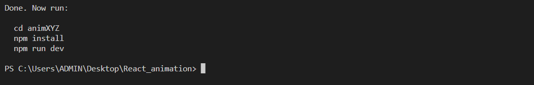
As stated in the picture, Enter your project directory via the cd command, then run the following command on the terminal.
npm installCompleting all of your project’s installations may take a few seconds. Now let’s install AnimXYX.Run the below command, which will install AnimXYZ as a dependency.
npm install @animxyz/react
Once finished, you can start your development server via the command below.
npm run devIt is still the command that you will repeatedly use when you want to start the server. Once the server is started, on the terminal, you will provide a URL link to your locally hosted application. Open your favorite browser and visit the URL to see your application.
XyzTransition Component
AnimXYZ comes with the XyzTransition provider component that you wrap around the elements you want to animate. The “XyzTransition” is an extension of React TransitionGroup, a React library dedicated to implementing visual transitions.
Now, open the app.css file and insert the following code.
#root {
  width: 100%;
  margin: 0;
  padding: 0;
  text-align: center;
  box-sizing: border-box;
}
.card {
  background-color: rgb(234, 255, 0);
  width: 10rem;
  height: 10rem;
  margin-top: 3rem;
  border-radius: 1rem;
}
.hero {
  width: 100%;
  background-color: cyan;
  align-items: center;
  height: 100vh;
  display: flex;
  flex-direction: column;
}
You can clear out all the styles in index.css then add the following code on app.jsx
import "./App.css";
import Hero from "./Components/Hero";
import { XyzTransition } from "@animxyz/react";
import "@animxyz/core";

function App() {
  return (
    <XyzTransition appear duration="auto">
      <div className="App">
        <div className="wrapper">
          <Hero />
        </div>
      </div>
    </XyzTransition>
  );
}

export default App;
From the above code, we have imported the XyzTransition component from @nimxyz/react, which we installed as a dependency earlier. Then, we have to wrap our application around the component. We are currently wrapping our entire application with the XyzTransition because it is a small demo app, and wrapping the entire application is not required as in the case of a provider in other technology like redux. Wrapping creates a unique code block that will be animated in a specific manner.
XyzTransition component usually takes duration, appears, and appear-visible as major props.
- Duration: The
durationdefines how long an animation will run. During this time, the animation has an active class applied to it, and when the time is over, the active class is removed. Active classes are AnimXYZ classes that carry out a specific operation. Thedurationprops can also be specified in milliseconds.
duration = "3000" //animation set to run for three seconds-
Appear:
appearis a boolean prop given to theXyzTransitioncomponent. When it’s set totrue, the animation on the element will only take effect when the page renders, and when set tofalse, the animation will run when toggled. -
AppearVisible:
appearVisibleutilizes the intersection observer to check if the element is visible on the screen. It keeps the animation from running until the element is visible on the screen. For its value, you can give a boolean or your custom-created intersection observer, i.e.
appearVisible = { boolean | IntersectionObserverOptions }- Mode: The
modeprops control the behavior of the animation. The two major ones are:
mode = "out-in"
mode = "in-out"
One caveat to always remember when using XyzTransition with react. You can only have HTML elements as your direct children, not the exact component. When you import a component, in our case, Hero, we wrap it with HTML tags.
<div><Hero/></div>
Additionally, we have included the below line in our imports.
import "@animxyz/core"This is necessary if your webpack utilizes the CSS loader, and you only need to import it once in your scripts.
Utilities
Now, create a new folder in the src and name it Components. Create a JSX file called Hero and have the below code.
import "../App.css";

function Hero() {
  return (
    <div className="hero" xyz="fade down small duration-30">
      <div className="card xyz-nested"></div>
    </div>
  );
}

export default Hero;
Now, here is where the magic happens. AnimXYZ is a variable and utility-oriented animation toolkit. You create your desired animation by passing the utility to the xyz variable.
AnimXYZ packages a large number of utilities that you can use.
Here is how you use them.
In the Hero component, we gave out the utilities to be
xyz="fade down small duration-30"The above utilities specify
fade: make the element visible as its opacity increases gradually.down: indicates that the element will grow from the top down.small: the element will start small and grow.duration: the total time the animation will take to run
For our child components to run the animation, we add xyz-nested to the class name of our child component. This is done so the children can inherit the animation from the parents’ component. It is especially convenient when you have a lot of nested elements or components.
Our app will render the below animation.

Let’s add more utilities to make the animation more complex.
Have the following line for the xyz utilities in our app:
xyz="fade up-100% flip-down flip-right-50% rotate-left-100% origin-bottom duration-10 stagger"Our animation will render as below.

Cool right?
XyzTransitonGroup Component
This component is similar to the XyzTransition component. It is useful when applying animation to a list of elements. Example:
<XyzTransitionGroup
  appear={boolean}
  appear-visible={boolean | IntersectionObserverOptions}
  duration={
    number |
    "auto" |
    { appear: number | "auto", in: number | "auto", out: number | "auto" }
  }
  tag={string}
>
  <child key="1" />
  <child key="2" />
  <child key="3" />
  ...
</XyzTransitionGroup>;
In addition to duration, appear, and appear-visible pros, in XyzTransitionGroup, you also have the tag props. The tag props require you to specify the HTML tag you will use to wrap your components, for example, the div tag.
Session Replay for Developers
Uncover frustrations, understand bugs and fix slowdowns like never before with OpenReplay — an open-source session replay tool for developers. Self-host it in minutes, and have complete control over your customer data. Check our GitHub repo and join the thousands of developers in our community.
Creating the landing page
Now let’s put everything we’ve learned so far into action by creating a landing page. We will use AnimXYZ to animate our project to resemble a production-level landing page.
Before coding, let’s create a good folder structure for easy application management. Delete the already existing Hero.jsx file in the Components folder and create two other folders, Navbar and Hero.
In the Navbar folder, create two files, Navbar.jsx and Navabar.css, for styling our Navbar.
Add the following line of code in index.css
:root {
  font-size: 16px;
  font-weight: 400;
  width: 100vw;

  color-scheme: light dark;
  color: rgba(255, 255, 255, 0.87);
  background-image:linear-gradient(to bottom right, rgb(14, 14, 83),rgb(1, 1, 29) ) ;
  background-repeat: no-repeat;
  background-size: cover;

  font-synthesis: none;
  text-rendering: optimizeLegibility;
  -webkit-font-smoothing: antialiased;
  -moz-osx-font-smoothing: grayscale;
  -webkit-text-size-adjust: 100%;
}
Create two files in the Hero folder: Hero.jsx and Hero.css.
Open the Navbar.css file and paste the below line of code.
/* Navbar.css*/
@import url("https://fonts.googleapis.com/css2?family=Montez&family=Poppins:ital,wght@0,200;0,300;0,400;1,300;1,400&display=swap");
.navbar {
  padding: 2rem;
  padding: 2rem;
  display: flex;
  justify-content: space-between;
  align-items: center;
  position: relative;
  top: 0;
  left: 0;
  max-height: 1rem;
}
.logo {
  display: flex;
}
.logo h1 {
  padding-left: 5px;
  font-family: "Montez", cursive;
  font-size: 3rem;
}
.items {
  display: flex;
  justify-content: space-between;
  width: 30%;
}
.items p {
  font-family: "Poppins", sans-serif;
}
We have imported two fonts from Google Fonts to add flavor to our text: the Poppins font and Montez. Open the Navbar.jsx file and have the below lines of code.
import svg from "../../assets/react.svg";
import "./Navbar.css";
import { XyzTransition } from "@animxyz/react";

const Navbar = () => {
  return (
    <XyzTransition appear={true} duration="auto">
      <div className="navbar" data-scroll-section>
        <div className="logo">
          <img src={svg} alt="logo" />
          <h1>Open replay</h1>
        </div>
        <div className="items" xyz="fade left stagger duration-30">
          <p className="xyz-nested">About</p>
          <p className="xyz-nested">Pricing</p>
          <p className="xyz-nested">Sponsors</p>
          <p className="xyz-nested">Team</p>
        </div>
      </div>
    </XyzTransition>
  );
};

export default Navbar;
The logo that we are using is the React logo that comes with Vite. We have followed this by importing our navbar CSS and the XyzTransition component from @animxyz/react.
We will only be animating our menu elements in the navbar by making them slide in from the left as the page loads.
For that, we first wrap the Navbar component with the XyzTransition.Then, to ensure the animation runs when the page loads, we set the appear pros to be true. For the duration, we have set it to auto since we will have nested elements, and we would like each element’s animation to complete before moving to the next.
To define the animation we want for our navbar menus, we give their parent element, the div with class name items, the xyz utility class. For the utilities, we have defined them as shown below.
xyz="fade left duration-30"-
fade: Increase the element’s opacity as it fades into visibility. -
left: This will make the element move from the left. -
duration-30: The duration specifies how long our animation will take.
Now, open the Hero.css file in the Hero folder, then paste the below lines of code.
@import url('https://fonts.googleapis.com/css2?family=Bricolage+Grotesque:opsz,wght@12..96,200..800&Barlow:wght@500;600;700&family=Figtree:wght@400;500;600;700&display=swap');
.hero{
    width: 100%;
    display: flex;
}
.text{
    width: 50%;

}
.text h1{
    font-size: 3.5rem;
    width: 80%;
    padding-left: 2rem;
    font-family: 'Bricolage Grotesque', 'Figtree', 'Roboto', sans-serif;
}
.text p{
    padding-left: 2rem;
    line-height: 1.8rem;
    font-family: 'Figtree', 'Poppins', sans-serif;

}
.buttons{
    width:100%;
    padding-left: 2rem;

}
.email{
    padding: 1rem;
    color:white;
    width: 40%;
    border-radius: .8rem;
    border: none;
}
.acces{
    padding: 1rem;
    color:white;
    width: 40%;
    border-radius: .8rem;
    border: none;
    margin-left: 5px;
    background-color: aqua;
    color:black;
    font-family: 'Poppins', sans-serif;

}
.image-wrapper{
    padding-left: 1rem;
}
We shall use Poppins font to style up our text, so we use the Google font link we previously had on the Navbar.css file since it had Poppins font.
Then, open the Hero.jsx file and have the below lines of code.
import heroPic from "../../assets/group.png";
import "./Hero.css";
import { XyzTransition } from "@animxyz/react";
function Hero() {
  return (
    <XyzTransition appear duration="auto">
      <div className="hero">
        <div
          className="text"
          xyz="fade small stagger ease-out-back delay-10 duration-30"
        >
          <h1 className=" xyz-nested">Welcome to open replay</h1>
          <p className=" xyz-nested">
            Lorem ipsum dolor sit amet consectetur adipisicing elit. Repellendus
            totam nemo vero quod laboriosam ullam suscipit beatae reiciendis
            doloremque minima repellat possimus error, voluptatum eaque. Quos
            dignissimos ullam dolorem molestiae.
          </p>
          <div className="buttons  xyz-nested">
            <input className="email xyz-nested" placeholder="@ Email" />
            <button className="acces xyz-nested">Get Early Acces</button>
          </div>
        </div>
        <div
          className="image-wrapper"
          xyz="fade right stagger delay-10 duration-20"
        >
          <img
            src={heroPic}
            className="xyz-nested"
            alt="colaboration illutartion"
          />
        </div>
      </div>
    </XyzTransition>
  );
}

export default Hero;
Now, go ahead and download an illustration image from here for free and drag and drop it into the assets folder in our application. We have imported the image and named it heroPic. We have also imported our styles and the XyzTransition component for animating our elements.
In the jsx, we have two major div tags with class names text, and image-wrapper. We shall be animating both of them, and as a result, we wrap the entire component with the XyzTransition component.
Now for the text class, we give it the xyz utility class with the below utilities.
xyz="fade small stagger ease-out-back delay-10 duration-30"-
fade: the element will appear gradually, and its color will sink in. -
Small: causes the element to expand inward and contract outward. -
stagger: causes the menu list animations to follow each other. -
ease-out-back: this gives the animation a slight overshoot at the end. -
delay-10: this causes the animation to pause for a few seconds before starting. -
duration-30: the time it will take to complete the animation
Additionally, all the elements in the list are given xyz-nested class. It is to make them inherit the animation from the parent class.
For the image-wrapper class, we gave it the below xyz utilities.
xyz="fade right delay-10 duration-20"-
fade: this makes the element gradually appear while increasing its opacity. -
right: it makes the element slide in from the right. -
delay-10: this will pause the animation for a few milliseconds after the page loads. -
duration-20: the time it takes for the animation to run.
We also gave the img JSX tag the xyz-nested class. It is to make it inherit the animation from its parent class.
Finally, open the App.jsx file and insert the following code.
//App.jsx
import Navbar from "./Componets/Navbar/Navbar";
import Hero from "./Componets/Hero/Hero";
import "@animxyz/core";
import "./App.css";
function App() {
  return (
    <main>
      <Navbar />
      <Hero />
    </main>
  );
}
export default App;
We have imported our Navbar and Hero components and rendered them in our apps’ JSX. We have also imported @animxyz/core. We have imported it because our Webpack uses a CSS loader. You can include the snippet anywhere in your JS file.
Conclusion
You must have seen how easy it is to get started using AnimXYZ. This article has introduced AnimXYZ, gone through how to set it up in a project, and shown how to use it. AnimXYZ is a powerful library that has a large community behind it. Feel free to try it out and bring the AnimXYZ awesomeness into your application.
Thank you.
Gain Debugging Superpowers
Unleash the power of session replay to reproduce bugs and track user frustrations. Get complete visibility into your frontend with OpenReplay, the most advanced open-source session replay tool for developers.