
CSS is a great way to style your web pages but can also be a pain to manage. However, when you have a lot of code and components that need to work together, you might end up with styles that affect the wrong elements, clash with each other, or are hard to change. The solution to this is using CSS modules, as this article shows.

Discover how at OpenReplay.com.
CSS modules are a way to write CSS code that is easy to reuse and organize. With CSS modules, each CSS file is like a module that has its class names that you can use in other files or components. This way, you can ensure that your styles only apply to the elements you want and don’t interfere with others.
Also, with CSS modules, you can avoid some common problems with CSS in large-scale projects, such as: global scope, specificity wars, naming collisions, etc.
Before we explore the benefits of using CSS modules, let’s see how we can set up our project to use them. This will help us understand how CSS modules work and how they differ from regular CSS files. We will use webpack as our bundler, but you can use any other tool that supports CSS modules.
We will create a new project directory and navigate to our integrated terminal.
After that, run the following command to initialize a new Node.js project and generate a package.json file:
npm init -yNow, we will install Webpack, style-loader, and css-loader by running the following command:
npm install webpack webpack-cli style-loader css-loader --save-devNext, we will create the following directory structure within the project directory:
- src
  - index.js
  - styles
    - style.css
After that, we will create a webpack.config.js file in the root of the project directory and add the following configuration:
const path = require('path');
module.exports = {
  entry: './src/index.js',
  output: {
    path: path.resolve(__dirname, 'dist'),
    filename: 'bundle.js',
  },
  module: {
    rules: [
      {
        test: /\.css$/,
        use: [
          'style-loader',
          {
            loader: 'css-loader',
            options: {
              modules: {
                localIdentName: '[name]__[local]--[hash:base64:5]',
              },
            },
          },
        ],
      },
    ],
  },
};
This will tell webpack to bundle all the CSS files that you import in your JavaScript modules and inject them into the <head> of your HTML document. It will also enable the modules option in the css-loader configuration, which will generate unique class names for each CSS selector and scope them to the corresponding component.
Now, in the src/styles directory, create a style.css file with the following content:
.button {
  background-color: #ff0000;
  color: white;
}

.active {
  background-color: #00ff00;
}
This is a regular CSS file, but we will use it as a CSS module by importing it into our JavaScript code.
In the src directory, create an index.js file with the following content:
import styles from './styles/style.css';
console.log(styles.button); // Outputs a unique class name for the .button selector
console.log(styles.active); // Outputs a unique class name for the .active selector
This will import the style.css file as a CSS module and assign it to the styles variable. We can then access the class names as properties of the styles object. The css-loader will transform the class names to be unique and scoped to the component.
Now, in the command line, run the following command to build your project using Webpack:
npx webpack --mode developmentThis will create a bundle.js file in the dist directory containing the bundled JavaScript and CSS code.
Next, you will open the generated bundle.js file and observe the transformed CSS class names. You will see something like this:
// ./src/styles/style.css
__webpack_require__.r(__webpack_exports__);
// extracted by mini-css-extract-plugin
/* harmony default export */ __webpack_exports__["default"] = ({
  "button": "style__button--3f4d5",
  "active": "style__active--2g6f7"
});

// ./src/index.js
__webpack_require__.r(__webpack_exports__);
/* harmony import */ var _styles_style_css__WEBPACK_IMPORTED_MODULE_0__ = __webpack_require__(/*! ./styles/style.css */ "./src/styles/style.css");

console.log(_styles_style_css__WEBPACK_IMPORTED_MODULE_0__.default.button); // Outputs a unique class name for the .button selector

console.log(_styles_style_css__WEBPACK_IMPORTED_MODULE_0__.default.active); // Outputs a unique class name for the .active selector
You can see that the original class names .button and .active have been replaced by unique class names such as style__button--3f4d5 and style__active--2g6f7. These class names are generated by the css-loader based on the file name, the original class name, and a hash. This ensures that the class names are unique and scoped to the component that imports them.
You can also see that the CSS code has been extracted by the style-loader and injected into the <head> of the HTML document. This means the styles will be applied to the elements with matching class names.
Now that we know how to set up our project, let’s move on to the benefits.
CSS modules enable local scope by default
One of the common problems with CSS in large-scale projects is that it has a global scope by default. This means that any style declaration can affect any element on the page, regardless of where it is defined or used. This can lead to unintended side effects, conflicts, and overrides, making the CSS code hard to maintain, read, and debug.
One of the benefits of using CSS modules is that they enable local scope by default. This means that the styles in a CSS module only apply to the component that imports them. They do not affect other components or elements on the page.
This is achieved by generating unique class names for each component, using a combination of the file name, the local name, and a hash.
For example, if we have a Button.module.css file with the following content:
.button {
  background-color: #ff0000;
  color: white;
}
.active {
  background-color: #00ff00;
}
The generated class names will look like this:
.Button_button__3Kc8r {
  background-color: blue;
  color: white;
}
.Button_active__1ljlC {
  background-color: green;
}
Here, the generated class names .Button_button__3Kc8r and .Button_active__1ljlC encapsulate the styles defined within the module, providing a modular and isolated approach to styling.
The generated class names will map to HTML or JSX code elements. This will use a special syntax. It imports the CSS module as an object and accesses its properties.
For example, if we have a Button.js React component that uses the CSS module, we can write something like this:
import React from 'react';
import styles from './Button.module.css';
function Button(props) {
  return (
    <button
      className={`${styles.button} ${props.active ? styles.active : ''}`}
      onClick={props.onClick}
    >
      {props.children}
    </button>
  );
}
export default Button;
Here, the component imports the CSS module for styling. The button’s class name is dynamically determined by the CSS module styles and the active prop. If the active prop is true, the styles.active class is added to the button’s class list. We use the ${} syntax to embed expressions in strings. This is a feature of JavaScript called template literals.
Now, to show the output of the code, we can use a simple HTML file that imports the React and ReactDOM libraries and the Button.js component. We can also use some inline styles to center the button on the page.
For example:
<!DOCTYPE html>
<html lang="en">
<head>
  <meta charset="UTF-8" />
  <title>CSS Modules Example</title>
  <style>
    body {
      display: flex;
      justify-content: center;
      align-items: center;
      height: 100vh;
    }
    .button {
      color: white;
      padding: 1rem;
    }
    .active {
      background-color: #00ff00;
    }
  </style>
</head>
<body>
  <div id="root">
    <button class="button active">Click me</button>
  </div>
  <script src="./dist/bundle.js"></script>
</body>
</html>
The output of this HTML file will look like this:
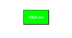
As you can see, the button component has different styles depending on the active prop. The styles are scoped to the component and do not affect other elements on the page.
CSS modules support the composition and inheritance of styles
Another benefit of using CSS modules is that they support composition and inheritance of styles. This means we can reuse and extend styles from other modules, without having to write them from scratch or duplicate them.
We do this using the composes keyword. It lets us import and combine styles from one or more modules.
For example, if we have a Card.module.css file with the following content:
.card {
  border: 1px solid black;
  padding: 10px;
  margin: 10px;
}
.title {
  font-weight: bold;
  font-size: 20px;
}
.content {
  font-size: 16px;
}
If we want to create a special type of card with a different background and font color, we can use the composes keyword to inherit the styles from the Card.module.css file and override or add new styles.
We can create a new file called BlueCard.module.css with the following content:
.blueCard {
  composes: card from './Card.module.css';
  background-color: blue;
  color: white;
}
We use the composes property to import styles from the Card.module.css module. It allows the blueCard class to inherit and apply those styles.
Note that composes applies the composed styles before the current styles. Use the current styles if there is a conflict or overlap between styles. They override the composed styles.
For example, in our BlueCard.module.css file, we have overridden the background-color and color properties of the card class with new values.
The composes keyword takes one or more class names from another module, separated by spaces. It can also take a path to the module using the from keyword. The composed class names are then added to the current class name, creating a new class name that inherits the styles from both modules.
The generated class name for the blueCard class will look like this:
.BlueCard_blueCard__2yf3Z,
.Card_card__1aB8r {
  border: 1px solid black;
  padding: 10px;
  margin: 10px;
  background-color: blue;
  color: white;
}
The composed class name is then mapped to the corresponding element in the HTML or JSX code using the same syntax.
Let’s say we have a BlueCard.js React component that uses the CSS module; we can write the following:
import React from 'react';
import styles from './BlueCard.module.css';
function BlueCard(props) {
  return (
    <div className={styles.blueCard}>
      <h1 className={styles.title}>{props.title}</h1>
      <p className={styles.content}>{props.content}</p>
    </div>
  );
}
export default BlueCard;
The component imports the CSS module styles from the BlueCard.module.css file. Inside the component, a <div> element is rendered with the class name styles.blueCard, which applies the corresponding styles defined in the CSS module. The component also receives props as its parameter, including title and content values, which are dynamically rendered within an <h1> and <p> element.
To show the output of this code, we can use the same HTML file as before. But, we should import the BlueCard.js component instead of the Button.js component.
For example:
<!DOCTYPE html>
<html lang="en">
<head>
  <meta charset="UTF-8" />
  <title>Composition and Inheritance</title>
  <style>
    body {
      display: flex;
      justify-content: center;
      align-items: center;
      height: 100vh;
    }
  </style>
</head>
<body>
  <div id="root"></div>
  <script src="https://unpkg.com/react/umd/react.development.js"></script>
  <script src="https://unpkg.com/react-dom/umd/react-dom.development.js"></script>
  <script src="./BlueCard.js"></script>
  <script>
    // Render the blue card component with some props
    ReactDOM.render(
      <BlueCard
        title="CSS Modules"
        content="CSS modules are a cool way to write modular and reusable styles."
      />,
      document.getElementById('root')
    );
  </script>
</body>
</html>
The output will look like this:
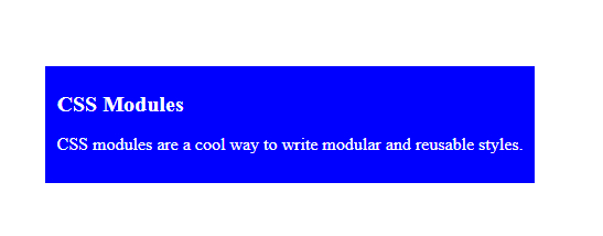
As you can see, the blue card has inherited and composed styles from the Card.module.css file and applied its own styles.
CSS modules integrate well with modern web development tools and frameworks
CSS modules are compatible with most of the popular web development tools and frameworks used today. You can easily integrate CSS modules into your existing workflow and enjoy the benefits of modular and reusable styles without changing your codebase.
In this section, we will explore how CSS modules seamlessly integrate with popular web development tools and frameworks (Webpack, React, and Vue).
Webpack:
Webpack is a module bundler. It bundles many JavaScript files (modules) into a single file. The file can run in the browser. This helps us organize our code into smaller, reusable units. It also optimizes our web application’s performance and compatibility.
To use CSS modules with Webpack, we must install and configure two loaders: style-loader and css-loader. These loaders will let us import CSS files into our JavaScript modules, which we can then inject into the DOM dynamically.
Here is a sample Webpack configuration that uses CSS modules:
module.exports = {
  // ...
  module: {
    rules: [
      {
        test: /\.css$/,
        use: [
          'style-loader',
          {
            loader: 'css-loader',
            options: {
              modules: true, // enable CSS modules
            },
          },
        ],
      },
    ],
  },
};
In the above code, we have a Webpack configuration file called webpack.config.js. It exports an object with various properties defining Webpack’s behavior. The module property defines rules for handling different types of files.
In this case, a rule is defined for files with a .css extension. The rule specifies that the files should be processed using the style-loader and css-loader. The css-loader is configured with the option modules: true, enabling CSS modules.
The css-loader will transform your CSS files into JavaScript modules. These modules export an object containing the mappings of the original class names and the generated ones.
For example, if we have a CSS file like this:
.button {
  background-color: blue;
  color: white;
  padding: 10px;
  border: none;
  border-radius: 5px;
  cursor: pointer;
}
.button:hover {
  background-color: darkblue;
}
The css-loader will produce a JavaScript module like this:
exports.locals = {
  button: 'Button_button__3fO1Z', // the generated class name
};
The style-loader will inject a <style> tag into your HTML document’s <head> with the generated CSS code.
For example, the style-loader will inject something like this:
<style>
  .Button_button__3fO1Z {
    background-color: blue;
    color: white;
    padding: 10px;
    border: none;
    border-radius: 5px;
    cursor: pointer;
  }
  .Button_button__3fO1Z:hover {
    background-color: darkblue;
  }
</style>
We can show the output of this code using a simple HTML file. The file imports the React and ReactDOM libraries and the Button.js component. We can also use some inline styles to center the button on the page.
For example:
<!DOCTYPE html>
<html lang="en">
<head>
<meta charset="UTF-8" />
<title>CSS Modules Example</title>
<style>
body {
display: flex;
justify-content: center;
align-items: center;
height: 100vh;
}
</style>
</head>
<body>
<div id="root"></div>
<script src="https://unpkg.com/react/umd/react.development.js"></script>
<script src="https://unpkg.com/react-dom/umd/react-dom.development.js"></script>
<script src="./Button.js"></script>
<script>
// Render the button component with different props
ReactDOM.render(
<div>
<Button onClick={() => alert('Hello')}>Click Me</Button>
<Button onClick={() => alert('World')} active>Click Me Too</Button>
</div>,
document.getElementById('root')
);
</script>
</body>
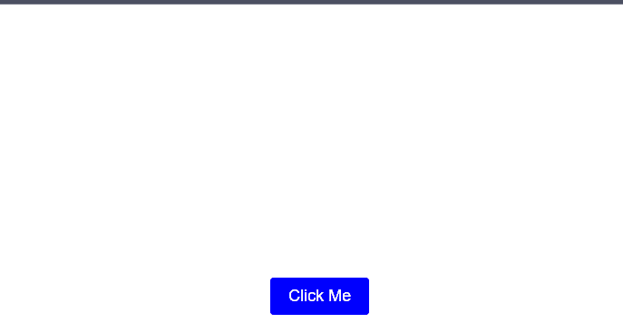
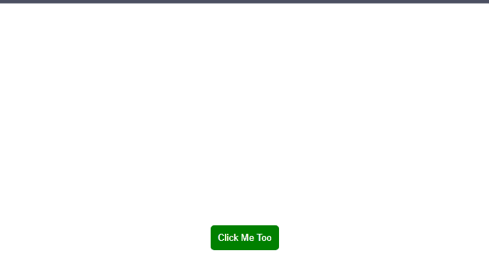
</html>The output of the code will look like this:
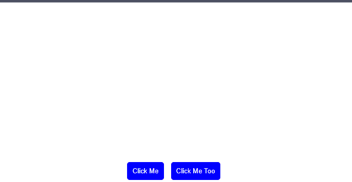
As you can see, the button component has different styles depending on the active prop. The styles are scoped to the component and do not affect other elements on the page.
React:
To use CSS modules with React, we must import our CSS modules as objects and use them as className props for our components.
Here is a simple React component that uses a CSS module:
import React from 'react';
import styles from './Button.module.css';
const Button = ({ children, onClick }) => {
  return (
    <button className={styles.button} onClick={onClick}>
      {children}
    </button>
  );
};
export default Button;
The styles object will contain the mappings of the original class names and the generated ones produced by the css-loader.
Here’s what it will look like:
const styles = {
  button: 'Button_button__3fO1Z',
  // other style properties if any
};
export default styles;
You can then use the styles.button property as the className prop for your button element. This will apply the corresponding style to it.
The button element will render something like this:
<button class="Button_button__3fO1Z" onclick="...">Click me</button>To show the output of this code, we can use a simple HTML file that imports the React and ReactDOM libraries and the Button.js component. We can also use some inline styles to center the button on the page, just as we did in the previous section.
<!DOCTYPE html>
<html lang="en">
<head>
  <meta charset="UTF-8">
  <title>CSS Modules Example</title>
  <style>
    body {
      display: flex;
      justify-content: center;
      align-items: center;
      height: 100vh;
    }
  </style>
</head>
<body>
  <div id="root"></div>
  <script src="https://unpkg.com/react/umd/react.development.js"></script>
  <script src="https://unpkg.com/react-dom/umd/react-dom.development.js"></script>
  <script src="./Button.js"></script>
  <script>
    // Render the button component with some props
    ReactDOM.render(
      <Button onClick={() => alert('Hello')}>Click Me</Button>,
      document.getElementById('root')
    );
  </script>
</body>
</html>
The output will look like this:
Here, the button component has the same style as the Webpack button component, but it applies it using a different syntax and method.
Vue:
Vue is a framework that allows us to create reactive and reusable components for our web applications. Vue uses single-file components. They are files that contain a component’s template, script, and style in one place.
We need to use the vue-loader to use CSS modules with Vue to enable CSS modules in our single-file components. This will allow us to use the module attribute on our <style> tags and access our styles as $style in our component.
Here is a simple Vue component that uses a CSS module:
<template>
  <!-- use the $style property as the class binding -->
  <button :class="$style.button" @click="onClick">{{ text }}</button>
</template>
<script>
export default {
  props: {
    text: {
      type: String,
      required: true,
    },
    onClick: {
      type: Function,
      required: true,
    },
  },
};
</script>
<style module>
.button {
  background-color: green;
  color: white;
  padding: 10px;
  border: none;
  border-radius: 5px;
  cursor: pointer;
}
.button:hover {
  background-color: darkgreen;
}
</style>
The vue-loader will process our single-file component. It will extract the CSS code from the <style> tag with the module attribute. It will then make a unique class name for each component. It will also inject the styles into the DOM dynamically.
For example, the vue-loader will produce something like this:
<style>
  /* the generated class name */
  .Button_button__2yXkG {
    background-color: green;
    color: white;
    padding: 10px;
    border: none;
    border-radius: 5px;
    cursor: pointer;
  }

  .Button_button__2yXkG:hover {
    background-color: darkgreen;
  }
</style>
The vue-loader will add a $style property to our component. It will contain the mappings of the original class names and the generated ones.
The $style property will look like this:
// $style property
const $style = {
  button: 'Button_button__2yXkG', // the generated class name
};
We can then use the $style.button property as the class for our button. This will apply the corresponding style to it.
The button element will render something like this:
<button class="Button_button__2yXkG" onclick="...">Click me</button>To show the output, we can use a simple HTML file that imports the Vue library and the Button.vue component. We can also use some inline styles to center the button on the page.
For example:
<!DOCTYPE html>
<html lang="en">
<head>
  <meta charset="UTF-8" />
  <title>CSS Modules Example</title>
  <style>
    body {
      display: flex;
      justify-content: center;
      align-items: center;
      height: 100vh;
    }
  </style>
</head>
<body>
  <div id="root"></div>
  <script src="https://unpkg.com/vue/dist/vue.js"></script>
  <script src="./Button.vue"></script>
  <script>
    // Render the Vue button component with some props
    new Vue({
      el: '#root',
      components: {
        'vue-button': Button,
      },
      template: `
        <vue-button text="Click Me Too" :on-click="() => alert('Hello')" ></vue-button>
      `,
    });
  </script>
</body>
</html>
The output will look like this:
Here, the Vue button has the same style as the React button, but it applies it using a different syntax and method.
To learn more about the vue-loader, check here.
Conclusion
CSS modules are a game-changer for web development. They allow us to create beautiful styles, which are tied to our components, not to the global scope. We can also inherit styles from other modules, making our code more reusable and maintainable. CSS modules work well with the newest tools and frameworks, improving our workflow and developer experience. By using CSS modules, we can improve the quality and performance of our web applications and our productivity and satisfaction as web developers.
If you want to learn more about CSS modules, you can check out the following resources and links:
- The official GitHub repository of CSS modules, with documentation, examples, and specifications
- A series of articles by CSS-Tricks that explain the basics and benefits of CSS modules with practical examples
- A guide by Create React App that shows how to use CSS modules with React
- Using CSS modules with Vue
- A guide by Webpack that shows how to use CSS modules with Webpack
Truly understand users experience
See every user interaction, feel every frustration and track all hesitations with OpenReplay — the open-source digital experience platform. It can be self-hosted in minutes, giving you complete control over your customer data.
Star on GitHub12k