Better Alerts with Sweetalert2 for React apps
A simple and powerful library for alerts, pop-ups, and more.


When building applications, one of the main things developers find tedious is working with pop-ups or modals. Sometimes they would like to alert the user but do not want to use the basic windows alert functionality. This is where the Sweetalert2 library comes in.
Sweetalert2 is a way to customize alerts in your games and websites. It allows you to change from a standard JavaScript button, and we can add buttons, change the color text, and even add additional alerts that change depending on the user’s click.
This article will show you how to install and use this exciting library.
Installation
First, your React app should be created on your local machine.
npx create-react-app my-appnpm install sweetalert2
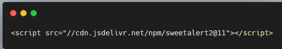
Or grab from jsdelivr CDN
npm run start
Usage
There are several ways in which Sweetalert2 can be used:
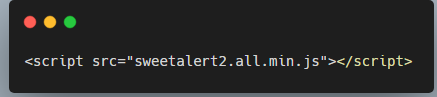
- Initialize the plugin by referencing the necessary files:
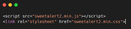
You can also include the stylesheet separately if desired:
Or
import it in the JS file you will be using the alert.
Now you have access to the alert and can customize it in any way you want.
Swal.fire({
  title: 'Error!',
  text: 'Do you want to continue?',
  icon: 'error',
  confirmButtonText: 'Cool'
})
This code is an example taken directly from sweetalert2 documentation. You can see it in action in the Live Demo
The most simple alert takes in 4 settings.
- The first is the
title; it can be a string or whatever you want to show up on the top of the alert. - The second is the
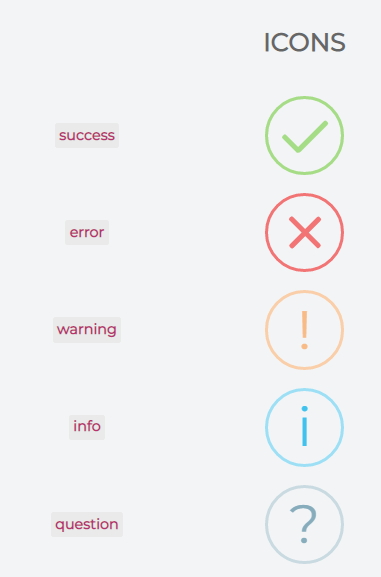
textparameter. This is usually where you can add the information on why the alert popped up. Examples would be “Wrong username or password”, “Successfully created the record”, etc. - The third parameter is the
icon:success,error,warning,info, andquestion. The Sweetalert2 library automatically generates the icon. - The last parameter is the type of
button(confirmButtonText) you would like to use and what text you want it to show inside the button.
Session Replay for Developers
Uncover frustrations, understand bugs and fix slowdowns like never before with OpenReplay — an open-source session replay tool for developers. Self-host it in minutes, and have complete control over your customer data. Check our GitHub repo and join the thousands of developers in our community.
Icons
You can also do much more with it since once the alert finishes, it returns a promise. You do have the option to handle the promise and do other actions depending on the result.
import React from "react";
import "./styles.css";
import Swal from "sweetalert2";
export default function App() {
const Alert = () => {
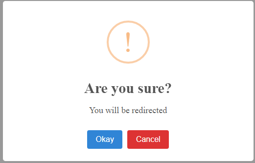
Swal.fire({
title: "Are you sure?",
text: "You will be redirected",
icon: "warning",
showCancelButton: true,
cancelButtonColor: "#d33",
confirmButtonText: "Okay"
}).then(function () {
// Redirect the user
window.location.href = "/";
});
};
return (
<div className="style">
<button onClick={Alert}>click</button>
</div>
);
}
Sweetalert2 uses promises to track how the user interacts with the alert. The following code above is an example of handling a promise in Sweetalert2. The first is to import the Sweetalert2 in the js file (import Swal from "sweetalert2"). Inside the functional component, an arrow function invokes the Swal.fire function when called. The title is a string that passes the icon’s message. The text is also a string. The icon pops up warning icon generated by the library. The showCancelButton sets the cancel button to be true to be able to show the cancel button, while the cancelButtonColor accepts a CSS which gives color to the cancel button. The confirmButtonText is the type of button you would like to use and what text you want it to display inside the button. The .then() is a function that returns a promise. On click of the button “Click” you call/invoke the function “Alert”. View Live Demo
 output sample of the above code
Here the warning icon ❗ is displayed, telling the user they will be redirected to another page, and the user should click Okay or Cancel. On click of okay(the confirm button), the user is redirected to the ”/” route, and On click of the cancel button, the modal closes.
If you have read this far, you can now implement Sweetalert2 on your project. This is how Sweetalert2 can be implemented in the React.js project.
Conclusion
Sweetalert2 is a library that is easy to install and use. Its main usage is to alert the user with whatever info you want. The alerts are styled to be very clean and minimalistic. That way, they can fit into any application you are building!
Sweetalert2 makes an alert box more attractive and easier to design. It automatically centers itself on the page and looks great, whether using a desktop computer, mobile, or tablet. It’s highly customizable, as shown in the live Demo above.
For more examples, you can read the documentation. https://sweetalert2.github.io/
Gain Debugging Superpowers
Unleash the power of session replay to reproduce bugs and track user frustrations. Get complete visibility into your frontend with OpenReplay, the most advanced open-source session replay tool for developers.