
Build beautiful tables with React Table

Tables are an efficient way to organize data on a website in rows and columns. They display data in a structured format that users can easily read. Organizing a large data set on a table calls for extra functionalities of the table. These functionalities may include sorting, filtering, pagination, etc.
React Table is a headless utility used to build robust tables and datagrid experiences for React applications. This library provides extendable, lightweight hooks that you can leverage to render your table markup.
In this article, you will learn how to use react-table to build a table with sorting, filtering, and pagination features.
Building a React Table Component
In this section, we will build a table component while leveraging hooks from react-table. First, we’ll create the project and install all dependencies. Apart from React-Table, we’ll also use Axios and Date-Fns, but that’s just for our example.
npx create-react-app react-table-project
cd react-table-project
npm install react-table axios date-fns --save
npm start
Update index.css file:
.container {
  display: flex;
  align-items: center;
  margin: 3rem 0;
  flex-direction: column;
}

table {
  border-spacing: 0;
  border: 1px solid black;
}

tr:last-child > td {
  border-bottom: 0;
}

th,
td {
  margin: 0;
  padding: 0.5rem;
  border-bottom: 1px solid black;
  border-right: 1px solid black;
}
th:last-child ,
td:last-child {
  border-right: 0;
}
Render a Basic Table
Mock data will be fetched from this endpoint https://giftea.github.io/proj-data/mock.json.
We have to create a new file, column.js, within your src folder to define the columns for our table.
import { format } from "date-fns";

export const COLUMNS = [
  {
    Header: "id",
    accessor: "id",
  },
  {
    Header: "First Name",
    accessor: "first_name",
  },
  {
    Header: "Last Name",
    accessor: "last_name",
  },
  {
    Header: "Email",
    accessor: "email",
  },
  {
    Header: "DOB",
    accessor: "date_of_birth",
    Cell: ({ value }) => {
      return format(new Date(value), "dd/MM/yyyy");
    },
  },
  {
    Header: "Age",
    accessor: "age",
  },
];
To build the table component, create a new folder, components, and add a new file, Table.jsx. Add the code below into components/Table.jsx:
import { useMemo } from "react";
import { COLUMNS } from "../column";
import { useTable } from "react-table";

const Table = ({ mockData }) => {
  const columns = useMemo(() => COLUMNS, []); // memoize before adding to useTable hook
  const data = useMemo(() => [...mockData], [mockData]);

  const { getTableProps, getTableBodyProps, headerGroups, rows, prepareRow } = useTable({
    columns, // useTable hook takes in memoized columns and data to be displayed
    data,
  });

  return (
    <>
      {/* apply the table props */}
      <table {...getTableProps()}>
        <thead>
          {
            // Loop over the header rows
            headerGroups.map((headerGroup) => (
              // Apply the header row props
              <tr {...headerGroup.getHeaderGroupProps()}>
                {
                  // Loop over the headers in each row
                  headerGroup.headers.map((column) => (
                    // Apply the header cell props
                    <th {...column.getHeaderProps()}>{column.render("Header")}</th>
                  ))
                }
              </tr>
            ))
          }
        </thead>
        {/* Apply the table body props */}
        <tbody {...getTableBodyProps()}>
          {
            // Loop over the table rows
            rows.map((row, i) => {
              // Prepare the row for display
              prepareRow(row);
              return (
                <tr {...row.getRowProps()}>
                  {
                    // Loop over the rows cells
                    row.cells.map((cell) => {
                      // Apply the cell props
                      return <td {...cell.getCellProps()}>{cell.render("Cell")}</td>;
                    })
                  }
                </tr>
              );
            })
          }
        </tbody>
      </table>
    </>
  );
};

export default Table;
Memoization of columns and data ensures that they are not recreated on every render. This optimizes and improves the component’s performance.
The useTable hook, in turn, returns a table instance, which is an object that contains everything you need to build a table.
{ getTableProps, getTableBodyProps, headerGroups, rows, prepareRow } are all destructured from the table instance.
The table UI is built using regular HTML elements: <table/>, <thead/>, <tr/>, <th/>, <tbody/> and <td/>. The only difference is that properties destructured from the table instance are added to the table elements to display the data properly:
getTablePropsis destructured in the<table/>element.headerGroupsis an array that contains the column heading information; within the<thead/>,headerGroupsis looped over to return the JSX for each header group.getTableBodyPropsis destructured in the<tbody/>element.rowsis looped over to return a list of rows; before returning eachrow,prepareRowis called, and therowis added as an argument.
Now, update App.js with the code below:
import React, { useEffect, useState } from "react";
import Table from "./components/Table";
import axios from "axios";

function App() {
  const [data, setData] = useState([]);

  const fetchData = async () => {
    const { data } = await axios("https://giftea.github.io/proj-data/mock.json").catch((err) => console.log(err));
    setData(data);
  };

  useEffect(() => {
    fetchData();
  }, []);

  return (
    <div className="container">
      <Table mockData={data} />
    </div>
  );
}

export default App;
Navigate to localhost to view the basic table UI.
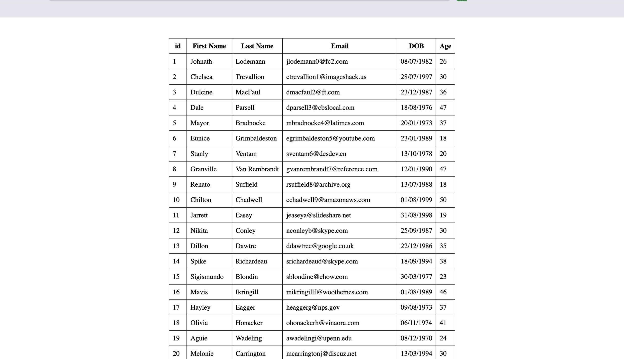
Now we’ll see how to add more features to the table, making it more usable and interesting.
Open Source Session Replay
OpenReplay is an open-source, session replay suite that lets you see what users do on your web app, helping you troubleshoot issues faster. OpenReplay is self-hosted for full control over your data.

Start enjoying your debugging experience - start using OpenReplay for free.
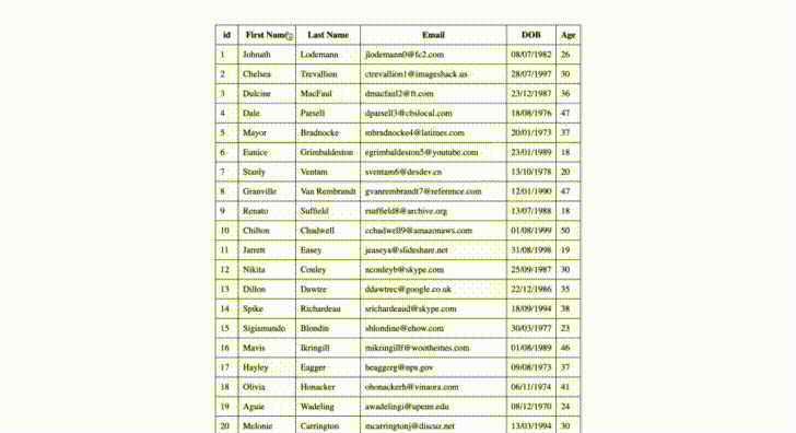
Adding Sorting Feature
The useSortBy hook implements the sorting feature on the table.
Import it:
import { useTable, useSortBy } from "react-table";Add as parameter:
const { getTableProps, getTableBodyProps, headerGroups, rows, prepareRow } = useTable(
  {
    columns,
    data,
  },
  useSortBy // this adds sorting feature to the table instance
);
Update the <th/> tag in with the code below:
<th {...column.getHeaderProps(column.getSortByToggleProps())}>
    {column.render("Header")}
    <span>{column.isSorted ? (column.isSortedDesc ? " 🔽" : " 🔼") : ""}</span>
</th>
column.getSortByToggleProps() adds sorting properties to each column.
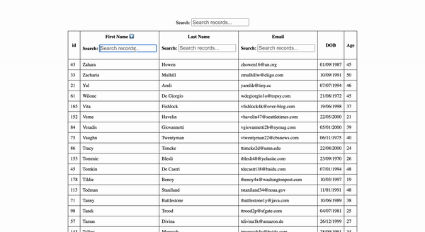
Adding Filtering Feature
Two forms of filtering can be added to the table component; Global filtering and Column filtering.
Global Filtering
This filter applies to all columns of the table globally.
Create a new file GlobalFilter.jsx within components folder.
Create the GlobalFilter component:
import { useState } from "react";
import { useAsyncDebounce } from "react-table";

export const GlobalFilter = ({ globalFilter, setGlobalFilter }) => {
  const [value, setValue] = useState(globalFilter);
  const onChange = useAsyncDebounce((value) => {
    setGlobalFilter(value || undefined);
  }, 200);

  return (
    <span>
      Search:{" "}
      <input
        value={value || ""}
        onChange={(e) => {
          setValue(e.target.value);
          onChange(e.target.value);
        }}
        placeholder={`Search records...`}
        style={{
          fontSize: "1.1rem",
          margin: "1rem 0",
        }}
      />
    </span>
  );
};
Here:
globalFilter: Is the value of the search input.setGlobalFilter: Is a function that sets theglobalFilter.
These two props will be destructured from the table instance returned from useTable.
Import <GlobalFilter/> and useGlobalFilter.
import { useTable, useSortBy, useGlobalFilter } from "react-table";
import { GlobalFilter } from "./GlobalFilter";
Destructure useful properties and add hook:
/*destructure globalFilter and setGlobalFilter */
      setGlobalFilter,
      state: { globalFilter },
    } = useTable(
      {
        columns,
        data,
      },
      useGlobalFilter, // add new param
      useSortBy
    );
Add <GlobalFilter/> above the <table/> tag and add globalFilter and setGlobalFilter as props.
<>
  <GlobalFilter globalFilter={globalFilter} setGlobalFilter={setGlobalFilter} />
  <table {...getTableProps()}>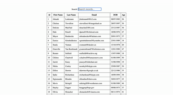
Column Filtering
This filter applies to only the column the filter is added to.
Create a new file ColumnFilter.jsx within components folder.
Create the ColumnFilter component:
export const ColumnFilter = ({ column }) => {
  const { filterValue, setFilter } = column;
  return (
    <span>
      Search:{" "}
      <input
        value={filterValue || ""}
        onChange={(e) => {
          setFilter(e.target.value);
        }}
        placeholder={`Search records...`}
        style={{
          fontSize: "1.1rem",
          margin: "1rem 0",
        }}
      />
    </span>
  );
};
Import ColumnFilter and useFilters.
import { useTable, useSortBy, useGlobalFilter, useFilters } from "react-table";
import { ColumnFilter } from "./ColumnFilter";
Create a default column component:
const data = useMemo(() => [...mockData], [mockData]);

  // default column component
const defaultColumn = useMemo(() => {
  return {
    Filter: ColumnFilter,
  };
}, []);
Add defaultColumn and add hook:
    /* */
    state: { globalFilter },
  } = useTable(
    {
      columns,
      data,
      defaultColumn, // add defaultColumn
    },

    useFilters, // add useFilters above useGlobalFilter
    useGlobalFilter,
Add a new <div> below the <span> element in <th>:
<span>{column.isSorted ? (column.isSortedDesc ? " 🔽" : " 🔼") : ""}</span>
<div>{column.canFilter ? column.render("Filter") : null}</div> {/*Add column filter component in each column header  */}
Navigate to src/column.js and add disableFilters: true to columns where you don’t want the filter component to be applied. Example: id, DOB and Age.
{
  Header: "id",
  accessor: "id",
  disableFilters: true, // add to `DOB` and `Age`
},
Adding Pagination Feature
Import usePagination hook:
import { useTable, useSortBy, useGlobalFilter, useFilters, usePagination } from "react-table";Destructure useful properties and add usePagination to useTable:
    page,
    canPreviousPage,
    canNextPage,
    pageOptions,
    pageCount,
    gotoPage,
    nextPage,
    previousPage,
    setPageSize,
    state: { pageIndex, pageSize, globalFilter },
  } = useTable(
    {
      columns,
      data,
      defaultColumn,
    },

    useFilters,
    useGlobalFilter,
    useSortBy,
    usePagination
  );
Update <tbody/>:
<tbody {...getTableBodyProps()}>
      {
        // Loop over page instead of rows
        page.map((row, i) => {
        // Prepare the row for display
Add the pagination JSX underneath the <table/> JSX.
  <div className="pagination" style={{ marginTop: "1rem" }}>
    <button onClick={() => gotoPage(0)} disabled={!canPreviousPage}>
      {"<<"}
    </button>{" "}
    <button onClick={() => previousPage()} disabled={!canPreviousPage}>
      {"<"}
    </button>{" "}
    <button onClick={() => nextPage()} disabled={!canNextPage}>
      {">"}
    </button>{" "}
    <button onClick={() => gotoPage(pageCount - 1)} disabled={!canNextPage}>
      {">>"}
    </button>{" "}
    <span>
      Page{" "}
      <strong>
        {pageIndex + 1} of {pageOptions.length}
      </strong>{" "}
    </span>
    <span>
      | Go to page:{""}
      <input
        type="number"
        defaultValue={pageIndex + 1}
        onChange={(e) => {
          const page = e.target.value ? Number(e.target.value) - 1 : 0;
          gotoPage(page);
        }}
        style={{ width: "100px" }}
      />
    </span>{" "}
    <select
      value={pageSize}
      onChange={(e) => {
        setPageSize(Number(e.target.value));
      }}
    >
      {[10, 20, 30, 40, 50].map((pageSize) => (
        <option key={pageSize} value={pageSize}>
          Show {pageSize}
        </option>
      ))}
    </select>
  </div>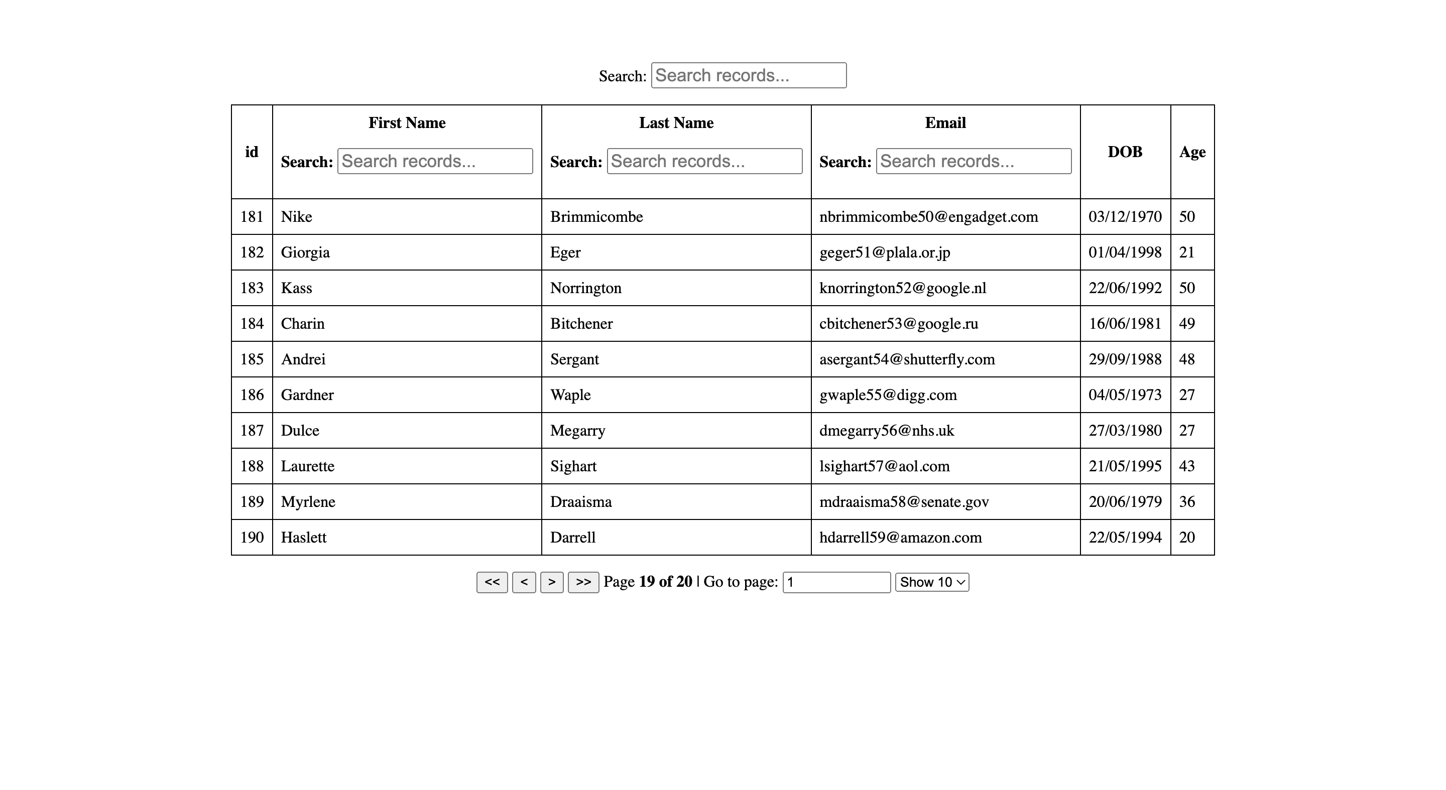
Conclusion
React Table utility offers a simple design that is fully customizable for different use cases. We have learned how to utilize various hooks to add: sorting, filtering, and pagination. React Table makes creating your table UI much easier.
Visit project Github Link and Live Link.
A TIP FROM THE EDITOR: For another way of creating tables for React apps, don’t miss our Build beautiful UI components with NextUI article.