

Carousels, also known as sliders or image sliders, are UI elements that allow users to swipe through a list of items like images, text, or cards. This article will show you how to build your own carousel for maximum flexibility.
Creating a carousel can be a good approach if you need to display a set of images on the screen and do not have enough space to accommodate these images. Some common use cases for using carousels include:
- Onboarding screens with illustrations are used to pass information to the user during onboarding.
- Carousels are commonly used to display galleries or previews of specific items, like booking or movie listings, allowing users to easily navigate back and forth through the items. In this article, we will use the
PageViewwidget to build carousels.
Flutter’s PageView widget can be used to create a scrolling list of pages. Each page can be any widget, created on demand using the builder callback. The PageView widget uses a PageController to control your scrolling list’s behavior. This also provides methods for programmatically controlling the current page and listening to scroll events.
Using PageView
A PageView widget allows for implementing scrollable pages in horizontal and vertical directions, and each page can be any widget.
The pages can be fixed by specifying the children:[] property. See the code snippet below:
  PageView(
      children: [
        Container(
          color: Colors.red,
        ),
        Container(
          color: Colors.blue,
        ),
        Container(
          color: Colors.green,
        ),
      ],
    );
If you need to dynamically generate pages based on the data source, you can use a different approach like the PageView.builder or PageView.custom constructors.
We will discuss these contractors further in the following sections of this article.
    PageView.custom(
      controller: myController,
      childrenDelegate: SliverChildBuilderDelegate(
        (context, index) {
          // return a CustomPage widget that represents the page
          return CustomPage(
            title: myData[index].title,
            color: myData[index].color,
          );
        },
        childCount: myData.length,
      ),
    );
PageView constructors
The PageView widget has three constructors. All three of them create a scrollable list but handle creating the list differently.
- PageView: This constructor creates a finite number of pages that cannot be changed dynamically at runtime by just specifying the
childrenproperty.
 PageView({Key? key,
    required this.children,
    this.scrollDirection = Axis.horizontal,
    this.controller,
    this.physics,
    this.pageSnapping = true,
    this.reverse = false,
this.allowImplicitScrolling = true})-
PageView.builder: This constructor is appropriate for pages with an infinite or large number of children. While it calculates the maximum scroll extent using the
itemCountproperty, the PageView.builder creates pages on demand using the builder function by taking in the index of the children and returning a widget. See the code snippet below:///code example PageView.builder( itemCount: myData.length, // number of pages itemBuilder: (context, index) { // return a widget that represents the page return Container( color: myData[index].color, child: Text(myData[index].title), ); }, ); //PageView.builder pararmeters PageView.builder({Key? key, required this.itemCount, IndexedWidgetBuilder itemBuilder, this.scrollDirection = Axis.horizontal, this.controller, this.physics, this.pageSnapping = true, this.reverse = false, this.allowImplicitScrolling = true}) -
PageView.custom: This constructor allows you to create custom child layouts and transitions. This means it is more flexible and gives the developer complete control over your item layout and state. When there is a more complex page to display, a PageView.custom is the right approach.
  PageView.custom(
      controller: myController,
      childrenDelegate: SliverChildBuilderDelegate(
        (context, index) {
          // return a CustomPage widget that represents the page
          return CustomPage(
            title: myData[index].title,
            color: myData[index].color,
          );
        },
        childCount: myData.length,
      ),
    )
However, in this article, we will use the PageView.builder in our example to show how to properly use the PageView widget.
PageView important parameters
You can use these parameters to configure the PageView widget in Flutter.
- scrollDirection: Determines the scrolling direction of the
PageView. It can be set toAxis.horizontalorAxis.vertical. - children: A list of widgets representing the pages in the
PageView. - controller: An optional
PageControllerobject that can be used to control the scrolling and page selection in thePageView. - physics: Determines the physics of the scrolling animation. The default is
PageScrollPhysics - pageSnapping: Determines whether the
PageViewshould snap to the nearest page when scrolling stops. The default istrue. - onPageChanged: A callback function called whenever the current page in the
PageViewchanges. - allowImplicitScrolling: Determines whether the
PageViewshould allow implicit scrolling. If set totrue, the user can swipe to scroll between pages even if they are not completely visible. The default isfalse. - clipBehavior: Determines the clipping behavior of the
PageView. The default isClip.hardEdge.
Why should I use a PageView Widget?
Indeed, one of the downsides of using packages in your Flutter app might increase the app’s bundle size, but most times these extra bytes can be considered negligible. Most of which could be as little as 10kb or even lesser. The following points below are reasons why you should use the PageView widget:
-
Control and Customization: The PageView widget allows you to create custom carousels while you have full control over the appearance and feel of your app.
-
Performance: When building carousels using the
PageViewwidget, you can ensure optimal performance by carefully controlling the number of created and displayed widgets. -
Compatibility: Using a package in your Flutter app can result in a few of the following :
- Versioning issues between packages.
- Discontinued packages.
- Always need to update packages to support a particular feature.
The issues above can be avoided using the PageView widget.
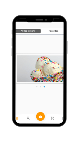
What will we be building?
We are going to create a basic Flutter app. The app will have a carousel, a scrollable list of images or content, in the center of the screen.
We will also add position indicators, which are small dots or icons that show which item is currently selected in the carousel.
To build the Flutter app, we will be using the builder constructor to show how to implement building pages on demand.
Flutter setup
To set up a Flutter project in your preferred coding environment, you can use flutter create.
- Open the terminal/command prompt and navigate to the directory where you want to create your project.
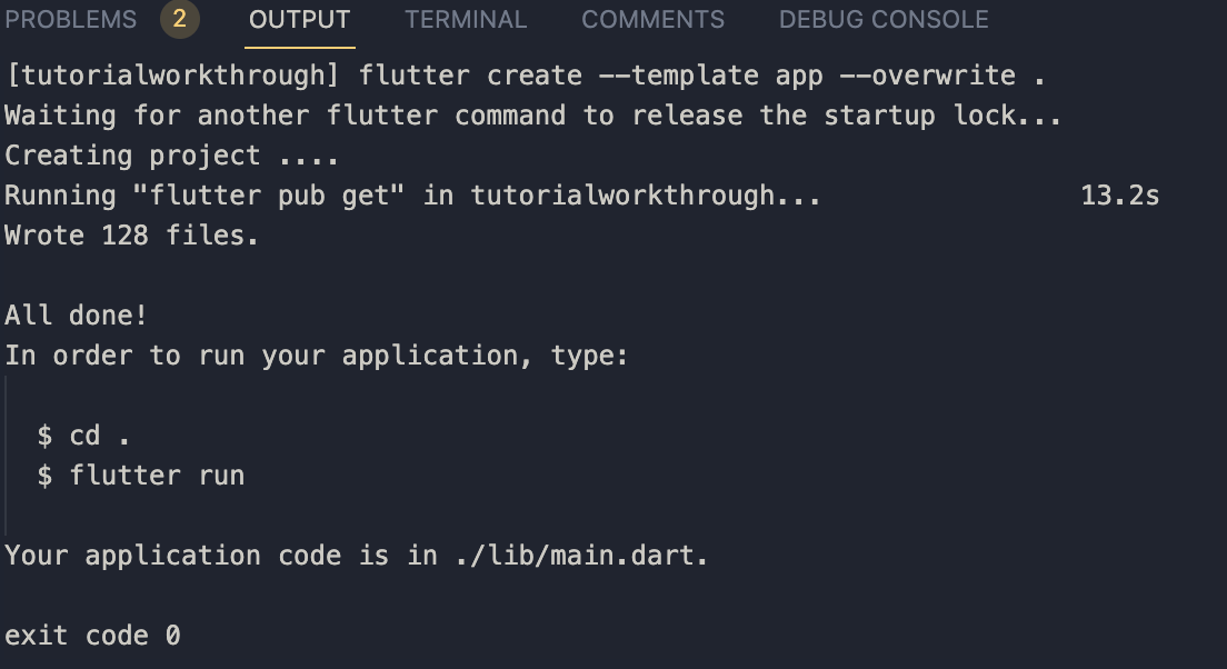
- Run the following command to create a new Flutter project:
flutter create <project-name>You should see this on your terminal if your project was created successfully:
-
Once the project is created, navigate to the project directory by running the following command:
cd <project-name> -
To run the project, you can use the following command: flutter run
After running the command, you will see the default Flutter counter app. You can replace the counter app with the following code below:
import 'package:flutter/material.dart';
void main() {
  runApp(const App());
}
class App extends StatelessWidget {
  const App({super.key});
  @override
  Widget build(BuildContext context) {
    return MaterialApp(
      debugShowCheckedModeBanner: false,
      title: 'Flutter Demo',
      theme: ThemeData(
        primarySwatch: Colors.blue,
      ),
      home: const ContentScreen(),
    );
  }
}

class ContentScreen extends StatefulWidget {
  const ContentScreen({Key? key}) : super(key: key);
  @override
  State<ContentScreen> createState() => _ContentScreenState();
}
class _ContentScreenState extends State<ContentScreen>
     {


  @override
  Widget build(BuildContext context) {
    return SafeArea(
      child: Scaffold(
        bottomNavigationBar: const BottomNavBarCurvedFb1(),
        extendBody: true,
        body: Container(
          padding: const EdgeInsets.symmetric(horizontal: 16, vertical: 40),
          child: Column(
            mainAxisSize: MainAxisSize.min,
            children: [ ],
          ),
        ),
      ),
    );
  }
}
Session Replay for Developers
Uncover frustrations, understand bugs and fix slowdowns like never before with OpenReplay — an open-source session replay tool for developers. Self-host it in minutes, and have complete control over your customer data. Check our GitHub repo and join the thousands of developers in our community.
Defining our data
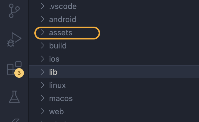
To implement the carousel, we need to add images that will be displayed. To add images, create an assets folder, and it should live inside the root directory like the below:
Add all the necessary images you need inside the assets folder. You can find the images we will be using for this tutorial here
Add the images to your pubspec.yaml file, in the assets section like below:
      assets:
         - assets/dell1.jpg
         - assets/dell2.jpg
         - assets/dell3.jpg
         - assets/pinky.jpg
         - assets/popsicles.jpg
         - assets/whitey.jpg
We will create a custom widget called SlideCard, which will help display our images on a card.
See the code snippet below:
class SlideCard extends StatelessWidget {
  const SlideCard({super.key, required this.cardImage});
  final String cardImage;
  @override
  Widget build(BuildContext context) {
    return Container(
      padding: const EdgeInsets.symmetric(horizontal: 10, vertical: 10),
      decoration: BoxDecoration(
          // color: Colors.blue[50],
          border: Border.all(
            style: BorderStyle.solid,
            color: Colors.grey,
          ),
          borderRadius: BorderRadius.circular(8)),
      child: Column(
        crossAxisAlignment: CrossAxisAlignment.stretch,
        children: [
          Expanded(
              child: Image(image: AssetImage(cardImage), fit: BoxFit.fitWidth)),
        ],
      ),
    );
  }
}
In the previous section, we created a custom widget that will help us display our images. We will now create a list of SlideCard of type widgets that will be our data source. Your source can be remote, and it can be a map or list.
Note: The reason for creating the SlideCard is that we want to display our list of images on a custom card.
List<Widget> items = [
    const SlideCard(
      cardImage: 'assets/pinky.jpg',
    ),
    const SlideCard(
      cardImage: 'assets/popsicles.jpg',
    ),
    const SlideCard(
      cardImage: 'assets/whitey.jpg',
    ),
  ];
Adding the PageView.builder Widget
The PageView.builder widget accepts the item count and the index of the items to be displayed. Below is a code snippet that shows how these parameters are used :
PageView.builder(
              itemCount: items.length,
              physics: const BouncingScrollPhysics(),
              itemBuilder: (context, index) {
                return Padding(
                  padding: const EdgeInsets.only(left: 26),
                  child: items[index],
                );
              },
            ),
From the above code, we are passing items.length to the itemCount parameter. This is because, for the pageview.builder to build a scrollable list, it also needs to determine the maximum scrollable extent.
The itemBuilder builds the widget when the item is greater than zero and less than the itemCount.
Add page controller
The PageController in Flutter provides a convenient way to control the display of the widgets in a PageView. It allows you to specify how the list of widgets should be displayed, from start to end, and which widget should be displayed first. The PageController is instantiated as shown in the following code snippet:
PageController controller = PageController(initialPage: 0, viewportFraction: 1.1);Update State
We need to find a way to update our carousel indicators when a page is selected. We can do this using the onPageChanged parameter in our builder constructor.
  PageView.builder(
            itemCount: items.length,
            controller: controller,
            onPageChanged: (value) {
                setState(() {
                currentIndex = value;
                        });
                     },
        physics: const BouncingScrollPhysics(),
        itemBuilder: (context, index) {
                return Padding(
            padding: const EdgeInsets.only(left: 26),
             child: items[index],
         );
        },
     ),
The onPageChanged parameter in the PageView widget is a callback function that is triggered every time the page in the PageView changes. The callback function takes a single argument, value, which is the index of the new page that has been selected.
In this case, the onPageChanged callback function uses the setState method to update the value of the currentIndex variable with the new page index.
Add positional indicators
Creating indicators for carousels can improve user experience, as they display the currently viewed item and indicate the remaining items to be seen. We will create custom indicators that change the color to a lighter shade of grey when an item is not in the viewport but turns blue when the item is currently being viewed. Below is the code snippet that implements indicators:
class IndicatorWidget extends StatelessWidget {
  const IndicatorWidget(
      {Key? key, required this.currentIndex, required this.length})
      : super(key: key);
  final int currentIndex;
  final int length;
  @override
  Widget build(BuildContext context) {
    return Row(
      mainAxisAlignment: MainAxisAlignment.center,
      children: [
        for (int i = 0; i <= length; i++)
          Container(
            margin: const EdgeInsets.symmetric(horizontal: 8),
            height: 8,
            width: 8,
            decoration: BoxDecoration(
                color: currentIndex == i ? Colors.blue : Colors.grey[300],
                borderRadius: BorderRadius.circular(50)),
          ),
      ],
    );
  }
}
From the code above, we have two fields, currentIndex and length.
To create the indications, we use a for loop to iterate through the length variable, and for each iteration, a new Container should be created, and add a blue color when the current index is equal to the current iteration value and a grey color when it is not.
Conclusion
We have seen how to create a custom carousel in Flutter without relying on external dependencies. By exploring the different constructors of the PageView widget, we were able to understand the importance of this widget in building interactive, scrollable user interfaces. We have also discussed the process of creating a Flutter app from scratch, including building custom widgets to support our design goals. By putting these concepts into practice, we were able to create a dynamic carousel that includes indicators to show which page is currently selected. With this new knowledge, you can confidently incorporate custom carousels and other interactive UI elements into your own Flutter projects.
Resources
Gain Debugging Superpowers
Unleash the power of session replay to reproduce bugs and track user frustrations. Get complete visibility into your frontend with OpenReplay, the most advanced open-source session replay tool for developers.


