Build a FAQ section with React and Headless UI


Using popular Javascript frameworks such as React and Vue brings many advantages such as scalability, performance, Easy development, SEO friendly, etc. One of the biggest bonuses of working with these libraries is accessing a collection of ready-made UI elements with composable and reactive view components.
These materials help facilitate the work of developers either by allowing them to apply them directly in a project or modify them, achieving more of a custom feel. Therefore, saving them time and the complexities of building from scratch.
One of the most challenging parts of building complex UIs is usually the state, events, side-effects, data management, and computation. Therefore, removing these concerns from the markups, styles, and implementation details, makes our logic and components more modular and reusable.
Headless UI provides interaction and state exposed by props with accessible and ready-made UI components, giving us the flexibility to customize the styles to meet our needs.
In this article, readers will learn what an FAQ is and why it is beneficial for their websites. Also, we’ll know how to integrate and use Headless UI to explore how to create, animate, add manual configuration, and style our FAQ using TailwindCSS and React. To follow along, ensure you have:
What is Headless UI?
Headless UI is a library that provides feature-rich, completely unstyled accessible UI components that are ready-made and provide us with the flexibility to add custom markups and styles. It provides the logic, state, processing, and API for UI elements and interactions. Headless UI is designed to integrate beautifully with Tailwind CSS.
It provides several benefits:
- It allows full customization of how our components behave.
- It provides accessibility to screen readers and keyboard users.
- It is easy to maintain and modify.
- It integrates with frameworks such as Vue and React.
What is a FAQ?
A “Frequently Asked Questions”, also known as FAQ, is a section in articles, websites, email lists, and online forums where organized information and text consisting of questions and answers tend to recur. It includes a series of questions commonly asked by customers and covers topics including product or service usage, business hours, prices, and more.
FAQs help improve the user experience. When a user wants a quick answer to a question about your product, service, or business, compiling answers to common questions on every possible topic related to your product or business saves the user the time to browse through a few pages looking for the correct answer. It allows easy navigation through the site and boosts SEO.
Building our FAQ with React and Headless UI
In this section, we look at how to set up our React, install Headless UI and create our FAQ component. Let’s start by creating our React app with create react-app. Run the following commands at your terminal to create the app and add Headless UI:
# npm
npx create-react-app headless-ui-faq
cd headless-ui-faq
npm install @headlessui/react
In our App.js file add the following code:
import { Disclosure } from '@headlessui/react'

function MyDisclosure() {
  return (
    <Disclosure>
      <Disclosure.Button>
        Is team pricing available?
      </Disclosure.Button>
      <Disclosure.Panel>
        Yes! You can purchase a license that you can share with your entire
        team.
      </Disclosure.Panel>
    </Disclosure>
  )
}
You noticed we import Disclosure from the dependencies we installed: @headlessui/react. Disclosure is a simple, accessible foundation built using the Disclosure, Disclosure.Button and Disclosure.Panel components for building custom UIs that display and hide content accessibly.
Disclosure.Button- This component automatically opens and closes the panel when clicked, and all components will receive the appropriate aria-* related attributes such asaria-expandedandaria-controls.Disclosure.Panel- This component automatically hides content based on the internal open state tracked within theDisclosurecomponent.
By default, Disclosure.Panel hides the content. Clicking on the Disclosure.Button content will display content on the Disclosure.Panel.
Adding Styles
Headless UI is designed to integrate beautifully with TailwindCSS. To install Tailwind CSS, run the following commands:
npm install -D tailwindcss postcss autoprefixer
npx tailwindcss init
The first command installs Tailwind CSS and its peer dependencies into your application and the second command creates a tailwind.config.js file. In your tailwind.config.js file, replace it with this code:
module.exports = {
  content: [
    "./src/**/*.{js,jsx,ts,tsx}",
  ],
  theme: {
    extend: {},
  },
  plugins: [],
}
Finally, in your index.css file, replace it with the following code:
@tailwind base;
@tailwind components;
@tailwind utilities;
Showing and Hiding Panels
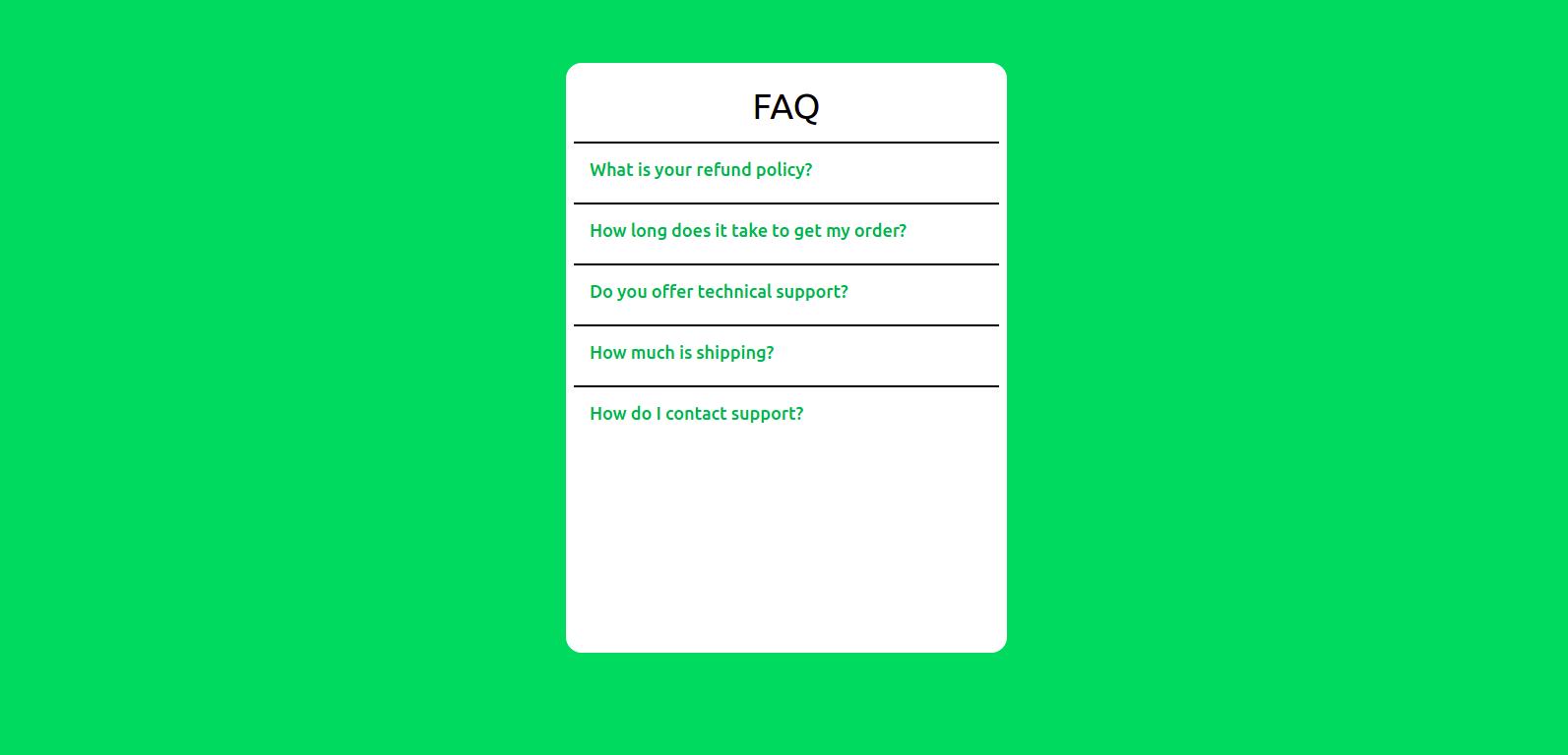
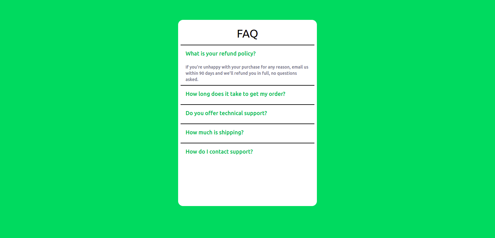
In our App.js file, replace it with the following code:
import { Disclosure } from '@headlessui/react';
const faqs = [
  {
    id: 1,
    question: 'What is your refund policy?',
    answer: `If you're unhappy with your purchase for any reason, email us within 90 days and we'll refund you in full, no questions asked.`
  },
  {
    id: 1,
    question: 'How long does it take to get my order?',
    answer: `Most customers can expect to receive their food and supplies within 1 to 3 days. Orders that require prescription approval or personalization may take longer to ship.`
  },
  {
    id: 1,
    question: 'Do you offer technical support?',
    answer: `No.`
  },
  {
    id: 1,
    question: 'How much is shipping?',
    answer: `Orders over $49 ship free! All other orders ship for a flat rate of $4.95.`
  },
  {
    id: 1,
    question: 'How do I contact support?',
    answer: `We offer support over email, and the best way to contact us is through the in-app help menu.`
  }
]

export default function App() {
  return (
    <div className="w-full h-screen px-4 pt-16 bg-green-500">
      <div className="mx-auto w-[500px] h-[500px] max-w-md rounded-2xl bg-white p-2 text-lg">
        <h1 className='text-center text-4xl py-4'>FAQ</h1>
      {faqs.map((faq) => (
        <Disclosure>
          <div className={faq.id}>
            <Disclosure.Button className="flex w-full justify-between rounded-lg bg-green-200 px-4 py-2 mb-2 text-left font-medium text-green-600">
              {faq.question}
            </Disclosure.Button>
            <Disclosure.Panel className="text-gray-700 flex w-full justify-between rounded-lg px-4 mb-2 text-left text-sm">
              {faq.answer}
            </Disclosure.Panel>
          </div>
        </Disclosure>
        ))}
      </div>
    </div>
  )
}
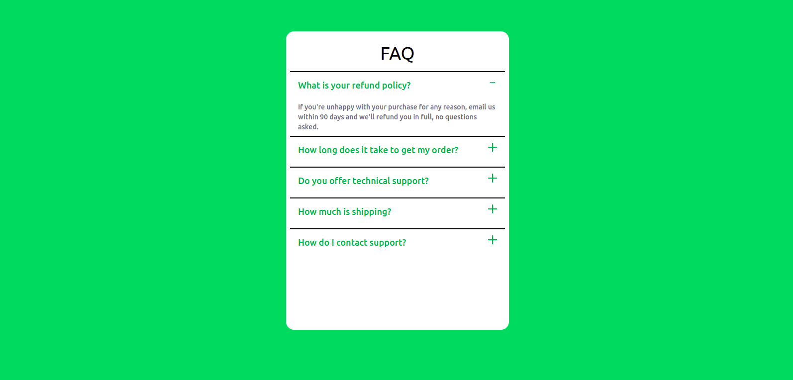
Disclosure.Button on click:
The Disclosure component with its related sub-components exposes a render prop containing the open state of the panel. You can use this to conditionally apply styles to any part of your disclosure; for example, the button can be used to change the icons:
import { Disclosure } from '@headlessui/react'
import { BiMinus } from 'react-icons/bi';
import { BsPlusLg } from 'react-icons/bs'

const faq = [/*...*/]

export default function App() {
  return (
    <div className="w-full h-screen px-4 pt-16 bg-green-500">
      <div className="mx-auto w-[500px] h-[500px] max-w-md rounded-2xl bg-white p-2 text-lg">
        <h1 className='text-center text-4xl py-4'>FAQ</h1>
        {faqs.map((faq) => (
          <Disclosure>
            {({ open}) => (
              <>
                  <div key={faq.id}>
                    <Disclosure.Button className="flex w-full justify-between rounded-lg bg-green-200 px-4 py-3 mb-2 text-left font-medium text-green-600">
                      <span>{faq.question}</span>
                      { open ? <BiMinus /> : <BsPlusLg />}
                    </Disclosure.Button>
                      <Disclosure.Panel className="text-gray-500 flex w-full justify-between rounded-lg px-4 mb-2 text-left text-sm font-medium">
                        {faq.answer}
                      </Disclosure.Panel>
                  </div>
              </>
            )}
          </Disclosure>
        ))}
      </div>
    </div>  )
}
The Disclosure also allows you to handle the state yourself by passing a static prop to the Disclosure.Panel to tell it to always render. Then use the open render prop to control when the panel is shown or hidden.
import { Disclosure } from '@headlessui/react'
import { BiMinus } from 'react-icons/bi';
import { BsPlusLg } from 'react-icons/bs';

const faq = [/*...*/]

export default function App() {
  return (
    <div className="w-full h-screen px-4 pt-16 bg-green-500">
      <div className="mx-auto w-[500px] h-[500px] max-w-md rounded-2xl bg-white p-2 text-lg">
        <h1 className='text-center text-4xl py-4'>FAQ</h1>
        {faqs.map((faq) => (
          <Disclosure>
            {({ open}) => (
              <>
                  <div key={faq.id}>
                    <Disclosure.Button className="flex w-full justify-between rounded-lg bg-green-200 px-4 py-3 mb-2 text-left font-medium text-green-600">
                      <span>{faq.question}</span>
                      { open ? <BiMinus /> : <BsPlusLg />}
                    </Disclosure.Button>
                    {open && (
                      <Disclosure.Panel static className="text-gray-500 flex w-full justify-between rounded-lg px-4 mb-2 text-left text-sm font-medium">
                        {faq.answer}
                      </Disclosure.Panel>
                    )}
                  </div>
              </>
            )}
          </Disclosure>
        ))}
      </div>
    </div>
  )
}
Open Source Session Replay
OpenReplay is an open-source, session replay suite that lets you see what users do on your web app, helping you troubleshoot issues faster. OpenReplay is self-hosted for full control over your data.

Start enjoying your debugging experience - start using OpenReplay for free.
Manually closing our Panels
Disclosure allows us to manually close our panels in two ways:
asprop - To close a disclosure manually when clicking a child of its panel,Disclosureexposes theasprop to customize the rendered element. This is useful when using disclosures for things that contain links, such as your mobile viewnavbar, where you want the disclosure to close when navigating to the next page.
import { Disclosure } from '@headlessui/react'

function MyDisclosure() {
  return (
    <Disclosure>
      <Disclosure.Button>Mobile Menu</Disclosure.Button>
      <Disclosure.Panel>
        <Disclosure.Button as={Link} href="https://headlessui.com/react">
          Home
        </Disclosure.Button>
      </Disclosure.Panel>
    </Disclosure>
  )
}closeprop -Disclosureand its sub-components expose aclose()render prop that exists on the components, which you can use to imperatively close the panel, such as after running anasyncaction.
import { Disclosure } from '@headlessui/react'

function MyDisclosure() {
  return (
    <Disclosure>
      <Disclosure.Button>Terms</Disclosure.Button>
      <Disclosure.Panel>
        {({ close }) => (
          <button
            onClick={async () => {
              await fetch('/accept-terms', { method: 'POST' })
              close()
            }}
          >
            Read and accept
          </button>
        )}
      </Disclosure.Panel>
    </Disclosure>
  )
}
Adding Transitions
Headless UI allows us to animate the opening and closing of the menu panel by providing the Transition component. The Transition component automatically communicates with the Disclosure component. To animate our FAQ, you must wrap the Disclosure.Panel or Disclosure.Button in a Transition, and the transition will be applied automatically.
import { Disclosure, Transition } from '@headlessui/react'
import { BiMinus } from 'react-icons/bi';
import { BsPlusLg } from 'react-icons/bs';

const faqs = [/*...*/]

export default function App() {
  return (
    <div className="w-full h-screen px-4 pt-16 bg-green-500">
      <div className="mx-auto w-[500px] h-[500px] max-w-md rounded-2xl bg-white p-2 text-lg">
        <h1 className='text-center text-4xl py-4'>FAQ</h1>
        {faqs.map((faq) => (
          <Disclosure>
            {({ open}) => (
              <>
                  <div key={faq.id}>
                    <Disclosure.Button className="flex w-full justify-between border-black border-t-2 px-4 py-3 mb-2 text-left font-medium text-green-600">
                      <span>{faq.question}</span>
                      { open ? <BiMinus /> : <BsPlusLg />}
                    </Disclosure.Button>
                      <Transition
                        show={open}
                        enter="transition duration-1000 ease-out"
                        enterFrom="transform scale-95 opacity-0"
                        enterTo="transform scale-100 opacity-100"
                        leave="transition duration-100 ease-out"
                        leaveFrom="transform scale-100 opacity-100"
                        leaveTo="transform scale-95 opacity-0"
                      >
                        <Disclosure.Panel static className="text-gray-500 flex w-full justify-between rounded-lg px-4 mb-2 text-left text-sm font-medium">
                          {faq.answer}
                        </Disclosure.Panel>
                      </Transition>
                  </div>
              </>
            )}
          </Disclosure>
        ))}
      </div>
    </div>
  )
}
Because they’re renderless, Headless UI components integrate well with other React animation libraries such as Framer Motion and React Spring.
Additional Info
By default the Disclosure.Button is rendered as a button and Disclosure.Panel renders as a div. The root component Disclosure does not render an element but renders its children directly by default. To render Disclosure and its sub-components as elements, use the as prop on every component.
import { Disclosure } from '@headlessui/react'
import { Fragment } from 'react';

export default function App() {
  return (
    <Disclosure as="div">
      <Disclosure.Button as={Fragment}>
        <button>Solutions</button>
      </Disclosure.Button>
      <Disclosure.Panel as="ul">
        <li>Egg</li>
        <li>Vegetable</li>
        <li>Rice</li>
      </Disclosure.Panel>
    </Disclosure>
  )
}
Conclusion
In this article, we learned about Headless UI, its benefits, and how to use it in creating a FAQ component. With unique props and components, Headless UI gives us out of the box a way to build a beautiful interface.
A TIP FROM THE EDITOR: To add another usual and powerful component to your app, check out our Creating a table of content widget in React article.