Build a Lightweight Web Component with Lit.js
Lit - a framework to build adaptable, reusable web components.


As the demand for web applications has drastically increased, the need for frameworks that can help developers speed up development becomes more demanding. Such frameworks save developers the time they would have spent reinventing the wheel. In this tutorial, you’ll learn how to build lightweight web components using Lit.js.
Without much delay, let’s get started!
What is Lit?
Lit is a simple library that can be used to create lightweight components. Lit components are incredibly adaptable and can be used across multiple apps and websites, even if those applications and websites are built on different front-end stacks. According to the documentation, Lit has various excellent features worth working with. They include:
- Speed: Lit adds just what you need to be happy and productive by building on top of the Web Components standards: reactivity, declarative templates, and a handful of thoughtful features to reduce boilerplate and make your job easier. Every Lit component is meticulously designed with web platform evolution in mind.
- Fast: Lit has a minified bundle and a compressed size of 5 kb. This small size allows you to keep your bundle small and thus make your application load faster. Lit also renders UI quickly because it only touches the dynamic parts of your UI when updating, eliminating the need to rebuild a virtual tree and diff it with the DOM.
- Future Ready: Every Lit component is a native web component with the ability to communicate with other members. Web components can be used with any HTML framework or with none. Lit is thus ideal for developing shareable components, design systems, and scalable, future-proof websites and apps.
Installing Lit
This is a hands-on demonstration tutorial; before getting started, ensure you have Node.js installed. The code for this tutorial is available here on Github; feel to clone and follow along.
You need to install Lit on your computer. To do that, run the command below:
npm i litThe above command will take some time to complete. However, once completed, it’s time to scaffold a lit project.
Creating a Lit project
To create a Lit project, choose the starter kit for your project from the Lit official documentation to get started with Lit. For the demonstration in this tutorial, we’ll use the Javascript starter kit. (The other possible kit is for Typescript.) So select the Javascript starter kit and click on the Use this template button. You’ll be redirected to create a new repository for the project. Call it Lit-demo and click the Create repository from template button. Now clone the project to your local computer with the command below:
git clone https://github.com/lit/lit-element-starter-js.gitThen change the directory to the project folder and install the project dependencies.
cd lit-demo && npm installNow run the application with the below command.
npm run serveYou may delete the dev, dev-src, and docs folders.
Creating App Components
Now open and replace the code in the my-element.js file with the code snippet below:
import { LitElement, html } from "lit";

class App extends LitElement {
  render() {
    return html`
      <div class="container">
        <div class="main">
          <h4>Daily Hobby</h4>
          <ul>
            <li>Coding</li>
          </ul>
          <div class="input-container">
            <input type="text" placeholder="Add a hobby" />
            <button>Add Hobby</button>
          </div>
        </div>
      </div>
    `;
  }
}
customElements.define("my-element", App);
In the above code snippet, we created our App component and rendered some content to the user using the render method. First, the HTML tag function processes a template literal and returns a TemplateResult. Then, we use the @customElement decorator to register our component with the browser as a new element type named my-element. Now replace the code in the index.html file with the code snippet below:
<!DOCTYPE html>
<html>
  <head>
    <script type="module" src="my-element.js"></script>
    <style>
      body {
      font-family: 'Open Sans', sans-serif;
      font-size: 1.5em;
      padding-left: 0.5em;
      }
    </style>
  </head>
  <body>
    <my-element></my-element>
  </body>
</html>
Here, we added our component to the page with simple HTML tags.
Creating reactive properties
Now let’s add some properties to our application. First, we create properties to hold our hobbies and the value of hobbies from the form field. Update my-element.js file, adding the code snippet below:
  static properties = {
    value: { type: String },
    hobbies: { type: Array },
  };
We defined the static property object in the code snippet to store our app properties. All javascript properties in Lit are defined inside this properties object. Next, we also need a constructor method in our App component class to set an initial value for the properties we created in the above snippet.
  constructor() {
    super();
    this.value = "";
    this.hobbies = [
      { text: "Reading" },
      { text: "Eating" },
      { text: "Cooking" },
    ];
  }
In the above code snippet, we assigned initial values to the value and hobbies properties.
The complete code for the component so far is as follows.
class App extends LitElement {
  static properties = {
    value: { type: String },
    todos: { type: Array },
  };

  constructor() {
    super();
    this.value = "";
    this.todos = [{ text: "Reading" }, { text: "Eating" }, { text: "Cooking" }];
  }

  render() {
    return html`
      <div class="container">
        <div class="main">
          <h4>Daily Hobbies</h4>
          <ul>
            ${this.todos.map((item) => html`<li>${item.text}</li>`)}
          </ul>
          <div class="input-container">
            <input
              type="text"
              placeholder="Add a hobby"
              .value=${this.value}
              @input=${(e) => (this.value = e.target.value)}
            />
            <button @click=${this.addHobbie}>Add Hubbie</button>
          </div>
        </div>
      </div>
    `;
  }
}
customElements.define("my-element", App);
Open Source Session Replay
OpenReplay is an open-source, session replay suite that lets you see what users do on your web app, helping you troubleshoot issues faster. OpenReplay is self-hosted for full control over your data.

Start enjoying your debugging experience - start using OpenReplay for free.
Styling the App
Now let’s add some stylings to the application to make things look more appealing. Update my-element.js file with the code snippet below:
import { LitElement, html, css } from "lit";

class App extends LitElement {
  static properties = {
    value: { type: String },
    todos: { type: Array },
  };

  static styles = css`
    * {
      box-sizing: border-box;
      padding: 0;
      margin: 0;
      font-family: sans-serif;
    }

    .container {
      background-color: #f0f0f0;
      height: 100vh;
      display: flex;
      flex-direction: column;
      align-items: center;
      justify-content: center;
    }
    .main {
      width: 50%;
    }
    .input-container {
      display: flex;
    }
    ul {
      list-style: none;
      margin-top: 20px;
      margin-bottom: 10px;
      color: green;
      text-align: left;
      width: 100%;
      font-size: 17px;
    }
    h4 {
      text-align: center;
    }
    input {
      width: 100%;
      padding: 10px;
    }
  `;

  constructor() { ... }

  render() { ... }
}
customElements.define("my-element", App);
In the above code snippet, we imported the CSS module from Lit and defined the static styles class field to style our component.
Create App methods
Now let;‘s add a method to our application to add a new hobby to our hobbies list. Update my-element.js file with the code snippet below:
  addHobbie() {
    const hobby = this.value;
    this.todos.push({
      text: hobby,
      completed: false,
    });
    this.value = "";
    this.requestUpdate();
  }
In the above code snippet, we created an addHobbie method, and we used the array push method to a hobby using the value from the form field. Then we used the requestUpdate method to update the component to update. This way, we can see the hobbies created once the button is clicked.
Adding event listeners
Now let’s add an event listener to our component to make our application interactive. But before that, let’s loop through all the hobbies and display them in our application with the code snippet below:
<ul>
  ${this.todos.map((item) => html`<li>${item.text}</li>`)}
</ul>
Then bind the value entered by the user to the input field and update the value once a user changes the value in the input field.
<input type="text" placeholder="Add a hobby" .value=${this.value} @input=${(e) => (this.value = e.target.value)}/>Next, we add an onclick listener to our button and bind the addHobbie method to it.
<button @click=${this.addHobbie}>Add Hubbie</button>In the end, our App component should look like the code snippet below:
import { LitElement, html, css } from "lit";

class App extends LitElement {
  render() {
    return html`
      <div class="container">
        <div class="main">
          <h4>Daily Hobbies</h4>
          <ul>
            <li>Coding</li>
          </ul>
          <div class="input-container">
            <input type="text" placeholder="Add a hobby" />
            <button>Add hobby</button>
          </div>
        </div>
      </div>
    `;
  }
}
customElements.define("my-element", App);
Test Application
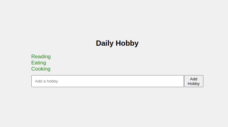
Now go ahead and test the application by adding a new hobby; you should see a similar output to the screenshot below on your browser.
Conclusion
You’ve learned how to build a lightweight web component using Lit by building a hobbies demo application.js. First, we started with an introduction to Lit. Then we discussed why you should use it in your application, and we built a demo application to explore its features. Now you may use Lit in your next project; you can learn more about Lit and add more features to the demo application you just created.