Build a Reusable Carousel with Vue and Splide.js
Use Splide to build a reusable component


In today’s web development landscape, building reusable components is essential to improve efficiency and maintainability. One of the most commonly used components in web design is the carousel, a sliding image gallery that allows users to browse through multiple images or items.
In this article, we will explore how to build a reusable carousel component with Vue and Splide.js, a lightweight and flexible slider library.
We will take a step-by-step approach to building the component, starting with installing the required dependencies and then moving on to implementing the basic functionality. By the end of this article, you will have a solid understanding of creating a fully functional and reusable carousel component with Vue and Splide.js, which can be easily integrated into your web projects.
How Splide.js Works
Splide.js is a lightweight, responsive, and customizable slider library for creating touch-enabled sliders and carousels on the web. It’s written in JavaScript and supports various features, such as multiple slideshows, infinite scrolling, and lazy loading. Here’s how Splide.js works:
- Initialization: To use Splide.js, you first need to initialize it on your web page by including the Splide.js script and calling the
Splideconstructor function. You can pass various options to the constructor function to customize the slider’s behavior and appearance, such as the number of slides to display, the transition speed, and the type of navigation buttons. - HTML Structure: Splide.js requires a specific HTML structure to work properly. You must wrap your slide elements (e.g., images or divs) in a container element with a specific class name. The container element should also have a data attribute specifying the slider type, such as
looporslide. - Slideshow and Slide Objects: Splide.js creates two main objects when you initialize it: the
slideshowobject and theslideobject. The slideshow object represents the entire slider, while the slide object represents each individual slide. You can access and manipulate these objects using various methods and properties provided by Splide.js. - Navigation: Splide.js provides various navigation options for your slider, such as arrows, dots, and thumbnails. You can customize the appearance and behavior of these navigation elements using CSS or the options provided by Splide.js.
- Events: Splide.js also provides various events that you can use to add custom behavior to your slider, such as changing the content of a slide when it becomes active or loading additional content when the slider is scrolled. You can listen to these events using the
onmethod provided by Splide.js.
In this article, you will learn how to use Splide.js for your carousel. Using Splide.js is just like integrating the everyday plugins that you use.
Its usage is being called up by their class names. Splide.js has integration for Vue, React, and Svelte, but this tutorial will be used for Vue.
Firstly we are going to install Splide.js using the command below:
npm install @splidejs/vue-splide
npm install @splidejs/splide
Next up is to globalize your Splide, which can be reused anywhere in your app. Open your main.js file and add this code snippet below.
import { createApp } from 'vue';
import App from './App.vue';
import "@splidejs/splide/dist/css/themes/splide-default.min.css";
import '@splidejs/vue-splide/css/skyblue';

const app = createApp( App );
app.mount( '#app' );
app.use( VueSplide );
You can visit Splide Documentation to learn more
Importance of using a Carousel
A carousel displays multiple images at once. Aside from the carousel being visually pleasing and attention-grabbing, carousels encourage customer interaction with your content by scrolling through videos or images, whether to find out more about your product or follow an interesting story.
Using a carousel is important to pass more information at a glance and beautify your website, which can help your brand leave a lasting impression on your customers.
Integrating Splide with Vue
Be sure you have installed and set up Splide.js. Since you have made your Splide reusable, the next up is importing it where you want to use it.
The code snippet below shows how to create a basic carousel by adding these properties to the options we returned.
<script>
export default {
components: {},
data() {
return{
options:{
rewind : true,
perPage: 1,
gap : '1rem',
height : '15rem',
arrows:'true',
type: 'fade',
pagination: 'true',
breakpoints: {
1000: {
perPage: 1,
}
},
},
}
}
}
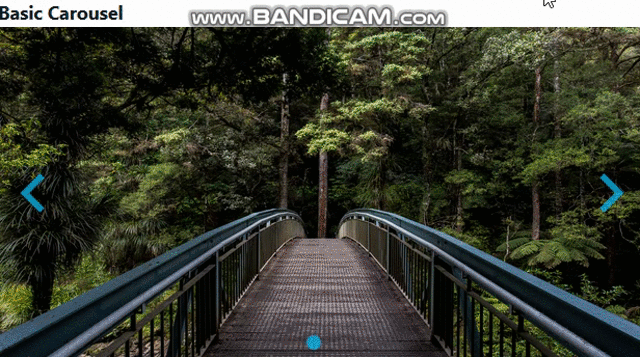
</script>This is how your HTML code snippet should look by swapping up our images with the Splide tag and passing the option’s value to it.
<template>
  <div class="max-w-2xl mx-auto px-3 flex flex-col items-center">
    <div class="flex items-center justify-center text-2xl font-bold py-2">
        Photo Gallery
    </div>
    <div class="flex flex-col justify-center  gap-3 w-full">
      <div class="bg-slate- py-3 px-3 w-full">
        <span class="text-gray-900 font-bold text-lg  py-2">Basic Carousel</span>

        <div class="flex justify-center items-center">
          <Splide :options="options">
            <SplideSlide   class="w-full">
              <img src="../assets/nature3.jpg" class="w-full h-full mx-auto">
            </SplideSlide>
            <SplideSlide  class="w-full">
              <img src="../assets/nature4.jpg" class="w-full h-full mx-auto">
            </SplideSlide>
          </Splide>
        </div>
      </div>
    </div>
  </div>
</template>
Test Sample
After you have done this, you should arrive at this beautiful carousel.
Creating Auto-scroll Carousel
To create an auto-scroll carousel, you should follow the steps below;
Add Auto scroll Extension
You are to install the Auto-scroll extension; use the command below to do that:
npm install @splidejs/splide-extension-auto-scrollNext up, add this code snippet to your script; you import the auto-scroll extension and pass it to your component, as shown below.
The major property for the auto-scroll is the
autoPlayattribute; you should set it to be true.
<script>
import { AutoScroll } from '@splidejs/splide-extension-auto-scroll';
import { defineComponent } from 'vue';

  export default defineComponent( {
    components: { AutoScroll},
    data() {
      return{
        options:{
          rewind : true,
          autoplay: 'true',
          perPage: 3,
          perMove: '1',
          gap    : '1rem',
          height : '15rem',
          type: 'loop',
          rewindSpeed: '3000',
          arrows: 'false',
          pagination: 'false',
          extensions:{ AutoScroll },
          autoScroll: {
              speed: 2,
              pauseOnHover: true,
              pauseOnFocus: false,
          },
          breakpoints: {
            1000: {
              perPage: 1,
            }
          },
        },
      }
    }
  })
</script>
Test Sample

Session Replay for Developers
Uncover frustrations, understand bugs and fix slowdowns like never before with OpenReplay — an open-source session replay tool for developers. Self-host it in minutes, and have complete control over your customer data. Check our GitHub repo and join the thousands of developers in our community.
Creating a Dynamic Carousel
To create a dynamic carousel, you should follow the steps below.
Dynamic Slide
To successfully generate a dynamic slide, you will create a file called generateSlides.ts then copy this code snippet from the code snippet below. You will use an array to hold your images that will be changing. You are generating the images here from Unsplash, and you will be using this same file for your thumbnail carousel as well.
export function generateSlides( length = 10, sig = 0 ): Array<{ src: string, alt: string }> {
    return Array.from( { length } ).map( ( value, index ) => {
      index = sig || index;

      return {
        src: `https://source.unsplash.com/random/800x450?sig=${ index }`,
        alt: `Image ${ index }`,
      };
    });
  }
Next up is to add this to your script as your previous carousel. Here you imported generateSlides and did some little tweaking compare to others.
<script lang="ts">
import { Options, Splide, SplideSlide, SplideTrack } from '@splidejs/vue-splide';
import { defineComponent, ref } from 'vue';
import { generateSlides } from '../utils/generateSlides';
export default defineComponent({
name: 'DynamicSlidesExample',
components: {
Splide,
SplideTrack,
SplideSlide,
},
setup() {
const slides = ref<ReturnType<typeof generateSlides>>( generateSlides( 1 ) );
const options: Options = {
rewind : true,
autoPlay: true,
perPage: 3,
gap : '1rem',
height : '15rem',
};
function add(): void {
slides.value.push( ...generateSlides( 1, slides.value.length ) );
}
function remove(): void {
--slides.value.length;
}
return {
slides,
options,
add,
remove,
}
},
});
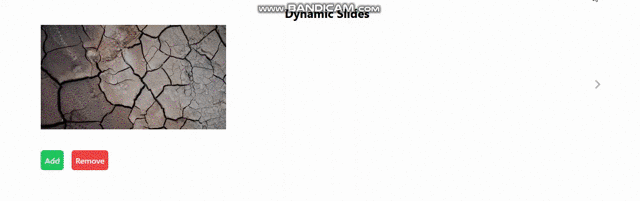
</script>Your HTML will be wrapped with a template tag, and you added a button to control the addition of images and removing them as well.
<template>
  <div class="max-w-6xl mx-auto">
    <h2 class="flex items-center justify-center text-2xl font-bold py-2">Dynamic Slides</h2>

    <Splide class="min-h-72" :options="options" :has-track="false"
    >
      <div style="position: relative">
        <SplideTrack>
          <SplideSlide v-for="slide in slides" :key="slide.alt">
            <img :src="slide.src" :alt="slide.alt">
          </SplideSlide>
        </SplideTrack>
      </div>

      <div class="controls flex gap-4 my-3">
        <button @click="add" class="bg-green-500 text-white font-semibold px-2 py-2 rounded-md">Add</button>
        <button @click="remove" class="bg-red-500 text-white font-semibold px-2 py-2 rounded-md">Remove</button>
      </div>
    </Splide>
  </div>
</template>
Test Sample
Creating a Thumbnail Carousel
To create an auto thumbnail carousel, you should follow the steps below;
Thumbnail slide
You are also generating these images from Unsplash; as said earlier, your generateSlides.ts will still be needed here since it was referenced too.
<script lang="ts">
import { Splide, SplideSlide, Options } from '@splidejs/vue-splide';
import { defineComponent, onMounted, ref } from 'vue';
import { generateSlides } from '../utils/generateSlides';
export default defineComponent( {
  name: 'ThumbnailsExample',
  components: {
    Splide,
    SplideSlide,
  },
  setup() {
    const main   = ref<InstanceType<typeof Splide>>();
    const thumbs = ref<InstanceType<typeof Splide>>();
    const slides = generateSlides();
    const mainOptions: Options = {
      type      : 'loop',
      perPage   : 2,
      perMove   : 1,
      gap       : '1rem',
      pagination: false,
    };
    const thumbsOptions: Options = {
      type        : 'slide',
      rewind      : true,
      gap         : '1rem',
      pagination  : false,
      fixedWidth  : 110,
      fixedHeight : 70,
      cover       : true,
      focus       : 'center',
      isNavigation: true,
      updateOnMove: true,
    };
    onMounted( () => {
      const thumbsSplide = thumbs.value?.splide;
      if ( thumbsSplide ) {
        main.value?.sync( thumbsSplide );
      }
    } );
    return {
      slides,
      main,
      thumbs,
      mainOptions,
      thumbsOptions,
    }
  },
} );
</script>
This HTML code snippet differs from what we have been doing because we have two Splide tags here.
One for the display images and the other for the images in the thumbnail that is clickable and will be displayed when clicked.
<template>
  <div class="max-w-6xl mx-auto py-2">
    <h2 class="flex items-center justify-center text-2xl font-bold py-2">Thumbnails</h2>

    <Splide :options="mainOptions" ref="main">
      <SplideSlide v-for="slide in slides" :key="slide.alt">
        <img :src="slide.src" :alt="slide.alt">
      </SplideSlide>
    </Splide>

    <Splide aria-label="The carousel with thumbnails. Selecting a thumbnail will change the main carousel" :options="thumbsOptions" ref="thumbs">
      <SplideSlide v-for="slide in slides" :key="slide.alt">
        <img :src="slide.src" :alt="slide.alt">
      </SplideSlide>
    </Splide>
  </div>
</template>
Test Sample

Creating a Video Carousel
To create an video carousel, you should follow the steps below;
Video Slide Extension
For the video slide, you will also need the video extension. You the command below to install the extension.
$ npm install @splidejs/splide-extension-videoNext, you are going to import the video extension. We will get these videos from YouTube by declaring a constant video and passing the URL to it as an object, as seen below.
<script lang="ts">
import { Video } from '@splidejs/splide-extension-video';
import { defineComponent } from 'vue';

export default defineComponent( {
  name: 'VideoExample',
  components: {},
  setup() {
    const videos = [ '20IfkyJigKg', 'JJSoEo8JSnc', 'jx5jmI0UlXU', ];
    const options = {
      rewind     : true,
      autoPlay: true,
      perPage: 2,
      gap: 10
    };
    return {
      videos,
      options,
      extensions: { Video },
    }
  },
} );
</script>
Your images will still be wrapped with your Splide tag.
Splide.js has a class for Youtube videos; which is the data-splide-youtube, in which an id will be passed to it.
<template>
  <div class="max-w-6xl mx-auto py-5">
    <h2  class="flex items-center justify-center text-2xl font-bold py-2">Video Carousel</h2>

    <Splide :options="options" :extensions="extensions">
      <SplideSlide v-for="( id, index ) in videos" :key="id" :data-splide-youtube="id">
        <img
          :src="`https://i3.ytimg.com/vi/${ id }/maxresdefault.jpg`"
          :alt="`YouTube Sample ${ index + 1 }`"
        >
      </SplideSlide>
    </Splide>
  </div>
</template>
Test Sample

Conclusion
In summary, building reusable components is a crucial aspect of web development, and creating a reusable carousel component can greatly improve the efficiency and maintainability of your web projects. By using Vue and Splide.js, we created a versatile and customizable carousel component that can be easily integrated into any web project.
Through the step-by-step approach we took in building the component, we have shown how to implement basic functionality, customize the styling, and add additional features such as autoplay and navigation. The final result is a powerful and flexible carousel component that can be used to enhance user experience and add visual interest to web projects. With the knowledge gained from this article, you are now equipped to create your own reusable carousel component with Vue and Splide.js and take your web development skills to the next level.
Gain Debugging Superpowers
Unleash the power of session replay to reproduce bugs and track user frustrations. Get complete visibility into your frontend with OpenReplay, the most advanced open-source session replay tool for developers.