Build accessible components with React Aria
Use React Aria to easily build accessible components for your website


React Aria is a library of React Hooks that provides accessible UI primitives for your design system. It provides accessibility and behavior for many standard UI components so you can focus on your unique design and styling. It implements adaptive interactions to ensure the best experience possible for all users, including support for mouse, touch, keyboard, and screen readers.
In this tutorial, you’ll learn how to use React Aria to build a web application. We’ll create components using React Aria to build a demo application.
Why use React Aria?
Here are some of the reasons you should consider using React Aria in your web application:
- It is easily accessible: React Aria offers complete screen reader and keyboard navigation support, as well as accessibility and behavior that adhere to WAI-ARIA Authoring Practices. To offer the greatest experience for every user, every component has been tested on a wide range of screen readers and devices.
- It is adaptive: React Aria maintains consistent functionality no matter the UI. It enables interactions with the mouse, touch, keyboard, and screen reader that have been tried on a range of browsers, gadgets, and platforms.
- International: Over 30 languages are supported by React Aria, which also has right-to-left behavior and internationalized date and number formatting, among other features.
- It is fully customizable: No rendering is implemented by React Aria, nor is a DOM structure, style approach, or design-specific information imposed. It enables interactions, behavior, and accessibility while letting you concentrate on your design.
Project setup
Now let’s go ahead and set up a React project to create a component library using React Aria. Run the command below to install the latest version of Reactjs below.
npx create-react-app library-demoWait for the installation to complete. Once that is done, let’s install React Aria. React Aria published all components as a separate module for adoptable sake, so you can choose to install the components independently or as all the package. (For instance, npm install @react-aria/button) We’ll install all the components packaged under the @react-aria scope with the command below to save time.
yarn add react-ariaNow change the directory to the project folder and run the application with the command below.
cd library-demo
npm start
Open Source Session Replay
OpenReplay is an open-source, session replay suite that lets you see what users do on your web app, helping you troubleshoot issues faster. OpenReplay is self-hosted for full control over your data.

Start enjoying your debugging experience - start using OpenReplay for free.
Creating React Components
We’ll use the React hooks provided by Aria to create component libraries for our React applications. React Aria offers accessibility and behavior for React hooks. You must define the DOM structure for your component and send the DOM props supplied by each React Aria hook to the proper elements because it does not provide any rendering. Additionally, it allows you total control over the DOM by enabling you to add additional components for styling or layout control, such as CSS classes, inline styles, CSS-in-JS, etc. We’ll explore some of them and how they work. To get started, create a component folder in our React project’s src folder to save the component libraries.
mkdir src/componentsCreate Button component
Let’s start with the button component, and we’ll use the useButton hook. The useButton hook takes care of several cross-browser discrepancies in interactions and accessibility capabilities so that you can focus on the styling. Create a Button.js in the component folder and add the code snippet below.
import React from "react";
import { useButton } from "@react-aria/button";

export default function Button(props) {
  let ref = React.useRef();
  let { buttonProps } = useButton(props, ref);

  return (
    <button {...buttonProps} ref={ref} style={props.style}>
      {props.children}
    </button>
  );
}
In the above code snippet, we imported the useButton hook and called it, passing the props along with a ref to the DOM node for this component to get the buttonProp property. Then we spread the props returned from the hook into the button element that we want to render, passing the ref and the style props.
Now you can import and use this component, pass in the props you want, and add styles and event listeners.
<Button style={{backgroundColor:"red"}} onPress={()=>console.log('button clicked')}>click me</Button>Create Input Component
Next, let’s create the input component library using the useFocus and useTextField hooks. The useTextField hook offers a text field’s behavior and accessibility implementation. In contrast, the useFocus hook handles focus events for the current target while ignoring events on the children of the focus element. Create an Input.js file in the component folder and add the code snippet below.
import React from "react";
import { useFocus } from "@react-aria/interactions";
import { useTextField } from "@react-aria/textfield";

export default function Input(props) {
  let [value, setValue] = React.useState("");
  let { focusProps } = useFocus({
    onFocus: (e) => setValue(e.target.value),
    onBlur: (e) => setValue(e.target.value),
  });
  let { label } = props;
  let ref = React.useRef();
  let { labelProps, inputProps, errorMessageProps } =
    useTextField(props, ref);

  return (
    <div style={props.style}>
      <label {...labelProps}>{label}</label>
      <input {...inputProps} {...focusProps} ref={ref} />
      {value.length < 1 && (
        <div {...errorMessageProps} style={{ color: "red", fontSize: 12 }}>
          All fields are required
        </div>
      )}
    </div>
  );
}
In the above code snippet, we imported the two Aria hooks and created a setValue state to get the value in the input field. The setValue state will let users know if the user has fielded the input field. Then we called the useFocus hook, which takes an object of event listeners as parameters. useFocus hook supports three event handlers.
- onFocus: This handler is called when the element receives focus.
- onBlur: This handler is called when the element loses focus.
- onFocusChange: This handler is called when the element’s focus status changes.
We only need the onFocus and onBlur events to track the state of the input field when a user clicks in and out of it. Also, we called the useTextField, passing the props along with a ref to the DOM node for this component to get the labelProps, inputProps, and errorMessageProps properties. Then we spread the props returned from the hook into the input element we want to render, passing the ref and the style props.
The
labelProps,inputProps, anderrorMessagePropshandle the behavior of the input label, error message, and input properties.
Create Header Component
We’ll use the useHover hook to create a Header component. This hook handles the pointer hover interactions for an element. Create a Header.js file in the component directory and add the code snippet below.
import React from "react";
import { useHover } from "@react-aria/interactions";

export default function Header(props) {
  let { hoverProps, isHovered } = useHover({});

  return (
    <div
      {...hoverProps}
      style={{
        background: isHovered ? "#167B73" : "#2D9E96",
        color: "white",
        padding: 4,
        cursor: "pointer",
        display: "block",
      }}
      tabIndex={0}
    >
      <div style={{display:"flex", justifyContent:"space-between", fontSize:"10px"}}>{props.children}</div>
    </div>
  );
}
We imported the two Aria useFocus hooks in the above code snippet. We called it to get the hoverProps and isHovered properties. We’ll use the isHovered props to know when the mouse or pen goes over the element, and we will change the background color of the elements in the header. Then we spread the hoverProps into the div element that we want to render, passing an initial tabIndex of 0.
Create Modal Component
We’ll take advantage of the useDialog, useFocusScope, useOverly, useOverlyPreventScroll, useModal, useOverlayContainer and useButton hooks.
Create a Model.js file in the component folder and add the code snippet below.
import React from 'react';
import {useOverlayTriggerState} from '@react-stately/overlays';
import {
  useOverlay,
  usePreventScroll,
  useModal,
  OverlayContainer
} from '@react-aria/overlays';
import {useDialog} from '@react-aria/dialog';
import {FocusScope} from '@react-aria/focus';
import {useButton} from '@react-aria/button';

function ModalDialog(props) {
  let {title, children} = props;
  let ref = React.useRef();
  let {overlayProps, underlayProps} = useOverlay(props, ref);

  usePreventScroll();
  let {modalProps} = useModal();
  let {dialogProps, titleProps} = useDialog(props, ref);

  return (
    <div
      style={{
        position: 'fixed',
        zIndex: 100,
        top: 0,
        left: 0,
        bottom: 0,
        right: 0,
        background: 'rgba(0, 0, 0, 0.5)',
        display: 'flex',
        alignItems: 'center',
        justifyContent: 'center',
      }}
      {...underlayProps}>
      <FocusScope contain restoreFocus autoFocus>
        <div
          {...overlayProps}
          {...dialogProps}
          {...modalProps}
          ref={ref}
          style={{
            background: 'white',
            color: 'black',
            padding: 30,
            width: '50%'
          }}>
          <h3
            {...titleProps}
            style={{marginTop: 0}}>
            {title}
          </h3>
          {children}
        </div>
      </FocusScope>
    </div>
  );
}

export default function Modal(props) {
  let state = useOverlayTriggerState({});
  let openButtonRef = React.useRef();
  let {buttonProps: openButtonProps} = useButton({
    onPress: () => state.open()
  }, openButtonRef);

  return <>
     <OverlayProvider>
        <button {...openButtonProps} ref={openButtonRef}>
          Open Dialog
        </button>
        {state.isOpen && (
          <OverlayContainer>
            <ModalDialog
              title={props.title}
              isOpen
              onClose={state.close}
              isDismissable
            >
              <div
                style={{
                  display: "flex",
                  justifyContent: "center",
                  alignItems: "center",
                  flexDirection: "column",
                }}
              >
                {props.children}
              </div>
            </ModalDialog>
          </OverlayContainer>
        )}
      </OverlayProvider>
  </>;
}
In the above code snippet, we imported the Aria hooks we need for this component, and we created a ModalDialog component to create a dialog for the modal. In the ModalDialog, we used the useOverly hook, which returns the overlayProps and underlayProps props to handle the user interactivity outside a dialog and to close the modal.
Then we used the useDialog hook, which returns dialogProps and titleProps to get the props of the dialogue and its title. Also, we used the FocusScope component to specify the focus area controlled by the dialog.
Next, we created the Modal component. Here we create the actual modal content. Here we used the useButton hook to ensure that focus management is handled correctly across all browsers. Focus is restored to the button once the dialog closes.
Lastly, we used the ModalDialog we created to create a dialog for the modal and pass in the required props. Also, we wrapped the application in an OverlayProvider hook so it can be hidden from screen readers when a modal opens. You can learn more about creating a modal from this link.
Using React Aria Components
Now let’s used the components libraries to create a small application. To do that, update the App.js file with the code snippet below.
import Button from "./components/Button";
import Input from "./components/Input";
import Modal from "./components/Modal";
import Header from "./components/Header";
function App() {
return (
<div className="App">
<Header className="primary">
<p>Formak</p>
<p>Signup</p>
</Header>
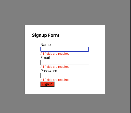
<Modal title="Signup Form">
<form>
<Input label="Name" />
<Input label="Email" />
<Input label="Password" type="password" />
<Button style={{backgroundColor:"red"}} onPress={()=>console.log('button clicked')}>Signup</Button>
</form>
</Modal>
</div>
);
}
export default App;In the above code snippet, we imported the component libraries and used them to create a small form application.
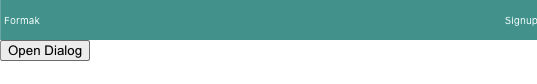
Now, if you click the Open Dialog, you should see the form modal below.
You can use the tools like Rollup.js to bundle the component library and share it with your friends.
Adding Server side rendering
SSR, or server-side rendering, is the process of rendering components to HTML on the server instead of only on the client. A comparable strategy is static rendering: instead of pre-rendering pages to HTML on each request but at build time. To make React Aria components work with SSR, you must wrap your application in an SSRProvider. This signals to all nested React Aria hooks that they are being rendered in an SSR context. Update the index.js file with the code snippet below.
...
import {SSRProvider} from '@react-aria/ssr';
...

...
root.render(
  <SSRProvider>
    <React.StrictMode>
      <App />
    </React.StrictMode>
  </SSRProvider>
);
...
Conclusion
Throughout this tutorial, we have learned how to create a component library in React using React Aria. We started by understanding React Aria and why you should consider using it for creating component libraries. Then we created some component libraries using React Aria to build a signup form. You can learn more about React Aria from the official docs.
A TIP FROM THE EDITOR: For other packages you can use to develop components, read our Building sensible UI components with React Suite and Build React components with Fluent UI articles.