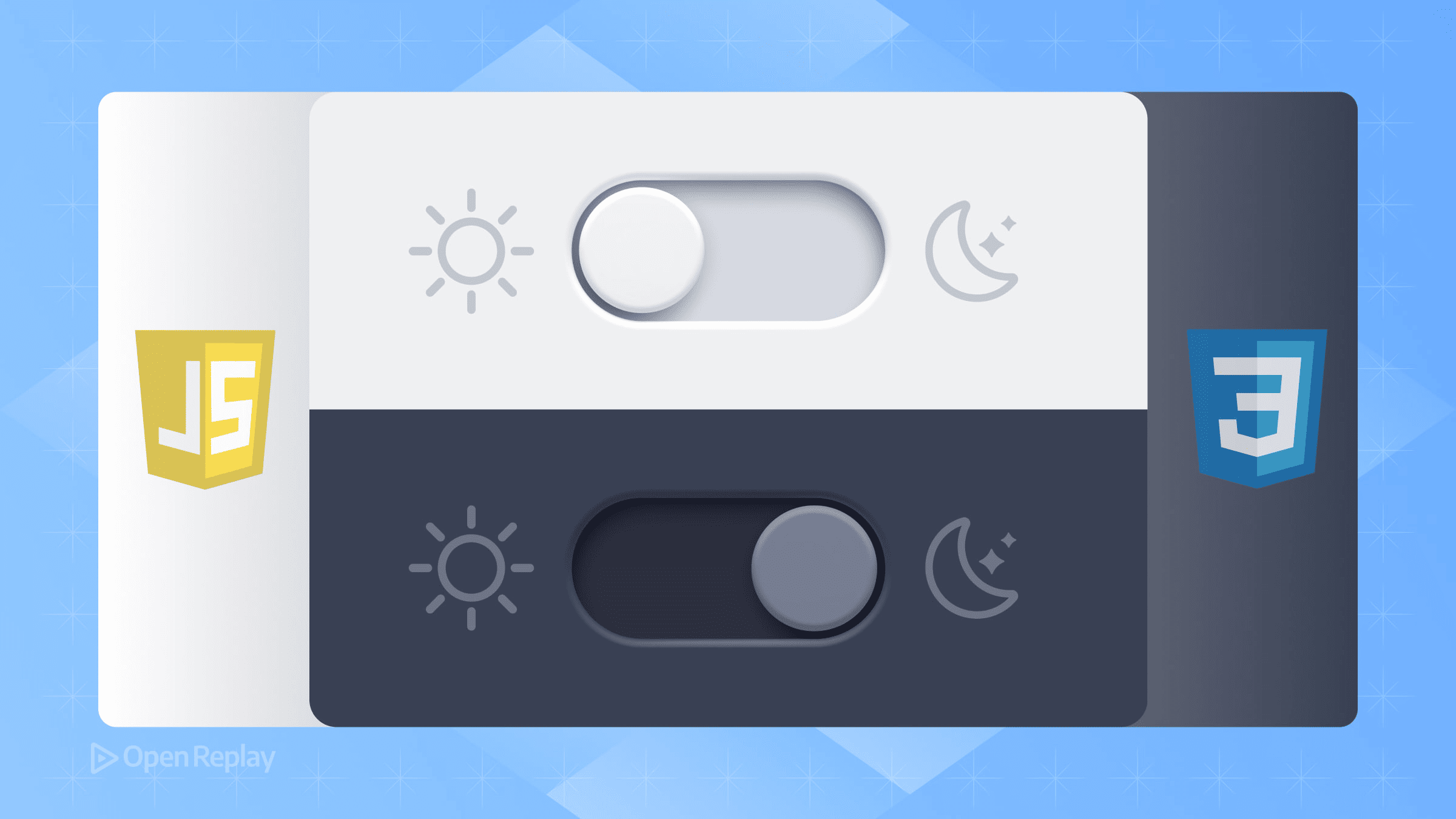
How to Build a Dark Mode Toggle with CSS and JavaScript

Dark mode has become essential for modern websites. Users expect to switch themes based on their environment, time of day, or personal preference. This tutorial shows you how to build a robust dark mode toggle that respects system preferences, remembers user choices, and leverages modern CSS features for optimal performance.
Key Takeaways
- Build a dark mode toggle that respects system preferences and persists user choices
- Use CSS custom properties and the color-scheme property for efficient theming
- Implement JavaScript that prevents flash of unstyled content on page load
- Apply accessibility best practices for keyboard navigation and screen readers
Setting Up the HTML Structure
Start with semantic HTML that includes a toggle button and declares the initial theme:
<!DOCTYPE html>
<html lang="en" data-theme="light">
<head>
    <meta charset="UTF-8">
    <meta name="viewport" content="width=device-width, initial-scale=1.0">
    <meta name="color-scheme" content="light dark">
    <title>Dark Mode Toggle Demo</title>
    <link rel="stylesheet" href="styles.css">
</head>
<body>
    <button type="button" id="theme-toggle" aria-label="Toggle dark mode">
        <span class="toggle-text">Dark</span>
    </button>
    <!-- Your content here -->
</body>
</html>
The data-theme attribute on the HTML element controls our theme. The color-scheme meta tag tells the browser to adapt native UI elements like scrollbars and form controls.
Implementing CSS with Modern Features
Using CSS Custom Properties and color-scheme
Define your color tokens using CSS custom properties, then leverage the CSS color-scheme property for native element theming:
:root {
    color-scheme: light dark;

    /* Light theme colors (default) */
    --bg-color: #ffffff;
    --text-color: #213547;
    --accent-color: #0066cc;
}

[data-theme="dark"] {
    --bg-color: #1a1a1a;
    --text-color: #e0e0e0;
    --accent-color: #66b3ff;
}

body {
    background-color: var(--bg-color);
    color: var(--text-color);
    transition: background-color 0.3s ease, color 0.3s ease;
}
Respecting System Preferences with prefers-color-scheme
Add support for prefers-color-scheme to automatically match system settings:
@media (prefers-color-scheme: dark) {
    :root:not([data-theme="light"]) {
        --bg-color: #1a1a1a;
        --text-color: #e0e0e0;
        --accent-color: #66b3ff;
    }
}
The Modern light-dark() Function
For browsers supporting the light-dark() function, you can simplify color definitions:
:root {
    color-scheme: light dark;
}

body {
    background-color: light-dark(#ffffff, #1a1a1a);
    color: light-dark(#213547, #e0e0e0);
}
This function automatically selects the appropriate color based on the active color scheme, reducing code duplication.

Discover how at OpenReplay.com.
JavaScript for Toggle and Persistence
Preventing Theme Flash on Load
Place this script immediately after the opening <body> tag to prevent flash of unstyled content:
<script>
    // Apply saved theme immediately to prevent flash
    (function() {
        const saved = localStorage.getItem('theme');
        if (saved) {
            document.documentElement.setAttribute('data-theme', saved);
        } else if (window.matchMedia('(prefers-color-scheme: dark)').matches) {
            document.documentElement.setAttribute('data-theme', 'dark');
        }
    })();
</script>
Complete Dark Mode Implementation
Add this JavaScript for the toggle functionality:
const toggle = document.getElementById('theme-toggle');
const html = document.documentElement;

// Get current theme
function getTheme() {
    return html.getAttribute('data-theme') ||
           (window.matchMedia('(prefers-color-scheme: dark)').matches ? 'dark' : 'light');
}

// Set theme and update UI
function setTheme(theme) {
    html.setAttribute('data-theme', theme);
    localStorage.setItem('theme', theme);
    updateToggleText(theme);
}

// Update button text
function updateToggleText(theme) {
    const text = toggle.querySelector('.toggle-text');
    text.textContent = theme === 'dark' ? 'Light' : 'Dark';
    toggle.setAttribute('aria-label', `Switch to ${theme === 'dark' ? 'light' : 'dark'} mode`);
}

// Initialize
updateToggleText(getTheme());

// Handle toggle click
toggle.addEventListener('click', () => {
    const current = getTheme();
    setTheme(current === 'dark' ? 'light' : 'dark');
});

// Listen for system preference changes
window.matchMedia('(prefers-color-scheme: dark)').addEventListener('change', (e) => {
    if (!localStorage.getItem('theme')) {
        setTheme(e.matches ? 'dark' : 'light');
    }
});
Accessibility and Best Practices
Essential Accessibility Features
Your dark mode toggle must be keyboard accessible and properly labeled:
#theme-toggle:focus-visible {
    outline: 2px solid var(--accent-color);
    outline-offset: 2px;
}
Ensure sufficient color contrast in both themes. Dark mode doesn’t mean low contrast—maintain at least WCAG AA standards (4.5:1 for normal text).
What to Avoid
Don’t use filter: invert(1) on the entire page—it inverts images and media unnecessarily. Avoid pure black (#000000) backgrounds in dark mode. Use dark grays (#1a1a1a) for better readability. Never rely solely on JavaScript without CSS fallbacks.
Testing Your Implementation
Test your dark mode toggle across different scenarios:
- Clear localStorage and verify system preference detection works
- Toggle the theme and refresh to confirm persistence
- Change system preferences while the site is open
- Check contrast ratios using browser DevTools
- Test keyboard navigation and screen reader announcements
Conclusion
A well-implemented dark mode solution respects user preferences, persists choices, and leverages modern CSS features. By combining the color-scheme property, custom properties, and minimal JavaScript, you create a theme switcher that’s performant, accessible, and user-friendly. The light-dark() function simplifies color management for modern browsers while fallbacks ensure compatibility.
Remember: the best dark mode implementation is invisible to users—it just works exactly as they expect.
FAQs
Yes, you can use CSS media queries with prefers-color-scheme to detect system preferences. However, JavaScript is needed to save user preferences and provide a manual toggle button that overrides system settings.
This happens when JavaScript runs after the page renders. Place a script immediately after the body tag that checks localStorage and applies the saved theme before the page paints to prevent this flash.
No, pure black can cause eye strain and make text harder to read. Use dark grays like #1a1a1a or #121212 instead. These colors reduce strain while maintaining good contrast ratios for accessibility.
Avoid using filter invert on images. Instead, provide alternative dark mode versions of images or use transparent PNGs with colors that work on both backgrounds. For complex graphics, consider using CSS masks or SVGs with currentColor.
Truly understand users experience
See every user interaction, feel every frustration and track all hesitations with OpenReplay — the open-source digital experience platform. It can be self-hosted in minutes, giving you complete control over your customer data. . Check our GitHub repo and join the thousands of developers in our community..