Build React components with Fluent UI
Use Fluent UI with React for easier development of components.


Have you ever considered how tedious it would be to rewrite your applications’ logic and user interface for each project you work on? This is why frameworks can save your life. You can now build your applications with prebuilt components, giving you more flexibility. In this tutorial, you’ll learn how to use Fluent UI to create a React UI component. Without much ado, let’s get to it!
What is Fluent UI?
Fluent UI is a Themable React component library in which UI provides extensible vanilla JavaScript solutions to component state, styling, and accessibility. In addition, it has some powerful features exposed behind simple APIs based on natural language. Fluent UI React exemplifies the Fluent UI design language, component specifications, and utilities.
Fluent UI has many excellent features, making it a good framework for creating appealing component UI for your React applications. These features include the following.
Shorthand Props
Fluent UI components can have “slots” which accept shorthand props. The Fluent UI shorthand props have shorthand values used as a recipe to customize rendered React Element. For example, the Loader component has a label slot whose value defines the message that will appear together with the loading indicator. jsx.
<Loader label="Fetching data..." />Each component’s slot has an associated default element type. For example, a <Text /> element is rendered for Loader’s label slot by default. The shorthand values make it possible to customize props of this default element by providing props objects as shorthand values.
<Loader label={{ content: 'Fetching data...', size: 'small' }} />You can learn more about the Fluent UI shorthand method here.
Composition
Fluent UI provides a way to compose React components as a prop. It allows managing component features and props without adding extra nested components.
<Header />
  {/* Uses another tag: <h2 class="ui-header" /> */}
<Header as="h2" />
The Fluent UI components handle only props defined in their interfaces, and all unhandled props are passed to the element that you are rendering. Therefore, Fluent UI components support all HTML props, which is essential for working with third-party libraries like react-router.
import { Link } from "react-router-dom";
...
<>
  <Button type="submit" />
  <Image
    src="//[via.placeholder.com/300](http://via.placeholder.com/300)"
    onLoad={() => alert("Loaded")}
    onError={() => alert("Error")}
  />
  <Button as={Link} to="/home">
    To homepage
  </Button>
</>;
You learn more about the Fluent UI composition here.
Icons
The Fluent UI Icons allows you to add icons to your component UI with over 200 customized icons. There’s no need to download or use any third-party icon for your applications!
<AppsIcon />
You learn more about the Fluent UI icons here..
Other components
Fluent UI has lots of excellent components styled using CSS in JS. These methods of styling components will require a style renderer to render the Javascript objects to CSS. FlunetUI component also uses React Context to provide a style renderer and themes to React components. We’ll use some of these components throughout this tutorial.
Creating a video streaming application
Alright, enough talking, let’s get our hands dirty. We’ll create a video streaming application to demonstrate how to use Fluent UI in building UI components in a React application. To get started, ensure you have Node.js installed. Also, the Github for these projects is available here; feel free to clone and follow along.
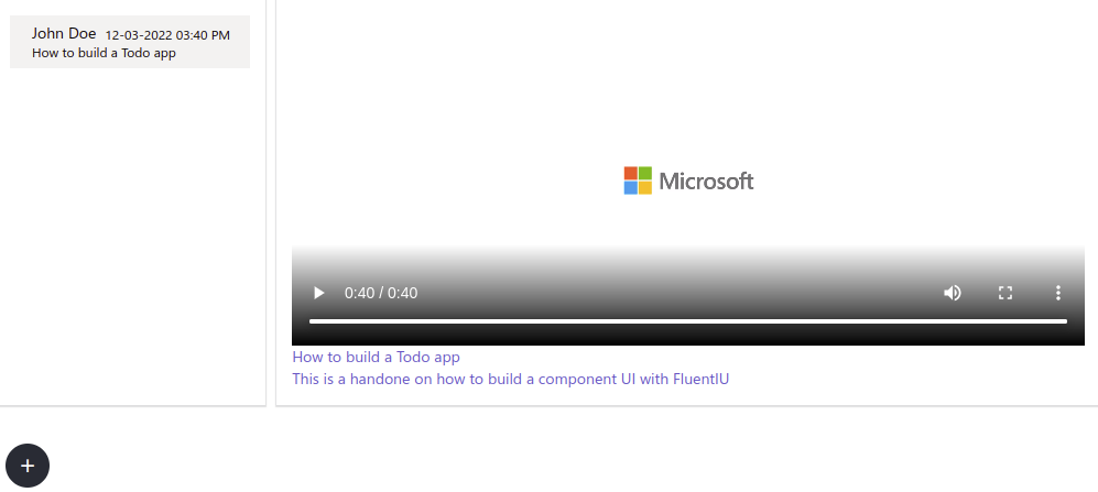
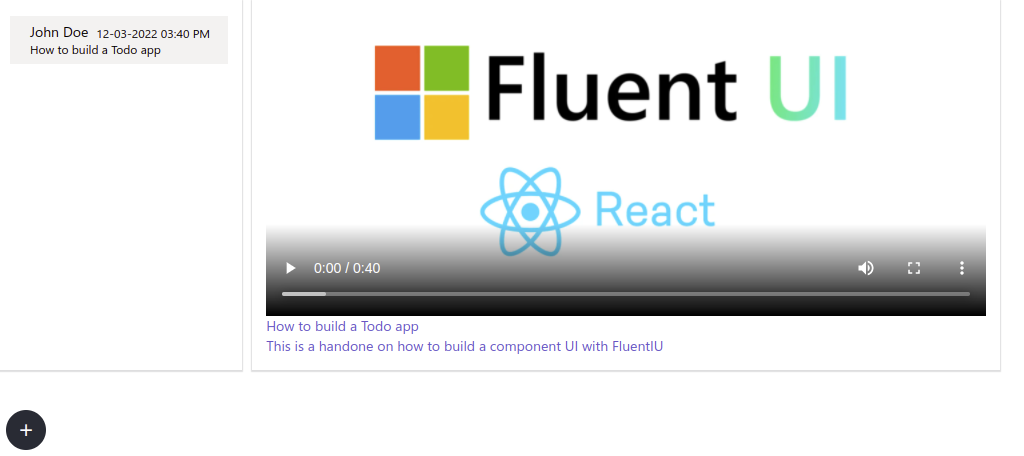
At the end of this tutorial, our application should look like the screenshot below:
Let’s create our basic app with the command below:
npx create-react-app video-streamerThe above command will take some time; you can grab a cup of coffee while you wait. Once installation is completed, change the directory to the project folder and run the application with the command below:
cd video-streamer && npm startThe above command will run the application on port 3000 (the default port) on your browser. With our application created and running, open a new terminal tab and run the command below to install the Fluent UI dependency with the command below:
npm install @fluentui/react-northstar --saveBuilding a Video Streamer component
The Fluent UI dependency is installed; let’s create our application components. We have the App component created for us by default. So we need to make modifications to make things work the way we expect. So first, we place a <Provider /> at the root of your app and pass the theme as props. Update your src/index.js file with the code snippet below:
import React from "react";
import ReactDOM from "react-dom/client";
import App from "./App";
import reportWebVitals from "./reportWebVitals";
import { Provider, teamsTheme } from "@fluentui/react-northstar";

const root = ReactDOM.createRoot(document.getElementById("root"));
root.render(
  <Provider theme={teamsTheme}>
    <App />
  </Provider>
);
reportWebVitals();
Then update your src/App.js file with the code snippet below:
import React, { useEffect, useState } from "react";
import Video from "./components/Video";
import Videolist from "./components/VideoList";
import "./App.css";
import Modal from "./components/Modal";
import { Flex, Segment } from "@fluentui/react-northstar";
function App() {
  const [videos, setVideos] = useState([
    {
      id: "1",
      name: "How to build a Todo app",
      createdBy: "John Doe",
      coverURL: "public/images/2020_MSFT_Icon_Celebration_placeholder.jpg",
      description:
        "This is a handone on how to build a component UI with FluentIU",
      videoURL:
        "http://fabricweb.azureedge.net/fabric-website/assets/videos/2020_MSFT_Icon_Celebration.mp4",
      createdAt: "12-03-2022 03:40 PM",
    },
  ]);

  return (
    <Flex gap="gap.small">
      <Segment
        color="white"
        content={
          <>
            {videos.map((video) => (
              <Videolist
                video={video}
                key={video.id}
                changeActive ={changeActive}
              />
            ))}
          </>
        }
        inverted
      />
      <Segment
        color="white"
        content={
          <>
            <div className="video">
              <Video activeVideo={activeVideo} />
            </div>
            <Modal
              handleSubmit={handleSubmit}
              setActiveVideo={setActiveVideo}
              setVideoName={setVideoName}
              setCoverURL={setVideoURL}
              setVideoURL={setCoverURL}
              setCreatedBy={setCreatedBy}
              setDescription={setDescription}
            />
          </>
        }
        inverted
      />
    </Flex>
  );
}
export default App;
In the above code snippet, we imported the required React dependencies to run the application. In addition, we also imported the Fluent UI Flex and Segment components, which allows the creation of the layout of our application. Next, we imported our Video, VideList, and Modal components, which we’ll be creating in a later section. Then we created our App class-based component with the state variable. In our state, we have an array of videos which is where all our videos will be stored, displayed, and streamed. Finally, we passed the required props to our Video, VideoList, and Modal components.
Now let’s add methods to our App component.
function handleSubmit(e) {
    e.preventDefault();
    const newVideo = {
      name: VideoName,
      coverURL: coverURL,
      videoUrl: videoURL,
      description: description,
      createdAt: Date.now(),
      createdBy: createdBy,
    };
    setVideos([...videos, newVideo]);
  }

    function changeActive(videoObj) {
    setActiveVideo(videoObj);
  }

  useEffect(() => {
    //Play the firt video by default
    setActiveVideo(videos[0]);
  }, [videos]);
In the above code snippet, we created three methods:
- The
changeActivemethod will enable us to pay for any video by setting it as the active Video. - The
handleChangemethod will allow us to get inputs from our input forms. - The
handleSumitmethod will handle our form submission to add a new video to the array of videos. - We create a
useStatehook, which sets the first Video in our Video as the active Video once the component mounts.
Now create the following state variables to our our App with the code snippet below:
const [activeVideo, setActiveVideo] = useState({});
  const [VideoName, setVideoName] = useState("");
  const [coverURL, setCoverURL] = useState("");
  const [videoURL, setVideoURL] = useState("");
  const [description, setDescription] = useState("");
  const [createdBy, setCreatedBy] = useState("");
Now let’s create the Video component.
Creating a Video Component
Here we’ll create the Video component to render and stream our videos. First, create a components/Video.jsx file in the src folder and import the Fluent UI Video, Text, and Flex components.
import React from "react";
import { Video, Text, Flex } from "@fluentui/react-northstar";
Now create the VideoComp component with code snippet below:
function VideoComp(props) {
  const {activeVideo} = props;
  return (
    <Flex column>
      <Video
        poster={activeVideo?.coverURL}
        src={activeVideo?.videoURL}
        variables={{
          height: "300px",
          width: "720px",
        }}
      />
      <Text color="brand">{activeVideo?.name}</Text>
      <Text color="brand">{activeVideo?.description}</Text>
    </Flex>
  );
}
export default VideoComp;
We decided to name our component VideoComp because we imported a Video component from Fluent UI. Then we used the Flex component to create a nice layout for the Video component. Next, we used the Video and passed in the props from our App component to play a video.
Finally, we used the Text component to display some friendly text about the Video from the props.
Now let’s create our VideoList component.
Open Source Session Replay
OpenReplay is an open-source, session replay suite that lets you see what users do on your web app, helping you troubleshoot issues faster. OpenReplay is self-hosted for full control over your data.

Start enjoying your debugging experience - start using OpenReplay for free.
Creating a VideoList Component
Here we’ll create the VideoList component to display the list of all our Videos. So, create a VideoList.jsx “file in the components folder and add the code snippet below:
import React from "react";
import { List } from "@fluentui/react-northstar";
function VideoList(props) {
  const { video, changeActive } = props;
  return (
    <List
      navigable
      styles={({ theme: { siteVariables } }) => ({
        backgroundColor: siteVariables.colorScheme.default.background4,
        color: "black",
      })}
    >
      <List.Item
        header={video.createdBy}
        headerMedia={video.createdAt}
        content={video.name}
        navigable
        index={0}
        onClick={() => changeActive(video)}
      />
    </List>
  );
}
export default VideoList;
In the above code snippet, we use the Fluent UI List component, which allows us to display a group of related sequential items. We used the List.Item component to display the details of our Video with the props from the App component.
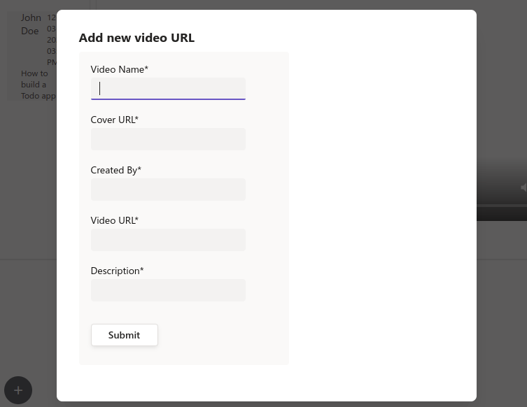
Creating a Modal Component
Now let’s create a modal with our form to allow us to add Video to our videos array. Create a Modal.jsx file in the components folder and add the code snippet below:
import {
  FormInput,
  CardBody,
  Dialog,
  Form,
  Card,
  FormButton,
} from "@fluentui/react-northstar";
import React, { useState } from "react";
import "../App.css";

function Modal(props) {
  const [_, setShowModal] = useState(false);
  const {
    handleSubmit,
    setVideoName,
    setCoverURL,
    setVideoURL,
    setCreatedBy,
    setDescription,
  } = props;
  function handleOpenModal() {
    setShowModal(true);
  }
We imported the Fluent UI Form, FormInput, Dialog, Card, CardBody, and FormButton components in the above code snippet. We also imported the App.css file, where we’ll style our modal open button.
Then we created the handleOpenModal and handleCloseModal methods to open and close our Modal. Then we bind them in our constructor method.
Now render the Modal with the code snippet below:
return (
    <Dialog
      content={
        <Card>
          <CardBody>
            <Form onSubmit={handleSubmit}>
              <FormInput
                label="Video Name"
                name="VideoName"
                required
                showSuccessIndicator={false}
                onClick={(e) => setVideoName(e.target.value)}
              />
              <FormInput
                label="Cover URL"
                name="coverURL"
                required
                showSuccessIndicator={false}
                onChange={(e) => setCoverURL(e.target.value)}
              />
              <FormInput
                label="Created By"
                name="createdBy"
                required
                showSuccessIndicator={false}
                onChange={(e) => setCreatedBy(e.target.value)}
              />
              <FormInput
                label="Video URL"
                name="videoURL"
                required
                showSuccessIndicator={false}
                onChange={(e) => setVideoURL(e.target.value)}
              />
              <FormInput
                label="Description"
                name="description"
                required
                showSuccessIndicator={false}
                onChange={(e) => setDescription(e.target.value)}
              />
              <FormButton content="Submit" />
            </Form>
          </CardBody>
        </Card>
      }
      header="Add new video URL"
      trigger={
        <span className="open" onClick={handleOpenModal}>
          +
        </span>
      }
    />
  );
}
export default Modal;
In the code snippet, we created our Modal form fields and attached their respective events and handlers. Now refresh your browser and test things out.
Testing the application
We have completed our video-streamer application. Now, click the + character to open the modal and add a new movie. You should see the output like the one on the screenshot below:
Now when you add the video, you should see the cover image displayed on the video as shown in the screenshot below.
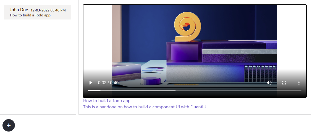
Also, when you click the play button, the selected video will start playing as shown in the screenshot below.
Conclusion
Glad you made it to this point. Throughout this tutorial, you’ve learned how to build a React component UI using Fluent UI. We started with an introduction to Fluent UI and then explored some of its cool features. Feel free to learn more about Fluent UI from the official documentation and add more features to the application!