Building a custom file upload component for Vue
Creating a file upload component from zero, for Vue apps


When building applications for either the web or mobile, very often, the need to make a provision for file upload arises. Many use cases exist for file uploads, including profile picture upload for an account, document upload for account verification, etc. I was spurred to build a custom file upload component after experiencing a snag while working on a project. I needed some custom features, but I could not find them. Then I thought to myself, hey! I will build them.
In this article, I will explore the basics of creating a simple yet useful file upload component for your next VueJS application. This article focuses on a single file upload, but many of the concepts can be extended and used for multiple file uploads.
While this article is designed to be beginner friendly, there are a few skills the reader is expected to possess:
- Basic HTML, CSS and JavaScript
- Basic understanding of some ES6+ concepts
- Basic VueJS. I will be using Vue 3 together with the options API. You can read more about the different APIs available in Vue here
Project Setup
In this article, I will use the Vue CLI to set up my project. If you already have the CLI installed, navigate to your preferred directory, open it up in your terminal and run the following command.
vue create file-uploadYou will be required to choose a few options after running this command. For this project, I am using the default presets, but you can choose to add more items if you want to expand beyond the scope of this article.
If everything works fine, your vue project should be created and look similar to the image below.
If you have not already started, proceed to start your development server to get your project up and running in your browser. This can be achieved by navigating to your project root directory and running npm run serve. This will start up a development server on http://localhost:8080.
Congrats if you have made it this far. I am proud of you! We will continue building out our upload component, where most of our logic will take place.
Creating our component markup
To spin up our Upload component, proceed to create a new file inside the components folder called FileUpload.vue and paste in the following code:
<template>
<div class="file-upload">
<div class="file-upload__area">
<input type="file" name="" id="" />
</div>
</div>
</template>
<script>
export default {
name: "FileUpload",
};
</script>
<style scoped>
.file-upload {
height: 100vh;
width: 100%;
display: flex;
align-items: flex-start;
justify-content: center;
}
.file-upload .file-upload__area {
width: 600px;
min-height: 200px;
display: flex;
align-items: center;
justify-content: center;
border: 2px dashed #ccc;
margin-top: 40px;
}
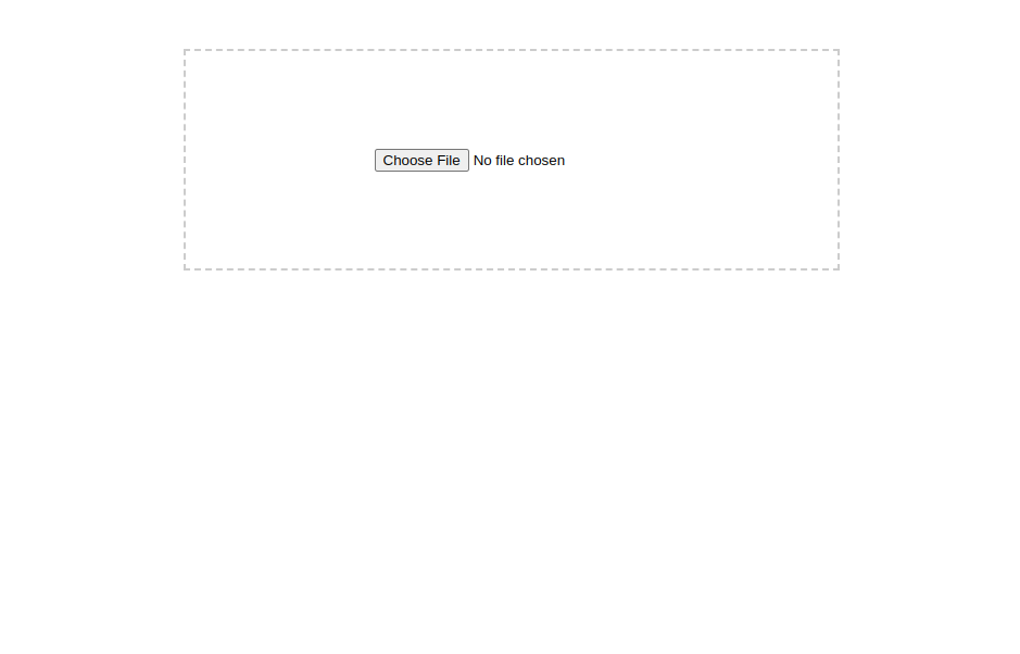
</style>For now, we have just some basic markup with an input element and some basic styling to improve the visual appearance of our component. We will proceed to register this component and render it so we can see what we have so far.
//App.vue
<template>
  <div>
    <FileUpload />
  </div>
</template>

<script>
import FileUpload from "@/components/FileUpload.vue";

export default {
  name: "App",
  components: {
    FileUpload,
  },
};
</script>
The above code will enable us to see what our component looks like now and in the future. If you followed the instructions correctly, you should see something similar to the image below when you visit your browser’s development URL in your browser.
Writing our upload logic
Now that we have our markup set up, we will proceed to write some logic to handle our file upload.
First, we will define a few props to help us control how our component should behave. Props are a useful way to pass data from parent components to child components and vice-versa in Vue. You can read more about props here.
Go ahead and add the code below to your File Upload components.
// FileUpload.vue
export default {
  ...
  props: {
    maxSize: {
      type: Number,
      default: 5,
      required: true,
    },
    accept: {
      type: String,
      default: "image/*",
    },
  },
};- The maxSize prop helps our component be more dynamic by specifying the maximum file size our component can accept.
- The accept prop allows us to define the type of files that should be permitted for upload.
After our props are set up, we can go ahead to define some data to help us perform our upload operation. We will update our code to look like this by defining some initial state.
// FileUpload.vue
  ...
  data () {
    return {
      isLoading: false,
      uploadReady: true,
      file: {
        name: "",
        size: 0,
        type: "",
        fileExtention: "",
        url: "",
        isImage: false,
        isUploaded: false,
      },
    };
  },
Here, we define some initial state for our component, which we will use to update our UI and perform certain logic for when files are selected. You can read more about Vue options data state here.
Now that we have defined our state, we can update our UI to better reflect what we have done.
First, we will head to App.vue to update our component declaration and specify values for our component props. Copy and replace the code in App.vue with
//App.vue

<template>
  <div>
    <FileUpload :maxSize="5" accept="png" />
  </div>
</template>

<script>
import FileUpload from "@/components/FileUpload.vue";

export default {
  name: "App",
  components: {
    FileUpload,
  },
};
</script>
Here we set our maxSize to 5 and tell our File Upload component only to accept .png files.
Having achieved our data setup, we can go on to define some logic we want to perform. First on the list will be to handle what happens when the user chooses a file. To achieve this, we create a function that will handle the upload. In vue, we can do this by creating a handleFileChange function within our methods (more on this here) object in our FileUpload.vue component. Go ahead and add the block of code below.
// FileUpload.vue

  methods: {
    handleFileChange(e) {
      // Check if file is selected
      if (e.target.files && e.target.files[0]) {
        // Get uploaded file
        const file = e.target.files[0],
          // Get file size
          fileSize = Math.round((file.size / 1024 / 1024) * 100) / 100,
          // Get file extension
          fileExtention = file.name.split(".").pop(),
          // Get file name
          fileName = file.name.split(".").shift(),
          // Check if file is an image
          isImage = ["jpg", "jpeg", "png", "gif"].includes(fileExtention);
        // Print to console
        console.log(fileSize, fileExtention, fileNameOnly, isImage);
      }
    },
  },
The above code helps us handle our initial file upload logic and extracts certain information from the selected file. First, we need to perform our first validation to be sure a file was selected, and then we get the uploaded file, extract the file size, file extension, and file name and then check whether or not the selected file is an image.
To see this work, we need to call the function somehow.
We will call this function from the input element using the @change event listener in Vue, which is similar to onchange in regular JavaScript. We will update our input element to look like this.
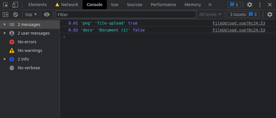
<input type="file" name="" id="" @change="handleFileChange($event)" />Here, we listen to a change event on our input and call our handleFileChange function. After this, we can go ahead to test what we have achieved by uploading a file from our file directory. If you have been following the discourse, you should see an output similar to the screenshot below.
Performing validations
Let us perform some validation based on the data we have in our props. Remember, in our prop, we set a max file size of 5 and told our component to only accept png files. When a file is selected, we want to handle these validations.
First, we create a new errors array in our data object.
// FileUpload.vue
  data() {
    return {
      errors: [],
      ...
    };
  },
And then, we update our markup to be able to render any possible error that occurs.
// FileUpload.vue
<template>
  <div class="file-upload">
    <div class="file-upload__area">
      <div>
        <input type="file" name="" id="" @change="handleFileChange($event)" />
        <div v-if="errors.length > 0">
          <div
            class="file-upload__error"
            v-for="(error, index) in errors"
            :key="index"
          >
            <span>{{ error }}</span>
          </div>
        </div>
      </div>
    </div>
  </div>
</template>
In our markup, we loop through our errors array to check if any errors exist and print that out on our UI. For this operation, we take advantage of two built-in Vue directives called v-for and v-if. More details about these can be found here.
Next up, we create three new functions:
isFileSizeValidwhich takes a parameter offileSizeand will handle validation for file sizeisFileTypeValidwhich takes a parameter offileExtensionand will handle the validation for accepted file type(s)isFileValid, which will take the parameter offile, which will be the object for the uploaded file
We will add these functions together with their logic in our methods object. Update your code to look like what is seen below
// FileUpload.vue
  methods: {
    ...
    isFileSizeValid(fileSize) {
      if (fileSize <= this.maxSize) {
        console.log("File size is valid");
      } else {
          this.errors.push(`File size should be less than ${this.maxSize} MB`);
      }
    },
    isFileTypeValid(fileExtention) {
      if (this.accept.split(",").includes(fileExtention)) {
        console.log("File type is valid");
      } else {
        this.errors.push(`File type should be ${this.accept}`);
      }
    },
    isFileValid(file) {
      this.isFileSizeValid(Math.round((file.size / 1024 / 1024) * 100) / 100);
      this.isFileTypeValid(file.name.split(".").pop());
      if (this.errors.length === 0) {
        return true;
      } else {
        return false;
      }
    },
  },
In our isFileSizeValid function, we performed a simple operation to check if the uploaded file size is less than or equal to the value set in our prop. We also checked if the file type is an accepted file type defined in our accept prop and our isFileTypeValid. Finally, we defined the isFileValid function, which calls our earlier defined functions and passes arguments for fileSize and fileExtension. If any of the conditions fail, we push an error message into our errors array, which will be shown to the user.
To use our new functions, we will need to make slight modifications to our handleFileChange function. Update your code to look like the code below.
// FileUpload.vue
methods: {
    handleFileChange(e) {
      this.errors = [];
      // Check if file is selected
      if (e.target.files && e.target.files[0]) {
             // Check if file is valid
        if (this.isFileValid(e.target.files[0])) {
          // Get uploaded file
          const file = e.target.files[0],
            // Get file size
            fileSize = Math.round((file.size / 1024 / 1024) * 100) / 100,
            // Get file extension
            fileExtention = file.name.split(".").pop(),
            // Get file name
            fileName = file.name.split(".").shift(),
            // Check if file is an image
            isImage = ["jpg", "jpeg", "png", "gif"].includes(fileExtention);
          // Print to console
          console.log(fileSize, fileExtention, fileName, isImage);
        } else {
          console.log("Invalid file");
        }
      }
    },
    ...
}
Here, we have modified our code to check if all validations are passed and then allow the user to select the file. Go ahead and test this out to be sure everything looks right. If it does, you should see outputs similar to the screenshot below.

Great to see you have made it this far! I’m proud of you.
Previewing and sending the file
The final phase will be to preview our uploaded file and send this data to our parent component.
To do this, firstly, we need to modify our component markup. Update your markup to look like this:
// FileUpload.vue
<template>
<div class="file-upload">
<div class="file-upload__area">
<div v-if="!file.isUploaded">
<input type="file" name="" id="" @change="handleFileChange($event)" />
<div v-if="errors.length > 0">
<div
class="file-upload__error"
v-for="(error, index) in errors"
:key="index"
>
<span>{{ error }}</span>
</div>
</div>
</div>
<div v-if="file.isUploaded" class="upload-preview">
<img :src="file.url" v-if="file.isImage" class="file-image" alt="" />
<div v-if="!file.isImage" class="file-extention">
{{ file.fileExtention }}
</div>
<span>
{{ file.name }}{{ file.isImage ? `.${file.fileExtention}` : "" }}
</span>
</div>
</div>
</div>
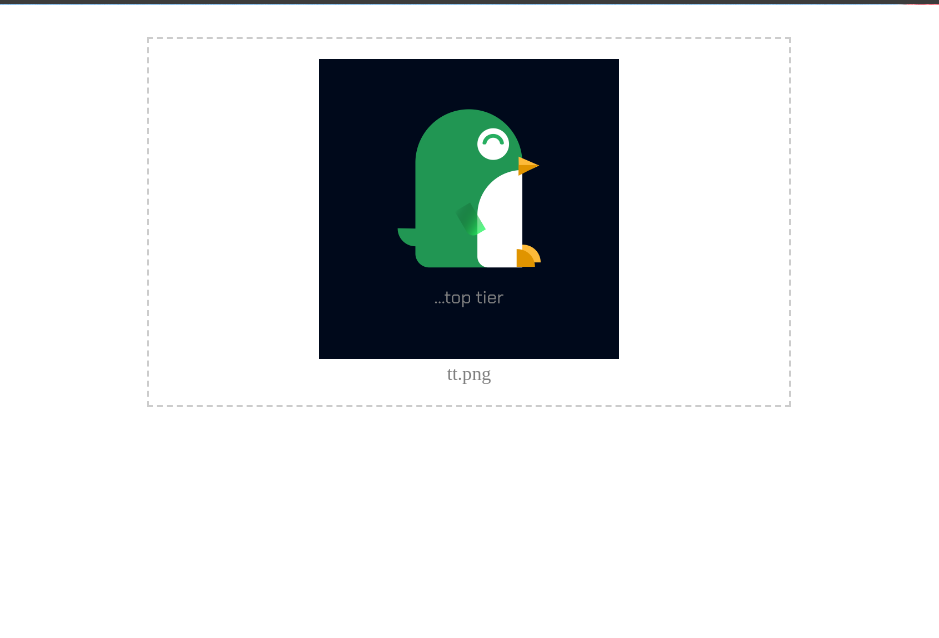
</template>In the new block of code added, we checked if the file had been selected, hid the input element, and showed a new set of elements to help us preview the selected file. We also checked if the selected file was an image so we could render the image, and then, finally, we displayed the name of the selected file.
We need to modify our handleFileChange function to see this action. Update your code to look like this:
// FileUpload.vue
methods:{
  handleFileChange(e) {
      this.errors = [];
      // Check if file is selected
      if (e.target.files && e.target.files[0]) {
        // Check if file is valid
        if (this.isFileValid(e.target.files[0])) {
          // Get uploaded file
          const file = e.target.files[0],
            // Get file size
            fileSize = Math.round((file.size / 1024 / 1024) * 100) / 100,
            // Get file extension
            fileExtention = file.name.split(".").pop(),
            // Get file name
            fileName = file.name.split(".").shift(),
            // Check if file is an image
            isImage = ["jpg", "jpeg", "png", "gif"].includes(fileExtention);
          // Print to console
          console.log(fileSize, fileExtention, fileName, isImage);
          // Load the FileReader API
          let reader = new FileReader();
          reader.addEventListener(
            "load",
            () => {
              // Set file data
              this.file = {
                name: fileName,
                size: fileSize,
                type: file.type,
                fileExtention: fileExtention,
                isImage: isImage,
                url: reader.result,
                isUploaded: true,
              };
            },
            false
          );
        } else {
          console.log("Invalid file");
        }
      }
    },
}
Above, we introduced some new pieces of code, but the most important of them is FileReader. This helps us read the uploaded file’s contents and use reader.readAsDataURL to generate a URL that we can use to preview our uploaded file. You can get a detailed breakdown of all the features of the File Reader here.
We then update our file object with appropriate data, which we will use to update our user interface.
Session Replay for Developers
Uncover frustrations, understand bugs and fix slowdowns like never before with OpenReplay — an open-source session replay tool for developers. Self-host it in minutes, and have complete control over your customer data. Check our GitHub repo and join the thousands of developers in our community.
Improving styles
We can also add some basic CSS to improve the visuals of our preview. Update your style section with the code below,
// FileUpload.vue
...
<style>
.file-upload .file-upload__error {
  margin-top: 10px;
  color: #f00;
  font-size: 12px;
}
.file-upload .upload-preview {
  text-align: center;
}
.file-upload .upload-preview .file-image {
  width: 100%;
  height: 300px;
  object-fit: contain;
}
.file-upload .upload-preview .file-extension {
  height: 100px;
  width: 100px;
  border-radius: 8px;
  background: #ccc;
  display: flex;
  justify-content: center;
  align-items: center;
  margin: 0.5em auto;
  font-size: 1.2em;
  padding: 1em;
  text-transform: uppercase;
  font-weight: 500;
}
.file-upload .upload-preview .file-name {
  font-size: 1.2em;
  font-weight: 500;
  color: #000;
  opacity: 0.5;
}

</style>
You can proceed to test this out, and if everything works fine, you should see a screen similar to the one below.
Adding a “reset” option
We can also create a function to reset our data, giving the user a neat way to change their selected file without refreshing the page.
To do this, we will need to create a new function called resetFileInput and update our code to look like this:
// FileUpload.vue
methods:{
     ...
     resetFileInput() {
      this.uploadReady = false;
      this.$nextTick(() => {
        this.uploadReady = true;
        this.file = {
          name: "",
          size: 0,
          type: "",
          data: "",
          fileExtention: "",
          url: "",
          isImage: false,
          isUploaded: false,
        };
      });
    },
}
Here, we have reset our state to its default. We can then update our markup with a button to call this function. Update your markup to look like this:
// FileUpload.vue

<template>
  <div class="file-upload">
    <div class="file-upload__area">
      <div v-if="!file.isUploaded">
        <input type="file" name="" id="" @change="handleFileChange($event)" />
        <div v-if="errors.length > 0">
          <div
            class="file-upload__error"
            v-for="(error, index) in errors"
            :key="index"
          >
            <span>{{ error }}</span>
          </div>
        </div>
      </div>
      <div v-if="file.isUploaded" class="upload-preview">
        <img :src="file.url" v-if="file.isImage" class="file-image" alt="" />
        <div v-if="!file.isImage" class="file-extention">
          {{ file.fileExtention }}
        </div>
        <span class="file-name">
          {{ file.name }}{{ file.isImage ? `.${file.fileExtention}` : "" }}
        </span>
        <div class="">
          <button @click="resetFileInput">Change file</button>
        </div>
      </div>
    </div>
  </div>
</template>
Sending the file
Finally, we can send the contents of our selected file to our parent component. To do this, we first create a new function called sendDataToParent and add the code below.
// FileUpload.vue

methods:{
    ...
    sendDataToParent() {
      this.resetFileInput();
      this.$emit("file-uploaded", this.file);
    },

}
Above, we created a custom event listener (more info on this here ) called file-uploaded which we will listen for in our parent component and then send the selected file when the event is triggered. We also reset our state.
We will also need to call our new function to trigger this event. To do this, we will update our markup with a button that will trigger this event when clicked. We can update our markup to look like this.
// FileUpload.vue

<template>
  <div class="file-upload">
    <div class="file-upload__area">
      <div v-if="!file.isUploaded">
        <input type="file" name="" id="" @change="handleFileChange($event)" />
        <div v-if="errors.length > 0">
          <div
            class="file-upload__error"
            v-for="(error, index) in errors"
            :key="index"
          >
            <span>{{ error }}</span>
          </div>
        </div>
      </div>
      <div v-if="file.isUploaded" class="upload-preview">
        <img :src="file.url" v-if="file.isImage" class="file-image" alt="" />
        <div v-if="!file.isImage" class="file-extention">
          {{ file.fileExtention }}
        </div>
        <span class="file-name">
          {{ file.name }}{{ file.isImage ? `.${file.fileExtention}` : "" }}
        </span>
        <div class="">
          <button @click="resetFileInput">Change file</button>
        </div>
        <div class="" style="margin-top: 10px">
          <button @click="sendDataToParent">Select File</button>
        </div>
      </div>
    </div>
  </div>
</template>
We need to modify our parent component to see it in action. To achieve this, we will navigate to our App.vue file and update our code to look like this:
<template>
  <div>
    <div>
      <p>Upload a file</p>
      <button @click="showFileSelect = !showFileSelect">Select a file</button>
    </div>
    <div v-show="showFileSelect">
      <FileUpload :maxSize="1" accept="png" @file-uploaded="getUploadedData" />
    </div>

    <div v-if="fileSelected">
      Successfully Selected file: {{ file.name }}.{{ file.fileExtention }}
    </div>
  </div>
</template>

<script>
import FileUpload from "@/components/FileUpload.vue";

export default {
  name: "App",
  components: {
    FileUpload,
  },
  data() {
    return {
      file: {},
      fileSelected: false,
      showFileSelect: false,
    };
  },
  methods: {
    getUploadedData(file) {
      this.fileSelected = true;
      this.showFileSelect = false;
      this.file = file;
    },
  },
};
</script>
<style>
#app {
  text-align: center;
}
</style>
Above, we have added some data to control our state. Firstly, we defined a file object to hold our received file, and we have fileSelected boolean to control our interface behavior. Then we have showFileSelect to toggle our File Upload component.
In our markup, we also added a new code. A button to toggle our File Upload component, a custom event listener which listens for a file-uploaded event and triggers a getUploadedData function. In our getUploadedData, we simply performed a user interface logic and then set the data received from our component to our parent’s file object.
It is important to note that from here, you could also proceed to upload this file to a backend server after receiving the data from the component or perform any other action you intend to with this file.
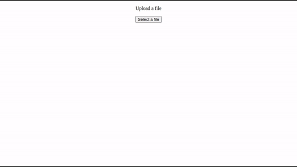
If everything is done right, you should have a similar experience to this:
Conclusion
Congrats! You have made it to the end, and I hope you were able to learn some new tricks and tips from this. Take it up as a challenge, extend the features covered here, and perhaps do something even more awesome with it.
Resources
You can find the complete code on GitHub.
You can also play around with a live demo here.
A TIP FROM THE EDITOR: For more on Vue3, check out our Vue 3 - The Evolution Of Vue and An ultimate guide to the Vue 3 Composition API articles.
Gain Debugging Superpowers
Unleash the power of session replay to reproduce bugs and track user frustrations. Get complete visibility into your frontend with OpenReplay, the most advanced open-source session replay tool for developers.