Building A Mobile Web App With Ratchet
Use Ratchet to build mobile-optimized web apps that look and feel native


Ratchet is a framework that lets you build mobile-optimized web apps that look and feel like native apps but doesn’t require anything but plain HTML, CSS, and JavaScript. This article will show you how to use it to create apps that are accessed and updated without any app store, so you’ll easily broaden your developing horizon!
Ratchet is a mobile web app framework that enables developers to build mobile-optimized web apps that look and feel like native apps. It uses HTML, CSS, and JavaScript to create a responsive user interface and is easy to use on small screens. As we know, Mobile web apps are accessed through a web browser on a mobile device rather than installed as a native app from an app store. They are an alternative to native apps and offer some advantages, such as the ability to be accessed from any device with a web browser and the ability to be updated and maintained without requiring a new app store release.
Ratchet is designed to make it easy for developers to build mobile web apps that offer a high-quality user experience. It includes a range of UI components and features that can be used to create professional-looking apps quickly and is highly customizable so you can create an app that matches your brand. It is well-documented and has a strong developer community, making it a great choice for building mobile web apps.
Why use Ratchet for building mobile web apps?
There are many reasons why developers use Ratchet in mobile web apps. One reason is that it allows for a more responsive design. You can Ratchet to create a more mobile-friendly experience for users. Additionally, Ratchet can help to improve the performance of mobile web apps. Ratchet saves you time by eliminating the need to code, but it also ensures that your app will have a consistent look and feel across all devices. It is because Ratchet takes care of your cross-browser compatibility issues. So no matter what device your users are on, they’ll always see the same beautiful interface you designed. Now, let us head to setting up the Ratchet development environment.
How to build a mobile web app with Ratchet
Setting up a development environment can be done in two ways:
- You can manually download and install the necessary tools and dependencies:
- To download Ratchet, you will need to visit the official website. On the homepage, you will see a button to download the latest version of the framework.
-
Click the “Download Ratchet” button to download the Ratchet zip file to your computer.
-
Unzip the file to access the Ratchet files once the download is complete. These files include the CSS, JavaScript, and image files you will need to build your mobile web app with Ratchet.
-
To use Ratchet in your project, you must link to the Ratchet CSS and JavaScript files in the head of your HTML file (Linking is done in the later part of this guide).
- You can install Ratchet via
npm:
npm install -g Ratchet-cliOnce Ratchet is installed, you can create a new project by running the following command:
Ratchet create my-appIt will create a new directory called my-app, which contains all the necessary files for your app.
Either of the ways above can successfully set up a development environment.
Set up a server
A Ratchet server is used to test mobile web apps built with the Ratchet framework. When working with Ratchet, you need to start a local server to test your app and see your changes in real time. Creating a server is important when working with Ratchet, as it allows you to test your mobile web app locally and ensure it functions as expected.
You need to use the Ratchet command to start a new Ratchet server. It will create a new server instance on port 8080 by default. If you want to change the default port, specify it as an argument when starting the server.
First, you must ensure you have installed the Ratchet software onto your computer. Then, open up a terminal window and enter the following command:
$ ratchetIt will start a new Ratchet server running on port 8080. If you want to change the default port, specify it as an argument when starting the server:
$ ratchet --port=8888Once your server runs, you can connect to it using any WebSocket client. For example, you can use the wscat utility to join and send messages:
$ wscat --connect ws://localhost:8080/You can also start a server by installing a web server onto your computer. Many options, such as Apache, Nginx, and Microsoft IIS, are available.
Once you have installed a web server, you can start the server by following these steps:
- Open a terminal window or command prompt and navigate to your project folder.
- Start the server by running the appropriate command for your web server. For example, if you are using Apache, you might run the following command:
$ apachectl start- Open a web browser and enter the URL for your project. For example, if your project is located at localhost.com/myproject, you would enter that URL in the browser to view your project.
- Make any changes to your project files and save them. The server will automatically refresh the page in the browser to show your changes.
Note: Remember to stop the server when you finish your project. To do this, use the appropriate command for your web server, such as:
$ apachectl stopFor MAC OS X users, type the following command to start a server:
$ python -m SimpleHTTPServer The above code should start a server on port 8000.
Type this code below in your browser, and your server should be up and running:
http://localhost:8000Alternatively, you can:
- Start a live server using Visual Studio Code
- Go to your PC settings and search for where you have your network connectivity settings
- look up your IP address; it would be in this format: 196.168.0.199
- Make sure your PC and Smartphone are connected to the same WIFI
- Then, on your Smartphone, open your browser and replace in the URL your PC’s IP address with the IP address generated from the VS code live server that is from: 127.0.0.1:5501/HTML to 192.168.0.199:5501/HTML.
If you have followed up on this step, proceed to the next.
Set up your project files
Ratchet project files are the various files used to build a mobile web app with the Ratchet framework. These files typically include HTML, CSS, and JavaScript files, image files, and those included with the Ratchet framework. Here is a breakdown of the types of project files that you might have in a Ratchet project:
- HTML files
- CSS files
- JavaScript files
- Image files
- Ratchet files
Now, to the actual setup steps:
- Create a new project folder that will serve as the location where you will store all of your project files, including the HTML, CSS, and JavaScript files.
- Extract the Ratchet zip file we downloaded earlier and place the files in your project folder. The Ratchet files include the CSS, JavaScript, and image files you will need to build your app.
- Create an index.html which will be the main HTML file for your app. You can use a template or create your own from scratch.
- Create a style.css file containing your app’s styles. You can use a template or create your own styles from scratch.
- Link your HTML and CSS files in the head of your index.html file, and add links to your style.css file and the Ratchet CSS and JavaScript files, like this:
<link rel="stylesheet" href="style.css">
<link rel="stylesheet" href="/sass/ratchet.css">
<link rel="stylesheet" href="/sass/theme-android.css">
<link rel="stylesheet" href="/sass/theme-ios.css">
<script src="js/ratchet.js"></script>
Linking CSS and Ratchet files to HTML:
<!DOCTYPE html PUBLIC "-//W3C//DTD HTML 4.01//EN" "http://www.w3.org/TR/html4/strict.dtd">
<html>
 <head>
  <meta http-equiv="Content-Type" content="text/html; charset=utf-8" />
  <meta http-equiv="Content-Style-Type" content="text/css" />
  <title>MyApp</title>
  <meta name="Generator" content="Cocoa HTML Writer" />
  <meta name="CocoaVersion" content="2113.6" />
  <link rel="stylesheet" href="style.css" />
  <link rel="stylesheet" href="/sass/ratchet.css" />
  <link rel="stylesheet" href="/sass/theme-android.css" />
  <link rel="stylesheet" href="/sass/theme-ios.css" />
  <script src="js/ratchet.js"></script>
 </head>
</html>
Note: This will link your HTML, CSS, and Javascript files.
If you have followed up to this step, installed the necessary tools and dependencies, and set up your project files, you have successfully set up a Ratchet development environment. Follow up in the remaining part of this article.
Building the app
Creating a basic app layout and navigation:
There are many ways to create a basic app layout and navigation with Ratchet. One way is to use the Ratchet library, which provides a set of CSS and JS components designed to work together. Another way is to use a framework like Bootstrap, which also offers tools for creating responsive layouts. Whichever approach you choose, the goal is to create a simple, effective layout allowing your users to navigate your app easily.
What app are we building?
We are learning to build a one-page static mobile app hosted on a server with a nav bar and some text as content. This will give you an idea of how a basic app is created using Ratchet. The steps below show the functionality of the static app being built. The nav bar(home, favorites, settings) will display icons.
To get started, you will:
- Create a basic HTML layout: Use HTML tags to create the basic layout of your app, including the header, footer, and any content areas. The Ratchet grid system can create a responsive layout that adjusts to different screen sizes.
<!DOCTYPE html PUBLIC "-//W3C//DTD HTML 4.01//EN" "http://www.w3.org/TR/html4/strict.dtd">
<html>
<head>
<meta http-equiv="Content-Type" content="text/html; charset=utf-8" />
<meta http-equiv="Content-Style-Type" content="text/css" />
<title>MyApp</title>
<meta name="Generator" content="Cocoa HTML Writer" />
<meta name="CocoaVersion" content="2113.6" />
<meta name="viewport" content="initial-scale=1, maximum-scale=1" />
<meta name="apple-mobile-web-app-capable" content="yes" />
<meta name="apple-mobile-web-app-status-bar-style" content="black" />
<link rel="stylesheet" href="css/style.css" />
<link rel="stylesheet" href="css/ratchet.css" />
<link rel="stylesheet" href="css/ratchet-theme-ios.css" />
<script src="js/ratchet.js"></script>
</head>
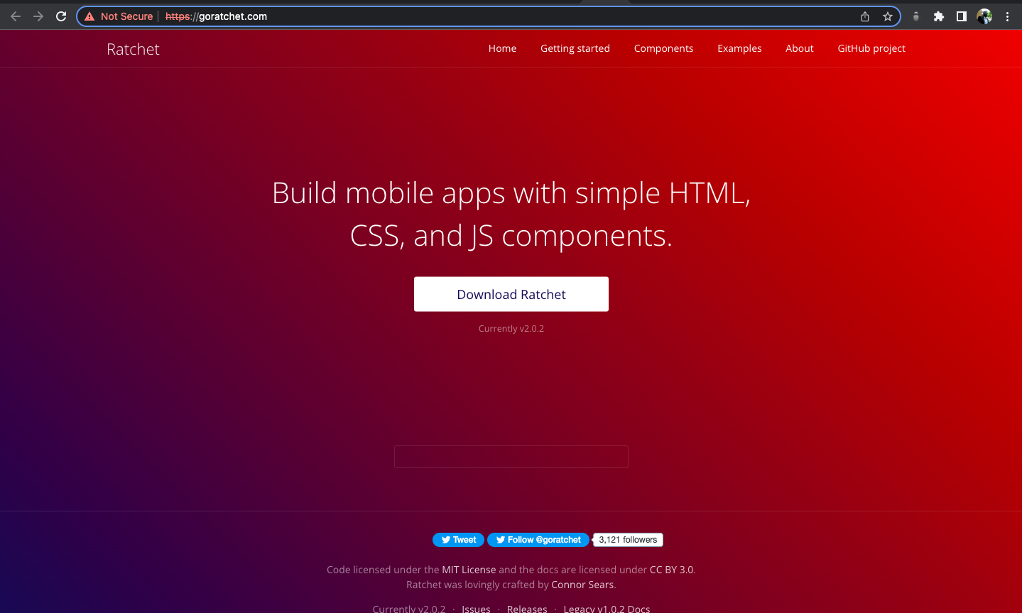
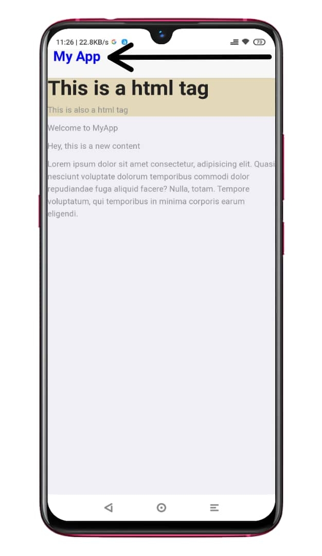
<body>
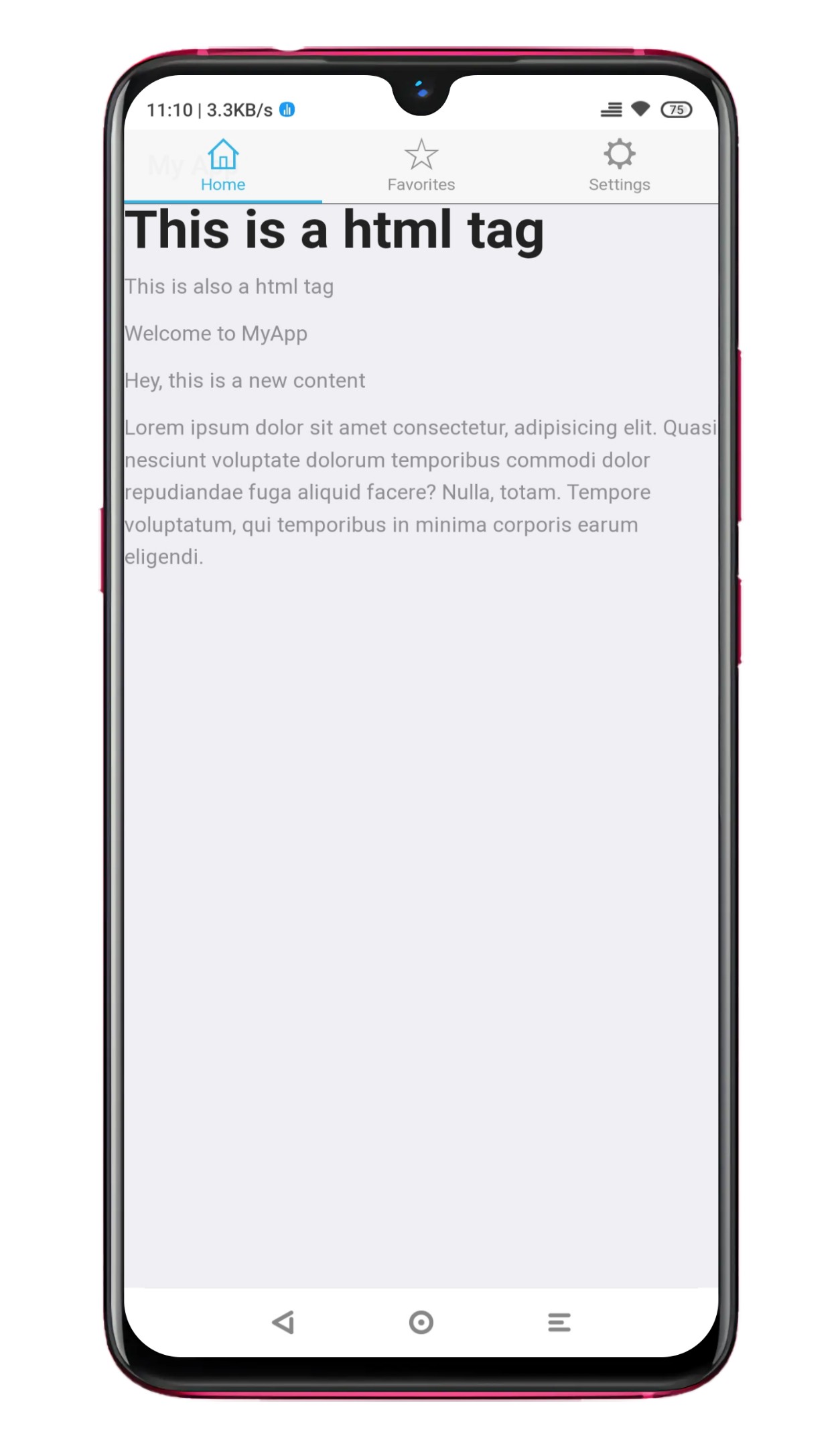
<h1>This is a html tag</h1>
<p>This is also a html tag</p>
</body>
</html>The output of the above code can be seen in the image below:
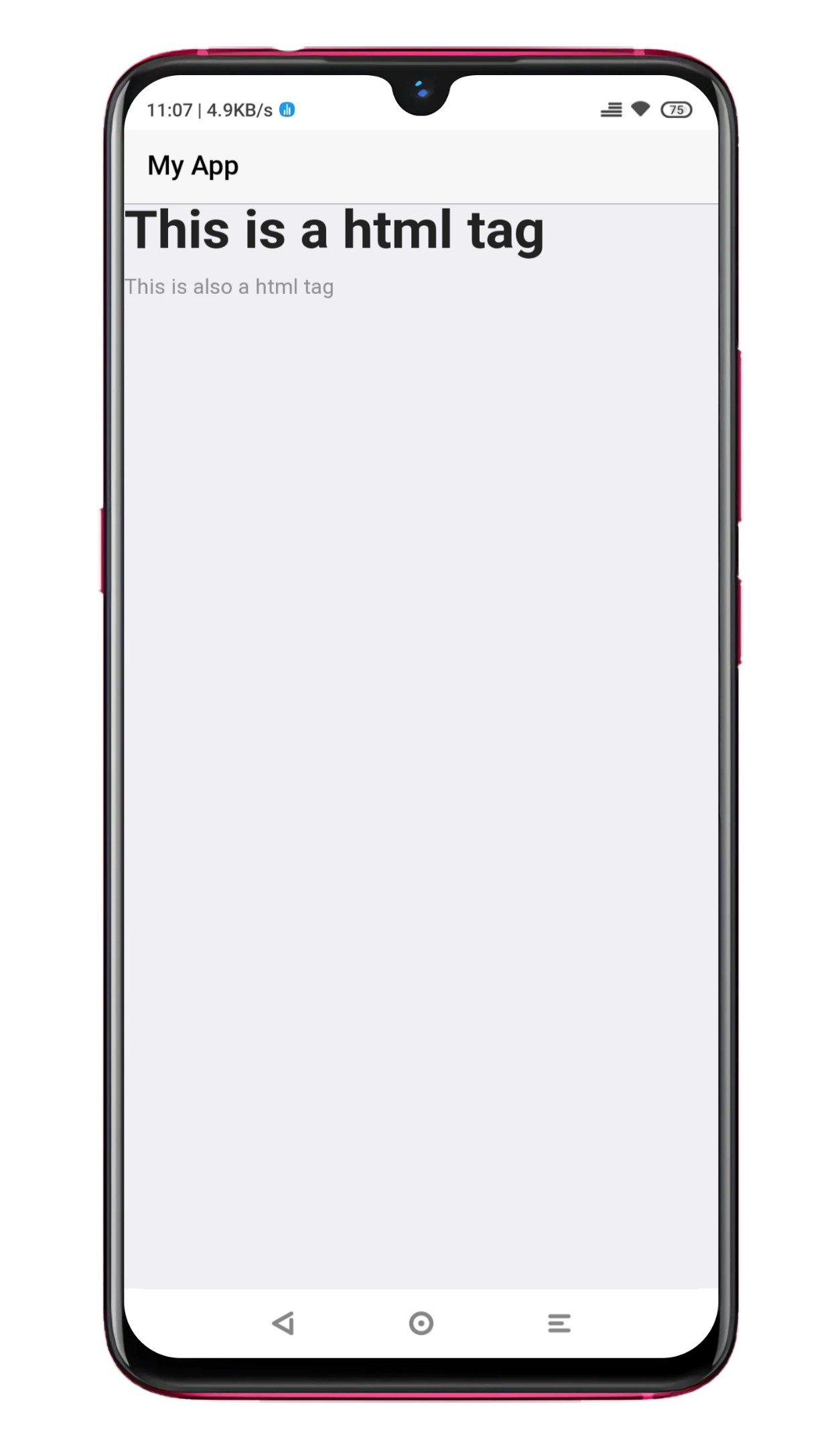
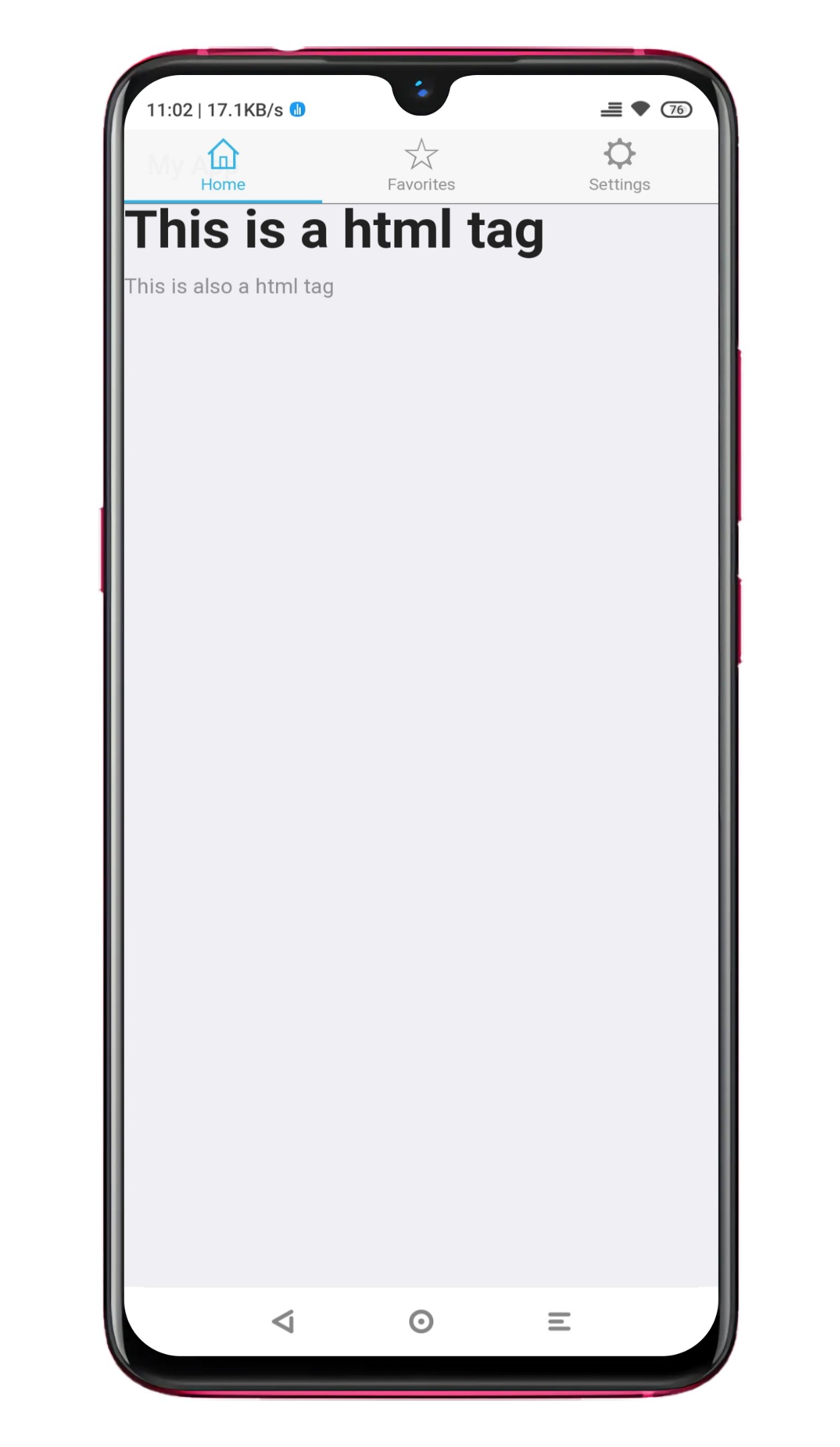
- Add navigation: Use the Ratchet nav bar component to create a navigation bar at the top of your app. This component provides a standard iOS-style navigation bar with a title and buttons. You can also use the Ratchet tab bar component to create a bottom navigation bar with links to different pages.
<!DOCTYPE html PUBLIC "-//W3C//DTD HTML 4.01//EN" "http://www.w3.org/TR/html4/strict.dtd">
<html>
 <head>
  <meta http-equiv="Content-Type" content="text/html; charset=utf-8" />
  <meta http-equiv="Content-Style-Type" content="text/css" />
  <title>MyApp</title>
  <meta name="Generator" content="Cocoa HTML Writer" />
  <meta name="CocoaVersion" content="2113.6" />
  <meta name="viewport" content="initial-scale=1, maximum-scale=1" />
  <meta name="apple-mobile-web-app-capable" content="yes" />
  <meta name="apple-mobile-web-app-status-bar-style" content="black" />
  <link rel="stylesheet" href="style.css" />
  <link rel="stylesheet" href="/sass/ratchet.css" />
  <link rel="stylesheet" href="/sass/theme-android.css" />
  <link rel="stylesheet" href="/sass/theme-ios.css" />
  <script src="js/ratchet.js"></script>
 </head>
 <body>
  <header class="bar bar-nav">
   <h1 class="title">My App</h1>
  </header>
  <nav class="bar bar-tab">
   <a class="tab-item active" href="#">
    <span class="icon icon-home"></span>
    <span class="tab-label">Home</span>
   </a>
   <a class="tab-item" href="#">
    <span class="icon icon-star"></span>
    <span class="tab-label">Favorites</span>
   </a>
   <a class="tab-item" href="#">
    <span class="icon icon-settings"></span>
    <span class="tab-label">Settings</span>
   </a>
  </nav>
 </body>
</html>
The output of the above code can be seen in the image below:
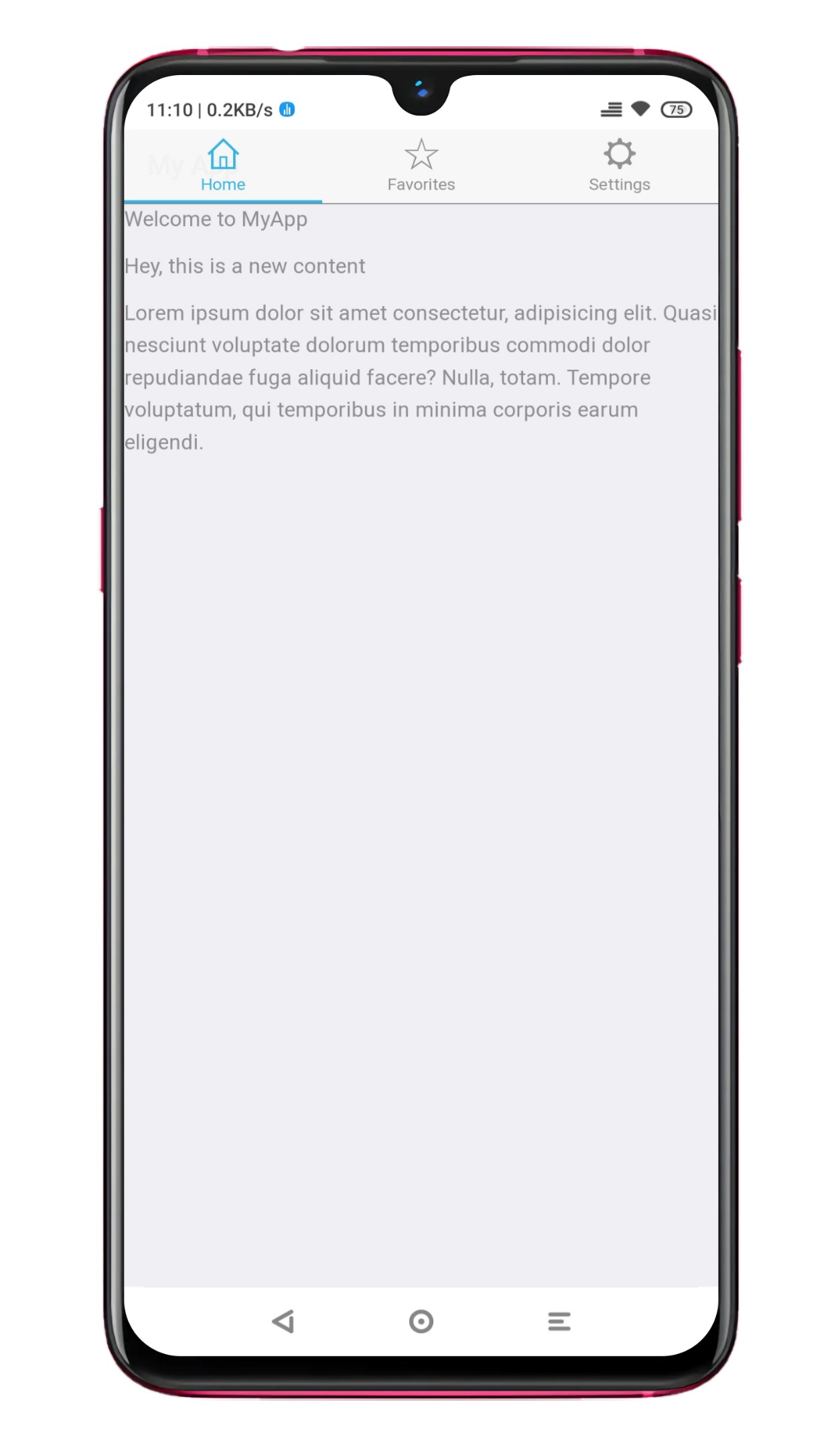
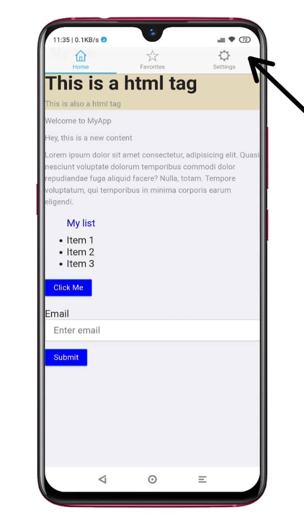
- Add content: Use HTML tags and CSS styles to add content to your apps, such as text, images, and buttons. You can use the Ratchet UI components, such as buttons, lists, and forms, to create a consistent and intuitive interface for your app.
<!DOCTYPE html PUBLIC "-//W3C//DTD HTML 4.01//EN" "http://www.w3.org/TR/html4/strict.dtd">
<html>
 <head>
  <meta http-equiv="Content-Type" content="text/html; charset=utf-8" />
  <meta http-equiv="Content-Style-Type" content="text/css" />
  <title>MyApp</title>
  <meta name="Generator" content="Cocoa HTML Writer" />
  <meta name="CocoaVersion" content="2113.6" />
  <meta name="viewport" content="initial-scale=1, maximum-scale=1" />
  <meta name="apple-mobile-web-app-capable" content="yes" />
  <meta name="apple-mobile-web-app-status-bar-style" content="black" />
  <link rel="stylesheet" href="style.css" />
  <link rel="stylesheet" href="/sass/ratchet.css" />
  <link rel="stylesheet" href="/sass/theme-android.css" />
  <link rel="stylesheet" href="/sass/theme-ios.css" />
  <script src="js/ratchet.js"></script>
 </head>
 <body>
  <header class="bar bar-nav">
   <h1 class="title">My App</h1>
  </header>
  <div class="content">
   <!-- Add your app content here -->
   <p>Welcome to MyApp</p>
  </div>
 </body>
</html>
The output of the above code can be seen in the image below:
- Test your layout: Open your app in a browser and test the layout to make sure it is working as expected.
If your layout works perfectly, the output will be the same as mine in the image below:
Here is an example of the HTML code for a basic app layout and navigation with Ratchet:
<html>
 <head>
  <link rel="stylesheet" href="style.css" />
  <link rel="stylesheet" href="/sass/ratchet.css" />
  <link rel="stylesheet" href="/sass/theme-android.css" />
  <link rel="stylesheet" href="/sass/theme-ios.css" />
  <script src="js/ratchet.js"></script>
 </head>
 <body>
  <header class="bar bar-nav">
   <h1 class="title">My App</h1>
  </header>
  <div class="content">
   <!-- Add your app content here -->
  </div>
  <nav class="bar bar-tab">
   <a class="tab-item active" href="#">
    <span class="icon icon-home"></span>
    <span class="tab-label">Home</span>
   </a>
   <a class="tab-item" href="#">
    <span class="icon icon-star"></span>
    <span class="tab-label">Favorites</span>
   </a>
   <a class="tab-item" href="#">
    <span class="icon icon-settings"></span>
    <span class="tab-label">Settings</span>
   </a>
  </nav>
 </body>
</html>
This code creates a basic app layout with a navigation bar at the top and a bottom navigation bar with three links. You can customize the layout and navigation by adding additional elements or using different Ratchet UI components.
Adding content and elements to the app
You successfully created a basic layout and navigation for your app. Now it is time to add some content:
You can use HTML tags and the Ratchet UI components to add content and elements to your mobile web app with Ratchet.
Here are some examples of how you can add content and elements to your app:
- Add text: You can use the
<p>,<h1>,<h2>, etc. tags to add text to your app. - Add images: You can use the
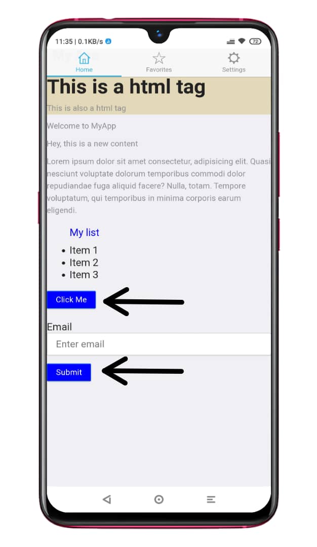
<img>tag to add images to your app. - Add buttons: You can use the Ratchet button component to add buttons to your app. The button component provides a consistent look and feel across different devices and platforms.
- Add lists: You can use the Ratchet list component to display a list of items in your app. The list component provides different styles and layouts, such as a standard, card, or media list.
- Add forms: You can use the Ratchet form component to add forms to your app. The form component provides input fields, such as text fields, select boxes, and radio buttons.
Using these techniques, you can add a wide range of content and elements to your mobile web app with Ratchet.
Session Replay for Developers
Uncover frustrations, understand bugs and fix slowdowns like never before with OpenReplay — an open-source session replay tool for developers. Self-host it in minutes, and have complete control over your customer data. Check our GitHub repo and join the thousands of developers in our community.
Customizing the app
Adding custom CSS for styling:
In the context of mobile web app development with Ratchet, CSS is used to style the layout and appearance of the app. You can use CSS to customize the look and feel of your app, such as the font, colors, and layout.
To use CSS with Ratchet, here is an example of how you can add custom CSS to your app:
- Create a CSS file: Create a new file called
style.cssin your project directory. - Add your custom styles: In the
style.cssfile, add your CSS styles. You can use any valid CSS rules and selectors to style your app. - Link to the CSS file: In your HTML file, add a link to the
style.cssfile in the<head>section.
<link rel="stylesheet" href="css/style.css">Here are some examples of CSS code that you can use with Ratchet to customize the appearance of your mobile web app:
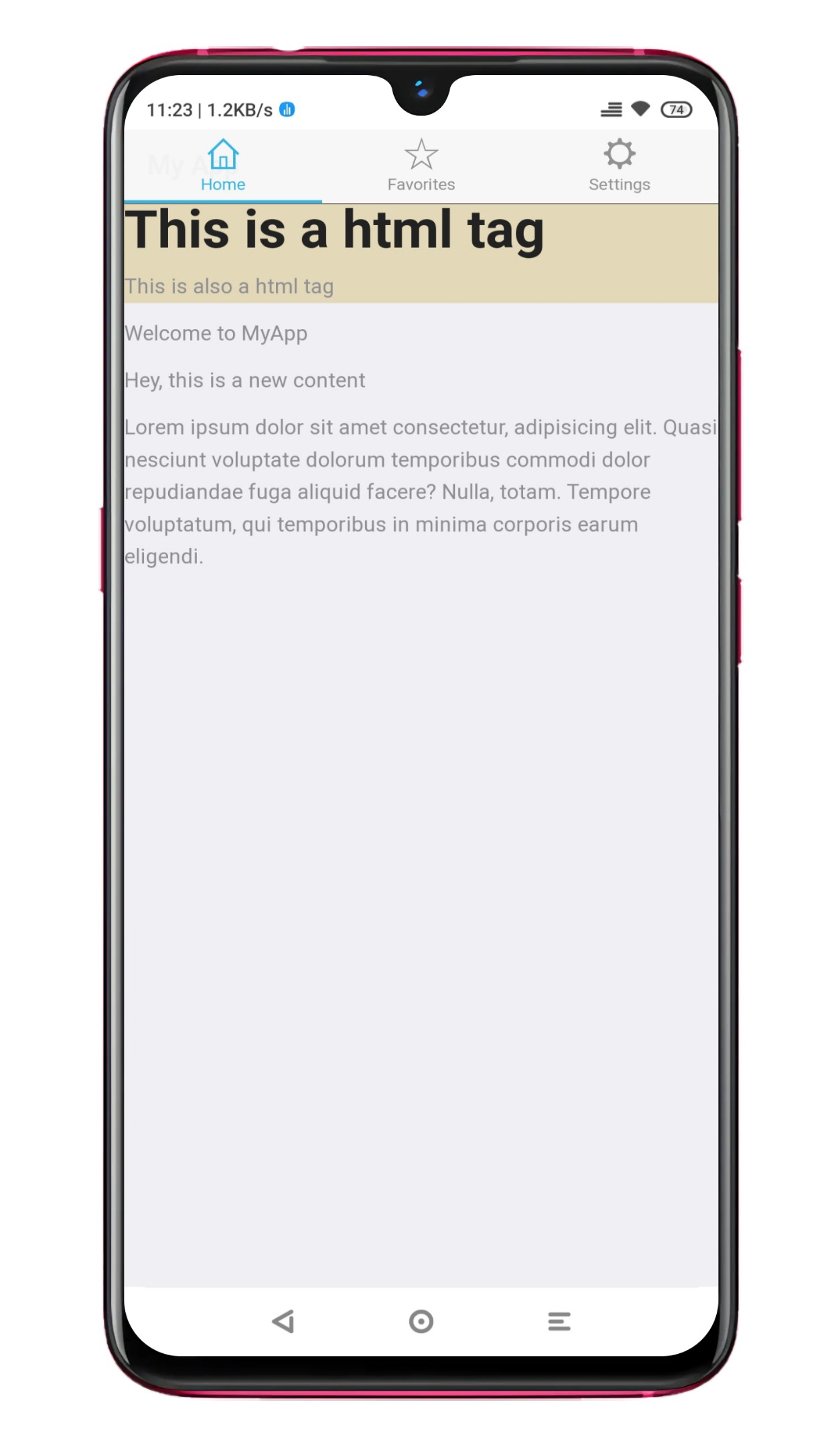
- Changing the background color of the body area:
.style1 {
  background-color: #e3d8b8;
}
The output of the above code can be seen in the image below:
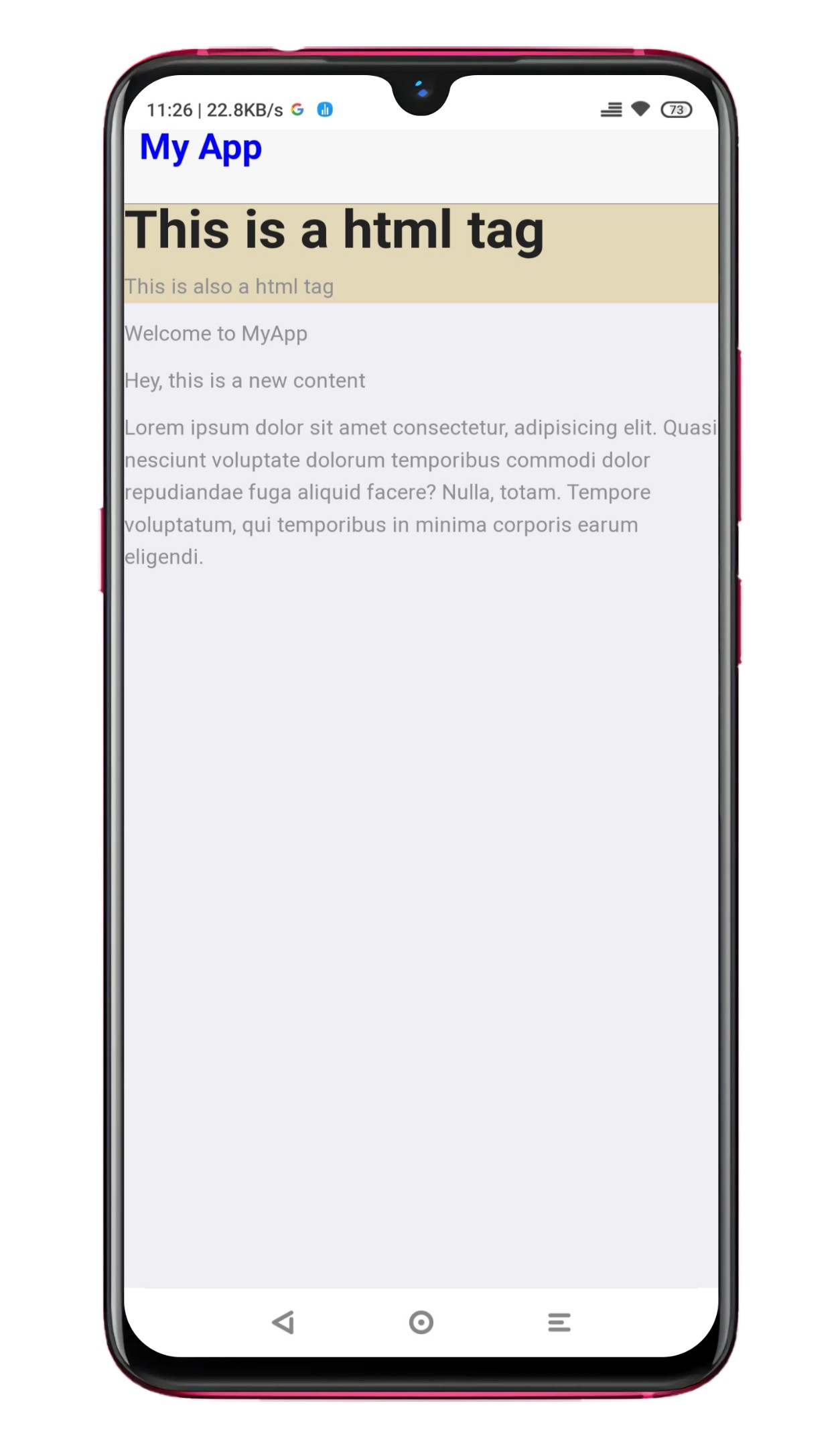
- Change the font size and color of the app title:
.title1 {
  font-size: 24px;
  color: blue;
}
The output of the above code can be seen in the image below:
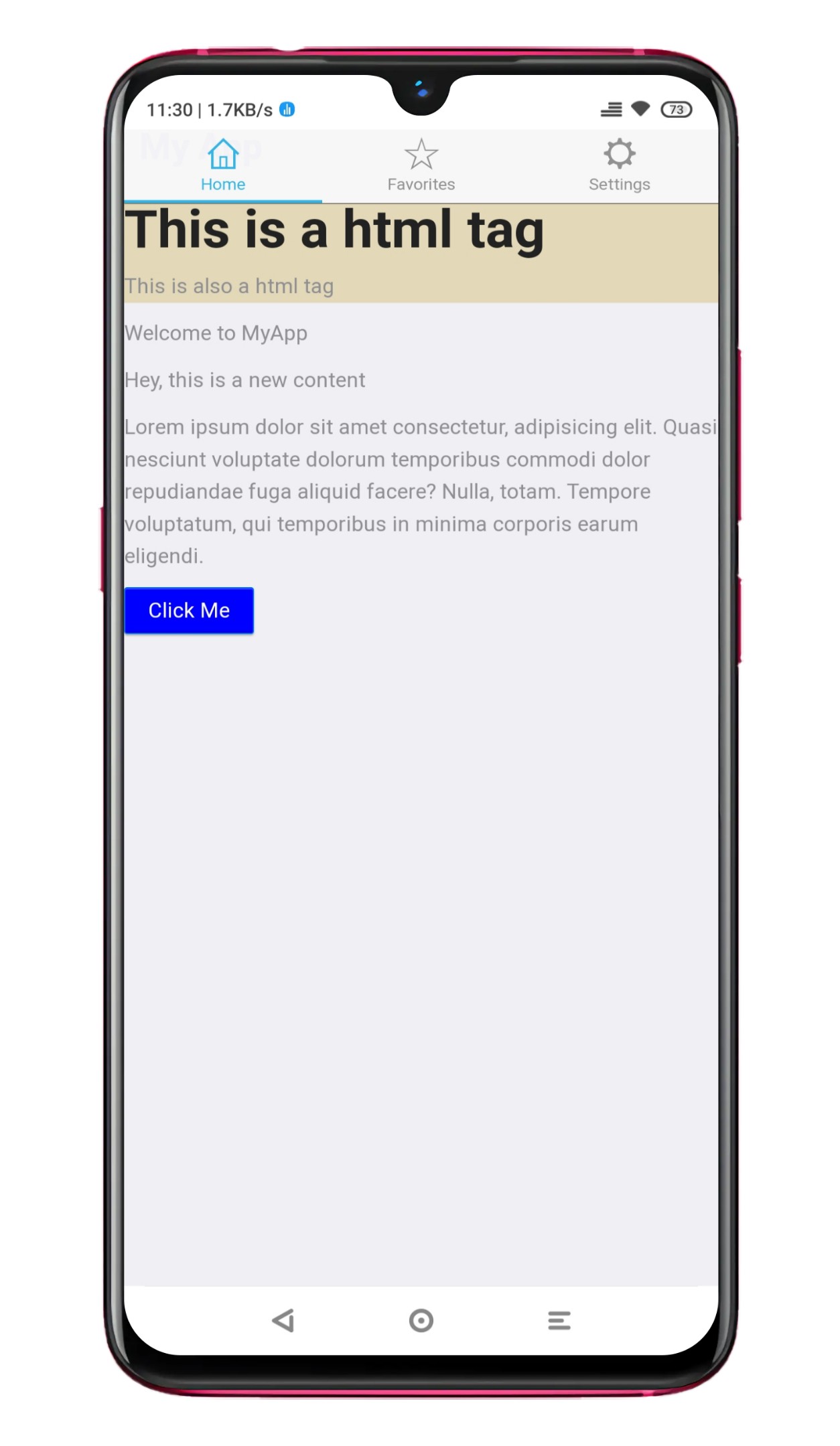
- Change the background color and font color of a button:
.btn {
  background-color: blue;
  color: white;
}
The output of the above code can be seen in the image below:
- Change the font size and color of a list item:
.list-item p {
  font-size: 18px;
  color: blue;
}
The output of the above code can be seen in the image below:
By using these CSS code samples, you can customize the appearance of your mobile web app with Ratchet.
Using Ratchet’s built-in UI components and features
Ratchet provides a set of built-in UI components and features that you can use to create a mobile web app. Using these UI features, you can create a mobile web app with a consistent and intuitive user interface. These UI components and features provide a consistent look and feel across different devices and platforms. They offer a range of functionality, such as navigation, buttons, lists, forms, and more.
To use Ratchet’s built-in UI components in your mobile web app, you can use the following HTML code:
- Title bar at the top:
<header class="bar bar-nav">
  <h1 class="title">My App</h1>
</header>
The output of the above code can be seen in the image below:
- Navigation bar with tabs:
<nav class="bar bar-tab">
 <a class="tab-item active" href="#">
  <span class="icon icon-home"></span>
  <span class="tab-label">Home</span>
 </a>
 <a class="tab-item" href="#">
  <span class="icon icon-star"></span>
  <span class="tab-label">Favorites</span>
 </a>
 <a class="tab-item" href="#">
  <span class="icon icon-gear"></span>
  <span class="tab-label">Settings</span>
 </a>
</nav>
The output of the above code can be seen in the image below:
- Button:
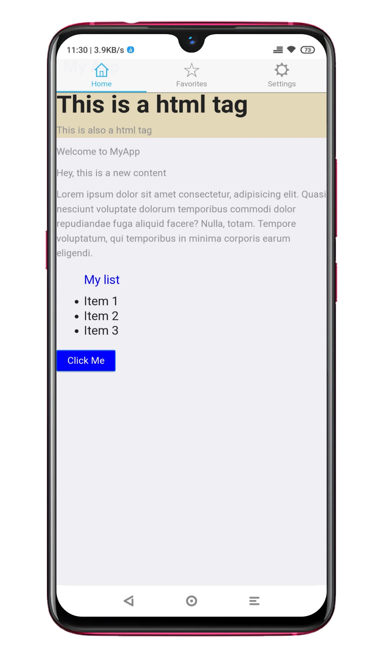
<button class="btn btn-primary">Click me</button>The output of the above code can be seen in the image below:
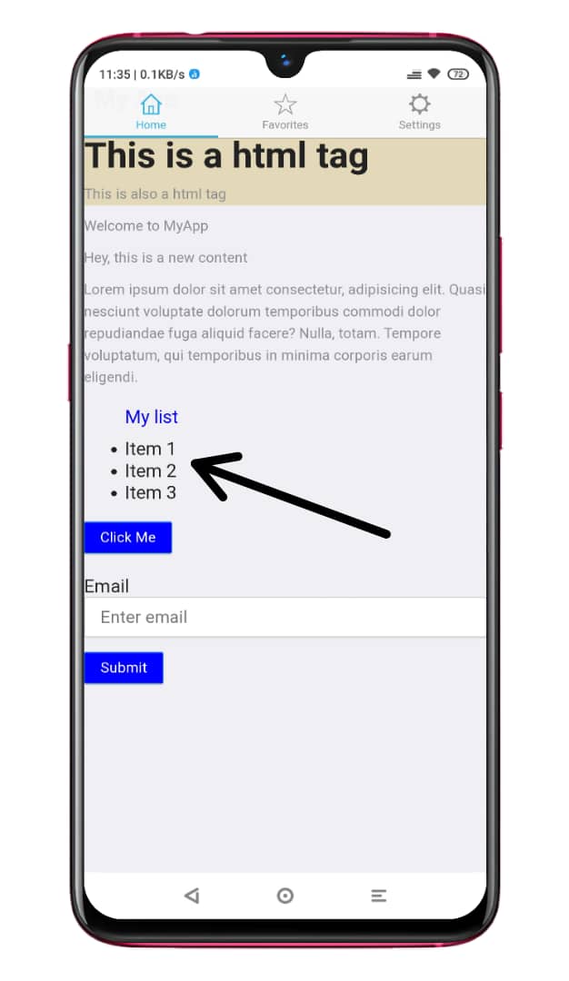
- List:
<ul class="list">
  <li class="list-item">Item 1</li>
  <li class="list-item">Item 2</li>
  <li class="list-item">Item 3</li>
</ul>
The output of the above code can be seen in the image below:
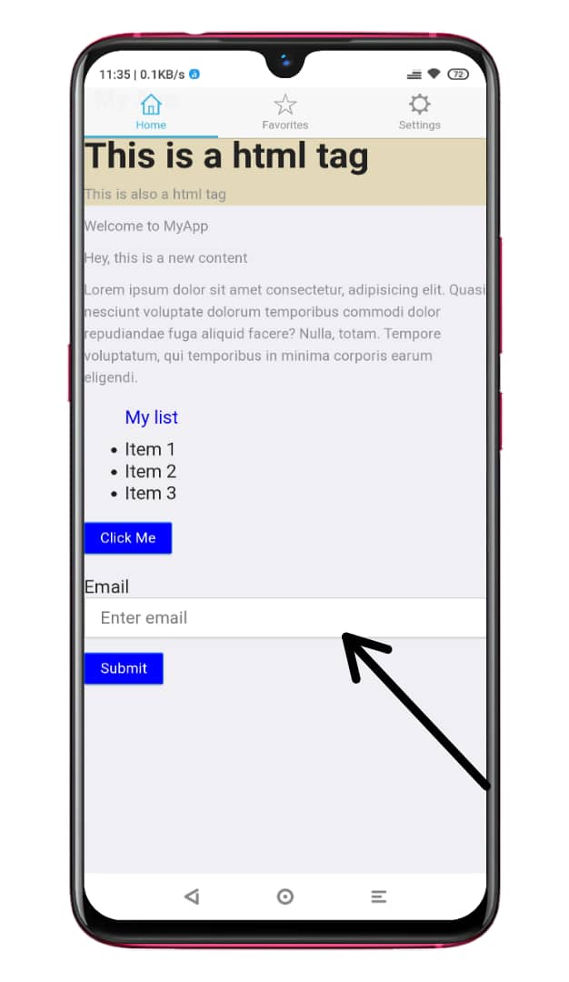
- Form:
<form>
  <label for="email">Email</label>
  <input type="email" id="email" name="email" placeholder="Enter email">
  <button class="btn btn-primary" type="submit">Submit</button>
</form>
The output of the above code can be seen in the image below:
Additionally, the provided CSS classes make it easy to style your applications without having to write much custom CSS. Overall, Ratchet is an excellent toolkit for building responsive mobile applications.
Making the app responsive for different devices
When building a mobile app, it’s important to ensure it’s responsive for different devices. It means that the app should look and feel great on everything from a small phone to a large tablet so that as more and more people use different devices to access the internet, it will look and work great no matter what device someone uses.
You can use the Ratchet grid system and media queries to create a responsive mobile web app with Ratchet.
- Ratchet grid system:
Ratchet provides a grid system that allows you to create a responsive layout that adjusts to different screen sizes. The grid system consists of rows and columns, and you can use these rows and columns to create a flexible design that adapts to other devices.
For example, you can use the following code to create a grid layout with three equal-width columns:
<div class="row">
  <div class="col-33">Column 1</div>
  <div class="col-33">Column 2</div>
  <div class="col-33">Column 3</div>
</div>- Media queries:
Using media queries in your CSS file to apply styles based on the device’s width. It allows you to create a responsive layout that adjusts to different screen sizes.
For example, you can use the following media query to apply styles to devices with a screen width of fewer than 640 pixels:
@media (max-width: 640px) {
  /* styles for small screens */
}
Here is a guide on how you can use the Ratchet grid system and media queries to create a responsive layout for a mobile web app:
- Start by creating a basic layout using the Ratchet grid system. For example, you can use the following code to create a grid layout with two equal-width columns:
<div class="row">
  <div class="col-50">Column 1</div>
  <div class="col-50">Column 2</div>
</div>- Add a media query to your CSS file to apply styles based on the device’s width. For example, you can use the following media query to apply techniques to devices with a screen width of fewer than 640 pixels:
@media (max-width: 640px) {
  /* styles for small screens */
}- Add styles to adjust the layout for small screens inside the media query. For example, you can use the following code to make the columns full-width on small screens:
@media (max-width: 640px) {
  .col-50 {
    width: 100%;
  }
}
Using the Ratchet grid system and media queries, you can create a responsive layout for your mobile web app that adjusts to different devices.
Debugging and testing
When building a mobile app, it’s important to ensure it is free of bugs and errors. It is known as debugging. Here are some basic debugging techniques:
- Use the browser’s developer tools:
Most modern browsers come with developer tools that allow you to inspect the HTML, CSS, and JavaScript on your web app. You can use the developer tools to debug your web app by inspecting the DOM, viewing the console, and using the debugger. Here is an example of how you can use the browser’s developer tools to debug a Ratchet app:
- Open the developer tools: In most browsers, you can open the developer tools by right-clicking on the page and selecting “Inspect” or pressing the F12 key.
- Inspect the DOM: You can use chrome developer tools to inspect the HTML structure of your web app. It allows you to see the elements and attributes of your HTML and how they are nested.
- View the console: You can use the console to view error messages and log statements. It can be useful for debugging issues in your web app.
- Use the debugger: You can use the debugger to set breakpoints in your code and step through it line by line. It allows you to identify the source of errors and debug your code more effectively.
- Use a debugging tool:
You can use a debugging tool like Charles or Fiddler to debug your web app. These tools allow you to intercept and inspect network requests and responses, which can be useful for debugging.
- Debug manually:
You can also debug your web app manually by using it on different devices and browsers and looking for any issues that may arise.
Testing the app on different devices and browsers
Testing is just as important as debugging. You should always test your code before releasing it.
To test a mobile web app built with Ratchet, you can use a testing framework like Mocha, Chai, or Jasmine to write automated tests.
Here is an example of how you can use Mocha and Chai to test a Ratchet app:
- Create a new test file, for example,
myapp.test.js, and install the required dependencies:
npm install mocha chai supertest ratchet-js --save-dev- Then, import the necessary modules and define your tests:
const expect = require("chai").expect;
const request = require("supertest");
const Ratchet = require("ratchet-js");
const MyApp = require("./MyApp"); // assuming your Ratchet app is in MyApp.js

describe("MyApp", function () {
 // Initialize the Ratchet app
 const app = new Ratchet(MyApp);

 // Test the home page
 describe("GET /", function () {
  it("should return the home page", function (done) {
   request(app.server)
    .get("/")
    .expect(200)
    .end(function (err, res) {
     if (err) return done(err);
     expect(res.text).to.include("Welcome to MyApp");
     done();
    });
  });
 });

 // Test the settings page
 describe("GET /settings", function () {
 it("should return the settings page", function (done) {
  request(app.server)
   .get("/settings")
   .expect(200)
   .end(function (err, res) {
    if (err) return done(err);
    expect(res.text).to.include("MyApp Settings");
    done();
   });
 });
});

 // Add more tests here
});- Run the following command to see the result of the test
$ mocha myapp.test.js
This will run the test and display the result in the console.
Your results should look like this if passed:
MyApp
  GET /
    ✓ should respond with a message "Welcome to MyApp!"
  GET /settings
    ✓ should respond with a message "This is the settings page"

2 passing (37ms)
If you encounter any issues while following these steps, it’s recommended to refer to the Mocha and Chai documentation and consult online resources for additional guidance.
By writing automated tests with a testing framework like Mocha and Chai, you can ensure that your Ratchet app is functioning correctly.
Conclusion
In this tutorial, we introduced what Ratchet means and why you should use Ratchet, How to set up a development environment alongside your project files, how to create a basic app layout and navigation, add contents to your app, customization, debugging and testing. With all these steps, we have seen how to build a mobile app with Ratchet.
Tips for continuing to learn and build with Ratchet
To learn more about Ratchet and its components, click this link.
Gain Debugging Superpowers
Unleash the power of session replay to reproduce bugs and track user frustrations. Get complete visibility into your frontend with OpenReplay, the most advanced open-source session replay tool for developers.


