
Building a responsive sticky navbar with CSS

Navigation bars are a great technique to let users move through your websites. Every time our application has multiple pages, a navigation bar is required to make it simpler to distinguish between them and to make the application more interactive.
We aim to develop a responsive sticky navbar that presents the nav menu’s ‘ul’ element in a horizontal arrangement at first glance. The menu expands to fill the remaining height and breadth of the screen once it reaches the mobile viewport, which is now positioned beneath the navbar.
Our goal is to have an app that exactly matches the GIF below by the end of the tutorial:
Setting up the project
Since our project is minimal, we won’t require many tools outside: Node.js and React installed in our system. Run the following code in your terminal to begin:
npx create-react-app project
cd project
npm start
The nav menu, or ul element, will initially be displayed in a horizontal layout as part of our responsive navbar. Upon reaching a mobile viewport, the menu repositions behind the navbar and fills the remaining height and width of the screen, as seen in our goals.
This layout will be accomplished by combining the positioning rules from CSS and Flexbox.
We need a starter, so here is what our App.js should look like:
import React from 'react';
import './App.css';

function App() {
 return(
   <div>
   </div>
 )

}

export default App;
Create a folder for components with a Navbar.js component and our Navbar.css. This is what our navbar component should look like:
import React from 'react';
import './Navbar.css';
function Navbar() {
return (
<nav className="Navbar">
<span className='nav-logo'>
<h2>Open Replay</h2>
</span>
<div className="nav-items">
<a href="/Home">Home</a>
<a href="/About">About</a>
<a href="/Service">Service</a>
<a href="/Contact">Contact</a>
</div>
</nav>
)
}
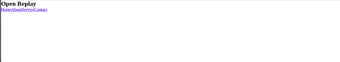
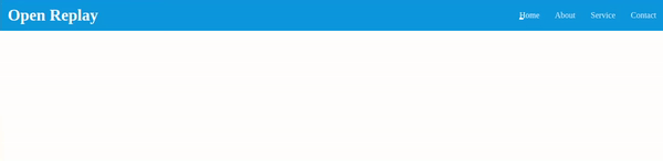
export default NavbarWe’ll import this file to our App.js component, so we can see it rendered in our browser. We should have this:
To get our application demo look alike, we need to add the styles below by importing styles from navbar.css :
.Navbar {
height: 60px;
display: flex;
justify-content: space-between;
align-items: center;
background: blueviolet;
}
.Navbar .nav-logo {
font-weight: 700;
font-size: 21px;
margin: 15px;
color: #fff;
}
.Navbar>.nav-items>a {
color: #fff;
font-size: 16px;
text-decoration: none;
margin: 15px;
position: relative;
opacity: 0.9;
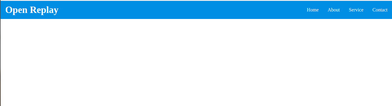
}We should have this after the styling:
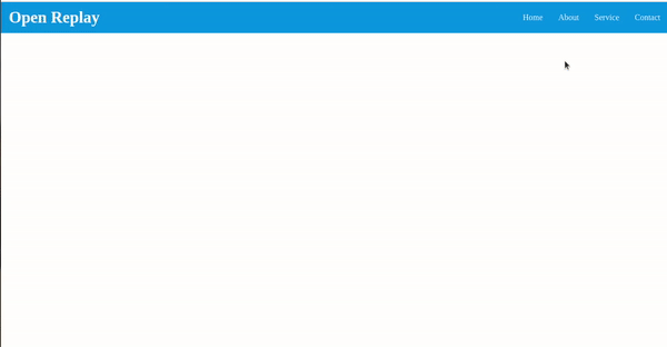
To add our little hover animation, as seen in the demo, add this to your CSS:
.Navbar>.nav-items>a:hover {
    opacity: 1;
}
.Navbar>.nav-items>a::before {
    content:"  ";
    position: absolute;
    left: 0;
    bottom: 0;
    width: 0;
    height: 3px;
    background: #fff;
    transition: all .45s;
}
.Navbar>.nav-items>a:hover::before {
    width: 100%;
}
We should have it up and running:
Session Replay for Developers
Uncover frustrations, understand bugs and fix slowdowns like never before with OpenReplay — an open-source session replay tool for developers. Self-host it in minutes, and have complete control over your customer data. Check our GitHub repo and join the thousands of developers in our community.
Hamburger Navbar Responsivity
By using responsive design, online properties are created such that how they are shown depends on the device they are accessed from. The “mobile first” philosophy is typically applied, meaning that the experience is first developed for small screens like smartphones and tablets before being scaled up for larger displays.
A navbar often has two views: enlarged and hidden. We need a new element for our toggle to work on the hamburger responsivity part of our navbar. This will be below our nav-item div in our navbar.js component, which will be a class named nav toggle; this will be used to create our hamburger:
<div className="nav-toggle">
  <div className="bar">

  </div>
</div>
A CSS feature called media queries allows you to describe how your content layout should react to certain circumstances, such as a change in viewport width.
The target media type and the breakpoint at which to apply the styles are written after the @media rule in queries:
@media screen and (max-width: 700px) {
  // the rules go here
}
We can add this CSS to see if it’s responsive:
We hide the ul element with display: none property :
.Navbar>.nav-toggle {
  display: none;
}
In the above code, we are setting the display of our hamburger navigation to none because we only want it to be visible on smaller screens.
We can now tell CSS what to do when the size screen reduces:
@media (max-width: 700px) {
  .nav-toggle {
    display: flex;
    width: 40px;
    height: 40px;
    align-items: center;
    justify-content: center;
    cursor: pointer;
  }
  .nav-toggle>.bar {
    position: relative;
    width: 32px;
    height: 2px;
    background: #fff;
  }
}
To get our hamburger up and running, we will replace our responsive styles with this:
    @media (max-width: 700px) {
            .Navbar>.nav-items {
                display: flex;
                flex-direction: column;
                background: #3b4da7;
                position: absolute;
                top: 50px;
                left: 0;
                height: 100%;
                width: 100%;
                transform: translateX(-100%);
                transition: all .40s;
            }
            .Navbar>.nav-items>a::before {
                background: transparent;
            }
            .Navbar>.nav-items.open {
                transform: translateX(0);
            }
            .Navbar>.nav-toggle {
                display: flex;
                width: 60px;
                height: 60px;
                align-items: center;
                justify-content: center;
                cursor: pointer;
            }
            .nav-toggle>.bar {
                position: relative;
                width: 32px;
                height: 2px;
                background: #ffffff;
                transition: all 0.45s ease-in-out;
            }
            .nav-toggle>.bar::before,
            .nav-toggle>.bar::after {
                content:"  ";
                position: absolute;
                height: 2px;
                background: #ffffff;
                border-radius: 2px;
                transition: all 0.45s ease-in-out;
            }
            .nav-toggle>.bar::before {
                transform: translateY(-8px);
                width: 30px;
                right: 0;
            }
            .nav-toggle>.bar::after {
                width: 30px;
                transform: translateY(8px);
            }
            .nav-toggle.open>.bar {
                transform: translateX(-40px);
                background: transparent;
            }
            .nav-toggle.open>.bar::before {
                width: 32px;
                transform: rotate(45deg) translate(26px, -26px);
            }
            .nav-toggle.open>.bar::after {
                transform: rotate(-45deg) translate(26px, 26px);
            }
        }
All we did was style the hamburger and enable it to match responsiveness.
For our toggle functionality which is quite easy to reproduce, we will replace our navbar.js component with the code below. In our code, we set our initial state to false; then, we use an if statement for our logic and pass an onclick function to get our hamburger menu to toggle whenever it is clicked.
import React, { useState } from "react";
import "./Navbar.css";
const Navbar = () => {
  const [Open, setOpen] = useState(false);
  return (
    <nav className="Navbar">
      <span className="nav-logo">Open Replay Blog</span>
      <div className={`nav-items ${Open && "open"}`}>
        <a href="/home">Home</a>
        <a href="/about">About</a>
        <a href="/Blog Page">Blog Page</a>
        <a href="/contact">Contact</a>
      </div>
      <div
        className={`nav-toggle ${Open && "open"}`}
        onClick={() => setOpen(!Open)}
      >
        <div className="bar"></div>
      </div>
    </nav>
  );
};
export default Navbar;
We should have this at the end of the code;
Sticky Functionality
For the sticky, import useEffect and replace our code with this:
import React, { useState, useEffect } from "react";
import "./Navbar.css";
const Navbar = () => {
  const [Open, setOpen] = useState(false);
  const[sticky, setSticky]=useState();

  useEffect(()=>{
    const handleScroll=()=>setSticky(window.scrollY>200)
    console.log(window.scrollY)
    window.addEventListener('scroll', handleScroll)
    return()=> window.removeEventListener('scroll', handleScroll)
  })

  return (
    <nav className={`${sticky ? "sticky" : ""}`}>
    <div className="Navbar" >
      <span className="nav-logo">Open Replay Blog</span>
      <div className={`nav-items ${Open && "open"}`}>
        <a href="/home">Home</a>
        <a href="/about">About</a>
        <a href="/Blog Page">Blog Page</a>
        <a href="/contact">Contact</a>
      </div>
      <div
        className={`nav-toggle ${Open && "open"}`}
        onClick={() => setOpen(!Open)}
      >
        <div className="bar"></div>
      </div>
    </div>
</nav>
  );
};
export default Navbar;
Code Explanation: We set our state sticky to false. In our useEffect we had our handle scroll function declared. In it, we have a logic that states if window.scrollY is greater than 200, set sticky to true else it will be false. We added the scroll event directly under it, and lastly, to avoid memory leakage we used this code: return()=> window.removeEventListener('scroll', handleScroll). We went ahead to wrap our div with a nav element and added a className with a JS logic that states if it is true, then add the class “sticky,” and if not, do otherwise.
In our CSS, we should have this:
.Navbar {
height: 60px;
display: flex;
justify-content: space-between;
align-items: center;
background: rgb(43, 153, 226);
transition: 3s;
}
.sticky {
box-shadow: 0px 5px 10px rgba(0, 0, 0, 0.6);
position: sticky;
top: 0;
z-index: 100;
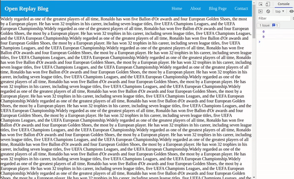
}To show our stick navbar at its best, I had to construct a component for text named Text.js and import it into our App.js. In this component, I entered a long text to activate the browser’s scroll gesture. We should have this at the end of the tutorial:

Conclusion
We learned how to create a unique sticky navigation bar in this article. Knowing CSS provides you an advantage over most designs, and thus we should learn to let CSS handle the design-related tasks and only use Javascript when absolutely necessary.
A TIP FROM THE EDITOR: For a different take on responsive components, don’t miss our Build Responsive Web Pages With React-Responsive And TypeScript article.
Gain Debugging Superpowers
Unleash the power of session replay to reproduce bugs and track user frustrations. Get complete visibility into your frontend with OpenReplay, the most advanced open-source session replay tool for developers.
