
Building Layouts with CSS3 Flexbox

Flexbox is a dominant aspect of the layout method for arranging items in rows or columns. It enables Items to flex to fill additional space or shrink to fit into smaller spaces. It’s essential to note that Flexbox is built specifically for building a responsive design, and it is a powerful layout mechanism that lets you solve a common responsive web design problem. You will learn how to build flexible structures, align items vertically and horizontally, order items as you like, and make a responsive layout. Be rest assured that this article will teach you all the fundamentals.
What is CSS3 Flexbox?
Flexbox is a new layout module in CSS3 that lets you layout, align and distribute space among items within a container even when their size is unknown or dynamic. Flexbox involves a whole set of properties to be applied on the flex container (parent element) and flex items (children). In the flex layout model, the children of a flex container can be laid out in any direction and can “flex” their sizes, either growing to fill unused space or shrinking to avoid overflowing the parent.
The Flexbox has two possible axes, the main axis and the cross axis (which you can define through the flex-direction property and runs perpendicular to it). However, Flexbox is a single direction, meaning that flex items can only layout in a particular vertical or horizontal orientation. Note that the Flexible Box Layout Module makes it easier to design a flexible, responsive layout structure without using float or positioning.
What is a Flex container?
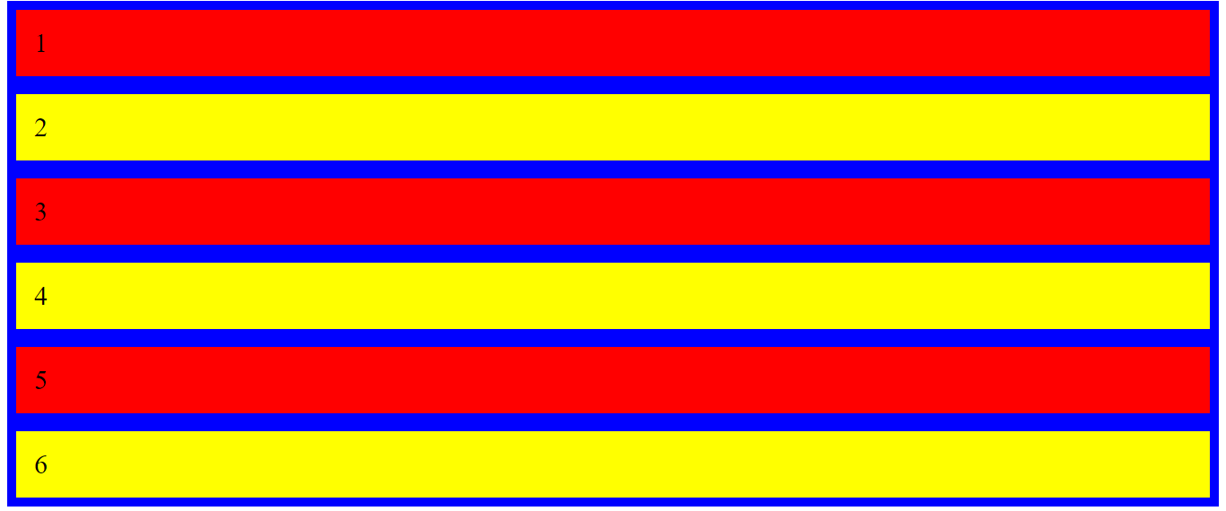
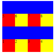
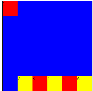
This property defines the container’s direction to stack the flex items. A container is always needed to start “flexing out.” This container defines how its items will lay out and how to distribute the space among them. The flex container becomes flexible by setting the display property to flex. Here is an example for a better understanding:
<!DOCTYPE >
<html>
<head>
<meta />
<title></title>
<style>
.flex-container {
display: flex;
background-color: blue;
}
.flex-container div {
background-color: yellow;
margin: 10px;
padding: 20px;
font-size: 30px;
}
</style>
</head>
<body>
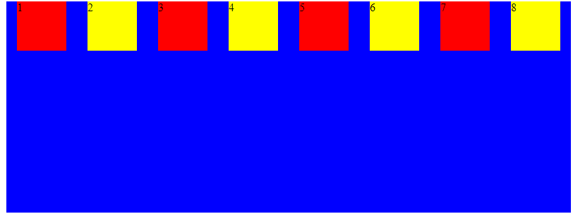
<h1>Example of a Flex Container</h1>
<div class="flex-container">
<div style="background-color: red">1</div>
<div style="background-color: yellow">2</div>
<div style="background-color: red">3</div>
<div style="background-color: yellow">4</div>
<div style="background-color: red">5</div>
<div style="background-color: yellow">6</div>
<div style="background-color: red">7</div>
<div style="background-color: yellow">8</div>
</div>
</body>
</html>Here is the outcome:

What is a Flex item?
Flex items property specifies how much a flex item will grow relative to the rest of the flex items. Meanwhile, they are the immediate children in a flex container. Note that a flex container’s direct child elements automatically become flexible (flex) items.
- flex-direction
- flex wrap
- justify content
- align-items
- align content
Let’s look at the following values to understand the subject clearly.
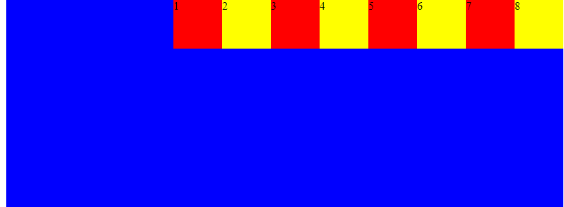
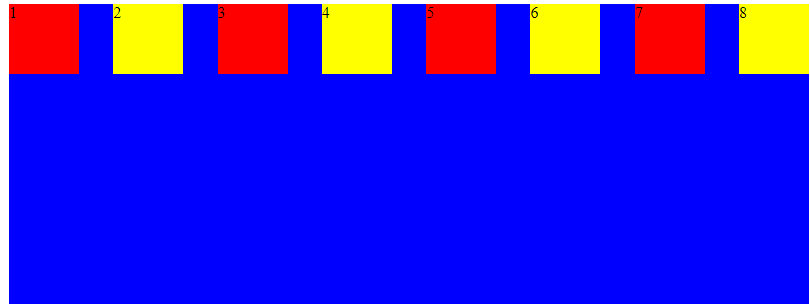
Flex-direction
Flex-direction is a property that defines the path to place the flex items in the flex container. More so, it sets the direction of the flexible items inside the <div> element in reverse order.
Flex direction can take on four different values such as:
row (default), row-reverse, column, column-reverse.
This example will give you an insight into how the subject works:
A row is a default value.
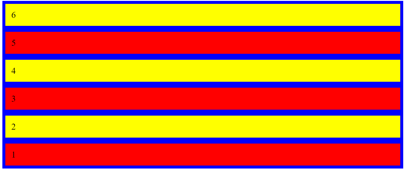
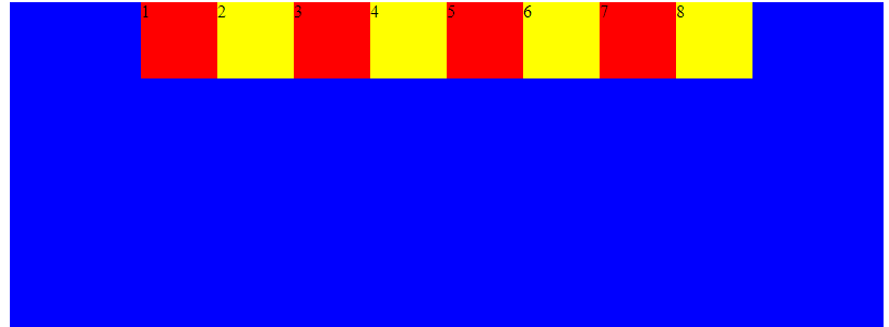
Example of row-reverse:
.flex-container {
  display: flex;
  flex-direction: row-reverse;
  background-color: blue;
}
.flex-container div {
  background-color: yellow;
  margin: 10px;
  padding: 20px;
  font-size: 30px;
}
Here is the outcome:

Example of a column:
.flex-container {
  display: flex;
  flex-direction: column;
  background-color: blue;
}
.flex-container div {
  background-color: yellow;
  margin: 10px;
  padding: 20px;
  font-size: 30px;
}
Here is the outcome:
Example of column-reverse:
.flex-container {
  display: flex;
  flex-direction: column-reverse;
  background-color: blue;
}
.flex-container div {
  background-color: yellow;
  margin: 10px;
  padding: 20px;
  font-size: 30px;
}
Here is the outcome:
Flex wrap
A Flex wrap is a property that specifies whether the flexible items should wrap or not. In addition, it lets you distribute flex items across multiple lines when it does not fit into the first line of the flex container. Flex wrap can take on three different values as stated: nowrap (default), wrap, wrap reverse.
These examples are for better understanding:
Example Of wrap value:
.flex-container {
  display: flex;
  width: 200px;
  height: 200px;
  background-color: blue;
  border: 1px solid white;
  flex-wrap: wrap;
}
.flex-container div {
  background-color: yellow;
  width: 50px;
  height: 50px;
}
Here is the outcome:
Example of a wrap-reserve:
.flex-container {
  display: flex;
  width: 200px;
  height: 200px;
  background-color: blue;
  border: 1px solid white;
  flex-wrap: wrap-reverse;
}
.flex-container div {
  background-color: yellow;
  width: 50px;
  height: 50px;
}
Let’s look at the outcome:
Justify content
Justify content is the property that aligns the flexible container’s items when the items do not use all available space on the main axis. Also, it will enable you to distribute free space left between the flex items on the main axis. Here are the five different values that you can apply over justify-content: flex-start (default),flex-end, center, space between,space around. These examples are for better understanding:
Example of justify-content center:
.flex-container {
  display: flex;
  width: 800px;
  height: 300px;
  background-color: blue;
  border: 1px solid white;
  justify-content: center;
}
.flex-container div {
  background-color: yellow;
  width: 70px;
  height: 70px;
}
Here is the outcome:
Example of justify-content flex-end:
.flex-container {
  display: flex;
  width: 800px;
  height: 300px;
  background-color: blue;
  border: 1px solid white;
  justify-content: flex-end;
}
.flex-container div {
  background-color: yellow;
  width: 70px;
  height: 70px;
}
Here is the outcome:
Example of justify-content space between:
.flex-container {
  display: flex;
  width: 800px;
  height: 300px;
  background-color: blue;
  border: 1px solid white;
  justify-content: space-between;
}
.flex-container div {
  background-color: yellow;
  width: 70px;
  height: 70px;
}
Here is the result:
Example of justify-content space around:
.flex-container {
  display: flex;
  width: 800px;
  height: 300px;
  background-color: blue;
  border: 1px solid white;
  justify-content: space-around;
}
.flex-container div {
  background-color: yellow;
  width: 70px;
  height: 70px;
}
Here is the result:
Align-items
Align items are the property that specifies the default alignment for items inside the flexible container. In addition, it defines the flex items on the current line along the cross-axis. Here are five different values that you can apply over aligned items: stretch (default),flex-start,flex-end, center,baseline.
These examples are for clarity:
Example of an align-items flex-start:
<!DOCTYPE >
<html>
  <head>
    <meta />
    <title></title>
    <style>
      .flex-container {
        display: flex;
        width: 220px;
        height: 300px;
        background-color: blue;
        border: 1px solid black;
        align-items: flex-start;
      }
      .flex-container div {
        width: 60px;
      }
    </style>
  </head>
  <body>
    <h1>Example of align-items: flex start</h1>
    <div class="flex-container">
      <div style="background-color: red; min-height: 10px">1</div>
      <div style="background-color: yellow; minheight: 30px">2</div>
      <div style="background-color: red; min-height: 50px">3</div>
      <div style="background-color: yellow; min-height: 190px">4</div>
    </div>
  </body>
</html>
Here is the result:
Example of an align-items flex-end:
.flex-container {
  display: flex;
  width: 220px;
  height: 300px;
  background-color: blue;
  border: 1px solid black;
  align-items: flex-end;
}
.flex-container div {
  width: 60px;
}
Let’s see the outcome:
Example of an align-items center:
.flex-container {
  display: flex;
  width: 220px;
  height: 300px;
  background-color: blue;
  border: 1px solid black;
  align-items: center;
}
.flex-container div {
  width: 60px;
}
Let’s look at the result:
Align content
Align content is the property that sets space distribution between and around content items along a flexbox’s cross-axis. Also, it aligns the lines within a flex container when there’s extra space on the cross-axis. It can also be effective when you have more than one line in your layout. There are five different values that you can apply over aligned items: stretch (default),flex-start,flex-end, center,space-between and space-around.
Let’s look at these examples for clarification:
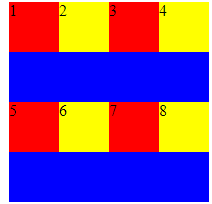
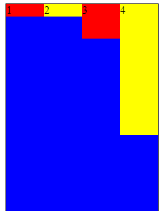
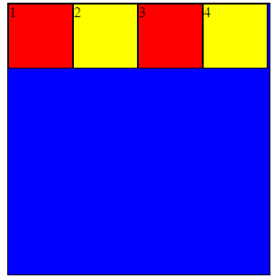
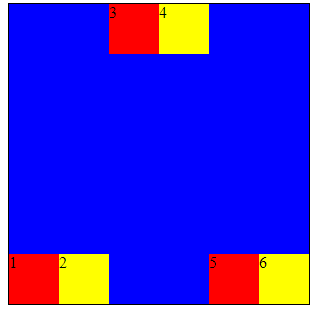
Example of Align content flex-start:
<!DOCTYPE >
<html>
  <head>
    <meta />
    <title></title>
    <style>
      .flex-container {
        display: flex;
        width: 290px;
        height: 300px;
        background-color: blue;
        border: 1px solid black;
        flex-wrap: wrap;
        align-content: flex-start;
      }
      .flex-container div {
        width: 70px;
        height: 70px;
        border: 1px solid black;
      }
    </style>
  </head>
  <body>
    <h1>Example of align-content: flex-start</h1>
    <div class="flex-container">
      <div style="background-color: red">1</div>
      <div style="background-color: yellow">2</div>
      <div style="background-color: red">3</div>
      <div style="background-color: yellow">4</div>
    </div>
  </body>
</html>
Here is the result:
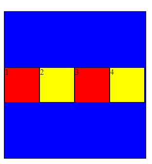
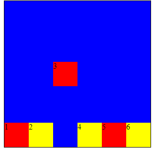
Example of Align content center:
.flex-container {
  display: flex;
  width: 290px;
  height: 300px;
  background-color: blue;
  border: 1px solid black;
  flex-wrap: wrap;
  align-content: center;
}
.flex-container div {
  width: 70px;
  height: 70px;
  border: 1px solid black;
}
Let’s look at the result:
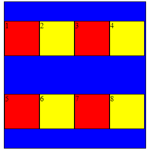
Example of Align content space-around:
<!DOCTYPE >
<html>
  <head>
    <meta />
    <title></title>
    <style>
      .flex-container {
        display: flex;
        width: 290px;
        height: 300px;
        background-color: blue;
        border: 1px solid black;
        flex-wrap: wrap;
        align-content: space-around;
      }
      .flex-container div {
        width: 70px;
        height: 70px;
        border: 1px solid black;
      }
    </style>
  </head>
  <body>
    <h1>Example of align-content: space-around</h1>
    <div class="flex-container">
      <div style="background-color: red">1</div>
      <div style="background-color: yellow">2</div>
      <div style="background-color: red">3</div>
      <div style="background-color: yellow">4</div>
      <div style="background-color: red">5</div>
      <div style="background-color: yellow">6</div>
      <div style="background-color: red">7</div>
      <div style="background-color: yellow">8</div>
    </div>
  </body>
</html>
Here is the outcome:
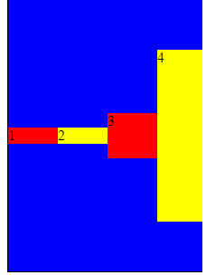
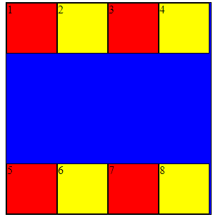
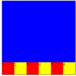
Example of Align content space-between:
.flex-container {
  display: flex;
  width: 290px;
  height: 300px;
  background-color: blue;
  border: 1px solid black;
  flex-wrap: wrap;
  align-content: space-between;
}
.flex-container div {
  width: 70px;
  height: 70px;
  border: 1px solid black;
}
Here is the outcome:
Session Replay for Developers
Uncover frustrations, understand bugs and fix slowdowns like never before with OpenReplay — an open-source session replay tool for developers. Self-host it in minutes, and have complete control over your customer data. Check our GitHub repo and join the thousands of developers in our community.
Types of Flex Items properties
- align self
- order flex items
- flex grow
- flex shrink
- flex basis
Let’s look at the following values in detail for a better understanding:
Align self
The Align self property enables you to override the flexible container’s alignment of a specific flex item on the cross-axis. It behaves exactly like the align-items property, but instead of being applied to the flex container, it uses flex items. It can take on the following values: auto (default),flex-start,flex-end, center,baseline,stretch.
Example of Align self flex-start:
<!DOCTYPE >
<html>
  <head>
    <meta />
    <title></title>
    <style>
      .flex-container {
        width: 300px;
        height: 300px;
        border: 1px solid black;
        display: flex;
        align-items: flex-end;
        background-color: blue;
      }
      .first-red {
        align-self: flex-start;
      }
      .flex-container div {
        flex: 1;
        width: 50px;
        height: 50px;
      }
    </style>
  </head>
  <body>
    <h1>Example of align-self: flex-start</h1>
    <div class="flex-container">
      <div style="background-color: red" class="first-red">1</div>
      <div style="background-color: yellow">2</div>
      <div style="background-color: red">3</div>
      <div style="background-color: yellow">4</div>
      <div style="background-color: red">5</div>
      <div style="background-color: yellow">6</div>
    </div>
  </body>
</html>
Here is the outcome:
Example of Align self stretch:
<!DOCTYPE >
<html>
  <head>
    <meta />
    <title></title>
    <style>
      .flex-container {
        width: 300px;
        height: 300px;
        border: 1px solid black;
        display: flex;
        align-items: flex-end;
        background-color: blue;
      }
      .third-red {
        align-self: stretch;
      }
      .fourth-yellow {
        align-self: stretch;
      }
      .flex-container div {
        flex: 1;
        width: 50px;
        height: 50px;
      }
    </style>
  </head>
  <body>
    <h1>Example of align-self: stretch</h1>
    <div class="flex-container">
      <div style="background-color: red">1</div>
      <div style="background-color: yellow">2</div>
      <div style="background-color: red" class="third-red">3</div>
      <div style="background-color: yellow" class="fourth-yellow">4</div>
      <div style="background-color: red">5</div>
      <div style="background-color: yellow">6</div>
    </div>
  </body>
</html>
Here is the outcome:
Example of Align self-center:
.flex-container {
  width: 300px;
  height: 300px;
  border: 1px solid black;
  display: flex;
  align-items: flex-end;
  background-color: blue;
}
.third-red {
  align-self: center;
}
.flex-container div {
  flex: 1;
  width: 50px;
  height: 50px;
}
Here is the outcome:
Example of Align self-baseline:
.flex-container {
  width: 300px;
  height: 300px;
  border: 1px solid black;
  display: flex;
  align-items: flex-end;
  background-color: blue;
}
.first-red {
  align-self: baseline;
}
.flex-container div {
  flex: 1;
  width: 50px;
  height: 50px;
}
Here is the outcome:
Order flex items
The Order flex items allow you to change the order without changing your HTML structure. The property specifies the order of a flexible item relative to the rest of the loose items inside the same container. It can take on any integer value (positive or negative).
Example of order flex items:
<!DOCTYPE >
<html>
  <head>
    <meta />
    <title></title>
    <style>
      .flex-container {
        display: flex;
        align-items: stretch;
        background-color: blue;
      }

      .flex-container > div {
        color: white;
        width: 100px;
        margin: 10px;
        text-align: center;
        line-height: 75px;
        font-size: 30px;
      }
    </style>
  </head>
  <body>
    <h1>Example of Order flex items</h1>
    <div class="flex-container">
      <div style="background-color: yellow; order: 3">1</div>
      <div style="background-color: red; order: 2">2</div>
      <div style="background-color: red; order: 4">3</div>
      <div style="background-color: yellow; order: 1">4</div>
      <div style="background-color: yellow; order: 5">6</div>
      <div style="background-color: red; order: 6">5</div>
    </div>
  </body>
</html>
Here is the outcome:

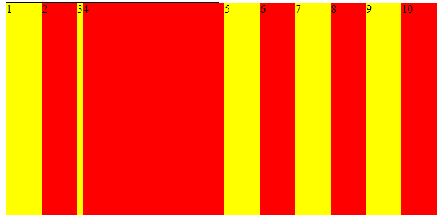
Flex grow
Flex grow property specifies how much the item will increase relative to the remaining flexible items inside the same container. It enables you to fill the remaining space on the main axis, changing the size of your flex items. It can take on any integer value, and the default value is zero.
Let’s look at the example of flex-grow:
<!DOCTYPE >
<html>
  <head>
    <meta />
    <title></title>
    <style>
      .flex-container {
        display: flex;
        align-items: stretch;
        background-color: blue;
      }

      .flex-container > div {
        color: white;
        margin: 10px;
        text-align: center;
        line-height: 75px;
        font-size: 30px;
      }
    </style>
  </head>
  <body>
    <h1>Example of flex-grow</h1>
    <div class="flex-container">
      <div style="background-color: red; flex-grow: 1">1</div>
      <div style="background-color: yellow; flex-grow: 1">2</div>
      <div style="background-color: red; flex-grow: 8">3</div>
    </div>
  </body>
</html>
Here is the result:

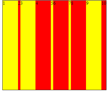
Flex shrink
Flex shrink is a property that defines whether flex items should shrink or not. In addition, when the size of all flex items is greater than the flex container, items shrink to fit inline to flex-shrink, and by default, it has the value one but can take on the value zero or one.
Example of flex-shrink:
<!DOCTYPE >
<html>
  <head>
    <meta />
    <title></title>
    <style>
      .flex-container {
        width: 350px;
        height: 300px;
        border: 1px solid black;
        background-color: blue;
        display: flex;
      }
      .flex-container div:nth-of-type(5) {
        flex-shrink: 5;
      }
      .flex-container div:nth-of-type(7) {
        flex-shrink: 7;
      }
      .flex-container div:nth-of-type(10) {
        flex-shrink: 10;
      }
      .flex-container div:nth-of-type(2) {
        flex-shrink: 2;
      }
      .flex-container div {
        flex-grow: 1;
        flex-shrink: 1;
        flex-basis: 100px;
      }
    </style>
  </head>
  <body>
    <h1>Example of flex-shrink</h1>
    <div class="flex-container">
      <div style="background-color: yellow">1</div>
      <div style="background-color: red">2</div>
      <div style="background-color: yellow; flex-shrink: 1">3</div>
      <div style="background-color: red">4</div>
      <div style="background-color: yellow">5</div>
      <div style="background-color: red">6</div>
      <div style="background-color: yellow">7</div>
      <div style="background-color: red">8</div>
      <div style="background-color: yellow">9</div>
      <div style="background-color: red">10</div>
    </div>
  </body>
</html>
Here is the outcome:
Flex basis
Flex basis is a property that specifies the initial length of a flexible item by defining the default size of a flex item before distributing the extra space. It can take on a length or a keyword. The available keywords are auto (default value), content, fill, max-content, min-content, and fit-content, but auto is the only supported among these values.
.flex-container {
  width: 300px;
  height: 300px;
  border: 1px solid black;
  background-color: blue;
  display: flex;
}
.flex-container div {
  flex-grow: 0;
  flex-shrink: 0;
  flex-basis: 50px;
}
.flex-container div:nth-of-type(4) {
  flex-basis: 100px;
}
Here is the outcome:
Conclusion
Flexbox is built specifically for building a responsive design. So now you can enjoy working with Flexbox.
A TIP FROM THE EDITOR: For another aspect of modern CSS, don’t miss our Modern CSS Selectors article.
Gain Debugging Superpowers
Unleash the power of session replay to reproduce bugs and track user frustrations. Get complete visibility into your frontend with OpenReplay, the most advanced open-source session replay tool for developers.
