Building React components with DaisyUI
Build a book store app and see how easy is working with DaisyUI


Although Tailwind CSS is the most popular utility CSS framework, most developers still see it as the hardest to pick up, and some that have been able to pick it up need help. This is primarily due to the decrease in markup readableness as the application expands.
DaisyUI is the most popular, free, open-source, and customizable Tailwind CSS component library that prevents expansive markup in front-end applications. It is simply a plugin for Tailwind CSS, which works on all frameworks and has made development faster, and customizable for developers using pure CSS.
Generally, DaisyUI offers you>
- Faster development
- Cleaner HTML
- Customizable and themeable
- Pure CSS. Works on all frameworks
In this article, we will build a book store using DaisyUI to demonstrate how straightforward and faster it is to style an application.
To follow along, you will need the following in place:
- Knowledge of Tailwind CSS and utility classes
- A basic knowledge of React, React-router-dom, and JavaScript
- Node.js and npm installed
Create a React Project
First, we need to create our project by running the following:
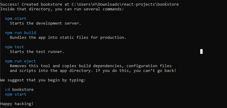
npx create-react-app bookstoreThe command above creates a new React.js app using create-react-app, which sets up everything automatically for you. I’ve also named our application bookstore. Feel free to give yours any suitable name.
To confirm the success of your app installation, you will see an output like the one in the screenshot below:
Next, to navigate into your project directory and start the development server, you have to run the command below:
cd bookstore && npm startRunning the command above will automatically start the application on localhost:3000 if not already in use, and it will display the default ReactJS boilerplate application interface. In the following steps, you will set up Tailwind CSS and configure DaisyUI to use the utility classes.
Install and Configure DaisyUI
In this phase, you will be installing and configuring the necessary dependencies for this project which include:
- TailwindCSS: provides the utility classes for our DaisyUI components
- DaisyUI: a TailwindCSS plugin that provides all the necessary components for building and styling our application.
- PostCSS: transforms our styles using JavaScript plugins.
- Autoprefixer: parses our CSS and adds/removes unnecessary vendor prefixes in our compiled CSS rules.
- React-router-dom: will allow us to navigate to other application pages.
To start the dependencies installation, run the following command in your terminal:
npm install daisyui tailwindcss postcss autoprefixer react-router-domOnce this is done, you will have all the dependencies required to follow up with this tutorial and can run the init command to generate both tailwind.config.js and postcss.config.js.
npx tailwindcss init -pNext, navigate into your tailwind.config.js file and add the following code:
plugins: [require("daisyui")]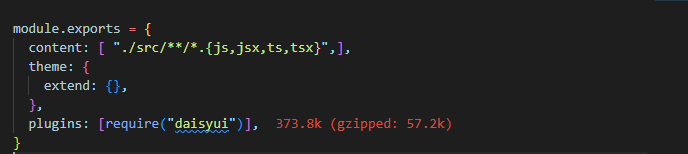
Create a Book Store
In this phase, we will create an array of books that stores our list of books and will be mapped to create a list of books in our Book Lists component.
const BOOKS = [
    {
      id: 1,
      image: book1,
      title: 'The Shadow Sister',
      author: 'Lucinda Riley',
      price: '$40'
    },
    {
      id: 2,
      image: book2,
      title: 'Jade War',
      author: 'Fonda Lee',
      price: '$70.99'
    },
    {
      id: 3,
      image: book3,
      title: 'Call Me By Your Name',
      author: 'Andre Aciman',
      price: '$58'
    },
    {
      id: 4,
      image: book4,
      title: 'The Dinner Quest',
      author: 'B.P. Walter',
      price: '$198'
    },
    {
      id: 5,
      image: book5,
      title: 'Marauder',
      author: 'Clive Cussler and Boyd Morrison',
      price: '$34.55'
    },
    {
      id: 6,
      image: book6,
      title: 'The Silmarillion',
      author: 'L.R.R Tolkien',
      price: '$44.84'
    },
  ]
Also, let’s quickly add other components provided by DaisyUI to improve our bookstore interface: the Navbar component will consist of the application navigation links, a Footer component, a Hero component to welcome the user to the landing page, and a Book Lists component which displays the lists of books.
Building the Navbar component
DaisyUI provides responsive components that we can always customize to our taste. Therefore, we will first create a components folder in our src folder; inside it, we will create our Navbar.jsx component. Next, add the following code inside the components/Navbar.jsx file you’ve created:
const Navbar = () => {
  return (
    <div className="bg-base-200 py-2">
      <div className="max-w-7xl mx-auto navbar">
        <div className="navbar-start">
          <div className="dropdown">
            <label tabIndex={0} className="btn btn-ghost lg:hidden">
              <svg
                xmlns="http://www.w3.org/2000/svg"
                className="h-5 w-5"
                fill="none"
                viewBox="0 0 24 24"
                stroke="currentColor"
              >
                <path
                  strokeLinecap= "round"
                  strokeLinejoin= "round"
                  strokeWidth= "2"
                  d="M4 6h16M4 12h8m-8 6h16"
                />
              </svg>
            </label>
            <ul
              tabIndex={0}
              className="menu menu-compact dropdown-content mt-3 p-2 shadow bg-base-100 rounded-box w-52"
            >
              <li>
                <Link to="/">Home</Link>
              </li>
              <li tabIndex="0">
                <span className= "justify-between cursor-pointer">
                  Books
                  <svg
                    className="fill-current"
                    xmlns="http://www.w3.org/2000/svg"
                    width= "24"
                    height= "24"
                    viewBox= "0 0 24 24"
                  >
                    <path d="M8.59,16.58L13.17,12L8.59,7.41L10,6L16,12L10,18L8.59,16.58Z" />
                  </svg>
                </span>
                <ul className="p-2 bg-gray-100">
                  <li>
                    <Link to="/">Submenu 1</Link>
                  </li>
                  <li>
                    <Link to="/">Submenu 2</Link>
                  </li>
                </ul>
              </li>
              <li>
                <div className="form-control mt-3">
                  <input
                    type= "text"
                    placeholder= "Search books..."
                    className= "input input-bordered input-primary w-full"
                  />
                </div>
              </li>
            </ul>
          </div>
          <Link href="/" className="btn btn-ghost normal-case text-2xl">
            Bookstore
          </Link>
        </div>
        <div className="navbar-center hidden lg:flex">
          <ul className="menu menu-horizontal p-0">
            <li>
              <Link to="/">Home</Link>
            </li>
            <li tabIndex="0">
              <span>
                Books
                <svg
                  className="fill-current"
                  xmlns="http://www.w3.org/2000/svg"
                  width="20"
                  height="20"
                  viewBox="0 0 24 24"
                >
                  <path d="M7.41,8.58L12,13.17L16.59,8.58L18,10L12,16L6,10L7.41,8.58Z" />
                </svg>
              </span>
              <ul className="p-2 bg-gray-100">
                <li>
                  <Link to="/">Submenu 1</Link>
                </li>
                <li>
                  <Link to="/">Submenu 2</Link>
                </li>
              </ul>
            </li>
          </ul>
        </div>
        <div className= "navbar-end hidden lg:flex">
          <div className="form-control">
            <input
              type= "text"
              placeholder= "Search books..."
              className= "input input-bordered input-primary w-full"
            />
          </div>
        </div>
      </div>
    </div>
  );
};

export default Navbar;
In the code above, we created a responsive Navbar consisting of navigation links, dropdown content, and a search field already styled and functional as DaisyUI components.
A simple Footer component
Here, we will build a centered footer with quick links and social icons by creating a Footer.jsx file in our components folder. Let’s add the following code inside our components/Footer.jsx file:
const Footer = () => {
  return (
    <footer className="footer footer-center p-10  bg-primary text-primary-content rounded">
      <div className="grid grid-flow-col gap-4">
        <Link to="/about" className="link link-hover">
          About us
        </Link>
        <Link to="/contact" className="link link-hover">
          Contact
        </Link>
        <Link to="/jobs" className="link link-hover">
          Jobs
        </Link>
        <Link to="/press-kit" className="link link-hover">
          Press kit
        </Link>
      </div>
      <div>
        <div className="grid grid-flow-col gap-4">
          <a href="www.twitter.com">
            <svg
              xmlns="http://www.w3.org/2000/svg"
              width= "24"
              height= "24"
              viewBox= "0 0 24 24"
              className="fill-current"
            >
              <path d="M24 4.557c-.883.392-1.832.656-2.828.775 1.017-.609 1.798-1.574 2.165-2.724-.951.564-2.005.974-3.127 1.195-.897-.957-2.178-1.555-3.594-1.555-3.179 0-5.515 2.966-4.797 6.045-4.091-.205-7.719-2.165-10.148-5.144-1.29 2.213-.669 5.108 1.523 6.574-.806-.026-1.566-.247-2.229-.616-.054 2.281 1.581 4.415 3.949 4.89-.693.188-1.452.232-2.224.084.626 1.956 2.444 3.379 4.6 3.419-2.07 1.623-4.678 2.348-7.29 2.04 2.179 1.397 4.768 2.212 7.548 2.212 9.142 0 14.307-7.721 13.995-14.646.962-.695 1.797-1.562 2.457-2.549z"></path>
            </svg>
          </a>
          <a href="www.youtube.com">
            <svg
              xmlns="http://www.w3.org/2000/svg"
              width= "24"
              height= "24"
              viewBox= "0 0 24 24"
              className="fill-current"
            >
              <path d="M19.615 3.184c-3.604-.246-11.631-.245-15.23 0-3.897.266-4.356 2.62-4.385 8.816.029 6.185.484 8.549 4.385 8.816 3.6.245 11.626.246 15.23 0 3.897-.266 4.356-2.62 4.385-8.816-.029-6.185-.484-8.549-4.385-8.816zm-10.615 12.816v-8l8 3.993-8 4.007z"></path>
            </svg>
          </a>
          <a href="www.facebook.com">
            <svg
              xmlns="http://www.w3.org/2000/svg"
              width= "24"
              height= "24"
              viewBox= "0 0 24 24"
              className="fill-current"
            >
              <path d="M9 8h-3v4h3v12h5v-12h3.642l.358-4h-4v-1.667c0-.955.192-1.333 1.115-1.333h2.885v-5h-3.808c-3.596 0-5.192 1.583-5.192 4.615v3.385z"></path>
            </svg>
          </a>
        </div>
      </div>
      <div>
        <p>Copyright © 2022 - All right reserved by Book Industries Ltd</p>
      </div>
    </footer>
  );
}

export default Footer;
To reuse the navbar and footer components across the pages, we will create a Layout.jsx component containing both the Navbar and Footer components and a children prop. Next, add the following code inside the components/Layout.jsx file you’ve created:
const Layout = ({children}) => {
  return (
    <>
      <Navbar />
      <main>{children}</main>
      <Footer />
    </>
  );
}

export default Layout;
Hero component
Next, we will create the Hero component, which will contain some introduction to the application. First, let’s create a pages folder in our src directory and then create our Home.jsx file, where we will add our Hero component. So far, this is the content of our Home.jsx file:
export default function Home() {
  return (
    <Layout>

    </Layout>
  )
}
Now, paste the code below inside the above code to create a Hero component;
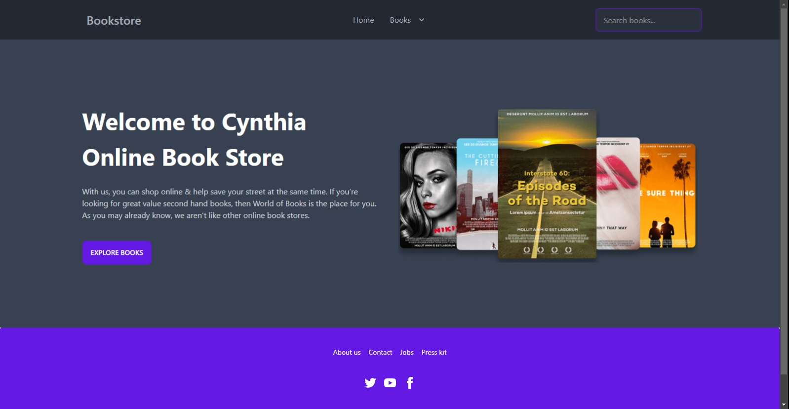
<div className="hero py-32 bg-gray-700">
    <div className="hero-content grid md:grid-cols-2 gap-8">
      <div className="order-2">
        <img
          src={hero_img}
          className=""
          alt="Hero"
        />
      </div>
      <div>
        <h1 className="text-5xl font-bold leading-normal text-white">
          Welcome to Cynthia Online Book Store
        </h1>
        <p className="py-6 text-gray-300">
          With us, you can shop online & help save your street at the same
          time. If you're looking for great value second-hand books, then
          World of Books is the place for you. As you may already know, we
          aren't like other online bookstores.
        </p>
        <button className="btn btn-primary mt-4">Explore Books</button>
      </div>
    </div>
</div>
Well done! Let’s preview what we’ve built so far using DaisyUI components.
Session Replay for Developers
Uncover frustrations, understand bugs and fix slowdowns like never before with OpenReplay — an open-source session replay tool for developers. Self-host it in minutes, and have complete control over your customer data. Check our GitHub repo and join the thousands of developers in our community.
Create the Book Component
Next, we will create our book component: the book image, title, author, category, and price. Let’s navigate inside our components folder and add a Book.jsx file. The following code creates a Book Component using DaisyUI card component styles and badge that shows the book category:
components/Book.jsx
const Book = ({ image, title, author, category, price }) => {
  return (
    <div className="card bg-base-100 shadow-xl">
      <figure className="px-10 pt-10">
        <img src={image} alt={title} className="rounded-xl" />
      </figure>
      <div className=" card-body items-center text-center">
        <h2 className="card-title text-white">
          {title}
          <div className="badge badge-secondary text-xs">{category}</div>
        </h2>
        <p>{author}</p>
        <p className="text-lg font-medium">{price}</p>
        <div className="card-actions">
          <Link to="/book-details" className="btn btn-primary">
            Buy Now
          </Link>
        </div>
      </div>
    </div>
  );
};

export default Book;
I noticed we passed some props to the book component. We also added a “Buy Now” button, which will take the user to the book details page.
Create Book List Component
The book list component will display the list of books in our bookstore. All we need to do here is to map our array of books on the Book component we’ve already created. We will add this component to our Home.jsx file immediately after the Hero component.
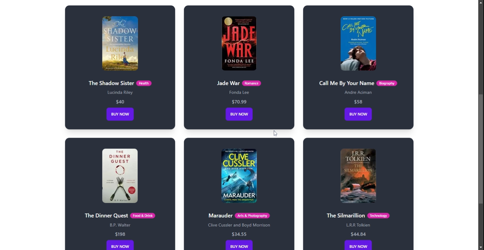
<div className="py-20 max-w-7xl mx-auto">
    <div className="grid md:grid-cols-2 lg:grid-cols-3 gap-8">
      {BOOKS.map((book) => (
        <Book
          key={book.id}
          image={book.image}
          title={book.title}
          author={book.author}
          category={book.category}
          price={book.price}
        />
      ))}
    </div>
</div>
Using DaisyUI components and styles, we can build a beautiful book list display. If done correctly, our book list should look like this:
It has been fun and fast exploring and applying DaisyUI components, and we’ve so far added different components to improve the look of our UI. So, let’s explore more of the components by adding a Book-details page so that when a user clicks on the “Buy Now” button on the Book component, they will be taken to a page containing some information about the book.
Navigate to the pages folder and create a BookDetails.jsx file. This file will contain complete information about each book, including an action button. Inside the BookDetails.jsx, we will paste the code below, which will automatically add the navbar and footer components for us:
const BookDetails = () => {
  return (
    <Layout>

    </Layout>
  );
};

export default BookDetails;
We will create the rest of the BookDetails content inside the code above. Let’s start by adding the breadcrumbs component by DaisyUI, which will help users navigate the website. Then, add the following code inside the BookDetails component:
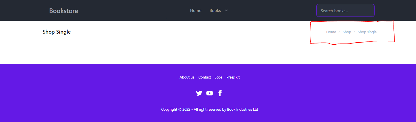
<div className="border-b py-6">
  <div className="flex justify-between items-center max-w-7xl mx-auto px-4">
    <h1 className="text-xl font-semibold text-black">Shop Single</h1>
    <div className=" text-sm breadcrumbs">
      <ul>
        <li>
          <Link to="/">Home</Link>
        </li>
        <li>
          <Link to="/">Shop</Link>
        </li>
        <li>Shop single</li>
      </ul>
    </div>
  </div>
</div>
This is what the above code looks like:
Next, we will add the DaisyUI divider component, which will separate the content of our page vertically.
<div className="max-w-7xl mx-auto px-4">
  <div className=" flex flex-col w-full lg:flex-row">
    <div className="grid flex-shrink-0 place-items-center my-20 lg:pr-6">
      **Left content**
    </div>
    <div className= "divider lg:divider-horizontal"/>
    <div className="grid flex-shrink my-20">
      **Right content**
    </div>
  </div>
</div>
In the code above, we separated the right content, which will contain our book cover slides, from the left content, which will include all the book information using the DaisyUI divider component.
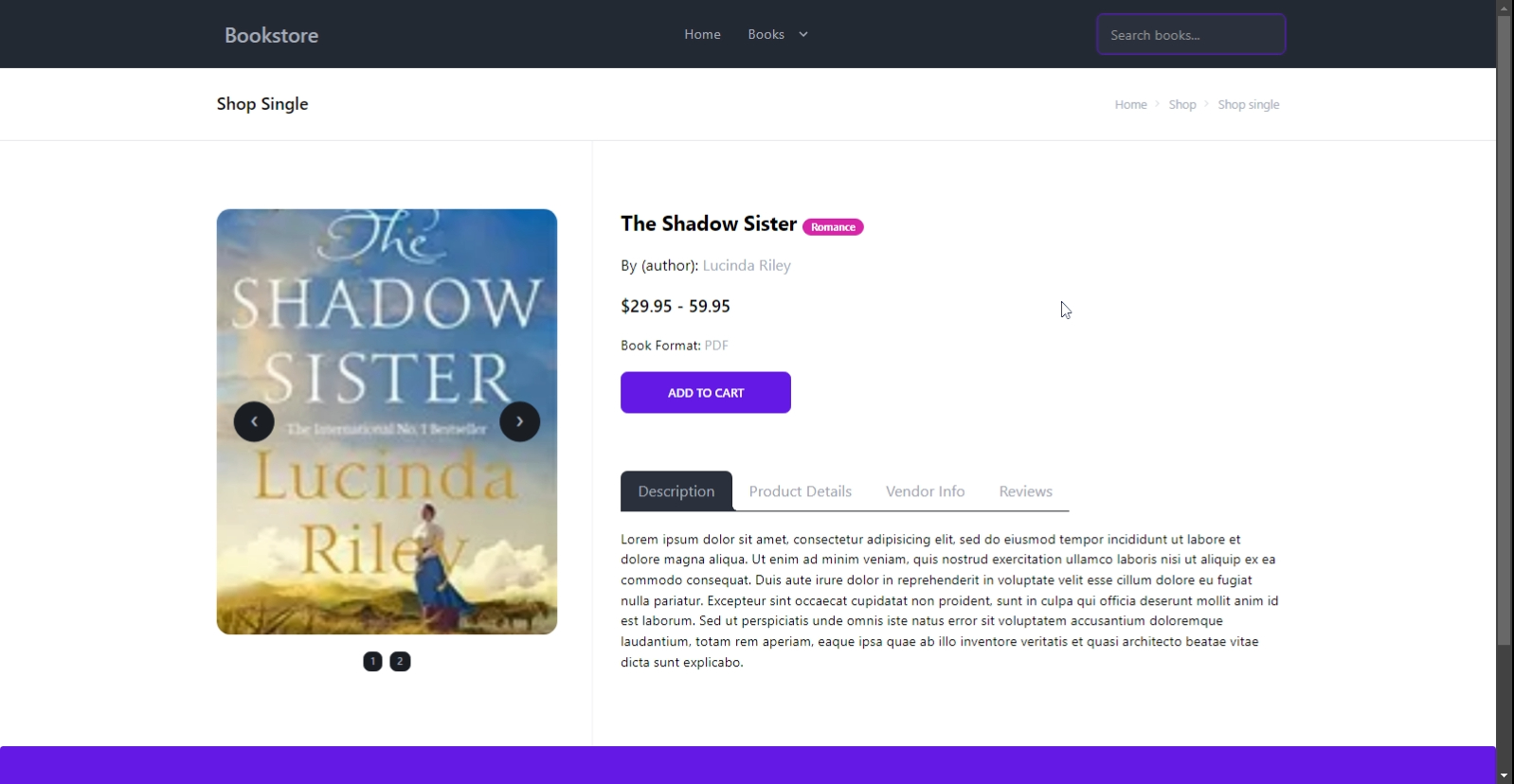
Next, we will replace the Left content text with the DaisyUI carousel component. The carousel component shows images or content in a scrollable area. Replace the Left content text with the following code:
<div className="carousel max-w-[400px] rounded-box">
<div id="slide1" className="carousel-item relative">
  <img
    src={book1}
    className="w-[400px] h-[500px] object-cover"
    alt=""
  />
  <div className="absolute flex justify-between transform -translate-y-1/2 left-5 right-5 top-1/2">
    <a href="#slide2" className="btn btn-circle">
      ❮
    </a>
    <a href="#slide2" className="btn btn-circle">
      ❯
    </a>
  </div>
</div>
<div id="slide2" className="carousel-item relative">
  <img
    src={book2}
    className="w-[400px] h-[500px] object-cover"
    alt=""
  />
  <div className="absolute flex justify-between transform -translate-y-1/2 left-5 right-5 top-1/2">
    <a href="#slide1" className="btn btn-circle">
      ❮
    </a>
    <a href="#slide1" className="btn btn-circle">
      ❯
    </a>
  </div>
</div>
</div>
<div className="flex justify-center w-full mt-3 py-2 gap-2">
<a href="#slide1" className="btn btn-xs">
  1
</a>
<a href="#slide2" className="btn btn-xs">
  2
</a>
</div>
For the Right content, we will replace the text with the book’s full details, including the book title, author, price, format, action button, and tab component containing product description, reviews, and vendor information. DaisyUI’s tab component can show a list of links in a tabbed format. Replace the Right content text with the following code:
<div className="flex flex-col space-y-5 lg:pl-4">
    <h2 className="text-2xl text-black font-bold">
      The Shadow Sister <div className="badge badge-secondary text-xs">Romance</div>
    </h2>
    <p className="text-lg">
      <span className="text-black">By (author):</span> Lucinda Riley
    </p>
    <h3 className="text-black text-xl font-semibold">
      $29.95 - 59.95
    </h3>
    <p>
      <span className="text-black">Book Format:</span> PDF
    </p>
    <button type="button" className="btn btn-primary w-[200px]">
      Add to Cart
    </button>
    {/* Tabs */}
    <div className="tabs pt-12">
      <button
        type="button"
        className="tab tab-lg tab-lifted tab-active"
      >
        Description
      </button>
      <button type="button" className="tab tab-lg tab-lifted text-gray-400">
        Product Details
      </button>
      <button type="button" className="tab tab-lg tab-lifted text-gray-400">
        Vendor Info
      </button>
      <button type="button" className="tab tab-lg tab-lifted text-gray-400">
        Reviews
      </button>
    </div>
    <p className="text-black">
      Lorem ipsum dolor sit amet, consectetur adipisicing elit, sed
      do eiusmod tempor incididunt ut labore et dolore magna aliqua.
      Ut enim ad minim veniam, quis nostrud exercitation ullamco
      laboris nisi ut aliquip ex ea commodo consequat. Duis aute
      irure dolor in reprehenderit in voluptate velit esse cillum
      dolore eu fugiat nulla pariatur. Excepteur sint occaecat
      cupidatat non proident, sunt in culpa qui officia deserunt
      mollit anim id est laborum. Sed ut perspiciatis unde omnis
      iste natus error sit voluptatem accusantium doloremque
      laudantium, totam rem aperiam, eaque ipsa quae ab illo
      inventore veritatis et quasi architecto beatae vitae dicta
      sunt explicabo.
    </p>
</div>
Congratulations! So far, you’ve been able to combine various DaisyUI components to create beautiful online bookstore landing and details pages. Let’s preview our complete details page:
Note: Do not forget to correctly set up your routes in the App.js file.
Conclusion
The code for our example application in this tutorial can be found on GitHub. This tutorial explored the building and customizing of our React application with DaisyUI components and Tailwind CSS utility classes. DaisyUI provided many customizable UI components we used across the pages to build our Book store application.
You can always explore more or take the information in this tutorial and apply it to your application. I hope you learned from this tutorial!
Gain Debugging Superpowers
Unleash the power of session replay to reproduce bugs and track user frustrations. Get complete visibility into your frontend with OpenReplay, the most advanced open-source session replay tool for developers.