Building a mobile app with React and Ionic
Learn how to use React -not Angular!- with Ionic


In this article, we will cover the basics of React and the Ionic framework. We will learn how to build a simple application with React and Ionic. We will cover the application structure by explaining how React and Ionic applications are laid out and organized.
What is Ionic?
According to its documentation, Ionic is an open-source UI toolkit for building performant, high-quality mobile apps using web technologies — HTML, CSS, and JavaScript — with integrations for popular frameworks like Angular, React, and Vue. Ionic allows developers to build apps for all major app stores and the mobile web, all while keeping the UI consistent with the device OS using Adaptive Styling.
Previously, Ionic was tightly coupled with and built mainly for Angular. Still, from version 4, it has been re-engineered to work as a standalone web component library. With integrations for the latest JavaScript frameworks, current versions can be used in most JavaScript, like React, as we’ll look for in this article.
Ionic with React
Ionic officially supports React, and with @ionic/react, developers can use their current web development skills to create iOS, Android, and web apps. This allows devs to use all the Ionic core components, but in a way that feels like using native React components.
Ionic CLI
Ionic provides an official CLI tool that quickly scaffolds Ionic apps and provides a number of helpful commands. It is also used for installing and updating Ionic. The CLI also comes with a built-in development server, and build and debugging tools.
Now that we have an idea of what Ionic is all about, let’s dive into building an Ionic application.
Set up the Ionic project
The Ionic CLI provides various development tools and support choices and is the recommended installation approach.
Install the Ionic CLI
We’ll install the Ionic CLI globally with npm, well also install native-run, used to run native binaries on devices and simulators/emulators, and cordova-res, used to generate native app icons and splash screens:
npm install -g @ionic/cli native-run cordova-resCreate an Ionic React app
To create an Ionic React app that uses the “Tabs” starter template and adds Capacitor for native functionality, we’ll run the following command:
ionic start ionic-react-app tabs --type=react --capacitorOnce the installation is complete, we can navigate to and start our starter template:
cd ionic-react-app/
ionic serve
Now we should see something like this when we go to http://http://localhost:8100/ in our browser. We should see this:
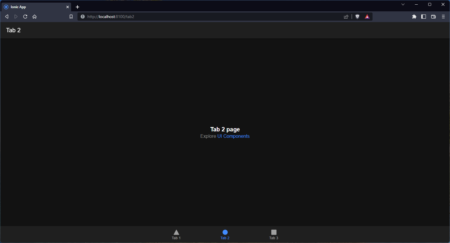
Awesome! Since the starter project comes complete with three pre-built pages and best practices for Ionic development, we can easily add more features as we start working on the app.
Theming the app
Ionic is built to be very customizable, and there are multiple ways we can customize colors and styling to suit our needs. First, we’ll look at how to customize the app’s color.
Customizing colors
Numerous Ionic components can change their colors using one of the nine default colors. Each color in Ionic is essentially a collection of various properties, including a shade and tint.
To successfully change or add color, all the related properties, including shade and tint, must be added to the list of properties for that color.
To make this easier, Ionic provides a Color Generator tool that makes this simple to accomplish, but if preferred, these can also be manually generated.
To generate a color theme, go to Ionic color generator and customize the colors:
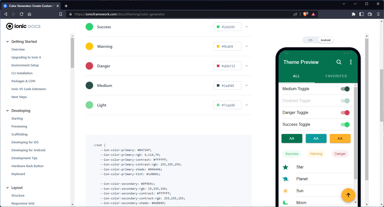
Once satisfied with the customization, we can copy out the generated code and place it in the ./src/theme/variables.css:
/* ./src/theme/variables.css */
/* Ionic Variables and Theming. For more info, please see:
http://ionicframework.com/docs/theming/ */
/** Ionic CSS Variables **/
:root {
  /** primary **/
  --ion-color-primary: #04724f;
  --ion-color-primary-rgb: 4, 114, 79;
  --ion-color-primary-contrast: #ffffff;
  --ion-color-primary-contrast-rgb: 255, 255, 255;
  --ion-color-primary-shade: #046446;
  --ion-color-primary-tint: #1d8061;
  /** secondary **/
  --ion-color-secondary: #0f9b9c;
  --ion-color-secondary-rgb: 15, 155, 156;
  --ion-color-secondary-contrast: #ffffff;
  --ion-color-secondary-contrast-rgb: 255, 255, 255;
  --ion-color-secondary-shade: #0d8889;
  --ion-color-secondary-tint: #27a5a6;
  /** tertiary **/
  --ion-color-tertiary: #ffb129;
  --ion-color-tertiary-rgb: 255, 177, 41;
  --ion-color-tertiary-contrast: #000000;
  --ion-color-tertiary-contrast-rgb: 0, 0, 0;
  --ion-color-tertiary-shade: #e09c24;
  --ion-color-tertiary-tint: #ffb93e;
  /** success **/
  --ion-color-success: #2dd36f;
  --ion-color-success-rgb: 45, 211, 111;
  --ion-color-success-contrast: #ffffff;
  --ion-color-success-contrast-rgb: 255, 255, 255;
  --ion-color-success-shade: #28ba62;
  --ion-color-success-tint: #42d77d;
  /** warning **/
  --ion-color-warning: #ffc409;
  --ion-color-warning-rgb: 255, 196, 9;
  --ion-color-warning-contrast: #000000;
  --ion-color-warning-contrast-rgb: 0, 0, 0;
  --ion-color-warning-shade: #e0ac08;
  --ion-color-warning-tint: #ffca22;
  /** danger **/
  --ion-color-danger: #d04155;
  --ion-color-danger-rgb: 208, 65, 85;
  --ion-color-danger-contrast: #ffffff;
  --ion-color-danger-contrast-rgb: 255, 255, 255;
  --ion-color-danger-shade: #b7394b;
  --ion-color-danger-tint: #d55466;
  /** dark **/
  --ion-color-dark: #222428;
  --ion-color-dark-rgb: 34, 36, 40;
  --ion-color-dark-contrast: #ffffff;
  --ion-color-dark-contrast-rgb: 255, 255, 255;
  --ion-color-dark-shade: #1e2023;
  --ion-color-dark-tint: #383a3e;
  /** medium **/
  --ion-color-medium: #2a4f48;
  --ion-color-medium-rgb: 42, 79, 72;
  --ion-color-medium-contrast: #ffffff;
  --ion-color-medium-contrast-rgb: 255, 255, 255;
  --ion-color-medium-shade: #25463f;
  --ion-color-medium-tint: #3f615a;
  /** light **/
  --ion-color-light: #7cda98;
  --ion-color-light-rgb: 124, 218, 152;
  --ion-color-light-contrast: #000000;
  --ion-color-light-contrast-rgb: 0, 0, 0;
  --ion-color-light-shade: #6dc086;
  --ion-color-light-tint: #89dea2;
}
The colors here apply to the default light mode. To apply the colors to the dark node as well, we have to replace the colors primary, secondary, success, warning, and danger in the @media (prefers-color-scheme: dark) section.
We’ll leave out dark, medium, and light since they are inverses of the light theme colors.
Here’s what we should have about now:
Nice.
Adding new colors
We can always add new colors in addition to the --ion-color-primary and others that are provided by default.
First, let’s generate a few colors using the new color creator tool:
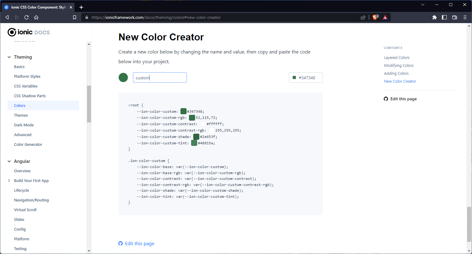
Next, define the CSS variables for all color variations at the :root.:
:root {
  /* ... */
  --ion-color-custom: #347348;
  --ion-color-custom-rgb: 52,115,72;
  --ion-color-custom-contrast: #ffffff;
  --ion-color-custom-contrast-rgb: 255,255,255;
  --ion-color-custom-shade: #2e653f;
  --ion-color-custom-tint: #48815a;
}
Then, create a new class that uses these CSS variables:
.ion-color-custom {
--ion-color-base: var(--ion-color-custom);
--ion-color-base-rgb: var(--ion-color-custom-rgb);
--ion-color-contrast: var(--ion-color-custom-contrast);
--ion-color-contrast-rgb: var(--ion-color-custom-contrast-rgb);
--ion-color-shade: var(--ion-color-custom-shade);
--ion-color-tint: var(--ion-color-custom-tint);
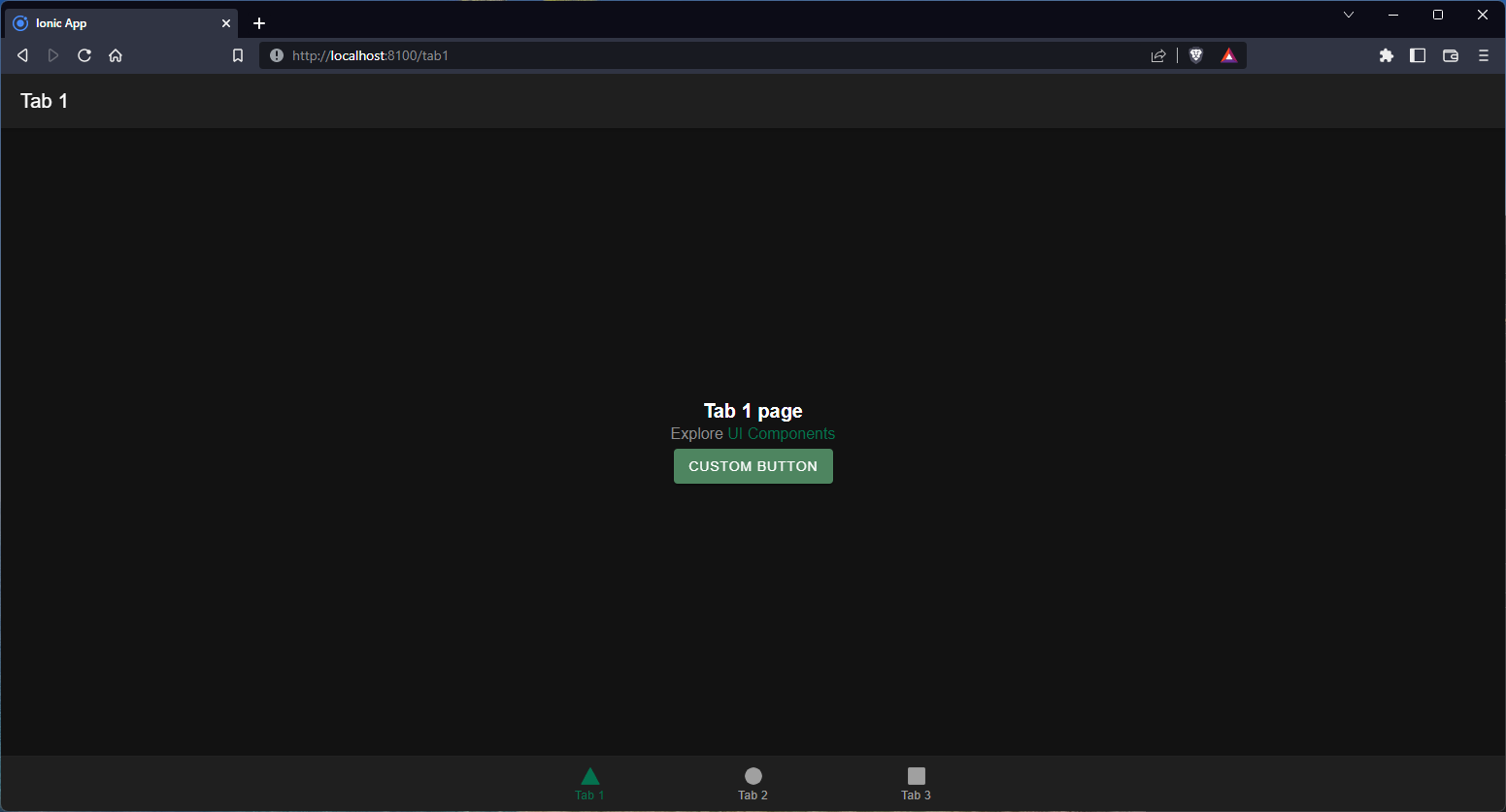
}Now, we can use our class in any component that supports the class attribute. To illustrate this, in the ./src/components/ExploreContainer.tsx file, we can add a button with the custom class:
// ./src/components/ExploreContainer.tsx
import { IonButton } from "@ionic/react";
import "./ExploreContainer.css";
interface ContainerProps {
  name: string;
}
const ExploreContainer: React.FC<ContainerProps> = ({ name }) => {
  return (
    <div className="container">
      <strong>{name}</strong>
      <p>
        Explore{" "}
        <a
          target="_blank"
          rel= "noopener noreferrer"
          href="https://ionicframework.com/docs/components"
        >
          UI Components
        </a>
      </p>
      {/* button with custom class */}
      <IonButton color={"custom"}>custom button</IonButton>
    </div>
  );
};
export default ExploreContainer;
We should have something like this now:
So far, we’ve covered what will be just the tip of the iceberg in theming Ionic apps in React, and more information, resources, and guides on themes can be found in the Ionic docs.
In the next section, we’ll look at how we can fetch data and create components in Ionic React.
Fetch data from REST API
Since we’re using React in our Ionic application, there are multiple packages we can use to handle data fetching. Still, in this article, we’ll take a more general approach and use the Fetch API.
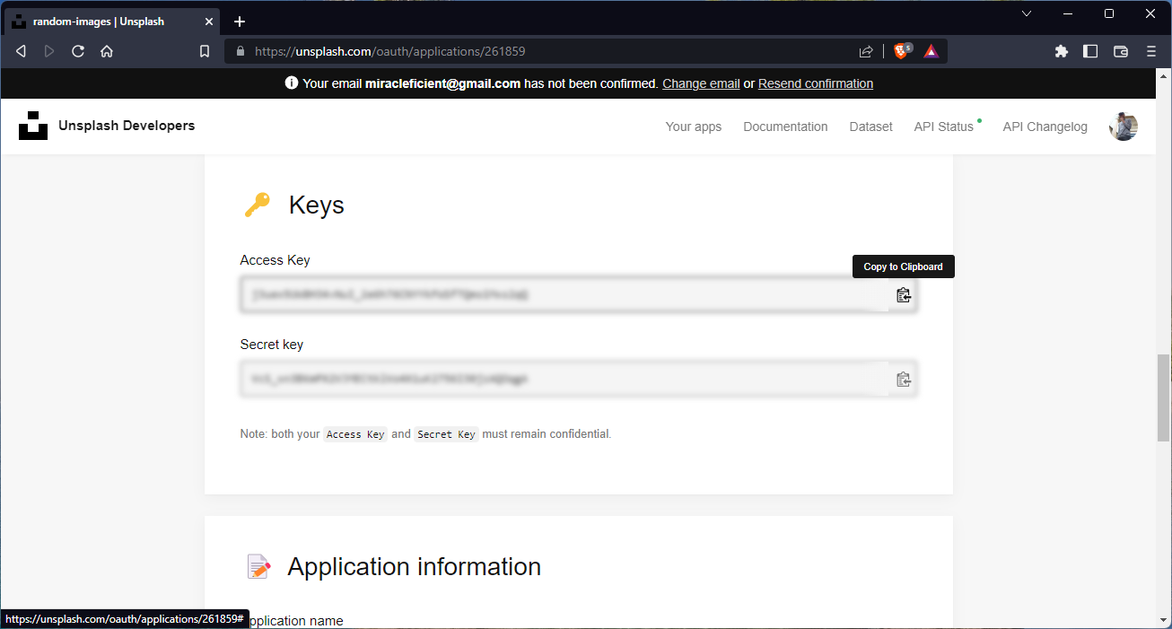
We will create an image gallery app powered by the Unsplash API. To obtain API keys, we have to set up a developer account by following the steps in the developers’ docs. Once the developer account is set up, we can obtain API keys by creating a new app in the Unsplash dashboard.
Back in our application, create a new file ./services/api.ts:
const ACCESS_KEY = "xxxxxxxxxxxxxxxxxxx";
const headerList = {
  "Content-Type": "application/json",
  Authorization: `Client-ID ${ACCESS_KEY}`,
};
export const getPhotos = async () => {
  try {
    const response = await fetch(`https://api.unsplash.com/photos/`, {
      headers: headerList,
    });
    const data = await response.json();
    return data;
  } catch (err) {
    return console.log(err);
  }
};
Here, we’re exporting a function getPhotos() that fetches photos from the Unsplash API. Next, we’ll create a PhotoCard component to display photos.
Create PhotoCard component
Create a new file - ./src/components/PhotoCard.tsx:
// ./src/components/PhotoCard.tsx

import {
  IonButton,
  IonCard,
  IonCardContent,
  IonCardSubtitle,
  IonCol,
  IonIcon,
  IonRow,
  useIonToast,
} from "@ionic/react";
import {  heartOutline } from "ionicons/icons";

import { Photo } from "../types/Photo";
const PhotoCard = ({ photo }: { photo: Photo }) => {
  const { id, urls, description, user, likes } = photo;

  return (
    <IonCard>
      <img
        src={urls.regular}
        alt={description}
        style={{
          height: "24rem",
          width: "100%",
          objectFit: "cover",
        }}
      />
      <IonCardContent>
        <IonRow>
          <IonCol style={{ display: "flex", flexDirection: "column" }}>
            <IonCardSubtitle>@{user.username}</IonCardSubtitle>
            <IonCardSubtitle>
              {likes} like{likes > 1 && "s"}
            </IonCardSubtitle>
          </IonCol>
          <IonCol className="ion-text-right">
            <IonButton>
              <IonIcon icon={heartOutline} />
            </IonButton>
          </IonCol>
        </IonRow>
      </IonCardContent>
    </IonCard>
  );
};
export default PhotoCard;
Here, we’re using the IonCard component to wrap other components like IonCardContent and others to make up the photo card.
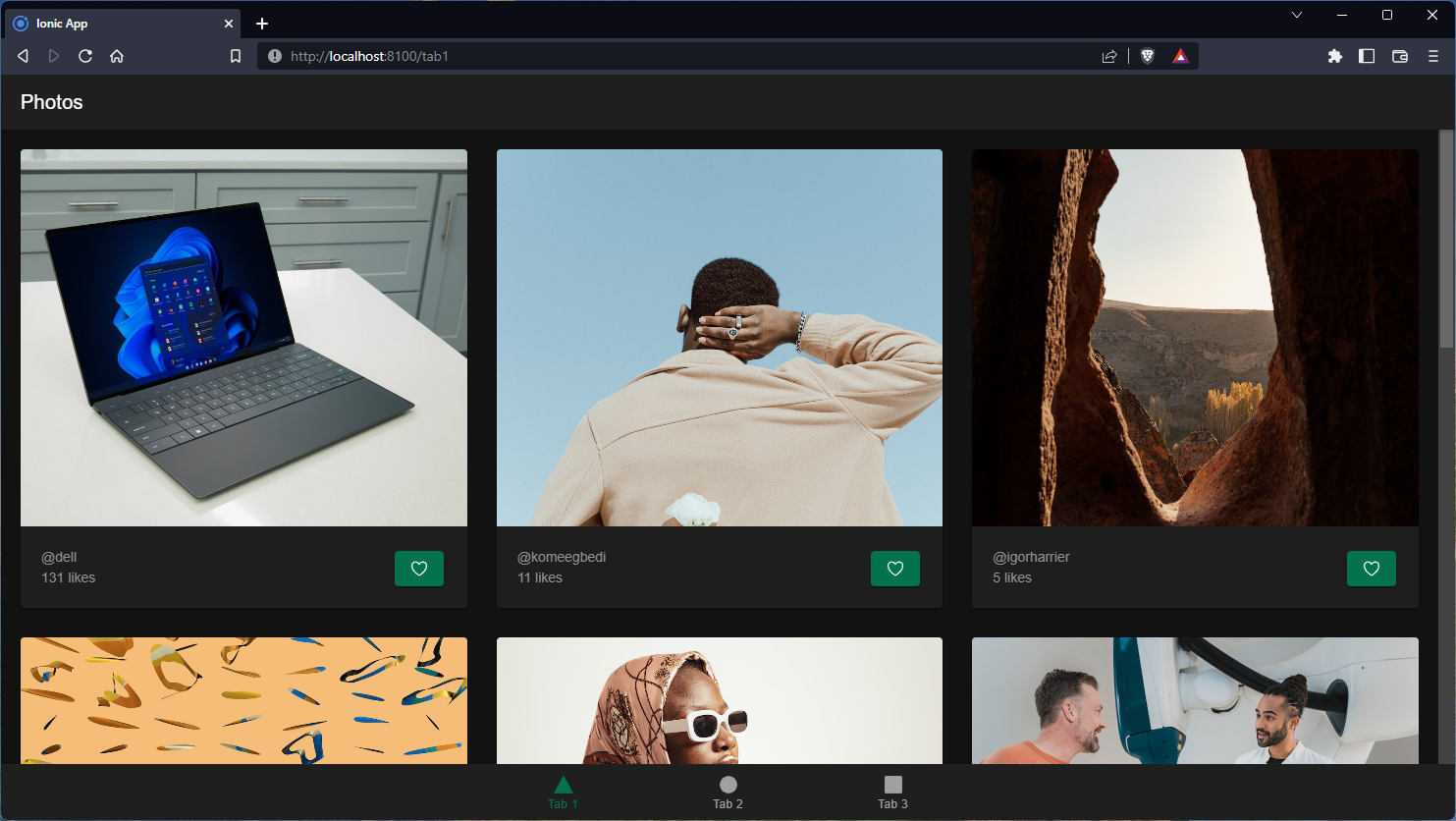
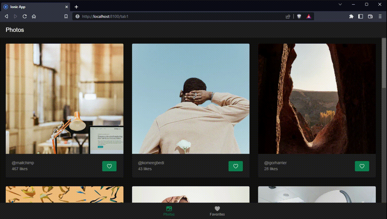
Now, to get the photos that will be displayed using the component we just created, in our ./pages/Tab1.tsx file, we can call our getPhotos() function and create a grid layout to display each photo card:
// ./pages/Tab1.tsx

import {
  IonCol,
  IonContent,
  IonGrid,
  IonHeader,
  IonPage,
  IonRow,
  IonTitle,
  IonToolbar,
} from "@ionic/react";
import { useEffect, useState } from "react";
import PhotoCard from "../components/PhotoCard";
import { getPhotos } from "../services/api";
import { Photo } from "../types/Photo";
import "./Tab1.css";
const Tab1: React.FC = () => {
  const [photos, setPhotos] = useState<Photo[]>([]);
  const fetchPhotos = async () => {
    const photos = await getPhotos();
    console.log({ photos });
    setPhotos(photos);
  };
  useEffect(() => {
    fetchPhotos();
  }, []);
  return (
    <IonPage>
      <IonHeader>
        <IonToolbar>
          <IonTitle>Photos</IonTitle>
        </IonToolbar>
      </IonHeader>
      <IonContent fullscreen>
        <div className="gallery">
          <IonGrid className="photo-list">
            <IonRow>
              {photos.map((photo) => (
                <IonCol
                  sizeXs="12"
                  sizeMd="6"
                  sizeXl="4"
                  className="photo-list-item"
                  key={photo.id}
                >
                  <PhotoCard photo={photo} />
                </IonCol>
              ))}
            </IonRow>
          </IonGrid>
        </div>
      </IonContent>
    </IonPage>
  );
};
export default Tab1;
We should have something like this:
Sweet! So far, we’ve seen how to set up an Ionic React app and perform functions like data fetching. In the following sections, we’ll look at how we can make our app more interactive by allowing users to save their favorite pictures.
Session Replay for Developers
Uncover frustrations, understand bugs and fix slowdowns like never before with OpenReplay — an open-source session replay tool for developers. Self-host it in minutes, and have complete control over your customer data. Check our GitHub repo and join the thousands of developers in our community.
Set up application storage in Ionic React
First, we have to set up our application storage. We’ll use the ionic/storage package, a simple key-value Storage module for Ionic apps. This utility uses the best storage engine available on the platform without having to interact with it directly. With ionic/storage, we don’t need to worry about the underlying storage method used on the target platform.
npm install @ionic/storageOnce that’s installed, create a new file - ./modules/Store.ts and initialize the store:
// ./src/modules/Store.ts

import { Storage } from "@ionic/storage";
export const store = new Storage();
store.create();
Awesome! Now, we can use it in our PhotoCard component to save favorite photos.
Add favorite functionality to the PhotoCard component
We’ll add a couple of functions to get favorites from the store, check if the current photo is already in the favorites list, add the photo to favorites, and remove the photo from favorites.
In the ./src/components/PhotoCard.tsx file, enter the following:
// ./src/components/PhotoCard.tsx

import { useEffect, useState } from "react";
import {
  IonButton,
  IonCard,
  IonCardContent,
  IonCardSubtitle,
  IonCol,
  IonIcon,
  IonRow,
} from "@ionic/react";
import { heart, heartOutline } from "ionicons/icons";
import { store } from "../modules/Store";
import { Photo } from "../types/Photo";
const PhotoCard = ({ photo }: { photo: Photo }) => {
  const { id, urls, description, user, likes } = photo;
  const [isFavorite, setIsFavorite] = useState(false);

  /**
   * function to get the favorites from the store
   * @returns {Promise<Photo[]>} the favorites
   */
  const getFavorites = async (): Promise<Photo[]> => {
    const favorites = await store.get("favorites");
    console.log({ favorites });
    return favorites || [];
  };

  /**
   * function to check if a photo is already in favorites
   */
  const checkIsFavorite = async () => {
    const favorites = await getFavorites();
    const isFavorite = favorites.some((favorite: any) => favorite.id === id);
    console.log({ isFavorite });
    setIsFavorite(isFavorite);
  };

  /**
   * function to add a photo to favorites
   * @param photo
   */
  const addToFavorites = async (photo: Photo) => {
    let favorites = await getFavorites();
    store.set("favorites", [...favorites, photo]);
    console.log({ favorites });
    setIsFavorite(true);
  };

  /**
   * function to remove a photo from favorites
   */
  const removeFromFavorites = async () => {
    let favorites = await getFavorites();
    store.set(
      "favorites",
      favorites.filter((favorite: { id: string }) => favorite.id !== id)
    );
    setIsFavorite(false);
  };

  /**
   * function to add or remove a photo from favorites depending on the current `isFavorite` state
   */
  const toggleFavorite = async () => {
    if (isFavorite) {
      removeFromFavorites();
    } else {
      addToFavorites(photo);
    }
  };

  useEffect(() => {
    checkIsFavorite();
  }, []);

  return (
    <IonCard>
      <img
        src={urls.regular}
        alt={description}
        style={{
          height: "24rem",
          width: "100%",
          objectFit: "cover",
        }}
      />
      <IonCardContent>
        <IonRow>
          <IonCol style={{ display: "flex", flexDirection: "column" }}>
            <IonCardSubtitle>@{user.username}</IonCardSubtitle>
            <IonCardSubtitle>
              {likes} like{likes > 1 && "s"}
            </IonCardSubtitle>
          </IonCol>
          <IonCol className="ion-text-right">
            <IonButton
              onClick={() => {
                toggleFavorite();
              }}
            >
              <IonIcon icon={isFavorite ? heart : heartOutline} />
            </IonButton>
          </IonCol>
        </IonRow>
      </IonCardContent>
    </IonCard>
  );
};
export default PhotoCard;
Let’s quickly look at the changes we’ve made and the functions we’ve added to our component.
To access our ionic storage, we have to import store,
import { store } from "../modules/Store"; Now, we can create the functions:
getFavorites- to get the favorites from the storecheckIsFavorite- to check if the photo is already in the favorites listaddToFavorites- to add a photo to favoritesremoveFromFavorites- to remove a photo from favoritestoggleFavorite- to add or remove a photo from favorites depending on the currentisFavoritestate
To check if the photo is already in the favorites list when mounted, we use useEffect() to run the checkIsFavorite function, which sets the isFavorite state to true or false.
To add or remove a photo from favorites, we add an onClick handler to our button and change the icon accordingly:
<IonButton
  onClick={() => {
    toggleFavorite();
  }}
>
  <IonIcon icon={isFavorite ? heart : heartOutline} />
</IonButton>
Using IonToast for subtle notifications
To let the user know when a photo has been added or removed from the favorites list, we’ll use useIonToast to trigger a subtle toast element.
First, we add it to our imports:
// ./src/components/PhotoCard.tsx

import {
  ...
  useIonToast,
} from "@ionic/react";
Next, we initialize useIonToast and assign it to present, which accepts the toast message and other configurations and triggers the toast.
// ./src/components/PhotoCard.tsx

import {
  ...
  useIonToast,
} from "@ionic/react";

// ...

const PhotoCard = ({ photo }: { photo: Photo }) => {
  // ...
  const [present] = useIonToast();

  /**
   * function to present a toast message
   * @param message the message to display
   */
  const presentToast = (message: string) => {
    present({
      message,
      duration: 2000,
      animated: true,
      position: "bottom",
    });
  };

  // ...

  /**
   * function to add or remove a photo from favorites depending on the current `isFavorite` state
   */
  const toggleFavorite = async () => {
    if (isFavorite) {
      removeFromFavorites();
    } else {
      addToFavorites(photo);
    }
    presentToast(isFavorite ? "Removed from favorites" : "Added to favorites");
  };
  useEffect(() => {
    checkIsFavorite();
  }, []);
  return (
    {/*  */}
  )
}
As you can see, we call presentToast from our toggleFavorite function, allowing the message to be shown after a photo has been added or removed from the favorites list.
Create a favorites page
Now, we’ll create a page to display our favorite photos. For that, we’ll modify ./src/pages/Tab2.tsx:
// ./src/pages/Tab2.tsx
import { useState } from "react";
import {
  IonCol,
  IonContent,
  IonGrid,
  IonHeader,
  IonPage,
  IonRow,
  IonTitle,
  IonToolbar,
  useIonViewWillEnter,
} from "@ionic/react";
import { store } from "../modules/Store";
import PhotoCard from "../components/PhotoCard";
import { Photo } from "../types/Photo";
import "./Tab1.css";
const Tab2: React.FC = () => {
  const [photos, setPhotos] = useState<Photo[]>([]);

  const getFavorites = async () => {
    const favorites = await store.get("favorites");

    return favorites || [];
  };

  useIonViewWillEnter(async () => {
    setPhotos(await getFavorites());
  });
  return (
    <IonPage>
      <IonHeader>
        <IonToolbar>
          <IonTitle>Favorites</IonTitle>
        </IonToolbar>
      </IonHeader>
      <IonContent fullscreen>
        <div className="gallery">
          <IonGrid className="photo-list">
            <IonRow>
              {photos.map((photo) => (
                <IonCol
                  sizeXs="12"
                  sizeMd="6"
                  sizeXl="4"
                  className="photo-list-item"
                  key={photo.id}
                >
                  <PhotoCard photo={photo} />
                </IonCol>
              ))}
            </IonRow>
          </IonGrid>
        </div>
      </IonContent>
    </IonPage>
  );
};
export default Tab2;
Although this is very similar to the Tab1 page, the notable differences are:
- We’re using
getFavoritesto get photos from storage and assigning the value to thephotostate. - We’re using
useIonViewWillEnter, which is fired when the Tab2 page is about to animate into view and get the photos instead ofuseEffect.
Finally, we’re going to remove the third tab link and change the icons in the tab bar in ./src/App.tsx:
// ./src/App.tsx

import { Redirect, Route } from "react-router-dom";
import {
  IonApp,
  IonIcon,
  IonLabel,
  IonRouterOutlet,
  IonTabBar,
  IonTabButton,
  IonTabs,
  setupIonicReact,
} from "@ionic/react";
import { IonReactRouter } from "@ionic/react-router";
import { heart, image } from "ionicons/icons";
import Tab1 from "./pages/Tab1";
import Tab2 from "./pages/Tab2";
import Tab3 from "./pages/Tab3";
/* Core CSS required for Ionic components to work properly */
import "@ionic/react/css/core.css";
/* Basic CSS for apps built with Ionic */
import "@ionic/react/css/normalize.css";
import "@ionic/react/css/structure.css";
import "@ionic/react/css/typography.css";
/* Optional CSS utils that can be commented out */
import "@ionic/react/css/padding.css";
import "@ionic/react/css/float-elements.css";
import "@ionic/react/css/text-alignment.css";
import "@ionic/react/css/text-transformation.css";
import "@ionic/react/css/flex-utils.css";
import "@ionic/react/css/display.css";
/* Theme variables */
import "./theme/variables.css";
setupIonicReact();
const App: React.FC = () => (
  <IonApp>
    <IonReactRouter>
      <IonTabs>
        <IonRouterOutlet>
          <Route exact path="/tab1">
            <Tab1 />
          </Route>
          <Route exact path="/tab2">
            <Tab2 />
          </Route>
          <Route exact path="/">
            <Redirect to="/tab1" />
          </Route>
        </IonRouterOutlet>
        <IonTabBar slot="bottom">
          <IonTabButton tab="tab1" href="/tab1">
            <IonIcon icon={image} />
            <IonLabel>Photos</IonLabel>
          </IonTabButton>
          <IonTabButton tab="tab2" href="/tab2">
            <IonIcon icon={heart} />
            <IonLabel>Favorites</IonLabel>
          </IonTabButton>
        </IonTabBar>
      </IonTabs>
    </IonReactRouter>
  </IonApp>
);
export default App;
With that, we should have this as our final result:
Conclusion
Congratulations on getting to the end of this article. So far, we’ve learned how to easily develop cross-platform applications using Ionic and React. We could customize our app, fetch data from the Unsplash API, and use multiple Ionic components and utilities.
Further reading and resources
Although not covered in this article, it’s pretty easy to build and deploy applications to the target platform. You can read more about it in the Ionic documentation: Deploying to iOS and Android
Other resources you might find helpful:
You can find the source code for this project on GitHub
A TIP FROM THE EDITOR: Don’t miss the Ionic+Capacitor combination, as described in our recent Cross-Platform Development Using Ionic+Capacitor article!
Gain Debugging Superpowers
Unleash the power of session replay to reproduce bugs and track user frustrations. Get complete visibility into your frontend with OpenReplay, the most advanced open-source session replay tool for developers.