How to Center Anything with Modern CSS

Centering in CSS has a reputation for being harder than it should be. You try text-align: center on a div, nothing moves. You add margin: auto, the element centers horizontally but not vertically. You search for a fix, find five different answers, and none of them explain why they work.
The real issue is that CSS has multiple layout contexts, and each one handles alignment differently. Once you understand which context you’re working in, centering becomes straightforward. Here’s what actually works today.
Key Takeaways
- CSS centering depends on the parent element’s layout context — flow, Flexbox, or Grid — so identify the context before choosing a technique.
- Use
text-align: centerfor inline content,margin-inline: auto(when the element is narrower than its container) for horizontal block centering, Flexbox for multi-item alignment, and Gridplace-items: centerfor the most concise single-element centering. - Prefer
min-height: 100dvhoverheight: 100vhin full-viewport layouts to account for dynamic browser UI on mobile devices.
Understand the Layout Context First
Before picking a technique, ask one question: what layout system is the parent element using?
Centering behaves differently in flow layout, Flexbox, and Grid. Applying the wrong method in the wrong context is why centering feels inconsistent. The three scenarios you’ll encounter most often are:
- Centering inline content (text, links) inside a block
- Centering a block element horizontally within its parent
- Centering an element both horizontally and vertically
Centering Inline Content with text-align
For text, links, and other inline elements, text-align: center on the parent is all you need:
.card-header {
  text-align: center;
}
This only affects inline content inside the container. It will not move the container itself. A common mistake is applying text-align: center expecting a div to shift position — it won’t.
Horizontal Centering with margin-inline: auto
To center a block element horizontally within its parent, use auto margins. The modern way to write this uses logical properties:
.content {
  width: 680px;
  margin-inline: auto;
}
margin-inline: auto is equivalent to margin-left: auto; margin-right: auto, but it respects writing direction, which matters for internationalized layouts. This is the right tool for centering page wrappers, article containers, and forms. The element must be narrower than its container so there is remaining horizontal space for the auto margins to distribute.
CSS Flexbox Centering: Horizontal and Vertical
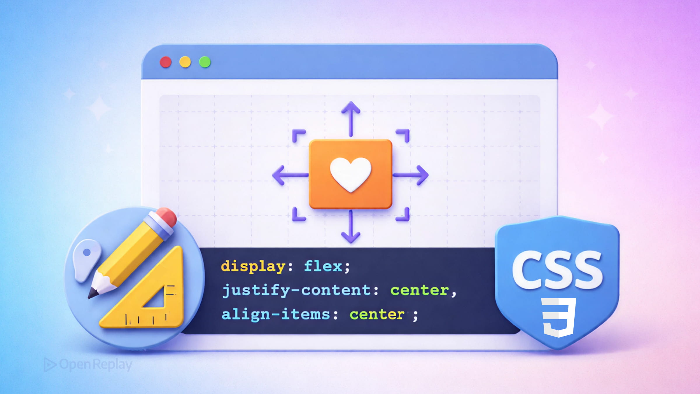
Flexbox is the most practical modern CSS centering technique for aligning items within a container, especially when you have multiple children or need directional control:
.container {
  display: flex;
  justify-content: center; /* horizontal */
  align-items: center;     /* vertical */
  min-height: 100dvh;
}
Note: Use
min-height: 100dvhinstead ofheight: 100vhfor full-viewport layouts. Thedvhunit accounts for dynamic browser UI on mobile (address bars, toolbars), which100vhdoes not handle correctly. Dynamic viewport units are now widely supported across modern browsers and tracked at https://webstatus.dev/features/viewport-unit-variants.
justify-content controls alignment along the main axis. align-items controls the cross axis. Together they center any child element regardless of its dimensions. This is the right choice when you’re centering multiple items or need gap and direction control.

Discover how at OpenReplay.com.
CSS Grid Centering: The Shortest Path
For centering a single element inside a container, CSS Grid with place-items is the most concise option:
.wrapper {
  display: grid;
  place-items: center;
  min-height: 100dvh;
}
place-items: center is shorthand for align-items: center and justify-items: center. It centers the child on both axes in two declarations. If you only need to center one element and don’t need complex layout logic, this is the cleanest approach.
You can also apply centering from the child side using place-self: center or margin: auto on a grid item, which is useful when you don’t control the parent’s CSS.
Which Method Should You Use?
| Scenario | Method |
|---|---|
| Center text or inline content | text-align: center on parent |
| Center a block horizontally | margin-inline: auto when the element is narrower than its container |
| Center one element (both axes) | Grid place-items: center |
| Center multiple items | Flexbox justify-content + align-items |
A Note on Newer CSS Capabilities
CSS Anchor Positioning lets you align an element relative to another specific element — useful for tooltips, popovers, and attached UI. The feature has recently reached modern browser availability and is tracked at https://webstatus.dev/features/anchor-positioning. For general page centering, however, Flexbox and Grid remain the reliable standard developers use today.
Conclusion
Centering in CSS stops being frustrating once you match the technique to the layout context. Use margin-inline: auto for horizontal flow layout, Flexbox when aligning multiple items, and Grid place-items: center when you just need something in the middle. That covers the vast majority of what you’ll encounter in real frontend work.
FAQs
In normal flow layout, margin auto only distributes horizontal space because block elements do not automatically expand to fill vertical space. The parent typically has no explicit height, so there is no vertical space to split. To center vertically in typical layouts, switch the parent to a Flexbox or Grid context, which provides alignment controls along both axes.
Use Flexbox when you need to center multiple child elements, control spacing with gap, or manage directional flow. Grid with place-items center is ideal for centering a single element with minimal code. Both work for vertical and horizontal centering, so the choice depends on whether you need additional layout control beyond centering itself.
The vh unit equals one percent of the viewport height as reported at page load, which on mobile browsers may include space hidden behind the address bar. The dvh unit recalculates as the browser UI expands or collapses, giving you the actual visible height. Use min-height with 100dvh for full-screen layouts to avoid content being clipped on mobile.
Yes, place-items center works with multiple children in a grid container. Each child will be centered within its own grid cell. However, if you have not defined explicit rows or columns, Grid auto-places children into a single column by default, stacking them vertically. For more control over multi-item layouts, Flexbox is often the better choice.
Complete picture for complete understanding
Capture every clue your frontend is leaving so you can instantly get to the root cause of any issue with OpenReplay — the open-source session replay tool for developers. Self-host it in minutes, and have complete control over your customer data.
Check our GitHub repo and join the thousands of developers in our community.