Charting and Graphing in React with Recharts
Use Recharts to create impressive charts for your app.


Graphs and charts are effective visual aids because they make information easy to understand and accessible. Therefore, it is not unexpected that print and electronic media frequently use graphs. Data presented as a graph instead of a table can frequently be simpler to grasp because the graph may demonstrate a pattern or comparison.
Have you ever wondered about adding graphs and charts to a website or other little project for work? So have I, and in this article, I’ll show you how to solve this issue in a very simple but effective way.
Installing and setting up Recharts
Recharts is a D3 and React-based Redefined chart framework. The main objective of this library is to make it simple for you to add charts to React apps. Recharts’ guiding principle is: Deploy React components simply.
That said, head into your terminal and type the command below to install the recharts package.
npm install rechartsOnce installed, the next thing to do is to import the package components into your project. For this project, we will create several graphs/charts, so I will import a few components, as seen below.
    import React from "react";
    import {
      Area,
      AreaChart,
      Bar,
      BarChart,
      Line,
      XAxis,
      YAxis,
      CartesianGrid,
      Tooltip,
      Legend,
      Scatter,
      ScatterChart,
      LineChart,
      PieChart,
      Pie,
      PolarAngleAxis,
      Radar,
      RadarChart,
      PolarGrid,
      PolarRadiusAxis
    } from "recharts";
We now need to add some data to the project, which will be displayed on the graphs/charts. Inside the react function, create a variable that will contain an array of the data we will be using for this project.
    // Add some mock data
    const data = [
      {
        month: 'January',
        savings: 5000,
        loss: 500
      },
      {
        month: 'February',
        savings: 8000,
        loss: 300
      },
      {
        month: 'March',
        savings: 3000,
        loss: 800
      },
      {
        month: 'April',
        savings: 6000,
        loss: 100
      },
      {
        month: 'May',
        savings: 4000,
        loss: 700
      },
      {
        month: 'June',
        savings: 9000,
        loss: 1200
      },
    ]
I have a data variable with an array of my monthly budgets, specifically my saves and losses, as can be seen above. With my data, we can now begin making graphs and charts.
Creating a Line Chart
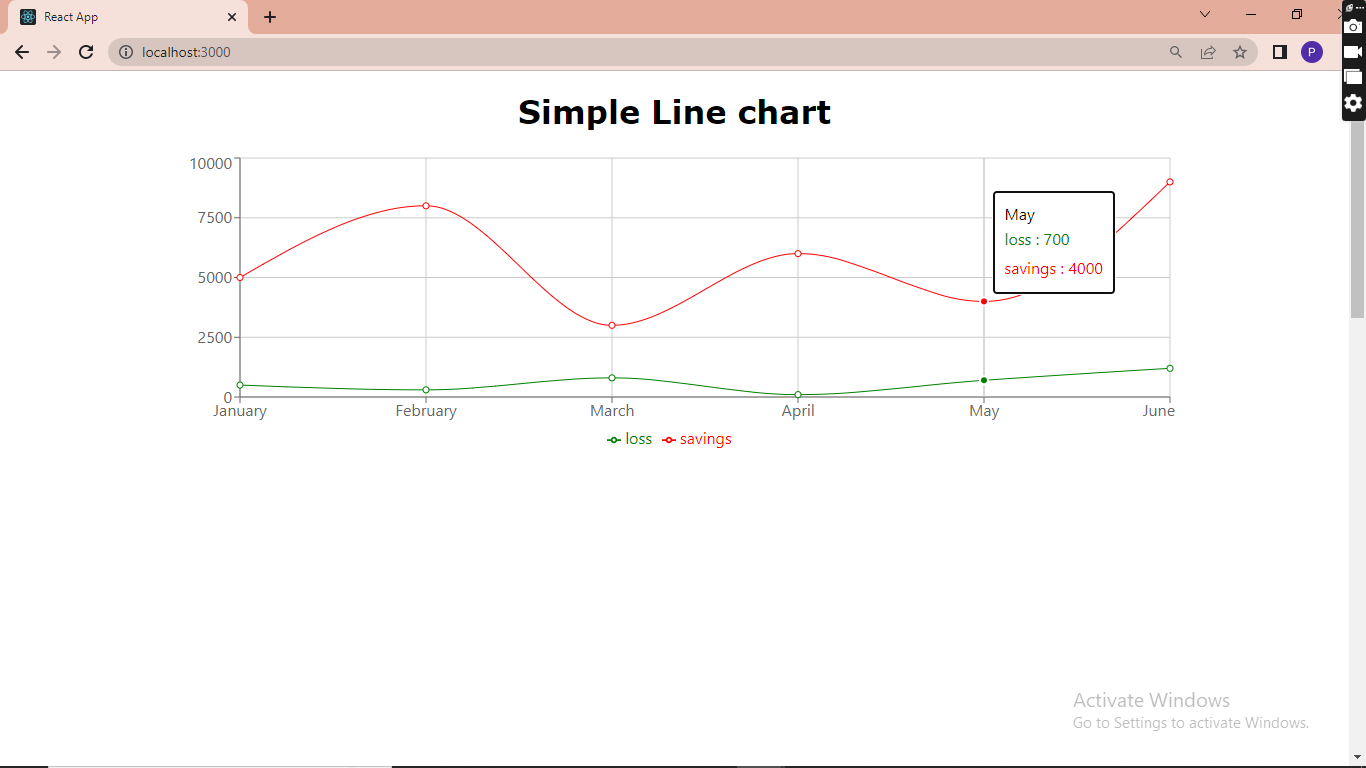
To create a simple line chart, you must add a LineChart element. Then add width, height, and data to the line chart element as attributes, then open the element.
Inside the element, add the cartesian grid element, the x-axis element with a dataKey of the month, then the y-axis element, tooltip, and legend elements.
Then, add the Line element with a type of monotone, a dataKey of savings from our mock data, and a stroke that gives the lines a color.
Repeat the action on the following line but with a different stroke. This is to get two lines in our Line Chart.
    <h1>Simple Line chart</h1>
       <LineChart width={1000} height={300} data={data}>
        <CartesianGrid></CartesianGrid>
        <XAxis dataKey="month"></XAxis>
        <YAxis></YAxis>
        <Tooltip> </Tooltip>
        <Legend></Legend>
        <Line type="monotone" dataKey="loss" stroke="green" />
        <Line type="monotone" dataKey="savings" stroke="red"/>
       </LineChart>
Once done, save the code and head into your browser. You should see a Line Chart similar to mine below.
Creating an Area Chart
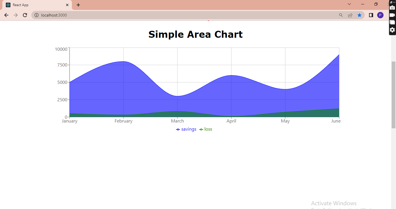
The process of creating an area chart is quite similar to that of the Line Chart. Still, in this case, you will create an AreaChart element and add the cartesian grid element, the x-axis element with a dataKey of the month, then the y-axis element, tooltip, and legend elements.
Lastly, You add the two Area elements with a type of monotone, a dataKey of savings from our mock data, a stroke, and a fill for coloring.
     <h1>Simple Area Chart</h1>
       <AreaChart width={1000} height={300} data={data}>
        <CartesianGrid></CartesianGrid>
        <XAxis dataKey="month"></XAxis>
        <YAxis></YAxis>
        <Tooltip> </Tooltip>
        <Legend></Legend>
        <Area type="monotone" dataKey="savings" stroke="blue" fill="blue"/>
        <Area type="monotone" dataKey="loss" stroke="green" fill="green"  />
        </AreaChart>
After finishing, save the code and open your browser. You ought to see an Area chart that resembles mine below.
Session Replay for Developers
Uncover frustrations, understand bugs and fix slowdowns like never before with OpenReplay — an open-source session replay tool for developers. Self-host it in minutes, and have complete control over your customer data. Check our GitHub repo and join the thousands of developers in our community.
Creating a Pie Chart
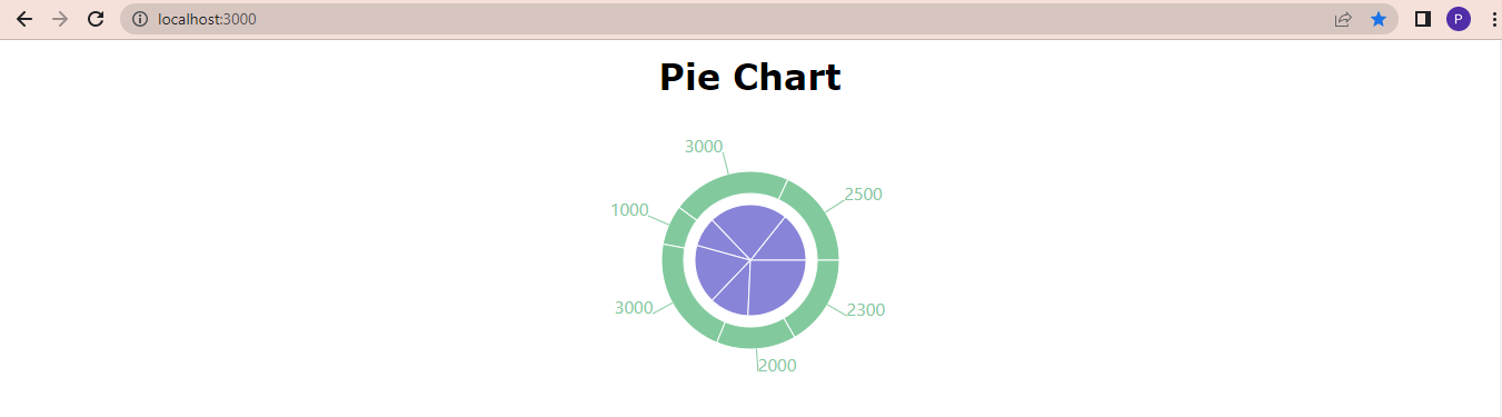
You must construct a PieChart element to make a pie chart using Recharts and give the element a height and width. Then just below the PieChart element, add the Pie element with some attributes such as:
data: the mock data we created at the beginning of the tutorial.
dataKey: the values savings and loss in the objects.
nameKey: the month value in the object.
cx and cy: the x and y coordinates of the center.
outerRadius and innerRadius: the outer and inner radius of the sectors.
Then close the PieChart element, and that’s all.
<h1>Pie Chart</h1>
<PieChart width={1000} height={300}>
  <Pie
    data={data}
    dataKey="savings"
    nameKey="month"
    name="savings"
    cx="50%"
    cy="50%"
    outerRadius={50}
    fill="#8884d8"
  />
  <Pie
    data={data}
    dataKey="loss"
    nameKey="month"
    name="loss"
    cx="50%"
    cy="50%"
    innerRadius={60}
    outerRadius={80}
    fill="#82ca9d"
    label
  />
</PieChart>
It should look like the following:
Creating a Simple and Stacked Bar Chart
The process of creating a Bar chart is similar to that of the Area chart. Still, in this case, you will be Creating a BarChart element and inserting those other elements earlier mentioned, and then replacing the Area element with a Bar element.
<h1>Simple Bar Chart</h1>
<BarChart width={1000} height={300} data={data}>
<CartesianGrid></CartesianGrid>
<XAxis dataKey="month"></XAxis>
<YAxis></YAxis>
<Tooltip> </Tooltip>
<Legend></Legend>
<Bar type="monotone" dataKey="savings" fill="blue"/>
<Bar type="monotone" dataKey="loss" fill="green" />
</BarChart>
It should look like the following:

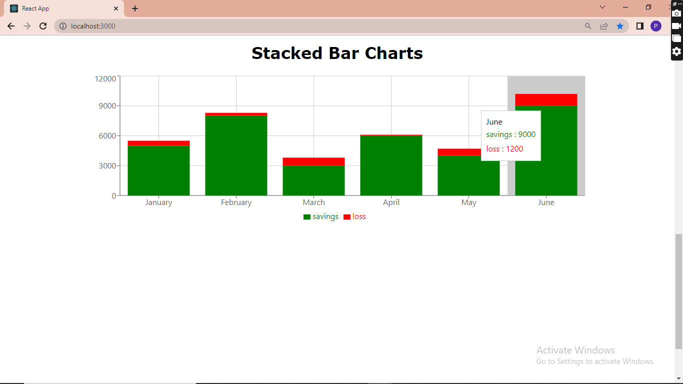
Secondly, the Stacked Bar Chart's only distinction from the simple Bar Chart is that a `stackId` is required and added as an attribute in the bar element, as seen below.
```javascript
<h1>Stacked Bar Charts</h1>
<BarChart width={1000} height={300} data={data}>
<CartesianGrid></CartesianGrid>
<XAxis dataKey="month"></XAxis>
<YAxis></YAxis>
<Tooltip> </Tooltip>
<Legend></Legend>
<Bar type="monotone" dataKey="savings" stackId="a" fill="green"/>
<Bar type="monotone" dataKey="loss" stackId="a" fill="red" />
</BarChart>Observe the stackId added after the dataKey inside the bar element. Your stacked bar chart should look like the below:
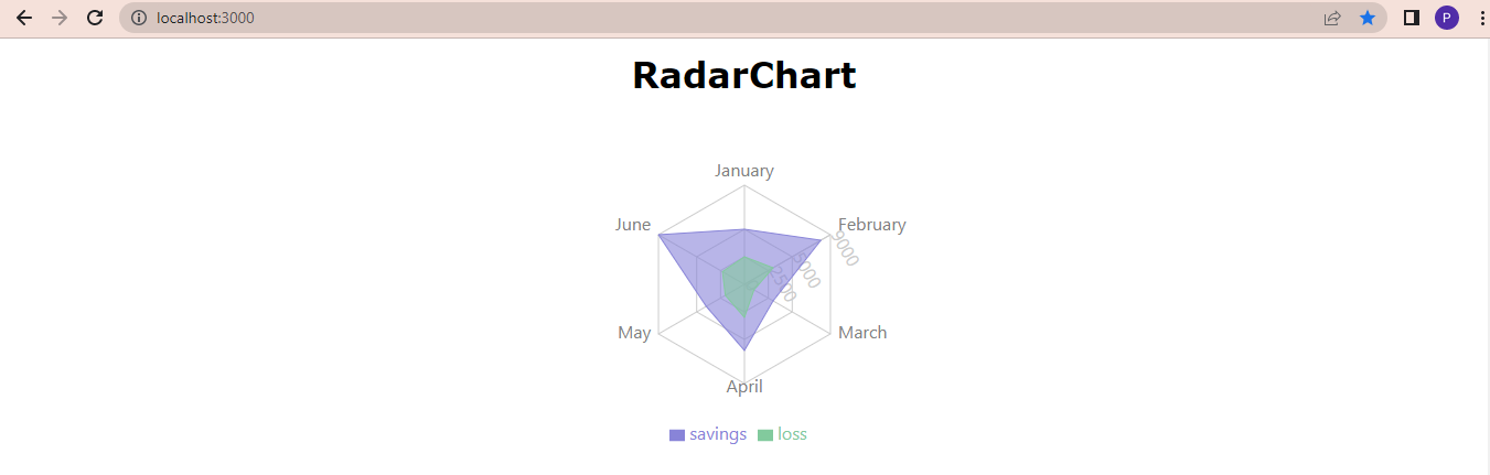
Creating a RadarChart
To create a radar chart, you must add a RadarChart element with a width and height. Inside the radar Chart element, add a PolarGrid element, a PolarAngleAxis element consisting of a dataKey attribute, a PolarRadiusAxis element consisting of an angle and domain attributes, a Legend element and then a Radar element that holds some attributes such as the name, dataKey, stroke, fill and fillOpacity. Then finally, close the RadarChart element and head into your browser.
<h1>RadarChart</h1>
  <RadarChart outerRadius={90} width={1000} height={300} data={data}>
    <PolarGrid />
    <PolarAngleAxis dataKey="month" />
    <PolarRadiusAxis angle={30} domain={[0, 150]} />
    <Legend />
    <Radar
      name="savings"
      dataKey="savings"
      stroke="#8884d8"
      fill="#8884d8"
      fillOpacity={0.6}
    />
    <Radar
      name="loss"
      dataKey="loss"
      stroke="#82ca9d"
      fill="#82ca9d"
      fillOpacity={0.6}
    />
</RadarChart>
Your Radar Chart should look like the below:
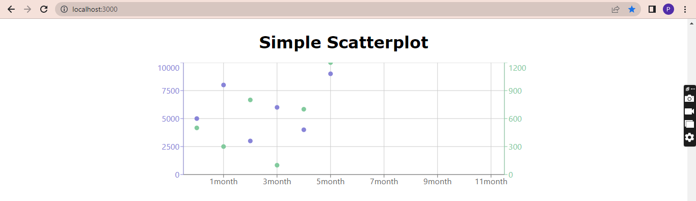
Creating a Simple Scatterplot
This is quite different from the rest. To create a scatterplot, you would need to add a Scatterplot element, and inside this element, add the cartesian grid element, the x-axis element with a name attribute month and a unit month. The y-axis element too will have an Id set to left and a type of number, dataKey of savings, and name savings with a stroke.
We will also have a second y-axis with an Id set to right, a type of number, a dataKey, and name of loss with a stroke. This sets the losses at the right side of the chart, as seen below.
Then add the tooltip elements (Observe that the Legend element was not added)
Then add two Scatter elements below, one with the Id set as left and the other set as right, and include the data and two fill colors as attributes.
<h1>Simple Scatterplot</h1>
<ScatterChart
  width={750}
  height={250}
  margin={{ top: 0, right: 0, bottom: 0, left: 0 }}
>
  <CartesianGrid />
  <XAxis name="month" unit="month" />
  <YAxis
    yAxisId="left"
    type="number"
    dataKey="savings"
    name="savings"
    stroke="#8884d8"
  />
  <YAxis
    yAxisId="right"
    type="number"
    dataKey="loss"
    name="loss"
    orientation="right"
    stroke="#82ca9d"
  />
  <Tooltip cursor={{ strokeDasharray: "3 3" }} />
  <Scatter yAxisId="left" name="Savings" data={data} fill="#8884d8" />
  <Scatter yAxisId="right" name="loss" data={data} fill="#82ca9d" />
</ScatterChart>
Once saved, your scatterplot should look like the below:
Conclusion
We have investigated a method that makes using charts and graphs in everyday work considerably simpler, quicker, and less laborious. Recharts significantly reduces this burden and makes it more orderly without the addition of a style or many functions.
Github repo: https://github.com/Preshy30/charting-with-recharts.git
Gain Debugging Superpowers
Unleash the power of session replay to reproduce bugs and track user frustrations. Get complete visibility into your frontend with OpenReplay, the most advanced open-source session replay tool for developers.