Responsive Design on Steroids: CSS Container Queries
Use this CSS feature for responsive design

Container queries, the highly anticipated feature in responsive design, have finally reached stability, and they live up to the hype! This article will explore the limitations of traditional media queries and how container queries provide elegant solutions. It will also dive into the mechanics of container queries to give you a hands-on experience of their awesomeness by making a webpage sidebar more responsive with container queries.

Discover how at OpenReplay.com.
In the world of web design, developers have continually strived to create web pages that are seamless and user-centric through the use of media query breakpoints.
Media queries are a cornerstone of responsive web design, enabling you to apply diverse styles and layout rules to a webpage based on specific attributes of the user’s device or viewport. These attributes include screen width, height, device orientation, and even the type of media used to display the content, such as print or screen.
On the other hand, container queries revolutionize our approach to designing web page layouts.
Similar to media queries, container queries serve as responsive breakpoints that dictate the layout and content order based on the available space within a web page. However, they offer a distinct advantage: rather than relying on the entire browser screen’s viewpoint, container queries allow breakpoints to be determined by the space available to individual elements.
Furthermore, container queries enable an element’s breakpoint to be adjusted to the most optimal layout based on the available space of another element, typically its parent. Everything, from backgrounds and borders to buttons, fonts, and layouts, can be dynamically altered.
To fully grasp the excellence of container queries, let’s dive into an illustrative example:
- Create a new html file,
containerVsMedia.html
<!doctype html>
<html lang="en">
  <head>
    <meta charset="UTF-8" />
    <meta name="viewport" content="width=device-width, initial-scale=1.0" />
    <title>Media vs Container Queries</title>
    <style>
      /* Media Query Styles */
      @media screen and (max-width: 600px) {
        .media-box {
          background-color: lightblue;
          width: 100px;
          height: 100px;
        }
      }

      /* Container Query Styles */
      .container {
        width: 50%;
        border: 1px solid #ccc;
        padding: 10px;
        container-type: inline-size;
      }

      .container-query-box {
        background-color: lightcoral;
        width: 50%;
        height: 100px;
      }

      /* Container Query */
      @container (min-width: 300px) {
        .container-query-box {
          background-color: lightgreen;
        }
      }
    </style>
  </head>

  <body>
    <h2>Media Query Example</h2>
    <p>Box with media query:</p>
    <div class="media-box"></div>

    <h2>Container Query Example</h2>
    <div class="container">
      <p>Box with container query:</p>
      <div class="container-query-box"></div>
    </div>
  </body>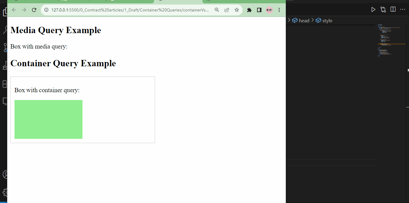
</html>- To explain this, there are two elements: one illustrates the use of media queries and the other showcases container queries.
- Let’s begin with the media query box. When the viewport width is
600pxor less, the background color of the.media-boxtransforms to light blue. - Moving on to the container query box, the container
divelement occupies 50% of the viewport width, while the.container-query-boxwithin it features a light coral background. - However, a container query comes into play, changing the background color of the element inside the container to light green when the container width exceeds
300pxand reverting to coral when the containerdivelement contracts to less than300px. - Hence, for the box example using container queries, we can control the behavior of its child element based on what happens to it instead of how the viewport changes.
- In the image below, the media query box is hidden as the entire viewport changes, but the container query box changes because of the change its parent element receives:
Don’t worry about the syntax at this stage; I’ll explain shortly.
The example might be a little oversimplified, but here are some advantages of using container queries in containerVsMedia.html:
Targeted Element-based Queries
In containerVsMedia.html, container queries target the .container-query-box element inside a specific container. This means you can apply styles based on the container’s dimensions rather than the global viewport.
Container queries allow you to make design decisions based on the specific context of elements, which is especially useful when you want elements to respond to their parent containers. With media queries, you typically respond to the entire viewport.
Scoped Style
In the container query section, the element’s background color with .container-query-box class is changed to light green when it’s inside a container with a minimum width of 300px. The change is scoped to this specific container.
Container queries enable scoped styles, meaning changes in one part of the layout don’t affect the rest of the page. This is in contrast to media queries, where changes are often global.
Component-based Design
The container query allows you to treat the .container element and its contents as a self-contained component with its own responsive behavior.
It’s more modular and easier to manage. Container queries promote a component-based approach to design, making it easier to build and maintain complex layouts.
Media queries can sometimes lead to interdependencies between elements, making maintenance more challenging.
Variable-Based Responsive Design
While not explicitly shown in containerVsMedia.html, container queries can allow you to respond to fixed-width breakpoints and variable conditions within containers.
You can adjust styles based on percentages, specific dimensions, or other container properties. This variable-based approach provides more flexibility in how elements respond to changes in container size, which is not as easily achievable with traditional media queries.
How Container Queries Work
Container queries have a remarkable feature: each component takes charge of its responsive behavior. This means that container queries seamlessly integrate with component-based architecture and environments. Achieving component-level responsiveness becomes significantly more straightforward if you aim to synchronize styles with component logic on the front end.
Gone are the days of needing an extra higher-level file to oversee responsive styles for various components or struggling to adapt a responsive component to different contexts. Each component can autonomously adjust to the available space within its parent element.
Pretty cool, isn’t it? Now, let’s delve into the mechanics.
CSS containment
Container queries diverge from the notion that your page layout must perfectly align with your component layout to achieve responsive design. It’s much easier to disentangle page layouts from individual component layouts, enhancing interface flexibility.
This used to entail much scripting and was prone to errors. However, it’s now an inherent part of CSS, thanks to CSS containment.
To kickstart using container queries, the first step is to apply containment to the parent element. Containment encompasses a suite of features that grant you control over how an element or a group of elements interact with the rest of the page.
CSS containment offers a reliable means to isolate a Document Object Model (DOM) subtree from the rest of the page. As a result, it enhances the browser’s rendering performance and empowers it to isolate queries for container queries.
With CSS containment, you can inform the browser which sections of the page encapsulate a distinct set of content, allowing the browser to analyze that content without considering the broader context outside that subtree. It puts the focus squarely on the subtree!
By identifying the sections of content or isolated subtrees, the browser gains the ability to optimize rendering decisions, ultimately improving page rendering performance.
Container query syntax
There are four categories of CSS containment: size, layout, style, and paint. Each type serves a specific purpose:
-
Layout Containment: This category focuses on regulating the layout of an element and its descendants. It affects how an element’s size and position are determined within the layout.
-
Paint Containment: Paint containment is dedicated to managing the rendering of an element and its descendants. It influences how elements are painted and repainted on the screen.
-
Style Containment: Style containment revolves around controlling the styles of an element and its descendants. It determines how an element’s styles are computed and what factors can impact them.
-
Size Containment: Size containment prevents the contained element from impacting the size of its parent element.
These containment types can be used individually or combined to achieve specific effects. To implement container queries, you’ll need to set size, layout, and style containment all at the same time.
Note: All the code snippets provided under this heading are meant for explanation only and are not used to achieve or show results.
Imagine you wanted to style a container element with a .card-container class using container queries; the code snippets show the syntax you would use for different purposes.
.card-container {
  contain: style layout inline-size;
  width: 100%;
}- To enable CSS containment on the
.card-container, you will need to declarestyle,layout, and size (represented byinline-size).inline-sizemeans that the size of the container is responsive to width but not height. - If you want the container’s size responsive to width and height, simply replace
inline-sizewithsize.
.card-container {
  contain: style layout size;
  width: 100%;
}
To simplify the process of setting container queries, the syntax can be shortened to:
.card-container{
    container-type: inline-size;
    width: 100%
}- This syntax inherently defines the style and layout, leaving you with the choice of size containment.
There’s a shorter way to declare containment, allowing you to name the container as well:
.card-container {
  container: inline-size / the-container;
  width: 100%;
}the-containerserves as the container name, and it proves handy if you intend to apply containment to another element within that parent element later in your code. While optional, it becomes especially valuable when dealing with multi-level container queries, aiding in easy reference.
If you wish to query styles on child elements within .card-container, you can achieve this using the following syntax:
.card-container {
  container-type: inline-size;
  width: 100%;
}

@container (max-width: 250px) {
  .child-container {
    display: flex;
    align-items: center;
    gap: 2rem;
  }
}- The
@containermedia feature is the key to achieving this. - Importantly, this behavior is intrinsic, relying on the size of
.card-container, not the entire browser viewport. - When
.card-containershrinks to less than250px, and if.child-containeris nested within.card-container, it triggers a flex direction with associated flex properties for.child-container.
Container query units
Container queries also introduce a noteworthy feature: container query-based unit values.
While viewport-relative units like vh and vw are commonly used for sizing and spacing UI elements, these new container query units allow you to define sizing based on the container’s width and height. These units are prefixed with “cq”, much like viewport units are prefixed with “v”:
-
cqw - 1% of a query container’s width: This unit represents a length equal to 1% of the width of the container in which it is used. So if the container is 1000 pixels wide, cqw(1) would be 10 pixels (1% of 1000).
-
cqh - 1% of a query container’s height: Similar to cqw, cqh represents a length equal to 1% of the height of the container. If the container’s height is 800 pixels, cqh(2) would be 16 pixels (2% of 800).
-
cqi - 1% of a query container’s inline-size: Inline-size is essentially a dimension corresponding to the width in horizontal writing modes and the height in vertical writing modes. So cqi represents 1% of this inline-size.
-
cqb - 1% of a query container’s block-size: Block-size is the opposite of inline-size. In horizontal writing modes, it’s the height; in vertical writing modes, it’s the width. So cqb represents 1% of this block-size, allowing for more adaptability in different writing modes.
-
cqmin - The smaller value of cqi or cqb: This represents the minimum value between cqi and cqb. So, if cqi is 20 pixels and cqb is 15 pixels,cqmin would be 15 pixels.
-
cqmax - The larger value of cqi or cqb: This represents the maximum value between cqi and cqb. If cqi is 20 pixels and cqb is 15 pixels, cqmax would be 20 pixels.
Demo: styling layouts
To effectively showcase the practicality of container queries, let’s explore a common real-world scenario that developers often encounter. Imagine a simple webpage layout containing a text section and a sidebar.
When crafting layouts with multiple components, making each component behave uniquely can be frustrating. For instance, achieving distinct layouts for a sidebar compared to the main content can be challenging.
This is precisely where container queries come into play. We’ll discover how they provide a simpler way to make components behave differently when achieving this through default browser responsiveness and media queries can be complex.
The demo will unfold in two phases. First, we’ll swiftly create the webpage. Then, we’ll identify a real-life problem where container queries simplify the solution.
Making the webpage
The demo has two main divisions: a content page and a sidebar. To keep the article concise, I’ll provide the structure and styling for the webpage with a short description.
- Create two files, one for HTML and one for CSS.
/containerQuery.html
/containerQuery.css- Create the HTML structure in
containerQuery.html
<!doctype html>
<html lang="en">
  <head>
    <meta charset="UTF-8" />
    <meta name="viewport" content="width=device-width, initial-scale=1.0" />
    <title>Container Page</title>
    <link rel="stylesheet" href="containerQuery.css" />
  </head>

  <body>
    <main>
      <article>
        <h1 class="page-title">Open Replay Blog</h1>
        <p>
          Lorem ipsum, dolor sit amet consectetur adipisicing elit. Similique
          doloribus doloremque tempora deleniti eveniet numquam.
        </p>
        <p>
          Incidunt esse quia quos? Cumque minima aliquid ut placeat nobis,
          quisquam eum omnis neque molestias.
        </p>
        <p>
          Aperiam temporibus autem ullam. Totam nesciunt quis blanditiis quas
          deserunt aperiam maxime debitis beatae tenetur!
        </p>
        <div class="call-to-action">
          <h2 class="section-title">This is an insightful blog!</h2>
          <p>Read about the latest tech from the best developers.</p>
          <button class="button">Read more</button>
        </div>
        <p>
          Lorem ipsum dolor sit amet, consectetur adipisicing elit. Amet
          mollitia laboriosam inventore in voluptas fuga perspiciatis, cumque
          adipisci assumenda? Veritatis.
        </p>
        <p>
          Magni nostrum animi modi similique voluptatibus, tenetur aliquam
          dignissimos voluptates et totam? Veritatis doloribus, harum obcaecati
          voluptas quam dolores id.
        </p>
        <p>
          Quo quia quod error, accusantium debitis voluptatibus, cupiditate
          delectus aspernatur dignissimos sapiente voluptate incidunt beatae
          natus deserunt officia provident veniam.
        </p>
        <p>
          Officia architecto, praesentium reprehenderit doloribus cumque
          blanditiis. Veritatis error hic modi ad dicta. Dicta, aspernatur
          dolores vero itaque omnis eum.
        </p>
        <p>
          Sed, vitae, dolore atque deleniti quam ex expedita quae ducimus eos
          quis, voluptates et assumenda autem magnam molestias ullam obcaecati.
        </p>
      </article>
      <aside>
        <div class="call-to-action">
          <h2 class="section-title">This is an insightful blog!</h2>
          <p>Read about the latest tech from the best developers.</p>
          <button class="button">Read more</button>
        </div>
      </aside>
    </main>
  </body>
</html>- as mentioned earlier, the structure comprises a
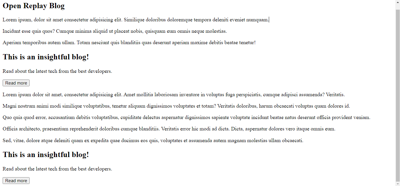
mainelement containing anarticleelement layout with components for headings and text. Additionally, there is anasideelement for the sidebar, which includes adivfor a call to action. - The plain HTML output for our demo is shown below:
- On to
containerQuery.cssfor styling.
body {
  font-family: -apple-system, BlinkMacSystemFont, "Segoe UI", Roboto, Oxygen,
    Ubuntu, Cantarell, "Open Sans", "Helvetica Neue", sans-serif;
}

main {
  max-width: 85em;
  margin-inline: auto;
  display: grid;
  align-items: start;
  gap: 2rem;
}

@media (min-width: 50em) {
  main {
    grid-template-columns: 1fr 12rem;
  }
}

aside {
  background: var(--beige);
}

.call-to-action {
  display: grid;
  gap: 1rem;
  background: var(--beige);
  padding: 2rem;
}

@media (min-width: 650px) {
  .call-to-action {
    grid-template-columns: 1fr min(10rem, 1fr);
  }

  .call-to-action > :not(.button) {
    grid-column: 1 / 2;
  }

  .call-to-action > .button {
    grid-row: 1 / 3;
    grid-column: 2 / 3;
    align-self: center;
    justify-self: end;
  }
}

/* general styling */

:root {
  --beige: #f2ffe9;
  --green-500: #557c55;
  --green-300: #a6cf98;
}

* {
  box-sizing: border-box;
  margin: 0;
}

body {
  font-family: system-ui;
  font-size: 1.125rem;
  line-height: 1.6;
  padding: 2rem;
}

h1,
h2,
h3 {
  font-weight: 900;
  color: var(--green-500);
  line-height: 1.1;
}

.page-title {
  margin-block-end: 2em;
}

.flow > :where(:not(:first-child)) {
  margin-top: 1em;
}

.button {
  cursor: pointer;
  border: 0;
  text-decoration: none;
  background: transparent;
  padding: 0.75em 1.5em;
  border-radius: 100vw;
  background: var(--green-300);
  font-size: 1rem;
  text-transform: uppercase;
  font-weight: 700;
  color: var(--beige);
  line-height: 1;
}- This makes the page look better.
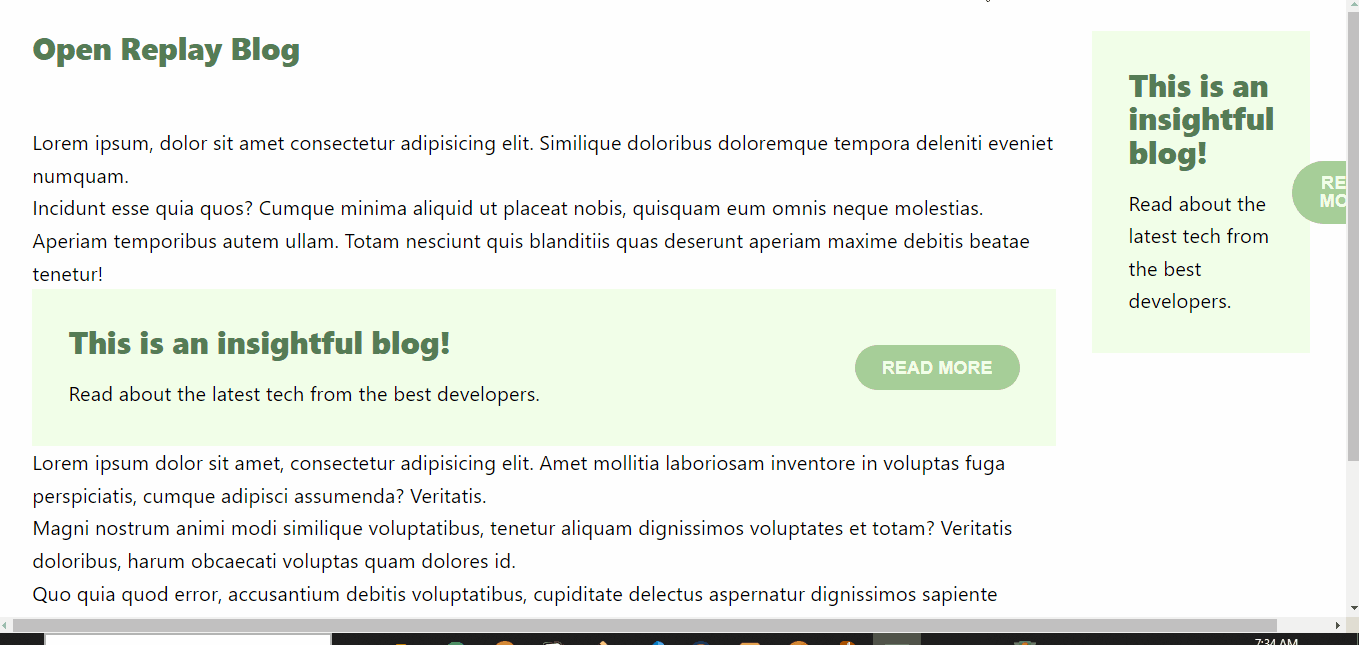
- Our demo has been styled and looks delightful, as shown below:
Solving a design problem
Achieving responsiveness has become more straightforward with the continuous improvement of new browser versions. However, as the modern web relies on component-based structures, diverging from the one-size-fits-all approach of the past decade, there are situations where traditional media queries prove insufficient. In such cases, emerging technologies like container queries are the preferred solution. We’ll explore one of these instances.
In containerQuery.html, the div with the .call-to-action class is used in the article and aside elements.
Since both .call-to-action components use the same class, we opted to use media queries in containerQuery.css to control the responsivity of both components.
@media (min-width: 50em) {
  main {
    grid-template-columns: 1fr 12rem;
  }
}

/*some other CSS*/

@media (min-width: 650px) {
  .call-to-action {
    grid-template-columns: 1fr min(10rem, 1fr);
  }

  .call-to-action > :not(.button) {
    grid-column: 1 / 2;
  }

  .call-to-action > .button {
    grid-row: 1 / 3;
    grid-column: 2 / 3;
    align-self: center;
    justify-self: end;
  }
}- These media queries style the webpage layout and the
.call-to-actionsections at a specific viewport, making components stack and expand as the viewport changes.
This approach works well if you desire uniform behavior among your webpage components based on the viewport.
However, a notable issue arises. When the page is in a larger view, the button appears beside the text in the sidebar component, which isn’t optimal for design.
In the image below, the “READ MORE” oversteps, extending the webpage and ruining the design:
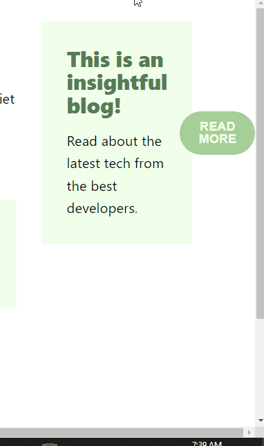
The problem happens because the <div class="call-to-action"> element only responds to the viewport and assumes a layout without any proper way to direct its child components.
Creating modifier classes would be necessary to achieve specific responsive behaviors in this scenario, potentially complicating the CSS code. As we know, CSS can become messy when it becomes too much:
Nevertheless, with container queries, we can easily make the button in the sidebar stack under the text with just a few subtle changes in containerQuery.css.
- Make the direct descendants of the
mainelement containers to enable modular control of child components.
main > * {
  container-type: inline-size;
}- Replace the commented media query with a container query.
/* @media (min-width: 650px){ */
@container (min-width: 650px) {
  .call-to-action {
    grid-template-columns: 1fr min(10rem, 1fr);
  }

  .call-to-action > :not(.button) {
    grid-column: 1 / 2;
  }

  .call-to-action > .button {
    grid-row: 1 / 3;
    grid-column: 2 / 3;
    align-self: center;
    justify-self: end;
  }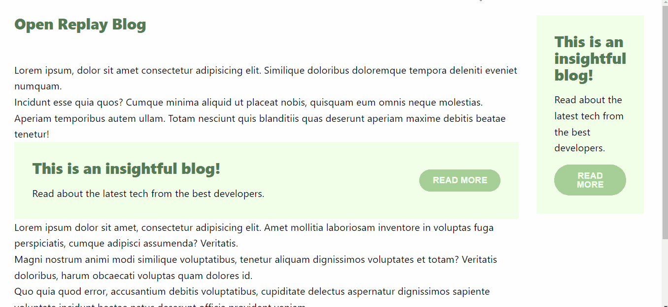
}- Voila! This arrangement causes the text and button components of the sidebar to stack on top of one another. This is a significant improvement compared to situations where achieving this effect was challenging.
- By situating the
.call-to-actionbutton in a narrow sidebar, the container query detects that this component should be treated as a distinct unit. Consequently, it applies styles for a smaller, more compact button. This ensures that the button consistently appears fitting for its context and avoids overwhelming the layout. - Observe in the image below that the design problem has been solved, and the “READ MORE” button no longer extends the webpage:

Container queries are like having a smart assistant that helps you adapt your website’s design to different situations. It’s like having a tailor-made outfit for every occasion on your website.
Debugging container queries with Devtools
To prepare for debugging container queries, let’s explore how to inspect the webpage demo using Chrome Developer Tools.
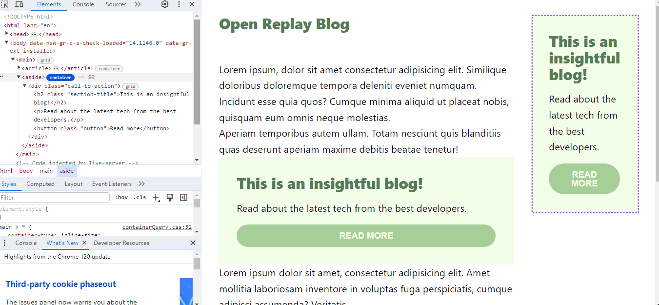
- Open Chrome Developer Tools to inspect the webpage. You can do this by right-clicking on an element with containment settings and selecting “Inspect,” or by pressing Option + ⌘ + J (on macOS) or Shift + CTRL + J (on Windows/Linux). You can choose to click on the options as depicted below:
- Next, navigate to the parent element where containment is applied and click on the container badge. This icon, resembling the grid and flexbox badges, helps to quickly identify container elements on the webpage. In the image below, I am clicking on the container badge of one of the container elements.
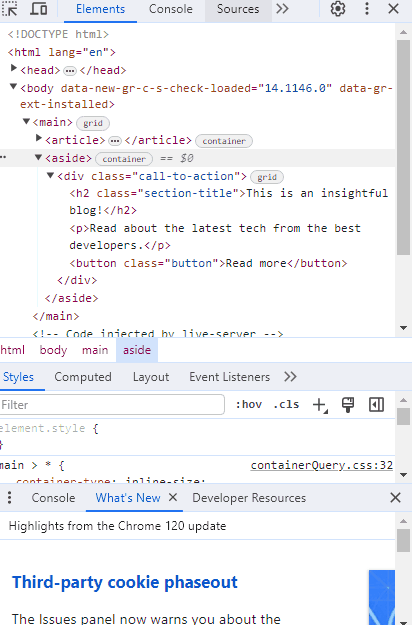
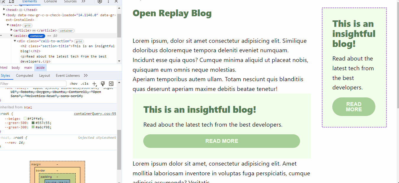
- Clicking on the container badge activates an overlay on the parent container and all its querying descendants. This overlay visually represents how the container and its descendants are arranged. The image below shows the overlay of the container elements and its descendants:
- Beyond just viewing, you can edit the container query in DevTools. Dynamically edit the elements within DevTools to observe real-time changes in the container. For instance, when inspecting the
asideelement in our demo, you can edit the display of buttons by clicking the checkbox, and the User Interface (UI) instantly reflects these alterations. Notice how the “READ MORE” button is being altered below, which is something you can find handy if you want to see how your design is modified in real time:
Browser support
At the time of writing this article, here is a list of major browser support for container queries:
Full support
The ability to query a parent’s inline size and container query unit values recently reached stable support in all modern browser engines:
- Chrome: 105
- Edge: 105
- Firefox: 110
- Opera: 91
- Safari: 16
Partial support
However, the ability to style custom property values for elements with containment and allow inheritance of these CSS values for query descendants is not yet available to all browsers:
- Chrome: 111
- Edge: 111
- Firefox: N/A
- Opera: 97
- Safari: N/A
Conclusion
I’m so happy for you; you now have a solid grasp of container queries and how to harness their power for responsive web design.
We’ve covered the distinctions between media and container queries, delved into the workings of container queries, explored the creative possibilities with practical demonstrations, and even provided insights on debugging.
With this knowledge, you’re better prepared to create web layouts that adapt seamlessly to different screen sizes and devices. Container queries open up a world of design opportunities, and your newfound understanding empowers you to craft user experiences that are not only functional but visually engaging.
Stay curious and experiment with container queries as you embark on your web development journey. Happy coding!
Resources - EDIT
Truly understand users experience
See every user interaction, feel every frustration and track all hesitations with OpenReplay — the open-source digital experience platform. It can be self-hosted in minutes, giving you complete control over your customer data.
Star on GitHub12k