
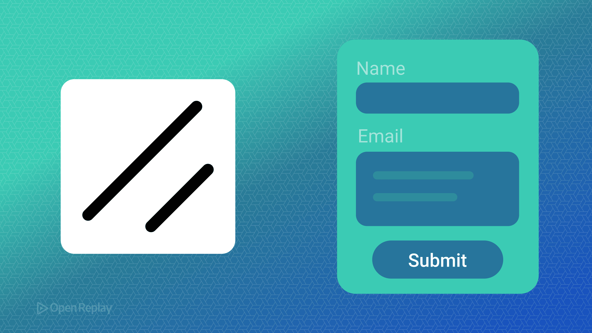
How to Create Accessible Forms Using ShadCN UI

Building forms that are both functional and accessible can be challenging. Between managing state, handling validation, and ensuring proper ARIA attributes, developers often spend countless hours on what should be straightforward tasks. ShadCN UI, combined with React Hook Form and Zod, offers a powerful solution that simplifies form creation while maintaining accessibility standards.
This article demonstrates how to build accessible forms with ShadCN UI, integrate ShadCN UI React Hook Form for state management, and implement ShadCN UI Zod validation patterns that will remain relevant for years to come.
Key Takeaways
- ShadCN UI automatically handles ARIA attributes and accessibility patterns through its composable form system
- React Hook Form integration provides efficient state management with minimal re-renders
- Zod schema validation ensures type-safe form validation with clear error messages
- Built-in components handle label associations, error announcements, and keyboard navigation
Understanding ShadCN UI’s Form Architecture
ShadCN UI provides a composable form system built on React Hook Form and Radix UI primitives. The architecture follows a consistent pattern:
<Form>
  <FormField
    control={form.control}
    name="fieldName"
    render={({ field }) => (
      <FormItem>
        <FormLabel>Field Label</FormLabel>
        <FormControl>
          <Input {...field} />
        </FormControl>
        <FormDescription>Helper text</FormDescription>
        <FormMessage />
      </FormItem>
    )}
  />
</Form>
This structure automatically handles:
- Unique ID generation using
React.useId() - Proper
aria-describedbyandaria-invalidattributes - Error message associations
- Label-input relationships
Setting Up Accessible Forms with ShadCN UI
First, install the necessary components:
npx shadcn@latest add form input textarea checkbox labelThis command installs ShadCN UI components along with React Hook Form and Zod dependencies.
Creating a Basic Form Schema
Define your form structure using Zod for type-safe validation:
import { z } from "zod"

const formSchema = z.object({
  name: z.string().min(2, "Name must be at least 2 characters"),
  email: z.string().email("Invalid email address"),
  message: z.string().min(10, "Message must be at least 10 characters"),
  terms: z.boolean().refine((val) => val === true, {
    message: "You must accept the terms"
  })
})

type FormData = z.infer<typeof formSchema>
Implementing the Form Component
Here’s how to build an accessible contact form using ShadCN UI React Hook Form integration:
import { useForm } from "react-hook-form"
import { zodResolver } from "@hookform/resolvers/zod"
import { Form, FormControl, FormField, FormItem, FormLabel, FormMessage, FormDescription } from "@/components/ui/form"
import { Input } from "@/components/ui/input"
import { Textarea } from "@/components/ui/textarea"
import { Checkbox } from "@/components/ui/checkbox"
import { Button } from "@/components/ui/button"

export function ContactForm() {
  const form = useForm<FormData>({
    resolver: zodResolver(formSchema),
    defaultValues: {
      name: "",
      email: "",
      message: "",
      terms: false
    }
  })

  function onSubmit(data: FormData) {
    console.log(data)
  }

  return (
    <Form {...form}>
      <form onSubmit={form.handleSubmit(onSubmit)} className="space-y-6">
        <FormField
          control={form.control}
          name="name"
          render={({ field }) => (
            <FormItem>
              <FormLabel>Name</FormLabel>
              <FormControl>
                <Input placeholder="John Doe" {...field} />
              </FormControl>
              <FormMessage />
            </FormItem>
          )}
        />

        <FormField
          control={form.control}
          name="email"
          render={({ field }) => (
            <FormItem>
              <FormLabel>Email</FormLabel>
              <FormControl>
                <Input type="email" placeholder="john@example.com" {...field} />
              </FormControl>
              <FormMessage />
            </FormItem>
          )}
        />

        <FormField
          control={form.control}
          name="message"
          render={({ field }) => (
            <FormItem>
              <FormLabel>Message</FormLabel>
              <FormControl>
                <Textarea
                  placeholder="Your message here..."
                  className="resize-none"
                  {...field}
                />
              </FormControl>
              <FormMessage />
            </FormItem>
          )}
        />

        <FormField
          control={form.control}
          name="terms"
          render={({ field }) => (
            <FormItem className="flex flex-row items-start space-x-3 space-y-0">
              <FormControl>
                <Checkbox
                  checked={field.value}
                  onCheckedChange={field.onChange}
                />
              </FormControl>
              <div className="space-y-1 leading-none">
                <FormLabel>
                  Accept terms and conditions
                </FormLabel>
              </div>
              <FormMessage />
            </FormItem>
          )}
        />

        <Button type="submit">Submit</Button>
      </form>
    </Form>
  )
}
Discover how at OpenReplay.com.
Accessibility Features Built-In
ShadCN UI’s form components automatically implement crucial accessibility patterns:
- Proper Labeling: The
FormLabelcomponent uses thehtmlForattribute to associate with form controls - Error Announcements:
FormMessagecomponents are linked viaaria-describedby - Invalid States: Fields automatically receive
aria-invalid="true"when validation fails - Keyboard Navigation: All components support standard keyboard interactions
Advanced Validation Patterns
Implement complex ShadCN UI Zod validation scenarios:
const advancedSchema = z.object({
  password: z.string()
    .min(8, "Password must be at least 8 characters")
    .regex(/[A-Z]/, "Password must contain at least one uppercase letter")
    .regex(/[a-z]/, "Password must contain at least one lowercase letter")
    .regex(/[0-9]/, "Password must contain at least one number"),
  confirmPassword: z.string()
}).refine((data) => data.password === data.confirmPassword, {
  message: "Passwords don't match",
  path: ["confirmPassword"]
})
Best Practices for Accessible Forms
- Always Use Labels: Every input needs a visible label for screen reader users
- Provide Clear Error Messages: Be specific about what went wrong and how to fix it
- Group Related Fields: Use
fieldsetandlegendfor logical groupings - Test with Keyboard: Ensure all interactions work without a mouse
- Validate on Submit: Avoid aggressive inline validation that interrupts users
Conclusion
ShadCN UI transforms form development by combining the power of React Hook Form’s state management with Zod’s type-safe validation, all while maintaining accessibility as a core principle. The component architecture ensures that every form you build meets WCAG standards without requiring manual ARIA attribute management.
By following these patterns, you create forms that work for everyone—regardless of their abilities or assistive technologies. The beauty of this approach lies in its simplicity: accessible forms become the default, not an afterthought.
FAQs
While technically possible, ShadCN UI's form components are designed to work with React Hook Form. Using them without it means losing automatic validation, state management, and accessibility features that make the library valuable.
ShadCN UI automatically generates unique IDs, associates labels with inputs through htmlFor attributes, links error messages via aria-describedby, and sets aria-invalid on validation errors. All components support keyboard navigation by default.
Zod validation runs only when needed, typically on blur or submit events. The performance impact is minimal since React Hook Form prevents unnecessary re-renders. For forms with hundreds of fields, consider using field-level validation instead of schema-level validation.
Gain Debugging Superpowers
Unleash the power of session replay to reproduce bugs, track slowdowns and uncover frustrations in your app. Get complete visibility into your frontend with OpenReplay — the most advanced open-source session replay tool for developers. Check our GitHub repo and join the thousands of developers in our community.
