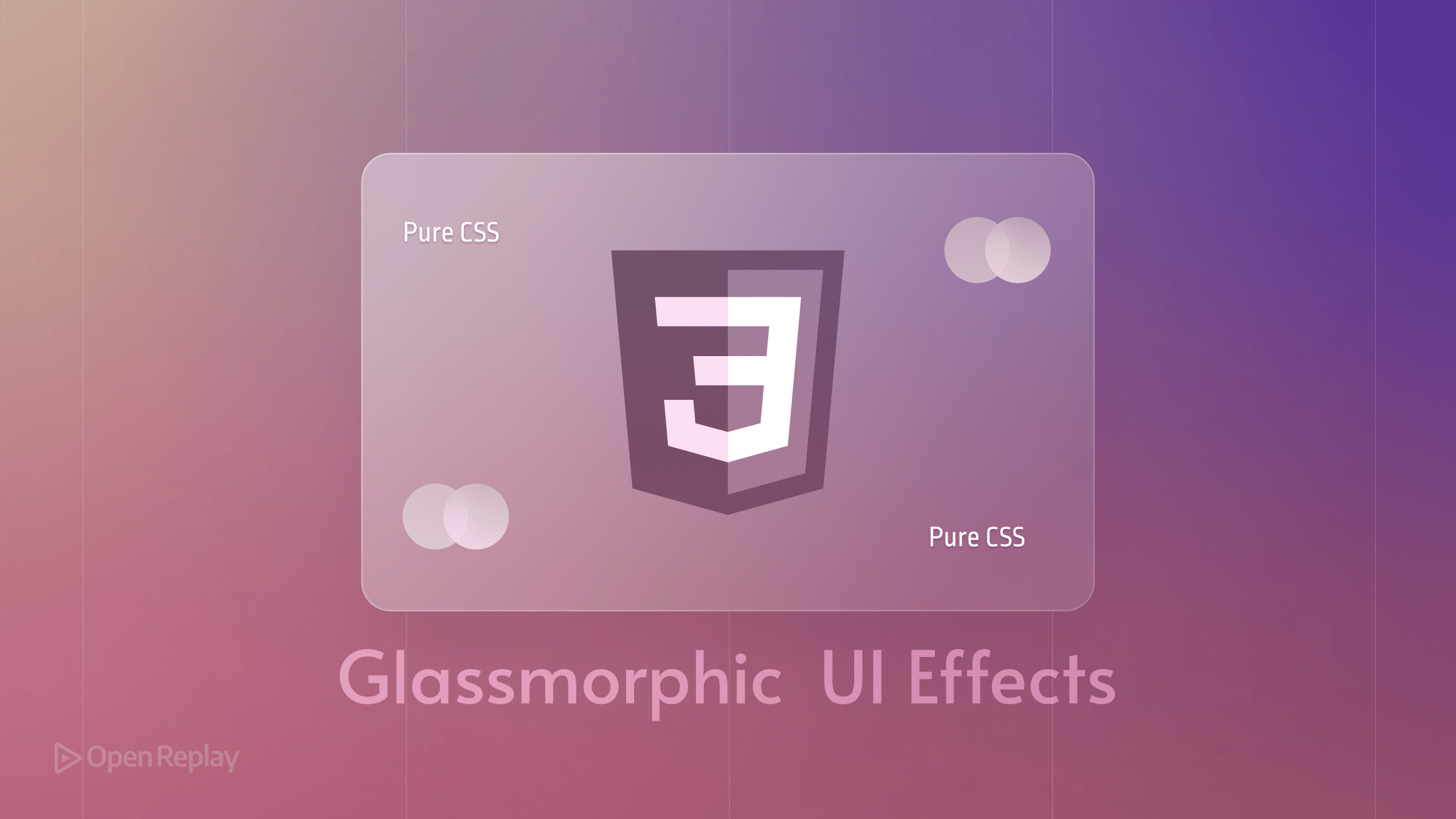
How to Create Glassmorphic UI Effects with Pure CSS

Apple’s recent design trends have reignited interest in glassmorphism, but the CSS properties behind this stunning effect are timeless. Whether you’re building a modern dashboard or updating your portfolio, mastering glassmorphism CSS techniques will add that polished, professional touch users expect.
This guide walks you through creating pure CSS glassmorphism effects from scratch—no frameworks, no generators, just the essential properties you need to implement beautiful frosted glass effects in your projects.
Key Takeaways
- Master the four core CSS properties for glassmorphism: backdrop-filter, semi-transparent backgrounds, borders, and shadows
- Learn to balance transparency with accessibility and readability
- Implement graceful fallbacks for older browsers
- Optimize performance for mobile and desktop experiences
The Essential CSS Properties for Glassmorphism
backdrop-filter: The Foundation
The backdrop-filter property is the cornerstone of any glassmorphic design. By applying blur() to the content behind an element, you create that signature frosted appearance:
backdrop-filter: blur(10px);
-webkit-backdrop-filter: blur(10px); /* Safari support */
The blur value typically ranges from 8px to 15px. Lower values create subtle frost, while higher values produce heavier diffusion. Most modern browsers support backdrop-filter, including Chrome 76+, Safari 9+, and Firefox 103+.
Semi-Transparent Backgrounds
Glassmorphism requires careful balance between transparency and visibility. Use RGBA colors with low alpha values:
background: rgba(255, 255, 255, 0.1); /* 10% white */For light backgrounds, alpha values between 0.1 and 0.25 work best. Dark themes can handle slightly higher values (0.15-0.3) without losing the glass effect.
Borders and Shadows for Depth
Subtle borders define the glass edges:
border: 1px solid rgba(255, 255, 255, 0.2);Combine with soft shadows to create floating elements:
box-shadow: 0 8px 32px rgba(0, 0, 0, 0.1);Building a Glassmorphic Card Step-by-Step
Basic HTML Structure
Start with a simple container and background:
<div class="background">
  <div class="glass-card">
    <h2>Glass Card</h2>
    <p>Your content here</p>
  </div>
</div>
Core CSS Implementation
Here’s the complete glassmorphism CSS for a polished card:
.glass-card {
  background: rgba(255, 255, 255, 0.15);
  backdrop-filter: blur(10px);
  -webkit-backdrop-filter: blur(10px);
  border: 1px solid rgba(255, 255, 255, 0.2);
  box-shadow: 0 8px 32px rgba(0, 0, 0, 0.1);
  border-radius: 16px;
  padding: 2rem;
}
Fine-Tuning the Effect
Adjust these values based on your background:
- Colorful gradients: Use lower opacity (0.1-0.15)
- Image backgrounds: Increase blur to 12-15px
- Solid colors: Reduce blur to 6-8px for subtlety

Discover how at OpenReplay.com.
Browser Support and Fallbacks
Current Browser Compatibility
| Browser | Support | Version |
|---|---|---|
| Chrome | ✓ | 76+ |
| Safari | ✓ | 9+ |
| Firefox | ✓ | 103+ |
| Edge | ✓ | 79+ |
Graceful Degradation
Always provide fallbacks using @supports:
.glass-card {
  /* Fallback */
  background: rgba(255, 255, 255, 0.9);
}

@supports (backdrop-filter: blur(10px)) {
  .glass-card {
    background: rgba(255, 255, 255, 0.15);
    backdrop-filter: blur(10px);
    -webkit-backdrop-filter: blur(10px);
  }
}
Accessibility and Performance
Ensuring Readable Content
Pure CSS glassmorphism can compromise text readability. Maintain WCAG compliance with these techniques:
-
Add text shadows for contrast:
text-shadow: 0 1px 2px rgba(0, 0, 0, 0.1); -
Increase background opacity for critical text areas
-
Test contrast ratios using tools like WebAIM’s Contrast Checker
Performance Optimization
The backdrop-filter property is computationally expensive. Optimize by:
- Limiting glass elements to 2-3 per viewport
- Avoiding animation on blurred elements
- Using
will-change: backdrop-filtersparingly - Testing on mid-range devices
For mobile, consider reducing blur intensity or providing alternate styles.
Practical Application Guidelines
Frosted glass effects work best for:
- Navigation bars and headers
- Modal overlays
- Card components
- Sidebar panels
Avoid glassmorphism for:
- Body text containers
- Form inputs (unless carefully tested)
- High-information-density areas
Remember: subtlety is key. One well-placed glass element creates more impact than an entire interface of transparency.
Conclusion
Creating professional glassmorphism CSS effects requires just four core properties: backdrop-filter, semi-transparent backgrounds, subtle borders, and soft shadows. By following these guidelines and respecting accessibility needs, you’ll implement modern glass effects that work across browsers while maintaining performance.
Start with a single component, test across browsers, and always prioritize readability. The result? Interfaces that feel polished and modern, built with nothing but pure CSS.
FAQs
Firefox requires version 103 or higher for backdrop-filter support. For older versions, use the @supports query to provide a solid background fallback that maintains readability without the blur effect.
Limit glassmorphic elements to 2-3 per viewport, reduce blur values to 6-8px on mobile, and avoid animating elements with backdrop-filter. Consider using media queries to serve simpler styles to lower-powered devices.
Aim for a minimum contrast ratio of 4.5:1 for normal text and 3:1 for large text. Increase the background opacity to 0.3-0.4 or add subtle text shadows to improve readability when the blur effect reduces contrast.
Truly understand users experience
See every user interaction, feel every frustration and track all hesitations with OpenReplay — the open-source digital experience platform. It can be self-hosted in minutes, giving you complete control over your customer data. . Check our GitHub repo and join the thousands of developers in our community..