Create Scroll Animations with just CSS
Scroll animations trigger when an element enters the viewport. Previously, JavaScript functions or libraries are needed to create scroll animations. With JavaScript, you’d need up to four variables plus mathematical operations to calculate the element’s position on the viewport. Another issue with JavaScript is that there are often multiple ways to do the same thing. In this post, you’ll learn how to create scroll-based animations with only CSS.

Discover how at OpenReplay.com.
Before we proceed, it is crucial to note that, at the time of writing, CSS-only scroll animations are only supported on Chromium-based browsers, like Chrome, Opera, and Microsoft Edge. Stay until the end to learn how to handle browsers like Firefox.
Scroll Animation With Only CSS
To create scroll animations, you need the animation-timeline and animation-range CSS properties.
The animation-timeline property specifies the timeline that controls an animation’s progress, while animation-range controls when it starts and stops.
For scroll-based animations, the animation-timeline property takes two functions, view() and scroll(). The animation-range property can take numerical values (px or percentage), keywords, or a combination of both.
Using the view() function
When using the view() function, the animation starts when a particular element enters the viewport.
We’ll build a simple web page with a few HTML elements to demonstrate.
Here’s an HTML markup of a webpage to use for this example:
<section id="main">
  <div class="main-text">
    <p>Hello there,</p>
    <p>Welcome!</p>
    <p>This page has CSS scroll animations</p>
    <p>Keep scrolling to see how they work</p>
  </div>
</section>

<section id="sections">
  <div class="sections-text">
    <h2>Section</h2>
    <h3>These boxes fade in from the right and move towards the left</h3>
  </div>
  <div class="container">
    <div class="box box-1">
      <h2>Box 1</h2>
      <p>
 Lorem ipsum dolor sit amet consectetur adipisicing elit. Reprehenderit
 perspiciatis accusantium nesciunt, officia sapiente natus!
      </p>
    </div>
    <div class="box box-2">
      <h2>Box 2</h2>
      <p>
 Lorem ipsum dolor sit amet consectetur adipisicing elit. Reprehenderit
 perspiciatis accusantium nesciunt, officia sapiente natus!
      </p>
    </div>
    <div class="box box-3">
      <h2>Box 3</h2>
      <p>
 Lorem ipsum dolor sit amet consectetur adipisicing elit. Reprehenderit
 perspiciatis accusantium nesciunt, officia sapiente natus!
      </p>
    </div>
  </div>
</section>
For this example, we’re targeting the HTML elements with the class name .box.
Here’s the CSS for the box elements:
.box {
  width: 300px;
  height: 320px;
  border-radius: 5px;
  display: flex;
  justify-content: center;
  align-items: center;
  flex-direction: column;
  padding: 7px;
  margin: 15px;
  border: 2px solid rgba(255, 255, 255, 0.1);
  background-color: #004958;
  opacity: 0;
}
.box h2 {
  color: #00c2cb;
  font-size: 23px;
  line-height: 0px;
}
.box p {
  text-align: center;
  width: 230px;
  margin: 0px 0px 20px 0px;
  color: #e0ffff;
}
After correctly styling to position every element, create an animation of what you want to happen when the target elements become visible on the viewport.
We’ll use the transform and opacity CSS properties for this scroll animation.
Next, we create the @keyframes for the CSS animation:
@keyframes reveal {
 0% {
    transform: scale(0.8) translateX(200px);
    opacity: 0;
 }
 100% {
    transform: scale(1) translateX(0);
    opacity: 1;
 }
}
For this example, the box elements will fade from the right and move towards the left side of the page.
Now we add the animation to the box elements:
.box {
  width: 300px;
  height: 320px;
  border-radius: 5px;
  display: flex;
  justify-content: center;
  align-items: center;
  flex-direction: column;
  padding: 7px;
  margin: 15px;
  border: 2px solid rgba(255, 255, 255, 0.1);
  background-color: #22232e;
  animation: reveal ease-in-out;
 animation-timeline: view();
}
Usually, CSS animations would have a duration, but in this case, the animation-timeline property set to view() is doing that job.
At this point, you should have a working scroll animation:
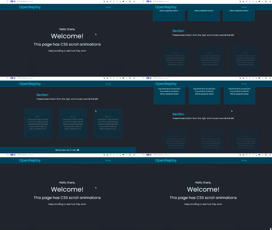
You may observe that the animation doesn’t quite finish before the elements exit the viewport. It’s more obvious when you reach the end of the page and can’t scroll past a certain point.
You can fix this problem by adding the animation-range property.
The CSS animation-range property is shorthand for animation-range-start and animation-range-end. By default, it’s set to cover.
animation-range-start: cover;
animation-range-end: cover;
/* OR */
animation-range: cover 0% cover 100%;
For our example, using the cover keyword means that the animation runs as long as the element is visible on the viewport. So, the box elements don’t reach full opacity until they exit out the top of the screen.
You can use three other keywords with the animation-range property when creating scroll animations. They are:
containentryexit
First up, we have the contain keyword. It starts the animation only when the entire element is inside the viewport.
Let’s reverse the scroll animation from our original example to see how this works clearly.
.box {
  animation: reveal ease-in-out forwards;
 animation-timeline: view();
 animation-range: contain 0% contain 100%;
}
@keyframes reveal {
 0% {
    transform: scale(1) translateX(0);
    opacity: 1;
 }
 100% {
    transform: scale(0.8) translateX(200px);
    opacity: 0;
 }
}
Here’s the result:
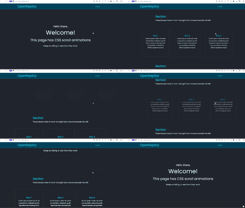
The boxes start fading out as soon as their entire length is inside the viewport.
The next keyword is entry, which also starts the animation as soon as the elements enter the viewport. The main difference between this and cover is that the animation is complete when the entire box enters the viewport.
.box {
  animation: reveal ease-in-out;
 animation-timeline: view();
 animation-range: entry 0% entry 100%;
}
Here’s the result:
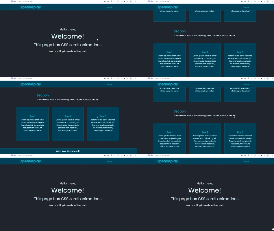
The animation is the same as the first example, but this time, the last three boxes have full opacity and complete translation when you scroll to the end of the page.
If you want the animation to start when the elements are leaving the viewport, you use the exit keyword.
.box {
  animation: reveal ease-in-out;
 animation-timeline: view();
 animation-range: exit 0% exit 100%;
}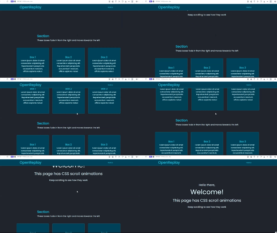
Here, we’re seeing the boxes fade out when they start leaving the viewport.
It’s crucial to note the size of the animated elements and the type of effect you want to trigger when scrolling will play a part in determining what keyword to use. For our fade-in and out animation, the last two keywords, entry and exit resulted in better-looking scroll animations when compared to cover and contain.
Setting the scroll animation-range
You can set the range with just the view() function, but it can be confusing. The positions of the start and end offsets (distance from the bottom and top of the viewport) are “wrong” when you use the view() function.
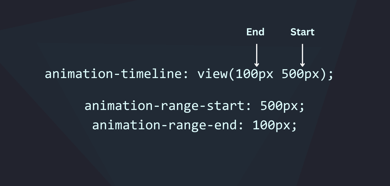
The end offset comes before the start when declaring in CSS. Naturally, and as is the case with most CSS properties, the starting values come first. With this in mind, using animation-range for scroll animations is a better option.
Figuring out to set the perfect animation-range might involve a lot of trial and error. Luckily Google has a tool called View Timeline Ranges Visualizer that can help you visualize your scroll animations as you create them.
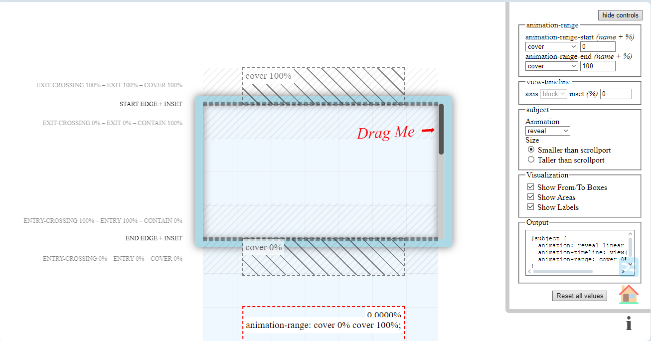
Using this tool is very straightforward. All you have to do is adjust the parameters with the controls on the right until you find what suits the animation you want to create.
You can use two different keywords to create scroll animations. Also, the animations don’t have to be based on 100% of the element’s height, you can change the default percentage values.
Using the scroll() function
While the view() function controls scroll animations based on the visibility of an element in the viewport, scroll() is based on the scroll behavior of a scrolling container element.
To demonstrate, we’ll create a scroll indicator, background-changing animation, and infinite scrolling.
We’ll use the same webpage from the previous section and attach the scroll indicator to the top of the page.
Here’s the CSS for the indicator:
.scroller {
  height: 5px;
  position: fixed;
  top: 0%;
  z-index: 100;
  background-color: #00c2cb;
  width: 100%;
}
The scroll indicator is the blue line that stretches across the length of the viewport in the screenshot below.

This is how it will look at the end of the scroll animation.
The indicator will grow longer towards the right side of the page as you scroll down.
Here’s the CSS for the indicator with the animation:
.scroller {
  height: 5px;
  position: fixed;
  top: 0%;
  z-index: 100;
  background-color: #00c2cb;
  width: 100%;
  transform: scale(0, 1);
  transform-origin: left;
  animation: scroller linear;
 animation-timeline: scroll();
}
@keyframes scroller {
 to {
    transform: scale(1, 1);
 }
}
The animation-timing-function of linear is so the speed of the animation matches the speed of your scrolling.
And here’s the animation for the background change to the navbar:
nav {
 display: inline-flex;
 justify-content: space-around;
 align-items: center;
 height: 60px;
 position: fixed;
 width: 100%;
 padding: 0px 5%;
 background-color: #004958;
 border-bottom: 2px solid rgba(255, 255, 255, 0.1);
 animation: color-change linear;
 animation-timeline: scroll();
}
@keyframes color-change {
 to {
 background-color: #22232e;
 }
}
Here’s the result:
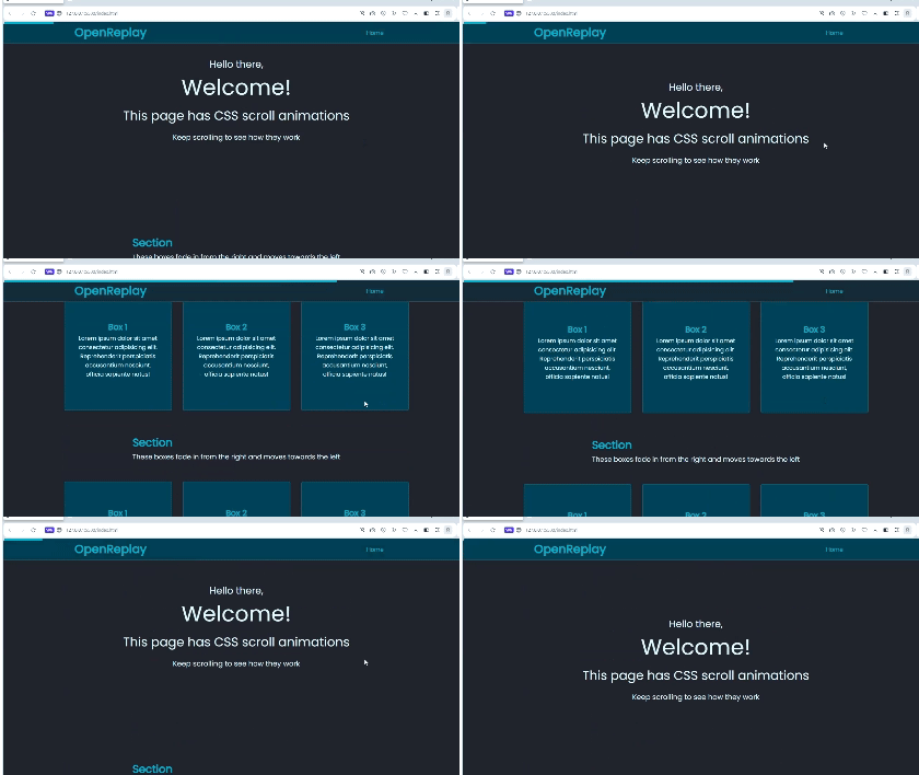
The blue scroll indicator stretches across the page, and the background of the navigation bar changes when you scroll.
Our final example with the scroll() function is creating an infinite scroller. It’s a band of text or images moving horizontally across the webpage as you scroll.
By default, the animation will respond to the nearest scrollable container or block element, usually the body or html element.
If we want to create an infinite scroller, we need content overflowing horizontally along the x-axis.
First, we’ll create the content for the infinite scroller:
 <div class="container">
  <div class="text-scroller">
    <ul class="scroll-list">
      <li>Lorem ipsum dolor sit amet consectetur adipisicing elit.</li>
      <li>Lorem ipsum dolor sit amet consectetur adipisicing elit.</li>
      <li>Lorem ipsum dolor sit amet consectetur adipisicing elit.</li>
      <li>Lorem ipsum dolor sit amet consectetur adipisicing elit.</li>
    </ul>
  </div>
</div>
Here’s a screenshot of what you should have at this point:

We can use CSS Flexbox to position the list horizontally:
.container {
  display: flex;
  justify-content: center;
  align-items: center;
  flex-wrap: wrap;
  margin: 20px 0px;
}
.text-scroller {
  max-width: 95vw;
  background-color: #004958;
}
.scroll-list {
  margin: 0;
  width: max-content;
  padding-inline: 0;
  padding-block: 0.5rem;
  list-style: none;
  display: flex;
}
.scroll-list li {
  padding: 0.5rem;
  color: #e0ffff;
  font-size: 1rem;
}
Here’s a screenshot of what it’ll look like:
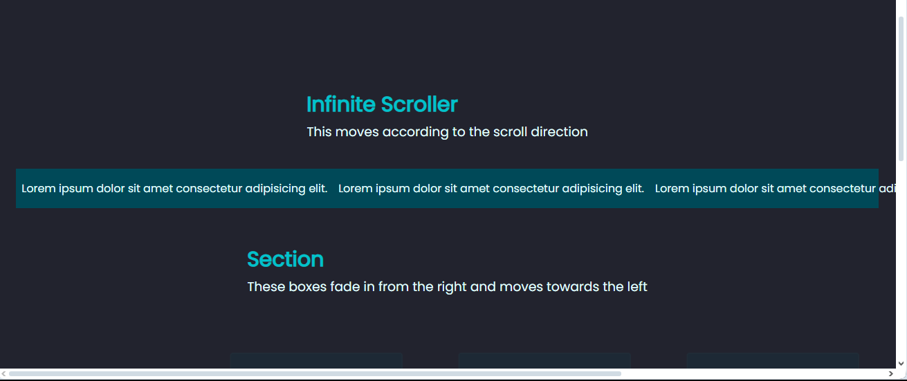
The content doesn’t fit its container and is overflowing along the x-axis. A vertical scrollbar will appear at the bottom of the viewport to indicate hidden content.
We don’t want this extra scrollbar, so we can add an overflow of hidden to the text-scroller:
.text-scroller {
  max-width: 95vw;
  overflow: hidden;
  background-color: #004958;
  mask: linear-gradient(90deg, transparent, white 20%, white 80%, transparent);
}
The added mask is purely for visual aesthetics, so the text appears to fade at both ends of the viewport. The screenshot below has the result:
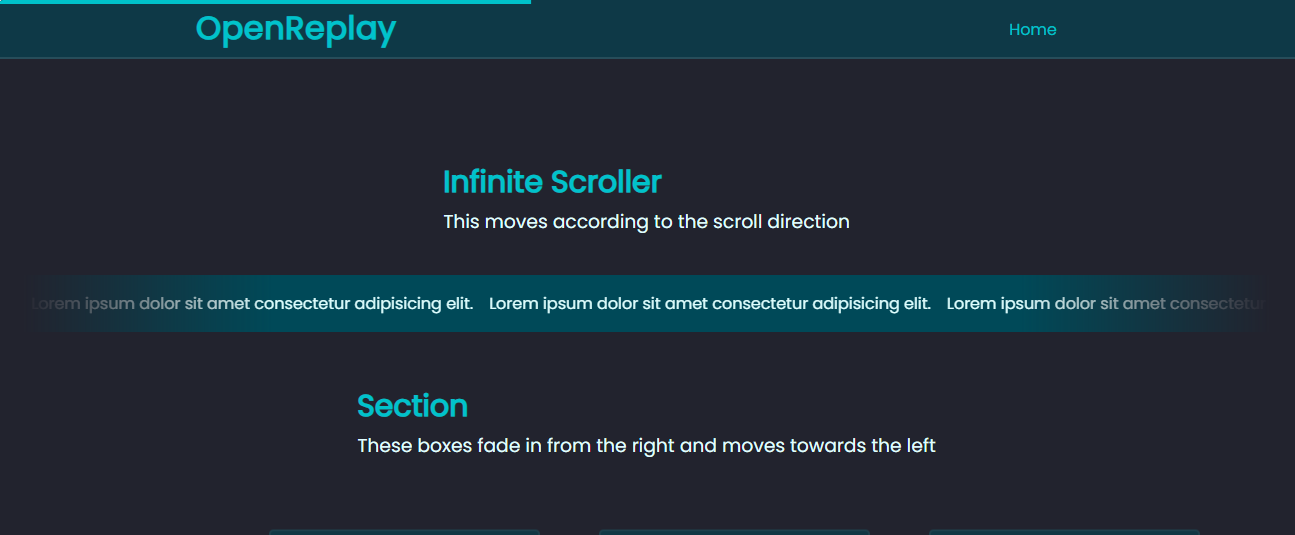
Next, we create the animation:
@keyframes text-scroll {
 to {
    transform: translateX(-50%);
 }
}
Now we add it to the scroll-list:
.scroll-list {
  margin: 0;
  width: max-content;
  padding-inline: 0;
  padding-block: 0.5rem;
  list-style: none;
  display: flex;
  animation: text-scroll linear;
 animation-timeline: scroll(root);
}
The scroll() parameter we’re using here is root. The root element is the outermost wrapper that nests all the content on the webpage, which is the html or body depending on the browser.
Here’s the result:
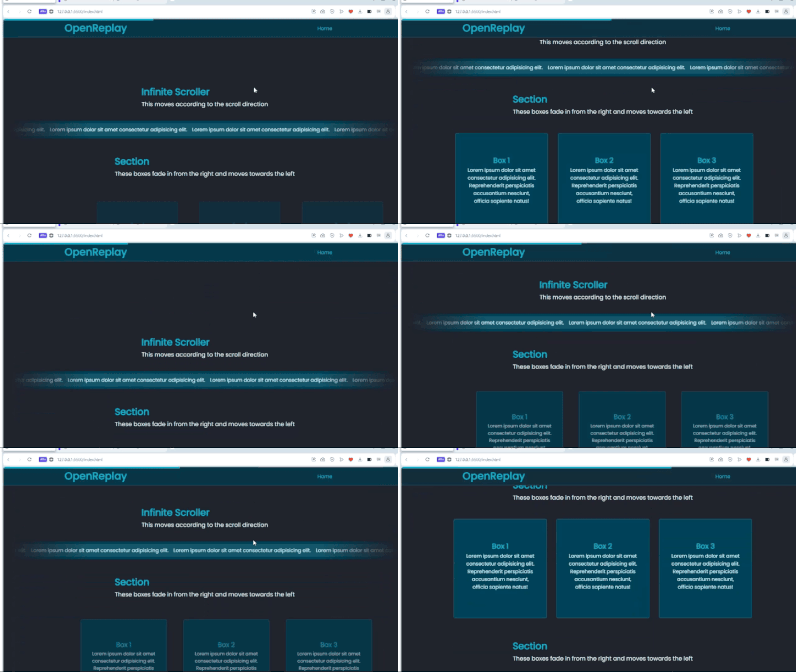
If we had left it blank without a scroll() parameter, the text-scroller element would be the nearest scrollable element. But its content is no longer scrollable because we’ve set overflow to hidden. We also want the scroll animation to respond to the vertical scrolling of the entire webpage.
To create nested scrollable content, you’d need to set the overflow of the parent element to scroll. You can also specify direction with overflow-x and overflow-y for horizontal and vertical scrolling respectively.
Here’s a screenshot of what happens when an overflow-x of scroll is added to the scroll-list:
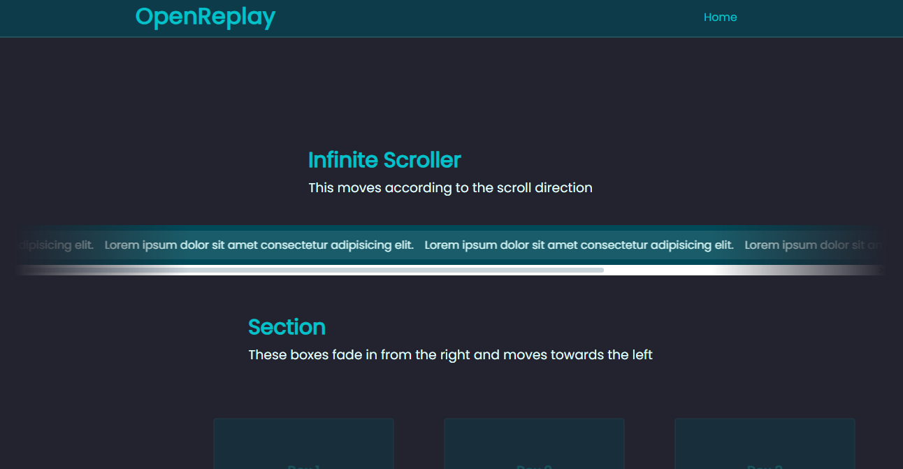
It now has a scrollbar attached to it to show that you can scroll to view the hidden content. If we added animation that responds to this horizontal scrollbar on the scroll-list, the scroll() parameter would be self.
Let’s create another list with vertical scrolling to clearly see how the self parameter works with scroll animations:
<div class="container">
  <div class="overflow-content">
    <ul class="scroll-y">
      <li>Lorem ipsum dolor sit amet consectetur adipisicing elit.</li>
      <li>Lorem ipsum dolor sit amet consectetur adipisicing elit.</li>
      <li>Lorem ipsum dolor sit amet consectetur adipisicing elit.</li>
      <li>Lorem ipsum dolor sit amet consectetur adipisicing elit.</li>
      <li>Lorem ipsum dolor sit amet consectetur adipisicing elit.</li>
      <li>Lorem ipsum dolor sit amet consectetur adipisicing elit.</li>
      <li>Lorem ipsum dolor sit amet consectetur adipisicing elit.</li>
      <li>Lorem ipsum dolor sit amet consectetur adipisicing elit.</li>
    </ul>
  </div>
</div>
We’ll limit the content’s height with the max-height property, then hide the overflowing content, and set the overflow-y to scroll. We’ll also use the background-changing animation.
.overflow-content {
  max-height: 200px;
  overflow: hidden;
  overflow-y: scroll;
  background-color: #004958;
  animation: color-change linear;
 animation-timeline: scroll(self);
}
.overflow-content li {
  margin-top: 20px;
  margin-left: -20px;
  color: #00c2cb;
}
@keyframes color-change {
 to {
    background-color: #22232e;
 }
}
Here’s the result:
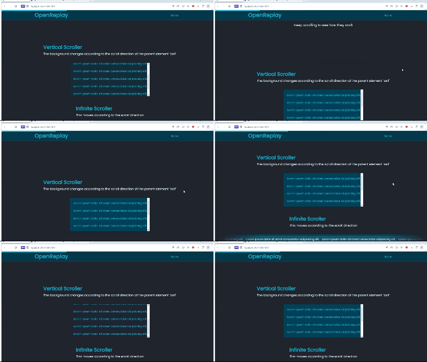
The background-color only changes when you use the scrollable container where the list is nested, it doesn’t respond to any other scrolling element.
A demo of all the scroll() parameters is available on Google’s scroll animation website.
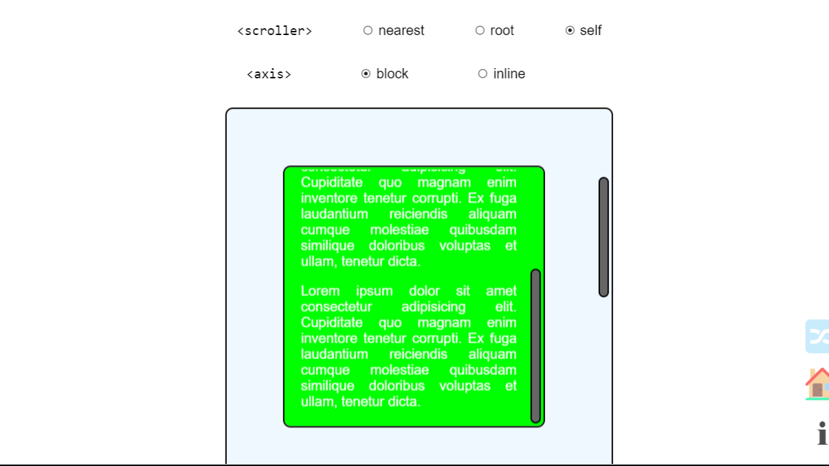
You can see the different scrolling elements and also change the axis so the animation responds to vertical and horizontal scrolling.
Browser Compatibility and JavaScript Fallback
The animation-timeline and animation-range properties are not supported on Firefox and Safari so you can’t create CSS-only scroll animations that work on these browsers. You’ll need a JavaScript fallback and feature queries.
In JavaScript, you can use the IntersectionObserver or a scroll event listener.
Creating a fallback with IntersectionObserver
The IntersectionObserver lets you track when an element enters or leaves the viewport, making it useful to trigger scroll animations. We’re still using the page with the box elements.
You’ll start by selecting all the box elements:
const boxes = document.querySelectorAll(".box")Next, create the IntersectionObserver with a callback function that runs whenever the boxes enter or leave the viewport.
const observer = new IntersectionObserver(entries => {
  entries.forEach(entry => {
    entry.target.classList.toggle("reveal", entry.isIntersecting)
 })
}, {
  rootMargin: '50px 0px -100px 0px',
  threshold: 0,
})
The callback receives a list of entries, each representing a box. The class reveal will be added to any box that enters the viewport.
After the callback function, we have the observer options, rootMargin and threshold. The rootMargin sets the intersection area, that is, it adds or removes margins from the viewport’s edges. In this example, the animation is triggered when the box elements are 50px away from entering the viewport and -100px from leaving
The threshold specifies how much of the element should be in the viewport before the animation is triggered. It has a range of 0 to 1 which represents 0 to 100 percent.
There’s a third option we’re not using here, which is root. It allows you to track when the box elements are visible relative to a selected container instead of the viewport or bounding element.
The final step is to observe each box element:
boxes.forEach(box => {
  observer.observe(box)
})
Here’s the complete IntersectionObserver:
const boxes = document.querySelectorAll(".box");

const observer = new IntersectionObserver(
 (entries) => {
    entries.forEach((entry) => {
      entry.target.classList.toggle("show", entry.isIntersecting);
 });
 },
 {
    rootMargin: "50px 0px -100px 0px",
    threshold: 0,
 },
);

boxes.forEach((box) => {
  observer.observe(box);
});
Now we create the animation and add it to the box elements in CSS:
.box {
  width: 300px;
  height: 320px;
  border-radius: 5px;
  display: flex;
  justify-content: center;
  align-items: center;
  flex-direction: column;
  padding: 7px;
  margin: 15px;
  border: 2px solid rgba(255, 255, 255, 0.1);
  background-color: #004958;
  transform: scale(0.8) translateX(200px);
  opacity: 0;
  transition: transform .3s linear, opacity .3s linear;
}
.reveal {
  transform: scale(1) translateX(0);
  opacity: 1;
}
This will be the default scroll animation, we’ll then use feature queries (@supports) to add the CSS-only scroll animation for compatible browsers.
@supports (animation-timeline: view()) {
  .box {
    animation: reveal linear forwards;
 animation-timeline: view(block);
 animation-range: cover 0% entry 50%;
 }

  @keyframes reveal {
 to {
      transform: scale(1) translateX(0);
      opacity: 1;
 }
 }
}
To avoid any possible interference, wrap the IntersectionObserver with JavaScript feature detection:
if (!CSS.supports("animation-timeline", "scroll()")) {
  const boxes = document.querySelectorAll(".box");

  const observer = new IntersectionObserver(
 (entries) => {
      entries.forEach((entry) => {
        entry.target.classList.toggle("reveal", entry.isIntersecting);
 });
 },
 {
      rootMargin: "50px 0px -100px 0px",
      threshold: 0,
 },
 );

  boxes.forEach((box) => {
    observer.observe(box);
 });
}
Here’s a CodePen you can interact with:
Using the scroll event listener
Here, you’ll create a JavaScript function, reveal, that will be triggered when you scroll the webpage.
Again, start by selecting all the box elements:
const boxes = document.querySelectorAll(".box");Next, you need to loop through all the box elements and calculate their position on the viewport.
for (let i = 0; i < boxes.length; i++) {
    const windowHeight = window.innerHeight;
    const elementTop = boxes[i].getBoundingClientRect().top;
    const elementVisible = 150;
windowHeight gets the height of the viewport (innerHeight), while elementTop calculates the distance from the top of the viewport to the top of the box. This tells the browser how far the box is from the top of the viewport.
The elementVisible variable defines an offset value of 150px. This means the animation will start when the box is 150px away from the bottom of the viewport.
Next, you’ll create an if statement to check the position of the box elements on the viewport:
if (elementTop < windowHeight - elementVisible) {
      boxes[i].classList.add("reveal");
 } else {
      boxes[i].classList.remove("reveal");
 }
 }
If this condition is true, it means the box is within the viewport, and the class reveal, which has the style changes, is added. If the box is not within the defined visibility area, the reveal class is removed, reverting the animation.
Finally, you add the scroll event listener:
window.addEventListener("scroll", reveal);Here’s the complete JavaScript function:
function reveal() {
  const boxes = document.querySelectorAll(".box");

  for (let i = 0; i < boxes.length; i++) {
    const windowHeight = window.innerHeight;
    const elementTop = boxes[i].getBoundingClientRect().top;
    const elementVisible = 150;

    if (elementTop < windowHeight - elementVisible) {
      boxes[i].classList.add("reveal");
 } else {
      boxes[i].classList.remove("reveal");
 }
 }
}

window.addEventListener("scroll", reveal);
The CSS application is the same as before, you create the default and use feature queries for the CSS-only scroll animations.
Using an event listener may involve more code but it allows you to be more precise with the timing of the animation.
Here’s a CodePen you can interact with:
Conclusion
The animation-timeline and animation-range CSS properties are relatively new and still listed as experimental. You should expect their behavior to change in the feature.
Scroll animations can be used for many things, like infinite scrolling, loading more web content, revealing elements on scroll, and so on. In this tutorial, you’ve learned how to create them with only CSS and create a JavaScript fallback for browsers that don’t support CSS-only scroll animations.
Gain control over your UX
See how users are using your site as if you were sitting next to them, learn and iterate faster with OpenReplay. — the open-source session replay tool for developers. Self-host it in minutes, and have complete control over your customer data. Check our GitHub repo and join the thousands of developers in our community.


