Building a Comment Form with React-Mentions
Introducing an interesting library for your React work


A comment form is a user interface element that allows users to leave comments or messages on a particular thread or discussion, which typically includes a text box where users can enter their comments and other optional fields such as name, email, and website, and also include features such as @mentions, formatting options, and the ability to upload images or files. This article will show you how to use the React-mentions library to build a powerful comment form.
Before the introduction of @mentions in most applications, commenting on threads and messages felt like an isolated activity. In conversations with multiple participants, determining who a note was intended for required much work. There was no easy way to involve individuals not already part of the discussion, which often led to confusion, miscommunication, and limited engagement. However, with @mentions this problem has been addressed, and commenting on threads and messages has become more inclusive and engaging, allowing you to direct messages to specific individuals or groups, ensuring that the intended recipient receives your message. Moreover, by mentioning friends or experts, you can invite them to join the conversation and share their insights and opinions.
React Mentions is a library for building interactive mentions or tagging functionality in React applications. It allows users to mention or tag other users in a comment, message, or post by typing the ‘@’ symbol followed by the user’s name. The library provides auto-complete suggestions, customizable styles, and callbacks for handling user interactions. In this context, exploring React Mentions functionalities refers to learning about the different features and capabilities of the library and how to use them effectively in your React projects.
This tutorial explores the @mention functionally using the React-mentions package.
Scaffolding the Application
Let’s begin with creating our React project using Vite. Run the command below to scaffold a react project.
yarn create viteAfter setting up your react project, change the directory to the project and add the React-Mentions plugin using the command below.
yarn add react-mentionsOverview
Before we dive into each of the functionalities, let’s get an overview and structure of the React Mentions component.
const [result, setResult] = useState("");
const data = [
{
id: "Avatar",
display: "Avatar Aang",
},
{
id: "Spiderman",
display: "Peter Parker",
},
];
<MentionsInput value={result} onChange={(e) => setValue(e.target.value)}>
<Mention style={mentionStyle} data={data} />
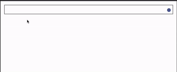
</MentionsInput>;This code above shows the skeleton of the React-Mentions component, and it renders a mention input field that allows users to mention other users by typing “@” followed by their names. The MentionsInput component has a single child Mention component. The value prop controls the input field’s value, and the onChange prop handles changes to the input field value, updating the result variable.
The Mention component defines how mentions of users will be rendered in the input field, which leverages the data prop that provides the list of mentionable users. The style prop specifies the styling of the Mention component, which displays the user’s name or email address, especially when mentioned in the input field.
Running the code above will give us the results below.
Styling and Customizing Mention Components.
From our previous example above, our user interface wasn’t looking good because it lacked a bit of style and customization. Let’s fix this by providing the necessary style for our React Mention components.
The React Mention library provides a style structure for the MentionInput and Mention components. This style is customizable to suit the user’s preference. Let’s put this into practice, create a styles.module.css file in the src/ folder and paste the code below into it.
/* mentions */
.mentions {
  margin: 2em 0;
}
.mentions--singleLine .mentions__control {
  display: inline-block;
  padding-left: 10px;
}
.mentions--singleLine .mentions__highlighter {
  padding: 1px;
  border: 2px inset transparent;
}
.mentions--singleLine .mentions__input {
  border: 2px inset grey;
  font-style: italic;
  padding-left: 10px;
}

.mentions--multiLine .mentions__control {
  font-family: monospace;
  font-size: 16pt;
}
.mentions--multiLine .mentions__highlighter {
  border: 1px solid transparent;
  padding: 9px;
  min-height: 63px;
}
.mentions--multiLine .mentions__input {
  border: 1px solid silver;
  padding: 9px;
  outline: 0;
  font-style: italic;
}
.mentions__suggestions__list {
  background-color: white;
  border: 1px solid rgba(0, 0, 0, 0.15);
  font-size: 10pt;
}
.mentions__suggestions__item {
  padding: 5px 15px;
  border-bottom: 1px solid rgba(0, 0, 0, 0.15);
}
.mentions__suggestions__item--focused {
  background-color: #639551fe;
  color: #fff;
}
.mentions__mention {
  position: relative;
  z-index: 1;
  color: green;
  font-style: italic;
  text-shadow: 1px 1px 1px white, 1px -1px 1px white, -1px 1px 1px white,
    -1px -1px 1px white;
  text-decoration: none;
  pointer-events: none;
}
Exploring React-Mentions Functionalities
Finally, let’s explore the React Mention functionality and see what it offers. The React Mentions library has many explorable features useful when using the @mention functionality. Let’s get to use a few in this section.
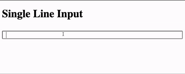
Single Line Input
The SingleLine Input functionality provides the user with a single-line text input field with the React mention style and functionalities. To create this, head to the src/ folder and create an Example.jsx file in it.
import { useState } from "react";
import { Mention, MentionsInput } from "react-mentions";
import style from "./style.module.css";

const MentionExample = () => {
  const [result, setResult] = useState("");

  const data = [
    {
      id: "Ichigo",
      display: "Kurosaki Ichigo",
    },
    {
      id: "Madara",
      display: "Madara Uchiha",
    },
    {
      id: "Nobody",
      display: "nobody@someone.whoknows",
    },
    {
      id: "Iamvictorsam",
      display: "iamvictorsam@gmail.com",
    },
  ];

  return (
    <>
      <h1>Single Line Input</h1>
      <MentionsInput
        classNames={style}
        singleLine
        value={result}
        onChange={(e) => setResult(e.target.value)}
      >
        <Mention className={style.mentions__mention} data={data} />
      </MentionsInput>
    </>
  );
};

export default MentionExample;
In the code block above, we’re leveraging on the React-Mention components by providing them with the value of the result. The classNames prop is an object that specifies CSS classes for various components of the MentionsInput, while the value prop sets the value of the input field.
The useState hook is used to manage the state of the result variable, which stores the input field’s current value. The setResult function updates the state of the result variable whenever the input field value changes.
Finally, the onChange event handler is attached to the MentionsInput component, which calls the setResult function whenever the input field value changes.
We have also added the singleLine flag to the MentionsInput component to give us access to the single-line style from our custom mention style.
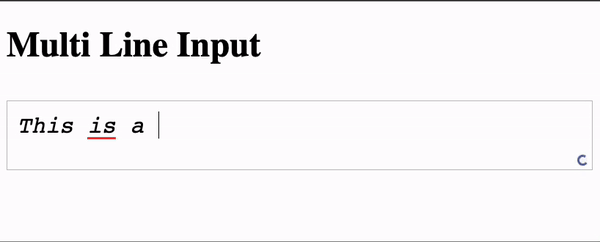
Multiline input
Unlike the Single-line input, the Multi-Line input creates a bigger text field, like a text area, enabling users to enter texts and comment in multiple lines. This can be achieved by removing the single line flag thus, setting it to false.
return (
  <>
    <h1>Multi Line Input</h1>
    <MentionsInput
      classNames={style}
      value={result}
      onChange={(e) => setResult(e.target.value)}
    >
      <Mention className={style.mentions__mention} data={data} />
    </MentionsInput>
  </>
);
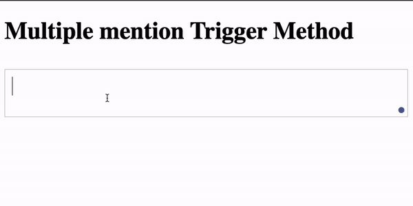
Using Multiple Triggers
The React Mention library also provides the flexibility of using and adding as many trigger methods of your choice. This section adds two more trigger methods to our default trigger (the @ symbol). This includes the :site and ?email keywords.
  return (
    <>
      <h1>Multiple mention Trigger Method</h1>
      <MentionsInput
        classNames={style}
        value={result}
        onChange={(e) => setResult(e.target.value)}
      >
        <Mention className={style.mentions__mention} data={data} />
        <Mention className={style.mentions__mention} data={data} trigger={":site"} />
        <Mention className={style.mentions__mention} data={data} trigger={"?email"} />
      </MentionsInput>
    </>
  );
In the code block above, we added two more Mention components with the trigger property into the MentionInput component. We added the :site and ?email keywords for both components newly added as triggers.
Fetching responses from external sources
Fetching responses from external sources takes our @mention form to the next level by allowing us to tap into vast databases and global sources for dynamic data retrieval. Whether fetching user information, live updates, or the latest trending tags, this feature empowers our form to stay up-to-date and deliver a seamless user experience. In this section, we’ll look at how to fetch data from an API and use it in our Mention form.
Firstly, let’s create some states and also handle our text input.
const [text, setText] = useState("");
const [dataResp, setDataResp] = useState([]);

const handleInputChange = (event) => {
  setText(event.target.value);
};
Next, we’ll fetch the data from the URL and store it in the dataResp state we created earlier.
useEffect(() => {
fetch(
"https://raw.githubusercontent.com/iamVictorSam/react-mentions-with-form/7d03dd94f7ae1740e835bef959d704ca81d1355b/src/names.json"
)
.then((response) => response.json())
.then((json) => {
const mentionableNames = json.people.map((person) => ({
id: person.name,
display: person.name,
}));
setDataResp(mentionableNames);
})
.catch((error) => console.log(error));
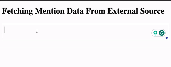
}, []);Finally, we’ll inject our data into the Mention component to gain access to the names from the endpoint.
return (
  <div>
    <h1>Fetching Mention Data From External Source</h1>
    <MentionsInput value={text} onChange={handleInputChange} classNames={style}>
      <Mention
        className={style.mentions__mention}
        trigger="@"
        data={dataResp}
        displayTransform={(id, display) => `@${display}`}
      />
    </MentionsInput>
    <div>{text}</div>
  </div>
);
We’ve used the useEffect hook from the code blocks above to fetch data from a JSON file containing names. The fetched JSON data is transformed into a format suitable for the mentioned component (Mention component) by mapping the names to an array of objects with id and display properties. The transformed data is stored in the dataResp state variable.
Session Replay for Developers
Uncover frustrations, understand bugs and fix slowdowns like never before with OpenReplay — an open-source session replay tool for developers. Self-host it in minutes, and have complete control over your customer data. Check our GitHub repo and join the thousands of developers in our community.
Building a Comment Form with React Mentions Functionalities
Let’s put the functionalities discussed above into a Comment Form. To start, create a commentFormStyle.module.css file in the src/ folder and paste the styles below.
.container {
  max-width: 500px;
  margin: 0 auto;
}
.form_group {
  margin-bottom: 20px;
}
.label {
  display: block;
  font-weight: bold;
  margin-bottom: 5px;
}
.input {
  width: 100%;
  padding: 10px;
  border: 1px solid #ccc;
  border-radius: 4px;
}
.comment-input {
  width: 100%;
  padding: 10px;
  border: 1px solid #ccc;
  border-radius: 4px;
}
.submit-btn {
  padding: 10px 20px;
  background-color: #4caf50;
  color: #fff;
  border: none;
  border-radius: 4px;
  cursor: pointer;
}
.commentTile {
  background-color: #000;
  color: #fff;
  padding: 10px;
  border-radius: 8px;
  margin: 20px auto;
  max-width: 500px;
}
We’ll be using the code above to style our Comment Form.
Next, paste the imports below into a Form.jsx file in the src/ folder.
import React, { useState, useEffect } from "react";
import { MentionsInput, Mention } from "react-mentions";
import styles from "./commentFormStyle.module.css";
import mentionStyle from "./style.module.css";
We’re importing our Mention components, styles, and some React states in the code above.
Next, We’ll be creating our custom Form components. Copy and paste the code after the imports in the Form.jsx file.
const CommentForm = () => {
  //Declaring states
  const [name, setName] = useState("");
  const [email, setEmail] = useState("");
  const [comment, setComment] = useState("");
  const [dataResp, setDataResp] = useState([]);
  const [submittedComment, setSubmittedComment] = useState(null);

  //handing our Submit
  const handleSubmit = (event) => {
    event.preventDefault();
    const randomId = Math.floor(Math.random() * 10000000);
    const currentDate = new Date().toLocaleString();
    const platform = getPlatform();
    const newComment = {
      id: randomId,
      name,
      email,
      comment,
      date: currentDate,
      platform,
    };
    setSubmittedComment(newComment);
    clearForm();
  };

  // Clearing Form State
  const clearForm = () => {
    setName("");
    setEmail("");
    setComment("");
  };

  // Getting user's Form State
  const getPlatform = () => {
    const isMobile = /iPhone|iPad|iPod|Android/i.test(navigator.userAgent);
    const isTablet = /(iPad|Android)/i.test(navigator.userAgent);
    if (isMobile) {
      return "Mobile";
    } else if (isTablet) {
      return "Tablet";
    } else {
      return "PC";
    }
  };

  //Fetching list of users
  useEffect(() => {
    fetch(
      "https://raw.githubusercontent.com/iamVictorSam/react-mentions-with-form/7d03dd94f7ae1740e835bef959d704ca81d1355b/src/names.json"
    )
      .then((response) => response.json())
      .then((json) => {
        const mentionableNames = json.people.map((person) => ({
          id: person.name,
          display: person.name,
        }));
        setDataResp(mentionableNames);
      })
      .catch((error) => console.log(error));
  }, []);

    return ();
};

export default CommentForm;
From the code block above, we’ve created some React states that we will be using to hold data from our form inputs. We’ve also handled our form submission by generating random numbers, getting the current date and time, getting the platform type, and adding all this data to the newComment state. We’re also fetching a List of users when the app initializes from an external URL.
Finally, update the return statement with the code below.
return (
<div>
{/* Displaying User's comment */}
{submittedComment && (
<div className={styles.commentTile}>
<div>
<strong>User #{submittedComment.id}</strong> - {submittedComment.name}
</div>
<div>Email: {submittedComment.email}</div>
<div>
Comment: <strong> {submittedComment.comment}</strong>
</div>
<div>ID: {submittedComment.id}</div>
<div>Date: {submittedComment.date}</div>
<div>Platform: {submittedComment.platform}</div>
</div>
)}
<form className={styles.container} onSubmit={handleSubmit}>
<div className={styles.form_group}>
<label className={styles.label} htmlFor="name">
Name:
</label>
<input
className={styles.input}
type="text"
id="name"
value={name}
onChange={(event) => setName(event.target.value)}
/>
</div>
<div className={styles.form_group}>
<label className={styles.label} htmlFor="email">
Email:
</label>
<input
className={styles.input}
type="email"
id="email"
value={email}
onChange={(event) => setEmail(event.target.value)}
/>
</div>
<div className={styles.form_group}>
<label className={styles.label} htmlFor="comment">
Comment:
</label>
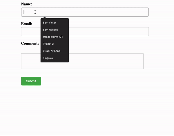
{/* Using the Mention Component */}
<MentionsInput
value={comment}
classNames={mentionStyle}
onChange={(event, newValue) => setComment(newValue)}
>
<Mention
trigger="@"
data={dataResp}
className={mentionStyle.mentions__mention}
/>
<Mention
trigger="#"
data={dataResp}
className={mentionStyle.mentions__mention}
/>
</MentionsInput>
</div>
<button className={styles["submit-btn"]} type="submit">
Submit
</button>
</form>
</div>
);In the code above, we have assigned the respective states to our inputs. We’ve also added a React-Mentions components with two trigger patterns (@ and #). Upon submission of the form, the handleSubmit function created earlier is called, and our response is displayed at the top of the form.
With all this done, we’ll have results like the one below.
Conclusion
React-Mentions provides a powerful and intuitive solution for implementing the mention functionality in React applications. By integrating this library, developers can effortlessly enable users to mention other participants and bring them into the conversation. With its customizable triggers, suggestions, and styling options, React-Mentions offers a seamless user experience. Whether for social media platforms, collaborative tools, or communication applications, React-Mentions empowers developers to enhance interactivity and engagement in their applications.
Here is the Link to the source code on GitHub.
Gain Debugging Superpowers
Unleash the power of session replay to reproduce bugs and track user frustrations. Get complete visibility into your frontend with OpenReplay, the most advanced open-source session replay tool for developers.