
Create Stunning Pages with React and Shoelace CSS


Shoelace CSS is a UI component library that offers a wide range of UX elements. These components have pre-designed visuals, accessibility, and customization options. Shoelace CSS distinguishes itself by using Web Components, allowing integration with any framework. This article will show you all the needed details so you can immediately start using the framework.

Discover how at OpenReplay.com.
Shoelace CSS is a lightweight and modular CSS framework that provides developers with a simple and efficient way to style their web applications while focusing on flexibility. Shoelace CSS offers a comprehensive set of customizable components to help create modern and responsive designs. It makes use of modern CSS features like Flexbox and Grid, with small file sizes and built-in dark mode support, allowing developers to quickly and simply create more complex layouts. The framework is made to be highly flexible and simple to use.
Benefits of using Shoelace CSS
Shoelace CSS brings several benefits for web developers, such as:
- Lightweight: Thanks to the lightweight design of Shoelace CSS, web pages load more quickly. To prevent unnecessary bloat, it focuses on providing only the necessary styles and components.
- Responsive: With the framework, it’s simple to develop responsive and visually stunning designs because it supports modern CSS features like Flexbox and Grid. Your web application will look modern and professional because the components are made with an updated design.
- Easy-to-Use: Using Shoelace CSS allows developers to save time and effort. Instead of building regular website parts from scratch, you may use the ready-to-use library of Shoelace CSS components and tools. It accelerates the development process by giving ready-made, well-tested components.
Drawbacks of using Shoelace CSS
While Shoelace CSS offers many benefits, there are also a few potential drawbacks to consider:
- Compared to larger CSS frameworks, Shoelace CSS might have fewer components available. You may need to modify an existing component if Shoelace CSS does not contain the exact component you need, or you may want to use a different CSS framework or library.
- Although Shoelace CSS is user-friendly for beginners, advanced customizations may require a deeper knowledge of CSS and the framework’s architecture. You might need extra time and effort to get the required outcomes if your design needs are complicated or you need highly customized components.
- Utilizing Shoelace CSS requires the use of an outside CSS framework. This can give your styles a strong base, but it also means that your project is dependent on the growth and changes of the framework. Future modifications or switching to a new framework may be necessary if the framework’s development is poor or does not include the features you want.
Modern Browser Support for Shoelace CSS
Shoelace CSS is made to be suitable for a wide range of modern web browsers thanks to its full browser support. The framework tries to support the most commonly used browsers, such as:
- Google Chrome
- Mozilla Firefox
- Safari (including iOS Safari)
- Microsoft Edge
- Internet Explorer 11 (with some limitations)
This library is not for you if you need to support IE11 or pre-Chromium Edge. Although supporting older browsers is outside this project’s scope, web components can (to a certain extent) be poly filled for them. You will experience problems if you use Shoelace CSS in such a browser.
Getting Started:
Shoelace CSS is the perfect tool to add to your toolbox if you’re a web developer trying to design beautiful and usable website interfaces. In this section, we’ll use React.js to work with Shoelace CSS, and we’ll be working with components and elements which are very simple to use. You don’t need any advanced knowledge to begin this section; simply understanding the fundamentals of React is sufficient to begin using Shoelace. Please remember that you can use Shoelace CSS in standard HTML, which is simple for us to implement.
Installations
The installation of Shoelace CSS will be discussed first, guiding you through the setup process to ensure integration, whether you prefer using package managers like npm or directly including the library via CDN.
Installing Shoelace CSS via npm
To install Shoelace CSS in your React project using npm, it is necessary to have node.js installed on your computer. Please follow the steps below to install Shoelace CSS in your project using npm:
Open the command prompt or terminal.
Navigate to the directory for your React project.
Run the following command in the terminal to install Shoelace CSS as a dependency:
npm install @shoelace-style/shoelaceTo give your website a specific appearance, you can choose a theme. In this case, we’ll use a bright and colorful light theme, the default. We’ll set a base path using a Content Delivery Network (CDN) to easily access icons and other assets. The CDN acts as a file storage space, ensuring quick and efficient delivery to our website. To achieve this, we need to open our index.js file and import the following lines of code:
import "@shoelace-style/shoelace/dist/themes/light.css";
import { setBasePath } from "@shoelace-style/shoelace/dist/utilities/base-path";
setBasePath("https://cdn.jsdelivr.net/npm/@shoelace-style/shoelace@2.5.2/cdn/");
Once we are done with that, we can start using Shoelace CSS components by importing them into our components, just as in the code example below:
import { SlButton } from "@shoelace-style/shoelace/dist/react";

const App = () => {
 return (
   <div>
     <SlButton>Hello, Click Me</SlButton>
   </div>
 );
};

export default App;
Specific components can be imported as needed because Shoelace CSS provides available imports for every React component used in our project. In React, the Shoelace CSS components are imported as React components instead of their original custom elements. This is unique to React alone.
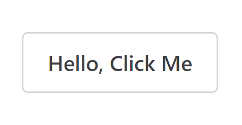
The above code will display a basic button element on the web browser but won’t have any predefined style by default.
Output:
Shoelace components are made to be very compatible with any possible theming system that may be used in our project. A default light theme, a dark theme, or a custom theme can be made to suit our needs.
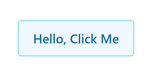
The theme you include in your project determines how your components will look by default. For example, if you add the light theme to your project by linking the light theme stylesheet to your App.js file:
import { SlButton } from "@shoelace-style/shoelace/dist/react";

///light theme stylesheet
import "@shoelace-style/shoelace/dist/themes/light.css";

const App = () => {
 return (
   <div>
     <SlButton>Hello, Click Me</SlButton>
   </div>
 );
};
export default App;
The light theme will define the initial style of your components. The light theme is also regarded as the default style theme.
Output:
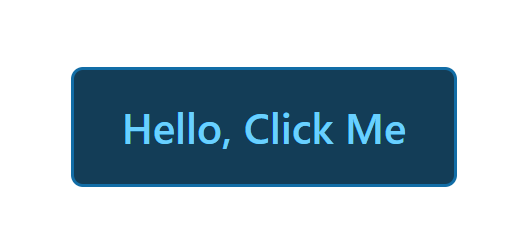
If you choose to use the dark theme instead, the component will automatically have a specific style matching your selected dark theme.
To apply the dark theme in your project, you must activate it after importing the stylesheet. Add the class name sl-theme-dark to the parent div inside the App.js file to do this. This tells the application to use the dark theme’s style.
import { SlButton } from "@shoelace-style/shoelace/dist/react";

///Dark theme stylesheet
import "@shoelace-style/shoelace/dist/themes/dark.css";

const App = () => {
 return (
   <div className="sl-theme-dark">
     <SlButton>Hello, Click Me</SlButton>
   </div>
 );
};
export default App;
Output:
By now, you must have understood how to add Shoelace CSS to your React project using npm and using the built-in themes.
Let’s explore another method of adding Shoelace CSS to our React application.
CDN Usage:
A CDN, or Content Delivery Network, is a special network of servers that helps deliver website content to people quickly. Shoelace CSS offers a CDN option, which means you can easily use Shoelace CSS in your project without needing to download or install anything.
In other to use Shoelace CSS CDN in your React project, the following steps below should be followed:
Create a new React project or navigate to the directory of an existing project.
Open the index.html file, which is located in your React project’s public folder.
In the <head></head> section of the index.html file, add the following link tag to include Shoelace CSS from the CDN:
<link
 rel="stylesheet"
 href="https://cdn.jsdelivr.net/npm/@shoelace-style/shoelace@2.5.2/cdn/themes/light.css"
/>

<script
 type="module"
 src="https://cdn.jsdelivr.net/npm/@shoelace-style/shoelace@2.5.2/cdn/shoelace-autoloader.js"
></script>
After that, save the link tag inside the index.html file.
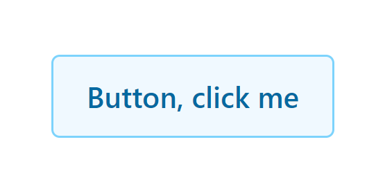
We can now return to our App.js file to import Shoelace CSS components. Before we start making use of Shoelace CSS components in our React project, let’s note that the method for importing Shoelace CSS components using CDN will be <sl->:
const App = () => {
 return (
   <div>
     <sl-button>Button, click me</sl-button>
   </div>
 );
};
export default App;
Output:
From the above result, we can see our button component work just fine but with a different approach. Now that we know how to install Shoelace CSS in our React project, it is high time we begin implementing Shoelace CSS styles to various elements.
Design Tokens
Design Tokens in Shoelace CSS are variables that store design-related values, such as colors, spacing, typography, and more. They provide a centralized and standardized approach to managing and customizing visual styles in the CSS framework. Here are some examples of Design Tokens in Shoelace CSS and how to use them:
Typography
Shoelace CSS offers powerful Typography components for web design. You can apply various font styles, sizes, and alignments to your web content, ensuring consistent and beautiful typography throughout your website. In this section, we’ll explore Shoelace CSS Typography components and learn how to create professional-looking text for your web pages. Let’s dive into the world of Shoelace CSS Typography and enhance your website’s visual impact.
Example
import { SlCard } from "@shoelace-style/shoelace/dist/react";

const Style = `
     .heading1 {
       font-size: var(--sl-font-size-x-large );
       font-family: var(--sl-font-serif);
       letter-spacing: var(--sl-letter-spacing-looser);
       line-height: var(--sl-line-height-looser );
     }

   `;

const App = () => {
 return (
   <div>
     <br />
     <SlCard className="heading1">
       Lorem ipsum dolor sit amet, consectetur adipiscing elit.
     </SlCard>
     <style>{Style}</style>
   </div>
 );
};

export default App;
Output:
Color
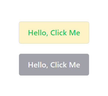
Color plays a vital role in web design, and Shoelace CSS offers Color Tokens to ensure consistent color usage across your application. Shoelace CSS provides palettes for theme colors and primitives, serving as a solid base for your design system. These Color Tokens are accessed through the --sl-color-{name}-{n} CSS custom property, where name represents the palette name and n indicates the desired numeric value.
Example
import { SlButton } from "@shoelace-style/shoelace/dist/react";

const Style = `
   .first-button::part(base) {
     background: var(--sl-color-warning-100);
   }
   .first-button::part(label) {
     color: var(--sl-color-success-500);
   }
   .second-button::part(base) {
     background: var(--sl-color-neutral-400);
   }
   .second-button::part(label) {
     color: var(--sl-color-neutral-100);
   }
   `;

const App = () => {
 return (
   <div>
     <SlButton className="first-button">Hello, Click Me</SlButton>
     <br />
     <br />
     <SlButton className="second-button">Hello, Click Me</SlButton>
     <style>{Style}</style>
   </div>
 );
};

export default App;
Output:
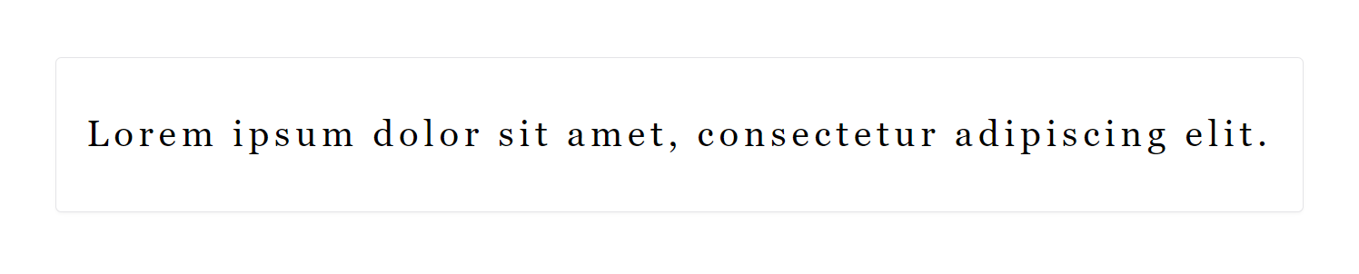
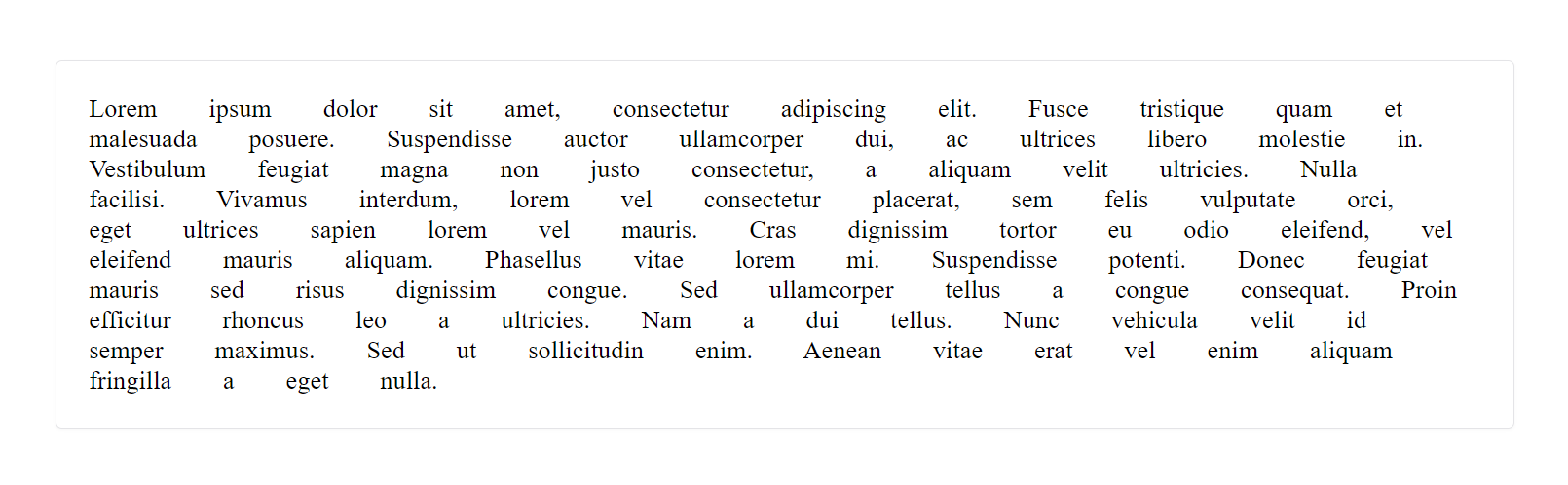
Spacing
Spacing is an important aspect of web design that helps create balance and organization in a user interface. In Shoelace CSS, the Spacing token provides an easy way to manage spacing between elements. By applying Spacing classes, you can control the margin and padding to achieve the desired spacing effect. Whether you want consistent spacing between components or visual separation, the Spacing utility class in Shoelace CSS offers a simple solution. With predefined spacing options, you can easily adjust the spacing in your web application for a visually appealing layout.
Example
import { SlCard } from "@shoelace-style/shoelace/dist/react";

const Style = `
     .content {
       word-spacing: var(--sl-spacing-x-large  );
     }

   `;

const App = () => {
 return (
   <div>
     <SlCard className="content">
       Lorem ipsum dolor sit amet, consectetur adipiscing elit. Fusce tristique
       quam et malesuada posuere. Suspendisse auctor ullamcorper dui, ac
       ultrices libero molestie in. Vestibulum feugiat magna non justo
       consectetur, a aliquam velit ultricies. Nulla facilisi. Vivamus
       interdum, lorem vel consectetur placerat, sem felis vulputate orci, eget
       ultrices sapien lorem vel mauris. Cras dignissim tortor eu odio
       eleifend, vel eleifend mauris aliquam. Phasellus vitae lorem mi.
       Suspendisse potenti. Donec feugiat mauris sed risus dignissim congue.
       Sed ullamcorper tellus a congue consequat. Proin efficitur rhoncus leo a
       ultricies. Nam a dui tellus. Nunc vehicula velit id semper maximus. Sed
       ut sollicitudin enim. Aenean vitae erat vel enim aliquam fringilla a
       eget nulla.
     </SlCard>
     <style>{Style}</style>
   </div>
 );
};

export default App;
Output:
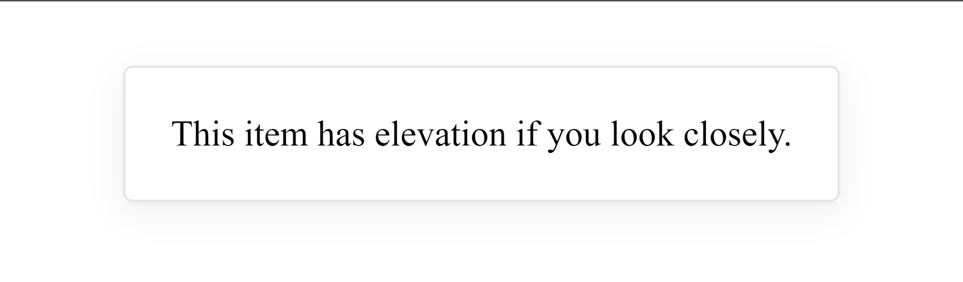
Elevation
Elevation is a feature in Shoelace CSS that allows you to add visual depth and prominence to elements on your website. By applying elevation, you can create a sense of layering and hierarchy, making certain elements stand out and appear more interactive. This feature is particularly useful when designing user interfaces that require a clear distinction between different components or when you want to highlight important elements. With Shoelace CSS Elevation classes, you can easily add depth and enhance the visual appeal of your website, creating a more engaging and intuitive user experience.
Example
import { SlCard } from "@shoelace-style/shoelace/dist/react";

const Style = `
     .card {
       box-shadow: var(--sl-shadow-x-large);
     }
   `;
const App = () => {
 return (
   <div>
     <SlCard className="card">
       This item has elevation if you look closely.
     </SlCard>
     <style>{Style}</style>
   </div>
 );
};

export default App;
Output:
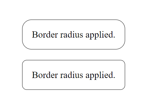
Border Radius
Border Radius tokens provide a way to soften sharp edges and create a smoother, rounded appearance. By applying border-radius, you can give a softer and more visually appealing look to buttons, cards, containers, and other components. The Border Radius token provides predefined values that you can use to achieve consistent and harmonious rounded corners across your design.
Example
const Style = `

   :root {
     --border-radius-1: var(--sl-border-radius-x-large);
     --border-radius-2: var(--sl-border-radius-large);
   }
   .border_1 {
     border-radius: var(--border-radius-1);
     border: 1px solid black;
     padding: 1rem;
   }
   .border_2 {
     border-radius: var(--border-radius-2);
     border: 1px solid black;
     padding: 1rem;
   }
   `;

const App = () => {
 return (
   <div>
     <div className="border_1">Border radius applied.</div>
     <br />
     <div className="border_2">Border radius applied.</div>
     <style>{Style}</style>
   </div>
 );
};

export default App;
Output:
Transition
Shoelace CSS Transition token adds smooth and animated effects to your web elements. Customize the duration, timing function, and properties of transitions easily. Whether a fade-in effect or a slide-out animation, the Shoelace CSS Transition token brings your elements to life with flexibility and visual appeal.
Example:
const App = () => {
 const Style = `
     p {
      display: inline;
      color: black;
      border: 1px solid black;
      padding: 20px;

      background: linear-gradient(to left, white 50%, salmon 50%) right;
      background-size: 200%;
      transition: var(--sl-transition-x-slow);
    }

     p:hover {
      background-position: left;
    }
    `;
 return (
   <>
     <p>Hover me</p>
     <style>{Style}</style>
   </>
 );
};
export default App;
Output:

Z-index
The Z-index token in Shoelace CSS controls the stacking order of elements on a web page. It ensures a logical arrangement and prevents overlapping of components like dropdowns, dialog boxes, and tooltips. With the Z-index token, you can create a visually appealing and well-organized user interface.
Example:
const App = () => {
 const Style = `

   .container {
     position: relative;
   }
   .element {
     position: absolute;
     width: 200px;
     height: 200px;
     background-color: #f1f1f1;
     border: 1px solid #ddd;
   }
   .element1 {
     z-index: var(--sl-z-index-dialog);
   }
   .element2 {
     z-index: var(--sl-z-index-dropdown);
   }
   .element3 {
     z-index: var(--sl-z-index-tooltip);
   }
   `;
 return (
   <div class="container">
     <div class="element element1">Element 1</div>
     <div class="element element2">Element 2</div>
     <div class="element element3">Element 3</div>
     <style>{Style}</style>
   </div>
 );
};

export default App;
Output:
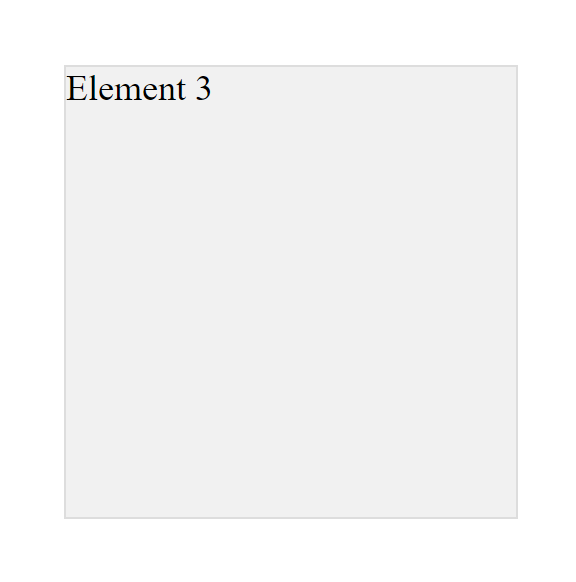
In the above example, we have three elements (Element 1, Element 2, and Element 3) stacked on top of each other within a container. We control their stacking order by assigning different Z-index tokens to each element. Element 1 has the lowest Z-index token, followed by Element 2, and Element 3 has the highest Z-index token. This arrangement determines which element appears in front or behind the others.
Components
Shoelace CSS provides a vast collection of customizable and reusable UI components for building user interfaces. These pre-designed components’ UI library help create stylish and responsive web designs and can be easily customized to match the desired style of your application. We should specify the component whenever we want to import a component for Shoelace CSS.
Below are some of the components offered by Shoelace CSS:
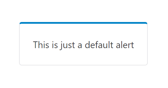
Alert
The Alert component in Shoelace CSS is a useful and flexible user interface element that shows important messages or alerts to users. The Alert component is designed to grab your attention and can be changed to suit different needs. To use the Alert component in our React project, we must import it from Shoelace CSS and add an attribute name open so the Alert becomes visible. Here’s an example of how to do it:
import { SlAlert } from "@shoelace-style/shoelace/dist/react";

const App = () => {
 return (
   <div>
     <SlAlert open>This is just a default alert</SlAlert>
   </div>
 );
};
export default App;
The open attribute is set to true by default, showing the alert immediately. However, it can be changed to false, hiding the alert initially until triggered by user actions like clicking a button. This flexibility of this attribute allows developers to control the alert’s visibility based on the desired user experience.
Output:
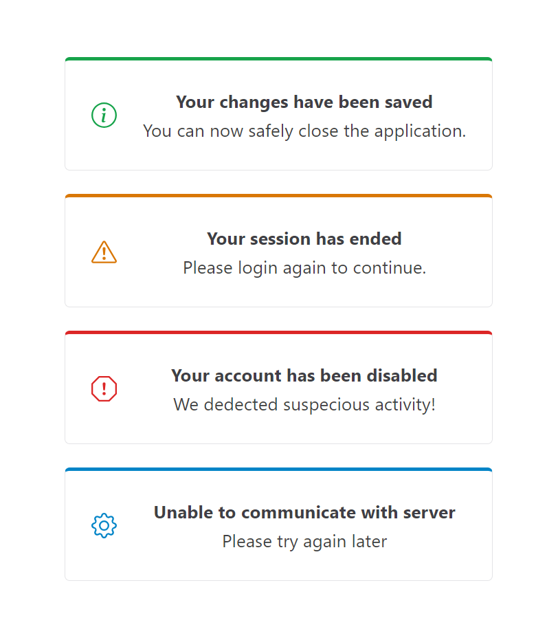
The code example above demonstrates a basic Alert component that can be customized to modify its content and icons. In Shoelace CSS, we can alter the default appearance of the Alert by using something called variant. This refers to different styles or looks available for a specific component. It’s similar to having different color schemes for different parts of the Shoelace CSS components.
For instance, the Alert component in Shoelace CSS offers variants such as success, warning, danger, neutral etc. These variants provide unique colors or icons to represent different types of messages. By utilizing variants, we can make the Alert component stand out or suit a specific purpose. It’s a straightforward and effective way to enhance a component’s visual appearance and uniqueness without altering the overall design.
Here is a code sample that showcases some Alert variants with custom icons from Shoelace CSS and demonstrates how they display various messages:
import { SlAlert, SlIcon } from "@shoelace-style/shoelace/dist/react";
const App = () => (
 <div>
   <SlAlert variant="success" open>
     <SlIcon slot="icon" name="info-circle" />
     <strong>Your changes have been saved</strong>
     <br />
     You can now safely close the application.
   </SlAlert>
   <br />
   <SlAlert variant="warning" open>
     <SlIcon slot="icon" name="exclamation-triangle" />
     <strong>Your session has ended</strong>
     <br />
     Please login again to continue.
   </SlAlert>
   <br />
   <SlAlert variant="danger" open>
     <SlIcon slot="icon" name="exclamation-octagon" />
     <strong>Your account has been disabled</strong>
     <br />
     We detected suspicious activity!
   </SlAlert>
   <br />
   <SlAlert variant="primary" open>
     <SlIcon slot="icon" name="gear" />
     <strong>Unable to communicate with server</strong>
     <br />
     Please try again later
   </SlAlert>
 </div>
);
export default App;
Output:
Now that we have added the Alert component to our React project, we must explore another interesting component in Shoelace CSS. Let’s dive into it and see how it enhances our application with new features.
Avatar
The Avatar component in Shoelace CSS displays user profile pictures or icons. It comes with different size, shape, and dynamic rendering options, making it look stylish and fancy. It can handle fallbacks to ensure things always look good. By default, the Avatar component displays a generic icon. However, you can customize avatars by adding your own icons, initials, or images. Including a label attribute for assistive devices is important to ensure accessibility.
By default, the Avatar component displays a common icon. However, you can customize avatars by adding your own icons, initials, or images.
If you want to use an image as the avatar, you can specify the image and label attributes. This image will be displayed instead of initials or icons, giving a more personalized touch to the avatar. Additionally, you can improve performance by lazily loading the avatar image using the loading attribute set to lazy.
Below is a code sample that explores some exciting features of the Avatar component and how it enhances the visual representation of individuals or users in our applications.
import { SlAvatar } from "@shoelace-style/shoelace/dist/react";

const App = () => {
 return (
   <div>
     <SlAvatar
       image="https://encrypted-tbn0.gstatic.com/images?q=tbn:ANd9GcQ12AfIQBvSlJTmZA 7b7Q6IOqZNDbPdsyYC_g&usqp=CAU"
       label="Avatar of a brown puppy sitting on grass"
       loading="lazy"
     />
   </div>
 );
};

export default App;
Output:

If you don’t have a specific image to use for an avatar, you can make it more unique and personal by setting the initials attribute. Instead of using an icon, the initials attribute allows you to display personalized letters as the avatar. This adds a touch of personalization even when an image is not available.
The code sample below demonstrates how initials can be used for the avatar:
import { SlAvatar } from "@shoelace-style/shoelace/dist/react";

const App = () => {
 return (
   <div>
     <SlAvatar initials="PIC" label="Avatar with initials: PIC" />
   </div>
 );
};

export default App;
Output:

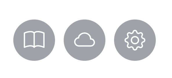
It will display a default icon if you don’t set an image or initials for the Avatar. By using the icon slot, you can customize the default icon to suit your preferences, as seen in the code sample below:
import { SlAvatar, SlIcon } from "@shoelace-style/shoelace/dist/react";

const App = () => {
 return (
   <div className="avatar_group">
     <SlAvatar label="Avatar with a book icon">
       <SlIcon slot="icon" name="book" />
     </SlAvatar>

     <SlAvatar label="Avatar with a cloud icon">
       <SlIcon slot="icon" name="cloud" />
     </SlAvatar>

     <SlAvatar label="Avatar with a gear icon">
       <SlIcon slot="icon" name="gear" />
     </SlAvatar>
   </div>
 );
};

export default App;
Output:
Badge
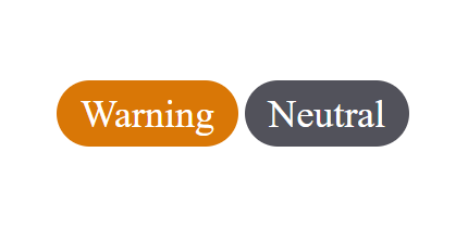
The Badge component allows you to display information, notifications, or status indicators visually appealingly. It’s a simple and effective tool to highlight important content and enhance the user experience in your web application. With customizable colors, sizes, and text, the Badge component offers flexibility to match the design and purpose of your project. Whether you want to display unread messages, indicate product availability, or draw attention to updates, the Badge component is a powerful addition to your project.
In the code sample below, we import the Badge component from Shoelace CSS and set the variant attribute to change the look of our Badge components.
import { SlBadge } from "@shoelace-style/shoelace/dist/react";

const App = () => {
 return (
   <div>
     <SlBadge variant="primary">Primary</SlBadge>
     <SlBadge variant="success">Success</SlBadge>
     <SlBadge variant="neutral">Neutral</SlBadge>
     <SlBadge variant="warning">Warning</SlBadge>
     <SlBadge variant="danger">Danger</SlBadge>
   </div>
 );
};

export default App;
The Badge component can be customized to have rounded edges by adding the pill attribute as shown in the code below:
import { SlBadge } from "@shoelace-style/shoelace/dist/react";

const App = () => {
 return (
   <div>
     <SlBadge variant="warning" pill>
       Warning
     </SlBadge>

     <SlBadge variant="neutral" pill>
       Neutral
     </SlBadge>
   </div>
 );
};
export default App;
Output:
Breadcrumb
The Breadcrumb component in Shoelace CSS shows the user’s current location within a website or app. It consists of clickable links representing different sections or pages, allowing easy navigation. Developers can customize its appearance and separator symbol to match the design. Using the Breadcrumb component improves navigation and enhances the user experience. Below is a Breadcrumb component containing a group of links so users can easily navigate a website:
import {
 SlBreadcrumb,
 SlBreadcrumbItem,
} from "@shoelace-style/shoelace/dist/react";

const App = () => {
 return (
   <div>
     <SlBreadcrumb>
       <SlBreadcrumbItem>Home</SlBreadcrumbItem>
       <SlBreadcrumbItem>Shop</SlBreadcrumbItem>
       <SlBreadcrumbItem>Clothing</SlBreadcrumbItem>
       <SlBreadcrumbItem>Men's Clothing</SlBreadcrumbItem>
       <SlBreadcrumbItem>Shirts & Tops</SlBreadcrumbItem>
     </SlBreadcrumb>
   </div>
 );
};

export default App;
Output:

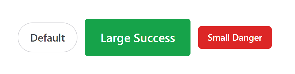
Button
In this section, we’ll use the Shoelace CSS Button component to make a responsive design, and this component allows users to trigger actions in a web application. It offers customization options for appearance, accessibility features, and event-handling capabilities.
The following code below shows how the Button component can be customized to create different stunning responsive output:
import { SlButton } from "@shoelace-style/shoelace/dist/react";

const App = () => {
 return (
   <div className="button_group">
     <SlButton variant="default" size="medium" pill>
       Default
     </SlButton>

     <SlButton variant="success" size="large">
       Large Success
     </SlButton>

     <SlButton variant="danger" size="small">
       Small Danger
     </SlButton>
   </div>
 );
};

export default App;
Output:
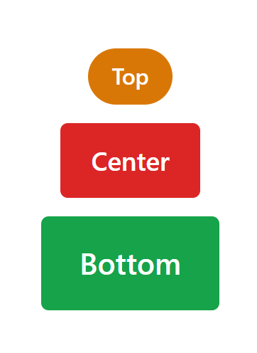
Button Group
The Button Group component in Shoelace CSS is a helpful feature that helps you organize and group buttons together clearly. It allows you to create horizontal or vertical groups of buttons, customize their appearance, and control how they work when clicked. Using the Button Group component, you can make your buttons look better and easier to use, making your app more enjoyable for everyone. Here’s an example of how the Button Group component can be used in our React application:
import { SlButton, SlButtonGroup } from "@shoelace-style/shoelace/dist/react";

const App = () => {
 return (
   <div>
     <SlButtonGroup>
       <SlButton size="small" variant="warning" pill>
         Top
       </SlButton>
     </SlButtonGroup>

     <br />

     <SlButtonGroup>
       <SlButton size="medium" variant="danger">
         Center
       </SlButton>
     </SlButtonGroup>

     <br />

     <SlButtonGroup>
       <SlButton size="large" variant="success">
         Bottom
       </SlButton>
     </SlButtonGroup>
   </div>
 );
};

export default App;
Output:
Card
The Card component is a useful tool for presenting information in a neat and attractive way. It allows you to customize titles, content, images, and buttons to create attractive cards. With its responsive design and interactive features, whether you are building a blog, e-commerce site, or any application that requires content grouping, the Card component can be used to group related subjects in a container.
In our example project, we will create a Card component that includes a button, an image, and a book icon.
import { SlButton, SlCard, SlIcon } from "@shoelace-style/shoelace/dist/react";

const Style = `
     .card {
       max-width: 300px;
     }
     .card small {
       color: var(--sl-color-success-500);
     }
     .card [slot="footer"] {
       display: flex;
       justify-content: space-between;
       align-items: center;
     }
   `;

const App = () => {
 return (
   <div>
     <SlCard className="card">
       <img
         slot="image"
         src="https://images.unsplash.com/photo-1516590914727-51e55df118d5?ixlib=rb-4.0.3&ixid=M3wxMjA3fDB8MHxzZWFyY2h8OHx8ZmVubmVjJTIwZm94fGVufDB8fDB8fHww&auto=format&fit=crop&w=600&q=60"
         alt="Wild life photography of snow fox."
       />
       <strong>Snow Fox</strong>
       <br />
       Captivating Snow Fox Wildlife Photography Caught on Camera
       <br />
       <small>8 weeks old</small>
       <div slot="footer">
         <SlButton variant="danger" pill>
           More info
         </SlButton>
         <SlIcon slot="icon" name="book"></SlIcon>
       </div>
     </SlCard>
     <style>{Style}</style>
   </div>
 );
};

export default App;
Output:
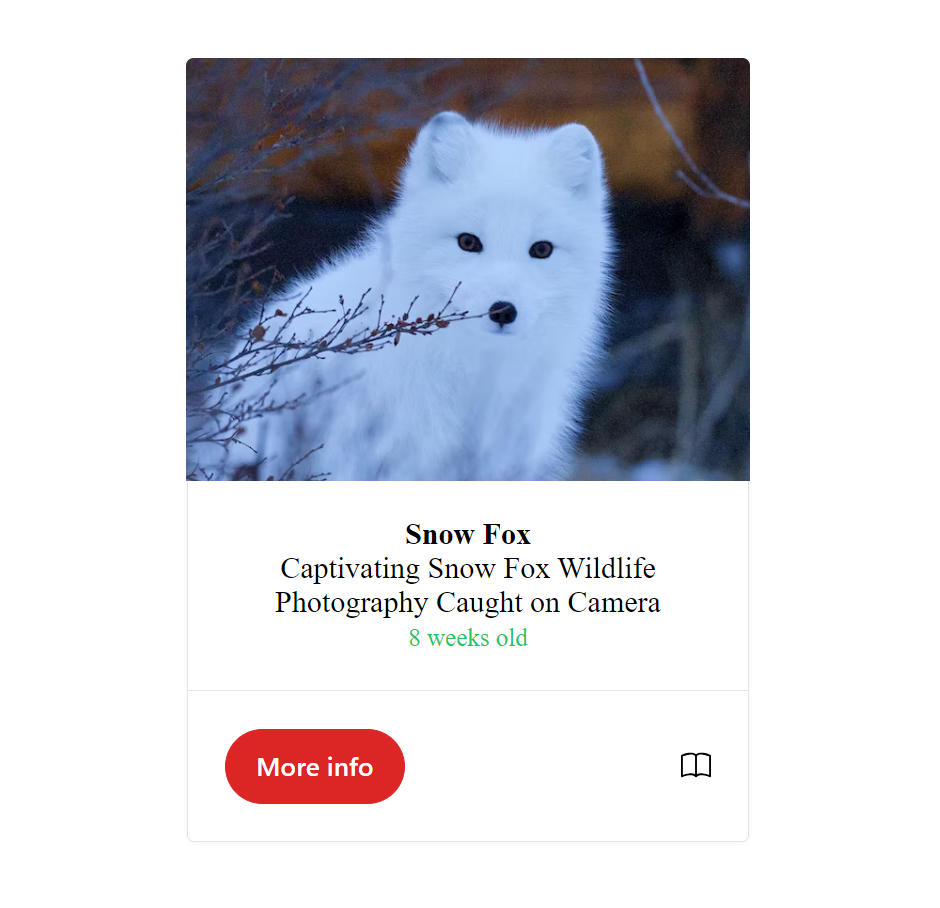
The code above imports three components from the Shoelace CSS library: SlButton, SlCard, and SlIcon. It also defines some CSS styles using the Style variable. In the App component, a SlCard component is rendered. Inside the card component, there is an image of a snow fox, a title wrapped in a strong tag, a captivating description, and a small text indicating the age of the fox. At the bottom of the card, there is a footer section containing a SlButton component with the label “More Info” and a SlIcon component with the “book” icon.
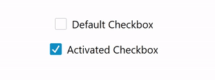
Checkbox
The Checkbox component in Shoelace CSS allows users to make selections or indicate choices. It consists of a small box that can be checked or unchecked, along with a label describing the option. With Shoelace CSS, we can change how the Checkbox looks, works, and can be accessed. The Checkbox component in Shoelace CSS is designed to make it easy for everyone to interact with forms and settings. It ensures that users can effectively use and understand its purpose. Whether you’re choosing options or indicating choices, the Checkbox offers flexibility to meet different design needs and make the user experience more enjoyable.
The following code shows a default Checkbox component and how we can use it in our React application:
import { SlCheckbox } from "@shoelace-style/shoelace/dist/react";

   const App = () => {
     return (
       <div>
         <SlCheckbox>Default Checkbox</SlCheckbox>
         <br />
         <br />
         <SlCheckbox checked>Activated Checkbox</SlCheckbox>
       </div>
     );
   };
   export default App;
We can activate the Checkbox by using the checked attribute.
Output:
Color Picker
The Color Picker component in Shoelace CSS is a tool that helps you choose and adjust colors and can be used as a self-closing element. It has a user-friendly design and can be customized to fit different needs. Whether you’re designing graphics, customizing themes, or working with colors in any way, the Color Picker makes it easy and fun to select the perfect shades. In the code sample below, we can see how we use the Color Picker component to style our React application:
import { SlColorPicker, SlButton } from "@shoelace-style/shoelace/dist/react";
import { useState } from "react";

const App = () => {
 const [onChange, SetOnChange] = useState(false);
 const clickHandler = () => {
   SetOnChange(true);
 };
 return (
   <div>
     <SlButton onClick={clickHandler}>Set Color</SlButton>
     <br />
     <br />
     {onChange && (
       <SlColorPicker
         value="#4a90e2"
         label="click to select a color"
       ></SlColorPicker>
     )}
     <br />
     <br />
     <SlButton
       onClick={() => {
         SetOnChange(false);
       }}
     >
       Close Color
     </SlButton>
   </div>
 );
};
export default App;
Output:
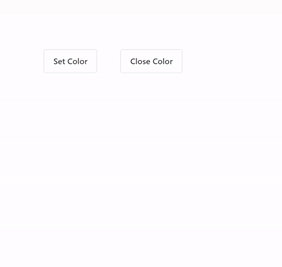
The above code shows a Shoelace CSS Button component that displays the Color Picker when the Set Color button is clicked and removes it from the UI when the Close Color button is clicked.
Details/Accordion
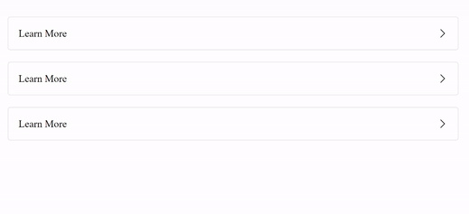
The Shoelace CSS Details component is a special element that helps display extra information on a webpage in a neat and organized way. It allows you to create collapsible sections, which means you can hide or show content with just a click. This is useful for things like FAQs, tutorials, or any time you want to provide more details. It’s a simple and user-friendly way to improve your website and make it more interactive for everyone.
Below is a code illustration of how to set up and use the Shoelace CSS Details component in our React project:
import { SlDetails } from "@shoelace-style/shoelace/dist/react";

const App = () => (
 <div>
   <SlDetails summary="Learn More">
     Lorem ipsum dolor sit amet, consectetur adipiscing elit, sed do eiusmod
     tempor incididunt ut labore et dolore magna aliqua. Ut enim ad minim
     veniam.
   </SlDetails>

   <br />

   <SlDetails summary="Learn More">
     Lorem ipsum dolor sit amet, consectetur adipiscing elit, sed do eiusmod
     tempor incididunt ut labore et dolore magna aliqua. Ut enim ad minim
     veniam.
   </SlDetails>

   <br />

   <SlDetails summary="Learn More">
     Lorem ipsum dolor sit amet, consectetur adipiscing elit, sed do eiusmod
     tempor incididunt ut labore et dolore magna aliqua. Ut enim ad minim
     veniam.
   </SlDetails>
 </div>
);

export default App;
The summary attribute can be used to set a default value for our Details component.
Output:
Divider
The Divider component in Shoelace CSS is a valuable tool for creating visually appealing and well-structured interfaces. It helps to separate different sections or elements clearly and organized. Whether you want to distinguish content sections, create visual breaks, or improve the overall layout of your interface, the Divider component offers a simple solution. You can customize its color, thickness, style, and alignment to match your design preferences. With this versatile and user-friendly component, you can enhance the visual hierarchy and improve the user experience of your interface.
Below is a brief example showing the Divider component in our React application:
import { SlDivider } from "@shoelace-style/shoelace/dist/react";

const App = () => (
 <div>
   <SlDivider />
   First Section
   <SlDivider style={{ "--width": "5px" }} />
   Second Section
   <SlDivider style={{ "--width": "5px" }} />
   Third Section
   <SlDivider style={{ "--width": "2px" }} />
 </div>
);

export default App;
Output:
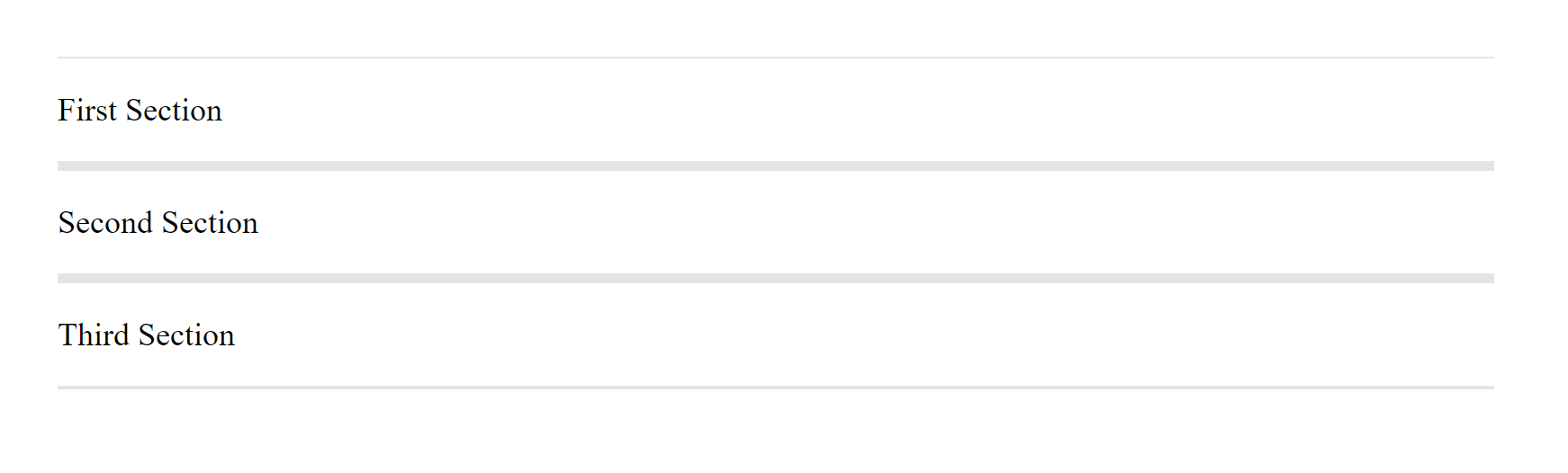
The above code shows the Shoelace CSS Divider component being used with some custom styles to separate different parts of the web page, making it look more clear and more organized.
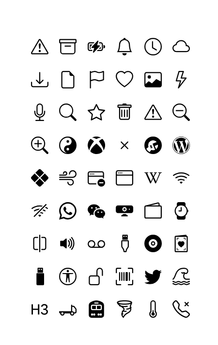
Icon
The Icon component s a powerful tool that lets you easily add attractive symbols to your website or application. These symbols help users understand and navigate your interface with ease. With a wide range of ready-to-use icons available, you can effortlessly enhance the look of your design. The Icon component allows you to customize the size, color, and style of the icons, making it simple to match them with your overall design. In this section, we’ll take a look at some of the icons Shoelace CSS provides us with.
The code below displays a list of icons that are ready to use in our React application. By setting the name attribute, we can easily include these icons in our design and make it responsive:
import { SlIcon } from "@shoelace-style/shoelace/dist/react";

const App = () => (
 <div>
   <div>
     <SlIcon name="exclamation-triangle"></SlIcon>
     <SlIcon name="archive"></SlIcon>
     <SlIcon name="battery-charging"></SlIcon>
     <SlIcon name="bell"></SlIcon>
     <SlIcon name="clock"></SlIcon>
     <SlIcon name="cloud"></SlIcon>
     <br />
     <SlIcon name="download"></SlIcon>
     <SlIcon name="file-earmark"></SlIcon>
     <SlIcon name="flag"></SlIcon>
     <SlIcon name="heart"></SlIcon>
     <SlIcon name="image"></SlIcon>
     <SlIcon name="lightning"></SlIcon>
     <br />
     <SlIcon name="mic"></SlIcon>
     <SlIcon name="search"></SlIcon>
     <SlIcon name="star"></SlIcon>
     <SlIcon name="trash"></SlIcon>
     <SlIcon name="exclamation-triangle" />
     <SlIcon name="zoom-out" />
     <br />
     <SlIcon name="zoom-in" />
     <SlIcon name="yin-yang" />
     <SlIcon name="xbox" />
     <SlIcon name="x" />
     <SlIcon name="wrench-adjustable-circle-fill" />
     <SlIcon name="wordpress" />
     <br />
     <SlIcon name="x-diamond-fill" />
     <SlIcon name="wind" />
     <SlIcon name="window-dash" />
     <SlIcon name="window" />
     <SlIcon name="wikipedia" />
     <SlIcon name="wifi" />
     <br />
     <SlIcon name="wifi-off" />
     <SlIcon name="whatsapp" />
     <SlIcon name="wechat" />
     <SlIcon name="webcam-fill" />
     <SlIcon name="wallet2" />
     <SlIcon name="watch" />
     <br />
     <SlIcon name="vr" />
     <SlIcon name="volume-up-fill" />
     <SlIcon name="voicemail" />
     <SlIcon name="usb-plug" />
     <SlIcon name="vinyl-fill" />
     <SlIcon name="valentine2" />
     <br />
     <SlIcon name="usb-drive-fill" />
     <SlIcon name="universal-access-circle" />
     <SlIcon name="unlock" />
     <SlIcon name="upc-scan" />
     <SlIcon name="twitter" />
     <SlIcon name="tsunami" />
     <br />
     <SlIcon name="type-h3" />
     <SlIcon name="truck-flatbed" />
     <SlIcon name="train-front-fill" />
     <SlIcon name="tornado" />
     <SlIcon name="thermometer-low" />
     <SlIcon name="telephone-x" />
   </div>
 </div>
);

export default App;
Output:
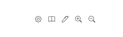
Icon Button
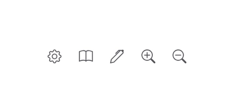
The Icon Button component is an easy-to-use tool that allows you to add interactive icons to your website or app. These buttons combine the functions of a regular button with attractive icons. You can choose from a variety of pre-designed icons and customize the size, color, and style of the icons to match your design. To use the Icon Button component, we first need to import SlIconButton from Shoelace CSS and pass in a name and a label attribute. The name attribute serves as the icon name, and the label attribute provides a text description or name for the icon, as seen in the code below:
import { SlIconButton } from "@shoelace-style/shoelace/dist/react";

const App = () => (
 <div>
   <SlIconButton name="gear" label="Settings" />
   <SlIconButton name="book" label="Book" />
   <SlIconButton name="pen" label="Edit" />
   <SlIconButton name="zoom-in" label="zoom-in" />
   <SlIconButton name="zoom-out" label="zoom-out" />
 </div>
);
export default App;
Output:
To give users more information, we can use a special tool called SlTooltip from Shoelace CSS. It works by wrapping it around a SlIconButton. When a user hovers over or interacts with the Icon Button, a small box called a tooltip appears. Inside the tooltip, we can use the content attribute to include specific information or descriptions that will be displayed when the user hovers over or interacts with the Icon Button. This helps users understand what will happen when they click or interact with the button.
Below is a code example of how the SlTooltip component works when used as a wrapper for the SlIconButton component:
import { SlIconButton, SlTooltip } from "@shoelace-style/shoelace/dist/react";

const App = () => (
 <div>
   <SlTooltip content="Settings">
     <SlIconButton name="gear" label="Settings" />
   </SlTooltip>
   <SlTooltip content="Book">
     <SlIconButton name="book" label="Book" />
   </SlTooltip>
   <SlTooltip content="Edit">
     <SlIconButton name="pen" label="Edit" />
   </SlTooltip>
   <SlTooltip content="Zoom-In">
     <SlIconButton name="zoom-in" label="Zoom-In" />
   </SlTooltip>
   <SlTooltip content="Zoom-Out">
     <SlIconButton name="zoom-out" label="Zoom-Out" />
   </SlTooltip>
 </div>
);

export default App;
Output:
Advanced Components
Shoelace CSS Advanced Components take web interfaces to the next level. With advanced features and customization options, these components empower you to build impressive web applications effortlessly. From dynamic modals to interactive forms and tables, they offer a wide range of functionalities. In this section, we’ll explore the power of Shoelace’s Advanced Components and how they can elevate the user experience of your website.
Notification Bar
In this section, we will be building a customized Navigation Bar using some of Shoelace CSS components. While Shoelace CSS provides a wide range of components, including buttons, forms, and cards, it does not offer a specific Navigation Bar component. However, by leveraging some of the provided components and applying custom styles, we can create our own unique Navigation Bar that fits our design requirements.
Below is a code example showing how we can customize some of Shoelace CSS components to build our very own custom Notification Bar component:
import { SlCard, SlButton, SlIcon } from "@shoelace-style/shoelace/dist/react";
import { useState } from "react";

const Style = `
   sl-card {
     width: 100%;
   }
   .card_holder .item {
     display: flex;
     justify-content: space-between;
     align-items: center;
     text-align: center;
   }
   sl-icon {
     margin: 1px;
     font-size: 1.5rem;
   }
   `;

const App = () => {
 const [showNotification, setShowNotification] = useState(false);

 return (
   <>
     {showNotification && (
       <SlCard className="card_holder">
         <div className="item">
           <SlIcon name="exclamation-octagon" style={{ color: "red" }} />
           <strong>
             Notice: This is an error message. This is an error message. This
             is an error message. This is an error message. This is an error
             message.
           </strong>
           <SlIcon
             name="x-lg"
             onClick={() => {
               setShowNotification(false);
             }}
           />
         </div>
       </SlCard>
     )}
     <br />
     <br />
     <SlButton
       variant="warning"
       onClick={() => {
         setShowNotification(true);
       }}
     >
       Show Notification
     </SlButton>
     <style>{Style}</style>
   </>
 );
};

export default App;
Output:

The code above demonstrates how to create a custom Notification Bar using Shoelace CSS components in React. It includes a button to show and hide the notification. The Notification Bar displays an error message and a close button when the Show Notification button is clicked. The code also includes CSS styles for the card’s layout and appearance.
Progress Bar
The Shoelace CSS Progress Bar component is a helpful tool for showing the progress or completion of a task in your web applications. It provides a simple and easy-to-understand way to communicate how far along a process is, such as uploading files or loading data. With options to customize its color, size, and animations, the Progress Bar improves the user experience by displaying the progress and ensuring a responsive interface. Whether you’re creating a basic form or a more advanced application, the Shoelace CSS Progress Bar component adds both functionality and visual appeal to your projects.
The code below shows how the Progress Bar can be used in our React application:
import { SlProgressBar } from "@shoelace-style/shoelace/dist/react";

const App = () => {
 return (
   <>
     <SlProgressBar
       value="45"
       label="Upload in progress"
       style={{ "--width": "15px" }}
     />
   </>
 );
};

export default App;
Output:
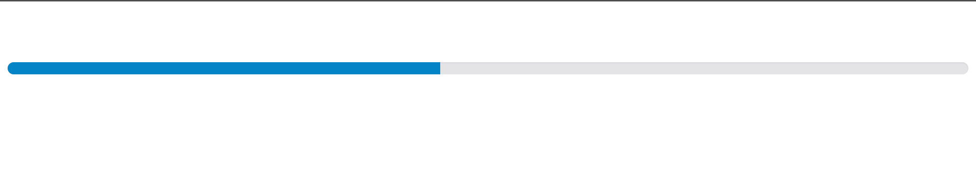
We can adjust the value attribute to change the upload progress of the Progress Bar and use the style attribute to set a custom height.
Search Bar
In Shoelace CSS, there isn’t a ready-made Search Bar component. However, we can make our own custom Search Bar using different components provided by Shoelace CSS. By combining elements like an Input Field and a Button, we can create a Search Bar that works well and looks good. This gives us the freedom to design the Search Bar according to our needs. In this section, we will learn how to build a personalized Search Bar using Shoelace components, allowing us to offer a pleasant and effective search experience to our users. Here’s an example of how you can do it:
import { SlInput, SlButton } from "@shoelace-style/shoelace/dist/react";
import { useState } from "react";

const App = () => {
 const [searchValue, setSearchValue] = useState("");

 const handleSearch = () => {
   console.log("Search Result:", searchValue);
 };

 const handleChangeInput = (event) => {
   setSearchValue(event.target.value);
 };

 return (
   <>
     <SlInput
       type="text"
       placeholder="Search..."
       onInput={handleChangeInput}
       value={searchValue}
     />
     <br />
     <SlButton onClick={handleSearch}>Search</SlButton>
   </>
 );
};

export default App;
Output:
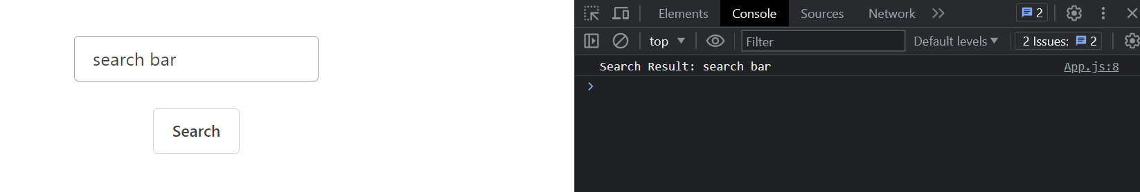
In the above code example, we use the SlInput component to create an input field for the search query, and the SlButton component to create a search button. The handleSearch function is triggered when the Search button is clicked, and it can contain your custom logic to handle the search operation. The handleChangeInput function updates the searchValue state as the user types in the input field.
By combining these Shoelace CSS components and custom logic, you can create a search bar that suits your specific needs.
Pagination
Pagination helps organize large amounts of data by splitting it into smaller sections across multiple pages. This makes it easier for users to navigate and find the information they need. While Shoelace CSS doesn’t have a built-in Pagination component, we can create our very own using buttons and page indicators provided by Shoelace CSS. Adding pagination improves the user experience and makes your web application more organized, particularly when working with large datasets.
In the below example, the Pagination component keeps track of the current page using the currentPage state variable. The goToPage function is responsible for updating the current page when a pagination button is clicked. The renderPaginationButtons function dynamically generates the pagination buttons based on the total number of pages. Each button is a SlButton component from Shoelace CSS and triggers the goToPage function with the corresponding page number. The Previous and Next buttons allow the user to navigate to the previous and next pages, respectively.
Example
import { SlButton } from "@shoelace-style/shoelace/dist/react";
import { useState } from "react";

const App = () => {
 const [currentPage, setCurrentPage] = useState(1);
 const totalPages = 5;
 const goToPage = (pageNumber) => {
   setCurrentPage(pageNumber);
 };
 const renderPaginationButtons = () => {
   const buttons = [];
   for (let i = 1; i <= totalPages; i++) {
     buttons.push(
       <SlButton
         key={i}
         variant={currentPage === i ? "primary" : "default"}
         onClick={() => goToPage(i)}
       >
         {i}
       </SlButton>,
     );
   }
   return buttons;
 };
 return (
   <div>
     <SlButton
       disabled={currentPage === 1}
       onClick={() => goToPage(currentPage - 1)}
     >
       Previous
     </SlButton>
     {renderPaginationButtons()}
     <SlButton
       disabled={currentPage === totalPages}
       onClick={() => goToPage(currentPage + 1)}
     >
       Next
     </SlButton>
   </div>
 );
};

export default App;
Output:
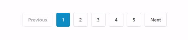
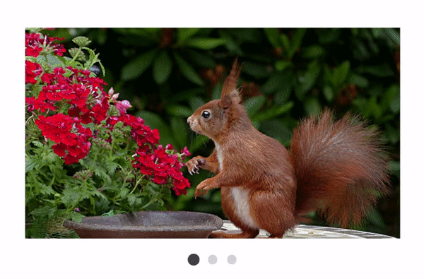
Image Carousel
The Image Carousel component in Shoelace CSS is a powerful tool for creating visually stunning and interactive image galleries on your website. It allows you to showcase a collection of images in a slideshow-like format, where users can navigate through the images by clicking on navigation arrows or indicators. The Image Carousel component offers various customization options to suit your needs, such as setting the transition duration, autoplay functionality, and controlling the number of visible images at a time.
Example
import {
 SlCarousel,
 SlCarouselItem,
} from "@shoelace-style/shoelace/dist/react";

const Style = `
   sl-carousel {
     height: 300px;
     width: 500px;
   }
   `;

const App = () => {
 return (
   <>
     <SlCarousel pagination>
       <SlCarouselItem>
         <img
           alt="red squirrel on brown table top"
           src="https://images.pexels.com/photos/460775/pexels-photo-460775.jpeg?auto=compress&cs=tinysrgb&w=2000"
         />
       </SlCarouselItem>
       <SlCarouselItem>
         <img
           alt="veranda surrounded by green cactus and pink bougainvillea"
           src="https://images.pexels.com/photos/919278/pexels-photo-919278.jpeg?auto=compress&cs=tinysrgb&w=2000"
         />
       </SlCarouselItem>
       <SlCarouselItem>
         <img
           alt="white mountain bike parks near white concrete poster on gray bricks pavement"
           src="https://images.pexels.com/photos/1145257/pexels-photo-1145257.jpeg?auto=compress&cs=tinysrgb&w=2000"
         />
       </SlCarouselItem>
     </SlCarousel>
     <style>{Style}</style>
   </>
 );
};
export default App;
Output:
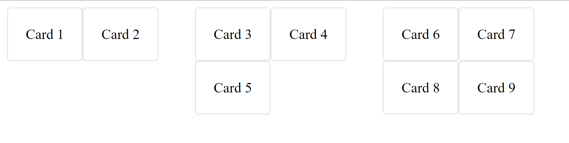
Masonry Grid
In web design, a Masonry Grid is a layout technique that arranges elements in a dynamic grid-like structure. While Shoelace CSS doesn’t provide a specific Masonry Grid component, we can build our own custom version using some of Shoelace CSS components and CSS. This allows us to create visually appealing and responsive grid layouts for displaying content. Let’s explore how to create a custom Masonry Grid using Shoelace CSS components.
Example:
import { SlCard } from "@shoelace-style/shoelace/dist/react";

const App = () => {
 return (
   <div style={{ display: "flex", gap: "10px" }}>
     <div style={{ flex: "1" }}>
       <SlCard>Card 1</SlCard>
       <SlCard>Card 2</SlCard>
     </div>
     <div style={{ flex: "1" }}>
       <SlCard>Card 3</SlCard>
       <SlCard>Card 4</SlCard>
       <SlCard>Card 5</SlCard>
     </div>
     <div style={{ flex: "1" }}>
       <SlCard>Card 6</SlCard>
       <SlCard>Card 7</SlCard>
       <SlCard>Card 8</SlCard>
       <SlCard>Card 9</SlCard>
     </div>
   </div>
 );
};

export default App;
Output:
Tag Input
The Tag Input component makes adding and managing tags very easy. With its interactive interface, users can easily input and remove tags, creating a seamless experience. Shoelace CSS does not provide a specific Tag Input component. However, we can create similar functionality using the available components. Here’s an example of how we can achieve that using some of Shoelace CSS components:
Example:
import React, { useState } from "react";
import { SlInput, SlTag } from "@shoelace-style/shoelace/dist/react";

const App = () => {
 const [tags, setTags] = useState([]);
 const [inputValue, setInputValue] = useState("");
 const handleInputChange = (event) => {
   setInputValue(event.target.value);
 };
 const handleInputKeyPress = (event) => {
   if (event.key === "Enter" && inputValue) {
     setTags([...tags, inputValue]);
     setInputValue("");
   }
 };
 const handleTagRemove = (tagToRemove) => {
   const updatedTags = tags.filter((tag) => tag !== tagToRemove);
   setTags(updatedTags);
 };
 return (
   <div>
     <div>
       {tags.map((tag, index) => (
         <SlTag key={index} onRemove={() => handleTagRemove(tag)}>
           {tag}
         </SlTag>
       ))}
     </div>
     <SlInput
       value={inputValue}
       onInput={handleInputChange}
       onKeyPress={handleInputKeyPress}
       placeholder="Enter a tag"
     />
   </div>
 );
};
export default App;
Output:
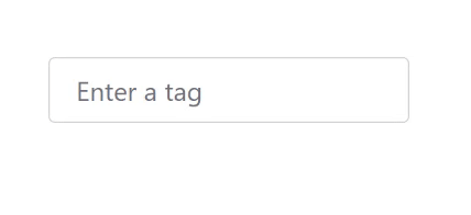
In the above code example, we use the tags state, managed by useState, to store an array of tags. The input value is stored in the inputValue state, which is updated as the user types using the handleInputChange function. When the user presses Enter, the handleInputKeyPress function adds the input value as a new tag to the tags array.
To display the tags, we use the SlTag component within a loop. Each tag includes a remove button that triggers the handleTagRemove function when clicked.
Accordion
Shoelace CSS does not provide a built-in Accordion component. However, we can create an accordion-like behavior using the available components and some additional code. One approach is to use the SlDetails component from Shoelace CSS along with some JavaScript logic to toggle the visibility of the content.
Here’s an example of how we can create an accordion-like behavior with Shoelace CSS:
Example:
import { useState } from "react";
import { SlDetails, SlButton } from "@shoelace-style/shoelace/dist/react";
const App = () => {
 const [isOpen, setIsOpen] = useState(false);
 const toggleAccordion = () => {
   setIsOpen(!isOpen);
 };
 return (
   <div>
     <SlButton onClick={toggleAccordion}>Toggle Accordion</SlButton>
     <SlDetails open={isOpen}>
       <summary>Accordion Content</summary>
       <p>This is the content of the accordion.</p>
     </SlDetails>
   </div>
 );
};
export default App;
Output:
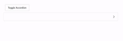
In the above example, the SlDetails component serves as a container for the accordion content. The open prop is used to control the visibility of the content based on the isOpen state. The SlButton component is used to toggle the isOpen state when clicked.
Rating System
The Rating component in Shoelace CSS is a tool for collecting and displaying user ratings on your website or app. It visually represents ratings using stars or symbols, allowing users to express their opinion. With the Rating component, you can easily implement a rating system that enhances user engagement and provides valuable feedback. It’s perfect for product reviews, feedback forms, and any application that requires user ratings. The Rating component offers a user-friendly and natural solution, making it easier for users to express their desire and for others to make informed decisions based on the ratings provided.
Below is an example of how the Rating component work:
import { SlRating } from "@shoelace-style/shoelace/dist/react";
   const App = () => {
     return (
       <div>
         <SlRating label="Rate this product" />
       </div>
     );
   };
   export default App;
A label should be provided for assistive devices using the label attribute.
Output:

Ratings are normally 0-5 by default, but we can increase the value of our rating to any number of our choice using the max attribute, as seen in the code below:
import { SlRating } from "@shoelace-style/shoelace/dist/react";
const App = () => {
 return (
   <div>
     <SlRating label="Rate this product" max={10} />
   </div>
 );
};
export default App;
Output:

Stepper
Shoelace CSS does not offer a built-in Stepper component. However, Shoelace CSS provides a wide range of other components that can be used to build a custom stepper. We can utilize components like Buttons, Progress Bars, and Input Fields to create the desired functionality and appearance of a stepper. By implementing the necessary logic and styling, we can achieve a stepper-like behavior using some of the Shoelace CSS components.
Here is an example of how we can do that:
Example:
import { useState } from "react";
import { SlButton } from "@shoelace-style/shoelace/dist/react";

const Stepper = () => {
 const [step, setStep] = useState(1);
 const handleNext = () => {
   setStep((prevStep) => prevStep + 1);
 };
 const handlePrevious = () => {
   setStep((prevStep) => prevStep - 1);
 };
 return (
   <div>
     {step === 1 && <div>Step 1 Content</div>}
     {step === 2 && <div>Step 2 Content</div>}
     {step === 3 && <div>Step 3 Content</div>}
     {step === 4 && <div>Step 4 Content</div>}
     {step === 5 && <div>Step 5 Content</div>}
     {step === 6 && <div>Step 6 Content</div>}
     <br />
     {step > 1 && <SlButton onClick={handlePrevious}>Previous</SlButton>}
     {step < 6 && <SlButton onClick={handleNext}>Next</SlButton>}
   </div>
 );
};

export default Stepper;
Output:
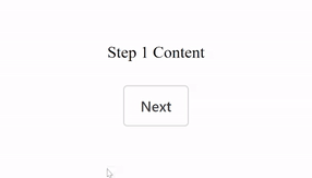
In the above example, the stepper component maintains the current step using the step state variable. The content of each step is conditionally rendered based on the current step value. The user can navigate between steps by clicking on the “Previous” and “Next” buttons, which update the step state accordingly.
Conclusion
I hope you found this article to be interesting. In this article, we discussed Shoelace CSS foundations and how to set up Shoelace CSS and use it with React.js`. Additionally, we use Shoelace to quickly construct different kinds of components without having to write a ton of CSS codes. I will encourage you to take another advanced project and integrate it with Shoelace CSS if you want to advance further with it. What you’ve covered in Shoelace CSS and other front-end frameworks can be easily integrated. Kindly click on this link to understand more about Shoelace CSS.
Truly understand users experience
See every user interaction, feel every frustration and track all hesitations with OpenReplay — the open-source digital experience platform. It can be self-hosted in minutes, giving you complete control over your customer data. . Check our GitHub repo and join the thousands of developers in our community..
