Creating a Custom Grid System with Vuetify
Design your own grid system for maximum flexibility


In modern web design, grid systems are crucial in creating flexible and responsive layouts. They provide a basis that helps designers and developers effectively align and arrange web page content. Vuetify, a popular framework for Vue.js, offers a built-in grid system with predefined grid classes to simplify creating responsive layouts. However, there may be cases where you need to create a custom CSS grid system to meet specific design requirements. This article will explore the Vuetify grid system, understand its capabilities, and explore creating a custom grid system using Vuetify.
If you want to create a Vue project with Vuetify, you can use Vuetify’s built-in tool to scaffold it. This tool imports all the required Vuetify components for your application. To start, open your terminal and enter the following command:
npm create vuetify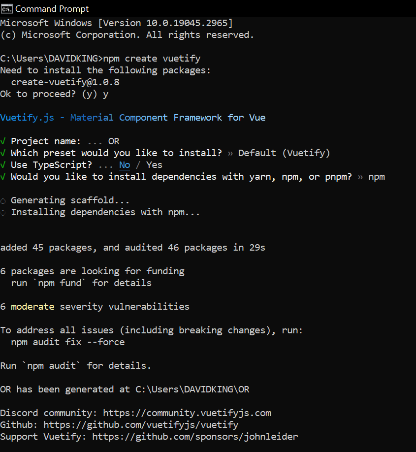 Once the scaffolding process has been completed, you may begin using the Vue development server by entering the following commands:
cd vuetify-project
npm dev
Installing Vuetify in an existing project
If you want to use Vuetify in an already established project, you must manually import all the required components. Start by going to the project folder and installing Vuetify with the following command:
npm install vuetify@^3.1.14After finishing the installation, we need to include Vuetify in the main.js file of the application. To do this, open the main.js file and add the configuration code below.
import { createApp } from 'vue'
import App from './App.vue'
// Vuetify
import 'vuetify/styles'
import { createVuetify } from 'vuetify'
import * as components from 'vuetify/components'
import * as directives from 'vuetify/directives'
const vuetify = createVuetify({
 components,
 directives,
})
createApp(App).use(vuetify).mount('#app')
Understanding the Vuetify Grid System
Before we dive into creating a custom grid system, let’s gain a solid understanding of the basic Vuetify grid system. Vuetify’s grid system is built on the concepts of rows and columns, allowing you to define a flexible layout structure. The primary components used in the grid system are grow and v-col.
The v-row component acts as a container for columns, while the v-col component represents individual columns within a row. You can achieve a responsive and adaptive layout by specifying the number of columns within a row and configuring responsive behavior.
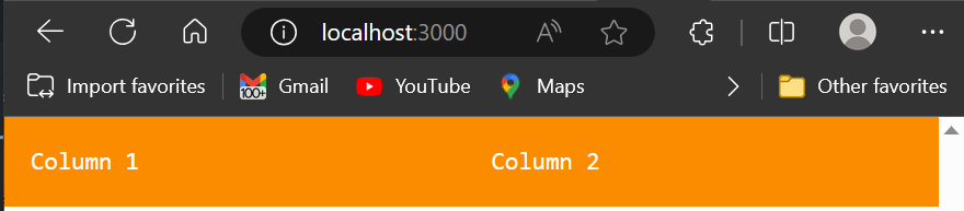
<template>
 <v-container class="bg-warning mb-6">
   <v-row>
     <v-col cols="6">Column 1</v-col>
     <v-col cols="6">Column 2</v-col>
   </v-row>
 </v-container>
</template>
With the example above, we create a row with two columns, each taking up 50% of the available width.
Configuring the number of columns is just the beginning. Vuetify’s grid system provides various options for managing margins, padding, content alignment, and responsiveness. Also, breakpoints are crucial in adapting the layout based on different screen sizes.
Below is an image showing a simple Vuetify grid layout with two columns.
Customizing the Vuetify Grid System
While Vuetify’s built-in grid system is robust, there may be cases where you need to customize it to achieve a specific layout or design. Fortunately, Vuetify provides several options for custom layouts.
Defining a Custom Grid Structure
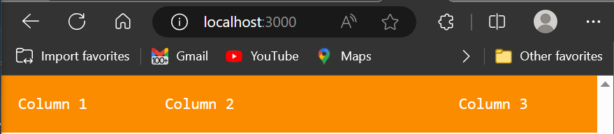
To create a custom grid structure in Vuetify, you can utilize the v-row and v-col components. You can define your unique grid layout by combining these components and specifying the desired number of columns.
<template>
 <v-container class="bg-warning mb-6">
   <v-row>
     <v-col cols="3">Column 1</v-col>
     <v-col cols="6">Column 2</v-col>
     <v-col cols="3">Column 3</v-col>
   </v-row>
 </v-container>
</template>
In the example above, we create a row with three columns, where the first and third columns take up 25% of the available width, and the second column takes up 50%.
Content Alignment and Responsive Behavior
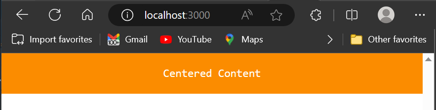
Vuetify’s grid system offers props like align and justify to precisely align and distribute content within rows and columns. You can use these props to achieve desired alignments, such as centering content vertically or horizontally.
<v-row justify="center">
 <v-col cols="4" align="center">Centered Content</v-col>
</v-row>
The example above demonstrates how to center content horizontally and vertically within a column.
To make your custom grid system responsive, you can leverage breakpoints. Vuetify provides predefined breakpoints like xs,
sm, md, lg, and xl allow you to adapt the layout based on different screen sizes.
<template>
 <v-container grid-list-md text-xs-center>
   <v-row>
     <v-col class="bg-warning mb-6" sm="6" md="4" lg="3"
       >Responsive Column</v-col
     >
   </v-row>
 </v-container>
</template>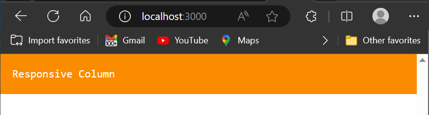
In the code snippet above, the column will take up 12 columns on extra-small screens, six on small screens, four on medium screens, and three on large screens.
The GIF below shows the video evidence of the above explanation of the code:
Additional Customization Options
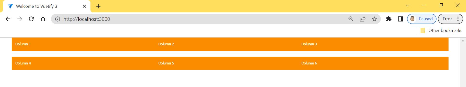
Vuetify’s grid system offers additional options for customization. For example, you can apply the no-gutters prop to remove spacing between columns, allowing for a more compact layout.
<template>
 <v-container class="bg-warning mb-6" grid-list-md text-xs-center>
   <v-row no-gutters>
     <v-col cols="4">Column 1</v-col>
     <v-col cols="4">Column 2</v-col>
     <v-col cols="4">Column 3</v-col>
   </v-row>
 </v-container>
 <v-container class="bg-warning mb-6" grid-list-md text-xs-center>
   <v-row no-gutters>
     <v-col cols="4">Column 4</v-col>
     <v-col cols="4">Column 5</v-col>
     <v-col cols="4">Column 6</v-col>
   </v-row>
 </v-container>
</template>
The example above creates a row with three columns, each without any gutters between them.
 Moreover, you can incorporate custom classes or extend the grid system with additional CSS or plugins to achieve unique styling and functionality.
Best Practices for Custom Grid Systems
When creating a custom grid system in Vuetify or any framework, it’s essential to follow best practices to ensure maintainability, performance, and accessibility. Here are a few essential best practices to keep in mind:
-
Planning and Prototyping: Before implementing a custom grid system, plan and prototype your layout to understand the desired structure and responsiveness.
-
Accessibility and Responsive Design: Consider accessibility guidelines and ensure your grid system adapts gracefully to different screen sizes and devices.
-
Optimizing Performance: Avoid excessive nesting of grids and strive for a flat hierarchy to optimize rendering performance.
-
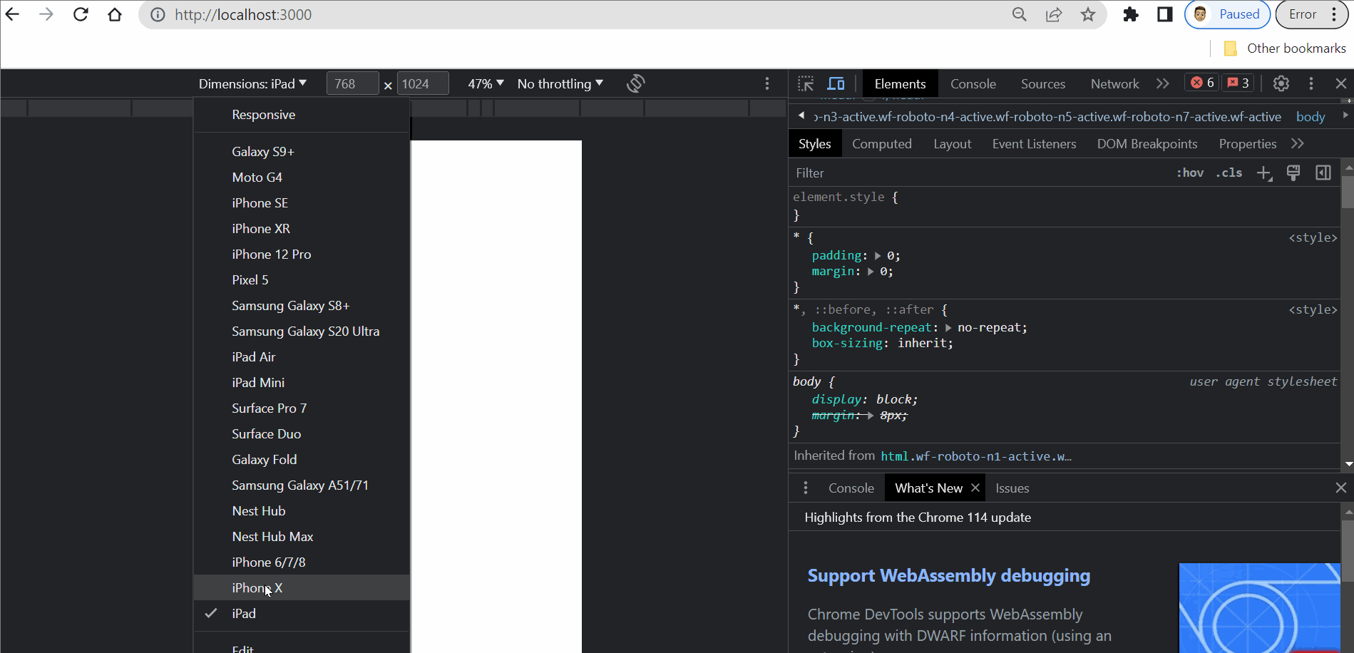
Testing and Debugging: Test your grid system thoroughly and use debugging techniques like inspecting grid-related issues using browser developer tools.
-
Documentation and Maintenance: Document your custom grid system, including usage examples and guidelines, to facilitate future maintenance and collaboration.
Session Replay for Developers
Uncover frustrations, understand bugs and fix slowdowns like never before with OpenReplay — an open-source session replay tool for developers. Self-host it in minutes, and have complete control over your customer data. Check our GitHub repo and join the thousands of developers in our community.
Advanced Techniques and Use Cases
Once familiar with creating a custom grid system in Vuetify, you can explore advanced techniques and use cases to enhance specific layouts. Here are a few examples:
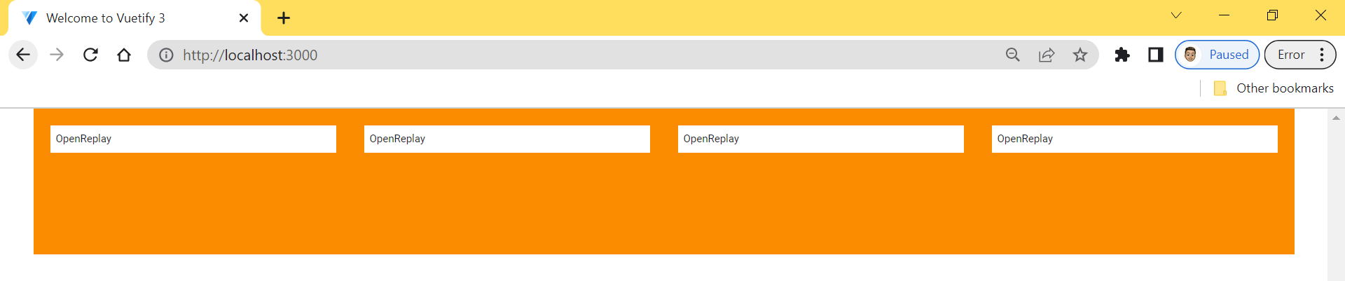
Using the Align Prop
We can utilize the align prop to align child elements vertically within a parent container. We can position items accordingly by applying classes such as .align-top, .align-center, or .align-bottom to the parent component. For instance, the .align-start prop can be used to place an item at the top of the parent, as shown in the example code below:
<template>
 <v-container class="bg-warning mb-6">
   <v-row align="start" style="height: 200px">
     <v-col v-for="n in 4" :key="n">
       <v-sheet class="pa-2 ma-2"> OpenReplay </v-sheet>
     </v-col>
   </v-row>
 </v-container>
</template>
The following image shows the result of utilizing the align-start attribute to position the item at the top of its parent element. The picture displayed depicts the outcome of utilizing the align-start property to position the item at the highest point of the parent element:
Using breakpoints
You might have noticed that the grid columns in the previous examples were the same size. You can customize the grid by adding the ‘cols’ attribute to the ‘v-col’ component. This will allow you to specify the desired size for each column using the following code:
<template>
 <v-container>
   <v-row class="bg-warning">
     <v-col cols="3">
       <v-sheet class="pa-2 ma-2"> .v-col-3 </v-sheet>
     </v-col>
     <v-col cols="5">
       <v-sheet class="pa-2 ma-2"> .v-col-5 </v-sheet>
     </v-col>
   </v-row>
 </v-container>
</template>
The following image shows the result of the above code:
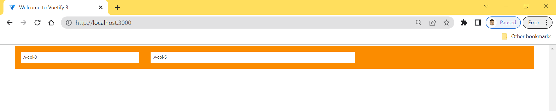 The picture displayed above illustrates that the grid remains uniform in size on various devices. To establish the size of each grid on different devices such as phones, tablets, and desktops, we can use the v-col component’s properties by indicating the corresponding device breakpoints like xs, sm, md, and so on.
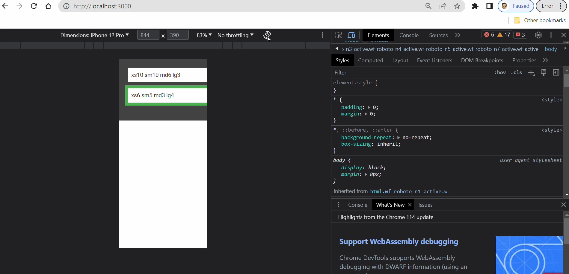
Here is an example code that demonstrates how to make grids that fill up the entire parent container when viewed on desktop devices and move to a new line when viewed on mobile devices:
<template>
 <v-container class="bg-surface-variant">
   <v-row class="mb-6" no-gutters>
     <v-col cols="10" sm="10" md="5" lg="3">
       <v-sheet class="pa-2 ma-2">xs10 sm10 md6 lg3</v-sheet>
     </v-col>

     <v-col class="bg-success" cols="5" sm="5" md="3" lg="4">
       <v-sheet class="pa-2 ma-2">xs6 sm5 md3 lg4</v-sheet>
     </v-col>
     <v-col class="lg-12 bg-success" cols="5" sm="5" md="3" lg="4">
       <v-sheet class="pa-2 ma-2">xs5 sm5 md3 lg4</v-sheet>
     </v-col>
   </v-row>
 </v-container>
</template>
This code above will generate a responsive grid, just like the gif shown below:
Conclusion
Grid systems are integral to web design, providing a structured and responsive layout framework. Vuetify’s built-in grid system offers a robust foundation, but creating a custom grid system becomes essential when specific design requirements arise. By leveraging Vuetify’s components and customization options, you can create unique and adaptable layouts tailored to your needs.
Gain Debugging Superpowers
Unleash the power of session replay to reproduce bugs and track user frustrations. Get complete visibility into your frontend with OpenReplay, the most advanced open-source session replay tool for developers.