Creating a Design System using Radix


Radix is an open-source UI component library used to build good, friendly, and accessible design systems and web applications. These components are un-styled and can be customized to user preference, making them uncontrolled by default. UI components are sometimes quite complex and intense to build; getting detailed accessibility takes time and energy. As developers, getting projects done efficiently is a major objective. Radix is a new headless UI for the front-end space; lately, it’s been getting lots of audiences.
For more information on Radix and how to get started, click here.
In this article, you will be shown how Radix works and how you can use it to build efficient design systems.
Radix outline
Radix is made up of three parts: Primitives, Colors, and Icons, plus Stitches. These parts help you build out various design systems. Let’s have an insight into these three tools and how they can help us efficiently as developers.
- Primitives: Radix Primitives is a low-level UI component library focusing on high-quality customization and user experience. It’s a comprehensive library of un-styled, accessible components with various choices. Its components have WAI-ARIA design patterns, which can be gradually adopted or be the initial layer of your design system.
- Colors: Radix colors is a color structure created for making wonderful, accessible websites and applications. Each plate has a uniform transparent form, essential for UI components that should merge into colored backgrounds. Each process is made for a particular case, with various combinations to pass the WCAG contrast ratio. Beautiful, thought-out palettes with auto-dark mode.
- Icons: Radix icons are separate components that can be installed via a single package. A crisp set of 15×15 icons designed by the Work OS team. Radix Icons are created as separate React components.
- Stitches: Radix Stitches is a mode of solution that centers on component designs and developer experience. It introduces a first-class variant API that enables design system creators to make known their objectives better. It can catch mistakes and improve the extensibility of design systems. It’s lightweight, coming in at less than 5kb.
Design Systems
Design systems are a collection of reusable components with standards that can be arranged to assemble any application. Definitions of UI elements like buttons, text elements, etc., that you know will be reusable throughout the design file can be made by you, and this makes the design workflow very easy. Design systems can become unwieldy collections of components and code when poorly implemented and maintained. But, when implemented well, they can educate team members, streamline work, and enable designers to tackle complex UX problems.
Design systems can take many forms, but they often contain a style guide, a pattern library, and a component library.
-
Style guides contain specific ways and guidelines, visual recommendations, and a design basis for building interfaces or other design products. Most style guides focus on branding (colors, typography, trademarks, logos, and print media). Still, style guides also offer guidance on content (such as tone of voice and language recommendations) and visual- and interaction-design standards (also known as front-end style guides). These guidelines are sometimes incorporated into the component library to provide relevant guidance in context.
-
Pattern libraries: Most times, the terms component library and pattern library are used equally, although there is a difference between the two types of libraries. Component libraries describe separate UI elements, while pattern libraries attribute collections of UI-element layouts. Pattern libraries are often considered less robust than component libraries, but they can be as thorough or as high-level as needed. They typically feature content structures, layouts, and templates. Much like components, patterns are supposed to be re-used and adapted.
-
Component libraries: Sometimes referred to as UI libraries. Component libraries (also known as design libraries) are what many people associate with design systems. These thorough libraries house predetermined, reusable UI elements and serve as a one-stop shop for designers and developers alike to learn about and implement specific UI elements. Creating these libraries takes significant time and resources.
Component Library
Let’s consider component libraries specifically. Visual examples of components include:
- Component name: a specific and unique UI component name to avoid miscommunication between designers and developers
- Description: a clear explanation for what this element is and how it is typically used, occasionally accompanied by do’s and don’ts for context and clarification
- Attributes: variables or adjustments that can be made to customize or adapt the component for specific needs (i.e., color, size, shape, copy).
- State: recommended defaults and the subsequent changes in appearance
- Code snippets: the actual code excerpt for the element (some design systems go as far as sharing multiple examples and offering a “sandbox” environment to try out different component customizations)
- Front-end & back-end frameworks to implement the library (if applicable) to avoid painful and unnecessary debugging.
To make this article understandable, we will build a component library as a subset of a design system. Although, Radix offers a full suite of tools that provide you with the resources to build wonderful design systems.
Setting up a project with Radix
Our project has been preconfigured with React Styleguidist, an environment for building React components. Let’s get started;
Open your terminal and run the following command to clone the radix component library:
git clone https://github.com/Cool-Runningz/radix-component-library.gitGo to the radix component directory, install the project dependencies, and start the development server:
cd radix-component-library
npm install
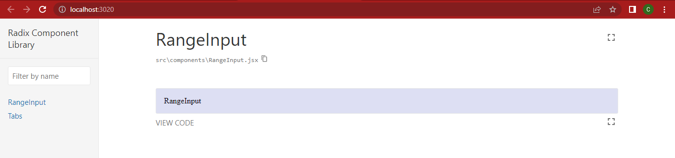
npm run libraryGo to http://localhost:3020/ in your browser. You should see the image below on your screen:
Session Replay for Developers
Uncover frustrations, understand bugs and fix slowdowns like never before with OpenReplay — an open-source session replay tool for developers. Self-host it in minutes, and have complete control over your customer data. Check our GitHub repo and join the thousands of developers in our community.
Building a range input component with Radix
We will build a range input that adheres to the WAI-ARIA slider design pattern. The range input can also be referred to as a slider; In Radix, each Primitive can be installed individually, leading to less code, as you only need to import the individual components you need.
To build a range input component, use the code block below;
npm install @radix-ui/react-sliderGo to the RangeInput.jsx file and make it look like the code block below;
import React from 'react'
import PropTypes from "prop-types"
import "./RangeInput.css"
import * as SliderPrimitive from '@radix-ui/react-slider';

const RangeInput = (props) => {
    return (
        <SliderPrimitive.Root className="rootSlider" value={props.value}>
            <SliderPrimitive.Track className="trackSlider">
                <SliderPrimitive.Range className="rangeSlider" />
            </SliderPrimitive.Track>
            <SliderPrimitive.Thumb className="thumbSlider"  />
        </SliderPrimitive.Root>
    )
}
export default RangeInput
Styling the component
Radix components do not apply any styles by default, so we will go through the process of adding CSS to the custom component. The radix slider consists of four basic components; let’s go ahead and list them alongside their CSS files.
- Root: Contains all the parts of a slider. It’ll render an input for each thumb when used within a form to ensure events propagate rightly. Create a
RangeInput.cssfile in your directory and input the code block below:
 .rootSlider {
    display: flex;
    align-items: center;
    position: relative;
    height: 1.5rem;
    max-width: 30rem;
}- Track contains the Slider Range. Add the code block below to your
RangeInput.cssas the Track slider class:
.trackSlider {
    background-color: #fafafa;
    border: 1px solid #d3d3d3;
    position: relative;
    flex-grow: 1;
    border-radius: 10px;
    height: 1rem;
}- Range is the range part that has to be inside the Slider Track. Add the code block below to your
RangeInput.css;
.rangeSlider {
    position: absolute;
    background: linear-gradient(90deg,#252678,#764abc);
    height: 100%;
    border-radius: 10px;
}- Thumb: A draggable thumb is the element on the track that the user can move around to select varying range values. You can render multiple thumbs.
.thumbSlider {
display: block;
width: 20px;
height: 20px;
background-color: #764abc;
border-radius: 30px;
border: 1px solid #d9d9d9;
}
.thumbSlider:hover {
cursor: pointer;
}
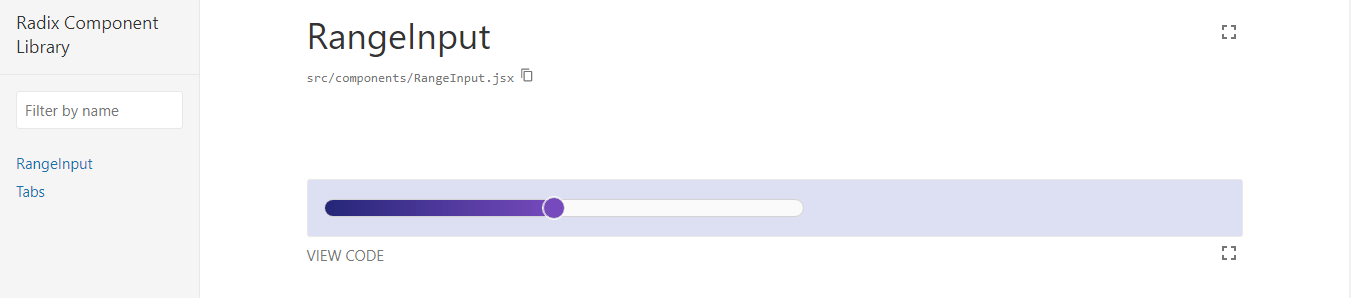
.thumbSlider:focus {
outline: 1px solid white;
}You can edit yours to whatever color you want, depending on your preference; If you navigate back to your browser, you will see the image below:
Adding props
For the final aspect of our project, we have to configure it to accept props, making it reusable and customizable. Radix components can be controlled or uncontrolled. Adding the value and onValueChange props will turn the Range Input into a controlled component.
The value represents the controlled value of the slider, which is used in conjunction with onValueChange; the event handler gets called when the value changes.
The prop-types library was formerly imported near the top of RangeInput.jsx, so now you can add the prop Types definition at the bottom of the file. Next, we want to update our RangeInput.jsx file to pass the props to the RangeInput component.
The value and onValueChange props need to get applied to the Slider Primitive Root element.
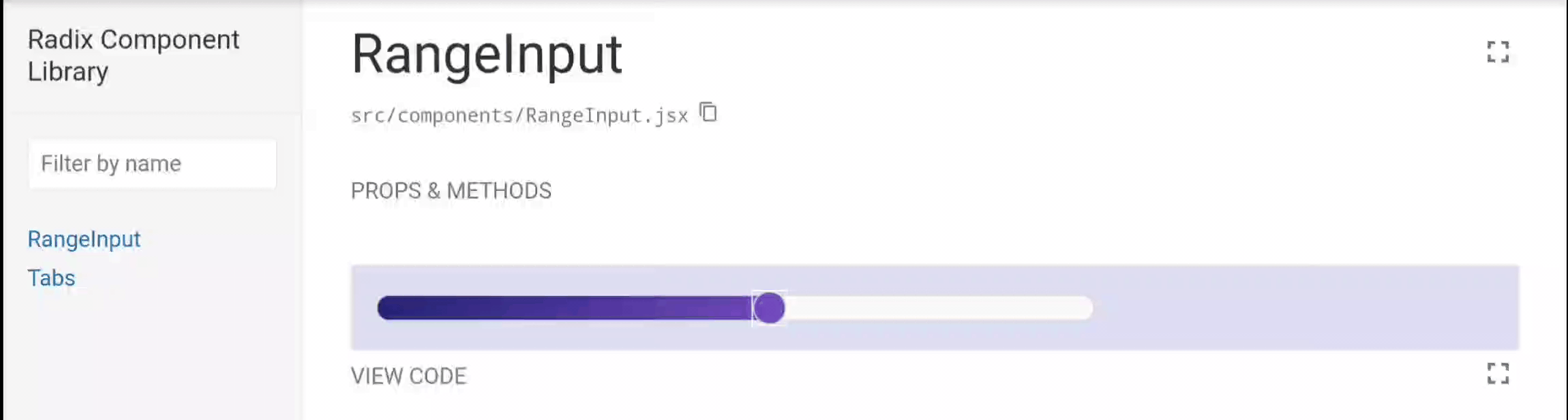
You will see that with a little bit of code, we created the Radix Slider to have an accessible and functional RangeInput component. Having understood this, make your RangeInput.jsx file look like the code block below;
import React from "react";
import PropTypes from "prop-types";
import "./RangeInput.css";
import * as SliderPrimitive from "@radix-ui/react-slider";

const RangeInput = (props) => {
  return (
    <SliderPrimitive.Root
      className="rootSlider"
      value={props.value}
      onValueChange={props.onValueChange}
    >
      <SliderPrimitive.Track className="trackSlider">
        <SliderPrimitive.Range className="rangeSlider" />
      </SliderPrimitive.Track>
      <SliderPrimitive.Thumb className="thumbSlider" aria-label={props.label} />
    </SliderPrimitive.Root>
  );
};

export default RangeInput;

RangeInput.propTypes = {
  label: PropTypes.string.isRequired,
  value: PropTypes.arrayOf(PropTypes.number).isRequired,
  onValueChange: PropTypes.func.isRequired,
};
If everything is done correctly, you should get the same experience as mine below;
Conclusion
In this article, we learned about Radix and how you can use its components to build wonderful design systems; building custom components that have to do with features like keyboard navigation, etc., can cause more complexity. Now with Radix, you can simplify the process to be much easier.
A TIP FROM THE EDITOR: To help you plan how your design library must look, read our Plan your User Interface with Figma article. Also, to test your development, you could follow the suggestions in the A Dive into React Storybook article.
Gain Debugging Superpowers
Unleash the power of session replay to reproduce bugs and track user frustrations. Get complete visibility into your frontend with OpenReplay, the most advanced open-source session replay tool for developers.