Create a Drag-and-Drop Zone in React with react-dropzone

Drag and drop is a platform whereby an application uses drag-and-drop features on browsers. The user selects a draggable item with a mouse or touchpad, drags those files to a droppable element (drop zone), and drops them by releasing the mouse button.
React-dropzone is a set of React libraries to help you build complex drag-and-drop interfaces while keeping your components destructured. The most common use cases for drag-and-drop in React comprise uploading files, rearranging images/files, and moving files between multiple folders. We’ll create a simple React application with a drag-and-drop interface, just like the one below.
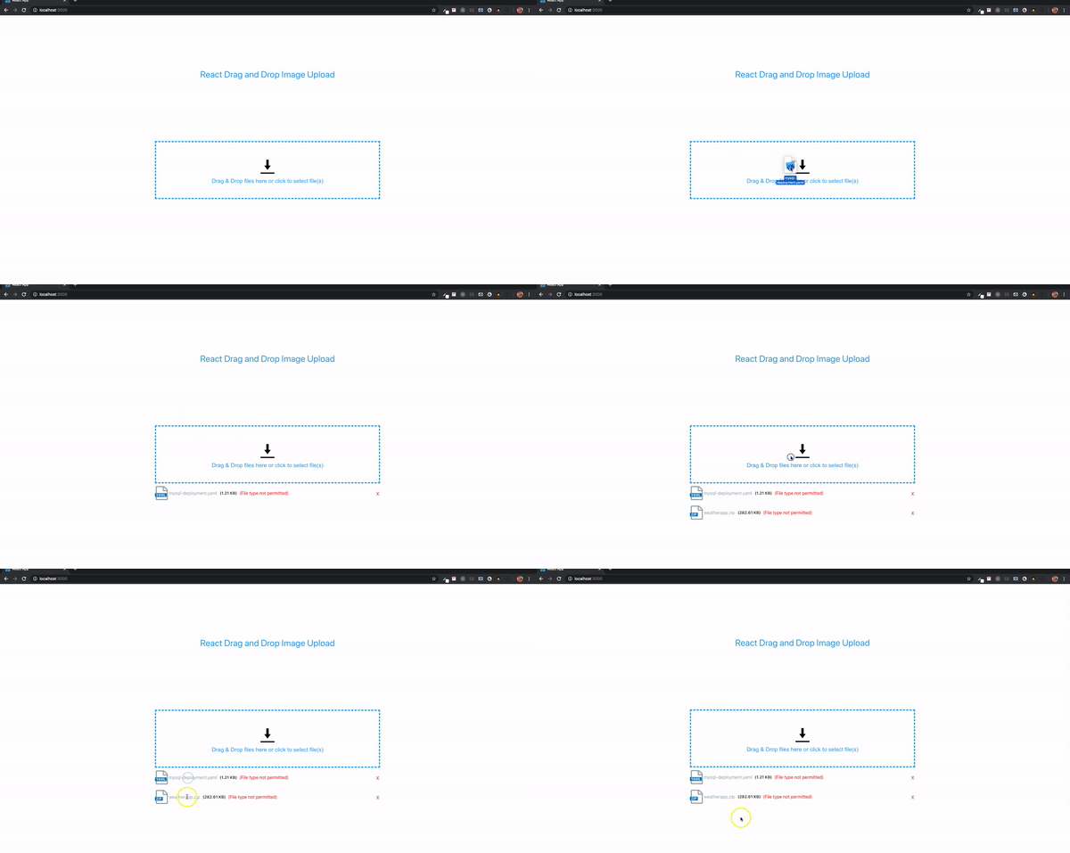
By the end of this tutorial, in our React application we’ll be able to do the following:
- Drag-and-drop a file on the drag-and-drop zone,
- Click event which initiates file selection dialog
- Display file preview on the drop zone,
- List file name, file type, and file size,
- Alternative option ‘click to open’ button,
- Indicate the file received on the drop zone,
Getting Started
First of all, we are going to create our React app. I believe we already know this process, but we will start from scratch here, for starters. We are creating our React app from our terminal using npx create-react-app drag-n-drop for those using npm, while others using yarn should run yarn create React-app drag-n-drop.
After, run npm start or yarn start to begin. You can manually delete some of the generated boilerplate files and code, such as:
- favicon.ico
- all logo files (logo192.png, logo512.png, logo.svg)
- manifest.json
- robots.txt
- reportWebVitals.js
- setupTests.js
- App.test.js
Alternatively, you could run npx clean-React-app to remove such files.
How to Implement a Drag and Drop Zone in React
We won’t be building all the logic and components from scratch. Instead, we’ll use one of the most common React drag-and-drop libraries available: React-dropzone. React-dropzone is a very powerful library and custom component. It’s a simple React hook to create an HTML-5 compliant drag-and-drop zone for files. Dropzone provides additional functions such as customizing the dropzone, restricting file types, etc. If you need a visual explanation of a drag-and-drop with React-dropzone, you can watch this video.
We will install our React dropzone with npm install React-dropzone or yarn add React-dropzone. Right now, our code should be looking something like this in our App.js component.
import React from "react";

function App() {
  return <div></div>;
}

export default App;
We want to create an area where, when we click on it, the React-dropzone library initiates the file selection dialog, allowing us to select and upload files. We’ll start by creating a component.
//*Dropzone.js*//

import React from "React";
import { useDropzone } from "React-dropzone";

function Dropzone({ open }) {
  const { getRootProps, getInputProps } = useDropzone({});
  return (
    <div {...getRootProps({ className: "dropzone" })}>
      <input className="input-zone" {...getInputProps()} />
      <div className="text-center">
        <p className="dropzone-content">
          Drag’n’drop some files here, or click to select files
        </p>
        )}
      </div>
    </div>
  );
}

export default Dropzone;
Now we have to import the Dropzone to our App.js ;
//*App.js*//

import React from "React";
import Dropzone from "./Dropzone";

function App() {
  // const [images, setImages] = useState([]);
  return (
    <div>
      <div className="container">
        <h1 className="text-center">Drag and Drop Test</h1>
        <Dropzone />
      </div>
    </div>
  );
}

export default App;
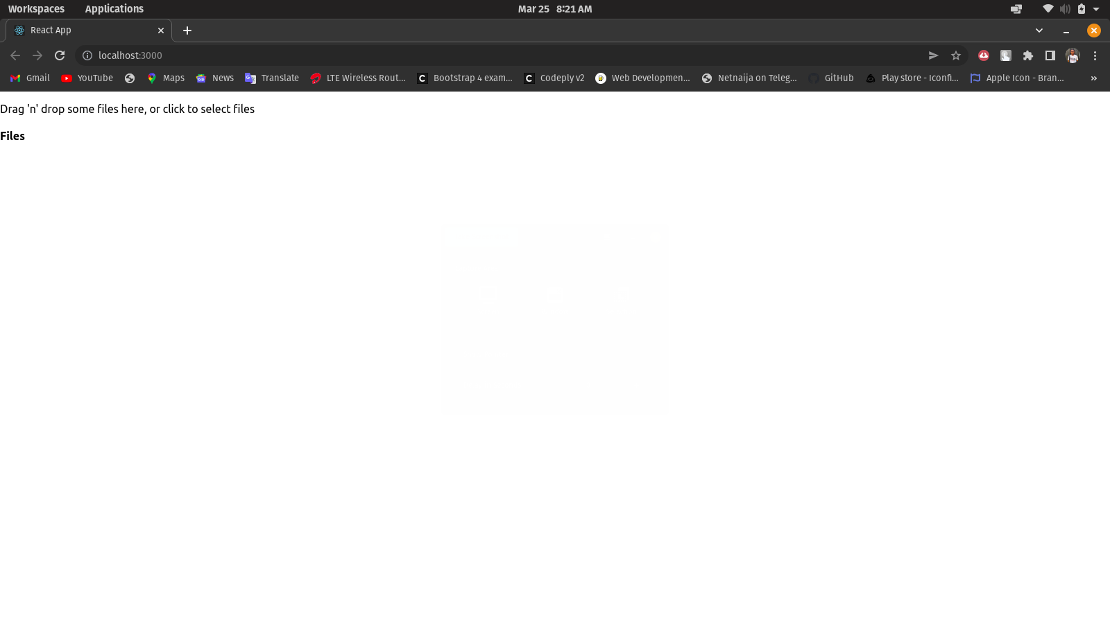
Now that we have done that, our browser should look like this.
Styling
Although our React-dropzone is working well, it doesn’t look pleasant, so we will style it a little bit so that it may look more like an actual dropzone. Now we move to index.css to implement some styling.
//*index.css*//
body {
  text-align: center;
  padding: 20px;
  border: 3px blue dashed;
  width: 60%;
  margin: auto;
}
We must import index.css in our App.js. The results are as follows.
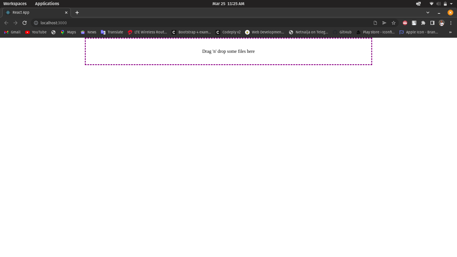
As you can see, this is our React-dropzone. However, it still needs more styling. I want to add some components to it to make it look more functional because, right now, the only thing it can do is the drag-and-drop and the click event, which initiate the file selection dialog. We also need to have a path to store files drawn into the dropzone.
Accepting Files and Recording File Properties
If you’re following this guide, you will have noticed that the React-dropzone does not accept files nor list the file name, file type, and file size; that’s what we’ll be working on. We have to create a function for our dropzone to enable it to accept files and display file names, types, and sizes. Our code should look like this.
import React from "React";
import { useDropzone } from "React-dropzone";
import "./index.css";

function Dropzone({ open }) {
  const { getRootProps, getInputProps, acceptedFiles } =
    useDropzone({});

  const files = acceptedFiles.map((file) => (
    <li key={file.path}>
      {file.path} - {file.size} bytes
    </li>
  ));

  return (
    <div className="container">
      <div {...getRootProps({ className: "dropzone" })}>
        <input {...getInputProps()} />
        <p>Drag 'n' drop some files here</p>
      </div>
      <aside>
        <ul>{files}</ul>
      </aside>
    </div>
  );
}

export default Dropzone;
With our app looking like this;
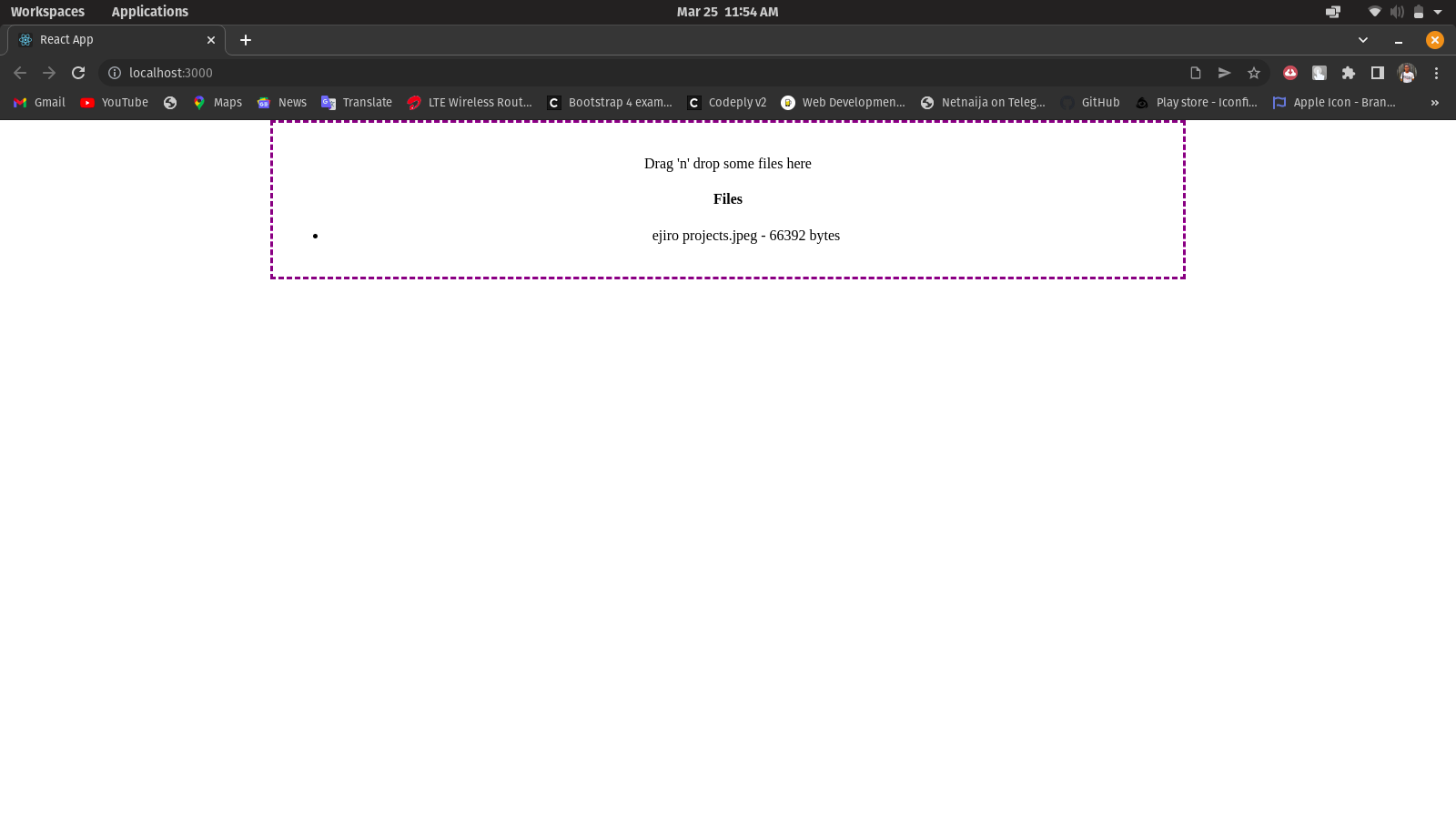
When we drag a file into our dropzone, the file is accepted, and its properties (name, type, and size) are displayed.
Adding our Buttons and Styling them
Our React-dropzone is getting into shape, but we would like to manually add a button to initiate the file selection dialog. All we have to do is create a button component beneath our <p> in our Dropzone.js.
...
<p className="dropzone-content">
  Drag’ n’ drop some files here, or click to select files
</p>
)}
<button type="button" onClick={open} className="btn">
Click to select files
</button>
...
All we have to do now is style our button with the class name btn and make it look beautiful. We’ll go to our index.css and beautify our buttons.
.btn {
  border: none;
  text-align: center;
  background-color: rgb(218, 216, 216);
  height: 50px;
  border-radius: 12px;
  color: black;
  font-weight: bold;
  transition-duration: 0.6s;
}

.btn:hover {
  background-color: blue;
  color: aliceblue;
}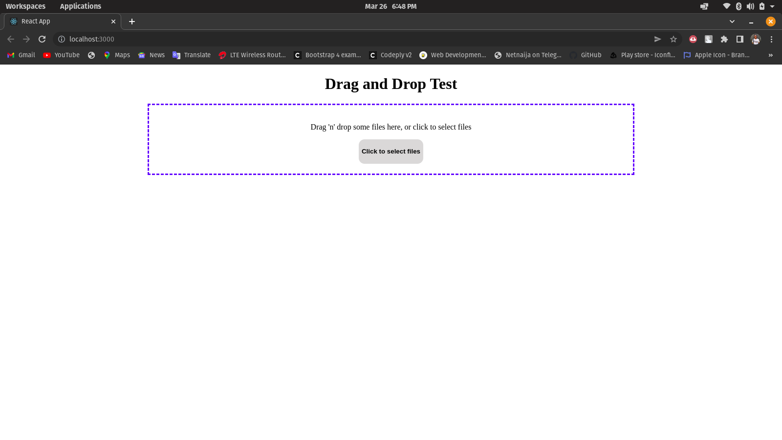
And it looks nice! Up next, we’ll be working on the isDragActive component. It is set to detect if a draggable file is within the dropzone; then the text at the dropzone changes from ‘drag’n’drop some files here or click to select’ to ‘release to drop the file here’.
Implementing the isDragActive Components
We’ll need some code.
//*Dropzone.js*//

...

function Dropzone({ open }) {
  const { getRootProps, getInputProps, isDragActive, acceptedFiles } =
    useDropzone({});

  ...

  return (
    <div {...getRootProps({ className: "dropzone" })}>
      <input className="input-zone" {...getInputProps()} />
      <div className="text-center">
        {isDragActive ? (
          <p className="dropzone-content">
            Release to drop the files here
          </p>
        ) : (
          <p className="dropzone-content">
            Drag’n’drop some files here, or click to select files
          </p>
        )}
        <button type="button" onClick={open} className="btn">
          Click to select files
        </button>
      </div>
      <aside>
        <ul>{files}</ul>
      </aside>
    </div>
  );
}

export default Dropzone;
Open Source Session Replay
OpenReplay is an open-source, session replay suite that lets you see what users do on your web app, helping you troubleshoot issues faster. OpenReplay is self-hosted for full control over your data.

Start enjoying your debugging experience - start using OpenReplay for free.
Display Image Preview
To show images in grid layout (another cool feature) we’ll create a component called imagegrid.js. We will use another library called React-dnd.
//*ImageGrid.js*//

...

function App() {
  const [images, setImages] = useState([]);
  const onDrop = useCallback((acceptedFiles) => {
    acceptedFiles.map((file) => {
      const reader = new FileReader();

      reader.onload = function (e) {
        setImages((prevState) => [
          ...prevState,
          { id: cuid(), src: e.target.result },
        ]);
      };

      reader.readAsDataURL(file);
      return file;
    });
  }, []);

  return (
    <main className="App">
      <h1 className="text-center">Drag and Drop Test</h1>
      <Dropzone onDrop={onDrop} accept={"image/*"} />
      <ImageGrid images={images} />
    </main>
  );
}

export default App;
If you check <Dropzone onDrop={onDrop} accept={“image/*”} />, you will see that we made it to only accept images, but you can allow multiple file types. We will also apply some styling to it.
//*index.css*//

.file-list {
  display: flex;
  flex-wrap: wrap;
  width: 65%;
  margin: 20px auto;
  padding: 10px;
  border: 3px dotted black;
}

.file-list img {
  height: 300px;
  width: 300px;
  object-fit: cover;
}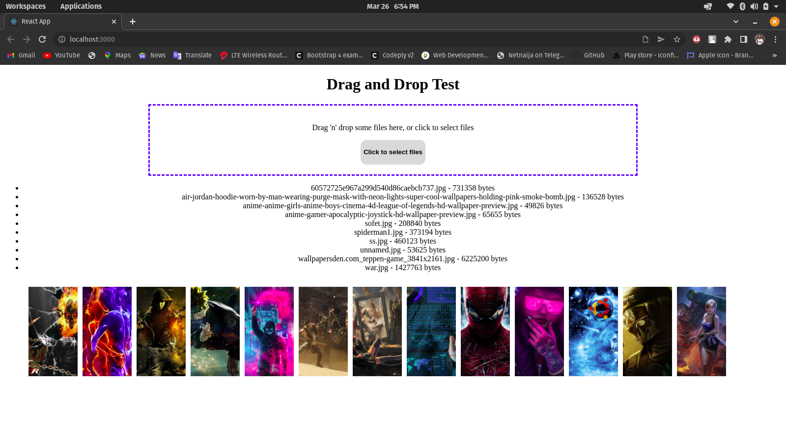
And our drag-and-drop zone is working perfectly with our well-styled button for manually initiating file dialog and our display preview on our images.
Conclusion
There are different React drag-and-drop libraries ranging from React-beautiful-dnd down to React-grid-layout and, finally, React-dnd (which I used for our image preview, and I’ll be discussing it in my next article). Although they have their pros and cons, they all work uniquely depending on what you use them for. For example, we used React-dropzone to customize our drag-and-drop zone earlier, and it looked winsome and responsive. There are so many ways you could customize your React-dropzone. Maybe you want a specific file type as we did there, or you want an accept-or-reject list? You can also implement that and open the file dialog programmatically with a button. You could also check their website for more information.
For reference, here’s the complete code for the project here.
//*App.js*//

import React, { useCallback, useState } from "React";
import cuid from "cuid";
import Dropzone from "./Dropzone";
import ImageGrid from "./components/ImageGrid";
import "./index.css";
import "./App.css";

function App() {
  const [images, setImages] = useState([]);
  const onDrop = useCallback((acceptedFiles) => {
    acceptedFiles.map((file) => {
      const reader = new FileReader();

      reader.onload = function (e) {
        setImages((prevState) => [
          ...prevState,
          { id: cuid(), src: e.target.result },
        ]);
      };

      reader.readAsDataURL(file);
      return file;
    });
  }, []);

  return (
    <main className="App">
      <h1 className="text-center">Drag and Drop Test</h1>
      <Dropzone onDrop={onDrop} accept={"image/*"} />
      <ImageGrid images={images} />
    </main>
  );
}

export default App;
//*ImageGrid.js*//
import React from "React";
// Rendering individual images
const Image = ({ image }) => {
return (
<div className="file-item">
<img
alt={`img - ${image.id}`}
src={image.src}
className="file-img"
/>
</div>
);
};
// ImageList Component//
const ImageGride = ({ images }) => {
// render each image by calling Image component
const renderImage = (image, index) => {
return <Image image={image} key={`${image.id}-image`} />;
};
// Return the list of files//
return (
<section className="file-list">{images.map(renderImage)}</section>
);
};
export default ImageGride;//*Dropzone.js*//
import React from "React";
import { useDropzone } from "React-dropzone";
function Dropzone({ onDrop, accept, open }) {
const { getRootProps, getInputProps, isDragActive, acceptedFiles } =
useDropzone({
accept,
onDrop,
});
const files = acceptedFiles.map((file) => (
<li key={file.path}>
{file.path} - {file.size} bytes
</li>
));
return (
<div>
<div {...getRootProps({ className: "dropzone" })}>
<input className="input-zone" {...getInputProps()} />
<div className="text-center">
{isDragActive ? (
<p className="dropzone-content">
Release to drop the files here
</p>
) : (
<p className="dropzone-content">
Drag’ n’ drop some files here, or click to select files
</p>
)}
<button type="button" onClick={open} className="btn">
Click to select files
</button>
</div>
</div>
re
<aside>
<ul>{files}</ul>
</aside>
</div>
);
}
export default Dropzone;//*index.css*//
body {
text-align: center;
}
.dropzone {
text-align: center;
padding: 20px;
border: 3px blue dashed;
width: 60%;
margin: auto;
}
.btn {
border: none;
text-align: center;
background-color: rgb(218, 216, 216);
height: 50px;
border-radius: 12px;
color: black;
font-weight: bold;
transition-duration: 0.6s;
}
.btn:hover {
background-color: blue;
color: aliceblue;
}
.file-list {
/* border: 3px dotted black; */
display: flex !important;
flex-wrap: wrap;
width: auto;
padding: 10px 20px;
margin: 20px 30px;
/* border: 3px dotted black; */
}
.file-list img {
height: 100%;
width: 100px;
padding-right: 10px;
object-fit: cover;
}We’ve successfully built a small project for dragging and dropping files. There are many more functionalities in React. For more, check out the links below.
Happy coding!


