Creating a Markdown Blog Powered by Next.js in Under an Hour
Get started with Next.js with this step-by-step tutorial

I’m pretty sure 99% of the developers out there just love markdown. It’s such a fantastic format to write in.
For those not familiar with markdown, it’s a flat text format that looks like this:
# Heading

Some text

- list item 1
- list item 2
- list item 3

[My website](https://daily-dev-tips.com)
Which would result in the following HTML
<h1><a id="Heading_0"></a>Heading</h1>

<p>Some text</p>

<ul>
	<li>list item 1</li>
	<li>list item 2</li>
	<li>list item 3</li>
</ul>

<a href="https://daily-dev-tips.com">My website</a>
Sounds lovely, right? And yes, it is lovely, so how cool would it be if we could make a blog in Next.js that allows us to write markdown formatted posts?
If you are wondering what the result is for this article, here is a little demo video:
Note: At the bottom, I linked the GitHub repo that you can fork 🥳
Project setup
If you are new to markdown or Next.js, don’t worry. This article will guide you completely through setting this project up from start to finish!
Let’s start by creating a new blank Next.js project. We’ll open up our favorite terminal and run the following command.
npx create-next-app next-blogThis command will create a blank next application in the next-blog folder.
Once it’s done installing, you can navigate to the project and run it. (This will show the basic Next.js starter)
cd next-blog

# Run the project
npm run dev
Adding Tailwind CSS for our styling
Tailwind CSS is a perfect CSS framework to make styling super easy for us, and it works super well in a Next.js project.
The first step we have to do is, install the dependencies that are required for Tailwind.
npm install -D tailwindcss@latest postcss@latest autoprefixer@latestThen we can initialize Tailwind by running the following command. It will create all the side files we need.
npx tailwindcss init -pNow head over to the tailwind.config.js file that the command above created for us.
Modify the content: array to look like this:
content: [
	'./pages/**/*.{js,ts,jsx,tsx}',
	'./components/**/*.{js,ts,jsx,tsx}',
],
The last step to making everything work is modifying the existing styles/global.scss file.
Remove everything in this file and only add the following three lines.
@import 'tailwindcss/base';
@import 'tailwindcss/components';
@import 'tailwindcss/utilities';
And that’s it. We can now leverage the power of Tailwind in our application.
Creating a reusable Next.js layout
Next.js supports different pages out of the box, but we want to have one main layout that wraps around this.
We will define a header and footer in this layout, which means we don’t need to add them in all the separate files.
To create a layout in Next.js, create a components folder in your project.
Inside that folder, create a layout.js file.
The layout is a component, which looks like this:
import Link from 'next/link';
export default function Layout({ children }) {
return (
<div className='flex flex-col min-h-screen'>
<header className='bg-fuchsia-100 mb-8 py-4'>
<div className='container mx-auto flex justify-center'>
<Link href='/'>
<a>🏡</a>
</Link>
<span className='mx-auto'>Welcome to my blog</span>{' '}
</div>
</header>
<main className='container mx-auto flex-1'>{children}</main>
<footer className='bg-fuchsia-100 mt-8 py-4'>
<div className='container mx-auto flex justify-center'>
© 2022 DailyDevTips
</div>
</footer>
</div>
);
}For this article, I decided not to extract any further, but you could go ahead and move the header and footer into their components for better readability.
The critical part here is that we accept children as property and render them in the main element.
This allows us to render any component inside there.
We have to open up our _app.js file to use this newly created layout. This file is the entry point for your entire application.
By default, you will see it renders a Component with specific properties.
We want to wrap that component in our layout.
import Layout from '../components/layout';
import '../styles/globals.css';

function MyApp({ Component, pageProps }) {
  return (
    <Layout>
      <Component {...pageProps} />
    </Layout>
  );
}

export default MyApp;
And that’s it. Any page we create now will be wrapped in our layout component, making it show the header and footer.
Let’s try this quickly before moving on.
Modify the index.js file and add the following markup for now:
return (<div>Hello world 👋</div>);When you rerun the application you should see the following:
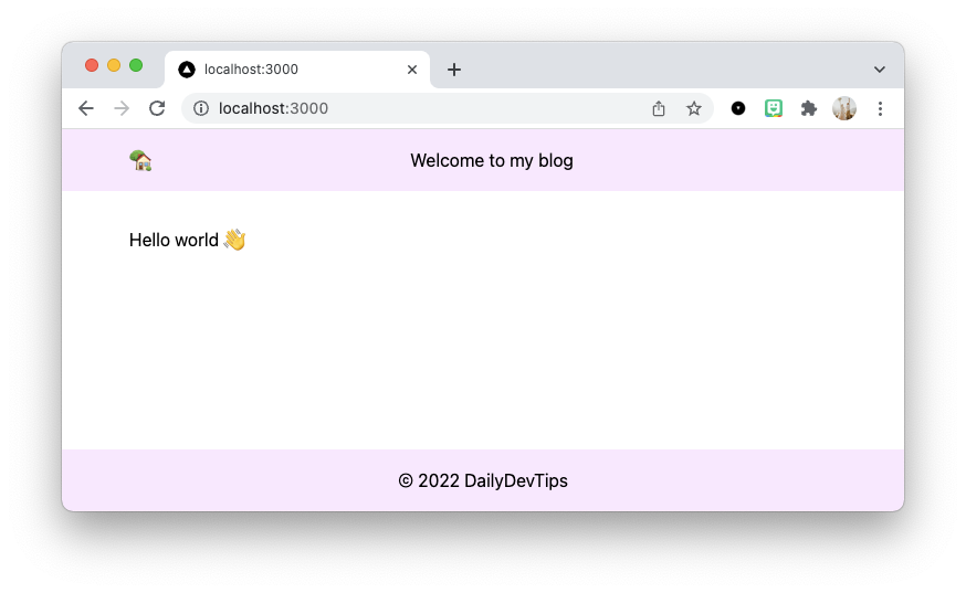
You see, the header and footer are automatically applied. We didn’t need to say they should be used in any way.
Creating the posts
Since we’ll be using markdown for our posts, create a new folder at the root of your project called posts.
Inside, you can start by creating your post items. Each file will also become the URL of the article, so keep this in mind.
One example of my articles looks like this: nextjs-page-options-and-how-they-work.md
Then inside the file, you have two sections.
The top part, called frontmatter, it’s a way to add non-rendered elements to your post.
They are divided by three dashes. And below that is all the content that you want.
For example:
---
title: 'Next.js page options and how they work'
metaTitle: 'Next.js page options and how they work'
metaDesc: 'How to use pages in Next.js exploring the options'
socialImage: images/22-09-2021.jpg
date: '2021-09-22'
tags:
  - nextjs
---

# The main content
You can add anything you want in the frontmatter, so you don’t have to use this example specifically.
We’ll only be using the following for this article:
- title
- socialImage
It’s up to you to enhance the website with other cool elements.
Note: Add the images in the
public/imagesdirectory.
Create a couple of markdown posts (or use the ones from the demo). This makes it easier to test what we are building.
Loading the markdown posts on the homepage
Now that we have our markdown posts in place, we want to retrieve them and show them on the homepage.
We want to show the image and the title and link to the actual post.
Since the image and title are defined in the markdown file’s frontmatter section, we need to find a way to extract them.
Luckily for us, there is a fantastic NPM package that can help us with this. Let’s install it.
npm install gray-matterThis package allows us to parse the frontmatter section and the content section from a content string.
Then we want to open up our index.js file and start importing the packages we will need.
import fs from 'fs';
import matter from 'gray-matter';
import Image from 'next/image';
import Link from 'next/link';
Then we need to leverage the Next.js getStaticProps method, which allows us to define variables the page can use on build time.
Note: Check out this article for more information on the rendering modes of Next.js
The main frame for this function looks like this:
export async function getStaticProps() {
  // Get all our posts
}
We need to work on retrieving all the posts from our posts folder.
We can leverage the fs (filesystem) module.
const files = fs.readdirSync('posts');Then we want to loop over all those posts to extract the frontmatter part to get the title and image.
const posts = files.map((fileName) => {
	const slug = fileName.replace('.md', '');
	const readFile = fs.readFileSync(`posts/${fileName}`, 'utf-8');
	const { data: frontmatter } = matter(readFile);

	return {
	  slug,
	  frontmatter,
	};
});
There is quite a lot going on here, so let’s look step by step.
First, we define the slug (URL) for the page, which is the filename without the .md part.
Then we read the file by using the fs module again.
And once it’s loaded, we use the matter package to read the file and extract the data object, but we destructure it as the variable frontmatter.
Basically, we change the data variable to frontmatter.
The last thing we need to do is return the props that our component will receive.
return {
	props: {
	  posts,
	},
};
This sends the posts variable to our component.
So let’s modify our Home component to receive this variable.
export default function Home({ posts }) {That’s it! Yes, super simple, right? We now have access to the posts inside the component.
Let’s create a grid and render our posts in there.
export default function Home({ posts }) {
return (
<div className='grid grid-cols-1 md:grid-cols-3 lg:grid-cols-4 p-4 md:p-0'>
{posts.map(({ slug, frontmatter }) => (
<div
key={slug}
className='border border-gray-200 m-2 rounded-xl shadow-lg overflow-hidden flex flex-col'
>
<Link href={`/post/${slug}`}>
<a>
<Image
width={650}
height={340}
alt={frontmatter.title}
src={`/${frontmatter.socialImage}`}
/>
<h1 className='p-4'>{frontmatter.title}</h1>
</a>
</Link>
</div>
))}
</div>
);
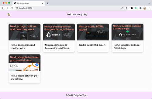
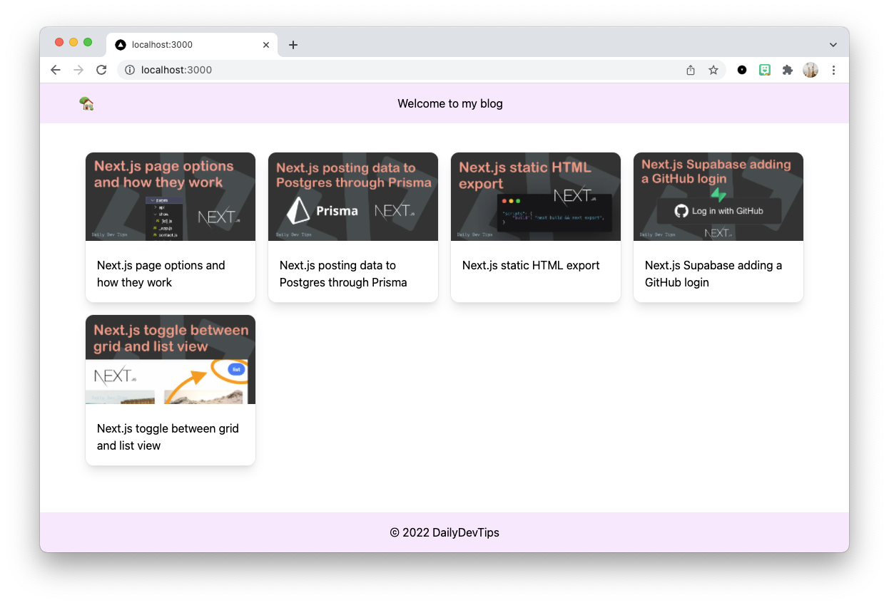
}The CSS part is rendering a grid, where we show one post on mobile and up to four for big screens.
Then we loop over each of the posts using the map method.
Each post will be one big link, including the image of the posts and the title.
And on click, it links to /post/{slug}, which we’ll start working on next.
Let’s quickly look and admire what we have made so far:
Creating individual markdown posts in Next.js
Now that we have a list of our posts on the homepage, we want to show more details and the actual content on each page.
We can leverage Next.js dynamic routing, allowing one file to render all our posts!
To create this file, create a post directory inside the pages directory and inside this folder, add a file called [slug].js.
The brackets define the file as a dynamic file.
This file will also use the getStaticProps to retrieve the data for a single post.
But it needs another function called getStaticPaths to create each path (URL).
Let’s start by importing the modules we need.
import fs from 'fs';
import matter from 'gray-matter';
And from here, we can work on the getStaticPaths function to ensure all our files get their URL.
export async function getStaticPaths() {
  // Retrieve all our slugs
}
Again, the first thing we need to do is get all our posts.
const files = fs.readdirSync('posts');And you guessed it right, map the filenames to get the slugs.
const paths = files.map((fileName) => ({
	params: {
	  slug: fileName.replace('.md', ''),
	},
}));
Then the critical part here is this function should return all valid paths, so we simply need to return them.
I also included a fallback: false, which ensures non-existing URLs will fail and show a 404.
return {
	paths,
	fallback: false,
};
The static part is much like what we did on the homepage. But for this one, we also want to retrieve the data from the file. This is because the file contains all our actual content.
export async function getStaticProps({ params: { slug } }) {
  const fileName = fs.readFileSync(`posts/${slug}.md`, 'utf-8');
  const { data: frontmatter, content } = matter(fileName);
  return {
    props: {
      frontmatter,
      content,
    },
  };
}
Before we start working on the component for this page, we want to install another NPM package called markdown-it.
This package can convert markdown into HTML.
npm install markdown-itThen load it on this page:
import md from 'markdown-it';Now we can start working on the actual component, which is super simple as it only renders the title and the content.
export default function PostPage({ frontmatter, content }) {
  return (
    <div className='prose mx-auto'>
      <h1>{frontmatter.title}</h1>
      <div dangerouslySetInnerHTML={{ __html: md().render(content) }} />
    </div>
  );
}
As you can see, we need to use dangerouslySetInnerHTML as we are setting HTML.
Don’t be scared by the name, as it’s only HTML we allow to be in there.
Almost there!
Let’s quickly try it out and see what we got. Run your app and open a page.
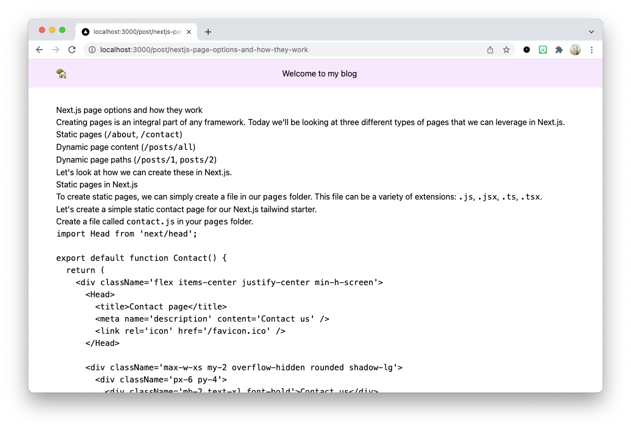
Cool, all our data is there, but it doesn’t look great yet.
Luckily we decided to use Tailwind CSS, and they have a fantastic plugin: Typography plugin
Let’s install this plugin and see what happens.
npm install -D @tailwindcss/typographyOpen the tailwind.config.js file and add it under the plugins section.
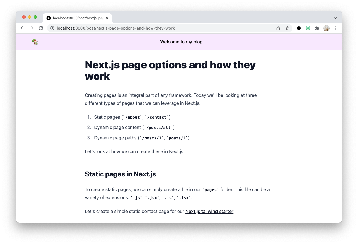
plugins: [require('@tailwindcss/typography')],Now reload your app and see what happens.
Open Source Session Replay
OpenReplay is an open-source, session replay suite that lets you see what users do on your web app, helping you troubleshoot issues faster. OpenReplay is self-hosted for full control over your data.

Start enjoying your debugging experience - start using OpenReplay for free.
Conclusion
And that’s it. We now have a super cool markdown-powered Next.js blog!
This is only a basic starter, but enough to get your blogging career started.
Not bad for an hour worth of work!
Not it’s up to you to make this blog even more unique and share with the world what you created.
Some ideas to make it more excellent:
- SEO aspect, add meta titles/description
- Add a tag overview
- Add some coolers to the code blocks
- Refactor elements into components
As promised, you can download and use this starter template for free.