
Carousels are components that allow users to scroll through items by sliding and swiping, and they are everywhere today. This article will show you how to add carousels to your app by using React Slick, a powerful library.
A carousel is a UI component that allows users to scroll through a collection of images, videos, or other types of content horizontally or vertically, similar to a slide show. A carousel component allows users to navigate through multiple items by swiping, clicking arrows, or using pagination dots. To implement a carousel component in React, we can use third-party libraries. One of them is React Slick, a popular carousel library that allows developers to create fully customizable carousels in React. This tutorial will introduce readers to React Slick library and provide a guide on how to use this library to create a carousel component in your React Applications.
What is React Slick?
React Slick is a popular open-source library that helps developers create responsive and customizable carousel components in React applications. It provides a powerful API to help developers easily create visually appealing and customizable carousels that support touch/swipe gestures, lazy loading, responsive breakpoints, infinite looping, autoplay, and more. You can also style and customize the look and feel of the carousel to match your application’s design.
React Slick is a lightweight React library, easily making it an efficient solution for building carousel components among developers. Some of the key features of React Slick include:
- Infinite looping: The carousel can be set to loop infinitely, which means that the carousel content can be scrolled infinitely in both directions.
- Lazy Loading: This feature allows you to load parts of your application to reduce the page load time and increase performance.
- Autoplay: This feature automatically scrolls through your content, with customizable delay, without requiring user interaction.
- Responsive Design: This feature provides responsive design features that enable carousels to be viewed seamlessly across various devices.
Installation and Setup
Here, we will add React Slick to our project. To install React slick library in your React application, use any of the commands below.
// NPM
npm install react-slick slick-carousel

// YARN
yarn add react-slick slick-carousel
It is important to note that the carousel component is provided by the react-slick command, while slick-carousel provides styling for it.
Setting up the carousel component
In this section, we will set up the carousel component in the App.js component.
Import the React-Slick library
Here, we will import the Slider component as shown below
import Slider from 'react-slick'The Slider component is a key component in React Slick library; it creates a carousel or slider component in React applications.
Import React-Slick CSS styles
Note that you will also need to import the CSS file for react-slick. The library does not provide its own CSS styling. Instead, it uses the theme of the original Slick jQuery plugin. We will import it into our component as shown below:
import 'slick-carousel/slick/slick.css'
import 'slick-carousel/slick/slick-theme.css'
These stylesheets contain the necessary styles for the Slider component to function properly.
Getting started
After successfully importing the Slider component into our App.js component, we will create and style a basic carousel app. First, we will introduce some of the library’s most used props and methods.
Introducing React-Slick APIs
The library provides a range of APIs that allow developers to configure and control various aspects of the carousel, such as its appearance, behavior, speed, and interaction. Here are some of the key APIs provided by React-Slick:
-
Slider: This is the main component of the library that wraps around the carousel elements and provides various props and methods to configure and control the carousel behavior -
speed: This prop enables and sets animation speed in milliseconds. -
autoplay: This prop enables the automatic sliding of carousel contents after a specified delay. -
autoplaySpeed: This prop enables and sets autoplay animation speed in milliseconds. -
infinite: This prop enables infinite looping of the slides, allowing the user to continuously scroll through the slides. -
dots: This prop adds navigation dots to the carousel to indicate the current position and allow users to jump to specific items. -
slidesToShow: This prop specifies the number of slides to show at once. -
slidesToScroll: This prop specifies how many slides to scroll at once.
The library API provides many other methods and props that allow developers to fully customize the behavior and appearance of the carousel to fit their specific needs. Click here to see all the props and methods provided by React Slick library.
Building a basic carousel
In this section, we will set up a basic carousel component app. Building a basic carousel with this library is quite simple. This section will show a simple live demo of how the Slider component work.
We will create a carousel component with six simple slides using React Slick. To set up the carousel, you must create an instance of the Slider component and pass in some settings in our App.js file. We will configure our carousel using the inbuilt methods and properties from the React Slick API :
const App = () => {
const settings = {
dots: true,
infinite: true,
speed: 500,
slidesToShow: 1,
slidesToScroll: 1,
autoplay: true,
autoplaySpeed: 1000,
};
return (
<div>
<h2> Basic Carousel Component</h2>
<Slider {...settings}>
<div>
<h3>SLIDE 1</h3>
</div>
<div>
<h3>SLIDE 2</h3>
</div>
<div>
<h3>SLIDE 3</h3>
</div>
<div>
<h3>SLIDE 4</h3>
</div>
<div>
<h3>SLIDE 5</h3>
</div>
<div>
<h3>SLIDE 6</h3>
</div>
</Slider>
</div>
);
};
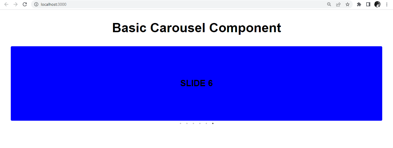
export default App;Styling the Carousel
Here, we will add the following code in the index.css to style and improve the UI of the carousel.
body {
  margin: 0;
  padding: 0;
}
h2 {
  font-size: 60px;
  font-family: sans-serif;
  display: flex;
  justify-content: center;
}
h3 {
  font-size: 40px;
  background-color: blue;
  display: flex;
  justify-content: center;
  border-radius: 5px;
  padding: 150px 0;
  margin: 0px auto;
  font-family: sans-serif;
  margin: 0 50px;
}
After styling is applied, it will look like this.
Session Replay for Developers
Uncover frustrations, understand bugs and fix slowdowns like never before with OpenReplay — an open-source session replay tool for developers. Self-host it in minutes, and have complete control over your customer data. Check our GitHub repo and join the thousands of developers in our community.
Creating a more complex Carousel
In this section, we will create a car gallery with React Slick. We will also create an arrow and thumbnail navigation for our carousel app.
Creating the Slides
First, we will create the path Images.js, In the root directory. We will store the contents of the carousel in an array. The array will contain a unique id, image source, alt description, title, and image description for each element, as shown below:
const Images = [
  {
    id: 1,
    src: "https://images.unsplash.com/photo-1552519507-da3b142c6e3d?ixlib=rb-4.0.3&ixid=MnwxMjA3fDB8MHxwaG90by1wYWdlfHx8fGVufDB8fHx8&auto=format&fit=crop&w=870&q=80",
    alt: "Image 1",
    title: "Lamborghini Huracan Performante",
    description:
      "The Huracán Performante has reworked the concept of super sports cars and taken the notion of performance to levels never seen before.",
  },
  {
    id: 2,
    src: "https://images.unsplash.com/photo-1594502184342-2e12f877aa73?ixlib=rb-4.0.3&ixid=MnwxMjA3fDB8MHxwaG90by1wYWdlfHx8fGVufDB8fHx8&auto=format&fit=crop&w=464&q=80",
    alt: "Image 2 ",
    title: "Porsche 911 Turbo S",
    description:
      "This Turbo S variant comes with an engine putting out 641 bhp @ 6750 rpm and 800 Nm @ 2500 rpm of max power and max torque respectively.",
  },
  {
    id: 3,
    src: "https://images.unsplash.com/photo-1494976388531-d1058494cdd8?ixlib=rb-4.0.3&ixid=MnwxMjA3fDB8MHxwaG90by1wYWdlfHx8fGVufDB8fHx8&auto=format&fit=crop&w=870&q=80",
    alt: "Image 3",
    title: "Ford Mustang",
    description:
      "For offroad lovers. Super fast, Super Comfortable.",
  },
  {
    id: 4,
    src: "https://images.unsplash.com/photo-1525609004556-c46c7d6cf023?ixlib=rb-4.0.3&ixid=MnwxMjA3fDB8MHxwaG90by1wYWdlfHx8fGVufDB8fHx8&auto=format&fit=crop&w=452&q=80",
    alt: "Image 4",
    title: "Lamborghini Aventador SV",
    description:
      "Aventador SV provide thrills unlike anything that has ever been experienced before.",
  },
  {
    id: 5,
    src: "https://images.unsplash.com/photo-1503736334956-4c8f8e92946d?ixlib=rb-4.0.3&ixid=MnwxMjA3fDB8MHxwaG90by1wYWdlfHx8fGVufDB8fHx8&auto=format&fit=crop&w=774&q=80",
    alt: "Image 5",
    title: "Ferrari 458 Speciale",
    description:
      "0 to 100 km/h (0 to 62 mph) takes 3.0 seconds and the Spider is capable of a top speed of 400 km/h (249 mph).",
  },
  {
    id: 6,
    src: "https://images.unsplash.com/photo-1471479917193-f00955256257?ixlib=rb-4.0.3&ixid=MnwxMjA3fDB8MHxwaG90by1wYWdlfHx8fGVufDB8fHx8&auto=format&fit=crop&w=1631&q=80",
    alt: "Image 6",
    title: "Porsche 911",
    description:
      "The Porsche 911 (pronounced Nine Eleven or in German: Neunelfer) is a two-door 2+2 high performance rear-engined sports car.",
  },
  {
    id: 7,
    src: "https://images.unsplash.com/photo-1555353540-64580b51c258?ixlib=rb-4.0.3&ixid=MnwxMjA3fDB8MHxwaG90by1wYWdlfHx8fGVufDB8fHx8&auto=format&fit=crop&w=378&q=80",
    alt: "Image 7",
    title: "Dodge Challenger",
    description:
      "The Challenger has a classic muscle-car interior, with a simple design",
  },
  {
    id: 8,
    src: "https://i.pinimg.com/750x/88/33/1b/88331be20045f95b28e91e21fa663ad0.jpg",
    alt: "Image 8",
    title: "Lamborghini Gallardo",
    description:
      "The Gallardo is a 2 seater 10 cylinder car and has length of 4345mm, width of 1900mm and a wheelbase of 2560mm.",
  },
  {
    id: 9,
    src: "https://i.pinimg.com/564x/2e/40/02/2e40027b9b156589cfbccbf7b33d3bc7.jpg",
    alt: "Image 9",
    title: "2021 Mercedes-AMG GLE53 Coupe electrifies",
    description:
      "Its electric motor can provide up to 184 pound-feet of torque on demand.",
  },
];

export default Images;
Import the Images.js component into the App.js component.
import React from "react";
import Slider from "react-slick";
import "slick-carousel/slick/slick.css";
import "slick-carousel/slick/slick-theme.css";
import Images from "./Images";
We will also employ some methods and props from the API provided by the React Slick library.
const settings = {
  dots: true,
  infinite: true,
  speed: 500,
  slidesToShow: 3,
  slidesToScroll: 1,
  autoplay: true,
  autoplaySpeed: 1000,
};
In the App.js, we will use the map function to iterate over each element in the array, as shown below:
return (
<>
<div className="content">
<h1 className="header">Car Gallery</h1>
<div className="container">
<Slider {...settings}>
{Images.map((item) => (
<div key={item.id}>
<img src={item.src} alt={item.alt} className="img" />
<h2 className="title">{item.title}</h2>
<p className="description">{item.description}</p>
</div>
))}
</Slider>
</div>
</div>
</>
);
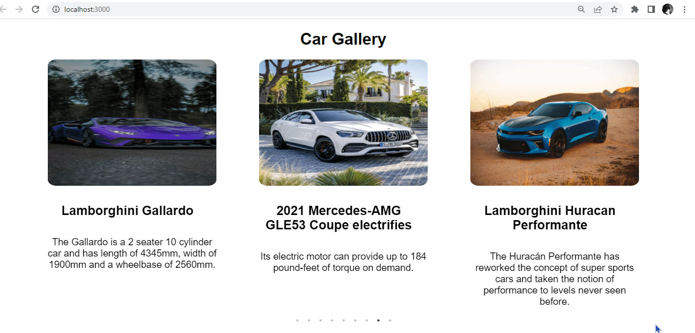
export default App;At this point, our carousel is up and functional.
Styling the carousel
Great! Our carousel app now works. The next natural step will be styling our carousel app, and we will apply all our styling in the index.css component.
body {
  margin: 0 auto;
  padding: 0;
  font-family: sans-serif;
  box-sizing: border-box;
  background: #fff;
  width: 90%;
}
.content {
  text-align: center;
  margin-bottom: 30px;
}
.header {
  font-size: 42px;
}
.img {
  display: flex;
  margin: 0 auto;
  height: 40vh;
  width: 80%;
  border-radius: 5%;
}
.container {
  margin: 0 auto;
  width: 100%;
  height: 80vh;
  border-color: white;
}
.title {
  margin-left: 50px;
  width: 70%;
  font-size: 30px;
  padding: 20px;
  border-radius: 5px;
  font-size: 33px;
}
.description {
  margin: 20px auto;
  width: 80%;
  font-size: 25px;
  margin: 20px auto;
}
After styling, the carousel will look like this:
Arrow Navigation with React Slick
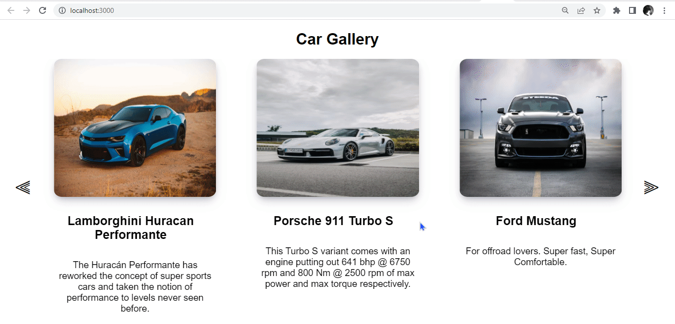
To create arrow navigation for React Slick, you can use the prevArrow and nextArrow props provided by the library. These props allow you to customize the arrows used for navigating the carousel. In our App.js file, go to settings and pass some props as shown below.
const settings = {
  infinite: true,
  slidesToShow: 3,
  slidesToScroll: 1,
  nextArrow: (
    <div>
      <div className="next-slick-arrow"> ⫸ </div>
    </div>
  ),
  prevArrow: (
    <div>
      <div className="prev-slick-arrow"> ⫷ </div>
    </div>
  ),
};
Also, update the CSS at index.css as shown below.
.slick-prev {
  left: -52px !important;
}
.slick-next:before,
.slick-prev:before {
  content: "" !important;
}
.next-slick-arrow,
.prev-slick-arrow {
  color: #000000;
  font-size: 45px;
}
After styling, it will look like this:
Thumbnails with React Slick
In this section, we will create thumbnails for our carousel components. First, we will use the asNavFor property, which provides ref to another slider and syncs it with the current slider to connect two Click slider carousels, which will act as the main Carousel and the other will work as a thumbnails slider. This will be saved in the thumbnailSettings and settings variables.
We will add some methods in the settings variable. We will set the centerMode configuration as true; this will center the current slide. We will set the focusOnSelect as true; this will go to slide on click.
import { useState, useEffect } from "react";

const App = () => {
  const [nav1, setNav1] = useState(null);
  const [nav2, setNav2] = useState(null);
  const [slider1, setSlider1] = useState(null);
  const [slider2, setSlider2] = useState(null);
  useEffect(() => {
    setNav1(slider1);
    setNav2(slider2);
  });
  const settings = {
    infinite: true,
    centerPadding: "200px",
    centerMode: true,
    slidesToShow: 3,
    slidesToScroll: 5,
    lazyLoad: true,
    asNavFor: ".slider-nav",
    focusOnSelect: true,
  };
  const thumbnailSettings = {
    slidesToShow: 9,
    slidesToScroll: 2,
    asNavFor: ".slider-for",
    swipeToSlide: true,
    focusOnSelect: true,
  };
  return (
    <div>
      <div className="content">
        <h1 className="header">Car Gallery</h1>
        <div className="container">
          <Slider
            {...settings}
            asNavFor={nav2}
            ref={(slider) => setSlider1(slider)}
          >
            {Images.map((item) => (
              <div key={item.id}>
                <img src={item.src} alt={item.alt} className="img" />
              </div>
            ))}
          </Slider>
        </div>
      </div>
      <div className="thumbnail-wrapper">
        <Slider
          {...thumbnailSettings}
          asNavFor={nav1}
          ref={(slider) => setSlider2(slider)}
        >
          {Images.map((item) => (
            <div key={item.id}>
              <hr />
              <img src={item.src} alt={item.alt} className="img" />
              <hr />
            </div>
          ))}
        </Slider>
      </div>
    </div>
  );
};
export default App;
Also, update the CSS at index.css as shown below.
hr {
  margin: 50px 0;
}
.thumbnail-wrapper {
  margin-top: -350px;
  height: 85px;
  width: 90%;
  margin-left: 60px;
}
.thumbnail-wrapper .slick-track .slick-slide {
  text-align: center;
}
.thumbnail-wrapper .slick-track .slick-slide img {
  display: flex;
  margin: 0px auto;
  height: 5vh;
  width: 30%;
  border-radius: 5%;
  cursor: pointer;
}
After styling, it will look like this:
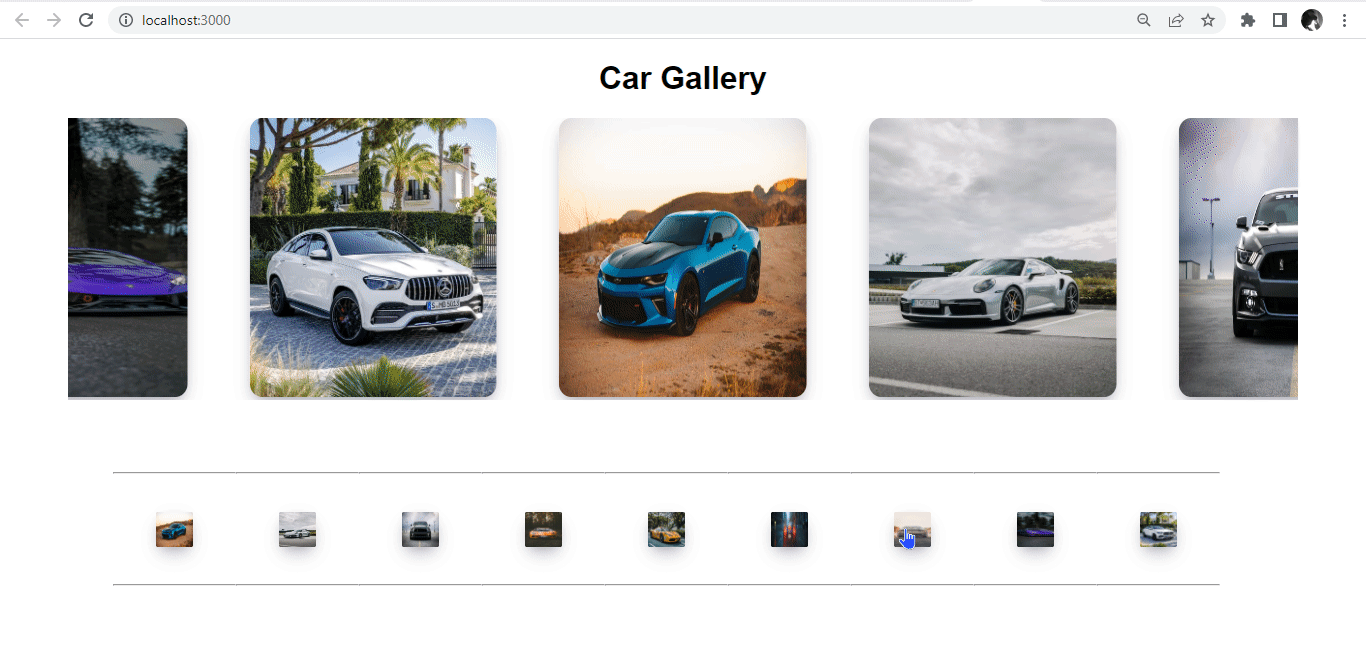
When a thumbnail is clicked, the corresponding image in the carousel will render at the center of the slide. This is another alternative for navigation, aside from dot and arrow navigation.
Conclusion
The React-Slick library offers a useful component that enables developers to integrate a carousel into our React projects. It allows users to customize the Slider component’s setting through the library’s API and apply styling based on their needs.
Gain Debugging Superpowers
Unleash the power of session replay to reproduce bugs and track user frustrations. Get complete visibility into your frontend with OpenReplay, the most advanced open-source session replay tool for developers.