Creating a Svelte Tabs component with Slot props
A double result: creating a useful tabs component, and learning how to use slots


When creating Svelte components, you may need to expose the parent component values to the child component. The Svelte let directive can do that through a slot.
In this article, we will create a Svelte tabs component using the let directive to expose a parent’s prop value to child elements and learn how to communicate the parent and child components.
The tabs component creates secondary navigation and toggles content inside a container.
Installation
We install SvelteKit and TailwindCSS.
npm create svelte@latest my-app
cd my-app
npm install
npx svelte-add@latest tailwindcss
npm i
Tabs basic structure
We are going to use the following structure:
<TabWrapper>
  <TabHead>
    <TabHeadItem>Tab 1</TabHeadItem>
    <TabHeadItem>Tab 2</TabHeadItem>
    <TabHeadItem>Tab 3</TabHeadItem>
  </TabHead>
  <TabContentItem>Tab 1 content</TabContentItem>
  <TabContentItem>Tab 2 content</TabContentItem>
  <TabContentItem>Tab 3 content</TabContentItem>
</TabWrapper>
TabWrapper holds other child components, and TabHead wraps head items with a ul tag. TabHeadItem holds a li tag and a on:click event forwarding. TabContentItem holds contents for each tab item.
TabWrapper
Our TabWrapper has a slot element to expose child components.
<script>
  export let divClass = 'w-full'
</script>

<div class={divClass}>
  <slot />
</div>
TabHead
We will fill up more CSS later for divClass. This component has a slot element to hold TabHeadItem.
<script>
  export let divClass = ''
  export let ulClass = 'flex flex-wrap -mb-px'
</script>

<div class={divClass}>
  <ul class={ulClass}  role="tablist">
    <slot />
  </ul>
</div>
TabHeadItem
This component has an on: directive with a click event to forward the event, and a slot element to hold a tab head name.
<script>
  export let id;
  export let buttonClass = ''
  export let liClass = 'mr-2'
</script>

<li class={liClass} role="presentation">
  <button
    on:click
    class={buttonClass}
    id="{id}-tabhead"
    type="button"
    role="tab">
    <slot />
  </button>
</li>
TabContentItem
We use an if statement to check the activeTabValue and id to show the tab content.
<script lang="ts">
  export let activeTabValue;
  export let id;
  export let contentDivClass = 'p-4 bg-gray-50 rounded-lg dark:bg-gray-300';
</script>

{#if activeTabValue === id}
  <div class={contentDivClass} id="{id}-tabitem" role="tabpanel" aria-labelledby="{id}-tab">
    <slot />
  </div>
{/if}
index.ts
We export all components in src/lib/index.ts.
export { default as TabWrapper } from './TabWrapper.svelte';
export { default as TabHead } from './TabHead.svelte';
export { default as TabHeadItem } from './TabHeadItem.svelte';
export { default as TabContentItem } from './TabContentItem.svelte';
+page
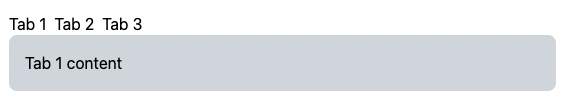
Let’s use the components we have created so far.
<script>
  import { TabWrapper, TabHead, TabHeadItem , TabContentItem } from '$lib'
  let activeTabValue = 1;
  const handleClick = (tabValue) => () => {
    activeTabValue = tabValue;
  };
</script>

<TabWrapper>
   <TabHead>
    <TabHeadItem id={1} on:click={handleClick(1)}>Tab 1</TabHeadItem>
    <TabHeadItem id={2} on:click={handleClick(2)}>Tab 2</TabHeadItem>
    <TabHeadItem id={3} on:click={handleClick(3)}>Tab 3</TabHeadItem>
  </TabHead>
  <TabContentItem id={1} {activeTabValue}>Tab 1 content</TabContentItem>
  <TabContentItem id={2} {activeTabValue}>Tab 2 content</TabContentItem>
  <TabContentItem id={3} {activeTabValue}>Tab 3 content</TabContentItem>
</TabWrapper>
We import all components from $lib and set an initial active tab using activeTabValue prop.
The handleClick function handles a click event to set the activeTabValue to the TabContentItem’s id.
Each TabHeadItem holds a handleClick event with the corresponding id and each TabContentItem holds id and activeTabValue props.
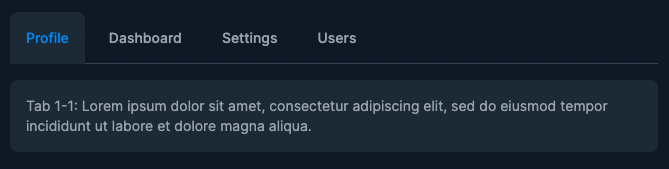
View the Tabs component in action
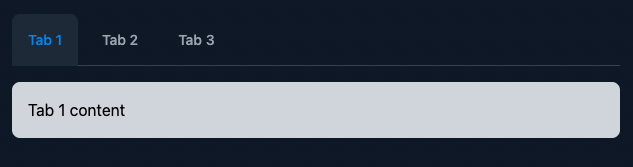
Highlighting an active tab head
Let’s add a highlight to an active tab head for the TabHeadItem component:
<script>
  // adding active class
  import classNames from 'classnames';
  export let id;
  export let activeTabValue
  export let inactiveClass = 'inline-block py-4 px-4 text-sm font-medium text-center text-gray-500 rounded-t-lg hover:text-gray-600 hover:bg-gray-50 dark:text-gray-400 dark:hover:bg-gray-800 dark:hover:text-gray-300'
  export let activeClass = 'inline-block py-4 px-4 text-sm font-medium text-center text-blue-600 bg-gray-100 rounded-t-lg active dark:bg-gray-800 dark:text-blue-500'
  const liClass = 'mr-2'
</script>

<li class={liClass} role="presentation">
  <button
    on:click
    class={classNames(activeTabValue === id ? activeClass : inactiveClass)}
    id="{id}-tabhead"
    type="button"
    role="tab">
    <slot />
  </button>
</li>
Please run npm i -D classnames to install the classnames package.
Once it is installed, we can import it as classNames.
We create the activeTabValue prop and new classes for active and inactive states.
We use classNames to change class using a conditional (ternary) operator to determine if the head item is active or inactive.
Let’s update the +page.svelte file:
<script>
  // updated version
  import { TabWrapper, TabHead, TabHeadItem , TabContentItem } from '$lib'
  let activeTabValue = 1;
  const handleClick = (tabValue) => () => {
    activeTabValue = tabValue;
  };
</script>

<TabWrapper>
   <TabHead>
    <TabHeadItem id={1} on:click={handleClick(1)} {activeTabValue}>Tab 1</TabHeadItem>
    <TabHeadItem id={2} on:click={handleClick(2)} {activeTabValue}>Tab 2</TabHeadItem>
    <TabHeadItem id={3} on:click={handleClick(3)} {activeTabValue}>Tab 3</TabHeadItem>
  </TabHead>
  <TabContentItem id={1} {activeTabValue}>Tab 1 content</TabContentItem>
  <TabContentItem id={2} {activeTabValue}>Tab 2 content</TabContentItem>
  <TabContentItem id={3} {activeTabValue}>Tab 3 content</TabContentItem>
</TabWrapper>
The only difference from the previous code is the {activeTabValue} prop in each TabHeadItem.
Let’s change the background style by adding CSS to src/app.html:
<body class="bg-gray-900">
<div>%sveltekit.body%</div>
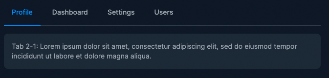
</body>This is what we have created.
View the Tabs component we have created so far.
Session Replay for Developers
Uncover frustrations, understand bugs and fix slowdowns like never before with OpenReplay — an open-source session replay tool for developers. Self-host it in minutes, and have complete control over your customer data. Check our GitHub repo and join the thousands of developers in our community.
Adding different styles
In the last section, we will add one more style to our tabs component. We could use the following, but it is not optimal since it requires a bit of writing when you change the tabStyle prop.
We could do this way, but you have to change the style name in every TabHeadItem
<TabHead tabStyle='default'>
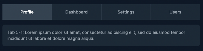
<TabHeadItem id={1} tabStyle='default' {activeTabValue} on:click={handleClick(1)}>Profile</TabHeadItem>
<TabHeadItem id={2} tabStyle='default' {activeTabValue} on:click={handleClick(2)}>Dashboard</TabHeadItem>
<TabHeadItem id={3} tabStyle='default' {activeTabValue} on:click={handleClick(3)}>Settings</TabHeadItem>
<TabHeadItem id={4} tabStyle='default' {activeTabValue} on:click={handleClick(4)}>Users</TabHeadItem>
</TabHead>For our components, we are going to use a slot prop with the [let](https://svelte.dev/docs#template-syntax-slot-slot-key-value) directive. This allows us to expose a prop value to slot elements.
TabWrapper.svelte
This component set the tabStyle prop like <TabWrapper tabStyle='underline' let:tabStyle />.
<script lang='ts'>
  // example 3
  import classNames from 'classnames'
  export let divClass = 'w-full'
  export let tabStyle: 'default' | 'underline' ='default'
</script>

<div class={classNames(divClass, $$props.class)}>
  <slot {tabStyle} />
</div>
Import classNames and add the tabStyle prop. You can extend this by adding more style. We also add $$props.class so that we can use it likeclass="mb-8". We use {tabStyle} to expose the value to the slot elements.
TabHead.svelte
We also need to update the TabHead component:
<script lang='ts'>
  // example 3
  export let tabStyle: 'default' | 'underline' ='default'
  type classOptions = {
    [key: string]: string;
  }
  export const divClasses = {
    default: 'mb-4 border-b border-gray-200 dark:border-gray-700',
    underline: 'mb-4 text-sm font-medium text-center text-gray-500 border-b border-gray-200 dark:text-gray-400 dark:border-gray-700'
  }
  export const ulClasses = {
    default: 'flex flex-wrap -mb-px',
    underline: 'flex flex-wrap -mb-px'
  }
</script>

<div class={divClasses[tabStyle]}>
  <ul class={ulClasses[tabStyle]}  role="tablist">
    <slot />
   </ul>
</div>
Create the tabStyle same as the TabWrapper.svelte and add a type declaration using Typescript’s index signatures.
We create objects that hold the style name as the key and CSS as the value and define a class depending on the tabStyle prop.
TabHeadItem.svelte
<script lang='ts'>
  // example 3
  import classNames from 'classnames';
  export let id;
  export let activeTabValue
  type classOptions = {
    [key: string]: string;
  }
  const activeClasses: classOptions  = {
    default: 'inline-block py-4 px-4 text-sm font-medium text-center text-blue-600 bg-gray-100 rounded-t-lg active dark:bg-gray-800 dark:text-blue-500',
    underline: 'inline-block p-4 text-blue-600 rounded-t-lg border-b-2 border-blue-600 active dark:text-blue-500 dark:border-blue-500'
  }
  const inactiveClasses: classOptions  = {
    default: 'inline-block py-4 px-4 text-sm font-medium text-center text-gray-500 rounded-t-lg hover:text-gray-600 hover:bg-gray-50 dark:text-gray-400 dark:hover:bg-gray-800 dark:hover:text-gray-300',
    underline: 'inline-block p-4 rounded-t-lg border-b-2 border-transparent hover:text-gray-600 hover:border-gray-300 dark:hover:text-gray-300'
  }
  const liClasses : classOptions = {
    default: 'mr-2',
    underline: 'mr-2'
  };
  export let tabStyle: 'default' | 'underline' ='default'
</script>

<li class={liClasses[tabStyle]} role="presentation">
  <button
    on:click
    class={classNames(activeTabValue === id ? activeClasses[tabStyle] : inactiveClasses[tabStyle])}
    id="{id}-tabhead"
    type="button"
    role="tab">
    <slot />
  </button>
</li>
We create objects activeClasses, inactiveClasses, and liClasses that hold the style name as the key and CSS as the value.
We also define a class depending on the tabStyle prop, class={liClasses[tabStyle]} and class={classNames(activeTabValue === id ? activeClasses[tabStyle] : inactiveClasses[tabStyle])}.
<script>
  // example 3
  import  { TabWrapper, TabHead, TabHeadItem , TabContentItem } from '$lib'
  let activeTabValue = 1;
  let activeTabValue2 = 1;
  const handleClick = (tabValue) => () => {
    activeTabValue = tabValue;
  };
  const handleClick2 = (tabValue) => () => {
    activeTabValue2 = tabValue;
  };
</script>

<TabWrapper class="mb-8">
  <TabHead>
    <TabHeadItem id={1}  on:click={handleClick(1)} {activeTabValue}>Tab 1</TabHeadItem>
    <TabHeadItem id={2} on:click={handleClick(2)} {activeTabValue}>Tab 2</TabHeadItem>
    <TabHeadItem id={3} on:click={handleClick(3)} {activeTabValue}>Tab 3</TabHeadItem>
  </TabHead>
  <TabContentItem id={1} {activeTabValue}>Tab 1 content</TabContentItem>
  <TabContentItem id={2} {activeTabValue}>Tab 2 content</TabContentItem>
  <TabContentItem id={3} {activeTabValue}>Tab 3 content</TabContentItem>
</TabWrapper>

<TabWrapper tabStyle='underline' let:tabStyle>
  <TabHead {tabStyle}>
    <TabHeadItem id={1} {tabStyle} on:click={handleClick2(1)} activeTabValue={activeTabValue2}>Tab 1</TabHeadItem>
    <TabHeadItem id={2} {tabStyle} on:click={handleClick2(2)} activeTabValue={activeTabValue2}>Tab 2</TabHeadItem>
    <TabHeadItem id={3} {tabStyle} on:click={handleClick2(3)} activeTabValue={activeTabValue2}>Tab 3</TabHeadItem>
  </TabHead>
  <TabContentItem id={1} activeTabValue={activeTabValue2}>Tab 1 content</TabContentItem>
  <TabContentItem id={2} activeTabValue={activeTabValue2}>Tab 2 content</TabContentItem>
  <TabContentItem id={3} activeTabValue={activeTabValue2}>Tab 3 content</TabContentItem>
</TabWrapper>
We are going to add two examples. Create two prop, activeTabValue and activeTabValue2 and event functions, handleClick and handleClick2.
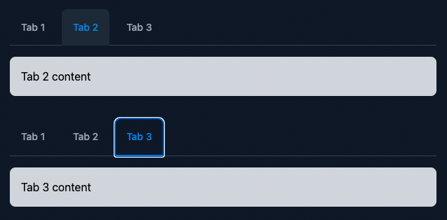
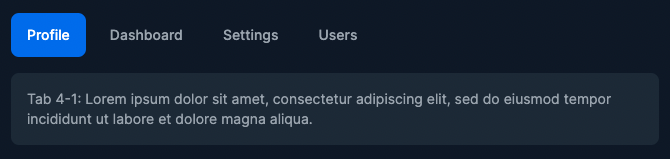
The first example is the default style tabs example, and the second is the underline style tabs example.
In line 25, the directive value must be a JavaScript expression enclosed in curly braces. This means you can’t use let:tabStyle='underline.
To get the tabStyle value from the TabHead component, use {tabStyle} in child components.
This is our final result.
View the final Tabs component we have created.
Conclusion
To extend this component, you can add different event handlers, such as on:mouseenter, on:mouseleave, on:keydown, etc., to the TabHeadItem component. Also, you can add more styles.
I hope these examples showed how to expose a parent prop value to slot elements using a slot prop with the let directive.
Flowbite-Svelte
(Disclaimer: I’m a contributor to Flowbite-Svelte, an open-source project.)
Flowbite-Svelte is an official Flowbite component library for Svelte. We used similar component structures and added more styles and functions. Flowbite-Svelte’s Tabs component styles are tabs with underline, tabs with icons, pills tabs, full-width tabs, and more.
Default tabs
Tabs with underline example
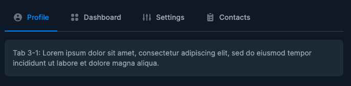
Tabs with icons example
Pills tabs example
A TIP FROM THE EDITOR: Learn more about Svelte in our A Practical Introduction To Svelte article.
Gain Debugging Superpowers
Unleash the power of session replay to reproduce bugs and track user frustrations. Get complete visibility into your frontend with OpenReplay, the most advanced open-source session replay tool for developers.