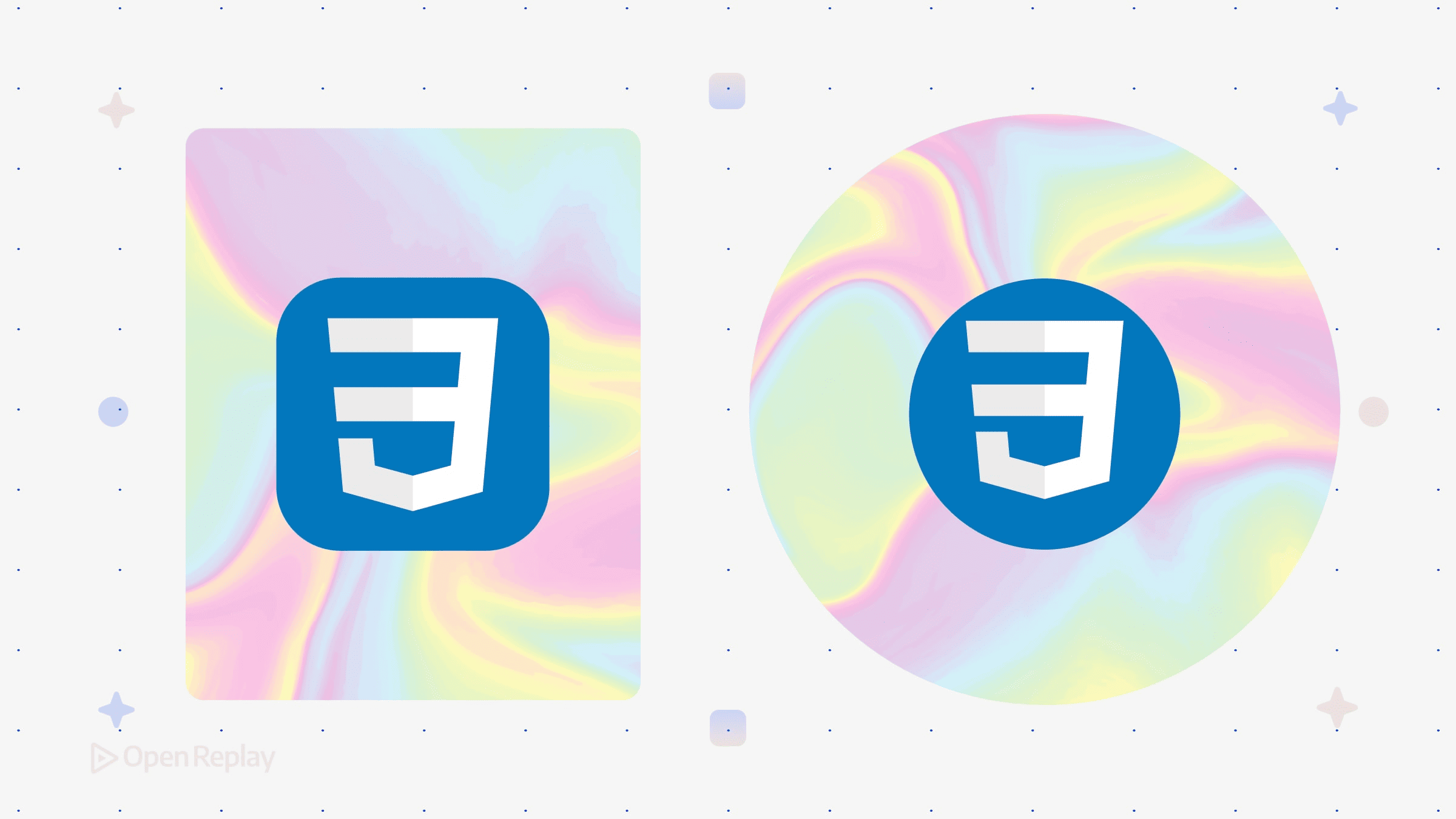
Creating Holographic Effects in CSS

You’ve seen them on trading cards, premium UI components, and portfolio sites: those iridescent, light-shifting surfaces that seem to respond to viewing angle. Holographic CSS effects simulate this optical phenomenon using layered gradients, blend modes, and subtle animation—no WebGL required.
This article explains the compositional techniques behind these modern CSS visual effects and when they’re appropriate for real interfaces.
Key Takeaways
- Holographic CSS effects combine layered gradients, blend modes, and animation to simulate iridescent surfaces
- OKLCH color space produces smoother, more predictable color transitions than RGB or HSL
- Always include
prefers-reduced-motionmedia queries and solid color fallbacks for accessibility - Use holographic effects sparingly on accent elements where visual attention is warranted
Why Holographic Effects Work
Physical holographic materials create iridescence through light interference patterns. In CSS, we simulate this by layering multiple color gradients that shift and blend in ways that suggest depth and movement.
The key insight: holographic CSS effects aren’t a single property. They’re a composition of several techniques working together—CSS gradient blending, strategic use of blend modes, and optional motion.
The Foundation: Layered Gradients
CSS iridescent gradients rely on stacking multiple gradient layers. You can combine linear-gradient, radial-gradient, and conic-gradient on a single element:
.holographic {
  background:
    linear-gradient(115deg, transparent 20%, oklch(0.7 0.15 200) 45%, oklch(0.75 0.18 320) 55%, transparent 80%),
    conic-gradient(from 45deg, oklch(0.8 0.12 60), oklch(0.7 0.15 180), oklch(0.8 0.12 300), oklch(0.8 0.12 60));
}
Each layer contributes to the final effect. Linear gradients provide directional shimmer, while conic gradients add the radial color shifts characteristic of holographic foil.
For background on gradient types and composition, see the MDN documentation on https://developer.mozilla.org/en-US/docs/Web/CSS/gradient
OKLCH Color CSS: The Modern Foundation
OKLCH color CSS has become the preferred color space for these effects. Unlike RGB or HSL, OKLCH is perceptually uniform—meaning equal numerical steps produce visually equal color differences.
For holographic effects, this matters because:
- Smoother transitions: Gradients don’t muddy through gray midpoints
- Predictable hue shifts: Colors rotate naturally around the spectrum
- Consistent lightness: The effect maintains visual balance across color stops
You can also control gradient interpolation explicitly:
.holographic {
  background: linear-gradient(in oklch, oklch(0.7 0.15 0), oklch(0.7 0.15 360));
}
This creates a continuous hue rotation (wrapping back to the starting hue) without the unexpected dark bands common in sRGB interpolation.
For a deeper explanation of OKLCH and why it replaced HSL for many design tasks, see: https://evilmartians.com/chronicles/oklch-in-css-why-quit-rgb-hsl
Blend Modes and Filters
Blend modes transform how gradient layers interact. The most useful for holographic effects:
color-dodge: Brightens underlying colors, creating metallic highlightsdifference: Inverts colors where layers overlap, producing prismatic shiftsoverlay: Combines multiply and screen for depth without washing out
Filters add the final polish:
.holographic-layer {
  mix-blend-mode: color-dodge;
  filter: brightness(0.8) contrast(1.4);
}
Be aware that combining blend modes and filters can increase rendering cost, particularly on lower-powered or mobile GPUs.

Discover how at OpenReplay.com.
Adding Motion Responsibly
Subtle animation brings holographic effects to life. The standard approach shifts background-position on an oversized gradient:
.holographic {
  background-size: 200% 200%;
  animation: shimmer 6s ease-in-out infinite;
}

@keyframes shimmer {
  0%, 100% { background-position: 0% 50%; }
  50% { background-position: 100% 50%; }
}
Performance consideration: Use transform and opacity for animations when possible. For background animations, apply will-change: background-position sparingly and temporarily (for example, on hover or active states) to avoid unnecessary memory overhead.
Accessibility requirement: Always respect user preferences:
@media (prefers-reduced-motion: reduce) {
  .holographic {
    animation: none;
  }
}
Practical Constraints
Holographic effects render differently across devices and browsers. Expect variation in:
- Color vibrancy on different display gamuts
- Animation smoothness on lower-powered devices
- Gradient banding on 8-bit displays
Build with progressive enhancement. Start with a solid fallback color, layer in gradients for capable browsers, and add animation last:
.holographic {
  background: #6366f1; /* Fallback */
  background: linear-gradient(115deg, transparent 20%, oklch(0.7 0.15 200) 45%, oklch(0.75 0.18 320) 55%, transparent 80%);
}
When to Use These Effects
Holographic CSS effects work best for:
- Accent elements (cards, badges, CTAs)
- Interactive states (hover, focus)
- Premium or playful brand contexts
They’re inappropriate for:
- Body text backgrounds
- Navigation elements requiring quick scanning
- Interfaces prioritizing accessibility or cognitive simplicity
The effect draws attention. Use it where attention is warranted.
Conclusion
Holographic CSS effects are compositional—layered gradients, blend modes, and motion working together. OKLCH provides the color foundation for smooth, realistic transitions. The techniques are broadly supported in modern browsers, but visual consistency across devices isn’t guaranteed.
Start simple: one gradient layer, one blend mode, minimal motion. Add complexity only when the effect serves the interface rather than decorating it.
FAQs
OKLCH colors are supported in modern evergreen browsers. Gradient interpolation using in oklch is also available in current browser versions, but support details vary. Always include fallback colors for environments that may not render OKLCH values correctly.
Gradient banding occurs on displays with limited color depth. To reduce it, use OKLCH color space for smoother interpolation, increase the number of color stops in gradients, and avoid large areas of very similar colors transitioning slowly. Optional dithering or noise techniques can further reduce visible banding.
Yes, complex layered gradients and continuous animations can strain rendering performance, especially on mobile devices. Limit animated elements on screen, use will-change sparingly, consider pausing animations when elements leave the viewport, and test on lower-powered devices during development.
Use JavaScript to track cursor position and update CSS custom properties that control gradient angles or positions. Apply these properties to gradient definitions, throttle updates to avoid performance issues, and always provide a static fallback for touch devices and users who prefer reduced motion.
Truly understand users experience
See every user interaction, feel every frustration and track all hesitations with OpenReplay — the open-source digital experience platform. It can be self-hosted in minutes, giving you complete control over your customer data. . Check our GitHub repo and join the thousands of developers in our community..

