
How to Create a User Onboarding Tour with Driver.js

A good user experience plays an important role in the success of any web or mobile application. Enhancing the user experience can be achieved through various methods. One such method is by creating an onboarding tour for new users. A product tour that showcases your application features and demonstrates how to navigate them can significantly increase product adoption, and this article will teach you how to achieve that.

Discover how at OpenReplay.com.
In this article, we will build a user onboarding tour using the driver.js library. Driver.js is a lightweight and highly configurable tour library, written in TypeScript.
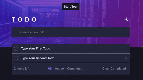
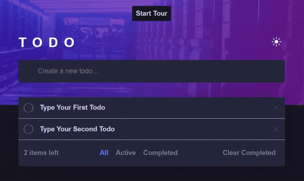
Before we proceed, here is a preview of the final product:
Setting Up Driver.js
In this section, I will walk you through setting up the driver.js library in your application.
Prerequisites
To follow along, there are basic things you need to have in place. You should have:
Project Overview
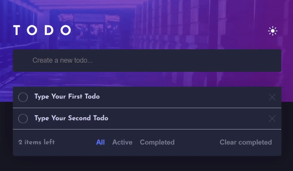
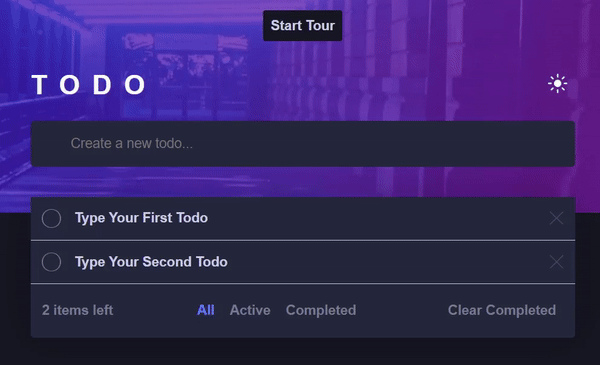
To keep things focused, I have provided a starter project, which can be set up by following the instructions in the README.md file. If you have followed the instructions correctly, you should be seeing this in your browser:
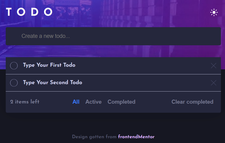
The starter project is a to-do application where users can create, delete, and toggle the status of a to-do between completed and active. The bottom tab includes buttons for viewing to-dos based on their status and clearing all completed to-dos.
Installing Driver.js
To install the driver.js library, run the following command in your terminal:
npm install driver.jsHighlighting an Element
The driver.js library is not just a tour library; it also allows you to highlight individual elements in your application. Let’s use this feature to highlight the input element when it gains focus.
To keep things organized, create a new tour directory inside the src directory. Next, create a new driver.js file in the tour directory and add the following code:
import { driver } from "driver.js";
import "driver.js/dist/driver.css";

const driverInstance = driver();

export default driverInstance;
In the above code sample, we imported the driver and its default stylesheet from the driver.js library. Next, we called the driver function and saved the returned driver object in the driverInstance variable which is exported for use in our project.
Next, open the TextInput component where the input element is located and import the driverInstance object:
// ...existing import statements
import driverInstance from "../../tours/driver";

function TextInput() {
  // ...existing TextInput code
}

export default TextInput;
Next, add an onFocus event listener to the input element:
// ...existing import statements
import driverInstance from "../../tours/driver";
function TextInput() {
// ...existing code
return (
<form onSubmit={(e) => createNewTask(e)}>
<label htmlFor="text-input" className={styles.label}>
<input
type="text"
id="text-input"
name="text-input"
placeholder="Create a new todo..."
className={styles.input}
value={inputValue}
// Add this
onFocus={() => {
driverInstance.highlight({
element: "#text-input",
popover: {
title: "Create a New Todo",
description:
"Type your todo and press the enter key on your keyboard to create a new todo",
},
});
}}
onChange={(e) => setInputValue(e.target.value)}
/>
<span className={styles.circle}></span>
</label>
</form>
);
}
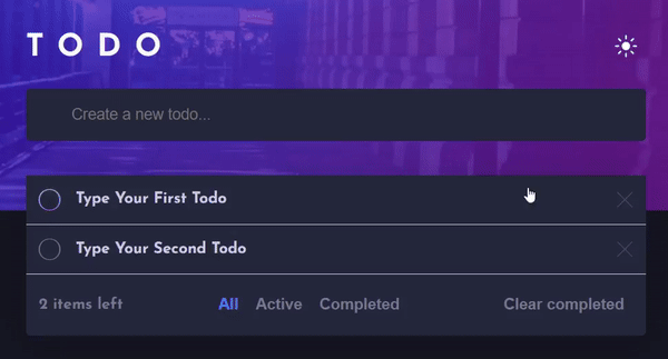
export default TextInput;In the above code sample, we have added an onFocus event listener to the input element. This event triggers when a user focuses on the input field. Inside the onFocus event, we call the highlight method on the driverInstance object. The highlight method is passed an object as an argument, which contains the following properties:
element: This is the element to highlight. You can pass in any validCSSselector that can be queried through thequerySelectormethod.popover: This property holds an object used to configure the highlightedpopoverelement. It contains various properties, which will be discussed in the next section.
The input element is now highlighted when it is in focus:
Customizing the Popover
Driverjs provides various options for configuring the appearance of the popover element. Some of the options include:
title: This can be a text or a validHTMLcode. It serves as the heading text for the highlighted step.description: This can also be a text or a validHTMLcode. It is used to provide additional information about the highlighted element.side: This controls the position of thepopoverelement relative to the highlighted element. It has four valid valuesright,left,top, andbottom.align: This controls the alignment of thepopoverelement based on the specifiedsideproperty. It has three valid values:start,end, andcenter.popoverClass: This is useful for applying custom styles to thepopoverelement. Its value is aCSSclass.onNextClick: A callback function that, when defined, replaces the defaultclickevent handler for thenextbutton.onPreviousClick: A callback function that, when defined, replaces the defaultclickevent handler for thepreviousbutton.
You can check out the driver.js documentation for a comprehensive list of the popover configuration options.
Let’s use some of these options to configure the input element’s popover:
// ...existing import statements

function TextInput() {
  // ...existing code

  return (
    <form onSubmit={(e) => createNewTask(e)}>
      <label htmlFor="text-input" className={styles.label}>
        <input
          type="text"
          id="text-input"
          name="text-input"
          placeholder="Create a new todo..."
          className={styles.input}
          value={inputValue}
          onFocus={() => {
            const driverObj = driver();

            driverObj.highlight({
              element: "#text-input",
              popover: {
                title: "Create a New Todo",
                description:
                  "Type your todo and press the enter key on your keyboard to create a new todo",
                // Add these properties
                side: "bottom",
                align: "center"
 },
 });
 }}
          onChange={(e) => setInputValue(e.target.value)}
        />
        <span className={styles.circle}></span>
      </label>
    </form>
 );
}

export default TextInput;
In the above code sample, we have added the side and align properties, which we set to bottom and center respectively. The popover will now be displayed at the bottom of the input element and aligned at its center:
We can also highlight the input element without displaying the popover by simply removing the popover property:
// ...existing import statements

function TextInput() {
  // ...existing code

  return (
    <form onSubmit={(e) => createNewTask(e)}>
      <label htmlFor="text-input" className={styles.label}>
        <input
          type="text"
          id="text-input"
          name="text-input"
          placeholder="Create a new todo..."
          className={styles.input}
          value={inputValue}
          onFocus={() => {
            const driverObj = driver();
            // Removed the popover property
            driverObj.highlight({
              element: "#text-input",
 });
 }}
          onChange={(e) => setInputValue(e.target.value)}
        />
        <span className={styles.circle}></span>
      </label>
    </form>
 );
}

export default TextInput;
The popover is no longer displayed when the input element is highlighted:
Creating a Basic Tour
When you need to introduce a series of features to your users, using the highlight method alone is inadequate, as it only highlights one element at a time. This is where creating a tour becomes useful. A tour allows you to define a sequence of elements to highlight. The elements are highlighted in a sequential manner, usually starting with the first element and continuing until all elements in the tour are highlighted.
To set up a tour for our todo app, start by creating a new steps.js file in the tour directory. Then, add the following code to the file:
const steps = [
 {
    element: "#toggle-theme",
    popover: {
      title: "Change Theme",
      description: "You can click on this icon to switch between themes",
 },
 },
 {
    element: "#text-input",
    popover: {
      title: "Add a new todo",
      description:
        "Type in your todo and press the enter key on your keyboard",
      disableButtons: ["next"],
 },
 },
 {
    element: "#todo-list",
    popover: {
      title: "Your Todos",
      description: "All your todos will appear here",
 },
 },
 {
    element: "#toggle-todo-status",
    popover: {
      title: "Toggle todo status",
      description:
        "Click to toggle todo status from active to completed and vice-versa",
 },
 },
 {
    element: "#delete-todo-btn",
    popover: {
      title: "Delete a Todo",
      description: "Click to delete a todo item",
 },
 },
 {
    element: "#num-of-active-todos",
    popover: {
      title: "Active Todos",
      description: "Helps you keep track of the number of active todos left",
 },
 },
 {
    element: "#all-todos-tab",
    popover: {
      title: "View all Todos",
      description: "Click to view all your todos",
 },
 },
 {
    element: "#active-todos-tab",
    popover: {
      title: "View Active Todos",
      description: "Click to view all active todos",
 },
 },
 {
    element: "#completed-todos-tab",
    popover: {
      title: "View Completed Todos",
      description: "Click to view all your completed todos",
 },
 },
 {
    element: "#clear-completed-todos-btn",
    popover: {
      title: "Clear Completed Todos",
      description: "Click to delete all completed todos",
 },
 },
];

export default steps;
In the above code sample, we have added an array of steps that contains objects with properties identical to those used when highlighting a single element. Each object in the array represents an individual element to be highlighted.
Next, import the Button component into the App.jsx file and include it in the returned JSX:
// ...existing import statements
import { ...otherComponents, Button } from "./components";

function App() {
  const { theme } = useTheme();

  return (
    <div className={`app ${theme === "dark" ? "dark" : "light"}`}>
 // Add this Button component
      <Button className="start-tour-btn">
 start tour
      </Button>
      {/* ...Existing JSX */}
    </div>
 );
}

export default App;
In the above code sample, we created a start tour button and added a start-tour-btn class name that applies predefined styles from the index.css file. The button should now be displayed in your browser:
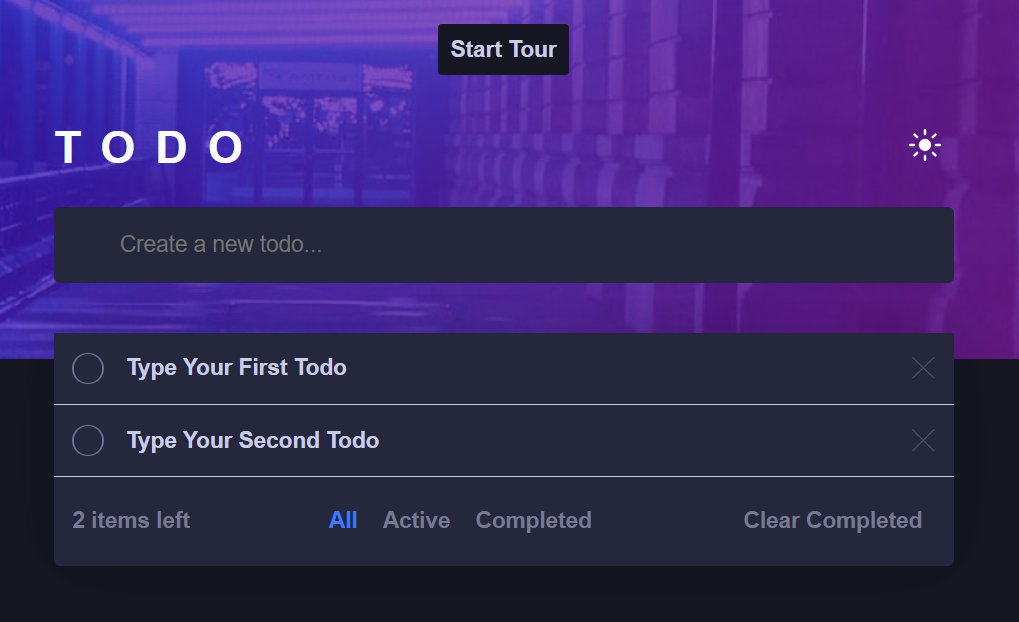
Next, let’s add an onClick event to the button to start the tour when clicked:
// ...existing import statements
// Add these import statements
import steps from "./tours/steps";
import driverInstance from "./tours/driver";
function App() {
const { theme } = useTheme();
return (
<div className={`app ${theme === "dark" ? "dark" : "light"}`}>
<Button
// Add this
onClick={() => {
driverInstance.setSteps(steps);
driverInstance.drive();
}}
className="start-tour-btn"
>
start tour
</Button>
{/* ...existing JSX */}
</div>
);
}
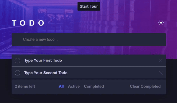
export default App;In the above code sample, we have imported the driverInstance and the earlier created steps array into our App component. We then add an onClick event to the Button component. In the onClick event, we define a callback function that sets the steps for the tour by passing in the steps array to the setSteps method of the driverInstance and then start the tour by calling the drive method. The tour now starts when the start tour button is clicked:
Well, that was not a good tour. The popover for each step was displayed, but only the input element was highlighted. This happens because only the id of the input element returns a reference to a DOM node. The other steps return null when queried in the DOM because they were not assigned to any elements in our application. To fix this, we need to add an id attribute to the relevant DOM elements.
Let’s start with the element in the first step. Open the index.jsx file in the Header component and add an id of toggle-theme to the Button component:
// ...existing import statements

function Header() {
  const { theme, toggleTheme } = useTheme();

  return (
    <header className={styles.header}>
      <h1>Todo</h1>
      <Button
        // Add this id prop
        id="toggle-theme"
        onClick={() => toggleTheme(theme === "dark" ? "light" : "dark")}
      >
        <img
          src={theme === "dark" ? sunIcon : moonIcon}
          alt="An icon of the sun"
        />
      </Button>
    </header>
 );
}

export default Header;
Next, add an id to the ul element in the TaskList component:
// ...existing import statements

function TaskList() {
  // ...existing Codes

  return (
    <section className={styles.box}>
 // Add an id
      <ul id="todo-list">
        {currentTabTodos.map((todo) => (
          <TodoItem key={todo.id} todo={todo} />
 ))}
      </ul>
      {/* ...existing JSX */}
    </section>
 );
}

export default TaskList;
Next, add an id to the Checkbox component and the img element in the TodoItem component:
// ...existing import statements

function TodoItem({ todo }) {
  const { title, status, id } = todo;

  return (
    <li className={styles.task}>
      <Checkbox
        status={status}
        // Add this id
        id="toggle-todo-status"
        onChange={() => toggleTodoStatus(id)}
      />
      <p className={status === "completed" ? styles.done : null}>{title}</p>
      <img
        // Add this id
        id="delete-todo-btn"
        src={cancelIcon}
        onClick={() => deleteTodo(id)}
        alt=""
      />
    </li>
 );
}

export default TodoItem;
Finally, add an id to the Button components and the p element in the BottomTab component:
// ...existing import statements

function BottomTab({ numOfActiveTodos, onTabChange, activeTab }) {

  return (
    <div className={styles.box}>
 // Add this id
      <p id="num-of-active-todos">
        {`${numOfActiveTodos} item${numOfActiveTodos > 1 ? "s" : ""} left`}
      </p>
      <div>
        <Button
          // Add this id prop
          id="all-todos-tab"
          style={{
            color: activeTab === "all" ? "var(--active-btn-color)" : null,
 }}
          onClick={() => onTabChange("all")}
        >
 All
        </Button>
        <Button
          // Add this id prop
          id="active-todos-tab"
          style={{
            color: activeTab === "active" ? "var(--active-btn-color)" : null,
 }}
          onClick={() => onTabChange("active")}
        >
 Active
        </Button>
        <Button
          // Add this id prop
          id="completed-todos-tab"
          style={{
            color: activeTab === "completed" ? "var(--active-btn-color)" : null,
 }}
          onClick={() => onTabChange("completed")}
        >
 Completed
        </Button>
      </div>
      <Button
        // Add this id prop
        id="clear-completed-todos-btn"
        className={styles.clearBtn}
        onClick={() => clearCompletedTodos()}
      >
 Clear completed
      </Button>
    </div>
 );
}

export default BottomTab;
The tour now works as expected:
Ending a Tour
By default, a tour ends when any of the following actions occurs:
- Clicking on the next or previous button when the tour is at the last or first step in the tour respectively.
- Clicking on the overlay element.
- Pressing the escape key on your keyboard.
- Clicking the cancel icon on the rendered popover.
In addition to the default options, the library also provides a destroy method that can be used to cancel a tour.
:::info
Calling the destroy method based on click events on elements outside the popover will not work once a tour has started. This is because driver.js captures any click events on your webpage when a tour is active, preventing these events from reaching the intended element. The destroy method is typically used to create a custom cancel button on the rendered popover.
:::
Here’s how you can exit the tour by clicking the cancel button:
Customizing the Tour
The tour can be customized throug a range of options. In this section, we will explore a few and demonstrate how to implement them.
Modifying the Drive Configurations
There are two ways of modifying the driver. We can change the configurations when the driver is initialized, or we can use the setConfig method to configure the driver later. Here are some of the available driver configuration options:
steps: This is the array of steps to highlight in your tour. It can be set when initializing thedriveror through thesetStepsmethod.animate: This determines whether the tour should be animated. Its value is a boolean.overlayColor: This is used to change the background color of the overlay element. Its value can be any valid CSS color format.overlayOpacity: This sets the opacity for the overlay element. Its value is a valid CSS opacity value.showProgress: This determines if the user should be able to see how far along they are in a tour. Its value is a boolean.allowClose: This determines whether clicking on the overlay element or pressing theesckey on your keyboard should exit the tour. Its value is a boolean.disableActiveInteraction: This option determines whether a user can interact with the highlighted element. Its value is also a boolean.
You can also check out the driver.js documentation for a comprehensive list of the available driver configuration options.
Let’s customize the tour by calling the setConfig method and setting some options. Open your App.jsx file and update the onClick event handler of the start tour button as shown in the code below:
// ...existing import statements

function App() {
  const { theme } = useTheme();

  return (
    <div className={`app ${theme === "dark" ? "dark" : "light"}`}>

      <Button
        onClick={() => {
          // Set up the driver configuration
          driverInstance.setConfig({
            showProgress: true,
            overlayColor: "yellow",
            animate: false,
 });

          driverInstance.setSteps(steps);
          driverInstance.drive();
 }}
        className="start-tour-btn"
      >
 Start tour
      </Button>
      {/* ...existing JSX */}
    </div>
 );
}

export default App;
In the above code, we set showProgress to true, overlayColor to yellow, and animate to false. The tour now looks and behaves differently:
Modifiying Tour Step
We can also customize each step in a tour. Some of the steps configuration options include:
element: This is theDOMelement you intend to highlight.popover: This contains the configuration for the step’s popover.onDeselected: A callback function executed beforedriver.jsmoves to the next step in the tour. The callback receives three parameters:element: The current highlightedDOMelement.step: The step object configured for the current step.options: This contains both the available configuration and the current state of thedriver.
onHighlightStarted: A callback function executed before an element is highlighted. It also receives the same parameters as theonDeselectedcallback function.onHighlighted: A callback function triggered when an element is highlighted. It receives the same parameters as theonDeselectedandonHiglighStartedcallback functions.
Let’s configure the last step to display a message when the element is about to be deselected. Add the onDeslected method, to the last step in the steps array:
const steps = [
  // ...existing steps,
 {
    element: "#clear-completed-todos-btn",
    popover: {
      title: "Clear Completed Todos",
      description: "Click to delete all completed todos",
 },
    // Add this
    onDeselected: () => {
      alert(
        "Thanks for taking the tour. We hope you enjoy using the application"
 );
 },
 },
];

export default steps;
In the above code sample, we have added an onDeselected method to the last step, which sends an appreciation message to the user using the browser alert method. Now, when the user reaches the last step and is about to exit the tour, the message will be displayed:
Conclusion
In this article, you learned to highlight elements and create engaging tours for your application using the driver.js library. We explored how to highlight an element and set up a tour, including how to configure the driver instance and customize each step to provide a seamless user experience. Additionally, we covered various configuration options that allow you to tailor the tour to the specific needs of your application.
With driver.js, you can guide your users through your application intuitively and engagingly, ensuring they understand its features and functionality.
Truly understand users experience
See every user interaction, feel every frustration and track all hesitations with OpenReplay — the open-source digital experience platform. It can be self-hosted in minutes, giving you complete control over your customer data. . Check our GitHub repo and join the thousands of developers in our community..
