
Mastering Visual Appeal: Implementing the CSS Blurry Shimmer Effect

Most of the time, you form an opinion about a website within seconds of landing. A visually appealing design goes beyond just looking nice; it is a potent instrument for building professional and polished looks that signal attention to essential details with clear layouts, color schemes, and proper typography. This article will show you how to implement the shimmer effect, to make your webpage far more attractive.

Discover how at OpenReplay.com.
Imagine a world where screens are no longer dull and static; that is where the CSS blurry shimmer effect swoops in to save the day. First impressions always matter; a good user experience positively impacts people visiting your website. This article is your guide to understanding the importance of taking visual appeals seriously.
What exactly does the Shimmer effect mean, and how does it work? The shimmer effect is a visual trick used to give webpage elements the appearance of faint movement or shimmering.
Here’s how it works: First, we will create an HTML structure to display the element. Then, we define the element’s appearance with CSS and specify the movement using animation keyframes. Lastly, we will apply the transition property to determine the state changes. These fundamental elements define the shimmer effect.
Creating the HTML Shimmer Effect Structure
To begin with, let’s establish the structure of our webpage by creating HTML elements to represent the widgets. We will enclose each widget within a div element and assign the class name widget for easy identification and styling. We’ll also arrange these widgets into rows using additional div elements to design the layouts.
Launch a new project folder and create a new file named index.html to get started. Then add the following code to it:
<!doctype html>
<html lang="en">
  <head>
    <meta charset="UTF-8" />
    <meta http-equiv="X-UA-Compatible" content="IE=edge" />
    <meta name="viewport" content="width=device-width, initial-scale=1.0" />
    <link rel="stylesheet" href="style.css" />
    <title>Shimmer Effect</title>
  </head>

  <body>
    <div class="container">
      <div class="row">
        <div class="widget widget1"></div>
        <div class="widget widget2"></div>
      </div>
      <div class="row">
        <div class="widget widget3"></div>
        <div class="widget widget4"></div>
      </div>
      <div class="row">
        <div class="widget widget5"></div>
      </div>
    </div>
  </body>
</html>
Styling the CSS: Creating the Visual Appeal
Now, to captivate your attention with a striking element, let’s infuse life into the widget with CSS styling through the colors, dimensions, and animations. We can imbue each widget with vibrancy, transforming them into dynamic components on our webpage.
To improve the layout, we’ll use the advanced CSS property flex-box to orchestrate the arrangement of the widgets into rows. Create a new CSS file in your working folder named style.css and add the following code.
Styling the Container and Rows
In this section, we define the CSS styles for the container and rows to create a structured layout for our widgets. The container holds the rows, and each row contains widgets arranged horizontally with space between them.
.container {
  display: flex;
  flex-direction: column;
  align-items: center;
  padding: 20px;
}

.row {
  display: flex;
  justify-content: space-between;
  margin-bottom: 20px;
}

.row:last-child {
  justify-content: flex-start;
}
Styling the Widgets
Here, we define the CSS styles for individual widgets, including their sizes, background colors, box shadows, border radius, and inter-widget spacing.
.widget {
  width: 120px;
  height: 150px;
  background: #ddd;
  position: relative;
  border-radius: 10px;
  box-shadow: 0 4px 8px rgba(0, 0, 0, 0.1);
}

.widget1 {
  background-color: #ddd;
}

.widget2 {
  background-color: #bbb;
}

.widget3 {
  background-color: #999;
}

.widget4 {
  background-color: #777;
}

.widget5 {
  background-color: #555;
}

.widget + .widget {
  margin-left: 29px;
}
Styling Widget with the Shimmer Effect
Let’s add a subtle shimmer effect to the widgets.
.widget::before {
  content: "";
  position: absolute;
  top: 0;
  left: 0;
  width: 50%;
  height: 100%;
  background: linear-gradient(
    100deg,
    rgba(255, 255, 255, 0) 20%,
    rgba(255, 255, 255, 0.5) 50%,
    rgba(255, 255, 255, 0) 80%
 );
  animation: shimmer 2s infinite linear;
}

@keyframes shimmer {
 from {
    transform: translateX(-200%);
 }
 to {
    transform: translateX(200%);
 }
}
The @keyframes shimmer property is vital for defining the sequence of animation applied to the shimmer effect. In that light, the core principle behind the shimmer effect relies on the animation that manipulates the background or the gradient position that illuminates the background.
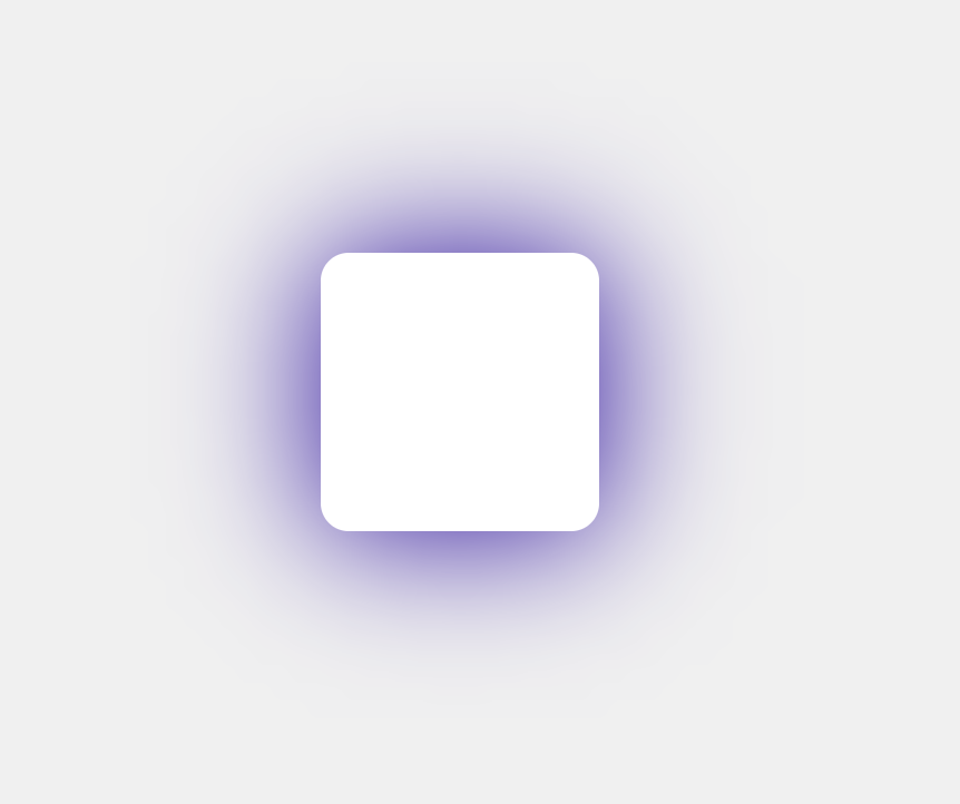
Now, open the code on your browser. You should see the following output, as shown in the image below.
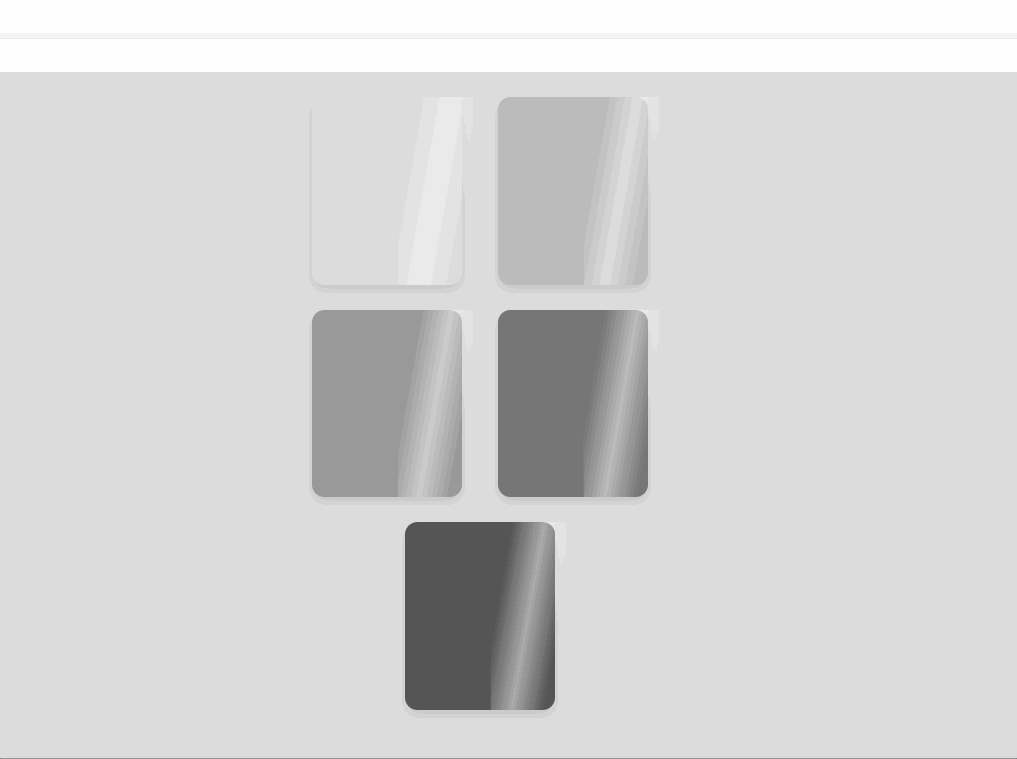 In the image above, the
 transform: translateX(-200%) starts the animation by shifting the widget’s gradient background 200% to the left, creating an initial off-screen shimmer. Following this, the transform: translateX(200%), as shown in the image above, completes the effect by shifting the shimmer back to its original position.
Combining Blurry and Shimmer Effect
Now that you understand the shimmer effect let’s create more examples that combine it with blurred text elements. Let’s work our way around the blurry shimmer effect since there is no specific property, such as box-blur, as we have with the box-shadow property. However, creatively combining multiple CSS features can easily achieve a similar effect.
To proceed, create an index.html file inside your working directory and add the code below.
<!doctype html>
<html lang="en">
  <head>
    <meta charset="UTF-8" />
    <meta name="viewport" content="width=device-width, initial-scale=1.0" />
    <link rel="stylesheet" href="style.css" />
    <title>Blurry Shimmer Effect</title>
  </head>

  <body>
    <div class="bg-overlay"></div>
    <div class="title">
      <h1 class="heading-group">
 BLURRY
        <span class="layer1" aria-hidden="true">BLUR</span>
      </h1>
    </div>
  </body>
</html>
The HTML code above creates a basic webpage with a blurred shimmer text effect. Once you’ve linked your HTML to the external style sheet, let’s move on to the CSS code that creates the visual impact. Copy and paste the code below into the style.css file.
@import url("https://fonts.googleapis.com/css2?family=Playfair+Display:ital,wght@0,400..900;1,400..900&display=swap");
HTML {
  height: 100%;
}

body {
  background: radial-gradient(ellipse at center, #5e5d5d 0%, #000000 100%);

  height: 100%;
  position: relative;
  -webkit-font-smoothing: antialiased;
  -moz-osx-font-smoothing: grayscale;
  display: flex;
  justify-content: center;
}
The code above sets the webpage’s height to the full viewport, establishing a dark radial gradient background that transitions smoothly from grayish-brown to black.
Following this, we create the shimmering movement and incorporate the blur effect using the filter blur property.
.bg-overlay::before {
  content: "";
  background-image: URL("./background.jpg");
  opacity: 0.75;
  position: absolute;
  background-position: center;
  background-size: cover;
  filter: blur(2px);
  -webkit-filter: blur(2px);
  top: 0;
  left: 0;
  width: 100%;
  height: 100%;
  z-index: -1;
}

.title {
  height: 100%;
  width: 100%;
  display: flex;
  align-items: center;
  justify-content: center;
  filter: blur(10px) brightness(0.75);
  -webkit-filter: blur(10px) brightness(0.75);
  transition: filter 1.5s ease-in-out;
  transition-delay: 0.35s;
}

.title:hover {
  -webkit-filter: none;
  filter: none;
}

h1 {
  background: linear-gradient(
 to bottom,
    #cccccc 22%,
    #c7c5c5 24%,
    #b8b8b8 26%,
    #b8b8b8 27%,
    #d9d9d9 40%,
    #3e3e3e 78%
 );
  background-position: 0 1vw;
  background-clip: text;
  -webkit-background-clip: text;
  -webkit-text-fill-color: transparent;
  color: #fff;
  font-family: "Playfair Display", serif;
  position: relative;
  text-transform: uppercase;
  font-size: 18vw;
  margin: 0;
  font-weight: 400;
}

h1:hover {
  text-align: center;
  color: rgba(255, 255, 255, 0.25);
  background: -webkit-gradient(
    linear,
    left top,
    right top,
    from(#222),
    to(#222),
    color-stop(0.5, #fff)
 );
  background: -moz-gradient(
    linear,
    left top,
    right top,
 from(#222),
 to(#222),
 color-stop(0.5, #fff)
 );
  background: gradient(
    linear,
    left top,
    right top,
 from(#222),
 to(#222),
 color-stop(0.5, #fff)
 );

-webkit-background-size: 66% 100%;
-moz-background-size: 66% 100%;
background-size: 66% 100%;
-webkit-background-clip: text;
-moz-background-clip: text;
background-clip: text;
-webkit-animation-name: shimmer;
-moz-animation-name: shimmer;
animation-name: shimmer;
-webkit-animation-duration: 2s;
-moz-animation-duration: 2s;
animation-duration: 2s;
-webkit-animation-iteration-count: infinite;
-moz-animation-iteration-count: infinite;
animation-iteration-count: infinite;
background-repeat: no-repeat;
background-position: 0 0;
background-color: #222;
}Let’s activate the shimmer animation effect when the cursor hovers over the text. We’ll then specify the animation duration and add a delay effect.
.layer1 {
  display: block;
  background: none;
  left: 0;
  top: 0;
  z-index: -1;
  position: absolute;
  text-shadow:
    -1px 0 1px #b3b3b3,
    0 1px 1px #b3b3b3,
    5px 5px 10px rgba(0, 0, 0, 0.4),
    -5px -5px 10px rgba(0, 0, 0, 0.4);
}
.heading-group:hover {
  animation-duration: 3.75s;
  animation-delay: 0.5s;
  animation-name: shimmer;
  animation-iteration-count: infinite;
  animation-direction: alternate;
}

@-moz-keyframes shimmer {
 0% {
    background-position: top left;
 }
 100% {
    background-position: top right;
 }
}
@-webkit-keyframes shimmer {
 0% {
    background-position: top left;
 }
 100% {
    background-position: top right;
 }
}
@-o-keyframes shimmer {
 0% {
    background-position: top left;
 }
 100% {
    background-position: top right;
 }
}
@keyframes shimmer {
 0% {
    background-position: top left;
 }
 100% {
    background-position: top right;
 }
}
In the code above, we define the shimmer animation to get activated when you hover over the text. This animation shifts the background position over time, creating a back-and-forth effect. We also added a delay effect to delay the animation for a half-second for a smooth visual transition.
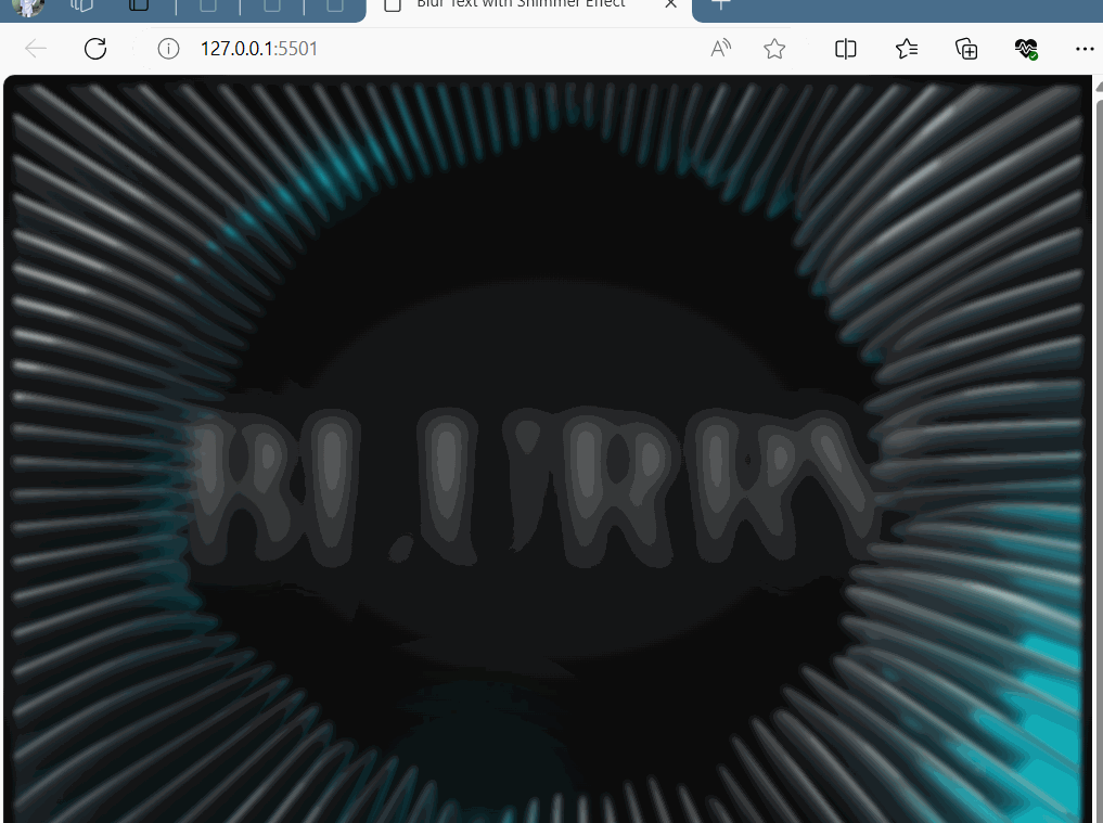 The image above illustrates a CSS combination element employing a sheen animation over initially blurred text. This effect is achieved by using a multi-colored gradient, enhancing the text and forming the basis for a shimmering effect. Upon hover, the animation subtly moves the gradient background, creating the illusion of shimmering light traversing the text.
Creating a Blurry Shimmer Loading Indicator
Let’s incorporate a loading indicator into our webpage to understand this further. We can use CSS animations and gradients to create a sleek loading spinner that can keep visitors engaged during content loading.
Add the HTML code below to your working directory’s ‘index.html’ file.
<!doctype html>
<html lang="en">
  <head>
    <meta charset="UTF-8" />
    <meta name="viewport" content="width=device-width, initial-scale=1.0" />
    <title>Loading Indicator with Shimmer and Blur Effect</title>
    <link rel="stylesheet" href="style.css" />
  </head>

  <body>
    <div class="loading-container">
      <div class="circle-container">
        <div class="circle shimmer"></div>
        <div class="circle blur"></div>
        <div class="circle blur"></div>
        <div class="loading-text">Loading...</div>
      </div>
    </div>
  </body>
</html>
The code above sets up a webpage with a loading indicator that combines shimmer and blur effects. Inside the body, there’s a container with circles representing the loading animation and text indicating loading. Next, let’s style our loading indicator using CSS:
body {
  margin: 0;
  padding: 0;
  font-family: "Arial Rounded MT Bold", sans-serif;
  background-color: #edebf3;
}

.loading-container {
  display: flex;
  align-items: center;
  justify-content: center;
  height: 100vh;
}

.circle-container {
  position: relative;
  width: 200px;
  height: 200px;
}

.circle {
  position: absolute;
  width: 100%;
  height: 100%;
  border-radius: 50%;
  border: 4px solid currentColor;
  animation: lds-ripple 1s cubic-bezier(0, 0.2, 0.8, 1) infinite;
}

.circle:nth-child(1) {
  border-color: #9c27b0;
}

.circle:nth-child(2) {
  border-color: #03a9f4;
}

.circle:nth-child(3) {
  border-color: #ffeb3b;
}

.loading-text {
  position: absolute;
  top: 50%;
  left: 50%;
  transform: translate(-50%, -50%);
  font-size: 24px;
  color: #4caf50;
  text-shadow: 2px 2px 4px rgba(41, 18, 171, 0.3);
  animation: text-shimmer 2s infinite linear;
}

@keyframes text-shimmer {
 0% {
    color: #4caf50;
 }
 50% {
    color: #8bc34a;
 }
 100% {
    color: #4caf50;
 }
}

@keyframes lds-ripple {
 0% {
    top: 88px;
    left: 88px;
    width: 24px;
    height: 24px;
    opacity: 0;
 }
 4.9% {
    top: 88px;
    left: 88px;
    width: 24px;
    height: 24px;
    opacity: 0;
 }
 5% {
    top: 88px;
    left: 88px;
    width: 24px;
    height: 24px;
    opacity: 1;
 }
 100% {
    top: 0;
    left: 0;
    width: 200px;
    height: 200px;
    opacity: 0;
 }
}
In the code above, the CSS keyframes animate the borders of circles, creating the shimmer effect. Each circle receives a blur effect to signify loading, while varied colors enhance visual appeal.
At the heart of it, let’s position the loading text at the container’s center and apply a shimmer animation. This combination of blur and shimmer on both circles and text creates a stunning design, as illustrated in the image below.
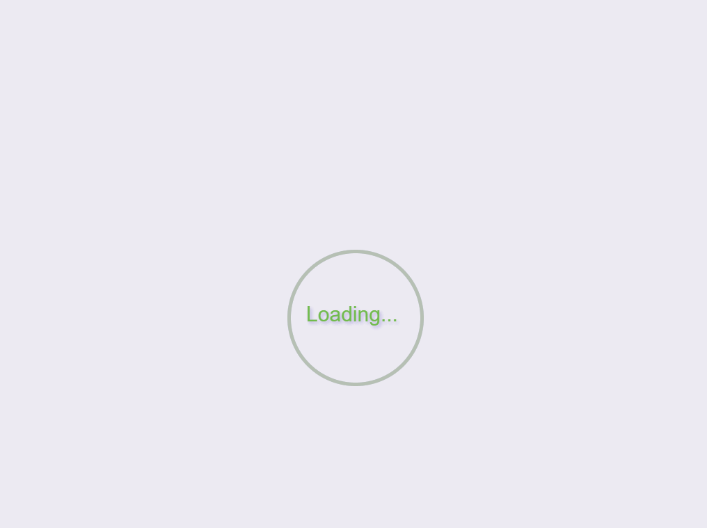 The image above showcases a loading indicator with shimmering circles. As the animation progresses, the circles shimmer with a subtle movement, creating an illusion of light reflecting off their borders while waiting for the content to load.
Rendering the box-shadow effect
The box-shadow property adds shadow effects around an element’s frame. With box-shadow, you can create depth and dimension, cast drop shadows, create rounded corners combined with border-radius, and add multiple shadows to an element.
HTML structure for the box-shadow effect
Let’s lay out the structure and foundation for the box-shadow effect to give the box element a special glow.
<!doctype html>
<html lang="en">
  <head>
    <meta charset="UTF-8" />
    <meta name="viewport" content="width=device-width, initial-scale=1.0" />
    <title>Box Shadow</title>
    <link rel="stylesheet" href="style.css" />
  </head>

  <body>
    <div class="box-container">
      <div class="box">
        <div class="shimmer"></div>
      </div>
    </div>
  </body>
</html>
CSS structure for the box-shadow effect
Imagine you’re painting a picture and want to add some effect to make it stand out. With CSS, you can add the box-shadow effect on boxes or anything you design to make it look visually appealing.
To achieve that, let’s add some tricks to make the box lifelike:
.box-container {
width: 100%;
height: 100vh;
display: flex;
justify-content: center;
align-items: center;
background-color: #f0f0f0;
}
.box {
width: 200px;
height: 200px;
background-color: #ffffff;
border-radius: 20px;
box-shadow: 0 0 100px rgba(38, 9, 156, 3);
position: relative;
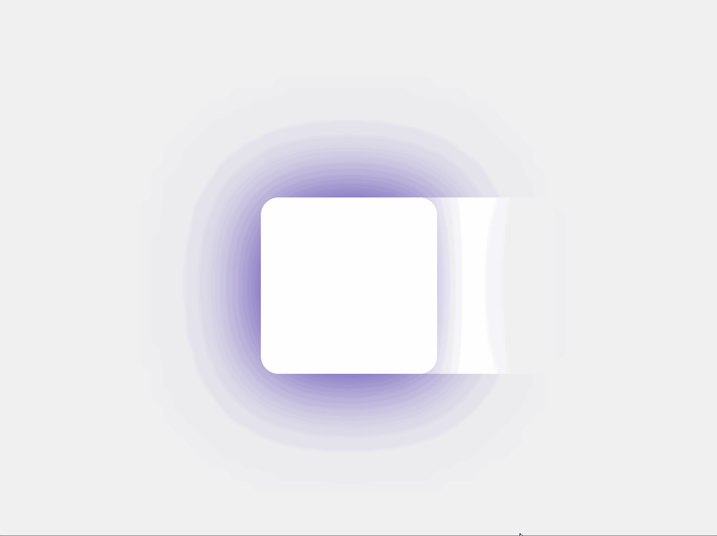
}In the code above, we created a centered box with a soft shadow using a few CSS tricks; we set the box-container to take an entire viewport with a light gray background, and we used the box-shadow property to style the box softly. By adjusting the opacity and setting the position to relative, if you followed correctly, you should have the following output, as shown in the image below:
To create a shimmer effect that moves across the white square in the right direction across the container’s width, Copy the following code and add it to your CSS code:
.shimmer {
  position: absolute;
  top: 0;
  left: -200px;
  width: 200px;
  height: 100%;
  background: linear-gradient(
 to right,
    transparent 0%,
    #fff 50%,
    transparent 100%
 );
  animation: shimmer 1.5s infinite linear;
}

@keyframes shimmer {
 100% {
    left: 100%;
 }
}
In the code above, we created a shimmering effect in which a white-to-transparent gradient moves from left to right across the container. We initially positioned it off-screen and animated its movement to the full width, successfully creating the shimmering effect.
Visual effect with CSS animation
CSS animations animate transitions between configurations. They employ a declarative approach (that is, we can specify what we want to achieve directly), which allows us to define the desired animation states and timings within our CSS code.
An animation comprises two key elements: a series of keyframes and a style that describes the CSS animation. Let’s create an animation effect that moves an element horizontally from left to right and back to its original position continuously. The code below demonstrates how to use the CSS animation effects on a webpage.
<html lang="en">
<head>
<meta charset="UTF-8" />
<meta name="viewport" content="width=device-width, initial-scale=1.0" />
<title>CSS Animation</title>
<style>
body,
HTML {
height: 100%;
margin: 0;
display: flex;
justify-content: center;
align-items: center;
background-color: #f0f0f0;
}
.animation {
width: 100px;
height: 100px;
background-color: RGB(142, 40, 110);
border-radius: 10px;
box-shadow: 0 0 20px rgba(0, 0, 0, 0.5);
animation: example-animation 2s linear infinite;
}
@keyframes example-animation {
0% {
transform: translateX(0);
}
50% {
transform: translateX(100px);
}
100% {
transform: translateX(0);
}
}
</style>
</head>
<body>
<div class="animation"></div>
</body>
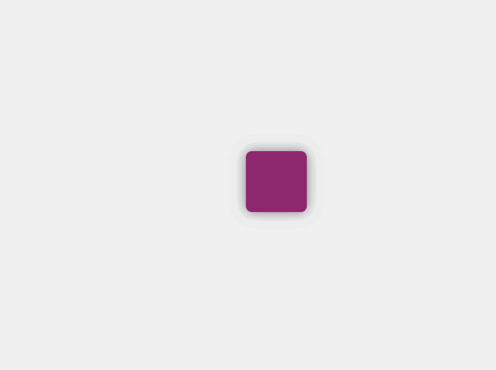
</html>In the code above, we created a straightforward CSS animation. The animation class defines the appearance of our animated element, setting properties like background-color ,border-radius, and box-shadow.
With the @keyframes example-animation, we dictate the motion of the animated object, specifying its movement over time with a linear timing function and an infinite repeat. Below is the output of the code above:
 You can also play around with various properties to build designs that best reflect your interests.
Conclusion
In conclusion, mastering the CSS Blurry Shimmer Effect boosts website visual appeal. Throughout this article, we’ve delved into various examples, from text to box shadows, offering engaging content while pages load. We’ve also discussed the core concepts behind the effect, including animations and gradients, and provided practical code samples showcasing the use of different CSS attributes. Try it on your own, now!
Truly understand users experience
See every user interaction, feel every frustration and track all hesitations with OpenReplay — the open-source digital experience platform. It can be self-hosted in minutes, giving you complete control over your customer data. . Check our GitHub repo and join the thousands of developers in our community..
